


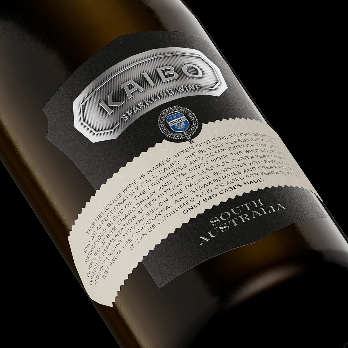
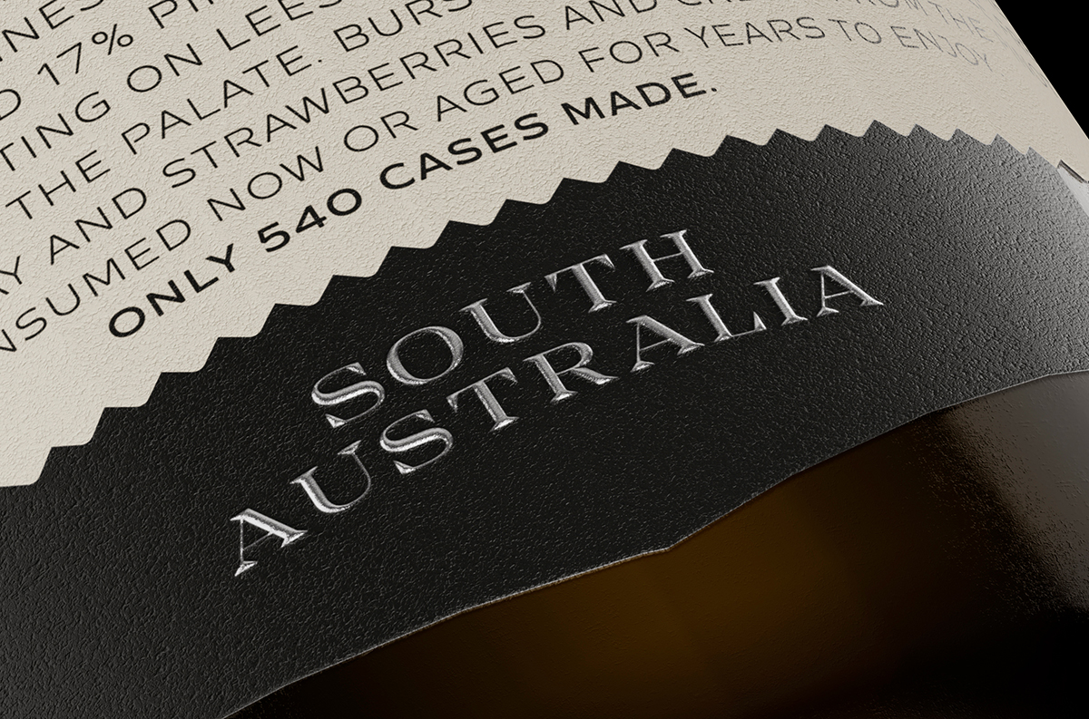
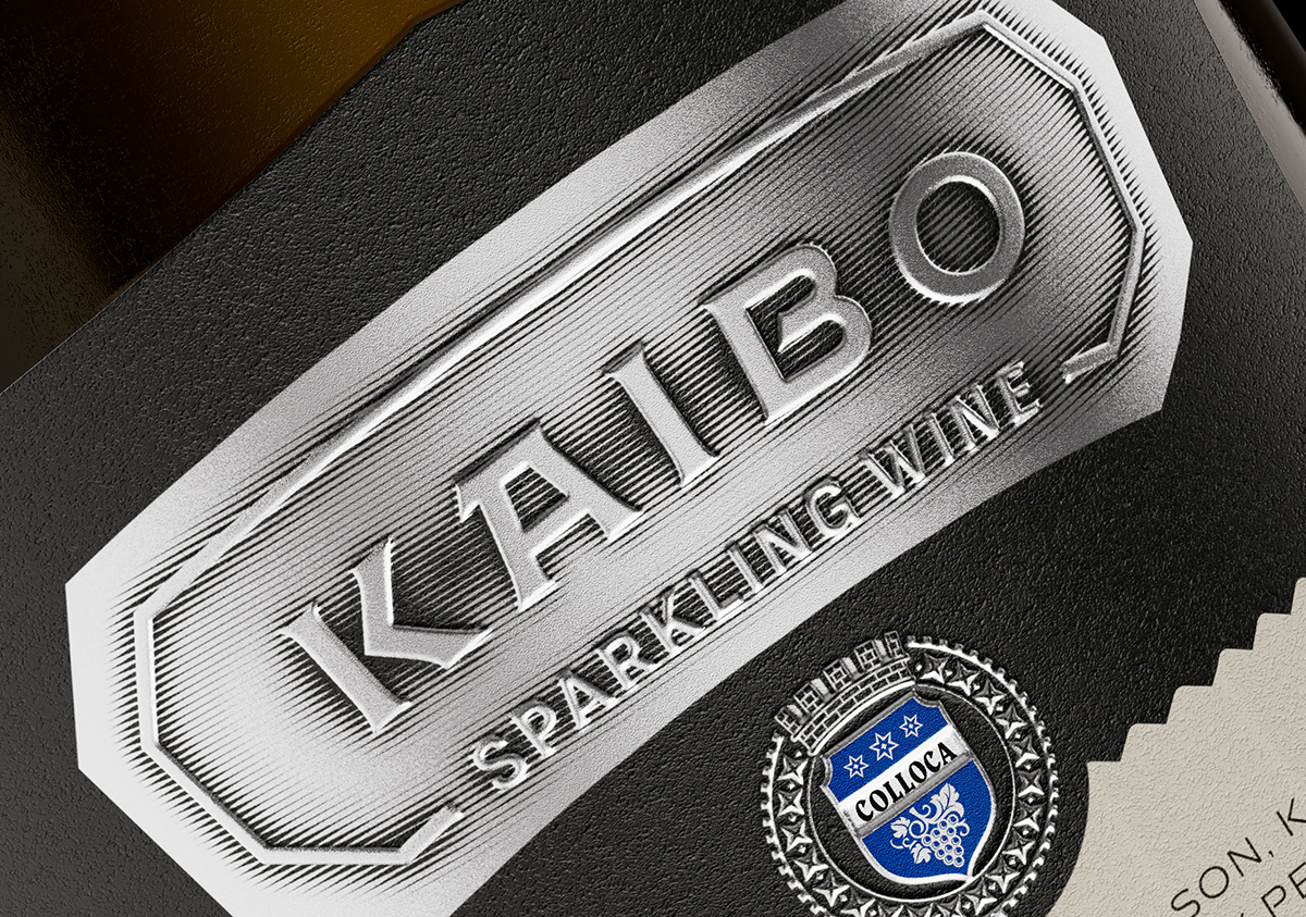
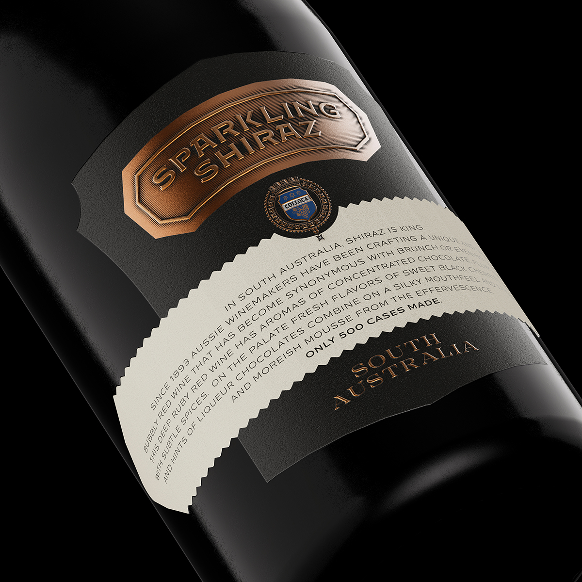
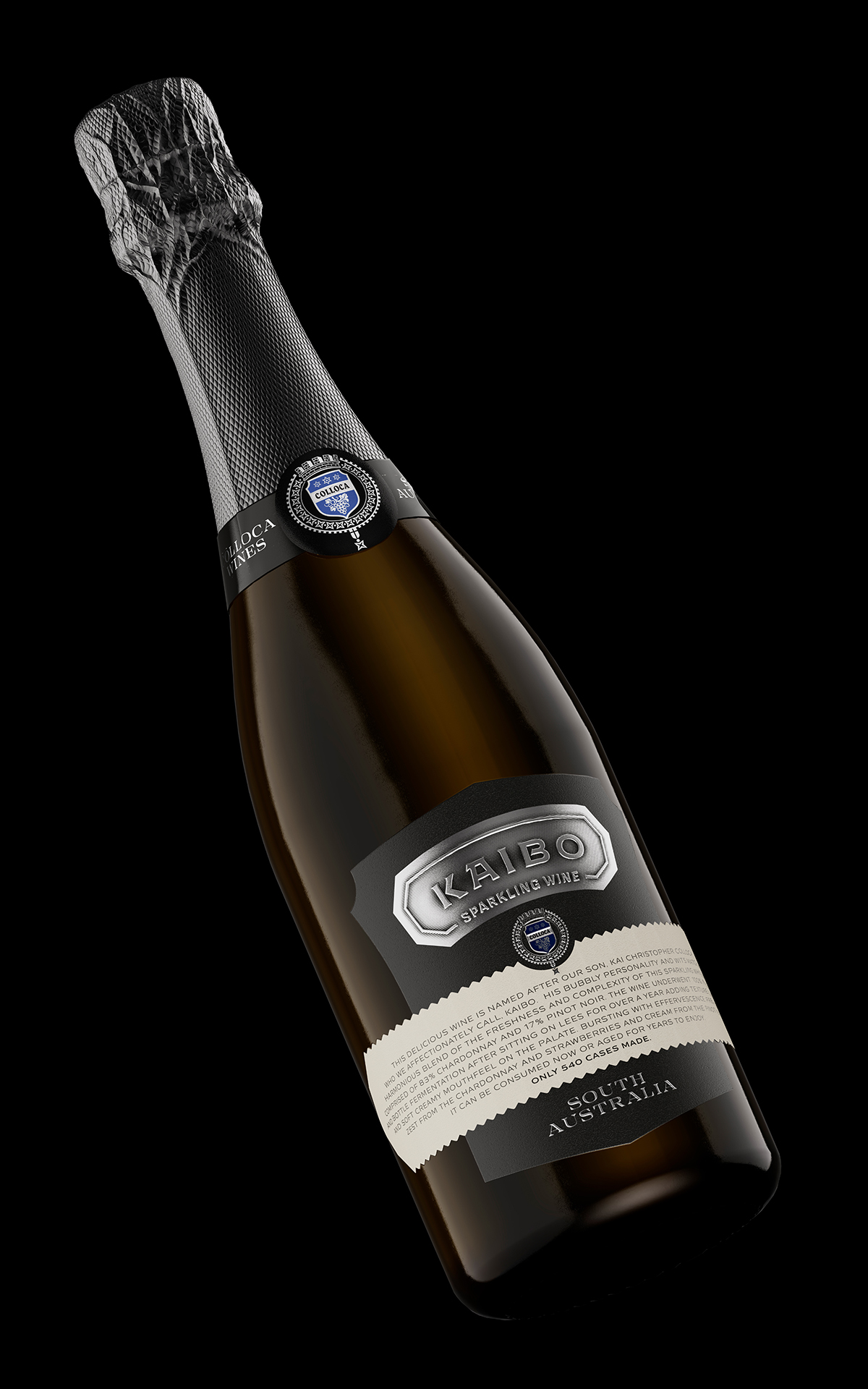
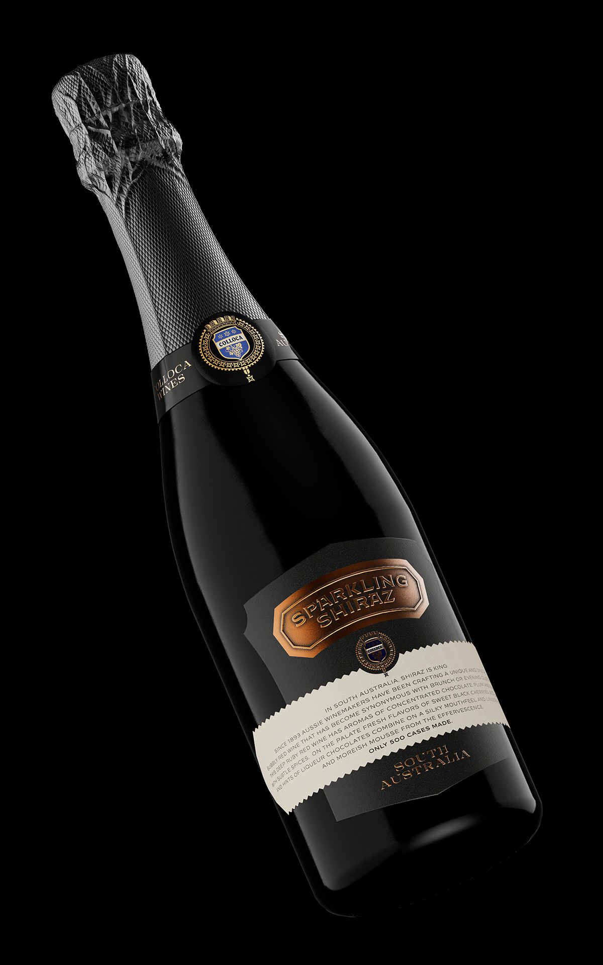
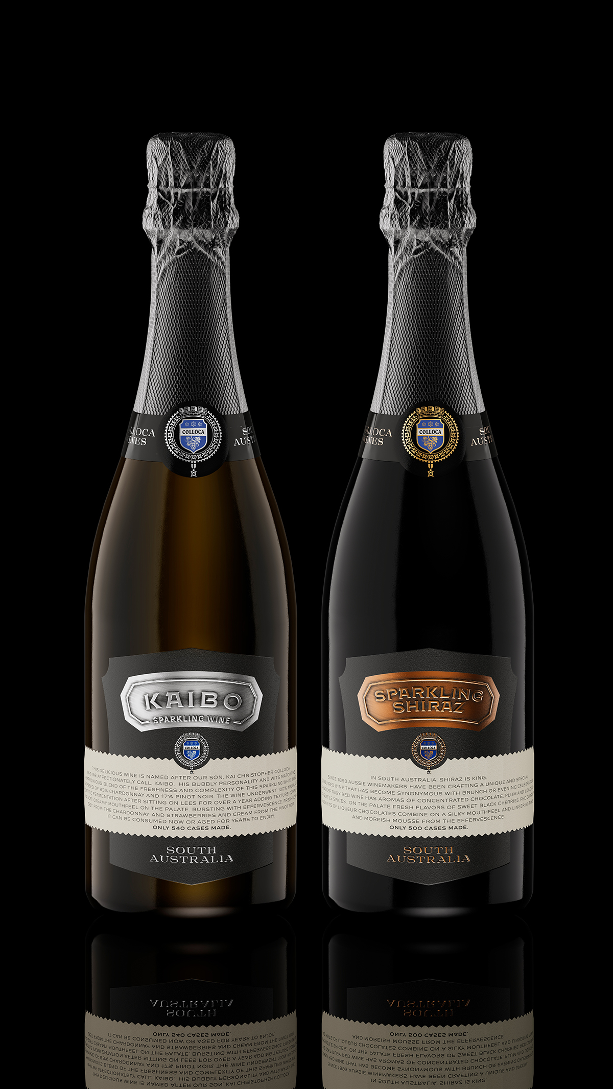
I have been working for Colloca Estate for more than 10 years and I have always admired their ability to develop. The latest addition to their portfolio are two sparkling wines made in Australia – Kaibo and Sparkling Shiraz. At first, I didn’t have a very clear idea of what exactly I wanted to do, because Chris Colloca had one idea and I had another. What the two had in common was that they were quite vague. Eventually, things became clearer and I was able to create a very different design for sparkling wine. Colloca has always had their own view of things, so I decided that their sparkling wines should be no exception. I used a non-traditional form of label, heavily influenced by heraldic shields and coats of arms. At the same time, the printing and the materials I used helped me to create a vintage design that complemented the shape of the label very well enhancing its historic visual roots. I wanted to have solid areas stamped with hot foil that would make an impression from a distance, while I also wanted to have many special details such as the strong embossing and the engraved shadow of the letters in the metal banners. I paid special attention to the paper – I chose a heavy stock with a flat delicate texture, which complemented the metal objects. Subsequently, I added a special sand varnish to the banner with the text description, which created the feeling that the label was made of two types of paper. Around the neck, I placed a black collar label that repeated the Colloca crest from the front label. And for the capsule I used a very interesting graphite gray color with matt metallic reflections. The printing process was very complicated, unconventional and risky, but my colleagues from Dagaprint.com once again worked wonders for this very special project. The design of the bottle became very convincing and memorable. At the same time, I was very pleased to find an individual color code for each wine so that they could be more easily recognized on the shelf. The two sparkling wines got a very serious and masculine look, which harmonized great with the design of the label enhancing its natural bonds with crests, coats of arms, heraldry and history.
CREDIT
- Agency/Creative: the Labelmaker
- Article Title: Label Design for Australian Sparkling Shiraz Wine Created by the Labelmaker
- Organisation/Entity: Agency
- Project Type: Packaging
- Project Status: Published
- Agency/Creative Country: Bulgaria
- Agency/Creative City: Sofia
- Market Region: North America
- Project Deliverables: 3D Art, Brand Creation, CGI, Graphic Design, Label Design, Packaging Design
- Format: Bottle
- Substrate: Glass Bottle
- Industry: Food/Beverage
- Keywords: the labelmaker, wine label art, wine label designer, wine label design, wine design, wine branding, wine label print, hot foil stamping, microembossing, copper hot foil, jordan jelev, embossed wine label, colloca estate, kaibo, sparkling shiraz
-
Credits:
client: Colloca Estate
Designer: Jordan Jelev


