


Brand Introduction:
“Western Choice” Deluxe Whisky is a distinguished spirit that embodies the essence of Indian craftsmanship and heritage. With an exquisite blend of smooth Indian finest malts and select grain spirits, Western Choice celebrates the rich legacy of traditional Indian distillation methods while incorporating a touch of modern sophistication. This premium whisky is crafted to offer an unparalleled sensory experience, showcasing the essence of India’s finest spirits to the markets of the Middle East and Africa.
Concept behind the Design:
The design of the label and packaging for Western Choice embodies a fusion of regal elegance and the vibrancy of Indian culture. Rooted in the legacy of the Indian subcontinent, the label and packaging evoke a sense of grandeur and opulence, reflecting the brand’s commitment to offering an exceptional and luxurious whisky experience. The concept is to merge the heritage of India with a contemporary touch, symbolizing the brand’s vision to become a symbol of prestige and sophistication in the global whisky market.
Label Design:
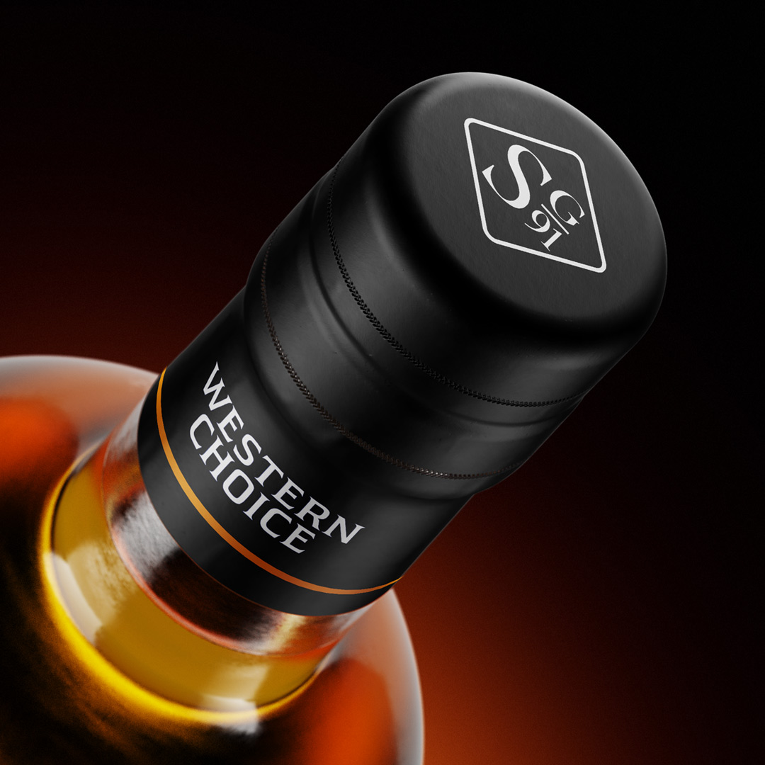
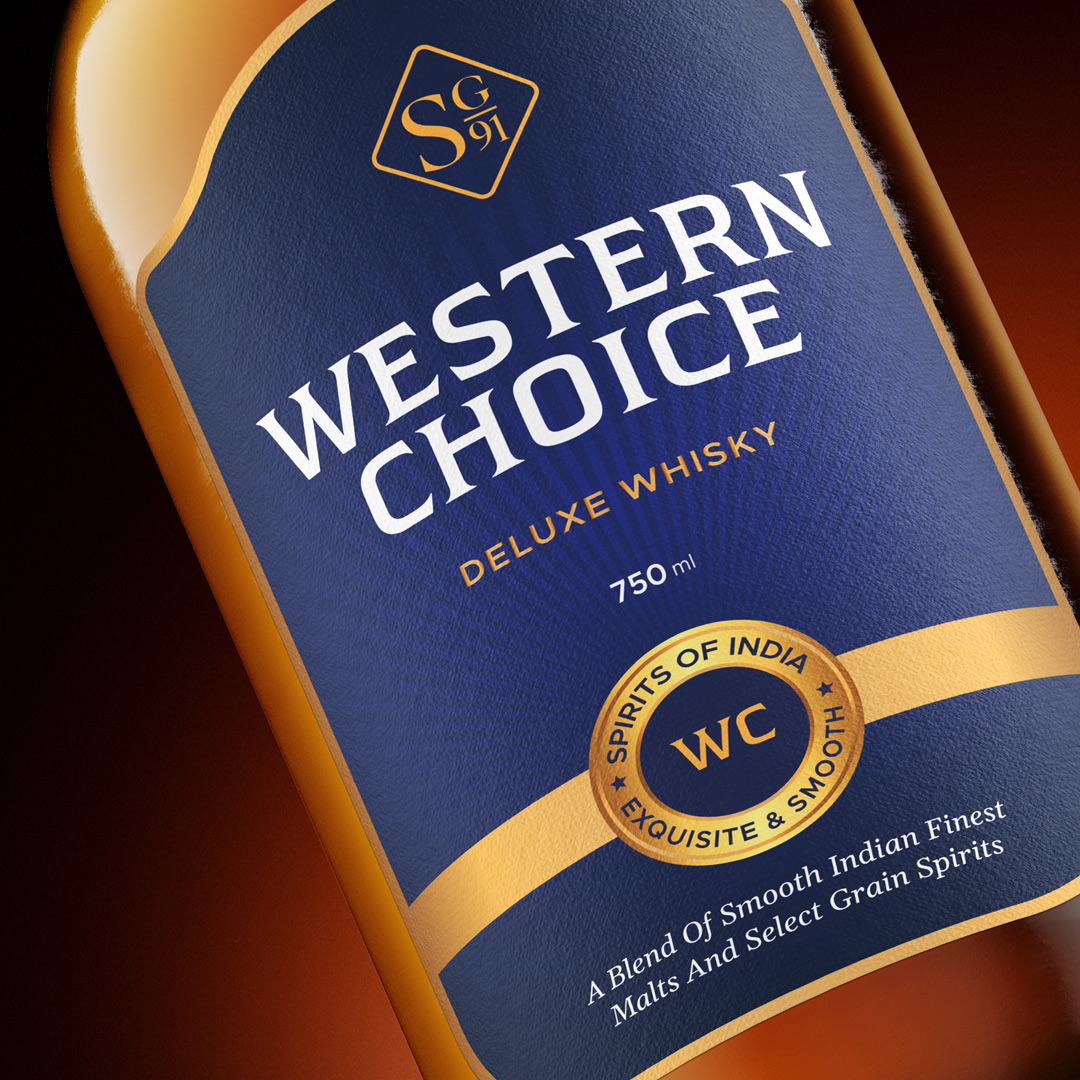
The label design for Western Choice Deluxe Whisky features a bold serif font, exuding an air of timelessness and prestige. The dominant color scheme of royal blue and gold symbolizes the brand’s regal lineage and luxurious appeal. A central element of rising rays represents the brand’s upward journey and aspirations, reflecting its commitment to continually reach new heights in the world of premium spirits. The label incorporates the narration, “A blend of smooth Indian finest malts and select grain spirits,” which serves as a testament to the whisky’s exceptional quality and rich Indian heritage.
Packaging:
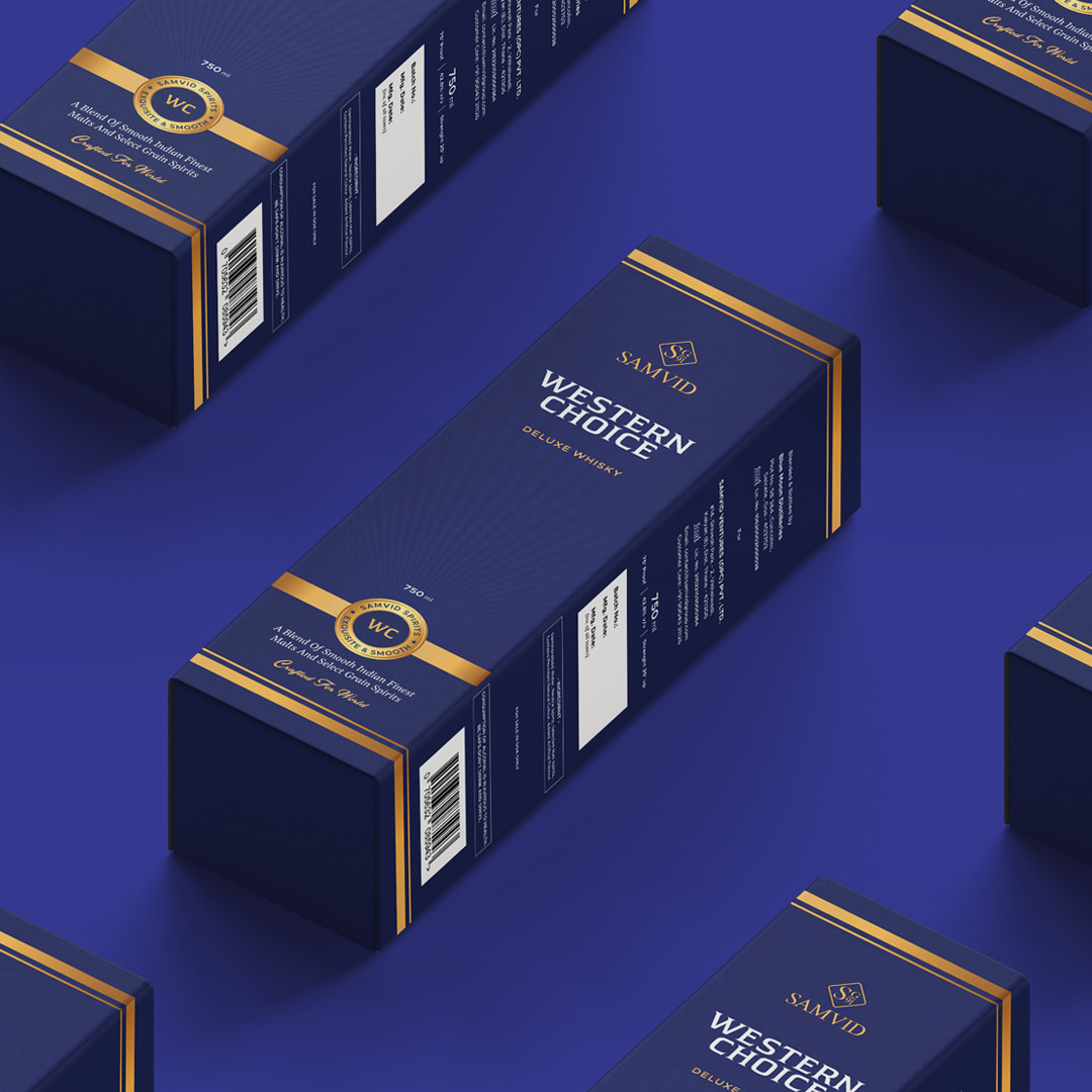
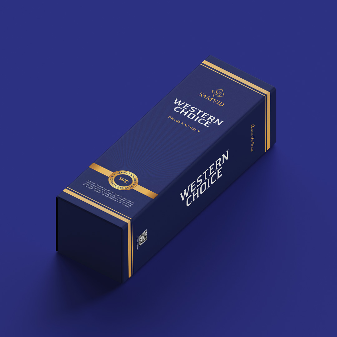
The packaging for Western Choice Deluxe Whisky mirrors the sophistication and luxury embodied by the brand. Encased in a sleek and premium royal blue exterior, accented with intricate golden detailing, the packaging exudes a sense of exclusivity and refinement. The use of high-quality materials and intricate design elements conveys the brand’s dedication to delivering an unparalleled whisky experience to connoisseurs in the Middle East and Africa. The packaging is meticulously crafted to provide a seamless unboxing experience that befits the superior quality of Western Choice Deluxe Whisky.
CREDIT
- Agency/Creative: elivatr branding agency
- Article Title: Label and Packaging Design for Western Choice Whisky
- Organisation/Entity: Agency
- Project Type: Packaging
- Project Status: Published
- Agency/Creative Country: India
- Agency/Creative City: Noida
- Market Region: Africa, Middle East
- Project Deliverables: Label Design, Packaging Design
- Format: Bottle, Box
- Industry: Food/Beverage
- Keywords: Whisky Label Design, Whisky Packaging Design, Whisky Branding
-
Credits:
Graphic Designer: Gaurav Py


