


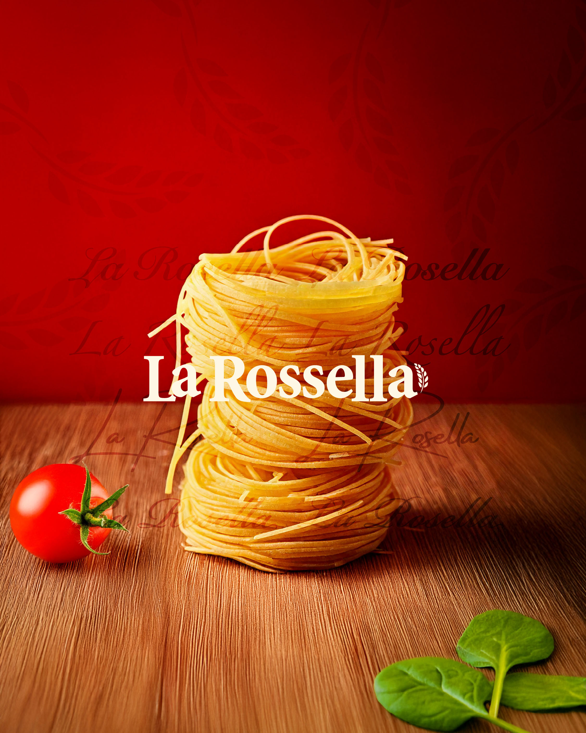
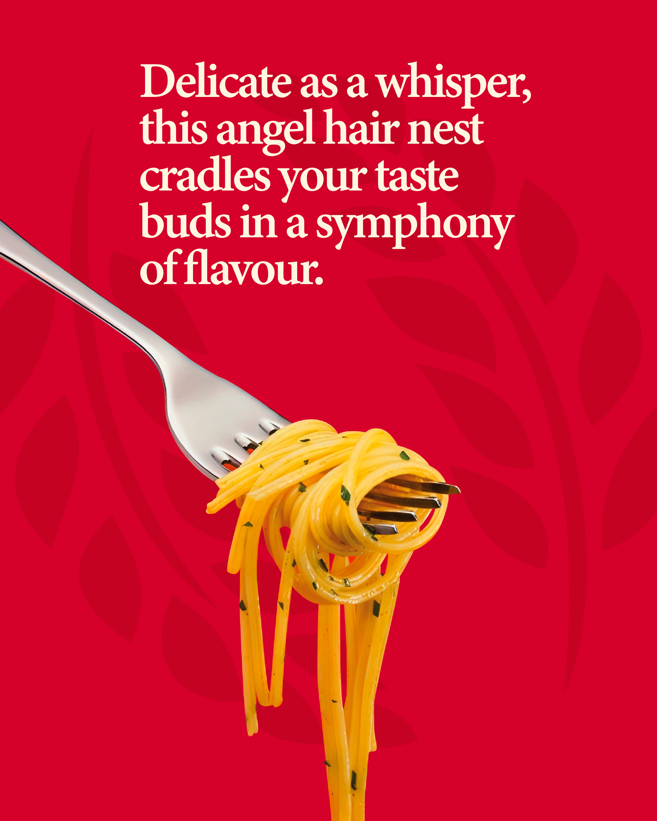
La Rossella is a newly born brand, backed by four generations of expertise in crafting high-quality Italian food products. Bringing premium oils, pastas, and other authentic offerings to the UK market, the brand needed an identity that balanced its rich heritage with a sense of freshness, quality, and beauty. We were tasked with creating La Rossella’s Brand Identity and the packaging for first-ever product, the “Angel Hair Nest Pasta” (Nidi Capellini). The packaging needed to stand out on crowded supermarket shelves while maintaining a balance of simplicity and premium appeal. It had to evoke the tradition of Italian pasta while feeling fresh and modern for a global audience.
Approach:
To build the identity of La Rossella, we focused on the core values of freshness, quality, and beauty—the very essence of the brand. La Rossella, meaning “the rose,” guided our creative direction. From the initial pitch, we aimed for the brand to evoke a sense of romanticism, where romanticism isn’t just a feeling but a reflection of the brand’s commitment to authenticity, excellence, and elegance in every product. Our goal was to create an identity that captures both the meaning behind the name and the brand’s future vision. By emphasising simplicity and cultural relevance, we ensured La Rossella’s Italian roots were reflected throughout, highlighting its Italian authenticity. Every design element was crafted to strike a balance between being visually striking and poetically memorable, creating a brand that resonates not only with the product but also with its deeper emotional connection to its audience.
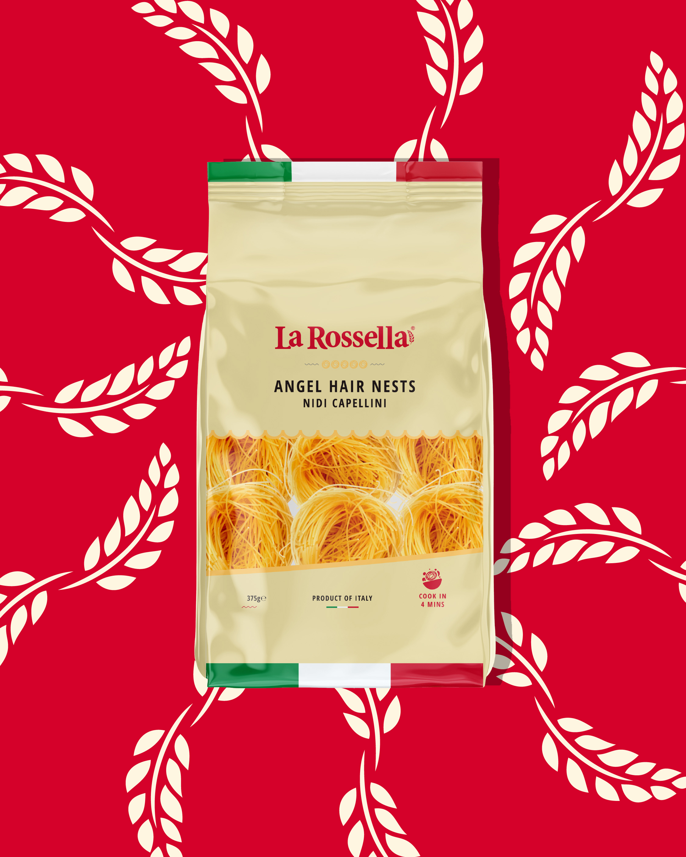
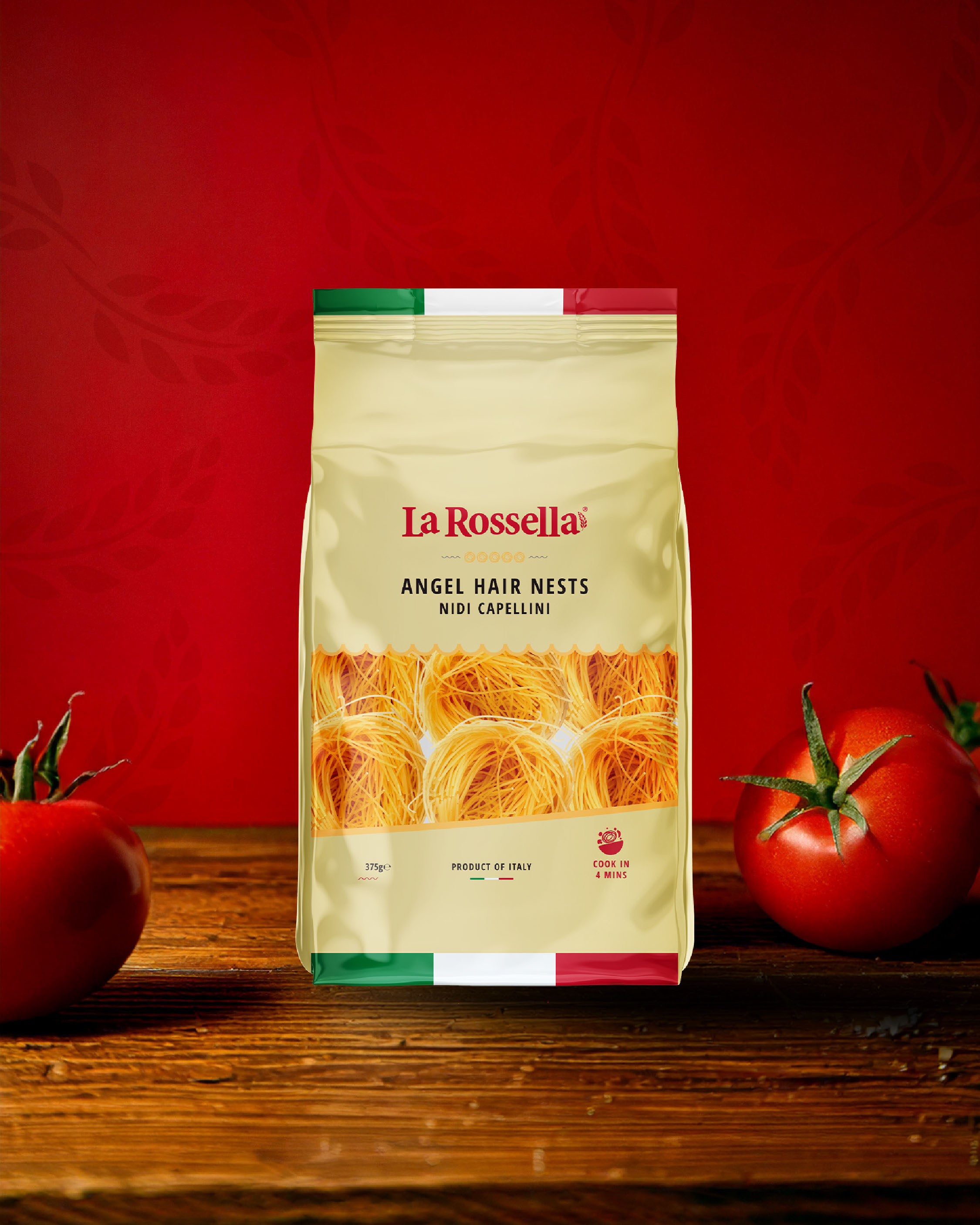
The packaging design draws inspiration from its Italian heritage and traditional pasta-making principles, striving to balance authenticity with standout shelf appeal. The design incorporates subtle yet meaningful elements: a roof-like shape symbolising tradition and stability, a rounded bottom reflecting progress, and a nest motif that emphasises movement and innovation. The cream colour palette, accented with a rich, vibrant red—chosen to evoke the beauty, freshness, and romantic, poetic feel of the brand—adds a sophisticated yet energetic touch. An open window symbolises La Rossella’s welcoming approach, inviting the world to experience its rich Italian traditions.
Solution:
The new brand identity and packaging design successfully met the core brief, delivering a solution that combined freshness, quality, and beauty while staying true to its Italian heritage. The typography-driven logo, combined with a cream base and vibrant red accents, creates a refined yet inviting look. The design reflects La Rossella’s dedication to authentic, high-quality food products, from oils to pastas, while appealing to a global audience. With a balance of tradition and modernity, the brand establishes a strong, premium, and approachable presence in the UK.
CREDIT
- Agency/Creative: Design164
- Article Title: La Rossella Brand Identity & Angel Hair Nest Nidi Capillini Packaging Design by Design164
- Organisation/Entity: Agency
- Project Type: Identity
- Project Status: Published
- Agency/Creative Country: United Kingdom
- Agency/Creative City: Bradford
- Market Region: Europe
- Project Deliverables: Brand Architecture, Brand Creation, Brand Design, Brand Identity, Brand Strategy, Branding, Graphic Design, Packaging Design
- Industry: Food/Beverage
- Keywords: Pasta
-
Credits:
Midweight Graphic Designer: Burhanuddin Muffaddal
Creative Director: Yaseen Badat


