


Background / Challenge
Contemporary brands struggle with an identity paradox:
too many products, too many styles, too many updates.
Logos change, aesthetics age, relevance fades.
In a market obsessed with constant reinvention, identity itself becomes disposable.
La Profilée was conceived as an antidote to this noise.
It asks a radical question:
What if identity were not printed on a surface but embedded in the structure of things?
What if form itself could become language, consistent, adaptive, and timeless?
Concept / Vision
La Profilée is not a logo, nor a product line.
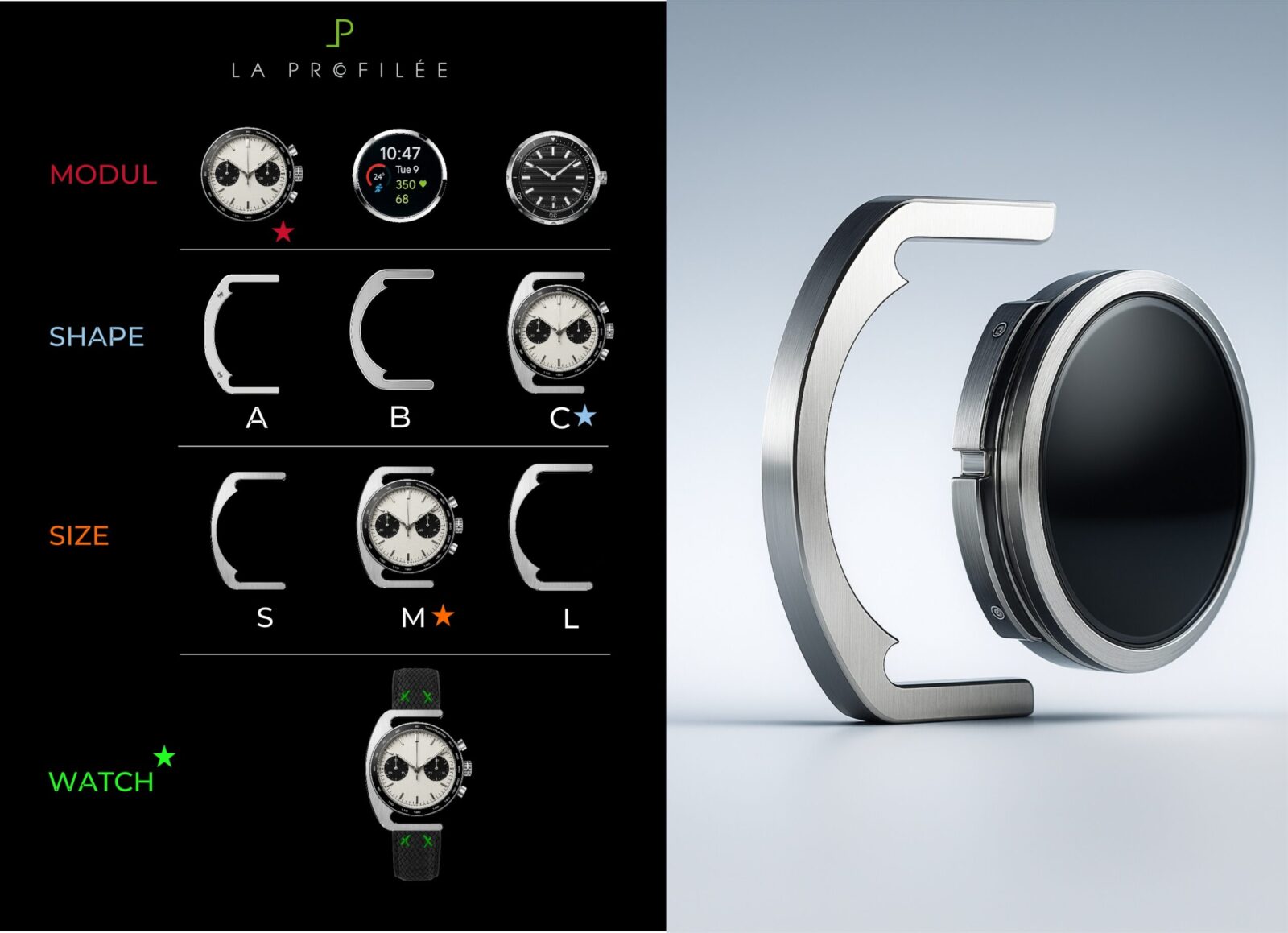
It is a brand architecture in physical form:
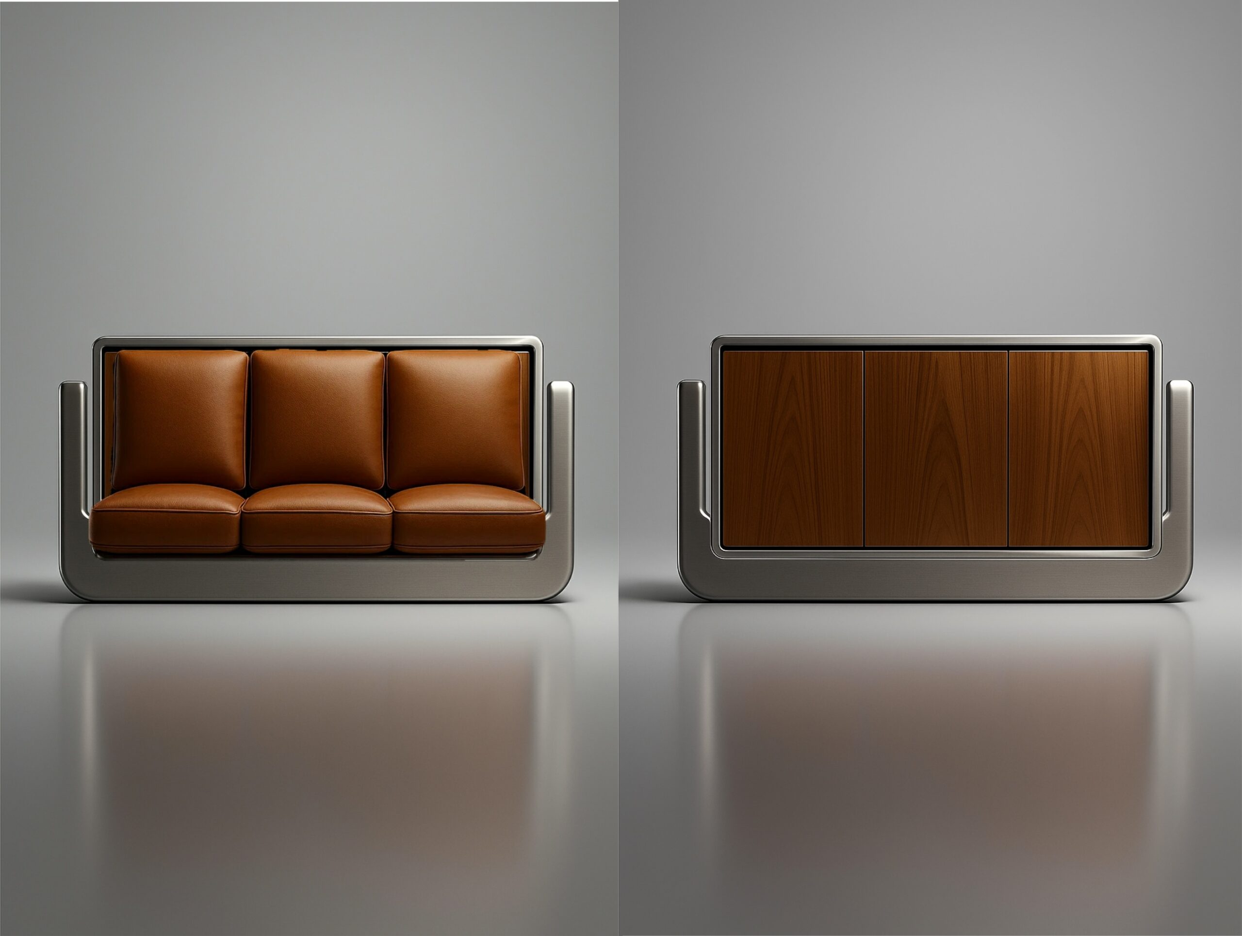
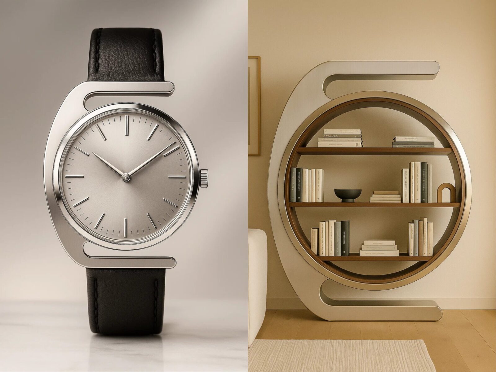
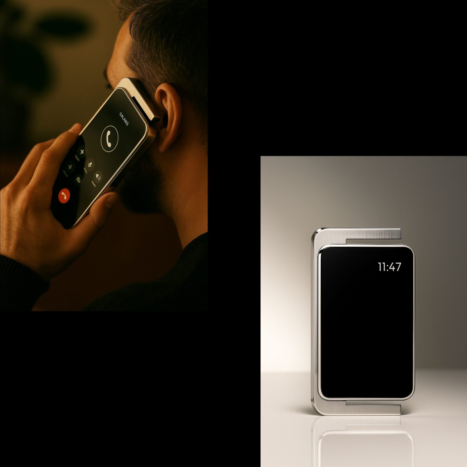
a modular frame-and-module system that defines structure, proportion, and variation across categories.
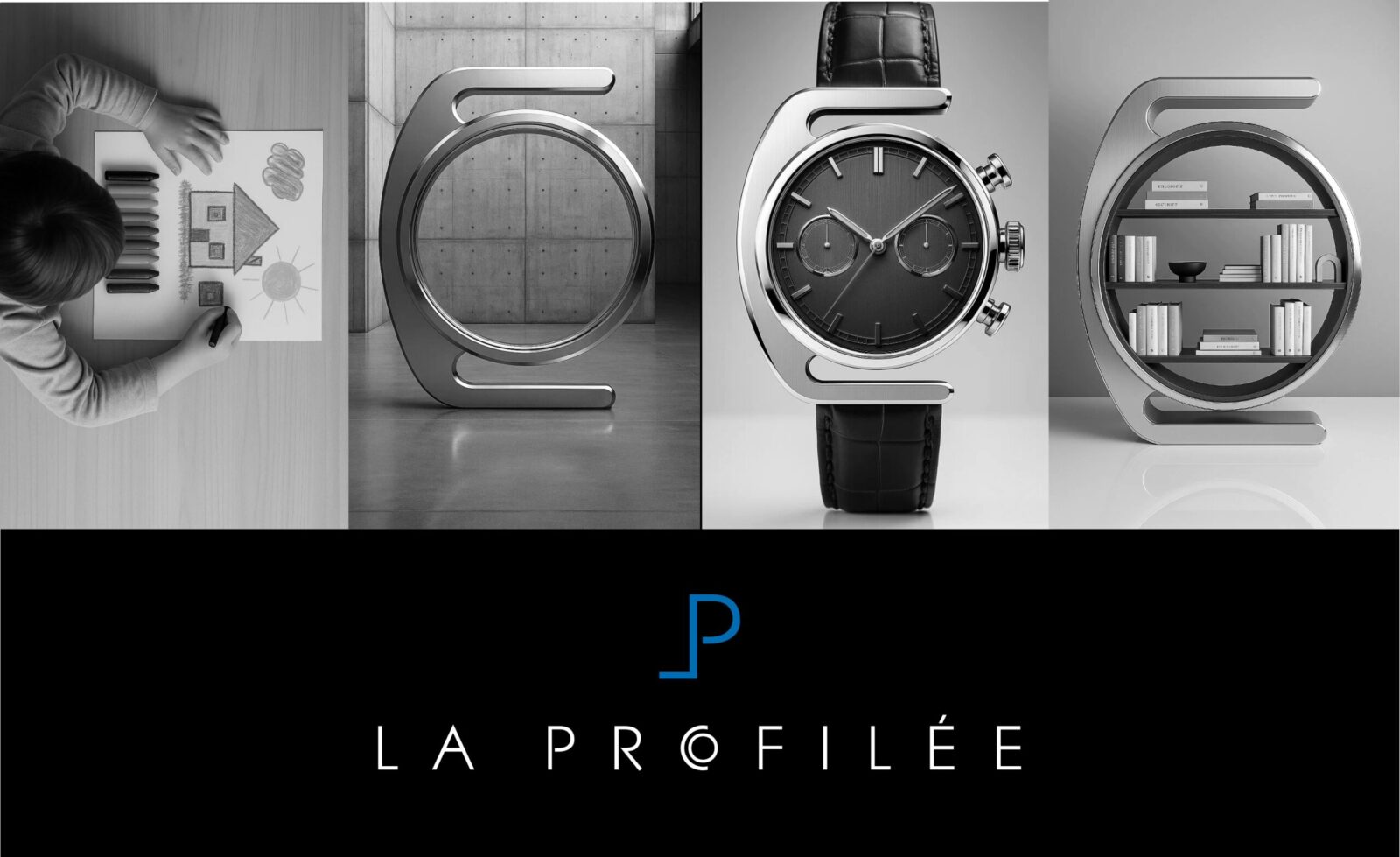
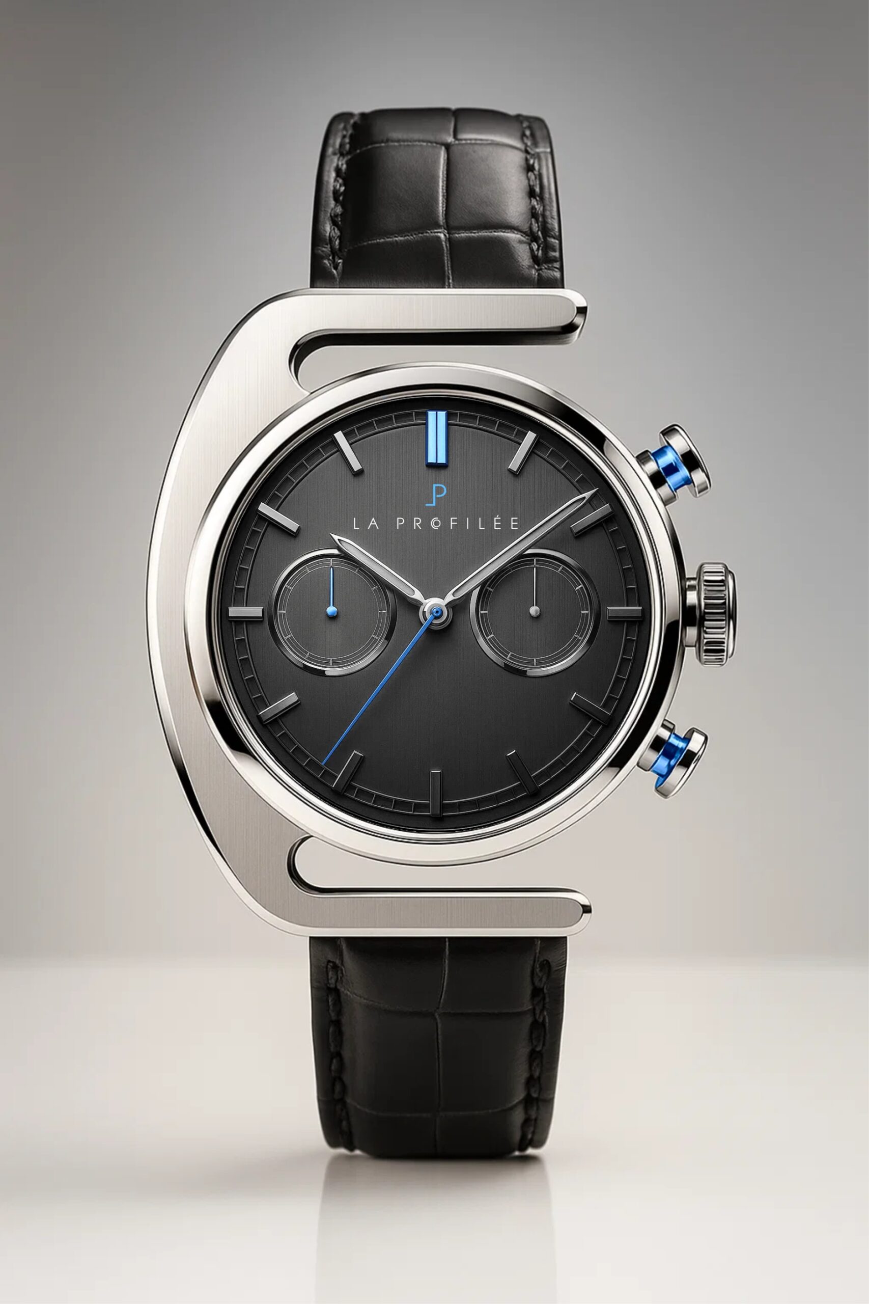
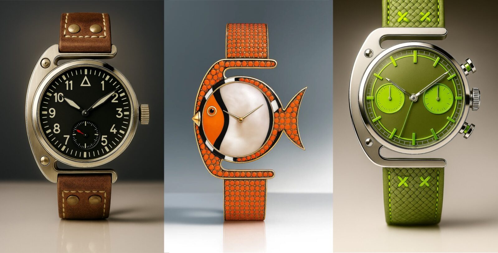
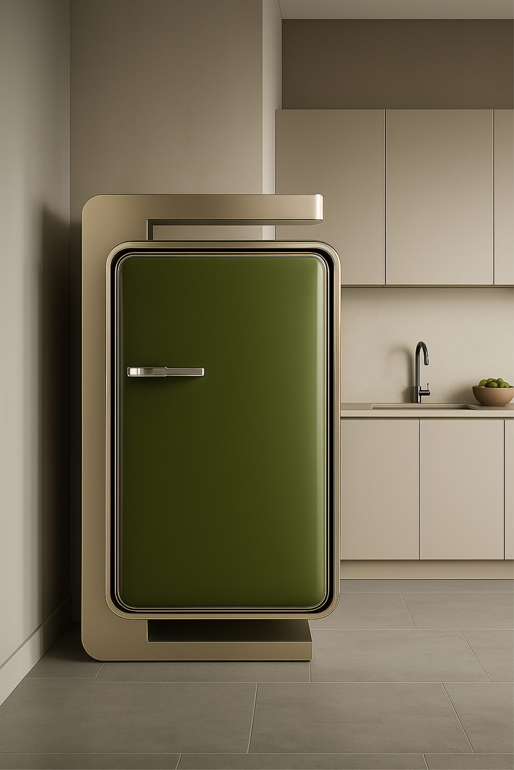
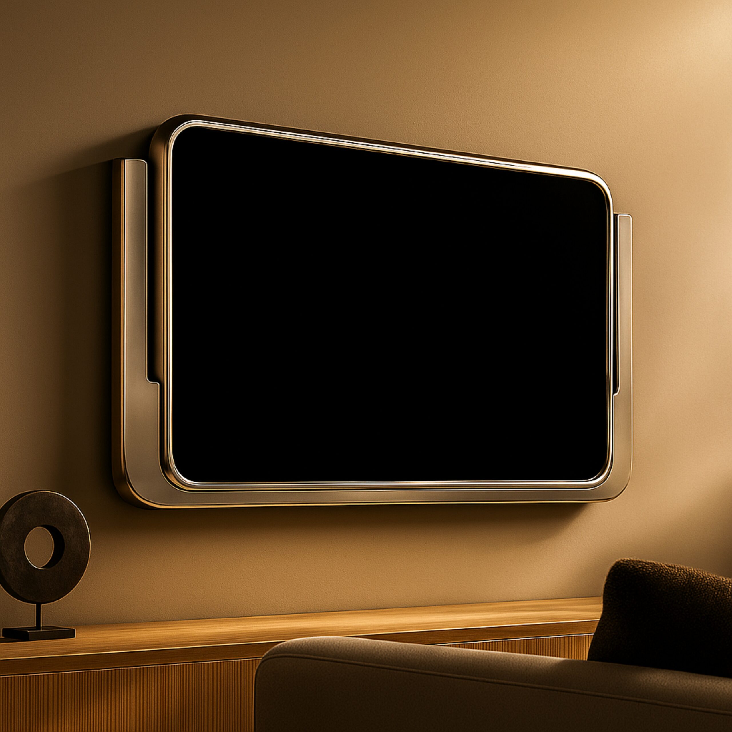
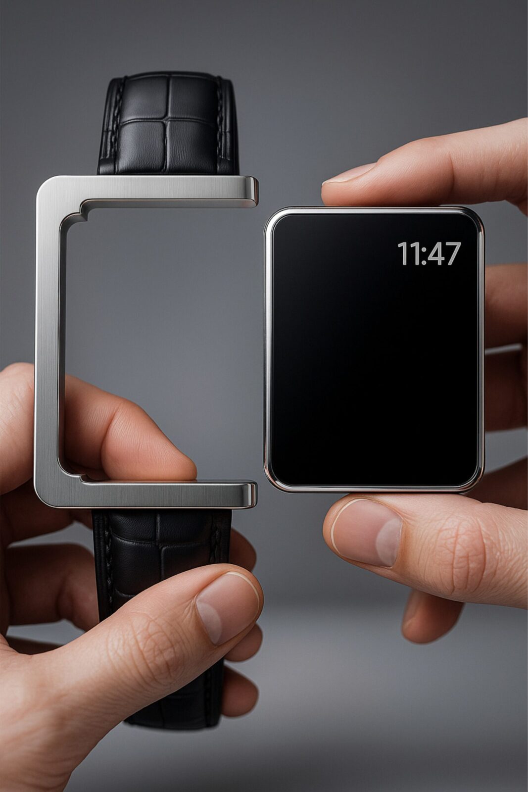
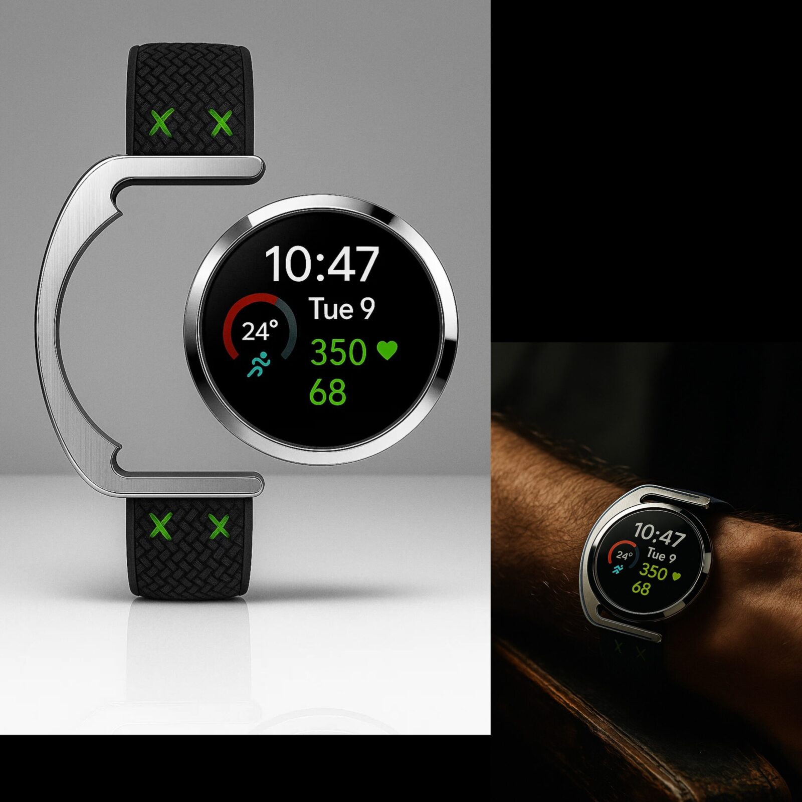
Every object designed within this system, a watch, a piece of furniture, a pendant, or a screen,
shares the same underlying contour:
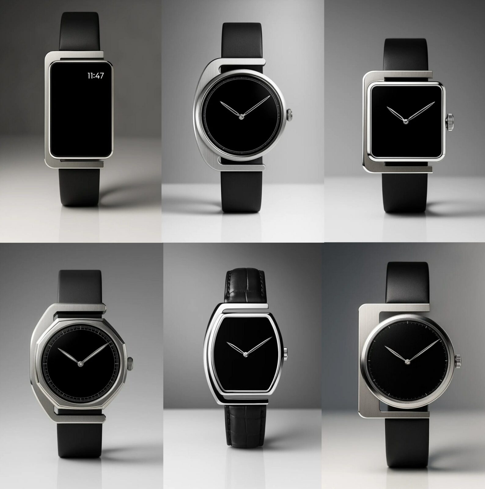
a single continuous line interrupted by one deliberate break.
That break is more than a gesture.
It is the visual signature of the system,
a mark of tension and release, permanence and change.
It defines a recognisable silhouette that replaces graphics with geometry.
Where traditional branding relies on typography and color,
La Profilée achieves identity through spatial memory.
The outline itself becomes the brand,
a universal visual DNA that transcends categories, materials, and industries.
Design Language / Execution
The design began with a human observation:
the natural posture of focus, a head inclined, a line bent, a moment of creation captured in stillness.
This archetype was distilled into a silhouette,
asymmetrical yet balanced, architectural yet human.
From there, the process became one of refinement,
reducing until only proportion, rhythm, and one defining break remained.
The result is an outline that carries its own logic, instantly identifiable regardless of scale or function.
Each iteration within the system preserves the same relational geometry.
Materials may change—steel, ceramic, wood, composite—but the spatial code remains.
Lighting, color, and texture express emotion, yet the identity endures.
The form communicates silently:
clarity instead of ornament, proportion instead of logo, meaning instead of marketing.
Brand Philosophy
La Profilée proposes a shift from brand as image to brand as structure.
Instead of decorating products with visual markers, it embeds identity into the architecture of the object itself.
This approach transforms design into a cultural constant.
Just as a column defines classical architecture or a serif defines a typeface,
the Profilée contour defines a new design lineage, one that brands can share without losing individuality.
Each partner or category can interpret the system differently,
by material, finish, or scale,
yet all remain visibly part of the same universe.
It creates coherence without conformity, diversity without fragmentation.
Emotional Identity
Human recognition operates through memory of shape before color or text.
La Profilée leverages this instinct: one form, one gesture, instantly recalled.
Users recognize it not through logos, but through familiarity,
the same curve on a watch they later find in a lamp or a door handle.
This continuity creates emotional durability.
It transforms ownership into connection.
People keep what still feels like part of them.
The system speaks to a deep human desire for order and meaning in an era of excess design.
Its calmness becomes its charisma.
Scalability & System Thinking
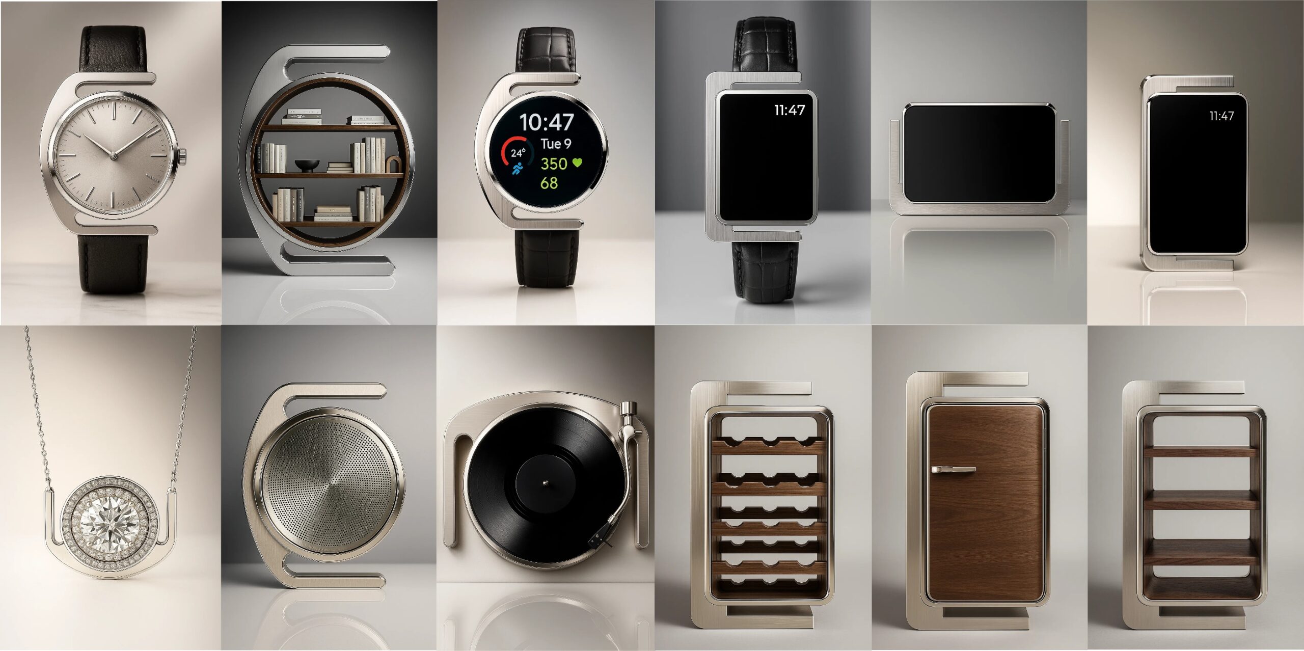
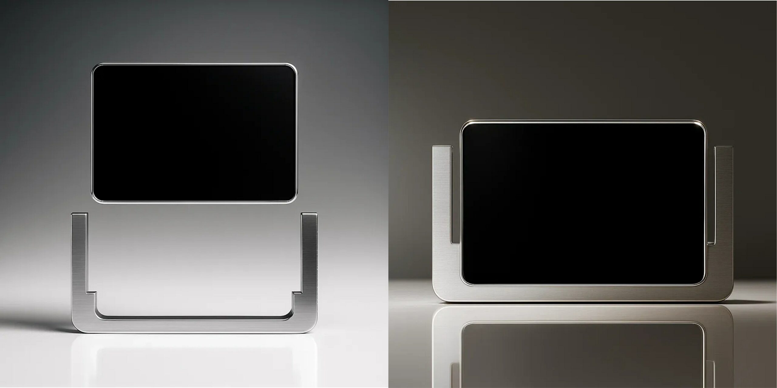
Because La Profilée is modular, it functions both as an aesthetic and as an industrial tool.
The same geometry can be applied to analog and digital interfaces alike.
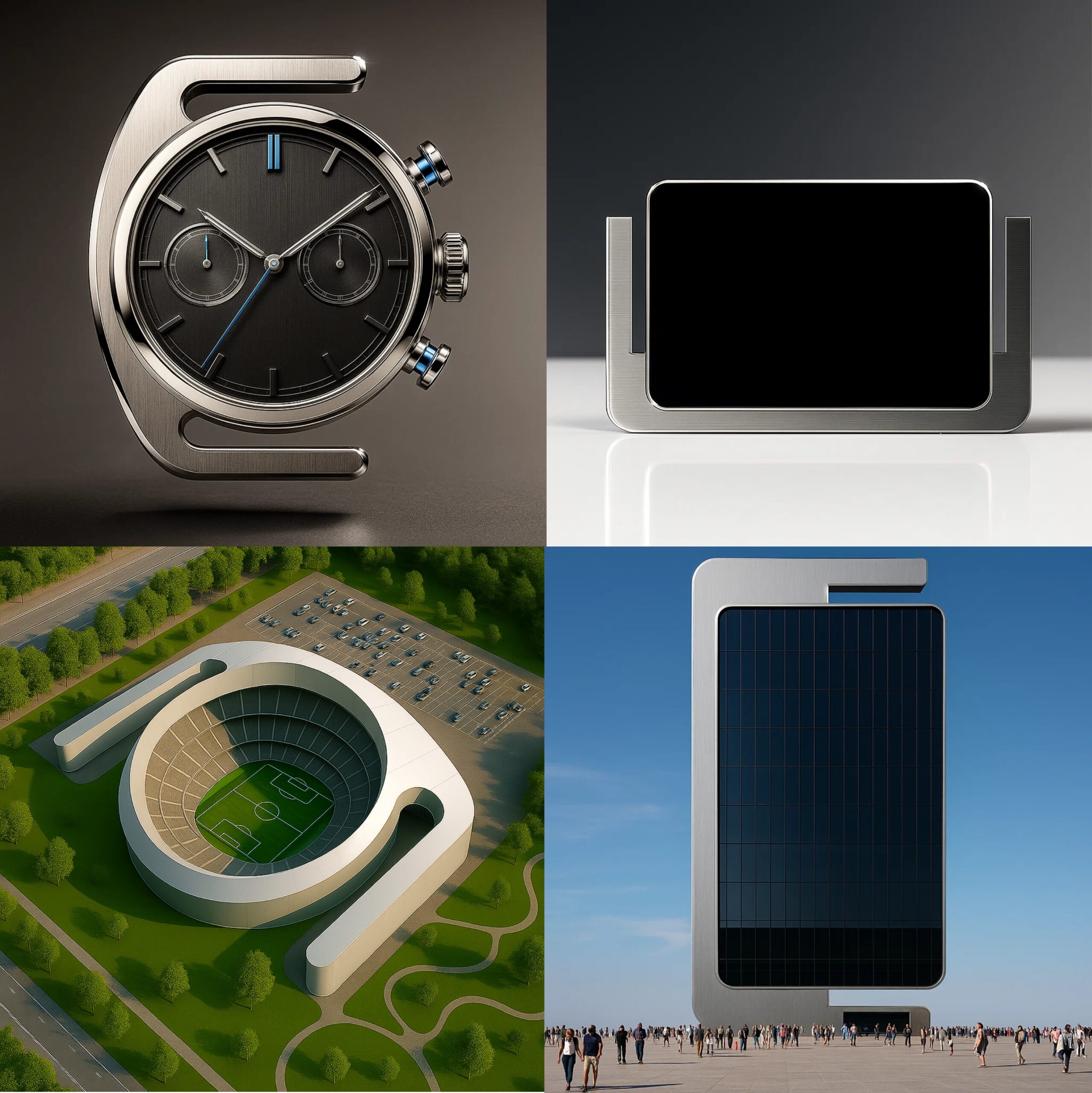
A smartwatch frame, a furniture handle, or a building façade can all share one outline.
This scalability enables brands to build multi-category coherence,
an architectural identity that grows organically rather than through constant redesign.
Where most visual systems degrade when stretched,
La Profilée strengthens. Repetition deepens recognition.
Every new object reinforces the collective memory of the shape.
Cultural & Industry Impact
In a time when brand expression often dissolves into trend cycles,
La Profilée offers a counter-model: slow identity.
It invites industries to build longevity not by freezing design,
but by maintaining a consistent framework that can evolve.
This principle mirrors how cultural symbols persist,
the Doric column, the Bauhaus chair, the iPhone silhouette,
not because they change constantly,
but because they remain open to reinterpretation within clear boundaries.
La Profilée belongs in that lineage,
a system that unites technology, craftsmanship, and philosophy into one recognisable shape.
Visual & Verbal Cohesion
The written identity of La Profilée mirrors its visual one:
short sentences, clear rhythm, deliberate structure.
Typography follows the same principles of contrast and precision,
serif and sans serif combined like frame and module.
Colors are restrained: deep black, bone white, and vivid red.
They anchor the narrative of permanence, neutrality, and energy.
Together, form, word, and color construct a unified visual grammar.
Outcome / Future Potential
The first prototypes demonstrate the universality of the system:
a watch, a smart device, a pendant, a shelf, even a building façade.
Each one different in function, yet unmistakably Profilée.
As a brand platform, the system can host collaborations across industries.
Designers and manufacturers can adopt the silhouette as a base,
a shared architecture that guarantees recognisability while allowing creative freedom.
For the audience, this continuity translates into trust.
For the industry, it creates efficiency and coherence.
For design culture, it marks a transition from form as expression to form as language.
Summary Statement
La Profilée transforms form into identity and identity into culture.
It replaces logos with logic and decoration with structure.
It is not a brand image but a brand architecture,
one that remains recognisable across time, category, and material.

CREDIT
- Agency/Creative: Marc Maibom
- Article Title: La Profilée by Marc Maibom Defines Brand Identity Through Form and Geometry
- Organisation/Entity: Creative
- Project Status: Non Published
- Agency/Creative Country: Germany
- Agency/Creative City: 45481 Mülheim
- Project Deliverables: 3D Design, 3D Modelling, 3D Motion, Brand Creation, Brand Design, Brand Identity, Brand Strategy, Design, Product Design, Visualisation
- Industry: Technology
- Keywords: WBDS Creative Design Awards 2025/26 , Brand Architecture, System Design, Form Identity, Design Language, Modular Framework, Meta Design, Visual DNA, Structural Branding, Product Identity, Design Philosophy, Iconic Form, Cross-Category Design, Intelligent Aesthetics, Timeless Design, Universal Shape


