La Galena is a cozy café located in the heart of Barcelona, Spain, embodying the spirit of a typical neighborhood coffee shop. Its aim is to promote music, literature, and art, becoming a meeting point and community hub. This space hosts various cultural events involving the local community on a monthly or weekly basis. It provides a platform for local illustrators and artists to exhibit their work and also offer literary workshops. It is important to highlight that they collaborate closely with local coffee and food producers to support the community and promote the local economy.
The name “La Galena” is inspired by Greek mythology. Nereids, the daughters of Nereus and Doris, are the nymphs of the Mediterranean Sea who are said to dwell in its depths, emerging occasionally to assist sailors. Galena, one of the lesser-known Nereids, is the muse or nymph representing the calmness of the Mediterranean. By choosing this name, we aim to convey the connection between the café and the geographical location of Barcelona in the Mediterranean. Additionally, “the calmness” represents the feeling it strives to create for their customers when they visit the establishment—a space of serenity and well-being where they can enjoy excellent coffee.
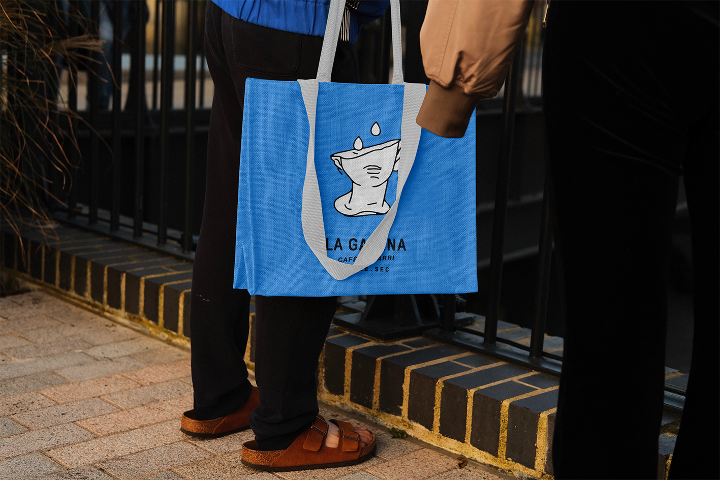
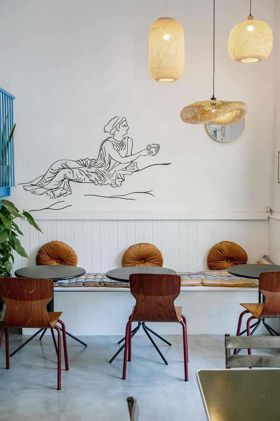
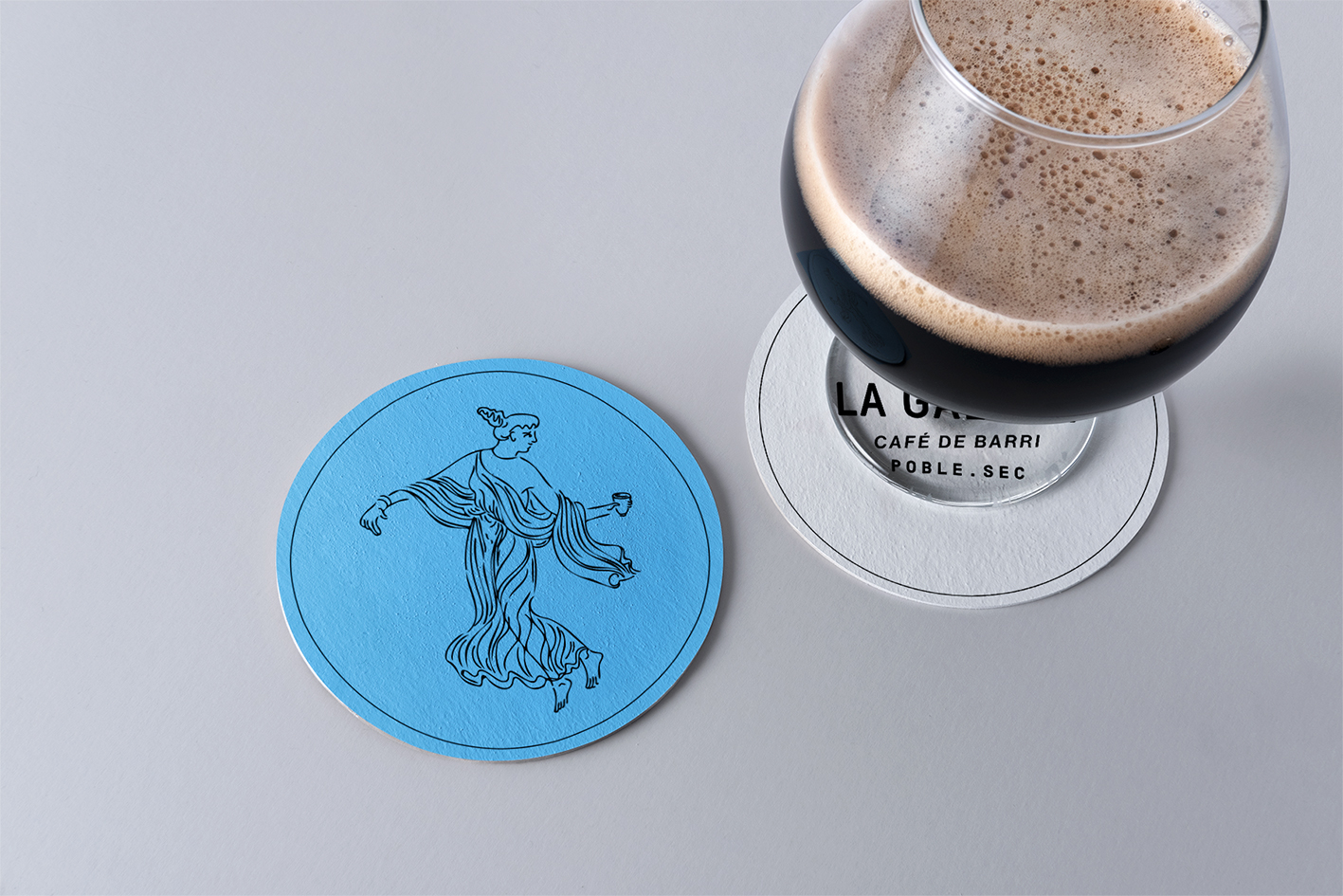
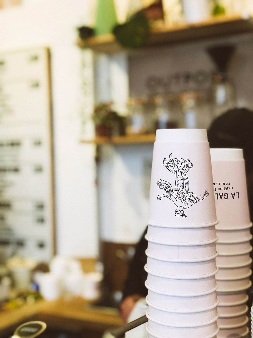
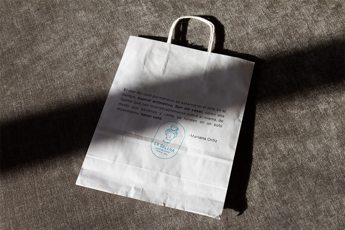
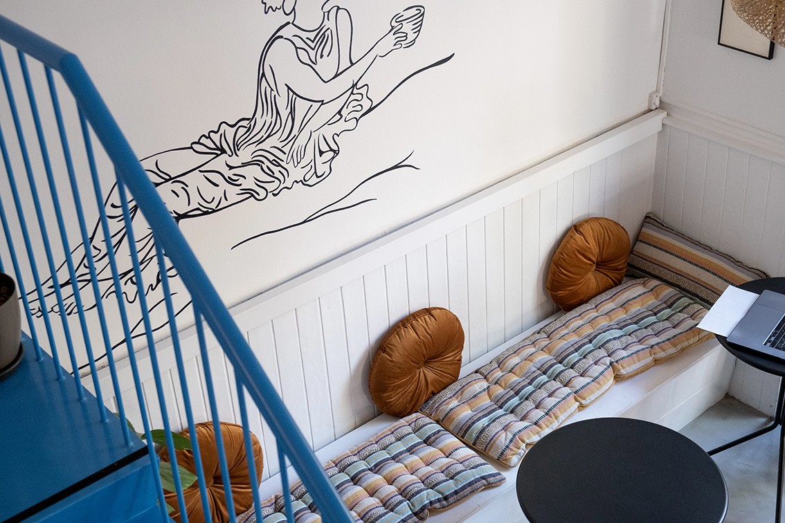
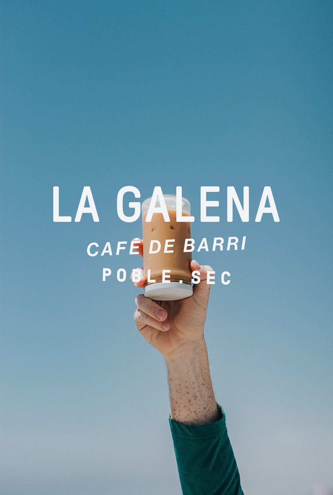
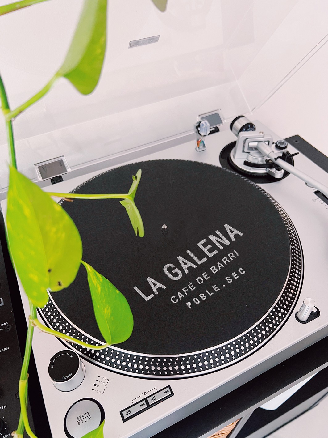
The graphic design proposal aims to develop a dynamic identity system using typographic compositions and illustrations depicting La Galena engaged in coffee and art-related activities like reading, dj’ing or drinking coffee. The objective is to create a direct user experience that fosters a sense of belonging and community. A solid and minimalist color palette inspired by the Mediterranean blue is employed to contrast with the baroque surroundings of the neighborhood.
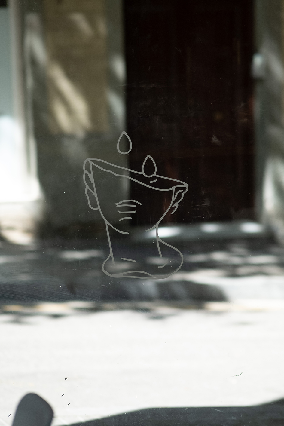
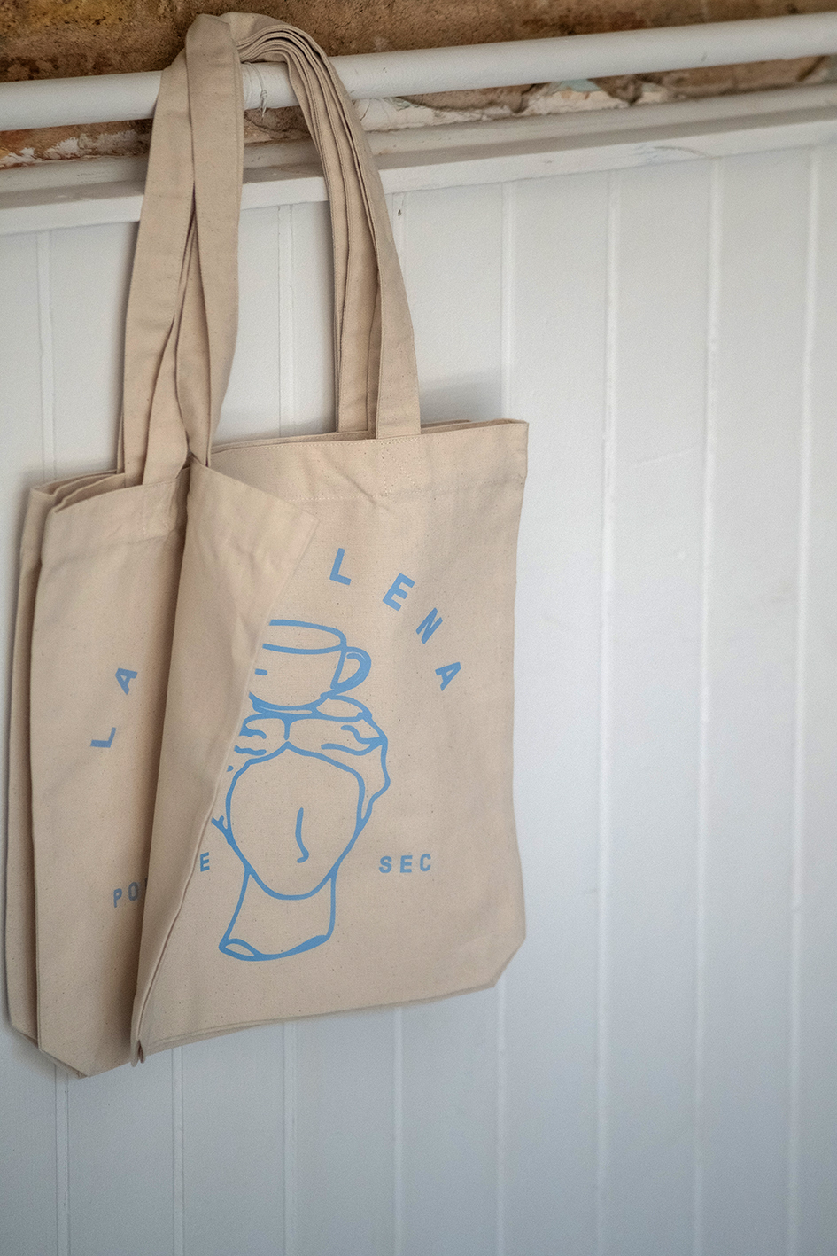
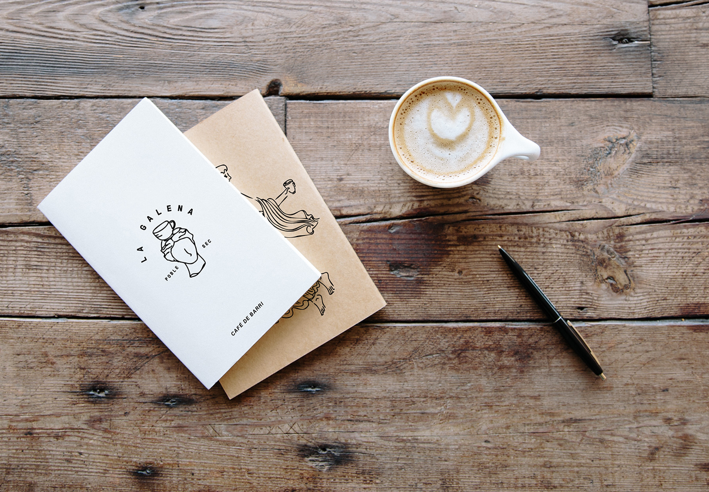
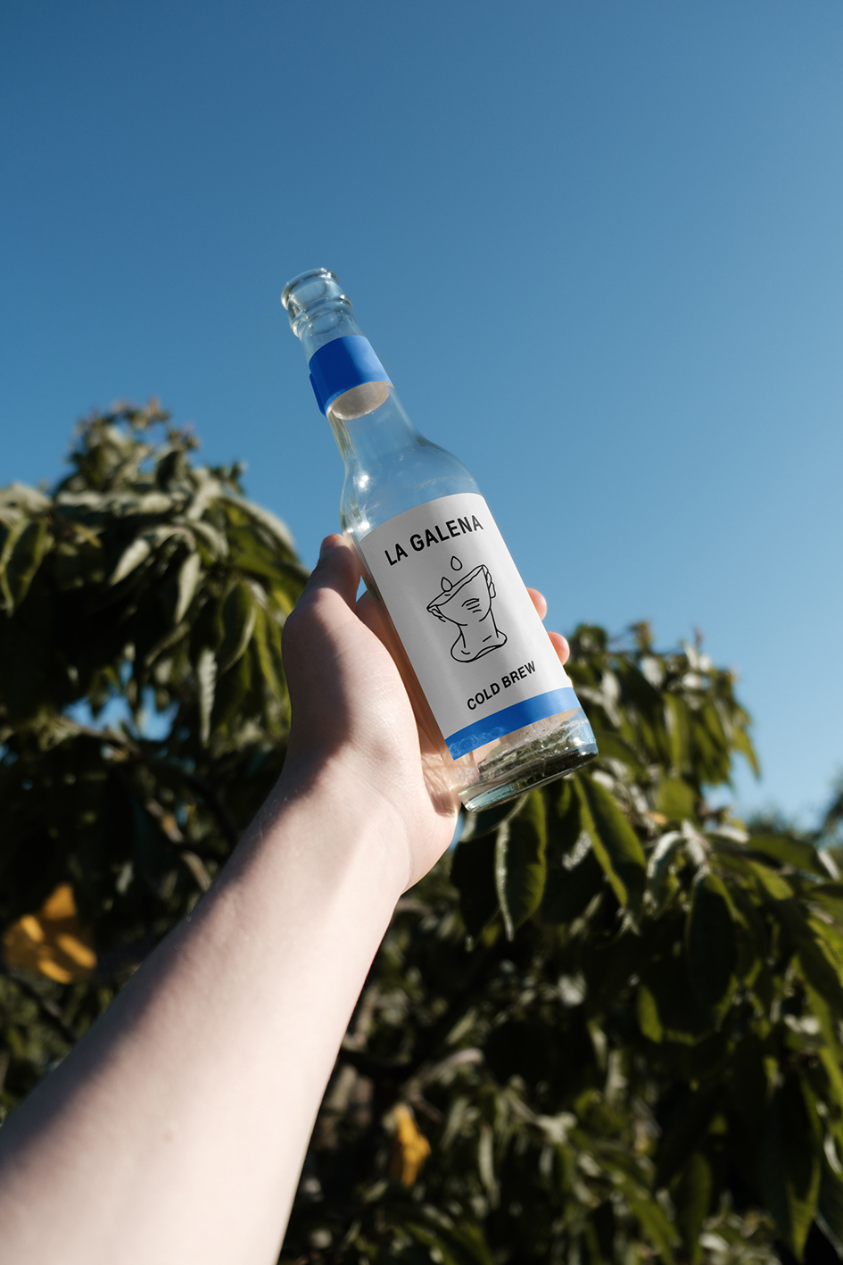
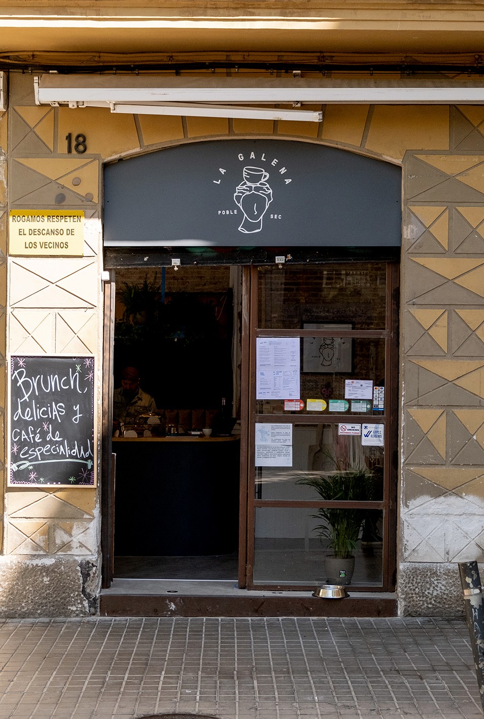
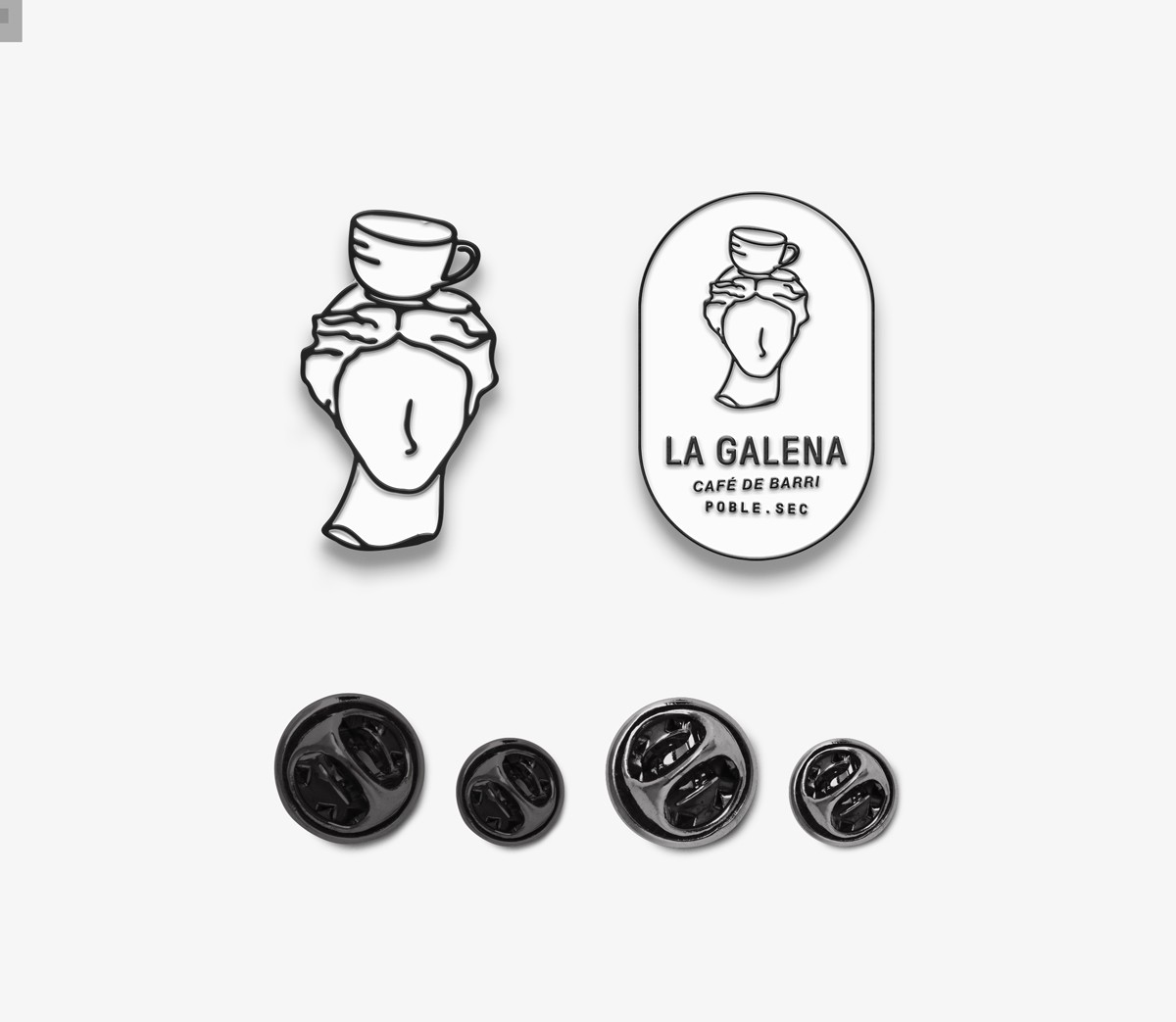
The logo of La Galena embodies the essence of the café through a series of illustrations depicting fragmented statues. These illustrations capture the vintage charm and character of La Galena, evoking a sense of history and uniqueness. The logo has various versions and typographic compositions, allowing users to experience different facets of the brand. Each iteration of the logo showcases a distinct and captivating visual, creating a dynamic and engaging brand identity. By embracing this diversity within the logo, La Galena offers its users a multifaceted and ever-evolving experience that reflects the rich and varied offerings of the café.
CREDIT
- Agency/Creative: Cantera
- Article Title: La Galena Cafe Branding
- Organisation/Entity: Agency
- Project Type: Identity
- Project Status: Published
- Agency/Creative Country: Mexico
- Agency/Creative City: Mexico City
- Market Region: North America
- Project Deliverables: Brand Design, Brand Identity
- Industry: Hospitality
- Keywords: WBDS Agency Design Awards 2023/24
- Keywords: Identity,Brand Design Creation
-
Credits:
Head of Design: Karol Rosales
Isabel Caso: Senior Designer


