


La Española, a centenary brand established in 1840, embarked on the creation of a distinctive product identity for its export line, Olivos Centenarios (Centennial Olive Groves). The goal was to capture the essence of a truly unique Extra Virgin Olive Oil (EVOO) derived from century-old olive trees, while honoring the brand’s deep heritage and longstanding expertise.
The primary challenge lay in communicating this profound legacy and the exclusive origin of the olive groves, while achieving strong visual disruption on the shelf. The design needed to embody both the technical mastery behind the product and the balance and intensity that define its flavor. Each detail had to reflect the passion, knowledge, and continuity of more than 180 years of tradition.
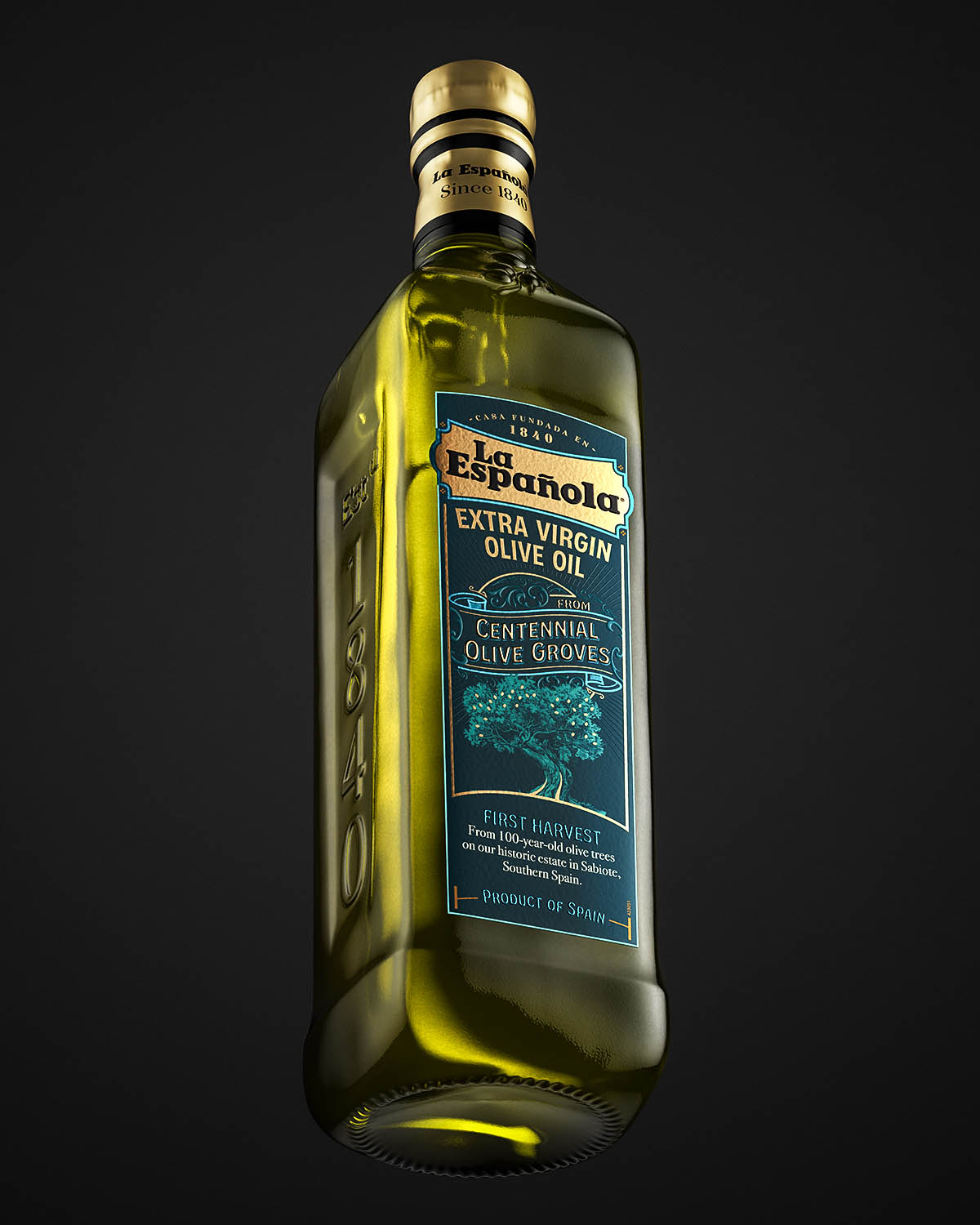
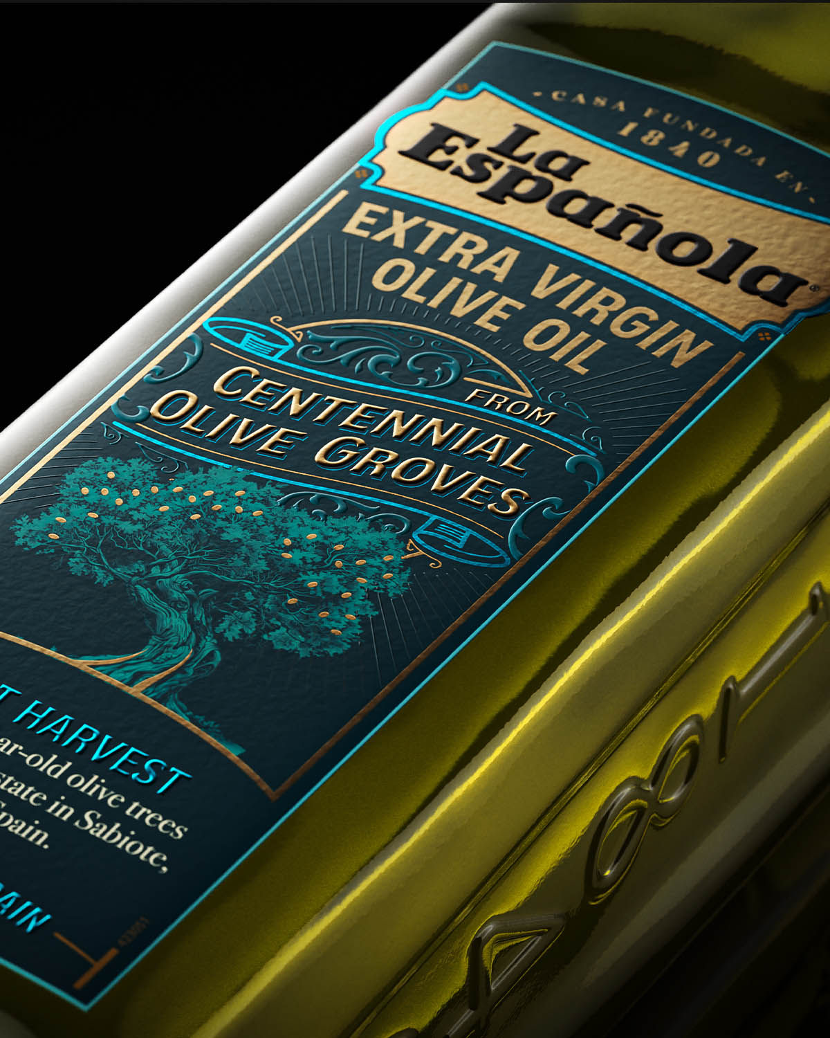
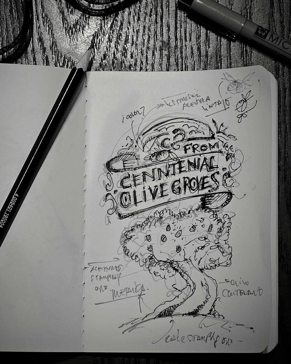
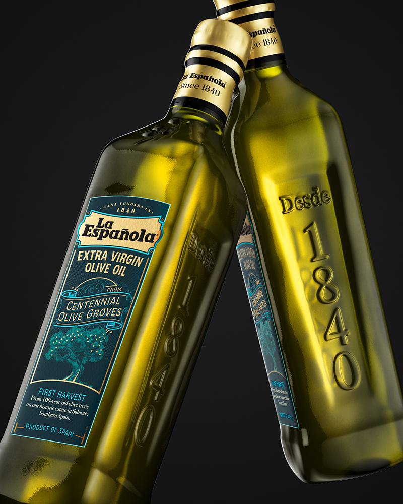
The design process centered on creating artisanal illustrations and refined visual details that evoke the spirit of an olive oil with history. The imagery of the ancient olive tree—large, deeply rooted, and centuries old—became a symbolic focal point. Illustrated using traditional techniques, the design bridges the past and the present, uniting heritage with innovation. The intention was to portray artisanal perfection through composition, conveying the EVOO’s aromatic complexity and smooth equilibrium while celebrating the evolution of La Española’s legacy.
From a technical standpoint, every material and finish was carefully selected to enrich both the tactile and visual experience. The label was printed on Fasson Greaseproof Rustique FSC paper, chosen for its authentic texture, grease resistance, and durable, traditional feel. The printing process, executed on a Gallus RCS press, employed six offset colors to create a rich and disruptive chromatic foundation in Pantone 457 Night Blue—breaking conventional visual codes while highlighting the product’s distinctive character. UV silk screen printing enhanced the illustrations, adding depth and vibrancy to the design’s most intricate details.
Further refinement came through the finishing techniques performed on a Gietz Rofo 450. The application of double hot stamping in tones 325 and 038 introduced a luxurious interplay of metallic effects, complemented by an aged gold finish known as Oro Vetusto. This aged gold stamping was used for typographic elements and fine details, evoking nobility, endurance, and a sense of reverence for the brand’s heritage and its vision for the future. The use of a bold blue palette on key elements reinforced the design’s disruptive quality while maintaining artisanal precision.
The result is a cohesive brand experience that elevates the perception of La Española’s Centennial Olive Groves line. Through a combination of groundbreaking color, sophisticated textures, and highly crafted finishes, the packaging conveys both the aromatic intensity and balanced smoothness of the EVOO. More than a visual statement, it embodies the authenticity and excellence that define La Española’s enduring legacy.
La Española Centennial Olive Groves now stands as a benchmark for authenticity and design excellence within the premium olive oil category, offering a sensory and emotional experience rooted in history, quality, and passion.
CREDIT
- Agency/Creative: hugo zapata / misiva
- Article Title: La Española Centennial Olive Grove Packaging Design by Hugo Zapata
- Organisation/Entity: Agency
- Project Type: Packaging
- Project Status: Published
- Agency/Creative Country: Spain
- Agency/Creative City: sevilla
- Market Region: Africa, Europe, Middle East, North America, Oceania, South America, Global
- Project Deliverables: Brand Design, Brand Identity, Illustration, Label Design, Packaging Design
- Format: Bottle
- Industry: Food/Beverage
- Keywords: oliveoil, spain, laespanola, acesur, evoo, aove, branding, packaging
-
Credits:
design and illustration: hugo zapata


