


L16° Far North Dry Gin is shaped by a place its founders know intimately. On a visit to a secluded coral cay on the outer Great Barrier Reef, they were struck by the clarity of the water, the stillness and the way sunlight moved across the shallows. The moment became a creative anchor. This was not a gin built around botanicals. It was a gin built around an experience of light, colour and calm. The design needed to hold that memory with clarity and restraint.
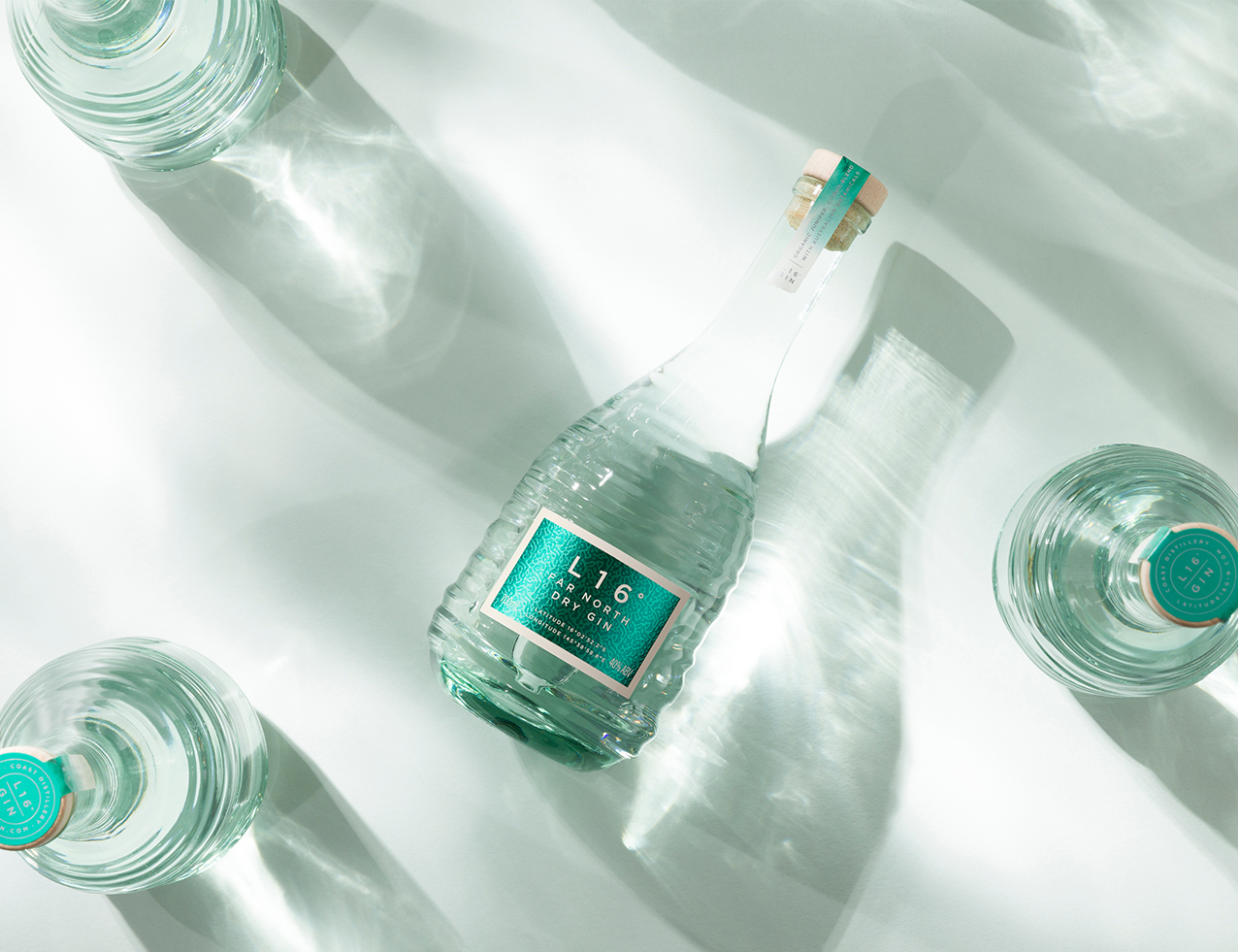
The overall intention was to translate the optical qualities of shallow reef water into a cohesive, modern expression. Rather than depict a coastal scene, the pack focuses on how the environment feels. The design system uses colour, surface behaviour and material contrast to evoke immersion, allowing light to become the primary storytelling device.
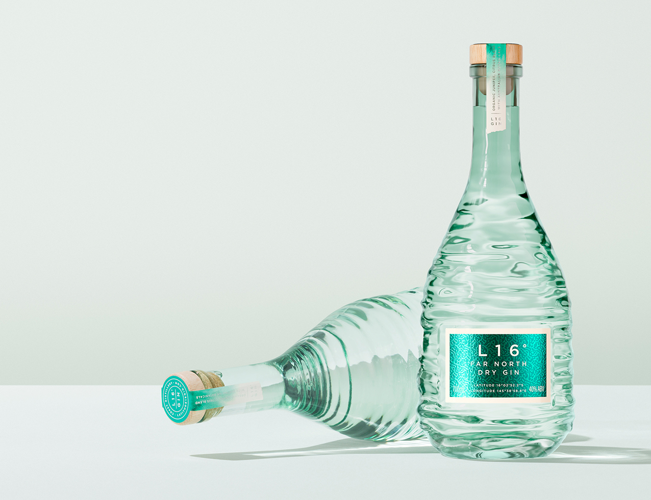
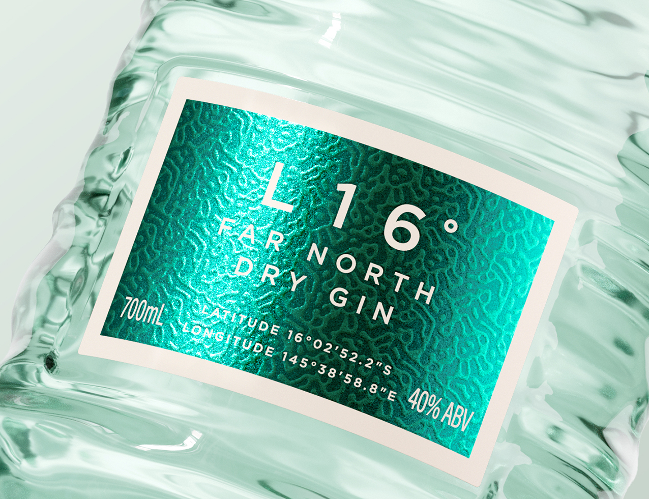
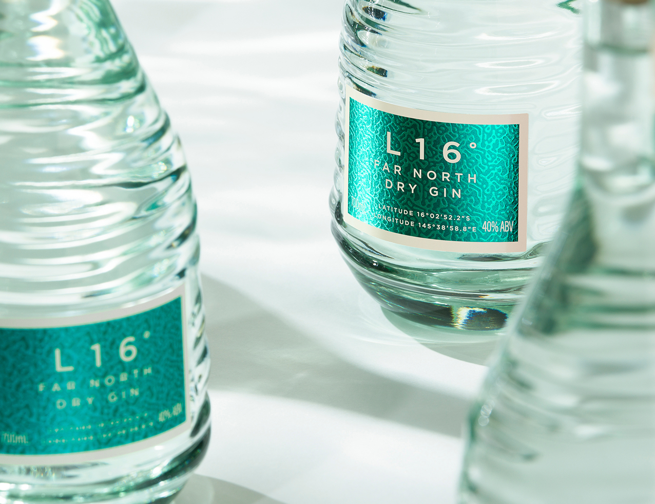
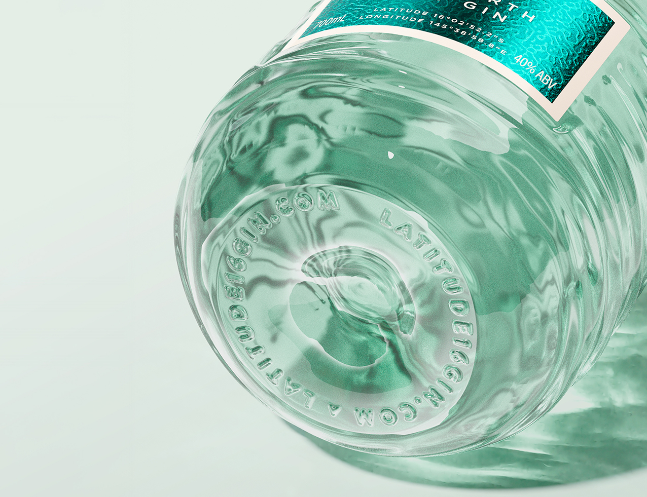
The pack brings the iridescent qualities of the location to life through a considered layering of finishes and textures. Metallised foils, sculpted emboss and fine screen work interact with shifting highlights to create a sense of depth and gentle movement, much like sunlight refracted across clear aqua shallows. The surface reveals subtle variations as it turns, reinforcing the idea of looking into moving water. A pale sand colour frames the composition and introduces a quiet balance to the vivid green blue, allowing the palette to remain fresh, modern and restrained.
Material choices support the purity of the concept. The pale beechwood closure introduces a natural warmth that complements the coastal tones, while the neck label carries a gentle green wash that references water sweeping over sand as the tide shifts across the cay. Every element is considered for how it behaves with light, ensuring the pack feels unified rather than reliant on any single gesture.
The custom bottle completes the system. Its pale aqua glass immediately recalls the clarity of reef shallows, while the sculpted profile echoes the movement of water through gently curved planes that catch and distort light. The base carries an embossed reference to the brand’s northern latitude and URL, grounding the design in its origin and providing a subtle, tactile marker of place. Used as part of the wider design intention rather than a standalone gesture, the bottle enhances the sense of immersion created by the pack’s finishes and colour.
L16° Far North Dry Gin is designed to transport. Through its integrated use of light, texture and form, the pack returns drinkers to a specific moment in a specific place. It is a distilled reminder of sunlight on shallow reef water, interpreted with restraint and contemporary craft. The result is a coastal gin with an immediate sense of place and a quietly confident presence on shelf.
CREDIT
- Agency/Creative: Clay Andrews
- Article Title: L16° Far North Dry Gin Showcases a Sensory Packaging Vision by Clay Andrews
- Organisation/Entity: Creative
- Project Status: Published
- Agency/Creative Country: Australia
- Agency/Creative City: Sydney
- Market Region: Australia
- Project Deliverables: Packaging Design
- Industry: Food/Beverage
- Keywords: WBDS Creative Design Awards 2025/26 , Drink Deign, Packaging Design, Gin Design, Spirits Design, Brand Identity, NPD, Brand Creation
-
Credits:
Bottle Structure (Vert): Charlie Payne


