


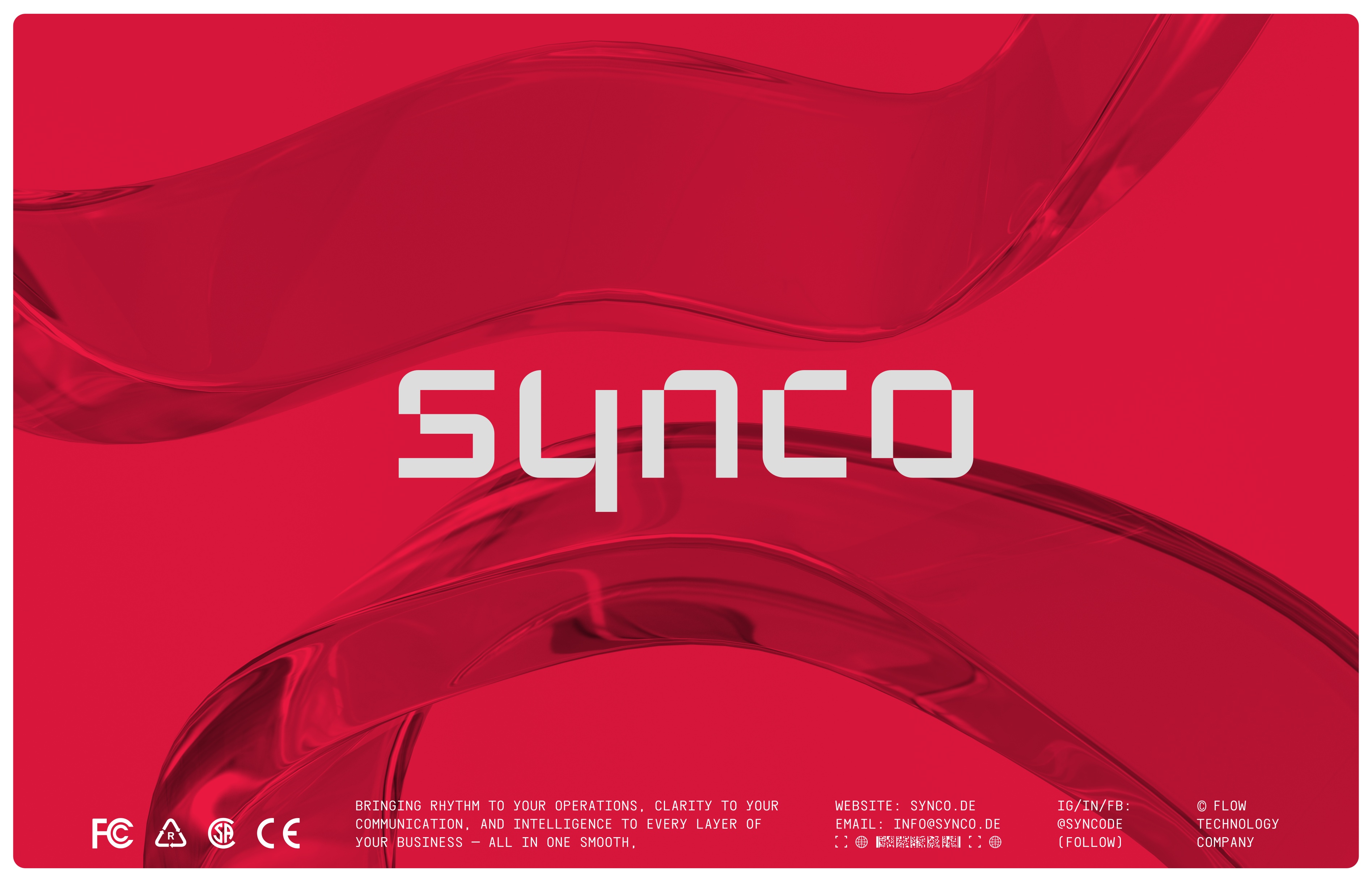
Synco – Flow Technology for the Modern Workplace
Synco is a Berlin-based flow technology service built to help startups and enterprises operate more efficiently. At its core, Synco focuses on real-time connection and seamless integration — aligning platforms, data, people, and processes to function as one cohesive system. Whether it’s streamlining operations or bridging digital gaps, Synco eliminates friction and brings clarity to how businesses work.
Its mission is simple but bold: to create harmony in the digital workspace by synchronizing what matters most.
Brand Identity & Design Approach
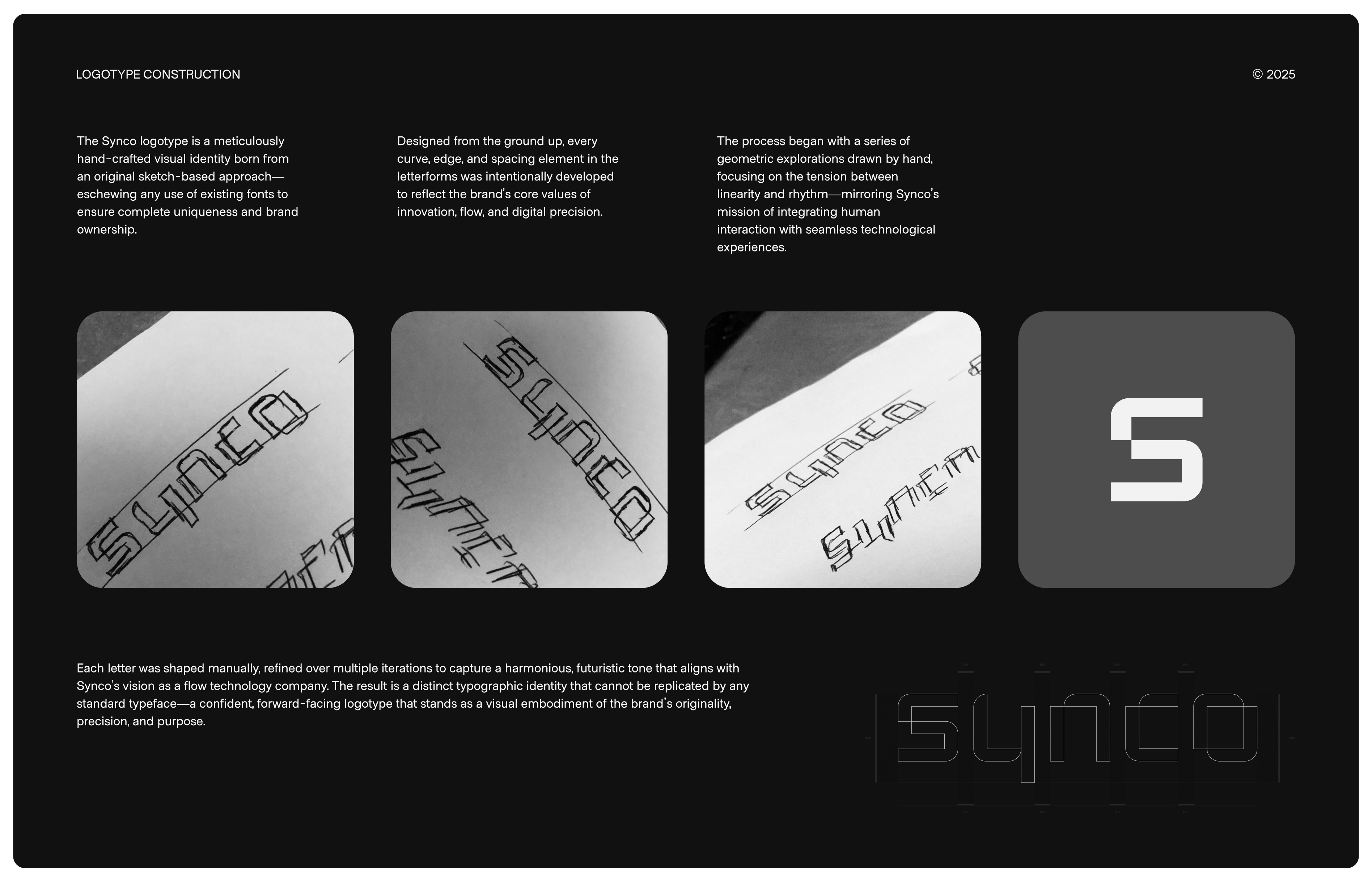
To support Synco’s mission and values, I developed a visual identity that speaks to its key principles: clarity, rhythm, precision, and innovation. Rather than relying on an existing typeface, the logotype was completely custom-designed — letter by letter.
Each curve and stroke was hand-drawn, refined through an iterative process to achieve the right balance between structure and flow. The design combines soft geometry with subtle motion, creating a visual sense of synchronization — a nod to the continuous connection and real-time data flow that defines Synco’s offering.
The result is a brand mark that feels both modern and timeless, clean yet expressive. It’s more than a logo; it’s a symbol of Synco’s commitment to smart, frictionless systems and forward-thinking design.
Why Custom?
By avoiding off-the-shelf fonts, we were able to create something truly unique — a typographic system that visually communicates movement, intelligence, and trust. The fluidity in form echoes the brand’s tech-driven DNA, while the precision in detail ensures scalability across digital platforms.
Every element — from the spacing and proportions to the subtle weight transitions — was designed to evoke a sense of flow, connection, and intentionality.
Conclusion
Synco’s identity is more than just visuals. It’s a reflection of a brand built to bring order to complexity and connection to systems. The custom-crafted wordmark is central to this story — embodying the harmony and motion Synco brings to the digital world.


CREDIT
- Agency/Creative: Kwiba Agency®
- Article Title: Kwiba Agency Shapes Synco’s Identity Around Seamless Flow and Digital Precision
- Organisation/Entity: Agency
- Project Type: Identity
- Project Status: Published
- Agency/Creative Country: France
- Agency/Creative City: Marseille
- Market Region: Global
- Project Deliverables: 2D Design, Brand Identity, Brand Naming, Type Design
- Industry: Technology
- Keywords: Logo Design, Custom Type, Branding, Visual Identity, SYNCO, Tech logo design, tech logo
-
Credits:
Gideon: Phillip


