


ROGER KOLMŎ Architecture Brand Identity
Studio Philosophy
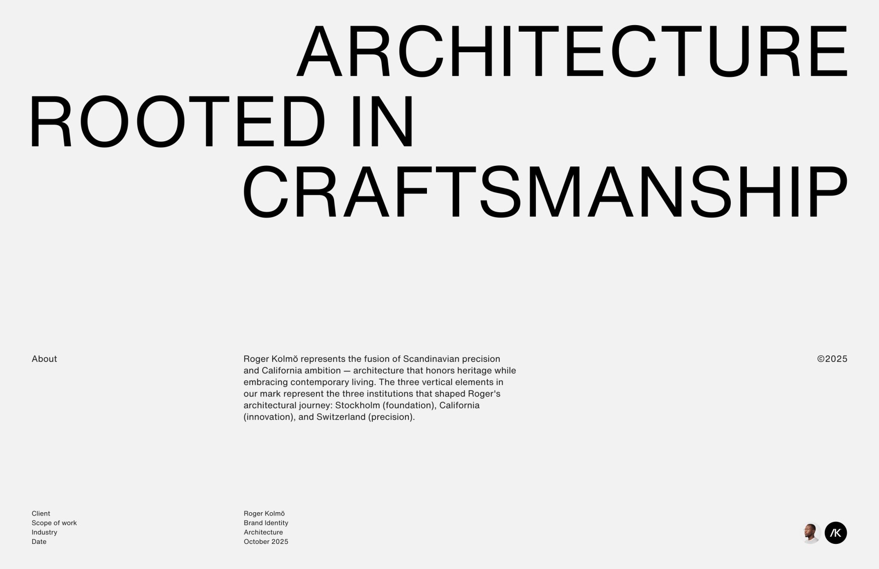
ROGER KOLMŎ creates premium residential and commercial spaces where Scandinavian precision meets California ambition. We design architecture that doesn’t shout but resonates—structures calibrated to site, climate, and the nuanced rhythms of the lives lived within them. The work of R.K.’s Architecture demonstrates that minimalism need not be cold, that precision can serve poetry, and that the most sustainable design is simply design that endures.
Each project reflects a philosophy where Nordic restraint meets West Coast possibility—architecture rooted in place, responsive to climate, and calibrated to the lives lived within. This duality isn’t decorative; it’s foundational. The measured discipline of Scandinavian craft provides structure, while California’s experimental spirit introduces possibility. Between these poles lives the studio’s distinctive approach: rigorous but not rigid, refined but never precious.
At ROGER KOLMŎ, every structure is conceived as a long-term investment in quality of life—spaces that improve with time, materials that develop character, proportions that never tire. The most sustainable building is one people never want to tear down. This philosophy extends beyond environmental considerations into the realm of emotional durability. A building that delights its inhabitants, that responds gracefully to changing needs, that rewards daily observation with subtle discoveries—this is architecture with staying power.
The studio’s methodology begins not with aesthetic preferences but with deep inquiry. How does light move across the site throughout seasons? What are the prevailing winds, the hidden microclimates, the acoustic character of the neighborhood? How do inhabitants actually move through their days—not in idealized sequences but in the messy, beautiful reality of lived experience? These questions inform every decision, from structural strategy to door handle selection.
Materials are chosen for their capacity to age with dignity. Concrete that develops a nuanced patina, wood that darkens and acquires texture, metal that oxidizes into rich earth tones—these aren’t flaws to be prevented but natural processes to be anticipated and embraced. The studio rejects the contemporary obsession with perpetual newness in favor of an aesthetic that accommodates time’s passage. A twenty-year-old ROGER KOLMŎ building should be more beautiful than the day it was completed, enriched by weather, use, and memory.
The Challenge
Architecture studios often face an identity paradox: how to communicate both creative vision and technical rigor without appearing either too sterile or overly artistic. The brand needed to reflect a dual heritage—Scandinavian discipline combined with California innovation—while maintaining gravitas in premium residential and commercial sectors.
This challenge extended beyond simple visual representation. The identity needed to speak simultaneously to multiple audiences with different priorities. Prospective residential clients seek warmth, livability, and personal expression. Commercial developers demand efficiency, timeline precision, and investment value. Planning commissions require technical competence and contextual sensitivity. Each constituency evaluates architecture through different lenses, yet all must perceive ROGER KOLMŎ as the right choice.
Furthermore, the studio operates in a crowded marketplace where differentiation is increasingly difficult. Many firms claim Scandinavian influence or California innovation. The identity needed to move beyond superficial styling to communicate something authentic and distinctive—a genuine fusion rather than borrowed aesthetics. It needed to feel both established and progressive, honoring tradition while embracing contemporary possibilities.
The branding challenge also involved navigating the personal nature of the studio’s foundation. Roger’s educational journey and multicultural background are central to the work’s character, yet the identity couldn’t feel like a personal vanity project. It needed to elevate individual biography into universal principles—transforming one architect’s path into a design philosophy that resonates broadly.
Finally, the identity system needed practical versatility. It would appear on construction documents and cocktail napkins, monument signage and Instagram posts, contracts and coffee mugs. The system needed to maintain authority across scales and contexts while remaining visually cohesive. Every application should reinforce the studio’s core values: precision, restraint, thoughtfulness, and enduring quality.
The Solution
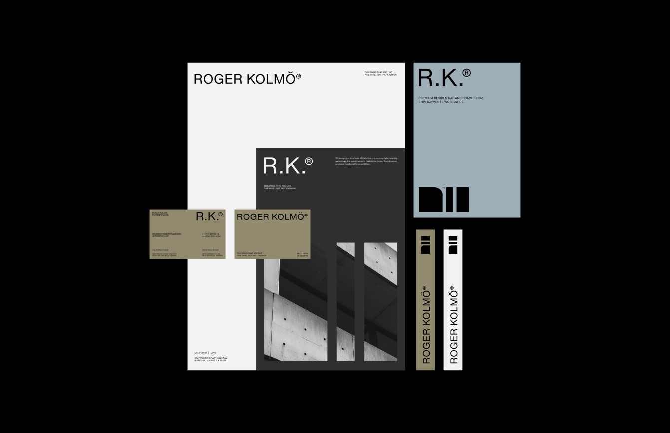
The ROGER KOLMŎ identity employs a sophisticated dual-mark system designed to communicate complexity without confusion. Each element serves multiple functions, layering meaning while maintaining visual clarity. The system operates through restraint—doing more with less, finding richness in refinement rather than elaboration.
The Primary Wordmark
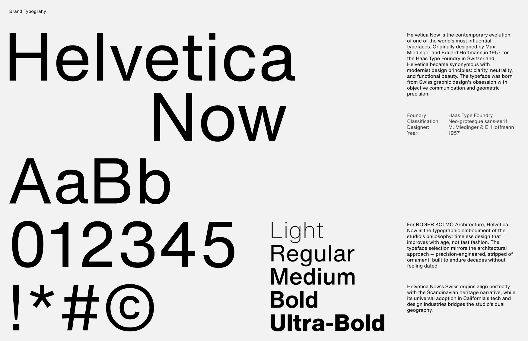
The primary wordmark uses refined sans-serif typography with the distinctive ŏ diacritic—a subtle nod to Scandinavian heritage that adds visual distinction without ostentation. This single character performs significant work. It immediately signals European sophistication while avoiding the clichés of Scandinavian branding. It’s not a snowflake or Viking ship but something more nuanced: a typographic detail that rewards attention.
The diacritic also introduces a quality of precision and care. Its presence suggests that every detail has been considered, that nothing appears by accident. This mirrors the studio’s architectural approach, where even minor elements receive thoughtful attention. The mark whispers rather than shouts, trusting that discerning clients will notice and appreciate the subtlety.
Typography selection reinforced these qualities. The sans-serif family chosen balances geometric clarity with humanist warmth. Its letterforms are rational but not mechanical, clean but not cold. The proportions feel contemporary without chasing trends, ensuring the wordmark won’t feel dated as years pass. Spacing between letters receives the same attention an architect gives to spacing between buildings—each interval calibrated for optical balance and rhythmic consistency.
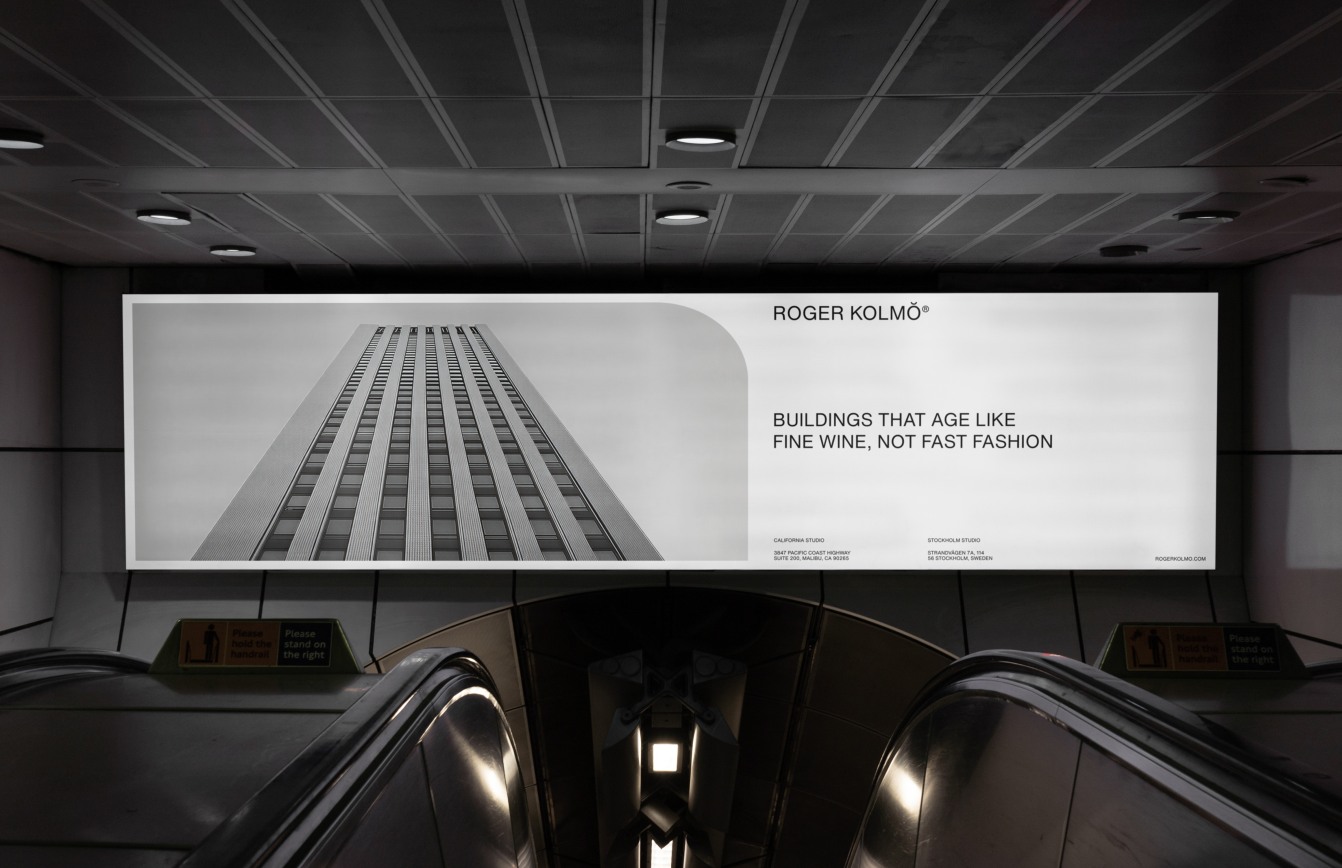
The wordmark’s weight distribution creates visual authority without aggression. It occupies space confidently, establishing presence through proportion rather than bulk. On business cards, it anchors the composition. On building signage, it commands attention through refinement rather than scale. The identity trusts that quality speaks for itself.
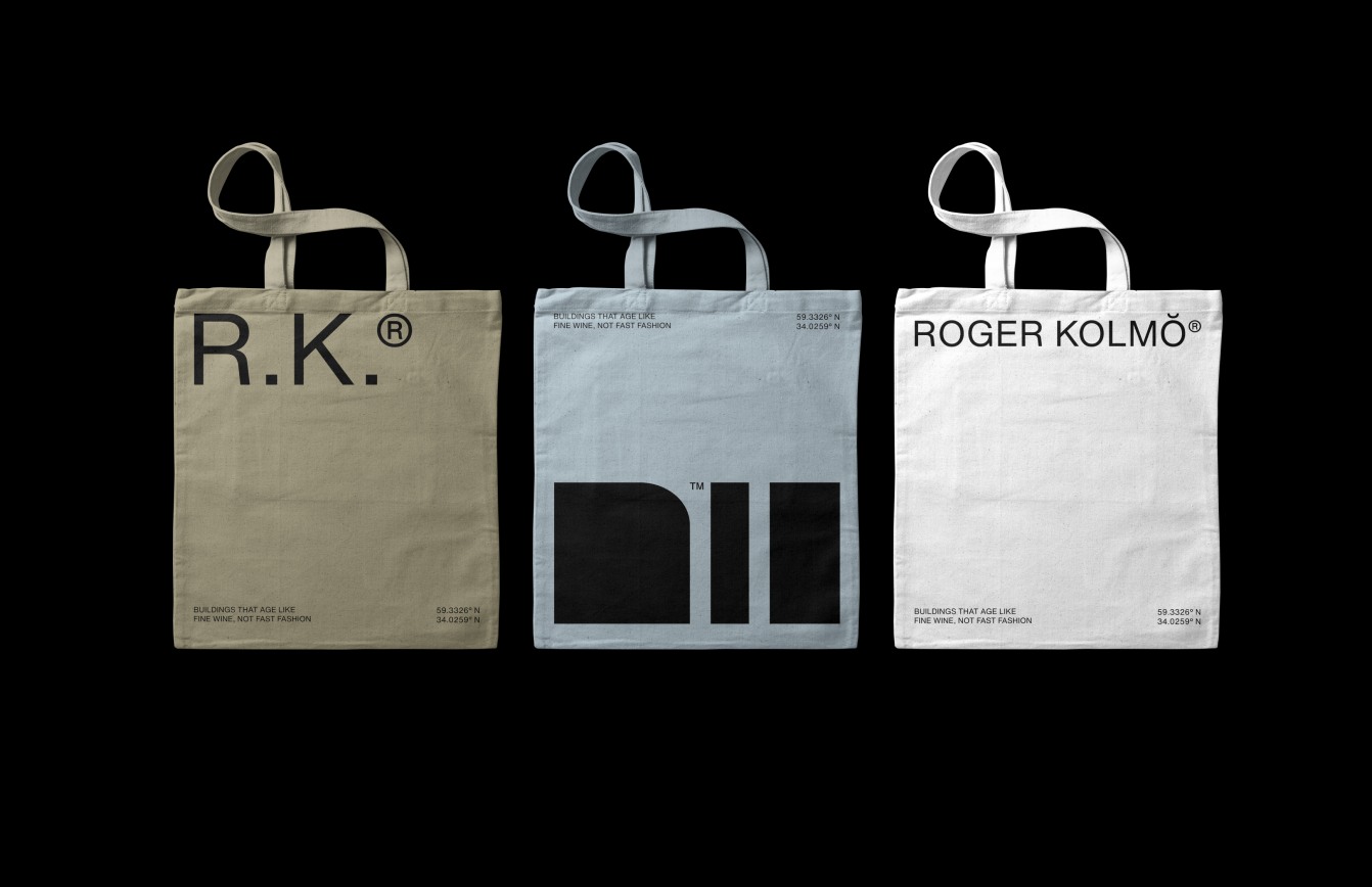
The Three Pillar Mark
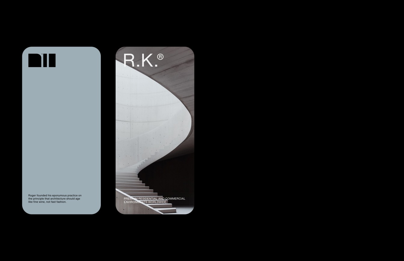
The secondary mark—three vertical elements of varying widths—draws from Roger’s formative years while functioning as an abstract architectural symbol. He attended three institutions that shaped his philosophical approach, each represented by a pillar. The first and largest represents Stockholm’s technical institute, where Roger’s passion for architecture first ignited—the foundation that holds his heart. The two narrower pillars represent the institutions in California and Switzerland that refined his vision, teaching him restraint, precision, and the courage to innovate.
Together, these three pillars form an abstract monogram while symbolizing the educational journey that forged his approach: foundation, discipline, and evolution. But the mark transcends autobiography. Visually, it reads as three vertical elements with carefully calibrated spacing—immediately suggestive of architecture without literally depicting buildings. The composition creates rhythm through repetition and variation, establishing a visual language that echoes throughout the studio’s work.
The proportional relationships between the pillars weren’t arbitrary. They derive from classical ratios found in architecture across cultures—proportions that feel intuitively correct to the human eye. The widest pillar grounds the composition, providing visual weight and stability. The two narrower elements create movement and lightness, preventing the mark from feeling static. The negative space between pillars matters as much as the positive forms, demonstrating the studio’s understanding that architecture is as much about void as mass.
This mark functions equally well at monument scale and favicon size. Its geometric simplicity ensures clarity across applications while its proportional sophistication prevents it from feeling generic. The three pillars can be rendered in various materials—carved into concrete, laser-cut from steel, debossed into leather—and the mark’s essential character remains intact. This material flexibility reflects the studio’s architectural philosophy: strong concepts survive translation across mediums.
The mark also carries symbolic resonance beyond Roger’s biography. Three is architecturally significant: the minimum number of points to define a plane, the tripod’s inherent stability, the trilogy’s narrative completeness. The mark suggests foundation, structure, and support—fundamental architectural concerns. It can be read as columns, as a simplified building elevation, as abstract representation of structural bays. This interpretive openness allows viewers to find their own meaning while maintaining coherent identity.
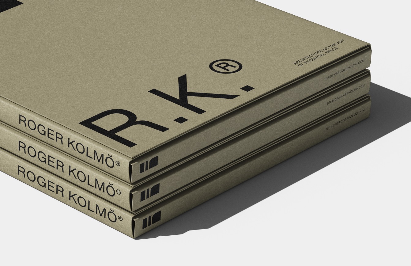
The R.K.® Monogram
The R.K.® monogram distills the identity to essential elements, using precise letter spacing and geometric proportion to suggest architectural drafting precision. The registered trademark symbol reinforces established authority and protection of the brand’s equity. This mark serves as the most condensed expression of studio identity—two letters carrying the full weight of philosophy, process, and promise.
Designing the monogram required balancing legibility with visual interest. The letters needed to read clearly at small sizes while maintaining enough character to feel distinctive. The spacing between R and K receives particular attention, creating a rhythm that prevents the letters from competing or collapsing into illegibility. The relationship mirrors the studio’s approach to building clusters—each structure distinct yet contributing to overall composition.
The monogram’s geometric construction reveals itself upon examination. Curves and angles align to invisible grids, creating subtle harmonies that register subconsciously. This hidden order produces the mark’s sense of rightness—it feels balanced because it is balanced, proportioned according to principles that transcend stylistic preference. The same mathematical relationships that inform classical architecture inform these two letters.
The registered trademark symbol isn’t merely legal protection; it communicates permanence and establishment. It signals that ROGER KOLMŎ isn’t an emerging experiment but a protected entity with history and standing. For high-value clients making significant investments, this subtle indicator of stability matters. It suggests the studio will be here in five, ten, twenty years—as enduring as the buildings it creates.
System Integration
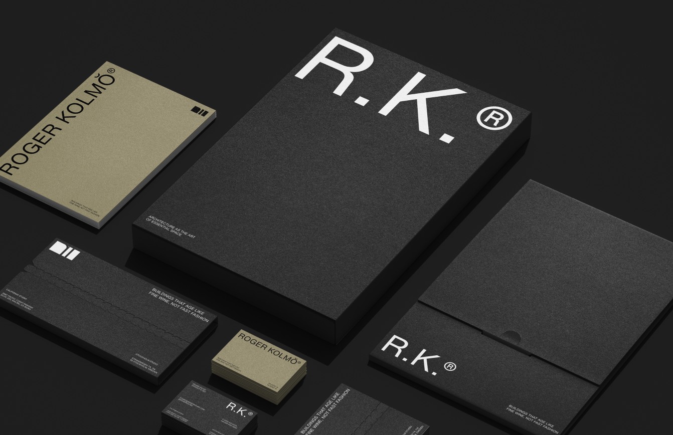
All marks work independently across applications while maintaining typographic DNA, demonstrating the same systematic thinking the studio applies to built environments. A business card might feature the full wordmark, while a construction hard hat displays the three pillars, and project documentation uses the R.K.® monogram. Despite these variations, the identity remains unmistakably cohesive.
This flexibility emerged from careful consideration of use cases. Which contexts demand formality versus accessibility? Where does the educational symbolism of the three pillars add value versus where pure typographic authority serves better? The system anticipates these questions, providing appropriate tools for each scenario while preventing visual chaos.
Color strategy reinforces the identity’s restraint. The primary palette emphasizes neutrals—sophisticated grays, warm whites, deep charcoals—reflecting the material honesty central to the studio’s work. These aren’t trendy hues but timeless tones that age gracefully. Accent colors appear sparingly, drawn from natural materials: the warm amber of aged wood, the blue-green of oxidized copper, the rust of weathering steel. Color usage mirrors material usage in architecture—essential, honest, purposeful.
Typography extends beyond the logo to encompass all written communications. A complementary serif typeface handles longer texts, chosen for readability and subtle character. Its proportions harmonize with the sans-serif wordmark, creating family resemblance across applications. Hierarchies are established through size and weight rather than decorative variation, maintaining the visual discipline that defines the brand.
The Result
An identity system that doesn’t just represent an architecture studio—it embodies one. Like the buildings ROGER KOLMŎ designs, the brand is built to endure: visually restrained yet conceptually rich, rooted in personal history yet universally resonant. Every mark, every proportion, every detail reflects the studio’s core belief that true design transcends decoration.
The identity performs across contexts with quiet confidence. On a construction site, it conveys professionalism and precision. In a client presentation, it communicates sophistication and thoughtfulness. On social media, it stands out through restraint in an environment of visual noise. The system adapts without compromising, flexible without losing coherence.
Perhaps most importantly, the identity attracts the right clients—those who value longevity over trend, quality over cost-cutting, nuance over ostentation. It pre-qualifies conversations, signaling the studio’s priorities before a word is spoken. Clients who respond to this aesthetic language tend to be clients who appreciate the studio’s architectural philosophy. The brand becomes a filter, attracting alignment and deterring mismatch.
The identity also provides internal clarity. It reminds the studio daily of its values and standards. When facing design decisions—architectural or otherwise—the brand serves as a reference point. Does this choice align with the precision suggested by the monogram? Does it honor the layered meaning of the three pillars? Would it satisfy the restraint embodied in the wordmark? The identity becomes not just external communication but internal compass.
Over time, the brand has developed its own presence in the market. Clients reference “the three pillars studio” or “the place with the ŏ.” The marks become shorthand for a particular approach to architecture, carrying accumulated meaning from each project completed, each client relationship, each building that ages beautifully. The identity grows richer with use, much like the materials Roger specifies—developing patina and depth through time and exposure.
This is branding as architecture: permanent, purposeful, and unmistakably ROGER KOLMŎ. Just as the studio’s buildings are designed to improve with age, the identity system is built to accumulate meaning rather than require periodic reinvention. It doesn’t follow trends because it establishes principles. It doesn’t chase attention because it earns respect. The identity, like the architecture it represents, plays the long game—betting on enduring quality over momentary impact.
In the end, the ROGER KOLMŎ brand identity achieves what all successful architectural branding must: it translates three-dimensional thinking into two-dimensional form without loss of complexity or depth. It makes visible the invisible—the philosophy, the process, the values that inform every decision. It creates recognition while inviting discovery, familiar enough to orient yet rich enough to reward sustained attention. It is, in the truest sense, architecture rendered into symbol—and symbols built to last.


CREDIT
- Agency/Creative: KWIBA Agency
- Article Title: KWIBA Agency Introduces a Refined Architectural Identity for Roger Kolmŏ
- Organisation/Entity: Agency
- Project Type: Identity
- Project Status: Published
- Agency/Creative Country: South Africa
- Agency/Creative City: Johannesburg
- Market Region: Global
- Project Deliverables: 2D Design, Brand Guidelines, Brand Naming, Branding, Editorial Design, Logo Design
- Industry: Construction
- Keywords: archirecture, brand identity, contemporary architecture, modern, minimalism, editorial design, architecture studio
-
Credits:
Art Director, Lead Designer: Gideon Phillip


