


Live it simple. Technology efficiency.
The Brief: How to build the credibility of a technology brand to serve the basic needs of everyday life? How do we align ourselves to the new standards of technology of the future? Breaking the white color paradigm as a category identifier.
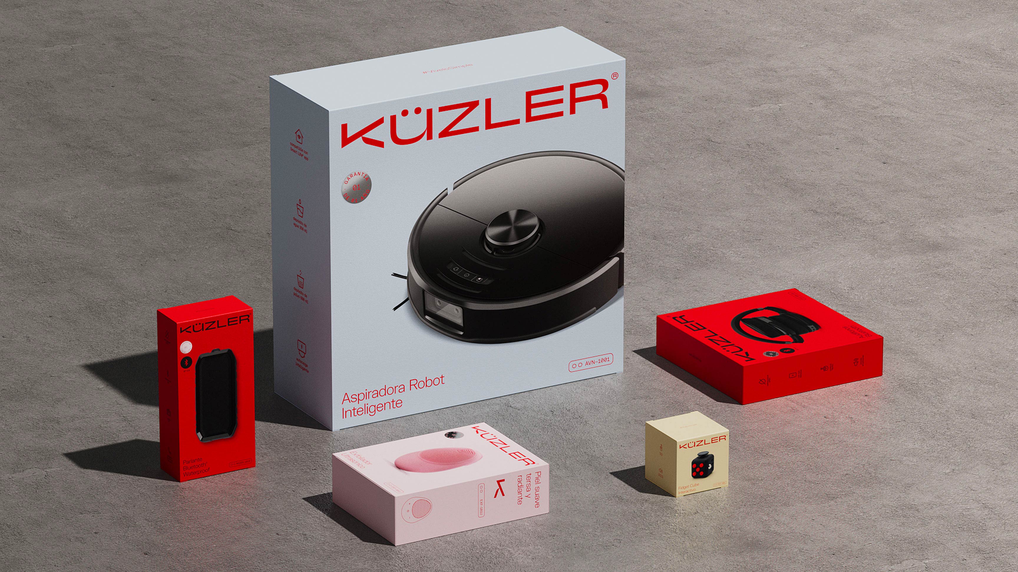
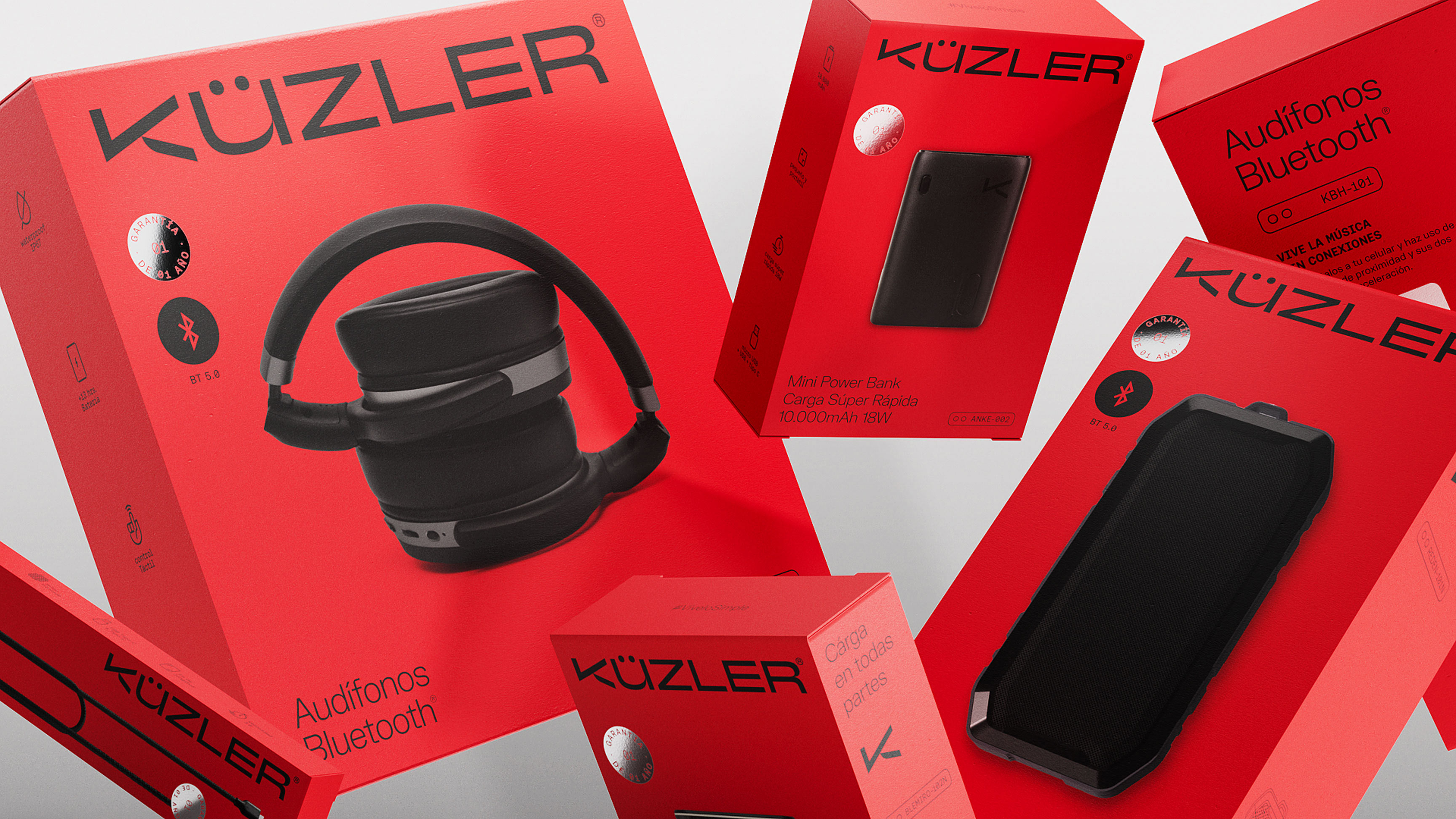
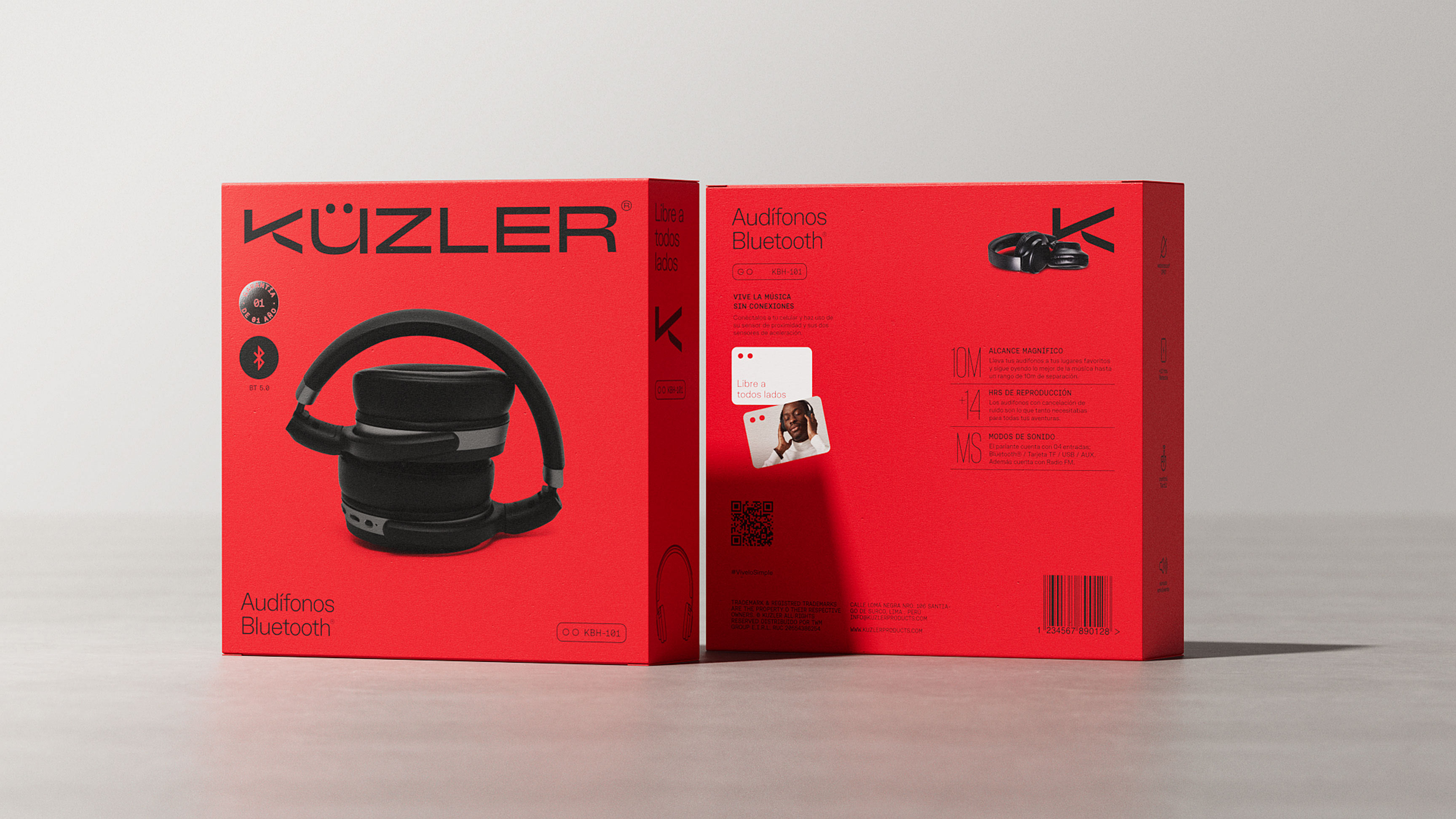
The Solution: With little more than 3 years, Küzler in the Peruvian market, renewed its brand perception accompanied by a DNA that encompasses the final goal of good performance of its electronic products: Live it simple. The simplicity of the good, the functional and the effective. The proposal of a new simple and dynamic visual system that allows easy understanding of the benefits of each product in their portfolio.
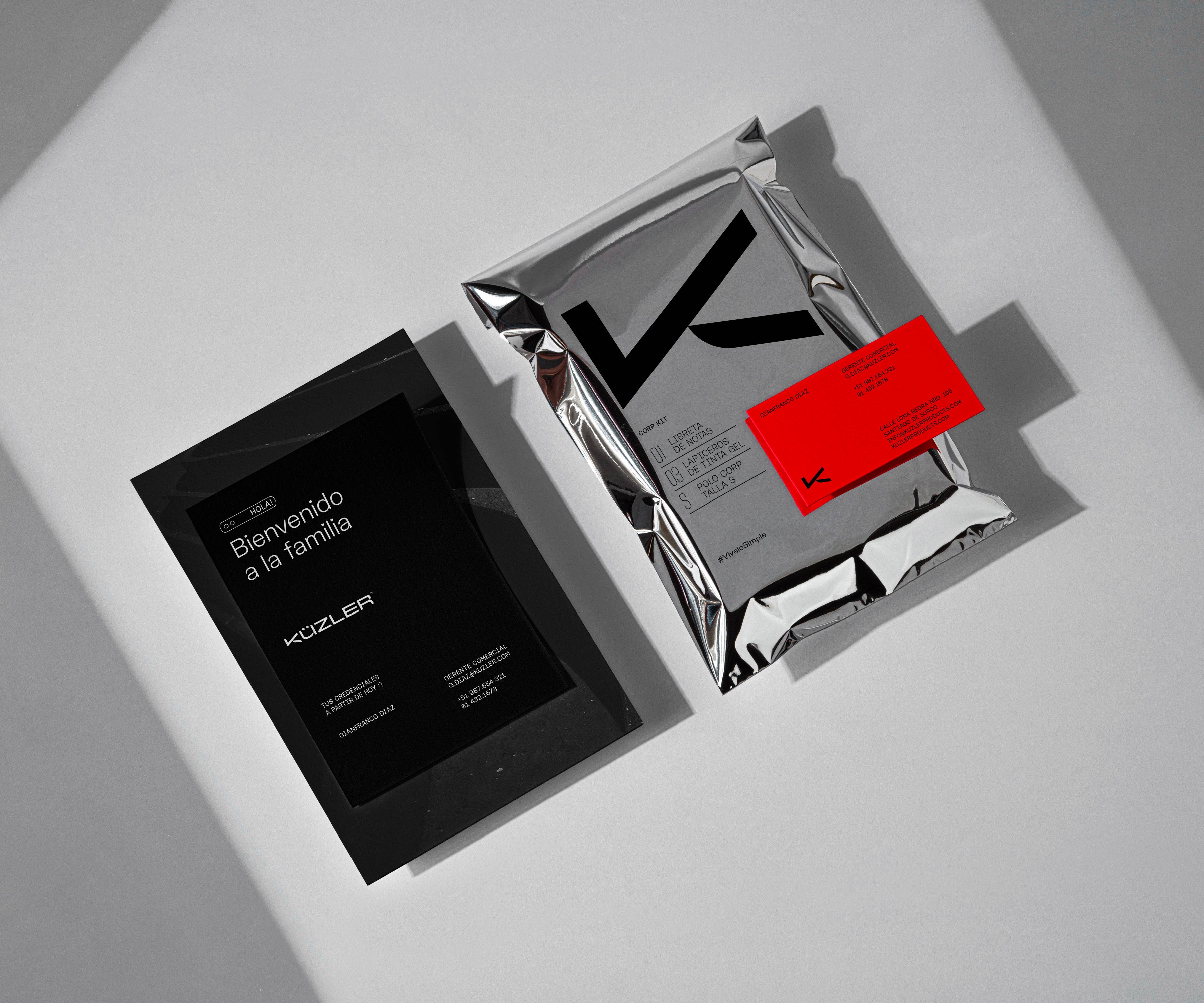
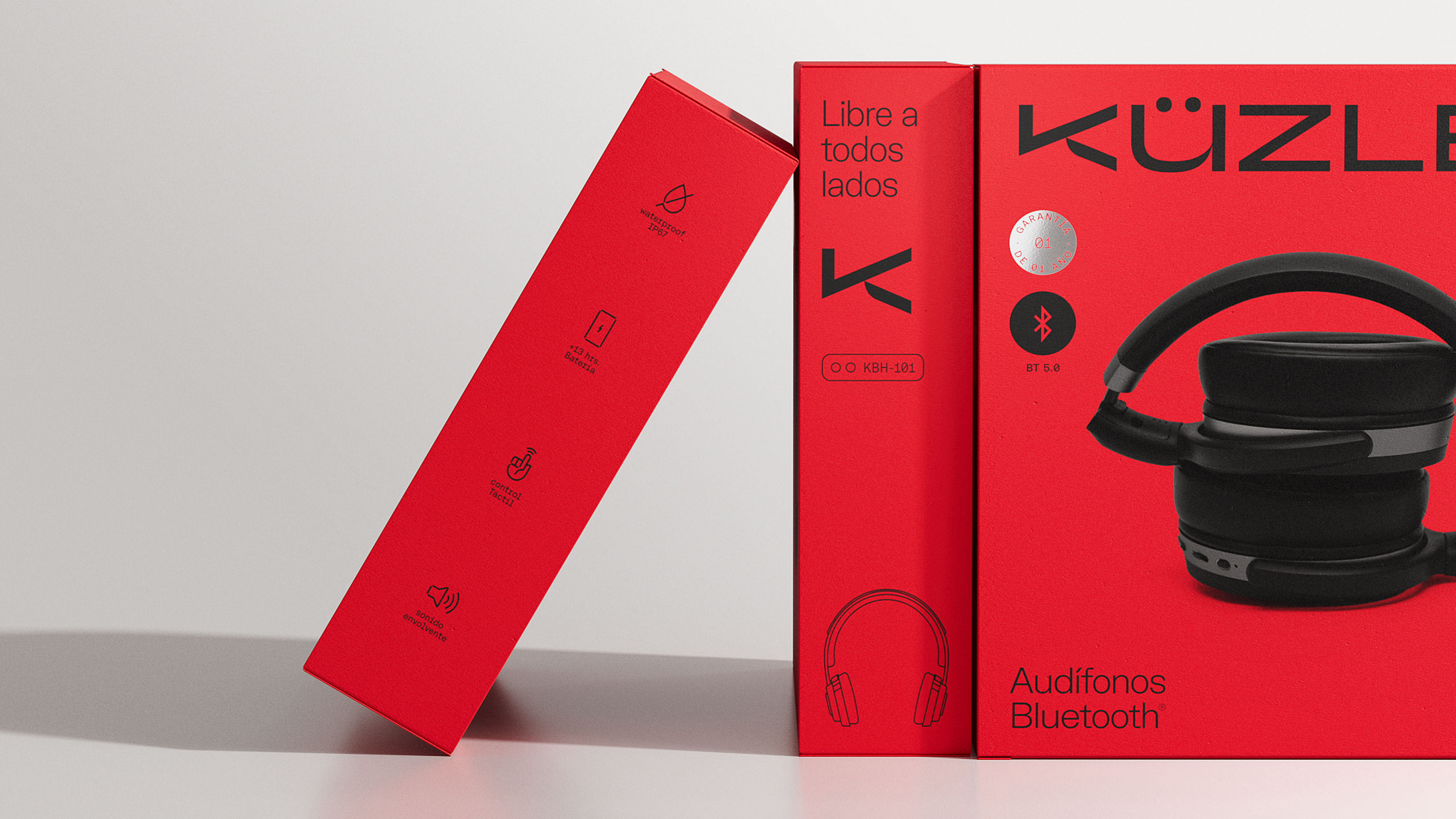
A new logo: The capitalisation of the monogram, as the new badge of effectiveness and certification. A brand focused on the solution.
Without resorting to new symbologies, but on the contrary, with the desire to build on the value of their products and their benefits, the “check” was introduced as the new element that builds the initial logo, which allows individual use of the monogram on a full scale.
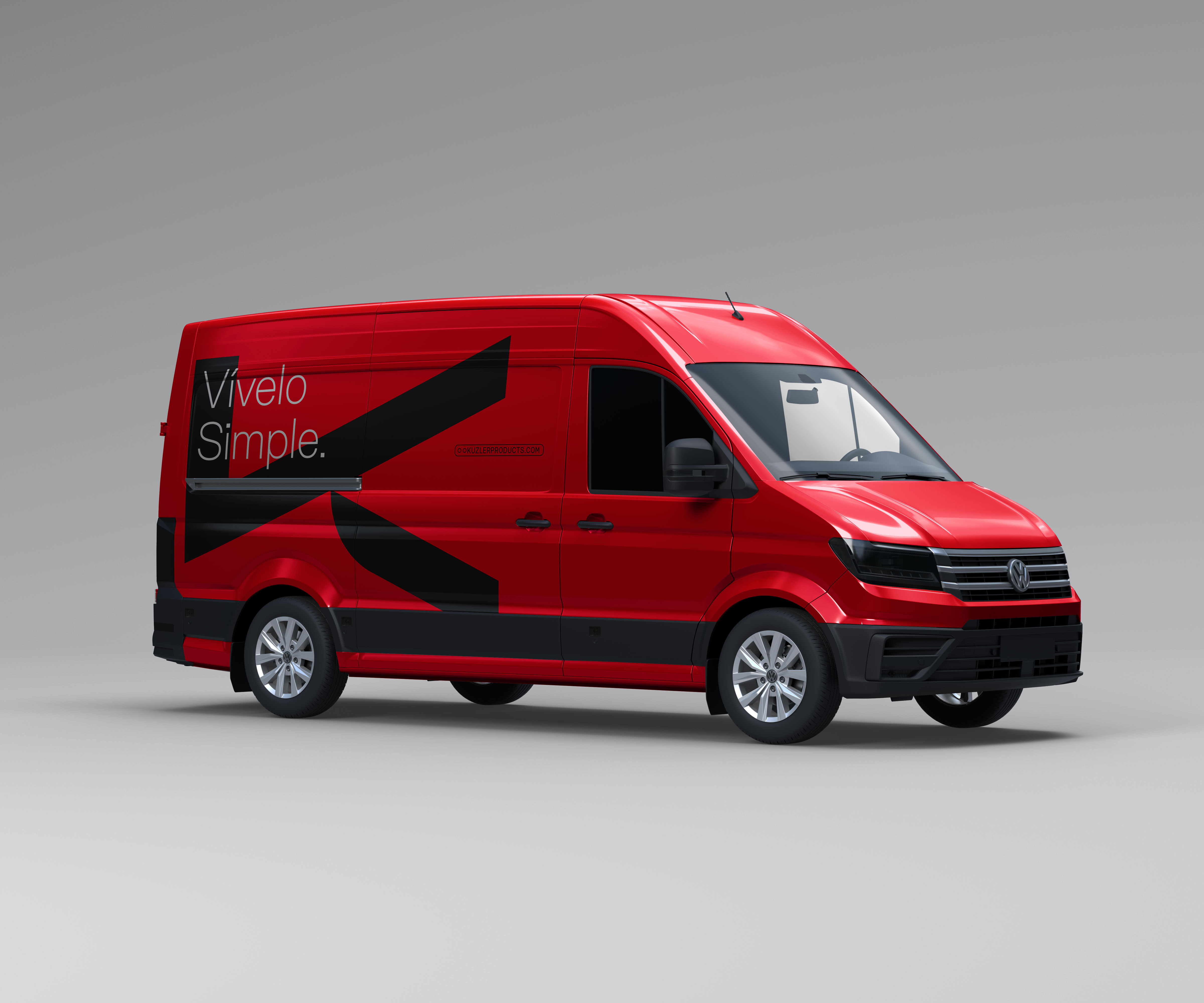
The colour: Turning the main brand asset into a visual enhancer.
From the analysis of the possible opportunities of the brand, we focused strategic efforts on giving a sense to the color they already used: the color red. A color that provides the necessary highlight within technological neutrality.
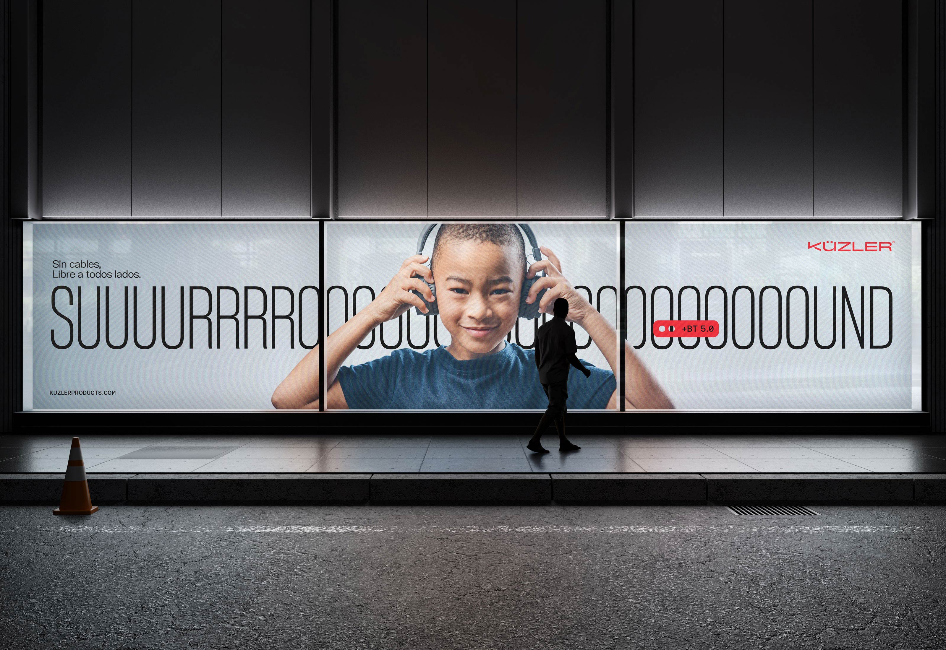
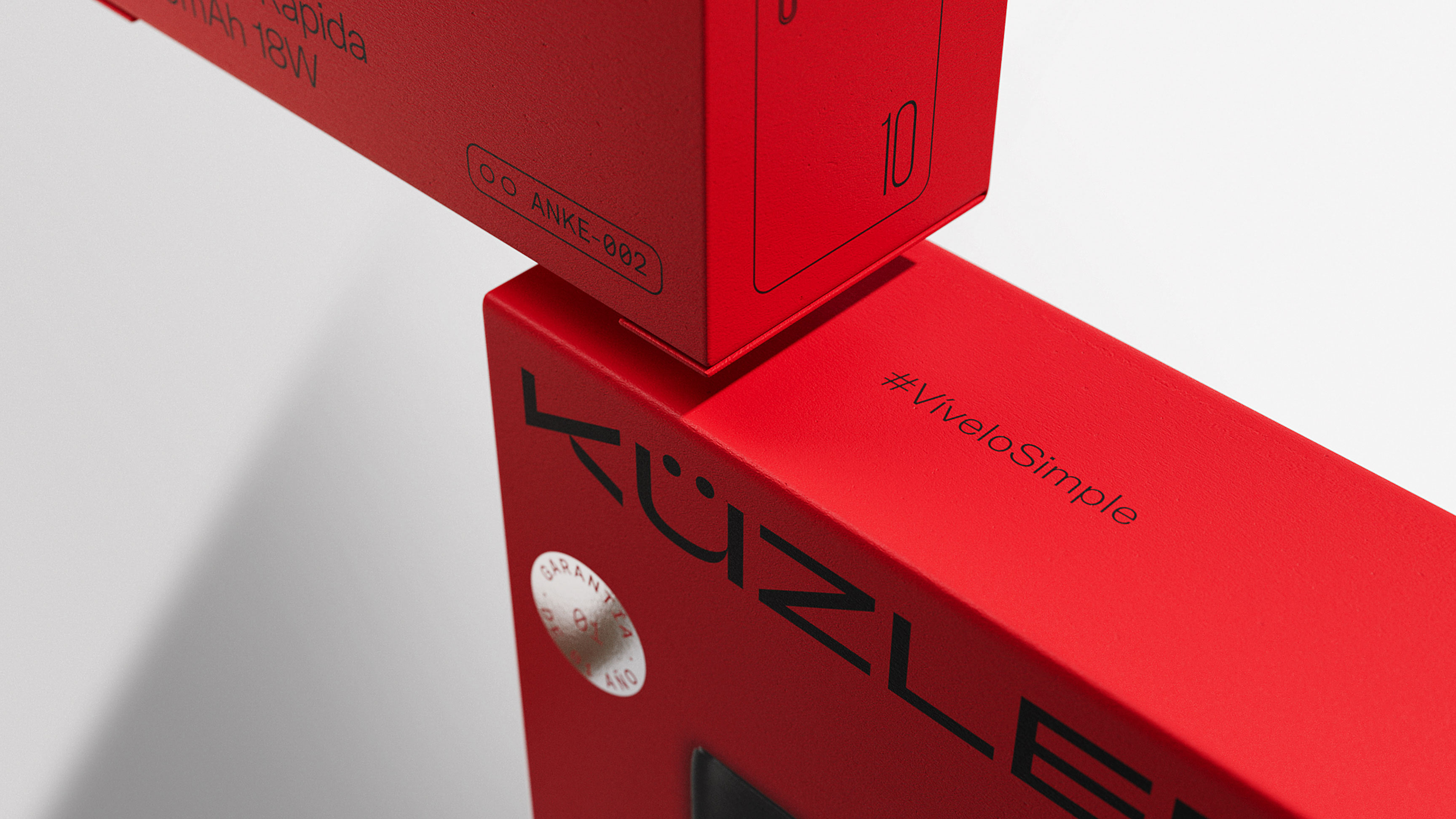
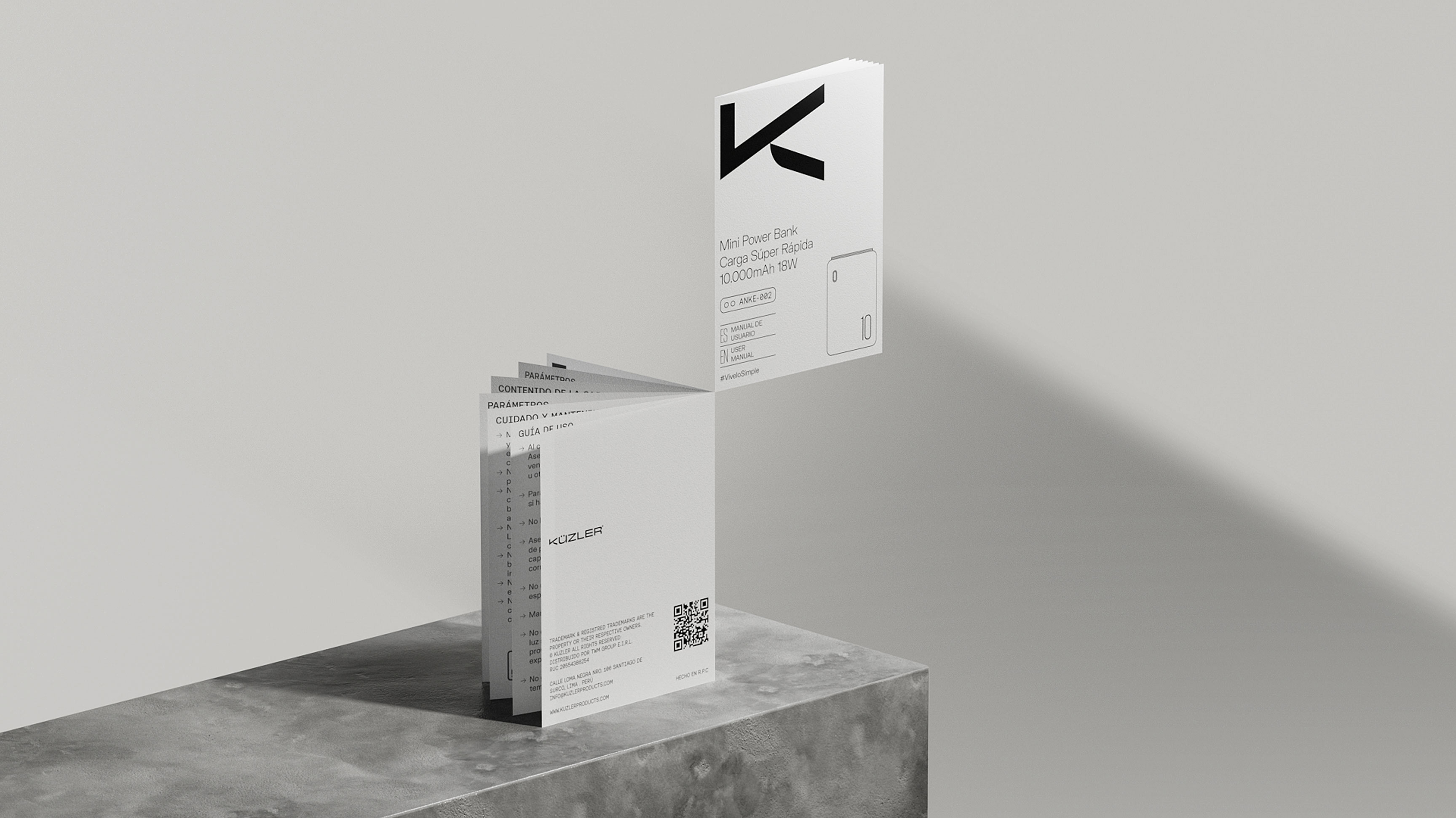
Simplicity and nothing more than simplicity. The common denominator for all graphic decisions made for the brand. A visual language that combines the functional, the technical and the neutral to give rise to a system of packages easy to read and understand.
“Before we were not looked at, today we are the brand that -breaks the visual scheme- of the gondolas and, moreover, is already considered by the largest business stakeholders, both in the traditional channel, as in the modern one.” -Gianfranco Panizo, Küzler General Manager.
Since the renewal of the brand, we have achieved what until 2 years ago we saw impossible: the consideration of placing our products in all channels. We are about to expand our lines and in the future be able to offer our products internationally.

CREDIT
- Agency/Creative: MINO™
- Article Title: Küzler: Redefining Technology with Simplicity and Efficiency by MINO
- Organisation/Entity: Freelance
- Project Type: Packaging
- Project Status: Published
- Agency/Creative Country: Peru
- Agency/Creative City: MINO™
- Market Region: South America
- Project Deliverables: Art Direction, Brand Redesign, Brand Strategy, Branding, Graphic Design, Illustration, Logo Design, Packaging Design
- Format: Box
- Industry: Technology
- Keywords: Branding, Brand strategy, graphic design, art direction, illustration, logo, packaging, electronics, technology, Peru, smart appliances
-
Credits:
Designer: Ronald Pizarro
3D Designer: Julio Martín


