


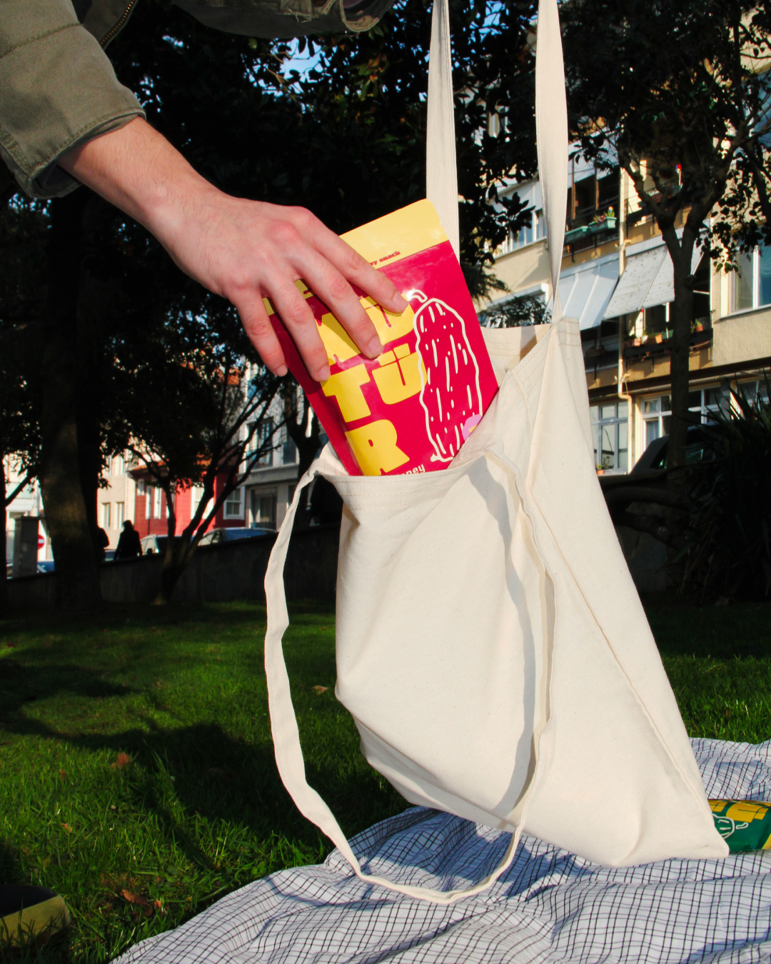
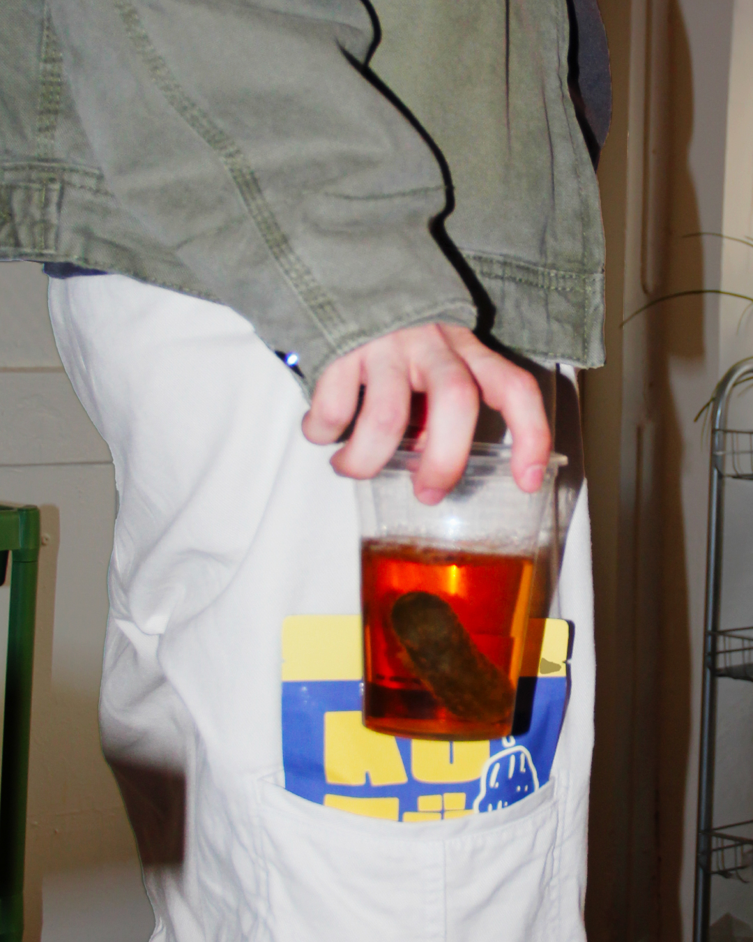
Kütür allows consumers to enjoy pickles anytime, anywhere, and aims to establish itself in fun social settings. Therefore, the brand must avoid the conventional and traditional appearance of the pickle market.
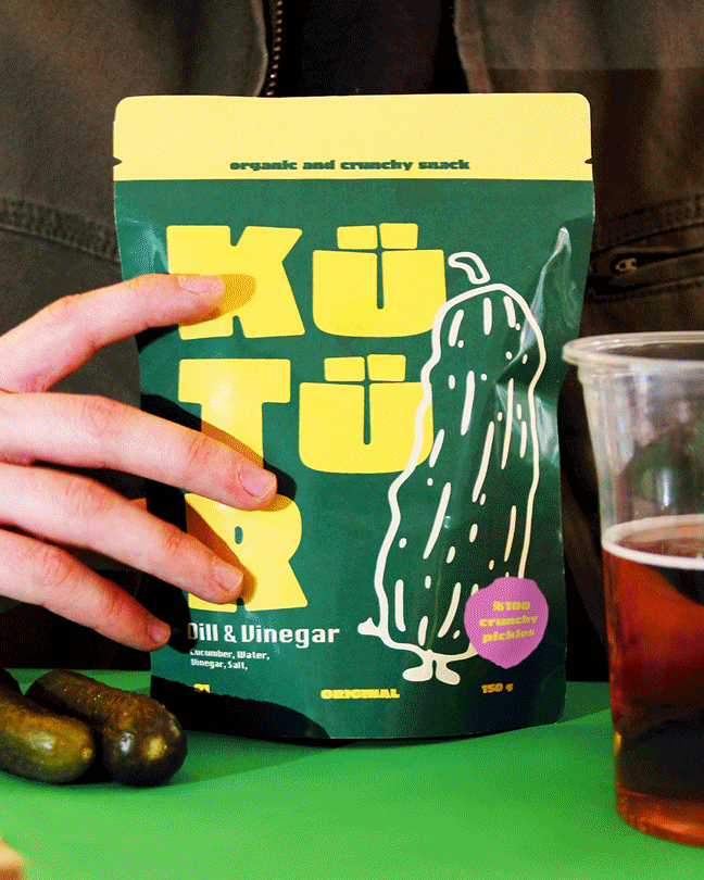
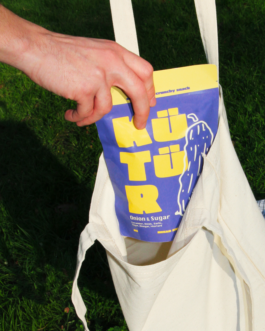
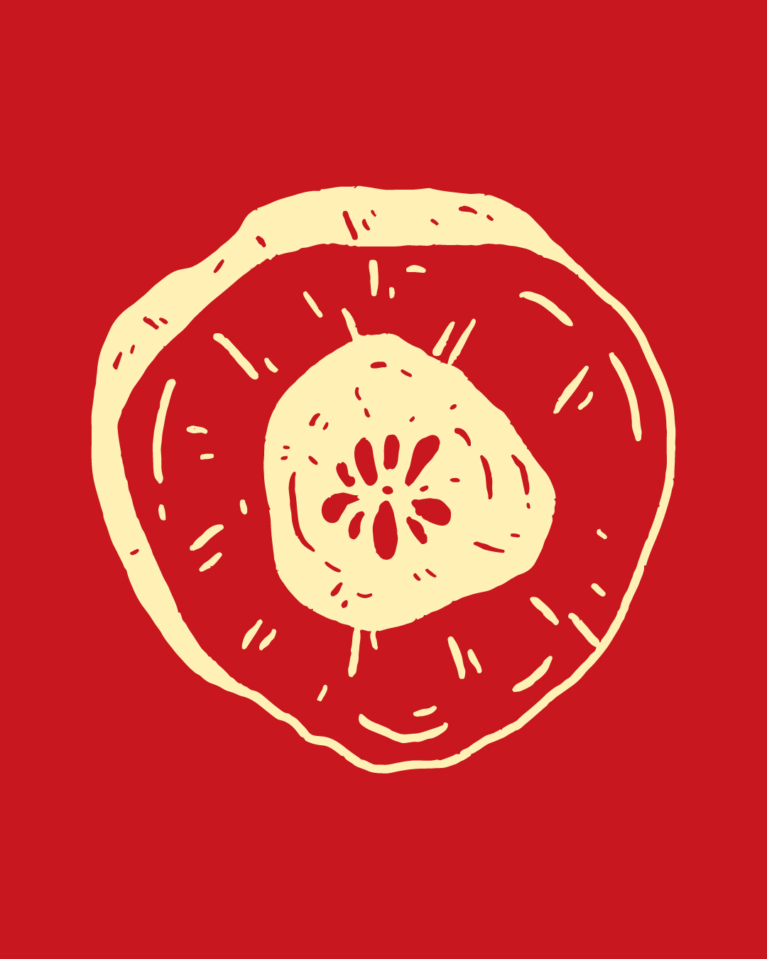
For a flavorful and trend-forward brand, the pickles should be represented with vibrant colors and bold, confident energy, just like its consumers. Rather than fitting into outdated or expected visuals, Kütür embraces a bold spirit that reflects the lifestyle and attitudes of its target audience.
Kütür is a company driven by creative passion, offering innovative ideas for delicious pickles. With the growing influence of Generation Z and Millennials in the market, the brand aims to build a strong connection with this audience through design. These generations value authenticity, playfulness, and originality all of which are central to Kütür’s identity.
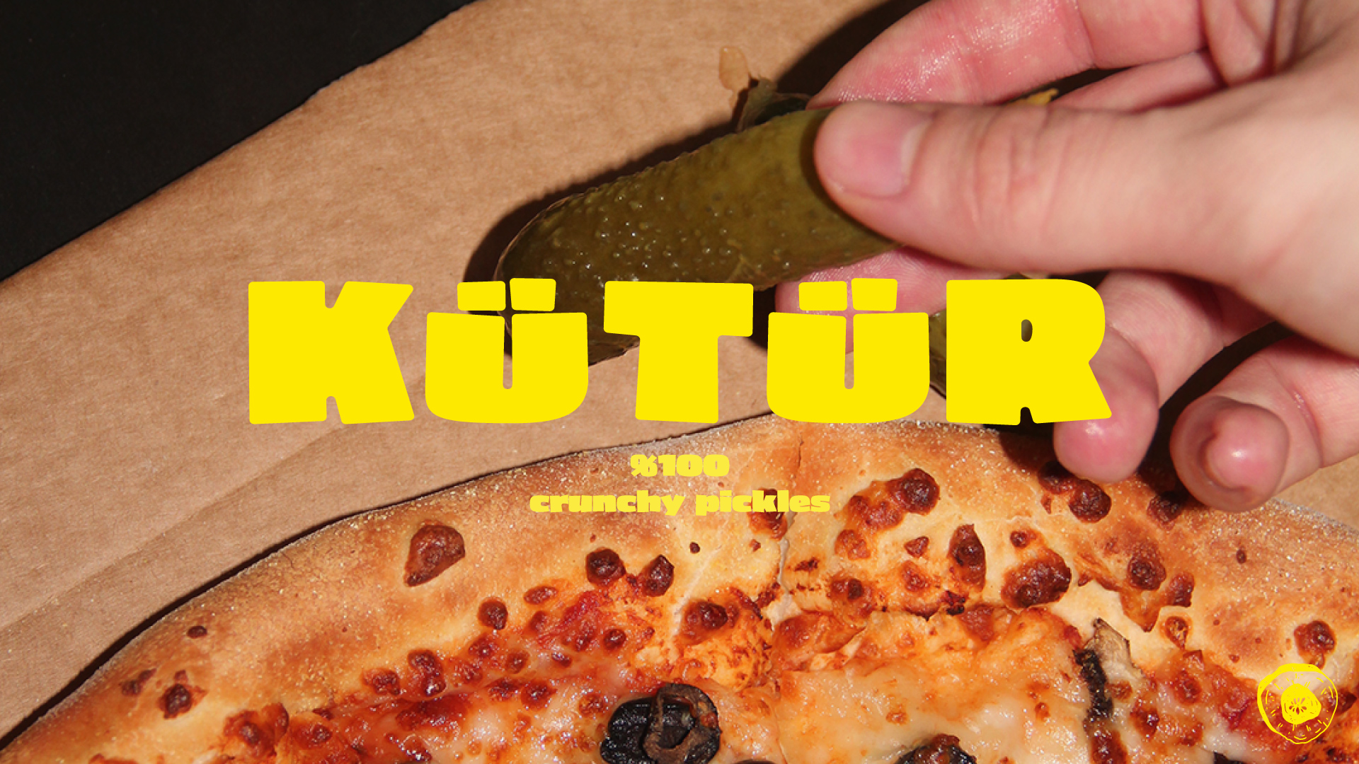
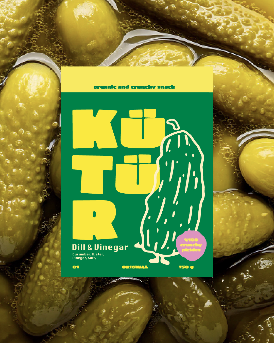
The idea for the name comes from the Turkish phrase “kütür kütür,” commonly used to describe the quality of crisp and juicy foods. This expression perfectly captures the sensory experience that Kütür delivers in every bite.
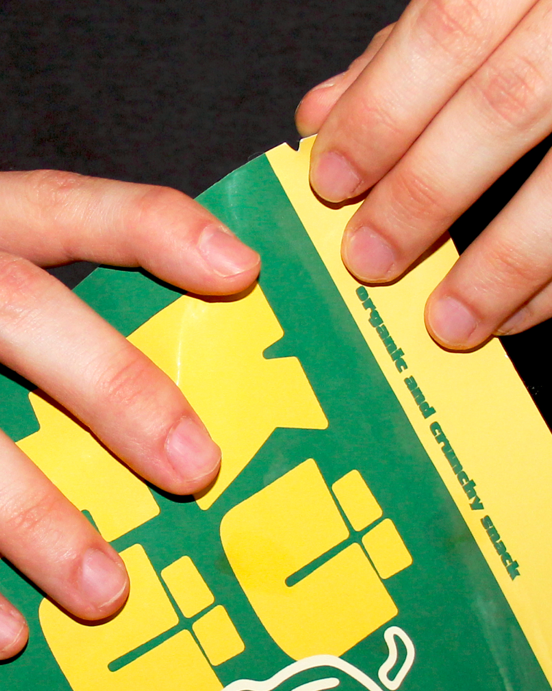
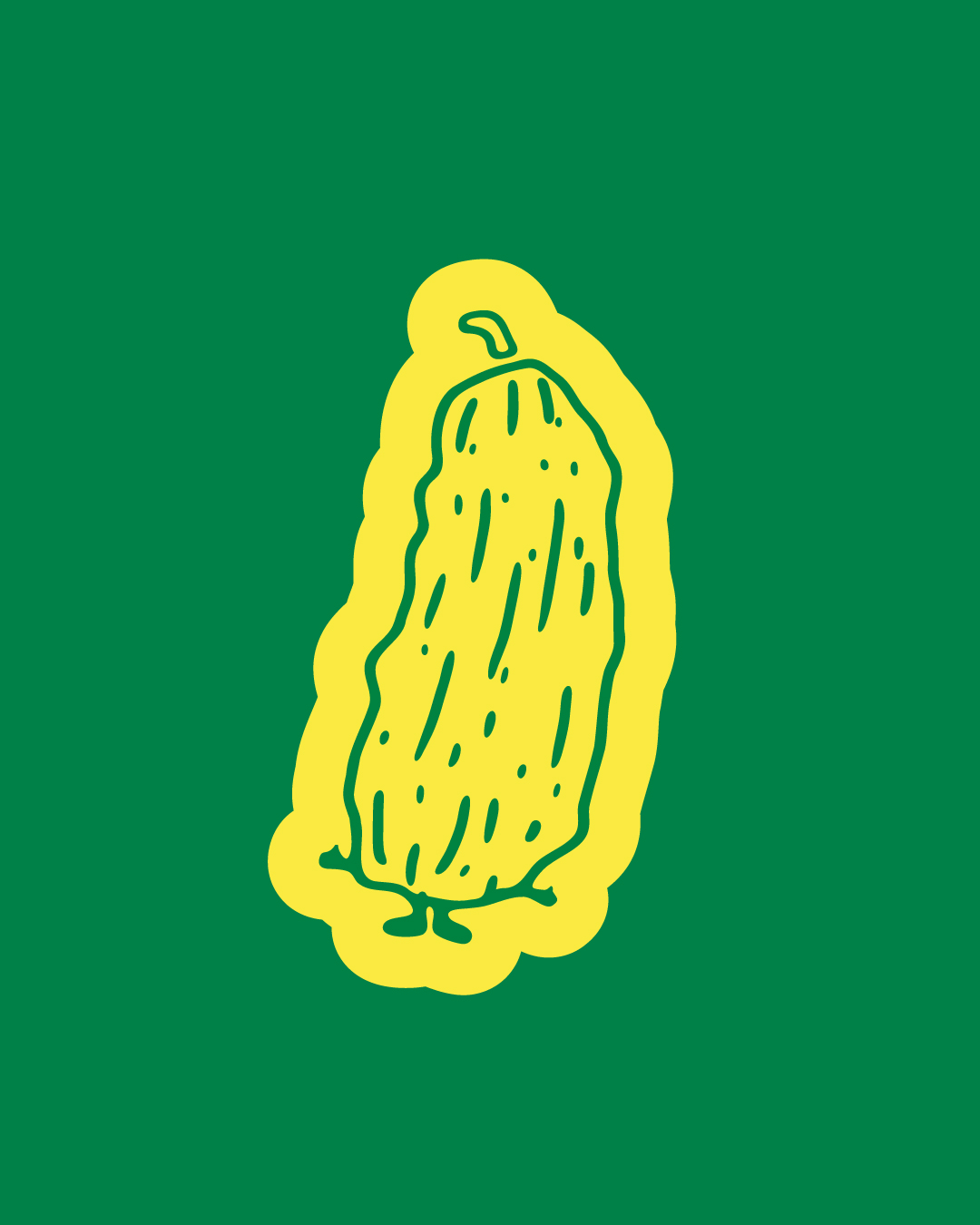
For the packaging design, we adopted an approach that uses distinctive colors and typographic designs that reflect joy and variety while maintaining an elegant yet bold aesthetic. From the choice of bold fonts to the energetic color palettes, every design element is chosen to express flavor, texture, and excitement.
Kütür seeks to stand out with a visual identity full of character. For the brand to achieve success and longevity, it is crucial to establish a consistent visual and communication language. This consistency helps reinforce brand recognition and ensures a strong emotional bond with customers.
To expand its product range in the future and introduce new flavors to consumers, the brand’s foundation must be built on solid ground. Establishing this groundwork through thoughtful, engaging design ensures that Kütür can evolve, grow, and continue delivering joyful taste experiences for years to come.
CREDIT
- Agency/Creative: so many things!
- Article Title: Kütür Pickle Packaging Design by so many things!
- Organisation/Entity: Freelance
- Project Type: Packaging
- Project Status: Published
- Agency/Creative Country: Turkey
- Agency/Creative City: Istanbul
- Market Region: Asia, Europe
- Project Deliverables: Brand Creation, Brand Design, Brand Identity, Packaging Design
- Format: Flow-Pack
- Industry: Food/Beverage
- Keywords: pickle, design, packaging, illustration
-
Credits:
Designer: Beste Cebeci
Designer: Bartu Erdoğan


