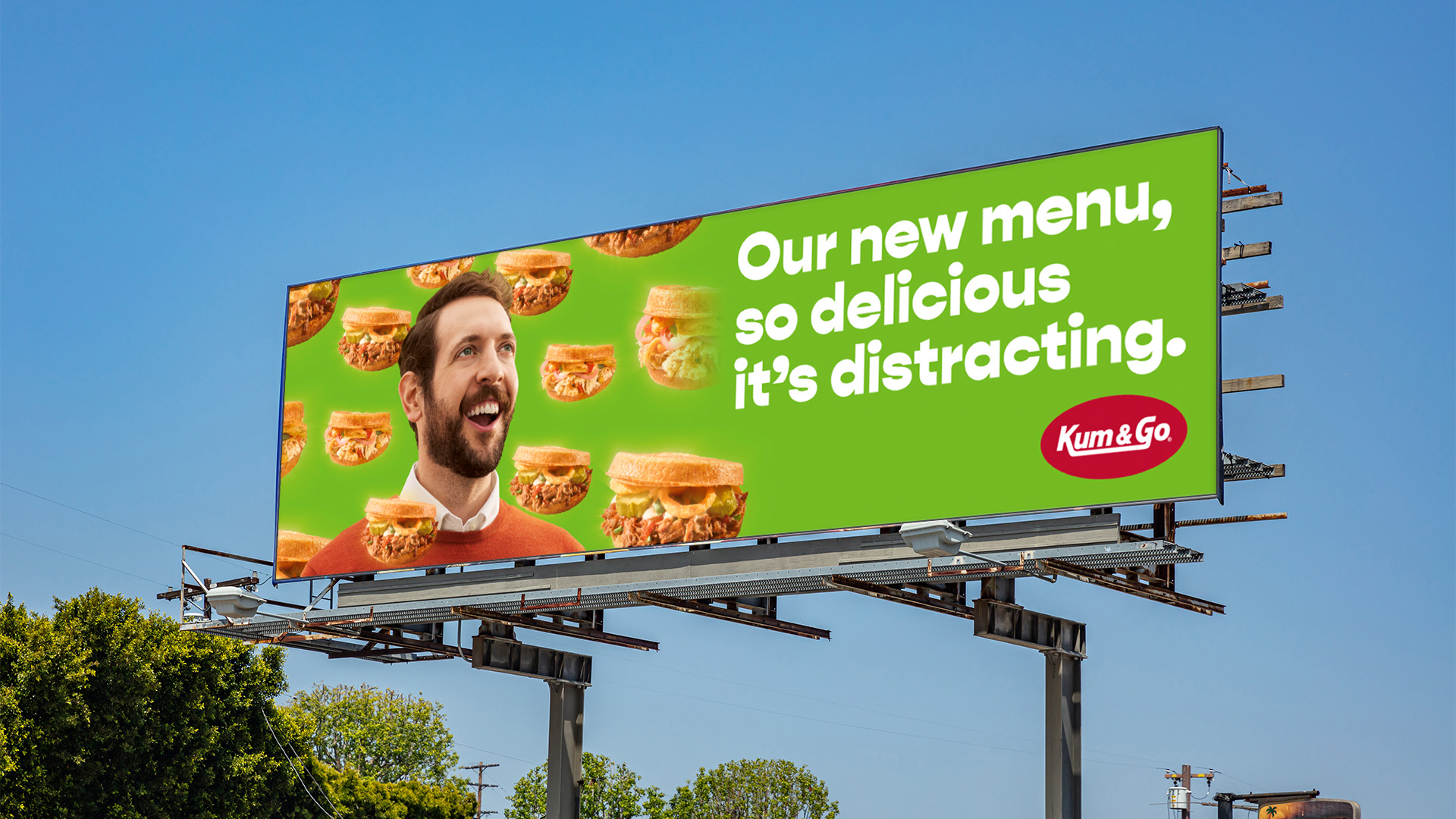
Family-owned convenience retail chain Kum & Go has unveiled a refreshed identity and an ambitious new campaign in a move to redefine the on-the-go category and connect with a wider audience. Launching alongside a deliciously fresh and flavorful new menu in specific markets, the brand’s modernizing renovation – led by global branding agency BrandOpus – aims to match the retailer’s evolved approach to food through a bold and contemporary aesthetic.
Founded in 1959 by Bill Krause and Tony Gentle, Kum & Go operates more than 400 stores in 11 U.S. states. The brand has always prided itself on being a welcoming hotspot for gas, groceries, and for communities to connect. Today, Kum & Go continues to innovate new ways to offer its customers the choices they deserve and desire. The recharged identity celebrates the idea of ‘empowered choices’.
As part of the drive to provide ‘empowered choices,’ Kum & Go has also developed a new menu that offers fresh, flavorful food without sacrificing convenience or value. Kum & Go’s biggest challenge was breaking the category stigma that convenience store food is often artificial and engineered. The BrandOpus team was tasked to craft a 360-degree campaign that brought to life the brands’ vision and represented the exciting updates happening at Kum & Go – a fresh look for fresh food.
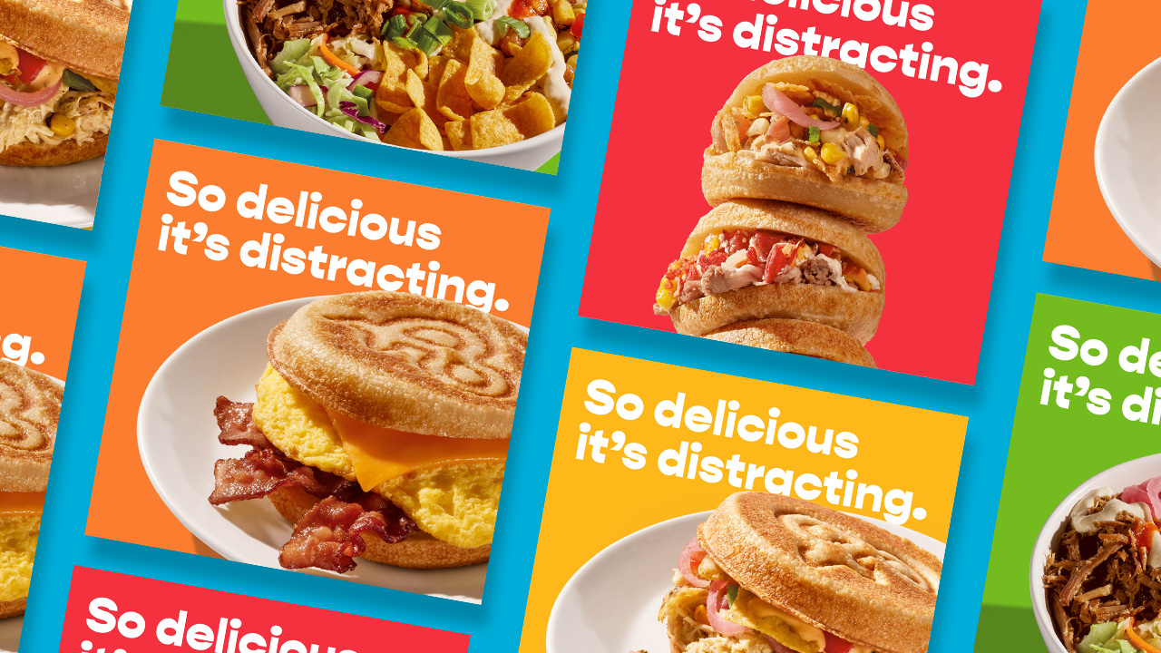
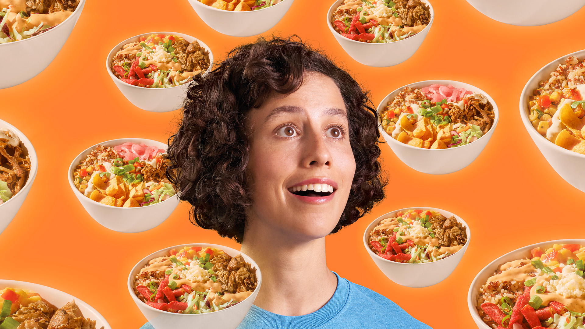
The new ad campaign titled “So Delicious It’s Distracting” debuts this week across TV, online, social media, radio, and in-store channels. The humorous campaign, developed by BrandOpus, aims to introduce both Kum & Go’s overhauled menu and new positioning. The irreverently playful 15-second film plays on the insight that once you’ve tried the new Kum & Go menu, it’s delicious flavors will drive you to distraction with hilarious consequences. “Towawav” & “Dodgeball” launch the week of September 20 in select markets.
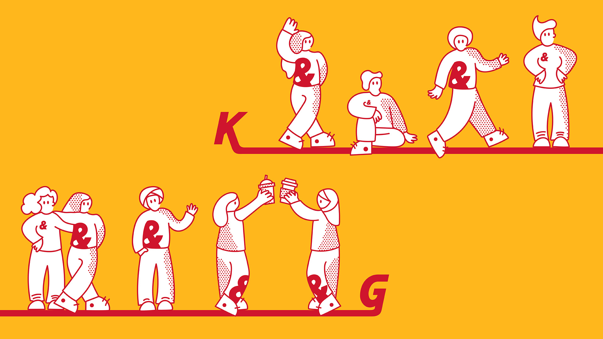
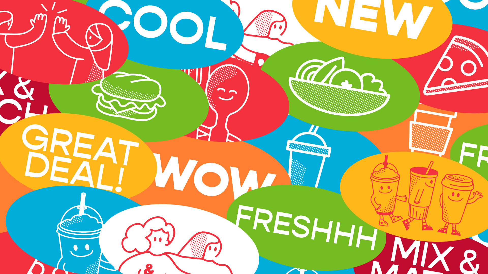
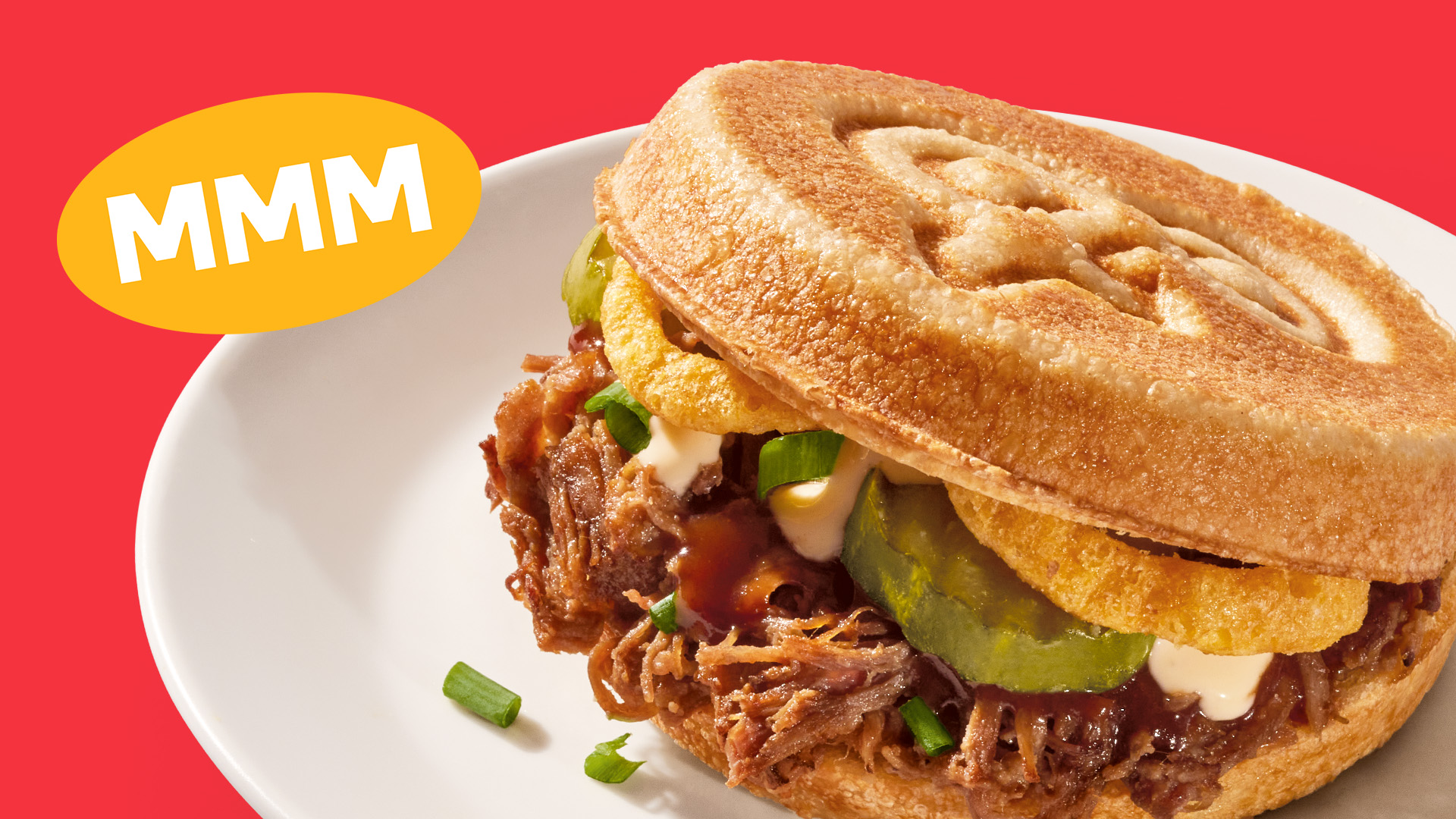
Details of the wider rebrand and campaign: A new tagline, “A Fresh Perspective,” encapsulates the brand’s approach to business—from the tasty food to the associates’ attitudes, the e-charging stations, and beyond. The ellipse and K&G connecting line within the logo have inspired an upbeat and energetic world of patterns and playful illustrations including “The Ampersandersons” characters, who echo the brand’s joyful spirit. The ampersand within the logo – previously a lead equity – now works within the wider brand world as a distinctive asset and signature for the brand. Kum & Go’s iconic red and white colour palette has been retained yet evolved to include an uplifting orange, green, and blue to evoke a sense of vibrancy. Punchy and bold, the Gopher and Sofia type style delivers a personable and spunky tone of voice across all activations and communications. A sharp, clean, and confident photography style draws out the mouth-watering flavor and quality of real ingredients.
Matt Riezman, Director of Brand Marketing, Kum & Go, comments: “We’ve witnessed food preferences evolve in recent times. Now felt like the right time to reevaluate what convenience means to our customers today and spearhead a significant change in the category. BrandOpus has been a fantastic partner throughout this journey and has equipped us with the tools to shift that meaning, delivering a dynamic and cohesive brand experience across all touchpoints.”
Paul Taylor, Chief Creative Officer and Founding Partner, BrandOpus, adds: “Our task was to wrap up Kum & Go’s new philosophy and approach to food into one strong narrative, bringing it to life through a contemporary and timeless visual expression. The 360-degree revamp brings a whole new meaning to convenience, and we’re excited for the world to experience it.”
Alongside the campaign, the rebrand features a new visual identity, brand strategy, tone of voice, and brand guidelines.
CREDIT
- Agency/Creative: BrandOpus
- Article Title: Kum & Go Set to Redefine Convenience with New Campaign and Brand Overhaul by BrandOpus
- Organisation/Entity: Agency
- Project Type: Campaign
- Project Status: Published
- Agency/Creative Country: United States
- Agency/Creative City: New York
- Market Region: North America
- Project Deliverables: 2D Design, Advertising, Advertising Photography, Brand Creation, Brand Experience, Brand Guidelines, Brand Identity
- Industry: Retail
- Keywords: Brand redesign, Campaign, Advertising
-
Credits:
Creative Agency: BrandOpus


