


Introduction
Kulta Katriina is an iconic brand of Finnish culture that has been present on supermarket shelves for many years. However, the brand owners felt the need to improve the packaging to convey greater emotional depth and modernity while still appealing to its market segmentation. The following case study outlines the process and solution that helped to create a revival of a classic.
The Goal
The primary goal was to create packaging that would awaken the senses of consumers while still appealing to the existing market segmentation. The challenge was to create a brand that would have a greater emotional depth and modernity without alienating the existing customer base.
The Solution
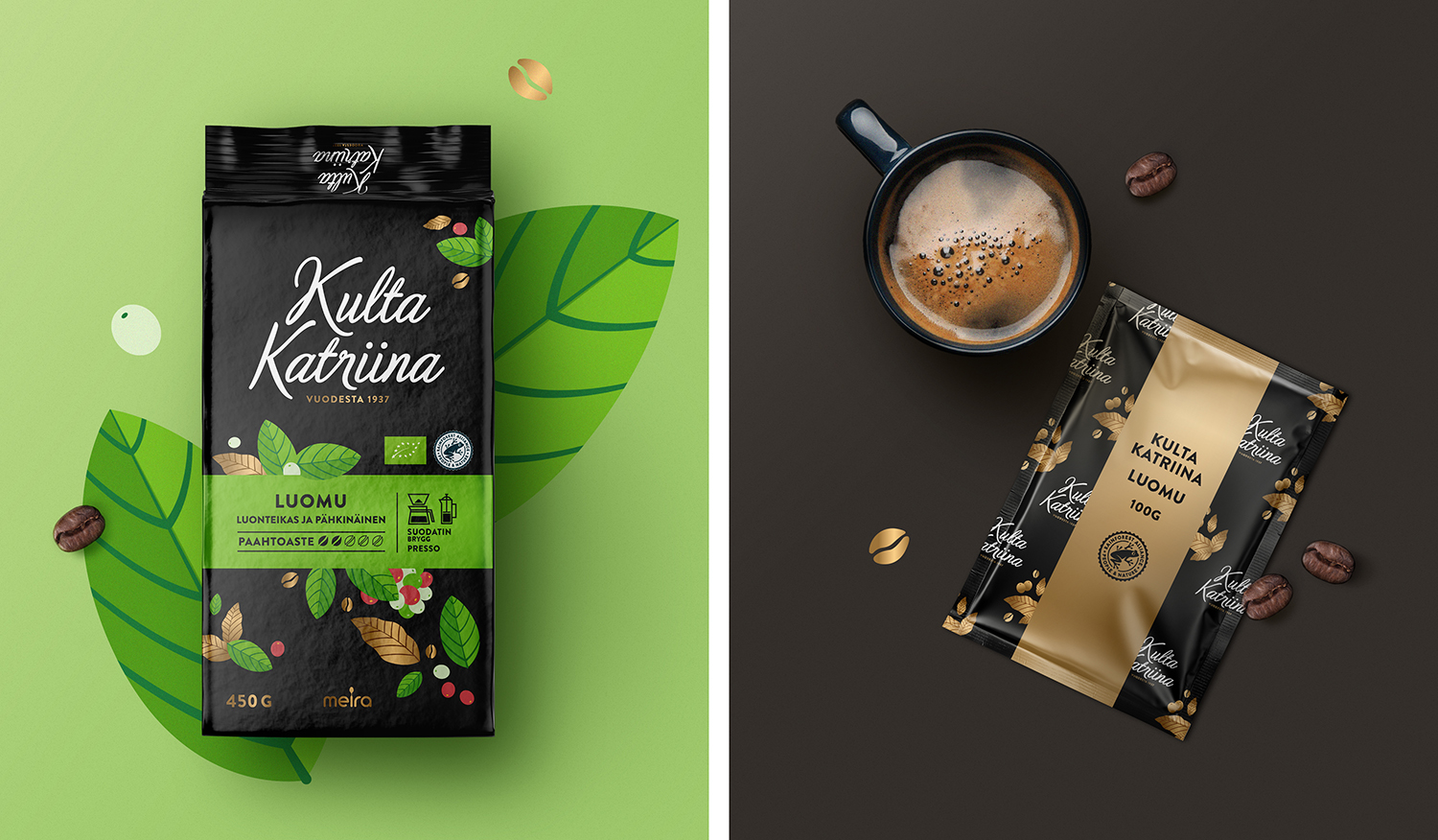
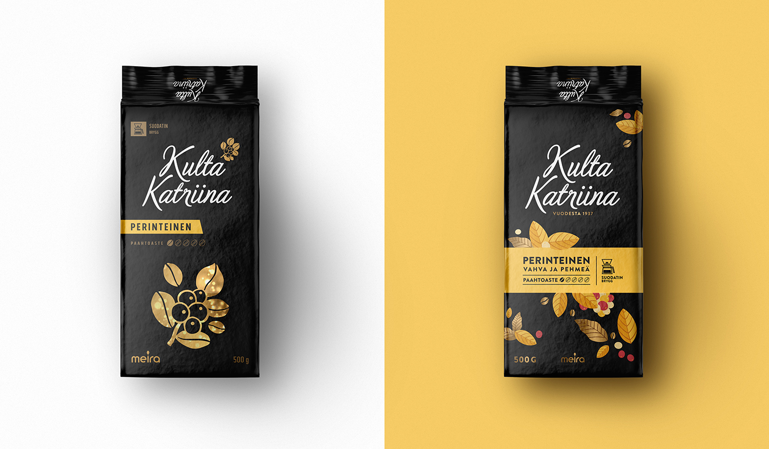
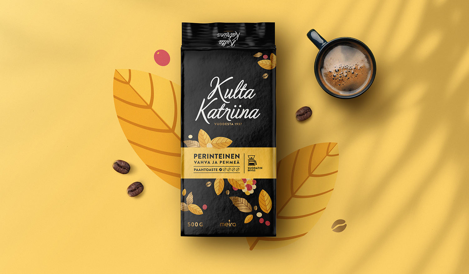
To achieve this goal, the team went for the brand essence, “The Coffee that gives life”. This essence was chosen to create an emotional connection with the consumers and to promote the idea of coffee as a life-giving and energy-boosting beverage. To differentiate between the brand’s range, which amounts to over ten varieties of coffee, an explosion of flowers and colours was created as a guide. A color band on the center was also introduced to help consumers identify each variety and know more about its unique characteristics, such as its intensity and preparation requirements. A set of icons was designed to help consumers see the characteristics of each variety at first sight.
The finished result was one of greater dynamism, colour, and above all, generosity, with a matte effect on the background combined with a golden metallic ink to create a more premium feeling and touch experience. The new packaging design successfully conveys the brand’s quality and flavour, and the unique moments shared over every cup of Kulta Katriina coffee.
Features
The branding strategy was developed to create an emotional connection with consumers, and the packaging design reflects this strategy. The use of organic and natural elements in the design, along with the coffee and delicate fonts, gives the packaging a premium and authentic feel.
Conclusion
The Kulta Katriina brand has been successfully revived with a modern and emotional touch. The new packaging design reflects the brand’s essence of “The Coffee that gives life” and its qualities of flavour and quality. The new packaging design is also successful in appealing to a younger demographic while still appealing to the existing customer base. The use of organic and natural elements in the design, along with the coffee and delicate fonts, gives the packaging a premium and authentic feel. Overall, the project was successful in achieving the primary goal of creating a revival of a classic brand with a modern and emotional touch.


CREDIT
- Agency/Creative: Pointbleu Design
- Article Title: Kulta Katriina – Reviving a Classic with a Modern and Emotional Touch
- Organisation/Entity: Agency
- Project Type: Packaging
- Project Status: Published
- Agency/Creative Country: Spain
- Agency/Creative City: Pointbleu Design
- Market Region: Europe
- Project Deliverables: Packaging Design
- Format: Bag
- Substrate: Plastic
- Industry: Food/Beverage
- Keywords: coffee, design, kulta katriina, meira, packaging
-
Credits:
Creative Direction and Design: Pointbleu Design


