


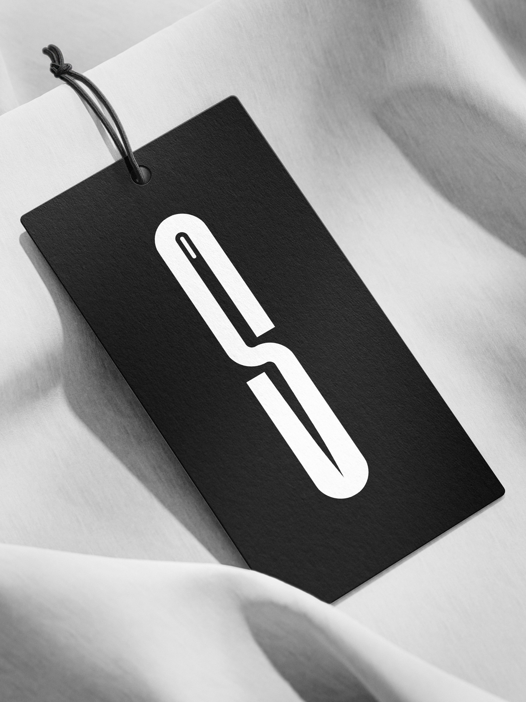
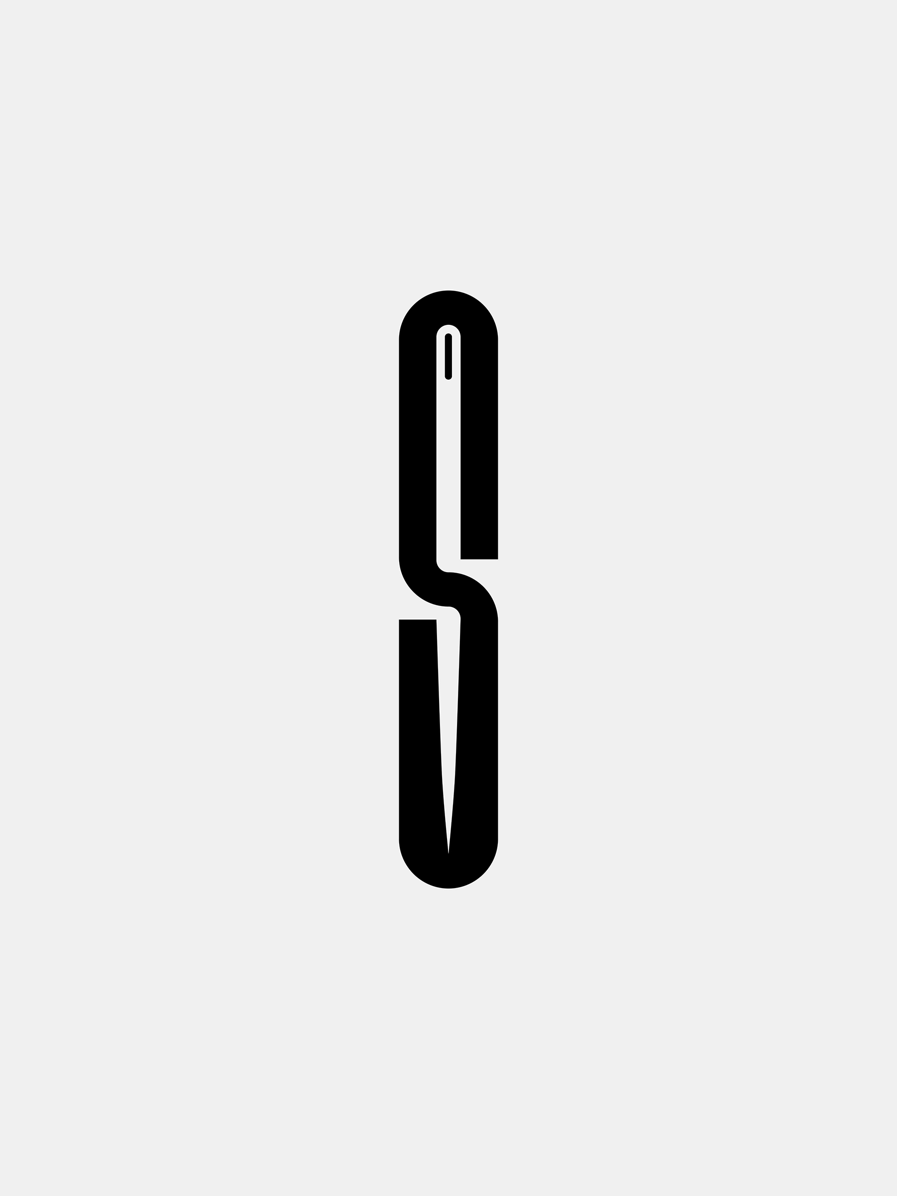
The logo was designed for the tailoring studio “Spod Igły”, a name that translates from Polish as “from the needle.” The identity was created to visually express the studio’s dedication to craftsmanship, precision, and timeless elegance—values that are deeply rooted in the tradition of bespoke tailoring. From the very beginning, the design process focused on capturing the quiet sophistication of the atelier and translating it into a refined, contemporary visual form.
A key conceptual element of the logo is the needle subtly concealed within the negative space of the letter “S.” This hidden symbol serves as a visual metaphor for the studio’s name and its core craft. Rather than presenting the needle in a literal or illustrative manner, it is integrated discreetly into the typographic form, rewarding attentive viewers with an additional layer of meaning.
The logo features a minimalist and slender structure, intentionally reduced to its essential elements. This restrained approach reflects the aesthetic philosophy of the studio itself, where attention to detail, balance, and proportion play a central role — qualities shared by both graphic design and tailoring. The delicate line weight and elegant typography evoke the subtlety and finesse associated with hand-crafted garments, while avoiding unnecessary ornamentation. As a result, the logo feels modern yet timeless, aligning seamlessly with the character of a tailoring studio that values both tradition and contemporary design sensibilities.


CREDIT
- Agency/Creative: Krzysztof Guzek
- Article Title: Krzysztof Guzek Designs Spod Igły With a Clean Visual System and High-Impact Brand Consistency
- Organisation/Entity: Freelance
- Project Type: Identity
- Project Status: Published
- Agency/Creative Country: Poland
- Agency/Creative City: Lodz
- Market Region: Europe
- Project Deliverables: Logo Design
- Industry: Fashion
- Keywords: logo tailor typography letter needle
-
Credits:
Designer: Krzysztof Guzek


