


Connecting Maritime Tradition With Modern Design
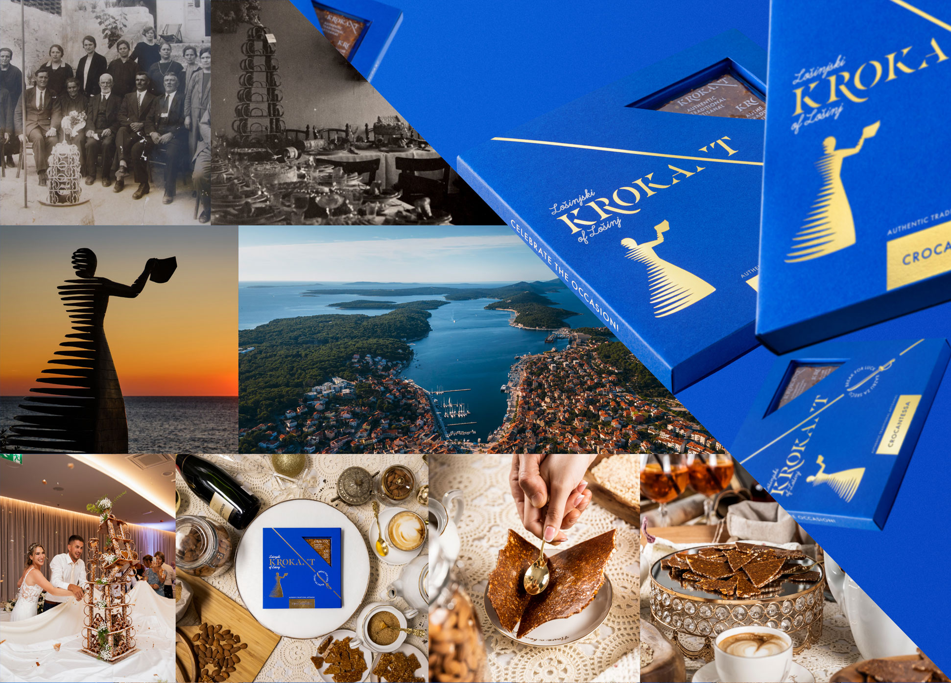
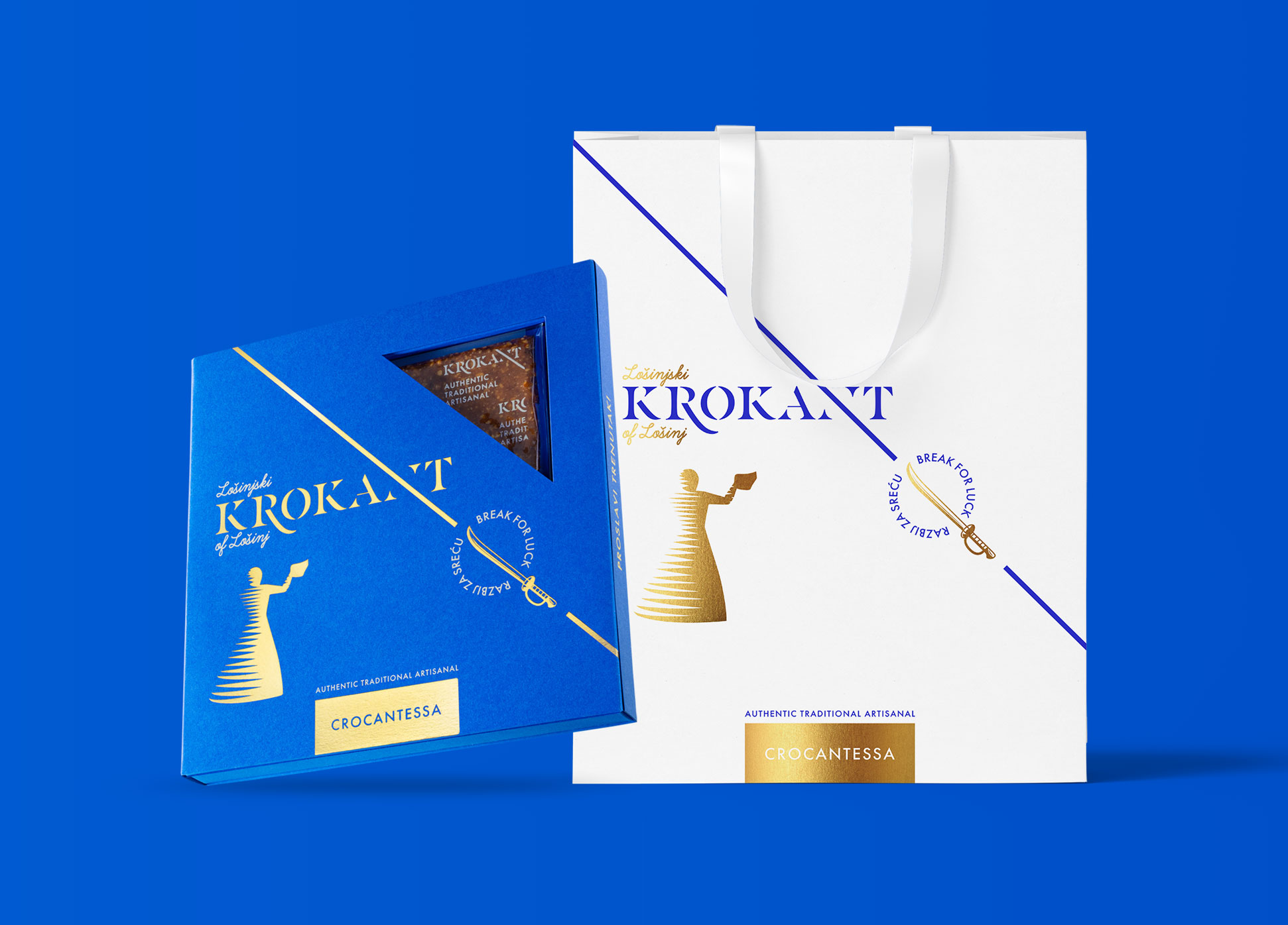
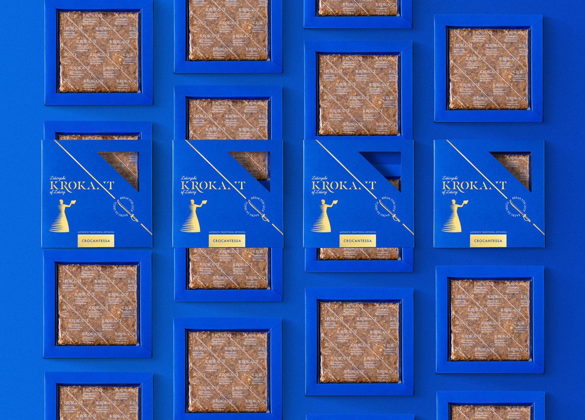
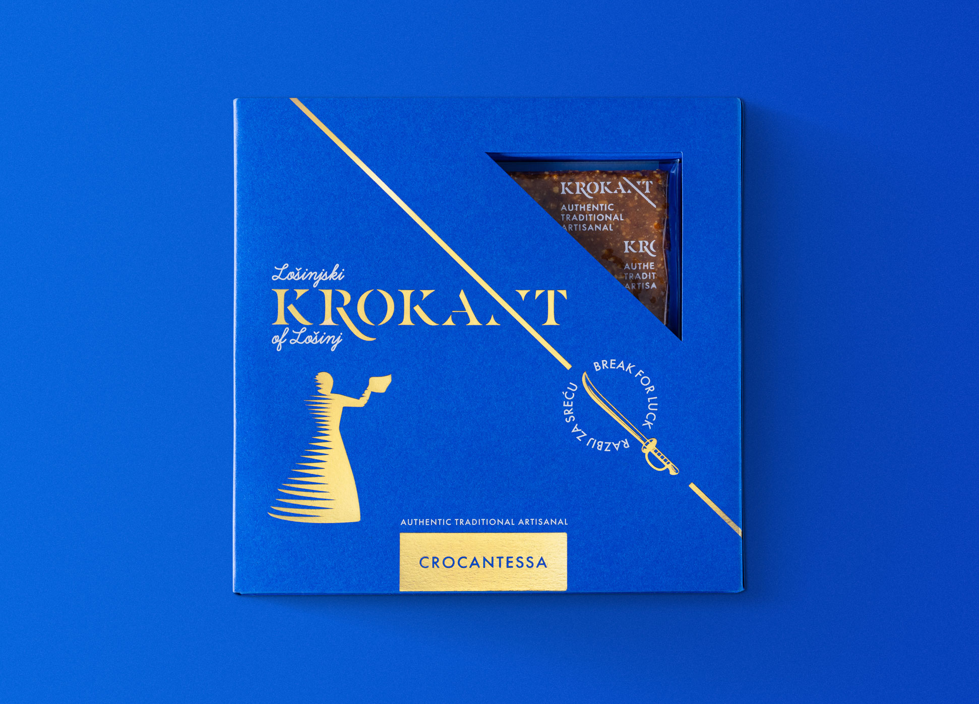
It was our great pleasure to brand an autochthonous traditional dessert – the Krokant of Lošinj. This festive dainty embodies the story of the golden age of seafaring in Lošinj, which lasted from the second half of the 18th to the end of the 19th century, when seafarers were absent for most of the year, their wives and families waited for them, and every major family celebration was celebrated with a specific dessert – krokant. Almonds and sugar were expensive at that time, so a dessert made exclusively from two ingredients was a real luxury and a sign of wealth. The Krokant of Lošinj has 7 floors and is decorated with sugar paste. It is made for weddings, baptisms, big anniversaries and holidays. For good luck, you should break the croquette with a saber, more pieces mean more luck!
Visual Identity
Our task was to design the visual identity of this autochthonous product of the island Lošinj.
With specific requests from the client, such as the inclusion of the Addio sculpture, we wanted to create a contemporary design inspired by the rich maritime tradition that will tell the story of rituals and identity of Lošinj.
Colours
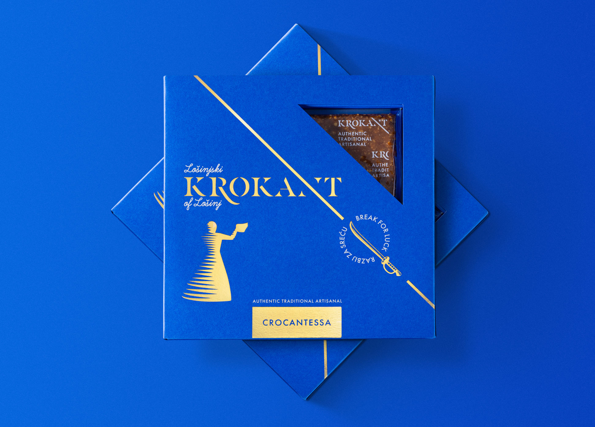
We started with our research with the blue color, which represents the sea and the maritime tradition of Lošinj. Additionally, the blue color is associated with nobility and relaxation, which perfectly suits the celebratory atmosphere. To further connect the color with maritime themes, we chose navy blue, specifically in the shade of Admiral blue – an elegant dark blue color that is simultaneously vibrantly interesting. It is named after the commander of the sea, symbolizing the rank of the navy.
To complement the primary blue color, we added gold – the most precious color among colors, as gold is the most precious metal among metals. Gold is the color of prosperity and abundance, instantly elevating the look of any gathering. In this way, we have seamlessly integrated the assigned narrative into the visual identity – the golden age of maritime.
Logotype
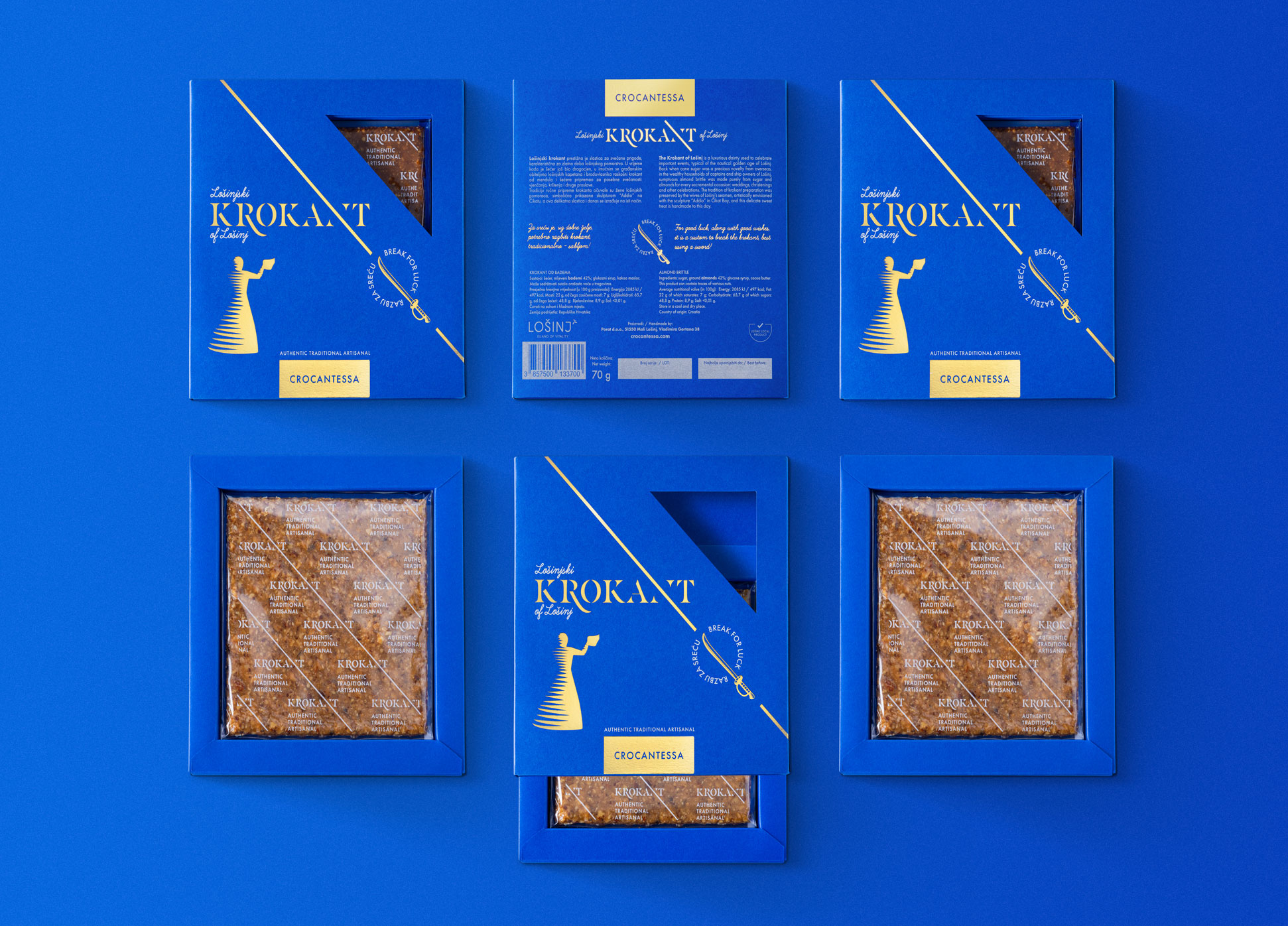
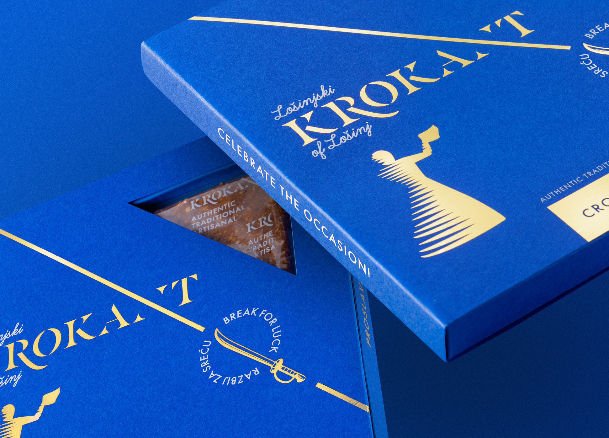
When creating the logo, we chose a strong typography with a historical touch and classic character. In the letter “R,” we depicted a stylized saber blade, while the letter “N” is broken like krokant and also serves as a symbol for the North, specifically the northern part of the Adriatic where Lošinj is located.
To the main typography of the logo, we added a script typography that adds a personal touch, creating the feeling of a handwritten note for this unique gift or souvenir.
Icon
An icon was created from the letter “N,” which is used as a graphic element and symbol of Lošinj’s krokant. By using the slant of the letter “N,” we break the visuals, symbolically representing the breaking of krokant that brings happiness.
Visual Symbols
We further enriched the visual identity with various visual symbols such as the Sable and the message “Break for happiness!”. We also incorporated the illustration of the Addio sculpture, an important cultural symbol of Lošinj, into the visual identity with great care.
Packaging
Creating the packaging was challenging because it involved packaging an extremely thin and fragile product, so the main focus was on product protection. We chose a “tray system” that both protects the product and is visually attractive. The client’s requirement was visibility of part of the product, which we achieved with an opening on the front of the packaging. By combining the visual identity with creative packaging, we created a high-quality product that embodies rich tradition in a contemporary way and is a must-have souvenir from the island, equally appealing to local residents and tourists.

CREDIT
- Agency/Creative: Fabula Design & Marketing Agency
- Article Title: Krokant of Lošinj Identity and Packaging – Connecting Maritime Tradition With Modern Design
- Organisation/Entity: Agency
- Project Type: Packaging
- Project Status: Published
- Agency/Creative Country: Croatia
- Agency/Creative City: Fabula Design & Marketing Agency
- Market Region: Europe
- Project Deliverables: Advertising Photography, Art Direction, Brand Design, Brand Identity, Food Photography, Illustration, Packaging Design, Product Photography
- Format: Box
- Industry: Food/Beverage
- Keywords: giftbox, traditional dessert, traditional cake, packaging
-
Credits:
Creative director: Marko Perozic
Creative strategist & copywriter: Tena Ruzic
Photography: Filip Gržinčić
Illustration: Darja Rubeša


