The Art of Fused Label Effect Design
Background: Nestled in Illinois, USA, Crystal Rain Distillery stands as a testament to the artistry and dedication of a family-owned venture deeply committed to the craft of distillation. With a passion for creating exceptional spirits, this young establishment embodies a relentless pursuit of quality and innovation. Among their illustrious endeavors, the creation of Kristone Craft Grape Brandy stands as a shining example of their commitment to excellence.
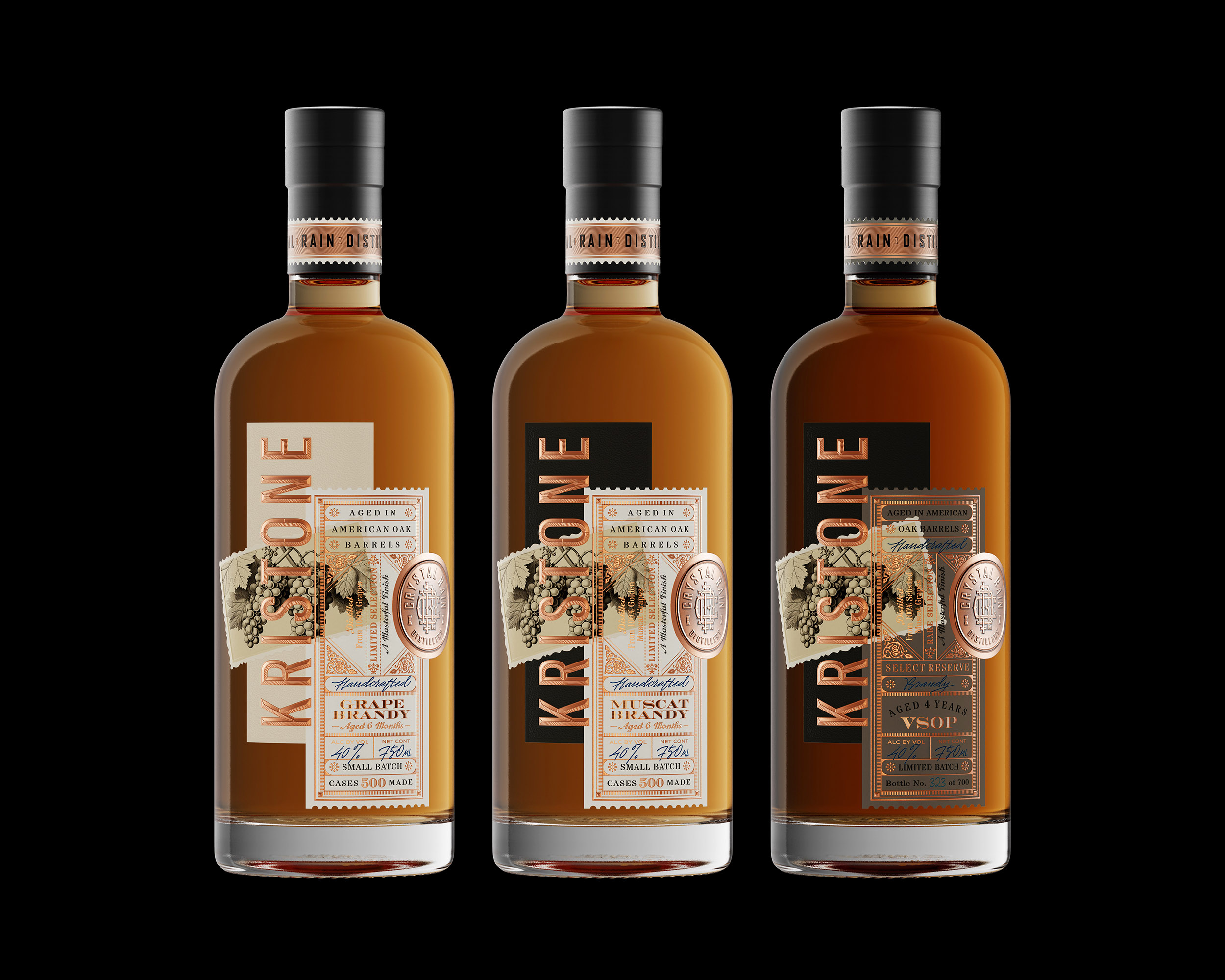
Design Thinking: Building upon the visual legacy established by the Kristone Craft Gin Label, the Grape Brandy project inherits a rich tradition of craftsmanship and innovation. Inspired by a myriad of influences, including postcards, paper collages, vintage label designs, and post stamps, the design ethos of Kristone Craft Grape Brandy is a seamless fusion of tradition and modernity.
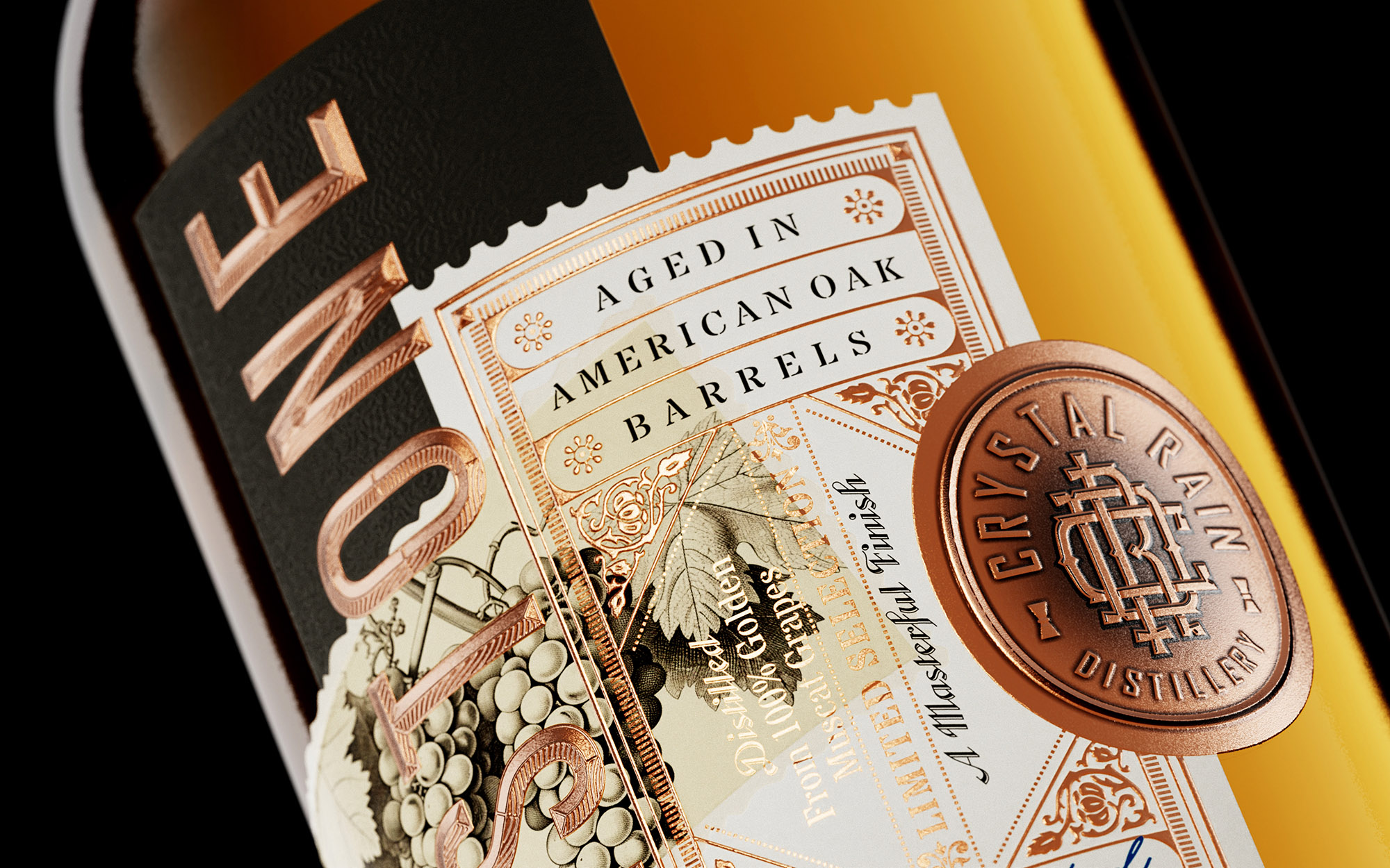
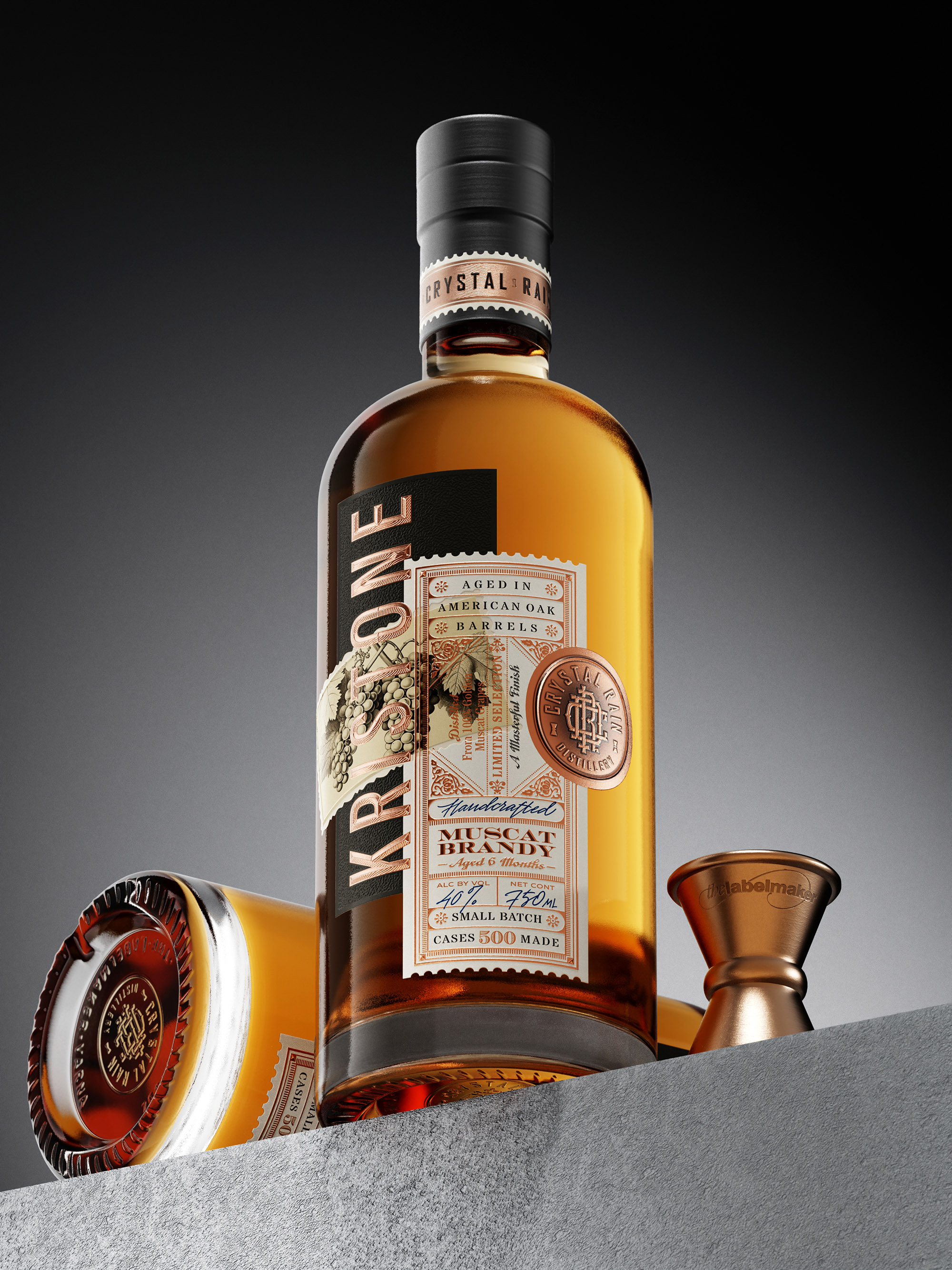
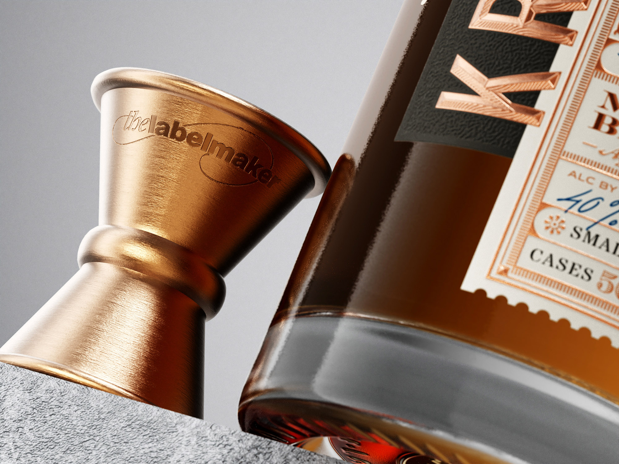
Challenges: Aiming to achieve a fused label effect, I started a creative journey, employing techniques such as embossing and deep texture debossing. The label was precisely crafted to emulate the appearance of distinct paper materials, each representing a key element of the product. Overcoming the challenge of overlapping label elements required careful consideration of where and how to utilize embossing and debossing techniques to enhance the desired effect. Additionally, achieving precision in label print was crucial, and Dagaprint delivered flawlessly, capturing every intricate detail with remarkable precision.
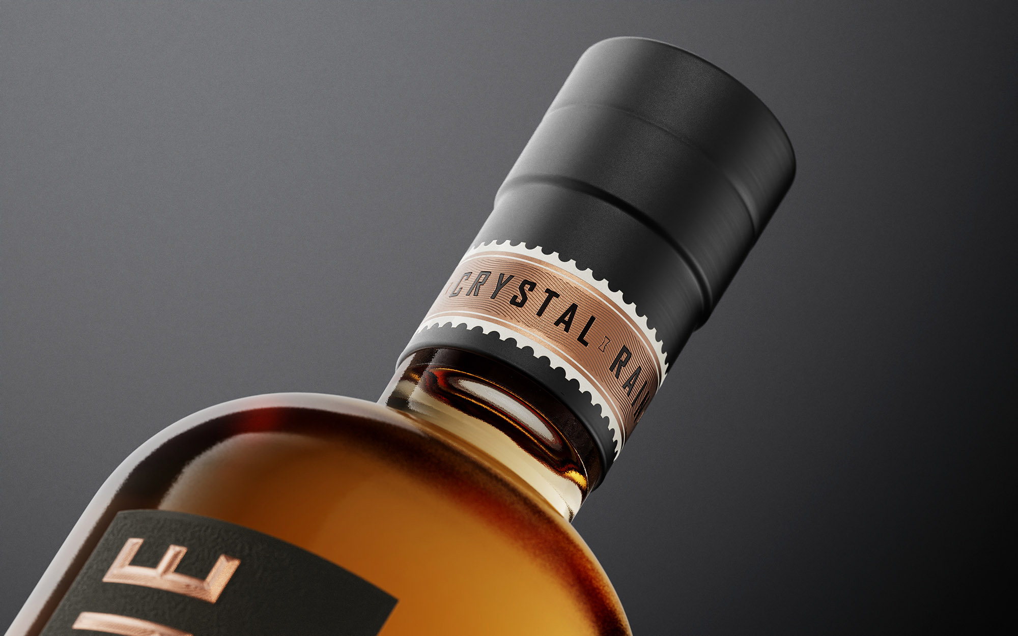
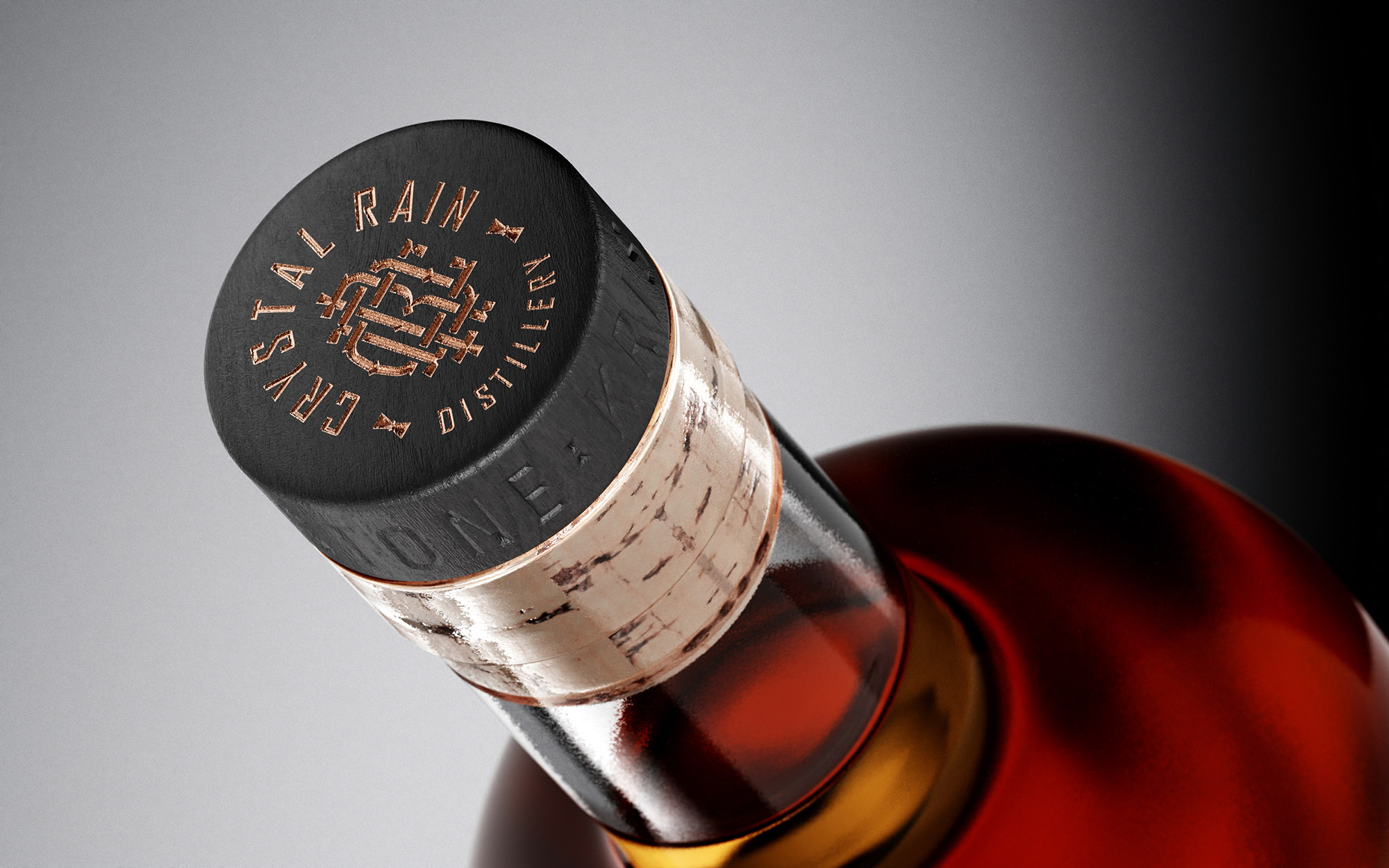
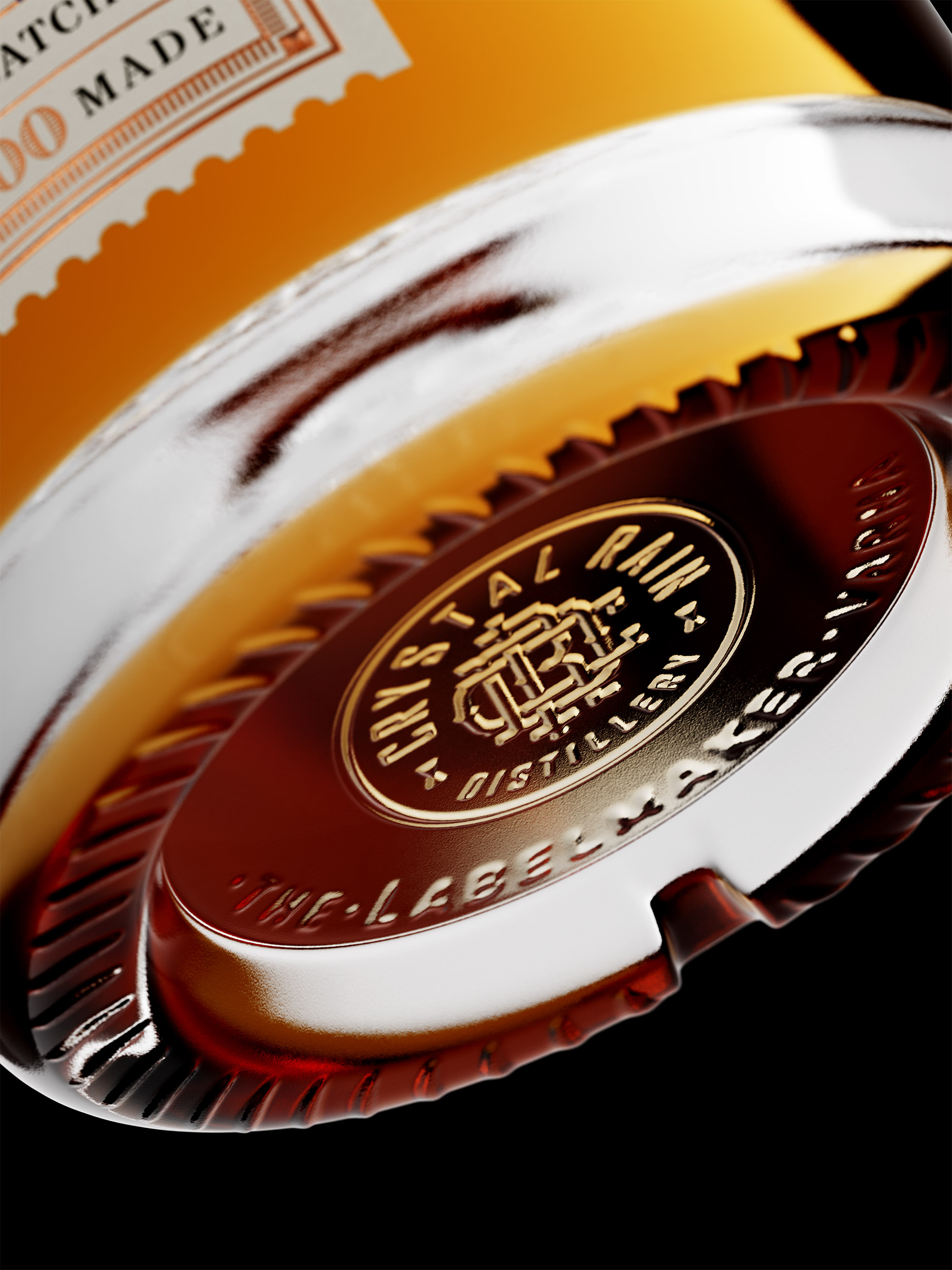
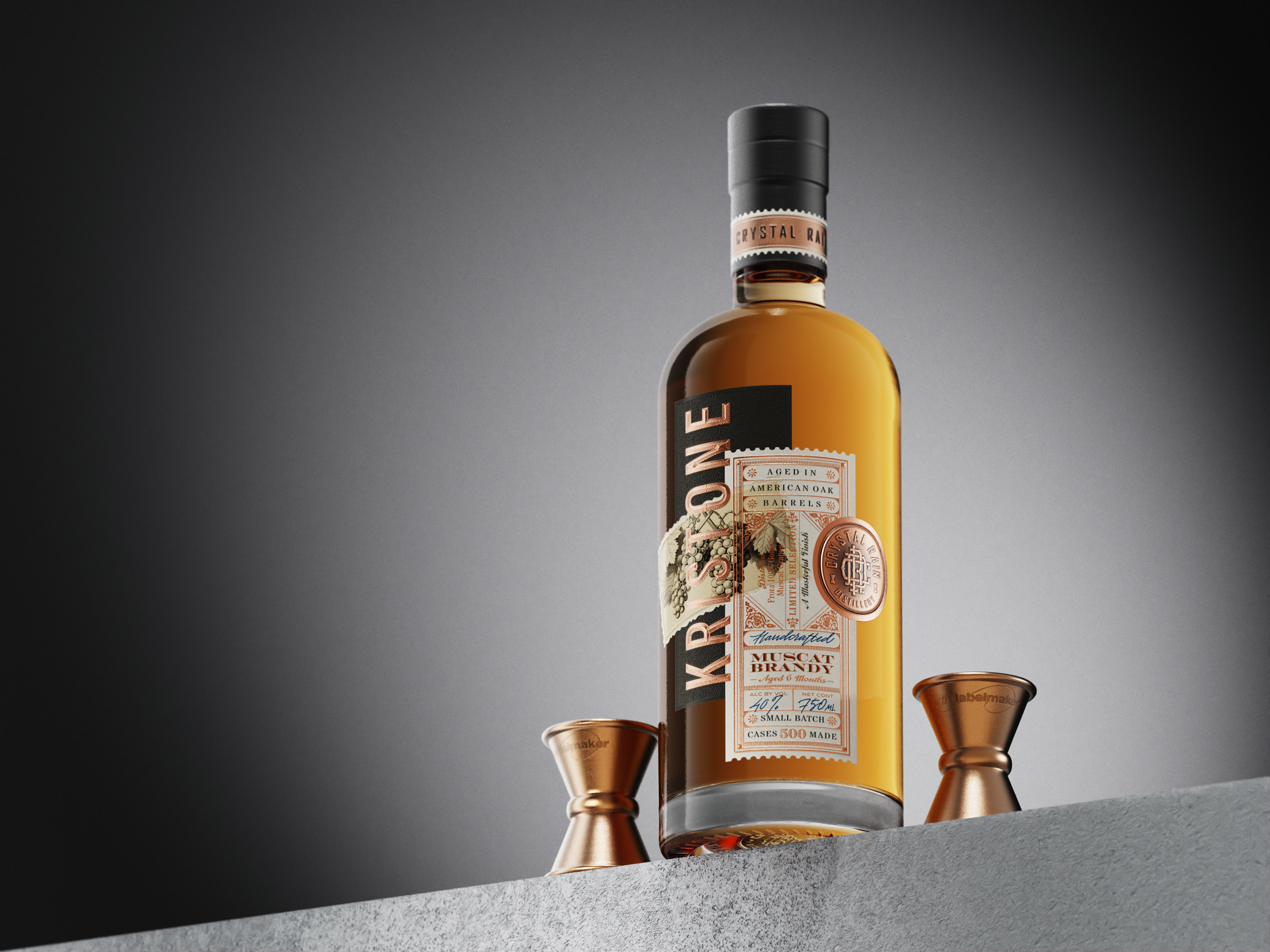
Favorite Details: In exploring the finer details of the Kristone Craft Grape Brandy label, it becomes evident that each element is a testament to the dedication to craftsmanship and attention to detail. The debossed background paper texture beneath the Kristone brand adds depth and character, while the meticulously crafted Kristone logo, with its roof embossing and micro-embossing, showcases the mastery of design. Adorned with the embossed distillery logo, the metal label exudes elegance and sophistication. The intricate embossed copper foil decorative frame surrounding the main information label adds a touch of opulence, enhancing the label’s overall aesthetic appeal. Additionally, the neck tag on the capsule, featuring postcard edges and a micro-engraved foiled background, evokes a sense of nostalgia and authenticity. Lastly, the custom-made cork stopper, with its engraved and copper-gilded wooden top, reflects the meticulous attention to detail and craftsmanship that defines the Kristone brand.
In essence, the design of Kristone Craft Grape Brandy embodies the perfect marriage of tradition and innovation, elevating the spirits experience to new heights of sophistication and elegance.
CREDIT
- Agency/Creative: the Labelmaker
- Article Title: Kristone Craft Grape Brandy Label Design by the Labelmaker
- Organisation/Entity: Agency
- Project Type: Packaging
- Project Status: Published
- Agency/Creative Country: Bulgaria
- Agency/Creative City: Sofia
- Market Region: North America, Global
- Project Deliverables: Brand Design, CGI, Graphic Design, Label Design, Packaging Design
- Format: Bottle
- Industry: Food/Beverage
- Keywords: kristone, crystal rain distillery, craft grape brandy, grape brandy label, label design, label art, metal label, fused label, embossed label, spirits label design, debossed label, the labelmaker
-
Credits:
Client: Crystal Rain Distillery, USA
Design & CGI: the Labelmaker


