This concept project is a collaboration with my sister, an illustrator Alexandra Zaharevich.
I had a long-term unrealized idea of simple, modern-looking gin in minimalist design.
I wanted to make it in some sort of Scandinavian style: visually simple and catchy, with good zoning, a vibrant accent color and an illustration on a large white background.
When I was looking for an interesting term for a trademark, I came across an article about unusual Norwegian words. So I learned about “koselig” — the word that is quite difficult to translate.
As far as I understood, it is something about physical pleasure — to sit by the fire after a long hiking day, to hide in a warm blanket, to have a cup of good tea, to sit on a comfortable sofa in front of the TV (a sofa has “kosekrok” — a corner where you can get comfy). So “koselig” is not only about the desire to feel comfortable and cozy, but also about taking care, snuggling up — no wonder a child’s soft toy-pet is called “kosedyr” in Norwegian, which means “a beast for hugging”.
It seemed to me that the feeling of coziness is quite suitable for the design and visual image, which began to develop gradually and was later supplemented by the illustrations carefully hand drawn by my sister.
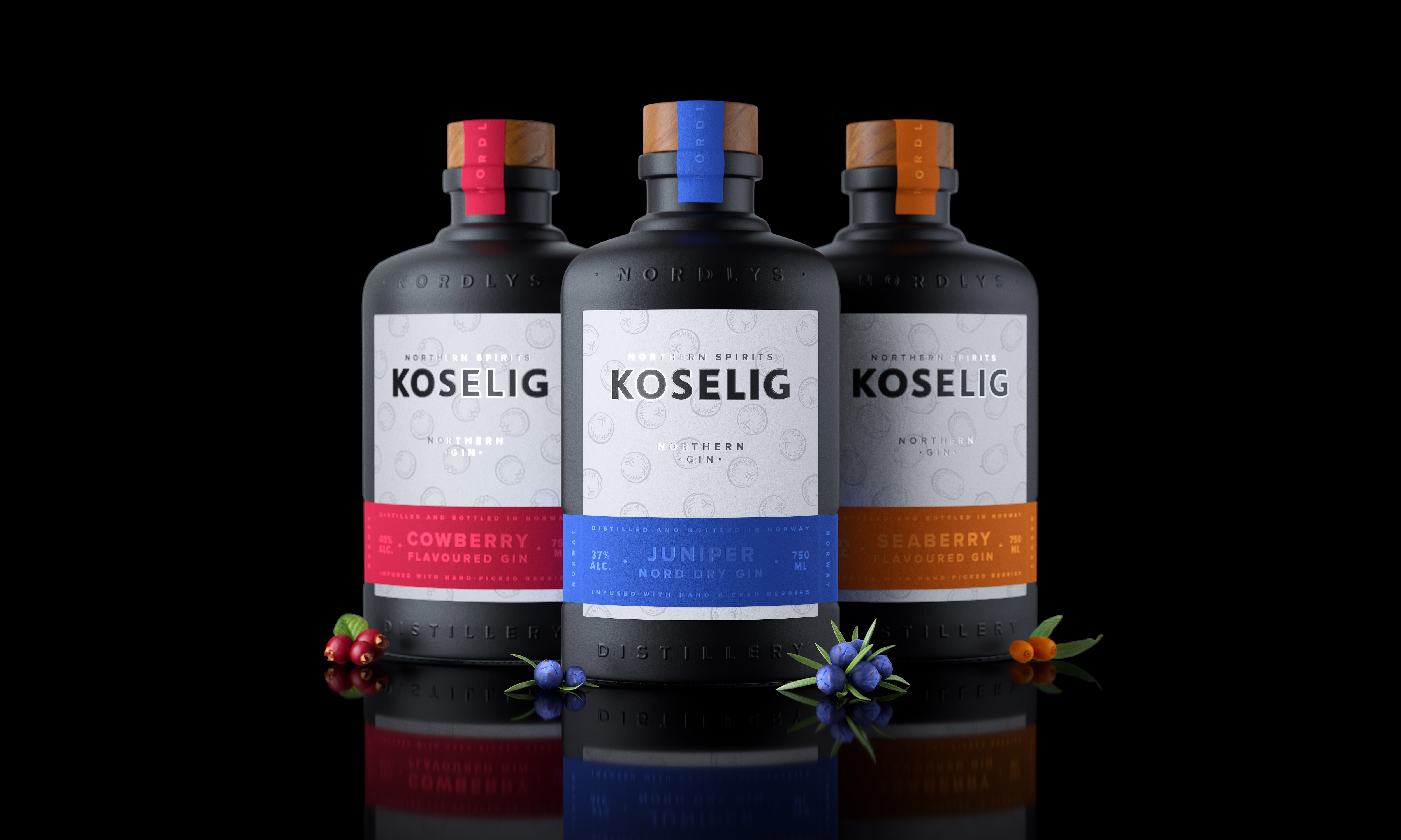
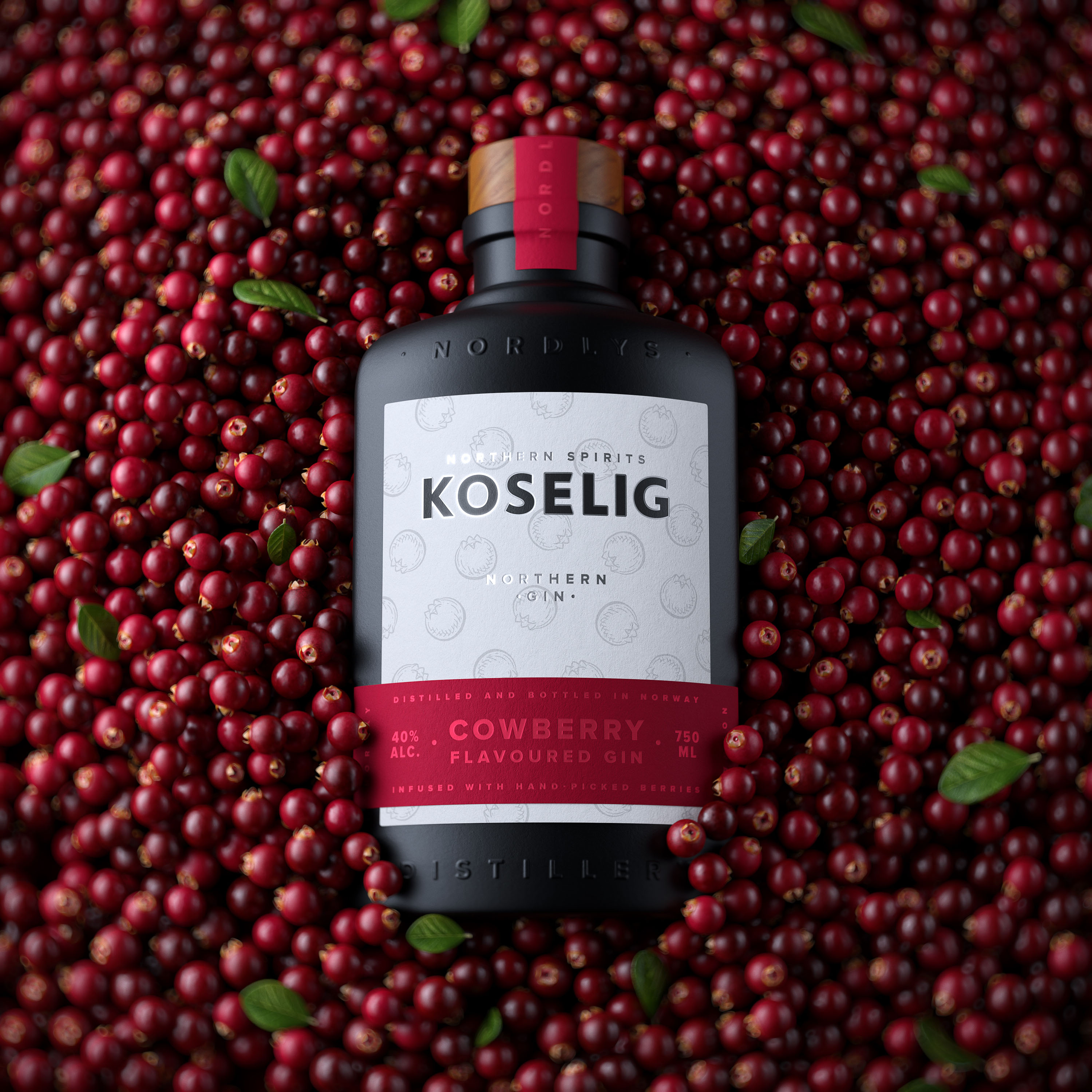
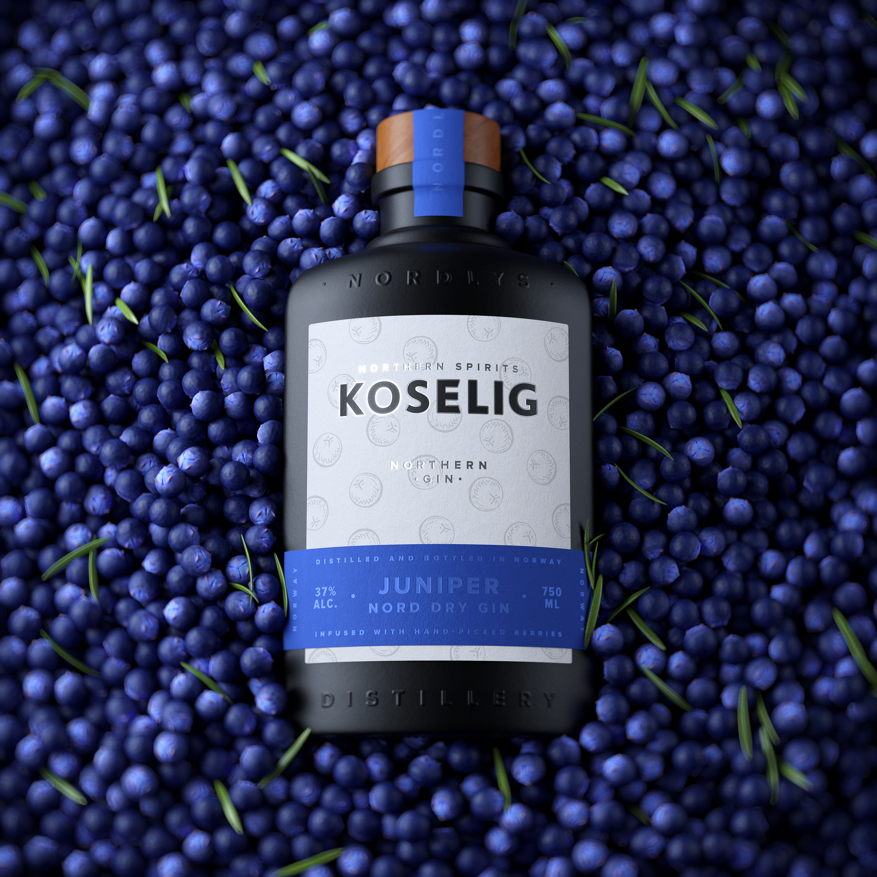
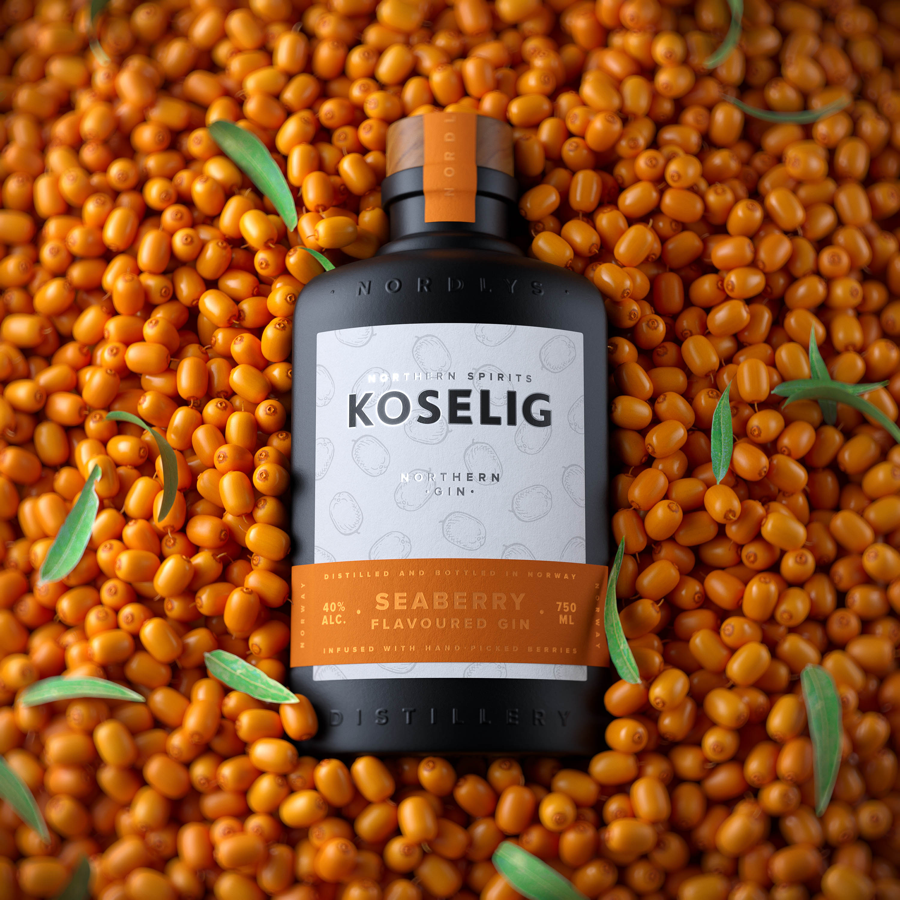
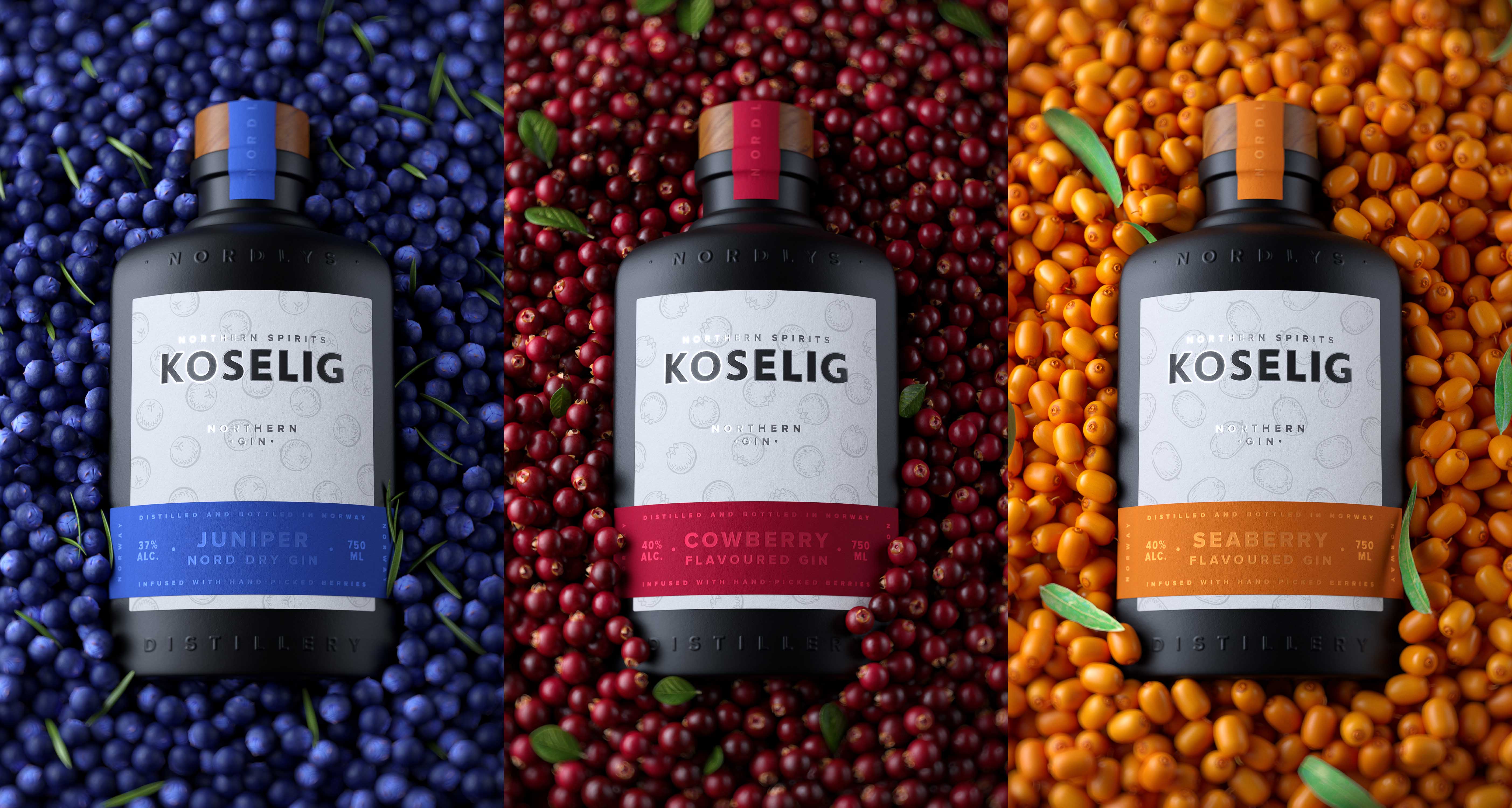
The Koselig gin line consists of three different gins: the first one is nord dry gin (ABV 38%) based on juniper berries and the two more are flavoured (ABV 40%) — cowberry flavoured gin and seaberry flavoured gin.
Koselig gins are made by a small team of artisan distillers at Nordlys distillery in Norway from natural berries, carefully grown and collected in the harsh but beautiful Norwegian nature: juniper, cowberry and seaberry.
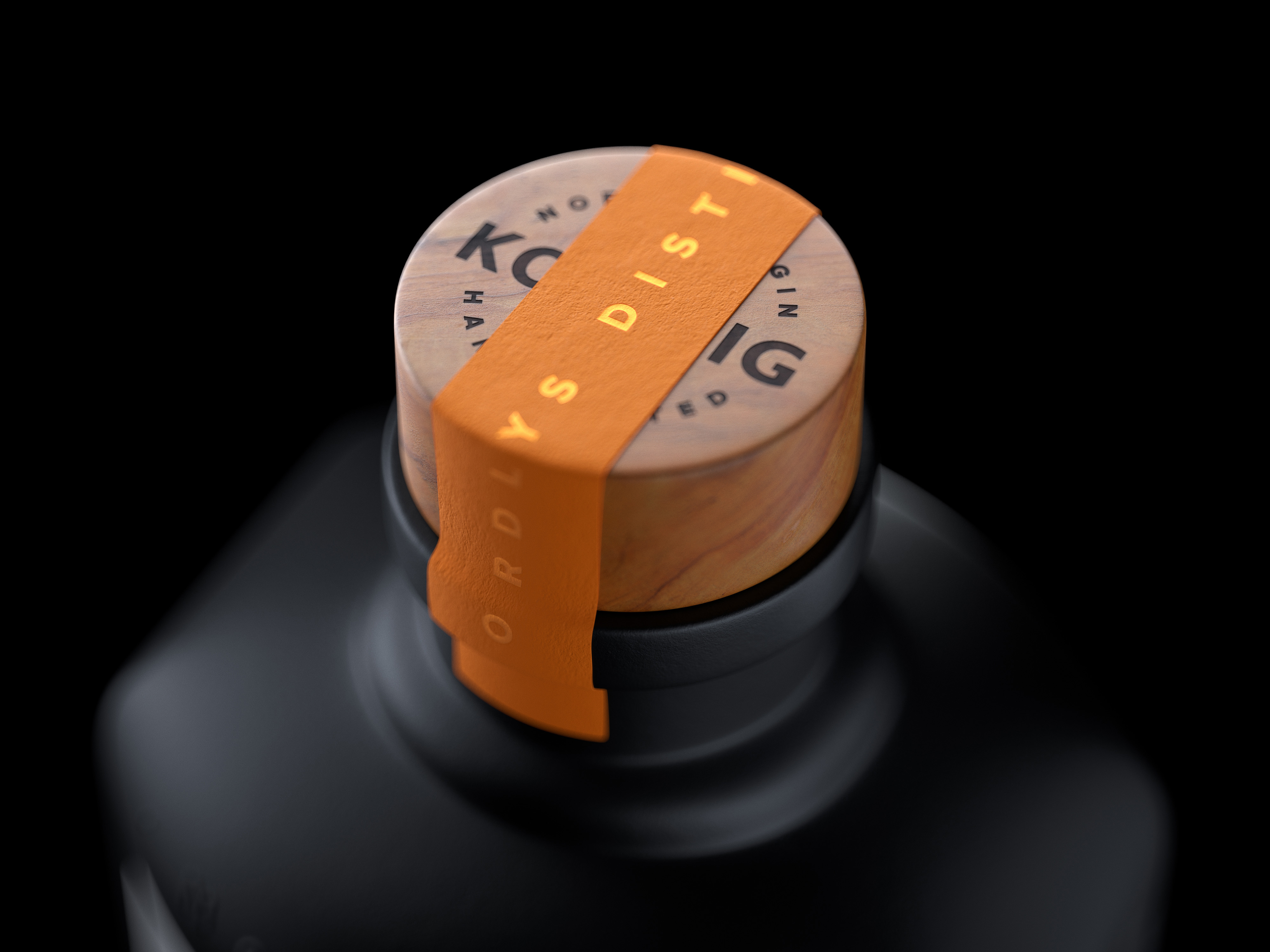
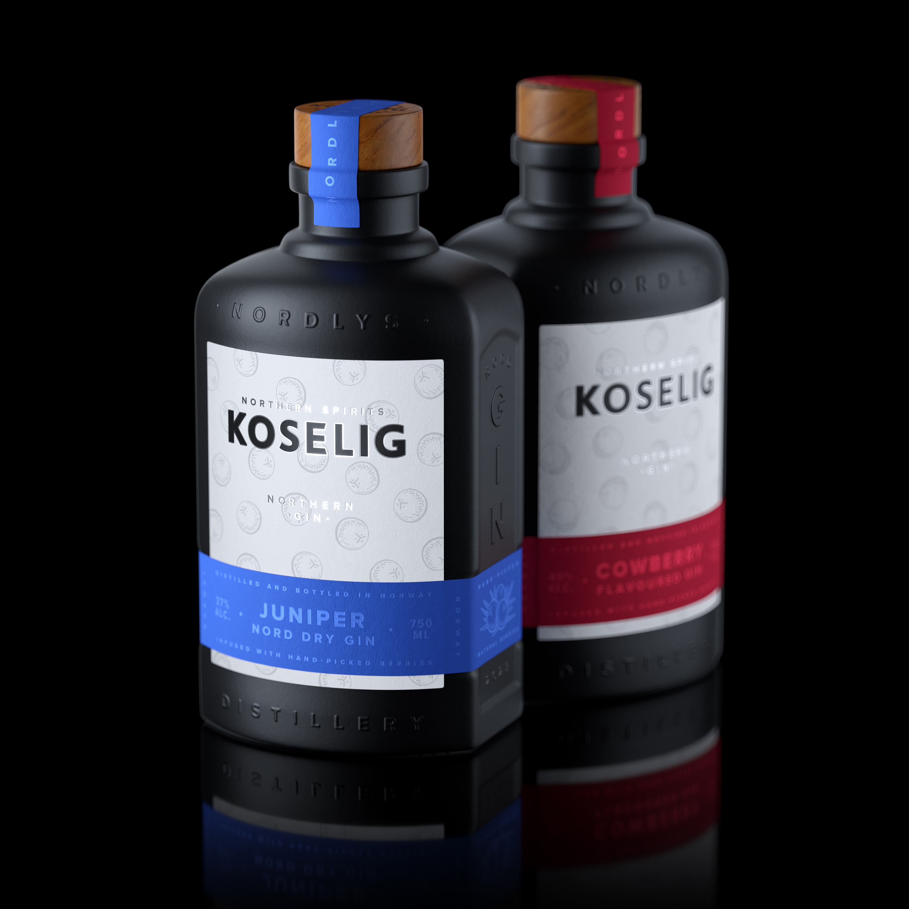
The bright and conspicuous appearance of the Koselig gin line is formed of very contrasting elements: bottles with black matte coating and several labels — a large white label wrappe with a colored one. The labels color coding is supported by an additional visual accent on a natural wood cork — a small label, which must be removed before the cork can be opened.
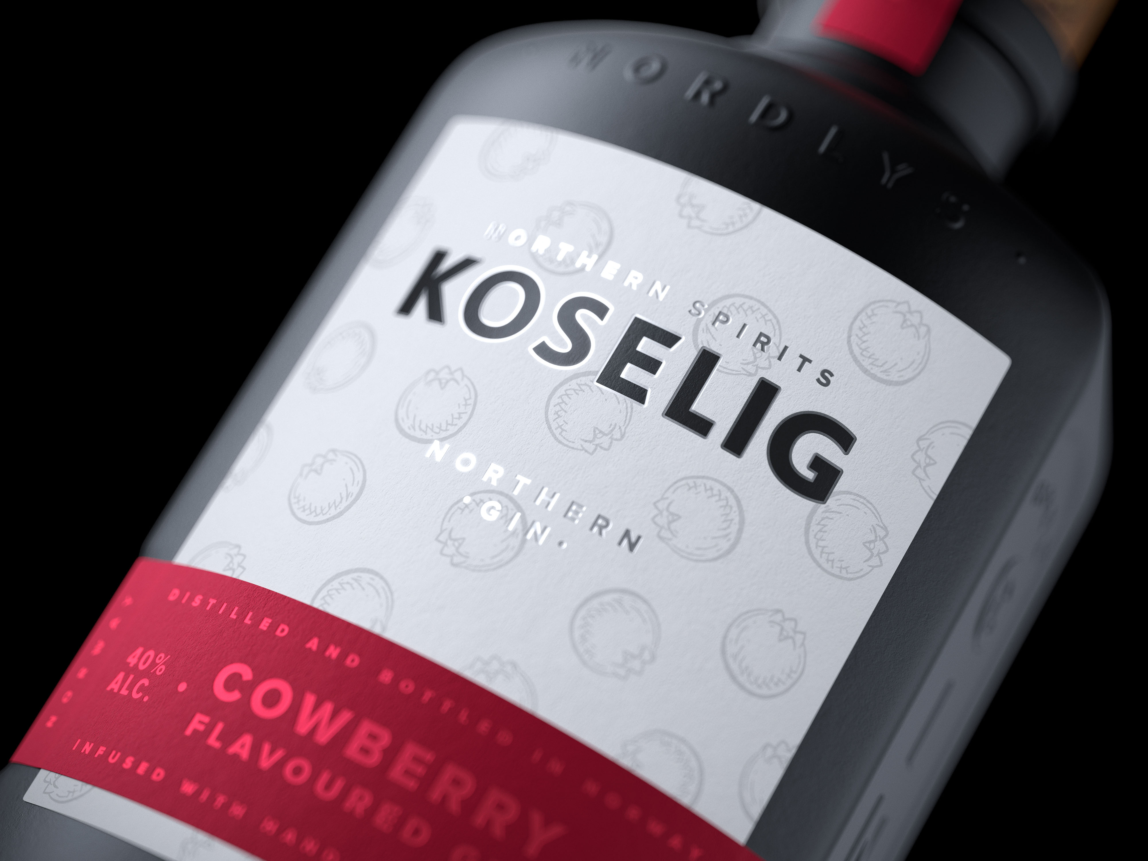
Each SKU label has unique illustrations that reflect the taste of gin. Berry pattern draws attention and increases the desire to take the bottle in your hand and consider the label.
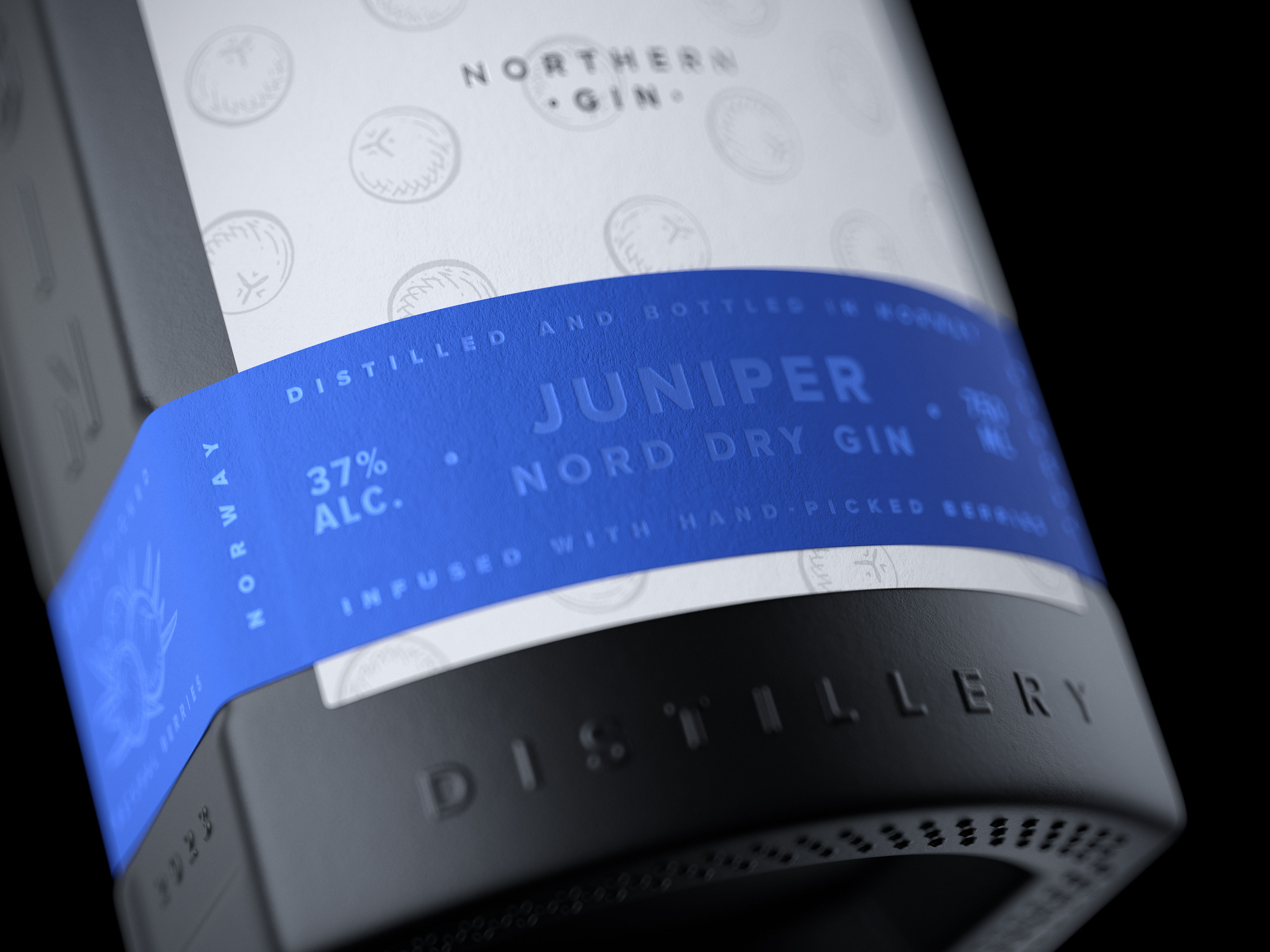
High-density textured paper is used for the labels to enhance tactile design experience and this effect becoming even more distinctive with the addition of colored hot foil stamping feature for text elements on all labels.
The shape and silhouette of the bottle is close to a rectangle, reminiscent of a small flask or a tincture bottle of a slightly pharmacy look. In addition to the aesthetic factor and tactile effect of a black matte covering, this shape feels very comfortable in the hand.
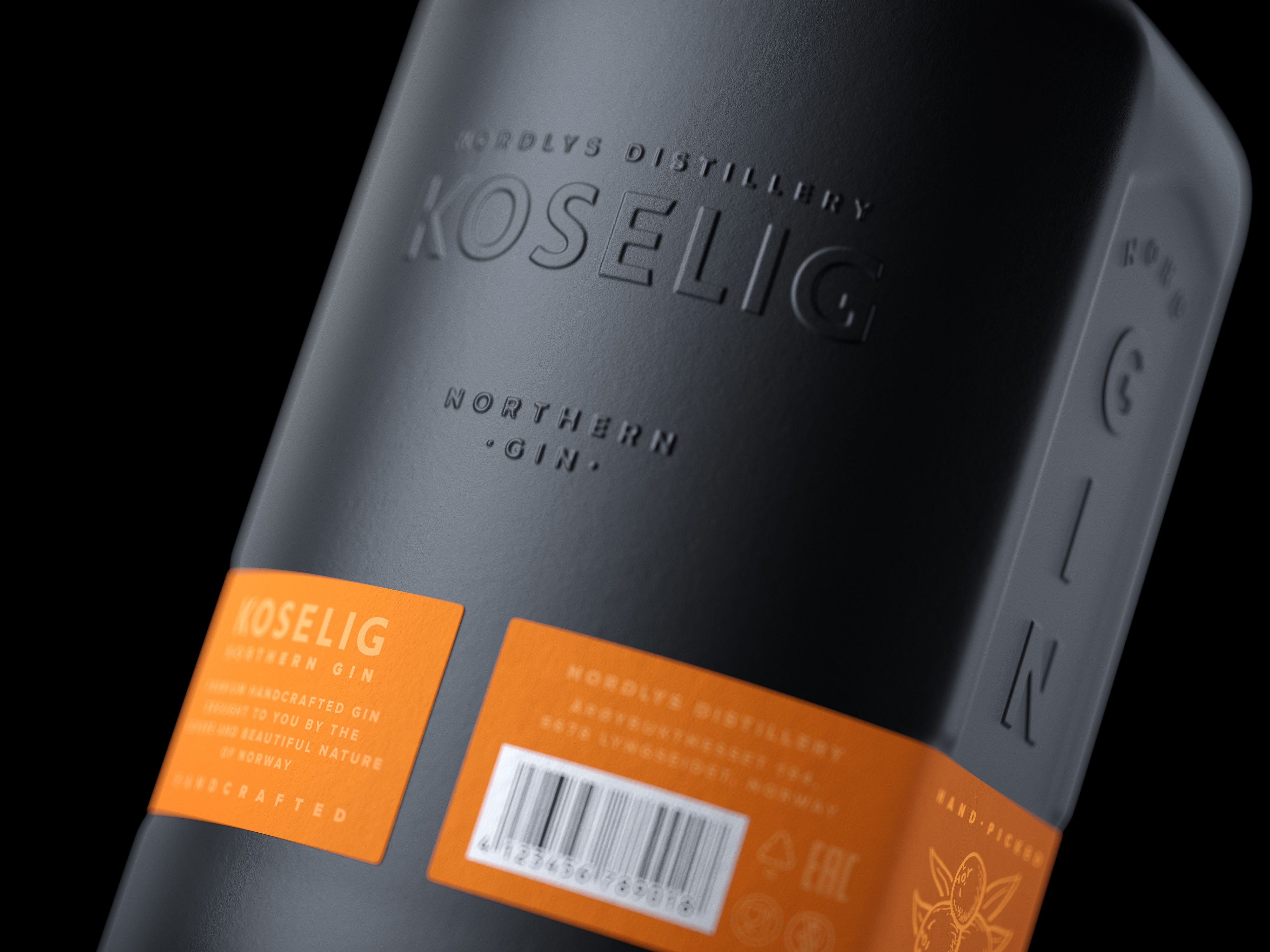
To give the bottle a more unique and premium image, embossed elements have been added on the flat sides, front and back of the bottle — brand name, product type and distillery name.
On the sides of the colored label that wraps around the bottle, there is an additional illustration with a composition of berries unique to each SKU. The colored hot foil stamped text next to the illustration emphasizes that the KOSELIG gin is made by hand from natural hand-picked berries.
This additional illustration complicates the visual image of the gin, making it more friendly and interesting. And also, together with color coding, it makes it easier to distinguish all the SKUs in the line, for example, when viewing in real conditions from a non-frontal angle. The bottom of the bottle has a concave rectangular shape to complicate the shape of the bottle and make it fits more comfortably in the hand.
CREDIT
- Agency/Creative: Oleg Zaharevich
- Article Title: Koselig Northern Gin Line CGI Concept
- Organisation/Entity: Freelance
- Project Type: Packaging
- Project Status: Published
- Agency/Creative Country: Belarus
- Agency/Creative City: Minsk
- Market Region: Europe
- Project Deliverables: 3D Modelling, Art Direction, Brand Design, CGI, Illustration, Packaging Design
- Format: Bottle
- Substrate: Glass Bottle
- Industry: Food/Beverage
- Keywords: WBDS Agency Design Awards 2023/24
- Keywords: gin, northern gin, koselig, cgi, concept, packaging design, packaging, illustration, hand-drawn, 3d visialization
-
Credits:
Art-direction, design, visualization: Oleg Zaharevich
Illustrator: Alexandra Zaharevich


