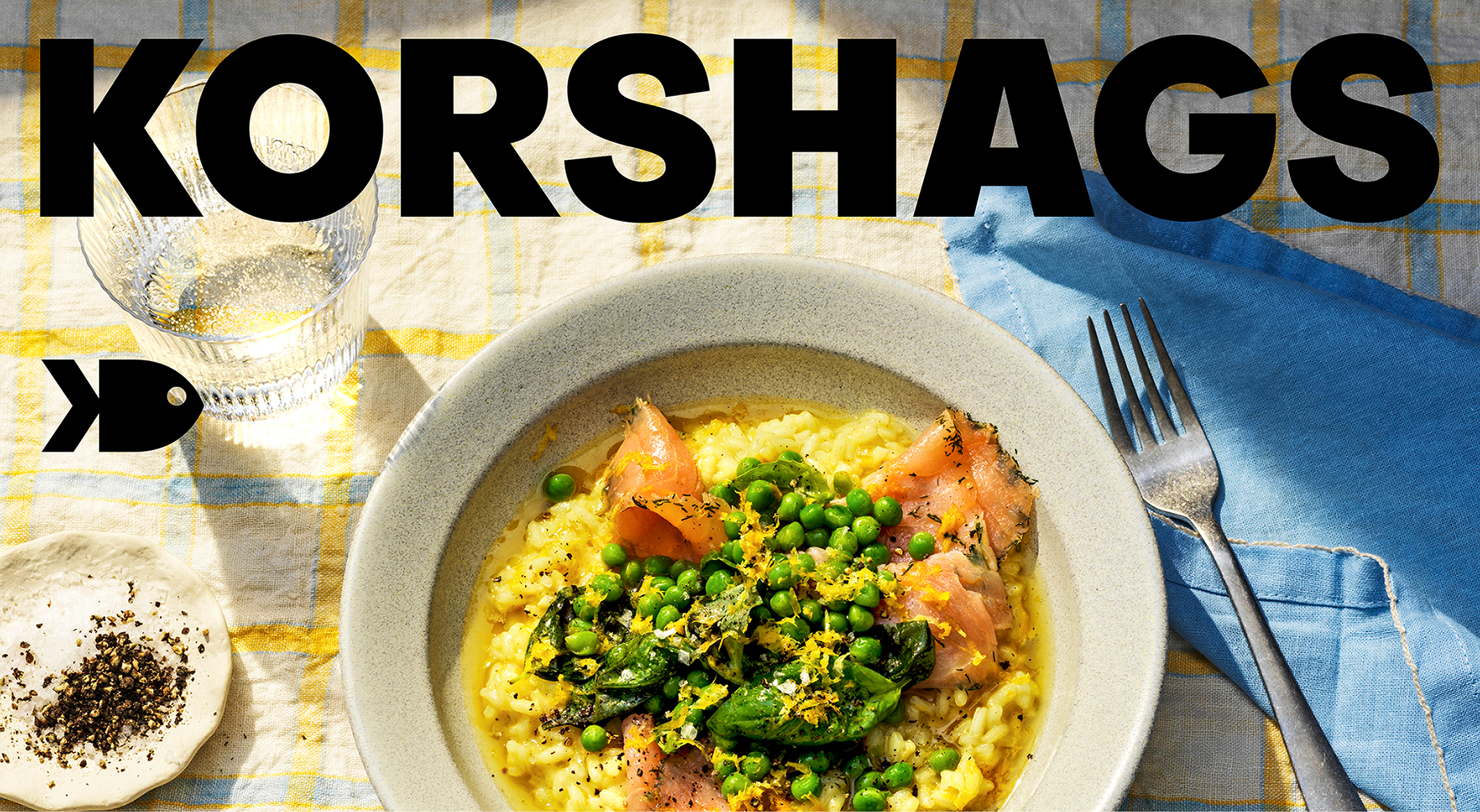
“Let the Sunshine In—Designing the New Wave of Seafood”: Surveys show that while many consumers enjoy seafood, salmon and sauces occasionally, they often find it time-consuming to cook and uninspiring to shop for. This is why many primarily eat fish on holidays, and never on weekdays. Korshags, a Swedish premium small-scale seafood brand, is here to change that. Knowing that responsibly farmed seafood is a healthier, tastier, and more sustainable choice, they are on a mission to spark a new wave of seafood love in households everywhere. To set sail, we reimagined what “premium” looks like and means in the category making it inclusive, inviting, and confidently modern.
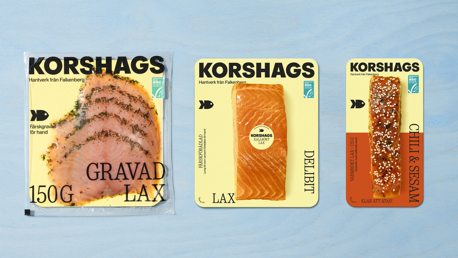
Diving into the category, it was obvious that fish deserves better packaging than the tired clichés cluttering supermarket shelves—dark blue hues, anchors, boats, and the ever-present fisherman aesthetic. The redesign gave us an opportunity to disrupt, rethink, and lead the way forward, injecting fresh, optimistic energy into the seafood aisle.
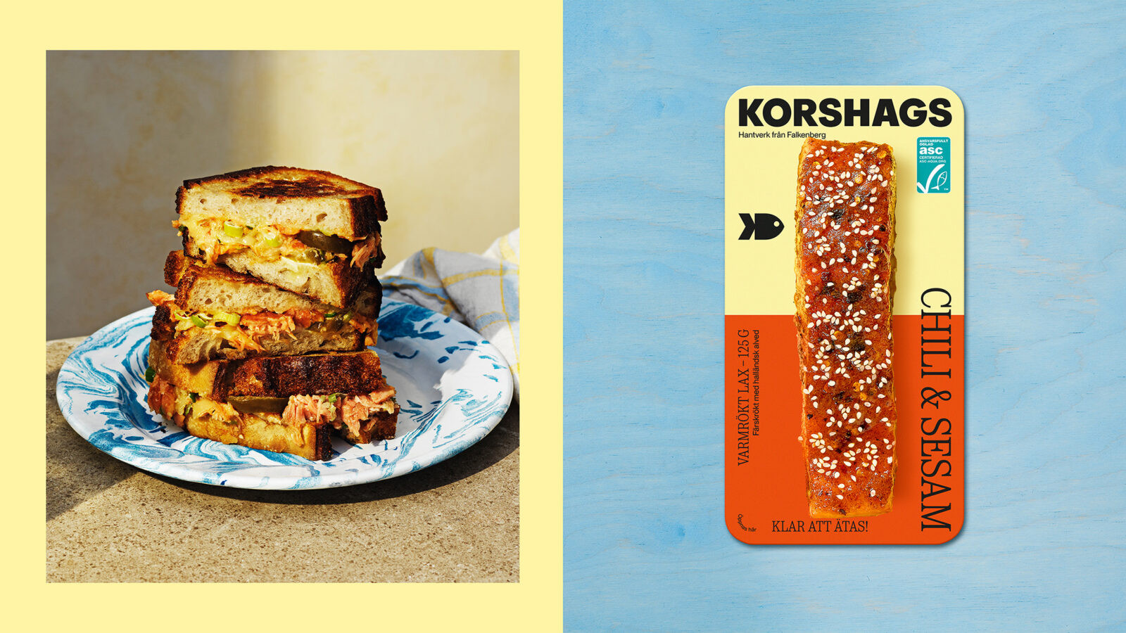
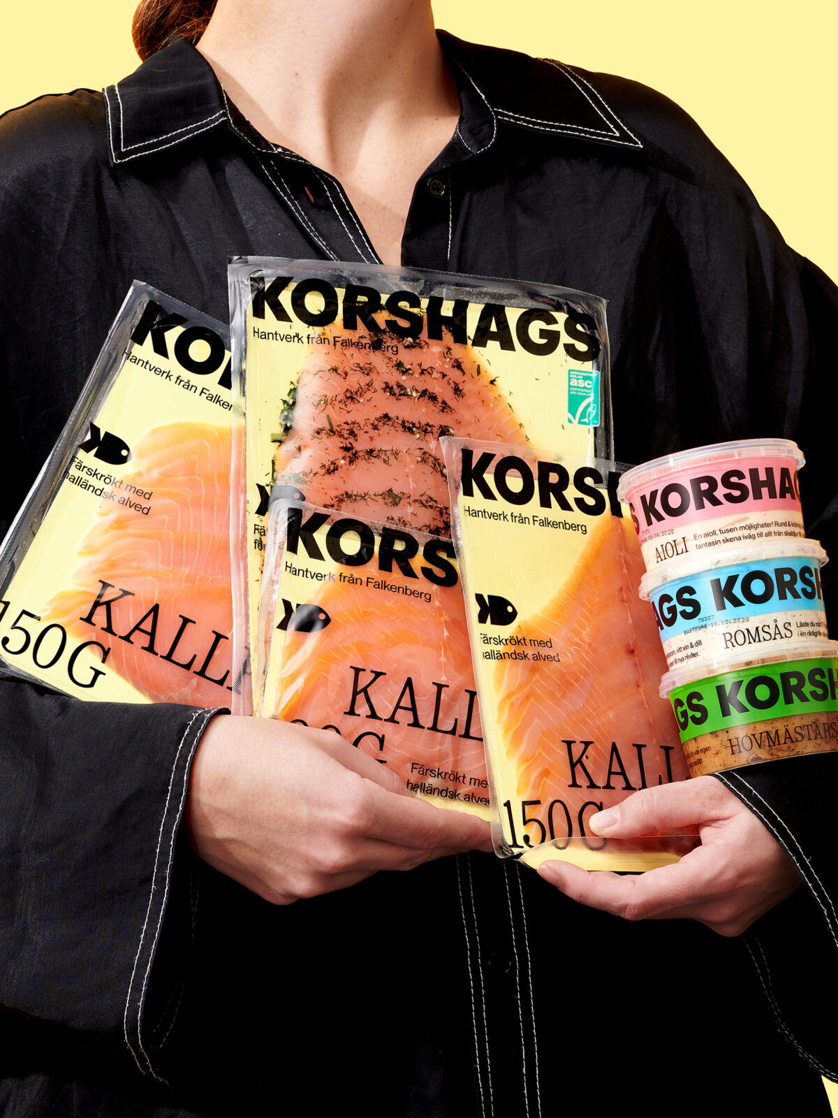
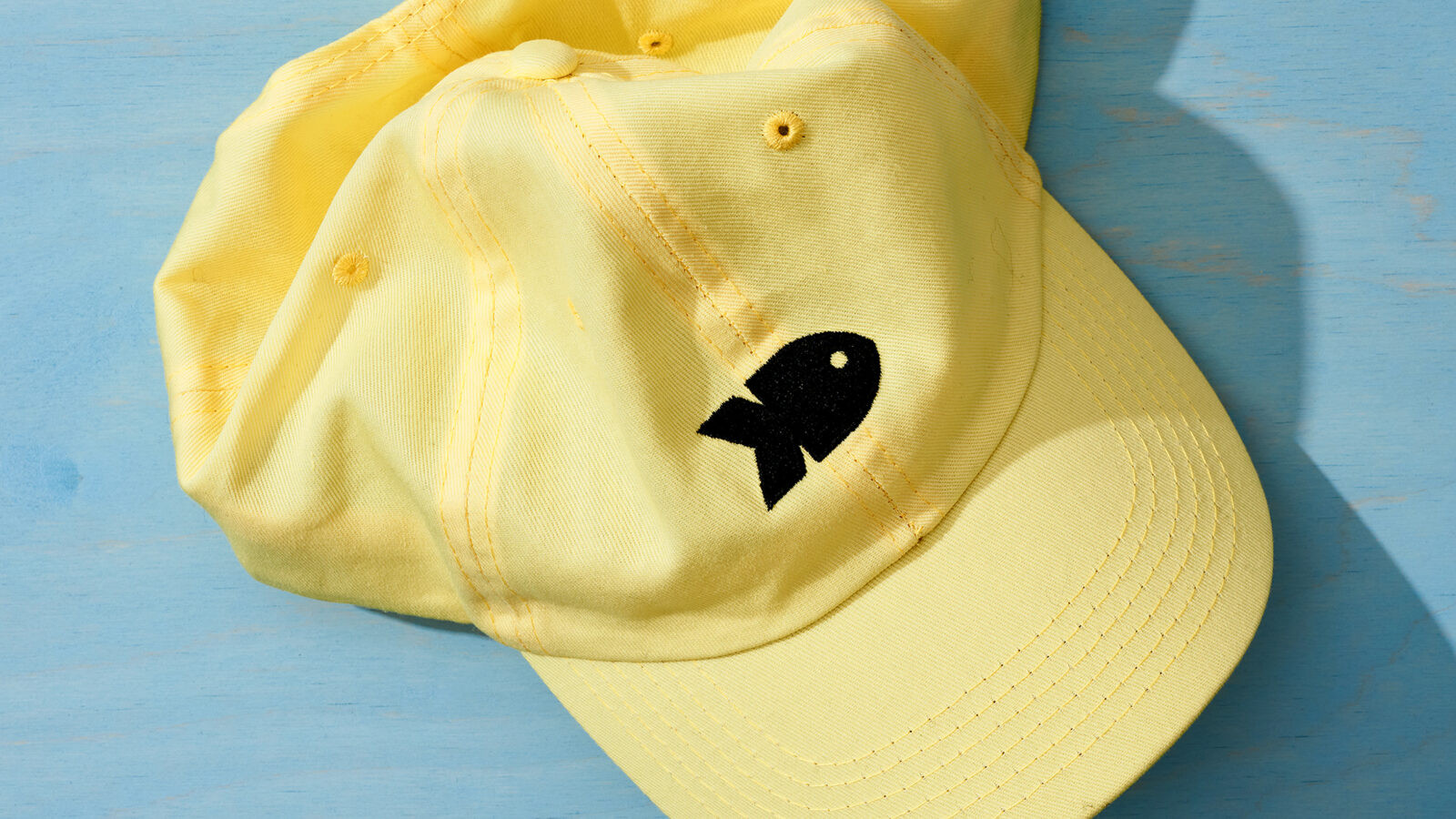
Rooted on Sweden’s sun-soaked west coast, Korshags’ origin became our springboard. We infused the brand with a vibrant, sunshiny yellow brand colour that contrasts the traditionally dark and melancholic palette in the seafood category. Confident typography commands attention while a strikingly big and impactful logo creates instant recognition. A playful symbol—a fish companion—brings warmth and approachability, while passionate craft claims reinforce the artisanal quality: “Freshly refined by hand.” Even the sauces invite culinary creativity, with bold statements like: “One aioli, a thousand possibilities letting your mind wander off to seafood feasts, barbecues, and golden sunsets.”
Beyond packaging, the design is about redefining the entire seafood experience. Korshags empowers people to see seafood not as complicated, but as joyful, inspiring, for everyday dining. By blending heritage with joy, the design brings rays of sunshine to supermarket shelves and onto everyday dinner tables, turning everyday meals into small celebrations.

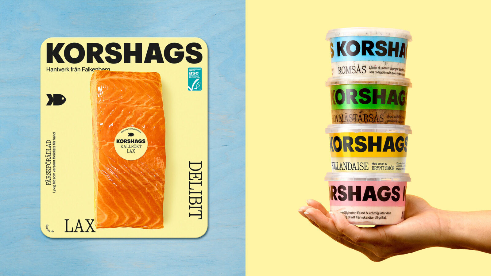
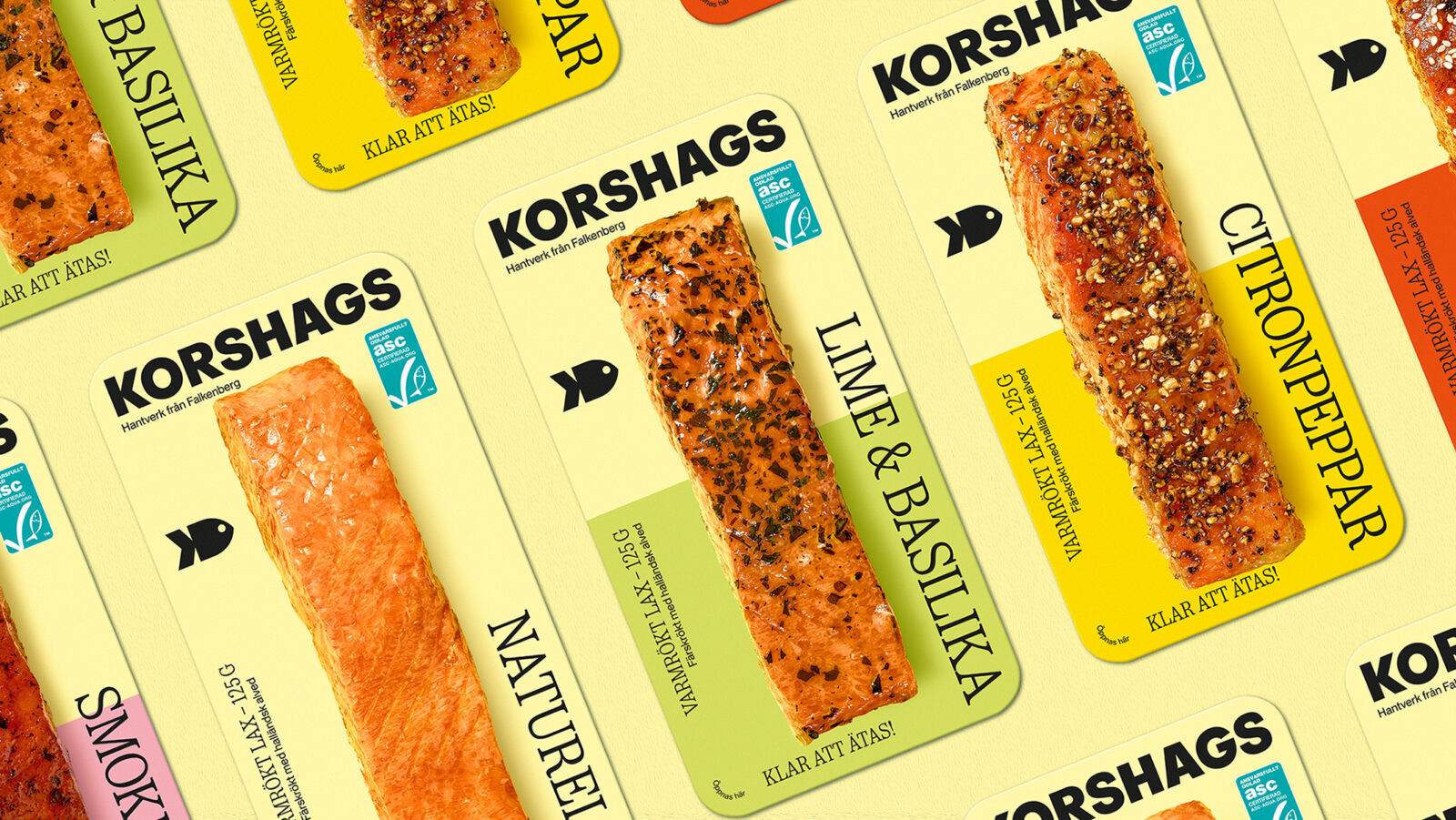
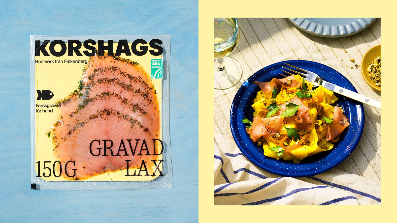



CREDIT
- Agency/Creative: Pond Design AB
- Article Title: Korshags Packaging by Pond Design Signals a Fresh Direction for the Seafood Aisle
- Organisation/Entity: Agency
- Project Status: Published
- Agency/Creative Country: Sweden
- Agency/Creative City: Stockholm
- Market Region: Stockholm
- Project Deliverables: 3D Design, Architecture, Art Direction, Brand Architecture, Brand Creation, Brand Design, Brand Experience, Brand Guidelines, Brand Identity, Brand Mark, Brand Naming, Brand Redesign, Brand Refinement, Brand Rejuvenation, Brand Strategy, Brand Tone of Voice, Brand World, Branding, Copywriting, Craft, Creative Direction, Design, Graphic Design, Icon Design, Identity System, Illustration, Insight, Label Design, Logo Design, Motion Graphics, Packaging Design, Packaging Guidelines, Photography, Photography Styling, Product Photography, Rebranding, Research, Retouching, Structural Design, Tone of Voice, Typography, Writing
- Industry: Food/Beverage
- Keywords: WBDS Agency Design Awards 2025/26 Seafood, Korshags, Pond Design, Premium, Falkenberg, Salmon, Fish, Sustainable, Small scale
-
Credits:
Senior Designer: Anna Tran
Senior Designer: Mattias Cederfeldt
Junior Designer: Linnéa Sonka
Copywriter: Emma Hagberg
Visualizer: Johan Svedelius
Creative Director: Cecilia Bjare
Final Art & Retouch: Monica Holm
Senior Client Director: Fredrik Svalstedt
Production Manager: Niclas Hemlin


