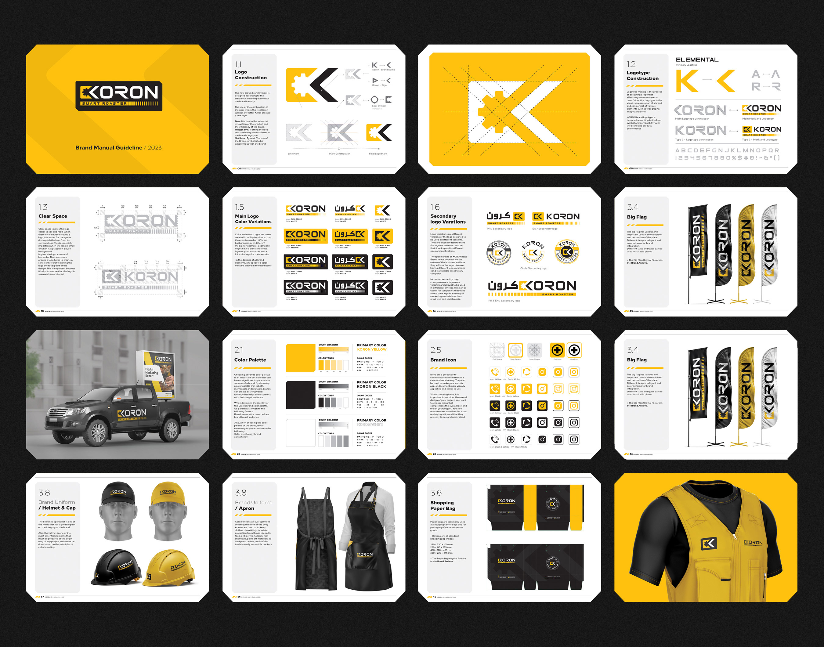
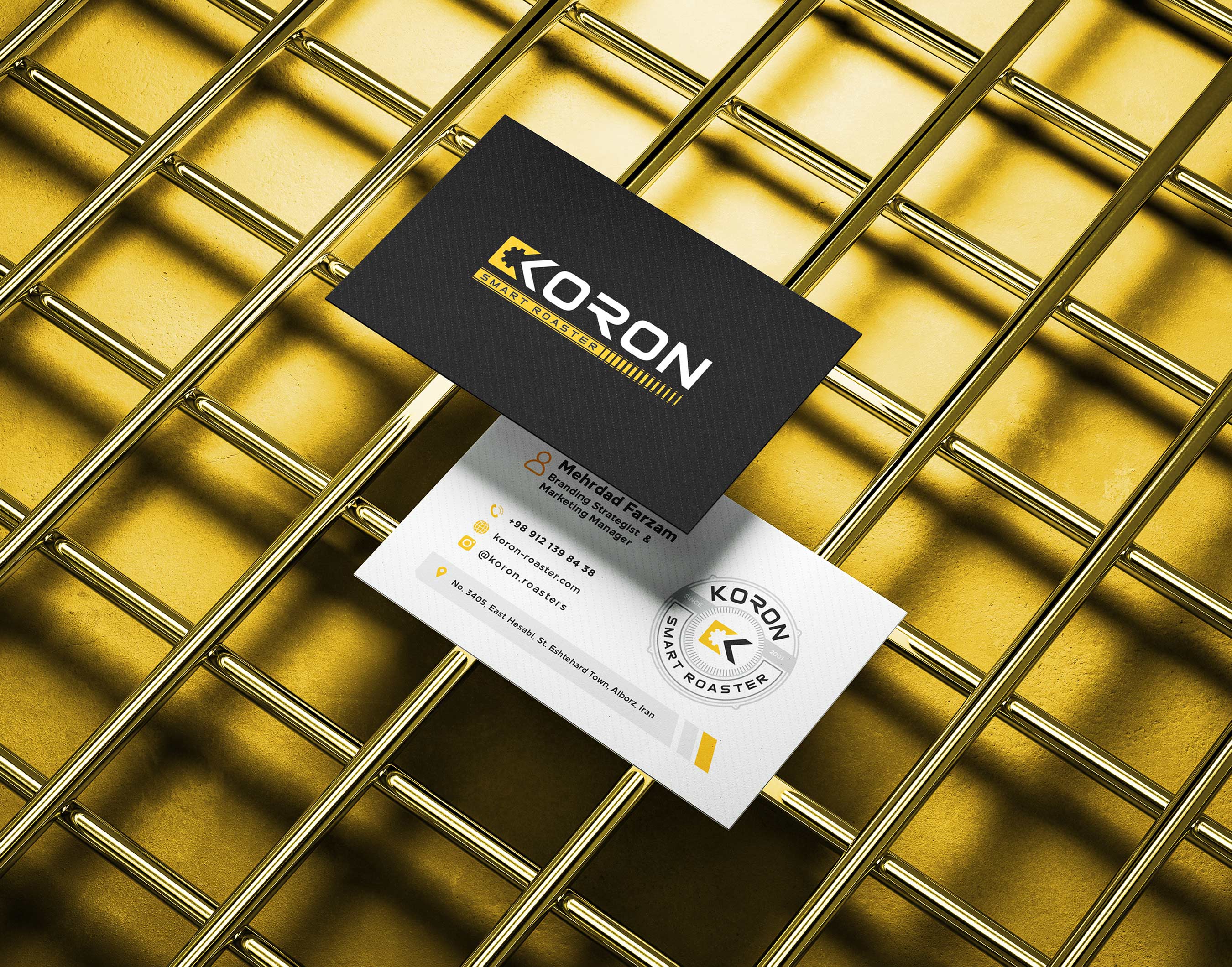
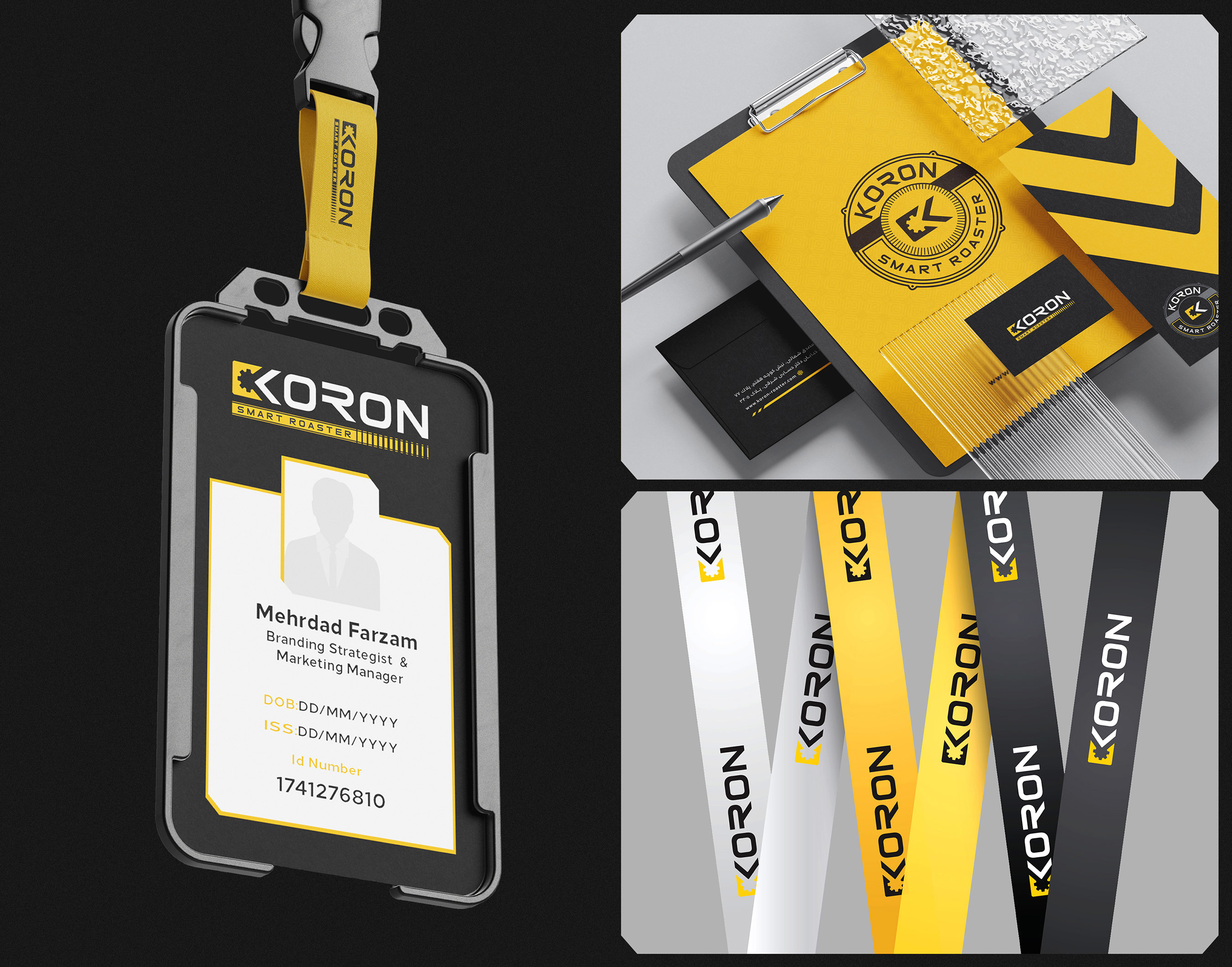
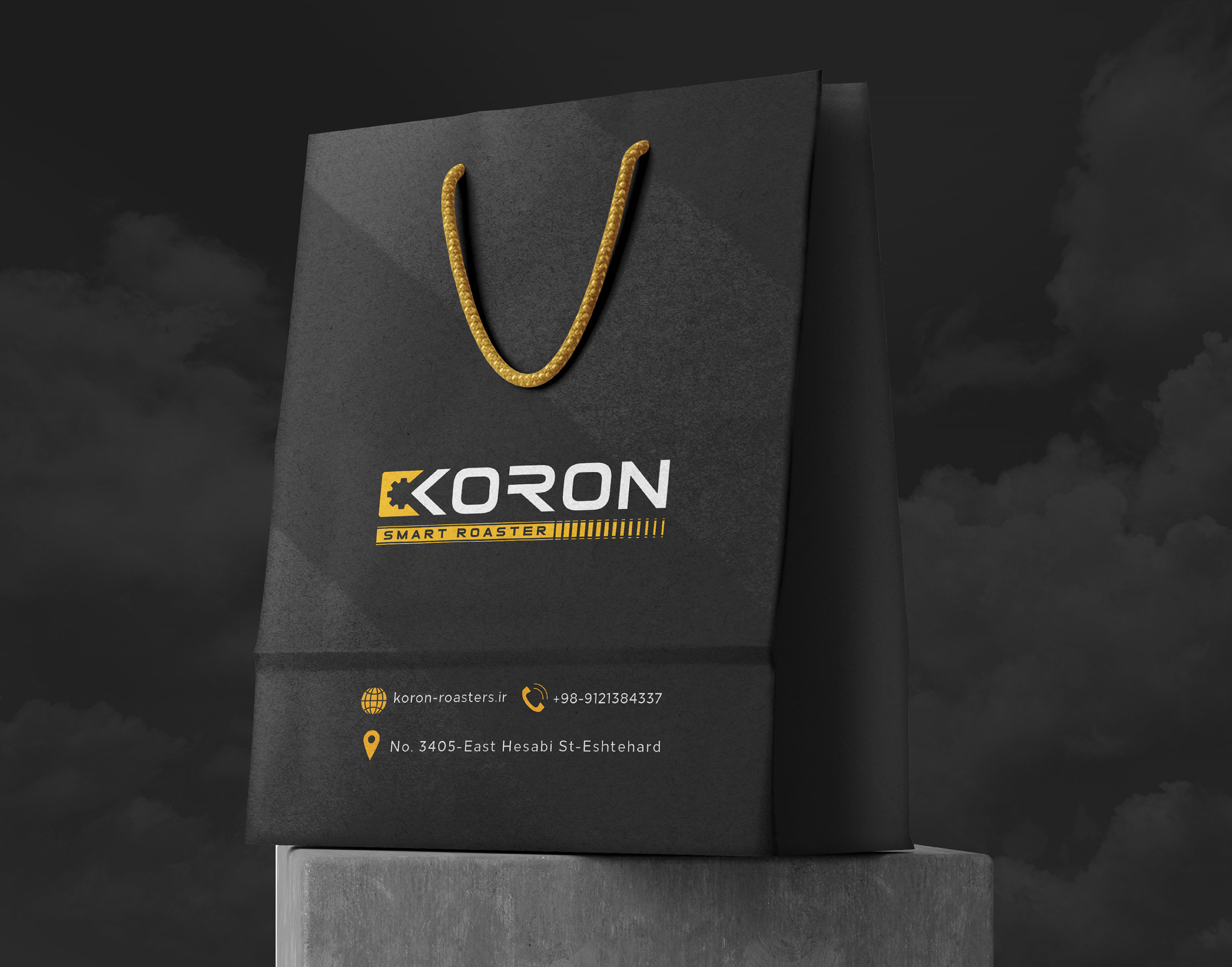
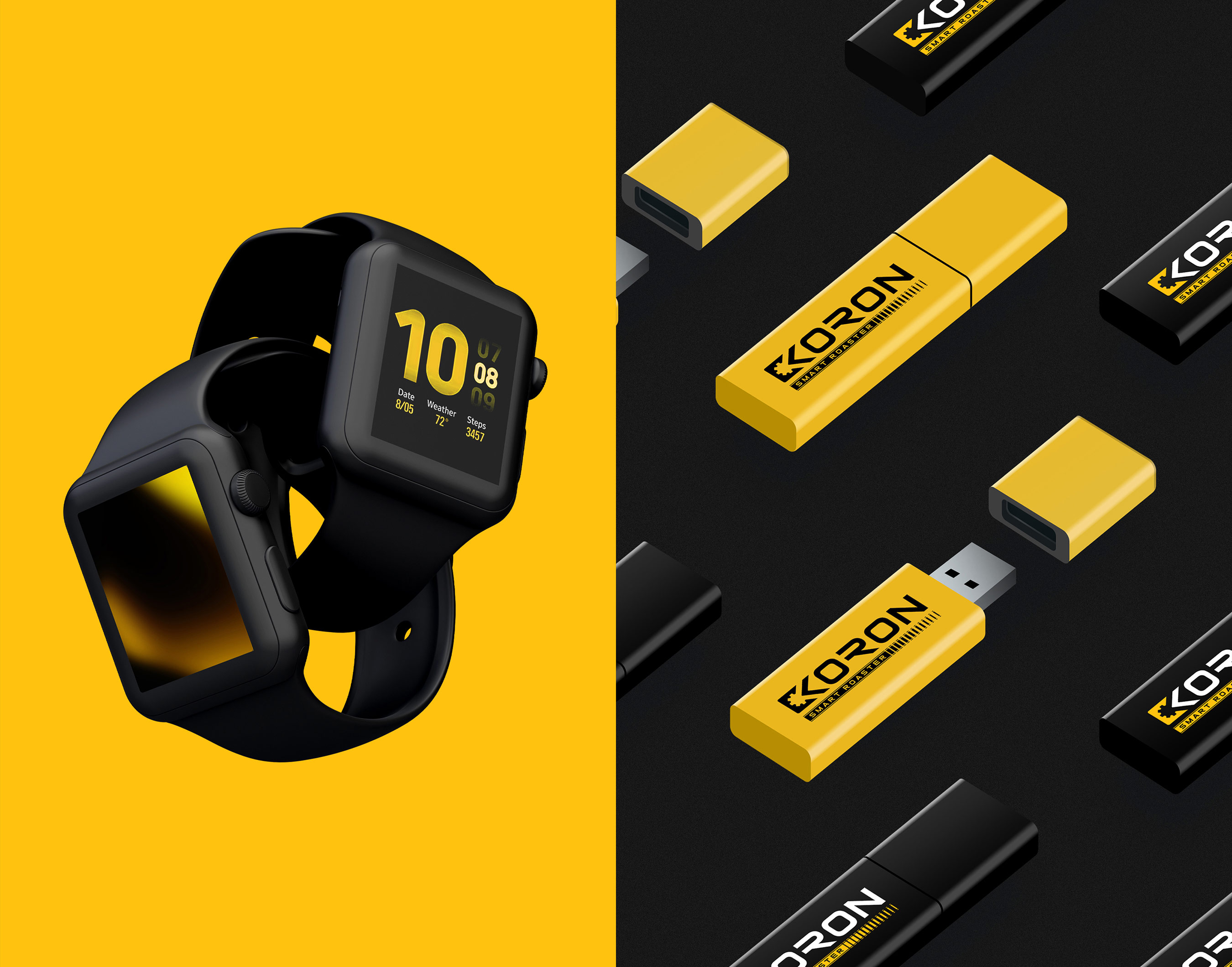
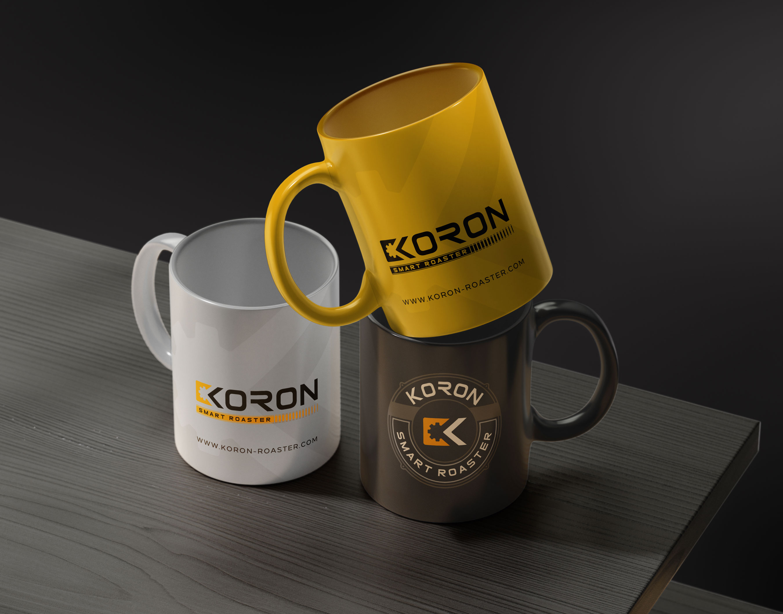
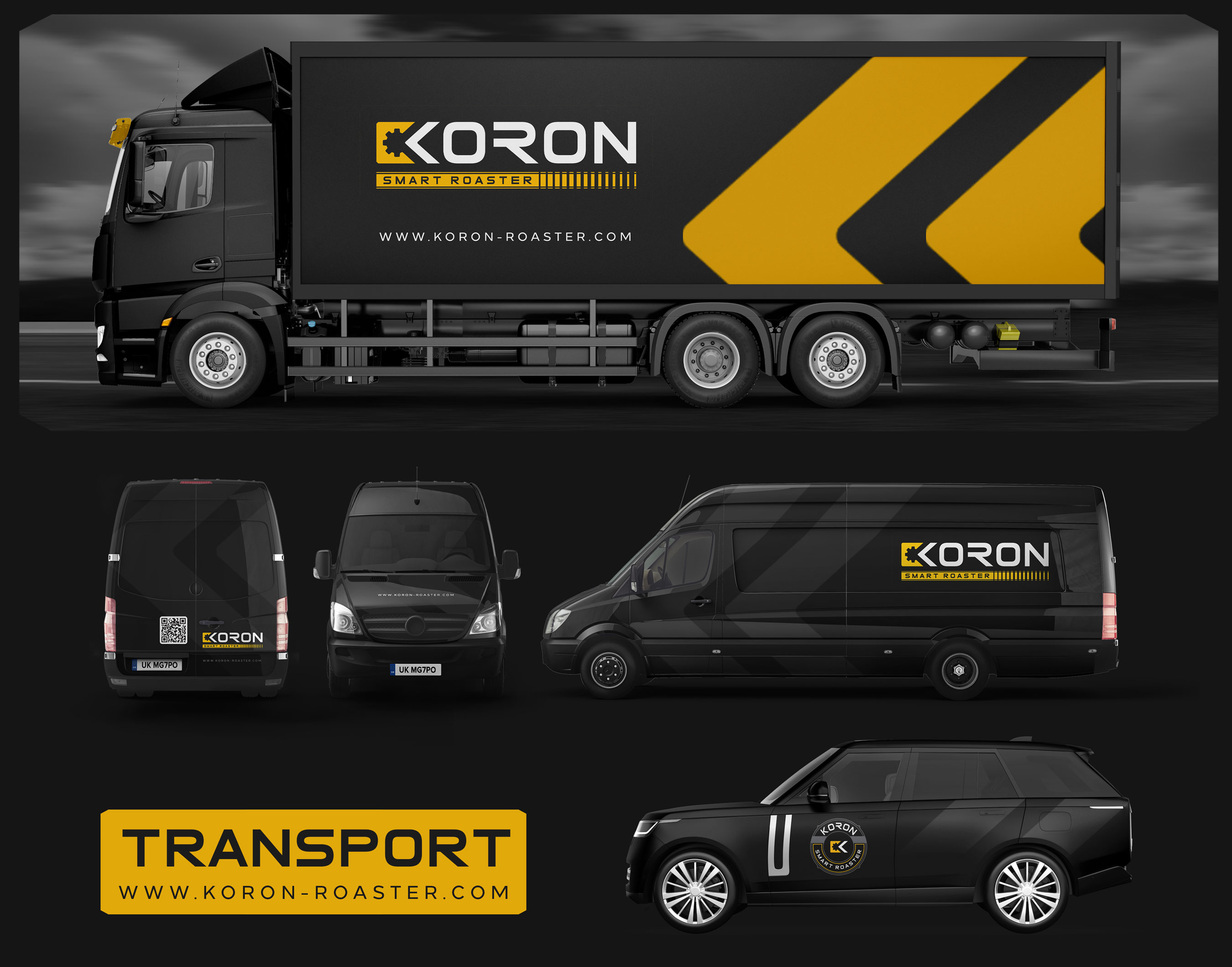
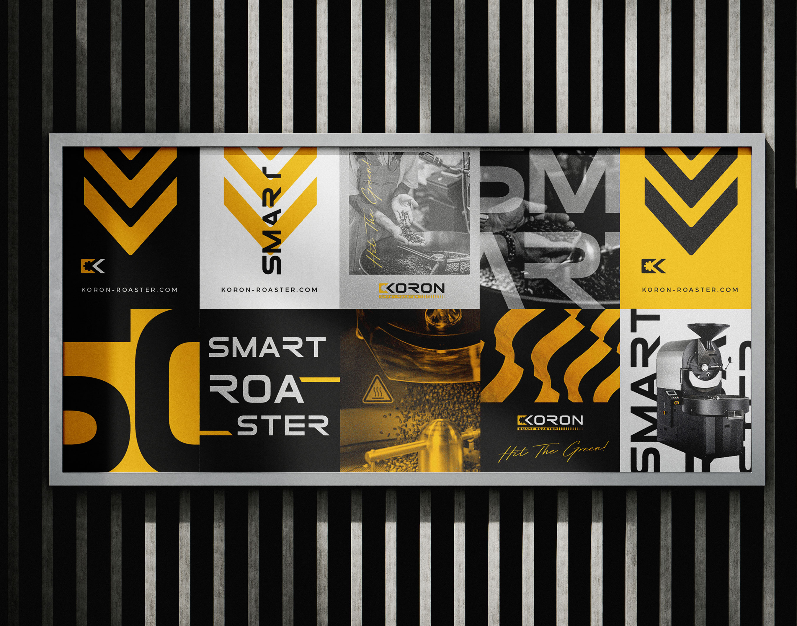
Koron brand has started its activity for several years, the main activity of this brand is the design and manufacture of coffee roasters, considering the range of activities and the competitive market of this brand, it has decided to redesign the entire structure of the brand. These changes include modifying the structure of the logo and logotype, brand visual identity, office set and office identity, exhibition identity, etc.
Powerful, impressive, sharp
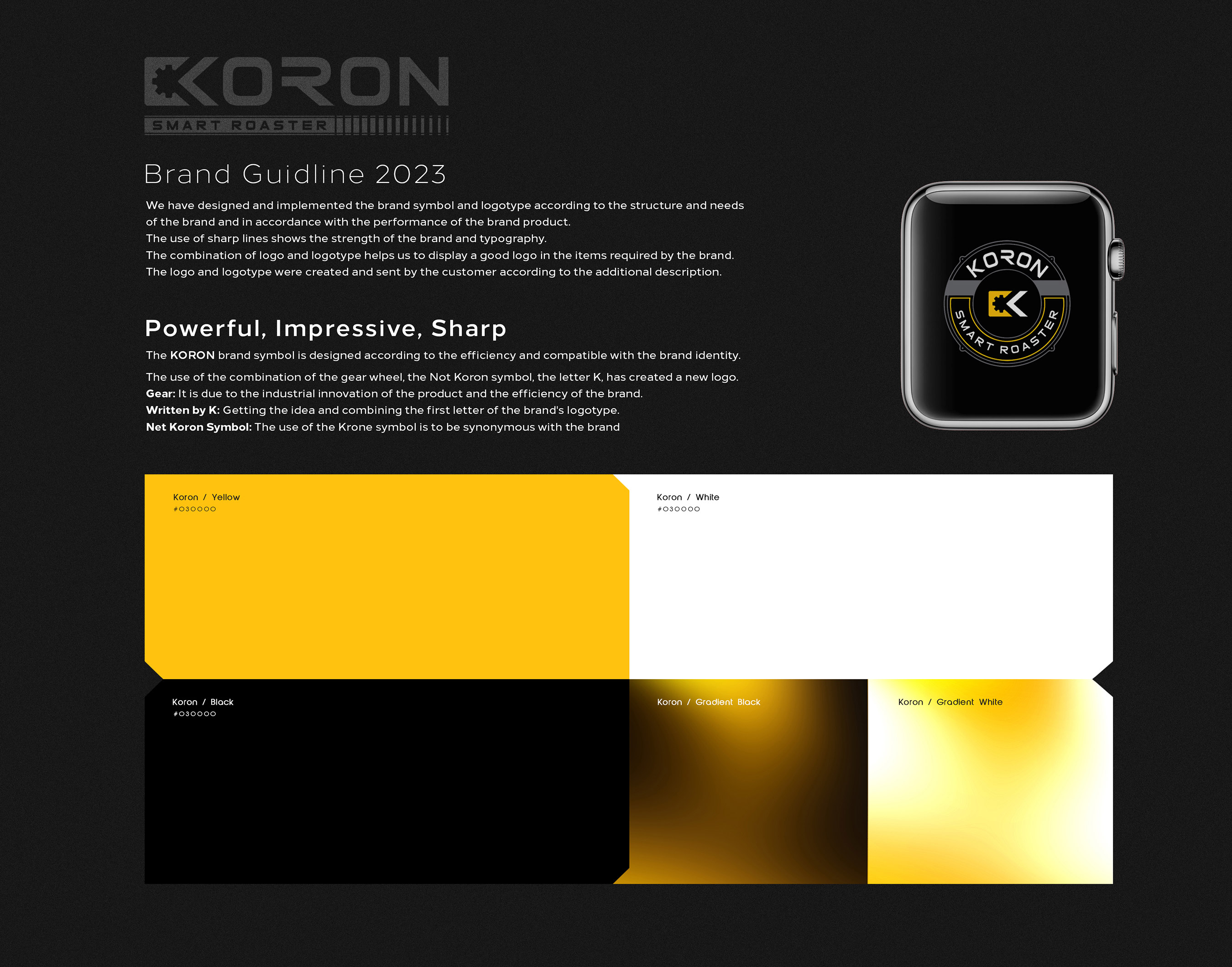
The Koron brand symbol is designed according to the efficiency and compatible with the brand identity.
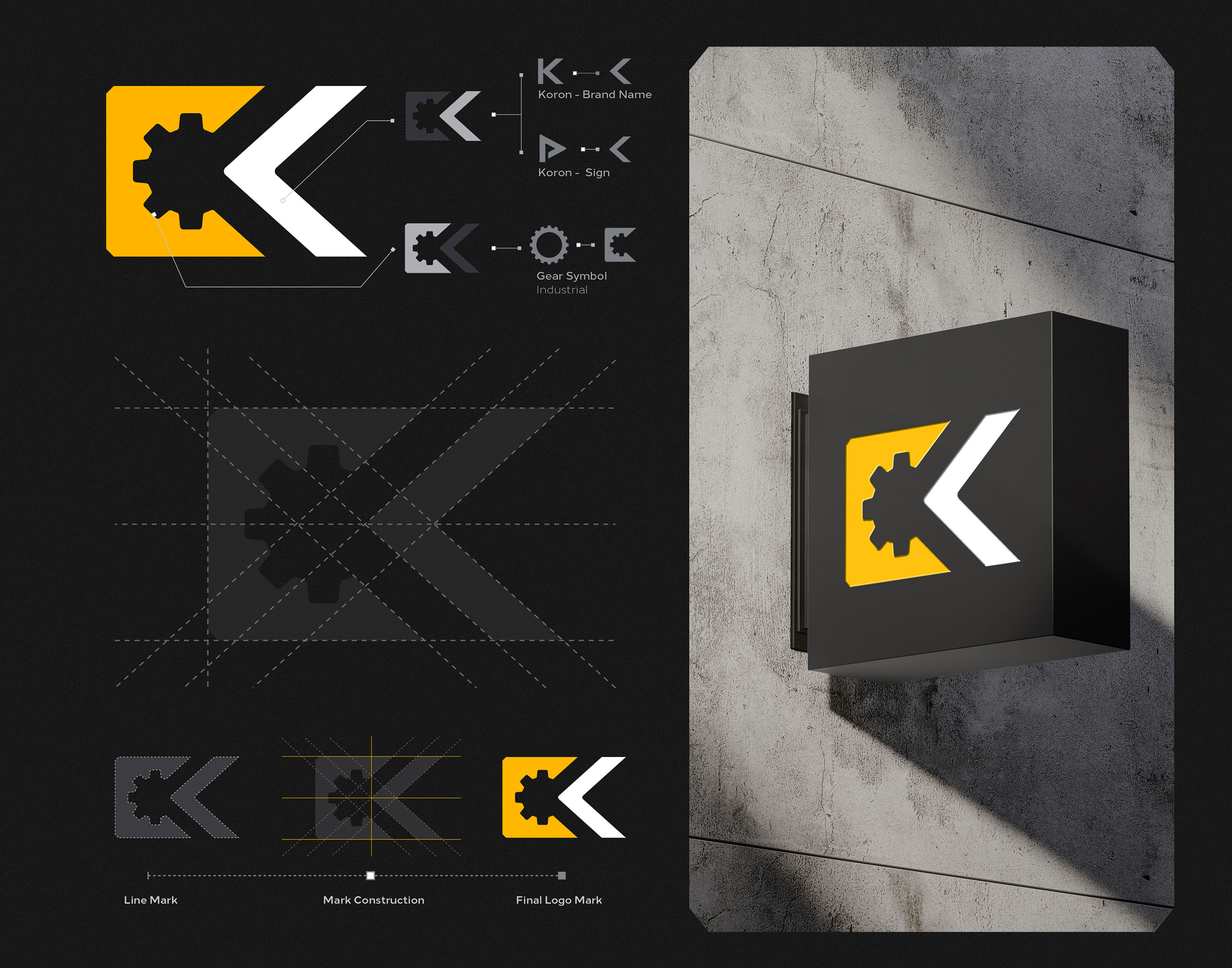
The use of the combination of the gear wheel, the Not Koron symbol, the letter K, has created a new logo.
Gear: It is due to the industrial innovation of the product and the efficiency of the brand.
Written by K: Getting the idea and combining the first letter of the brand’s logotype.
Net Koron Symbol: The use of the Koron symbol is to be synonymous with the brand
We have designed and implemented the brand symbol and logotype according to the structure and needs of the brand and in accordance with the performance of the brand product.
The use of sharp lines shows the strength of the brand and typography.
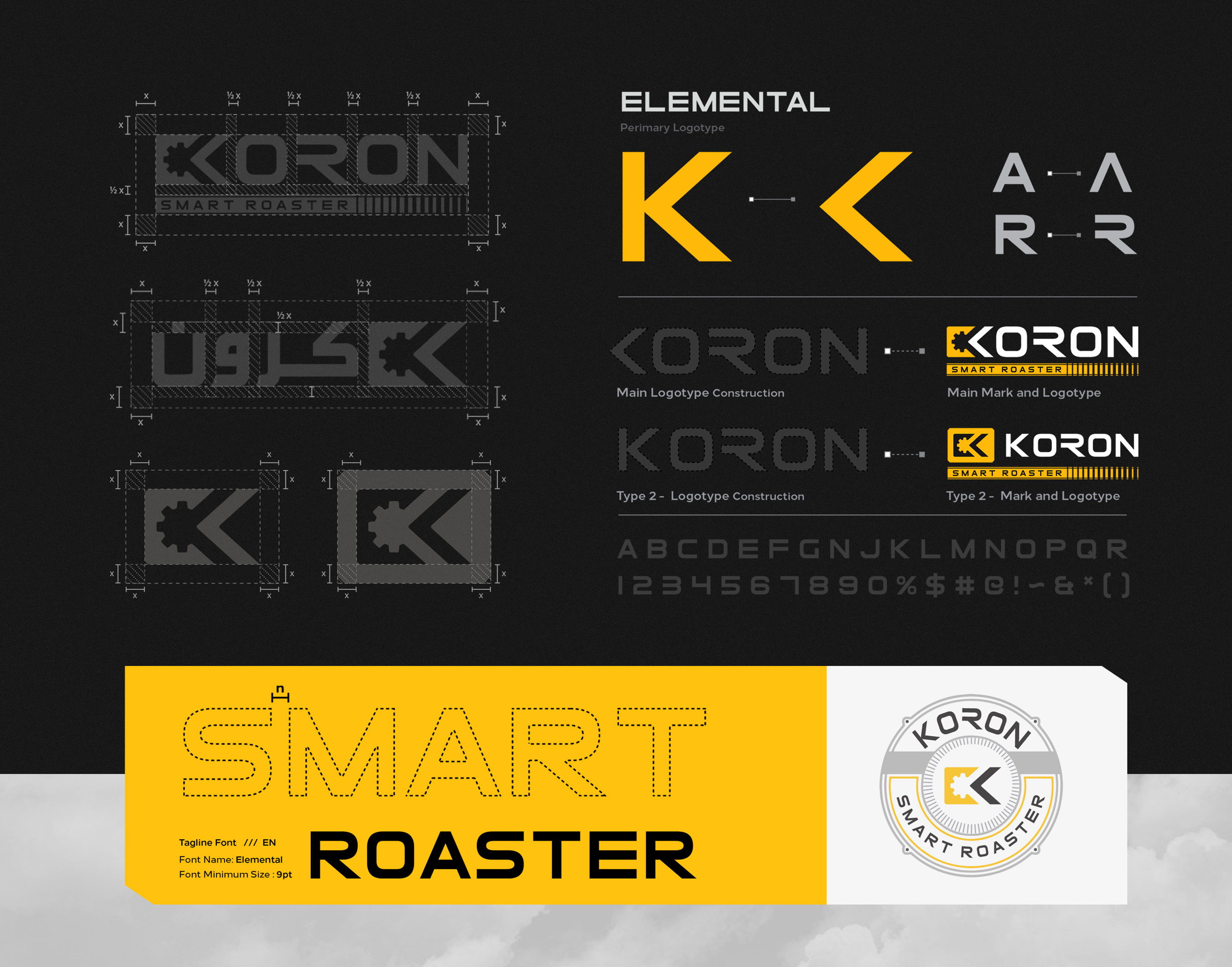
The combination of logo and logotype helps us to display a good logo in the items required by the brand.
The logo and logotype were created and sent by the customer according to the additional description.
Finally, we unified all the designed items in the format and framework of the brand structure and designed and executed them in a collection as a brand manual, so that according to the many brand designs, the new identity and structure will be respected. The KORON brand manual includes all the items needed by the brand, from logo and logotype design to visual identity and office set, etc.
All items are carefully designed and implemented within the framework of brand identity, all important and significant inputs in future designs are considered in this guide.
CREDIT
- Agency/Creative: Studio Metis
- Article Title: Koron Roaster Brand Guidelines
- Organisation/Entity: Agency
- Project Type: Identity
- Project Status: Published
- Agency/Creative Country: Iran
- Agency/Creative City: Studio Metis
- Market Region: Asia, Middle East
- Project Deliverables: Beauty Photography, Brand Architecture, Brand Design, Brand Guidelines, Brand Identity, Brand Mark, Brand Naming, Brand Redesign, Brand Strategy
- Industry: Technology
- Keywords: branding, Roaster, Coffee, Brand,Guidelines, Identity
-
Credits:
Creative Director: vahid Khezrian
Brand Strategist: Dr. Mehrdad Farzam
Team Managar: Nazanin Hedayati
Ui/ Ux: Abbas Mousavi


