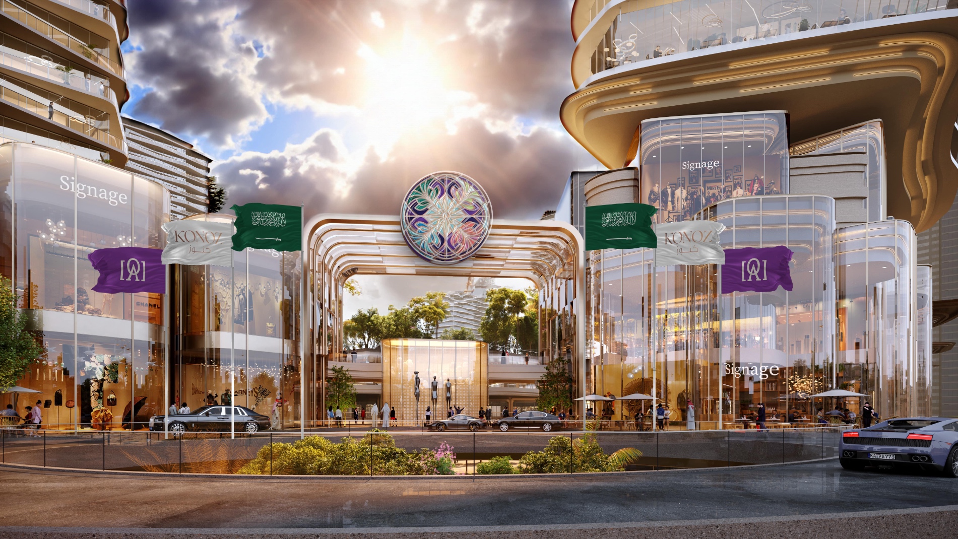
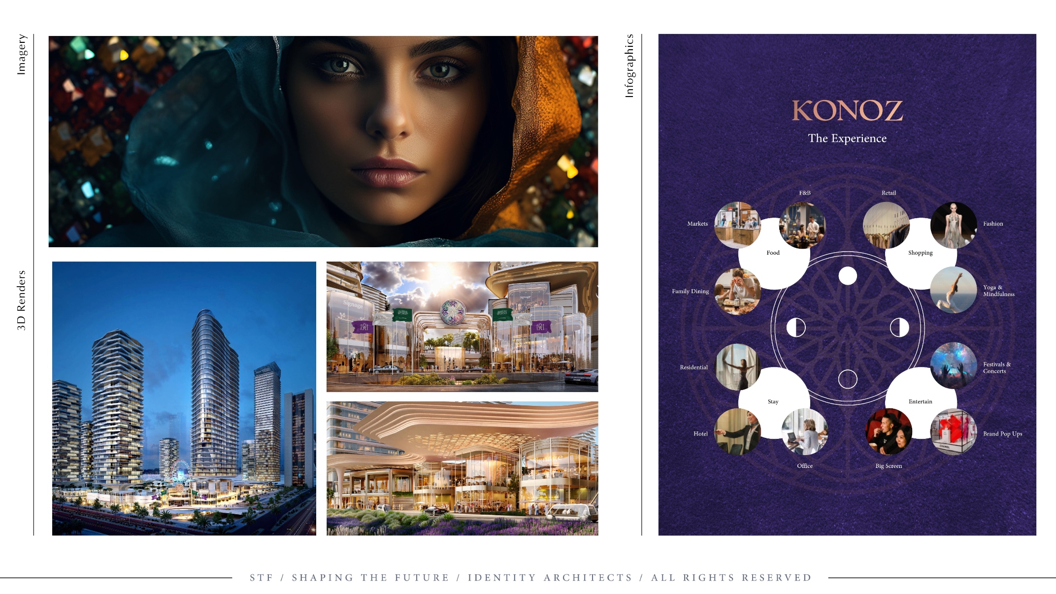
In the heart of Riyadh, the KONOZ treasure box stands as a $1.7 billion affirmation of architectural brilliance and design ingenuity. Entrusted as STF, the identity designers, we undertook the intricate task of not just reflecting the lavish brief but interweaving the multifaceted master plan with the vibrancy of gemstone inspirations. The challenge was to crystallize a mix-use real estate concept that encapsulated the dynamism of different zones while maintaining an overarching harmony and luxury befitting the KONOZ vision.
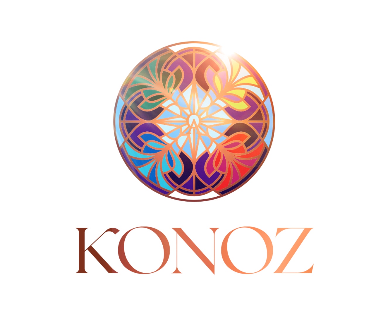
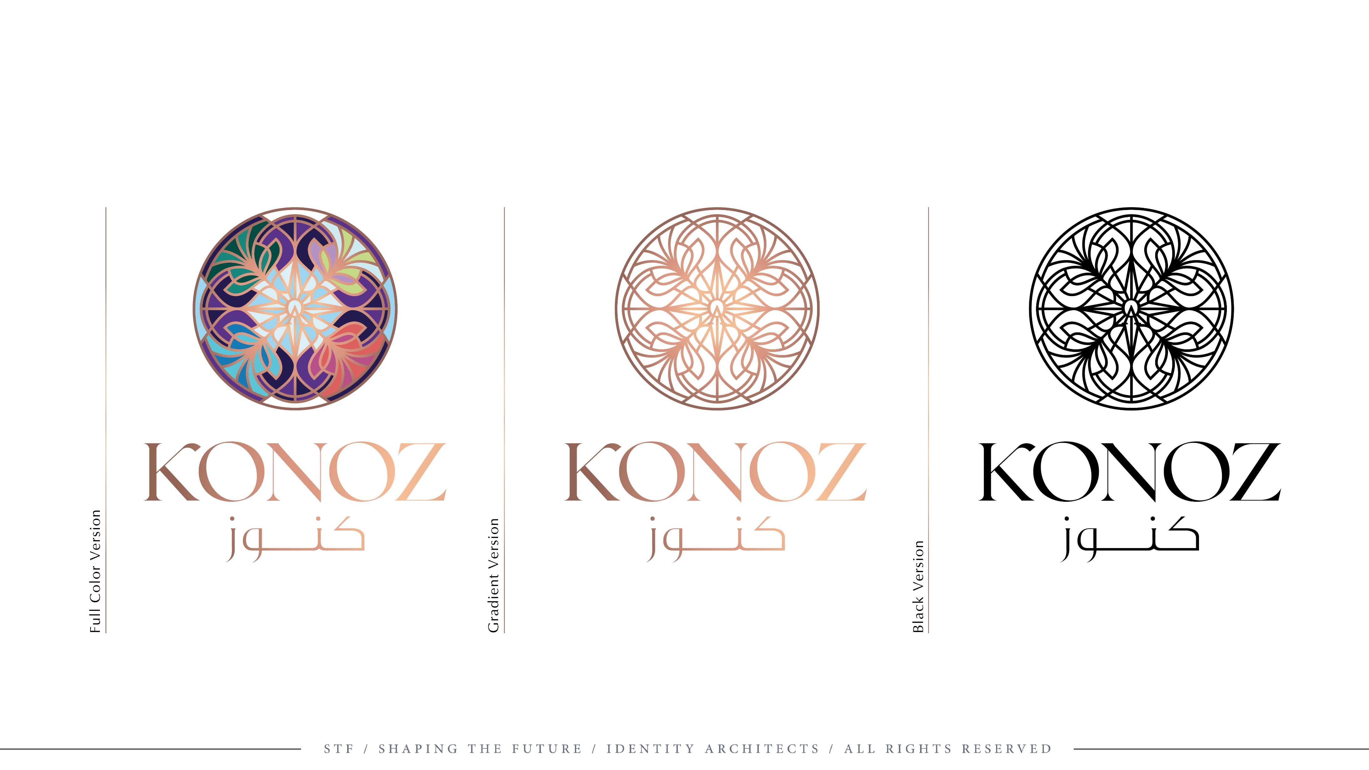
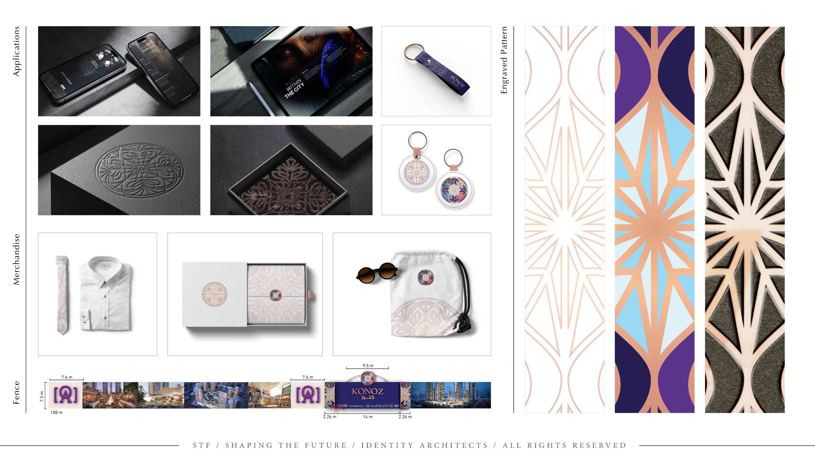
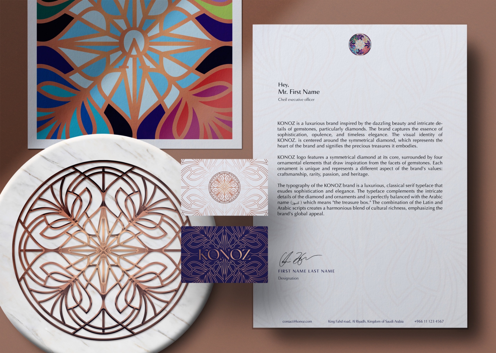
We embarked on this venture by anchoring the brand’s identity in a symmetrical diamond, the epitome of nature’s handiwork in precious stones, mirroring the heart of KONOZ and the treasures it guards. The logo, a haven of elegant sophistication, integrates this central diamond with four ornamental elements, each mirroring the facets of gemstones. They are not mere adornments but storytelling devices that speak of KONOZ’s dedication to craftsmanship, rarity, passion, and heritage.
The typographic choice for KONOZ, a seamless marriage of classical and luxury, dons a serif typeface that interlaces effortlessly with the intricate details of the diamond and ornamental elements. This choice was deliberate, ensuring the name “كنوز” resonated with the aesthetic and cultural ethos of the brand, thereby weaving a narrative that transcends borders.
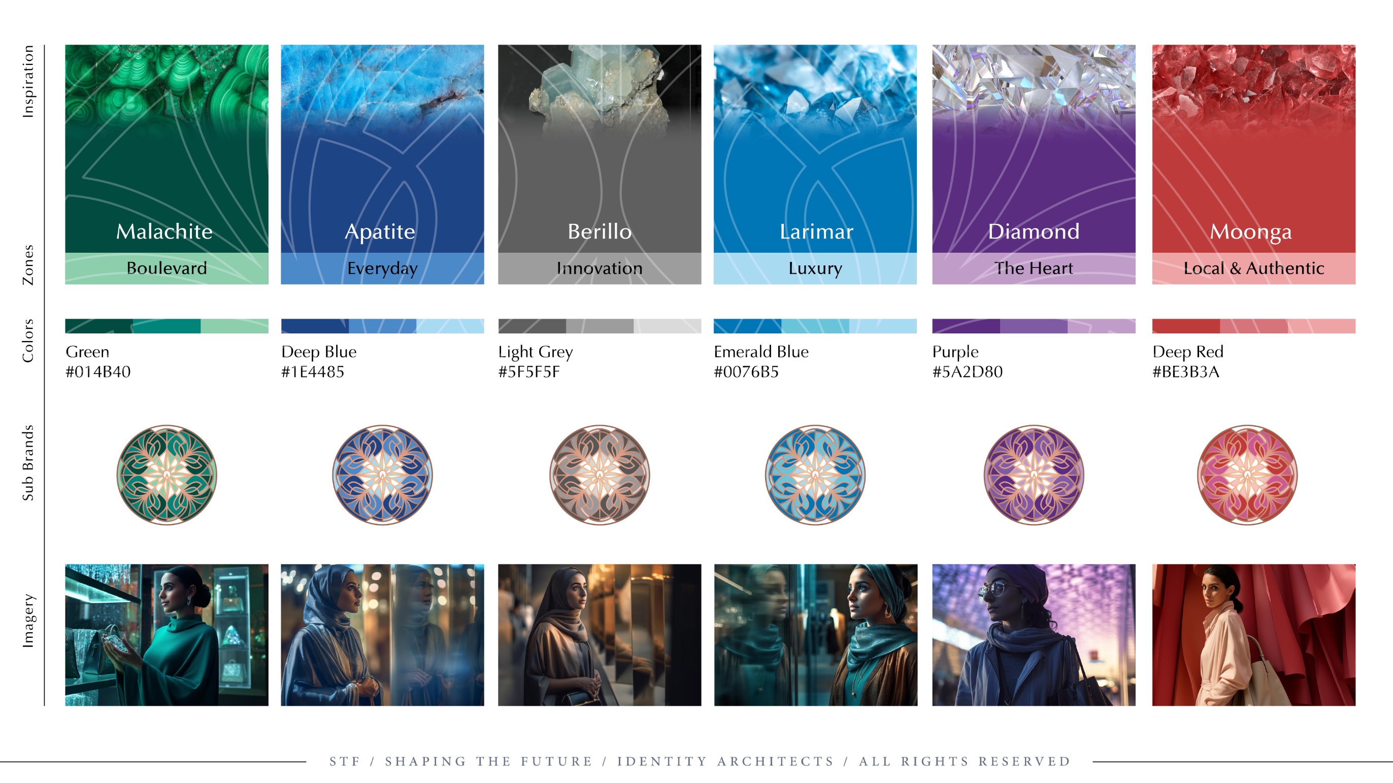
Our palette drew from the deep reservoirs of gemstone colors—sapphire’s integrity, emerald’s vitality, and amethyst’s tranquility, crowned with gold’s immutable prestige. These hues were not randomly chosen but meticulously selected to represent different zones within the KONOZ realm, each synonymous with the attributes of its namesake gemstone. The residential zone, suffused with sapphire tones, promises stability and serenity. The commercial areas glint with emerald hues, embodying growth and prosperity, while the cultural district is brushed with the wisdom of amethyst.
The omnipresent gemstone illustrations serve as a constant reminder of the brand’s core values, ensuring that every touchpoint, from packaging to marketing collateral, is a microcosm of the KONOZ experience. These illustrations are not merely visuals; they are a promise—a vow to uphold the meticulousness and splendor that each gemstone holds within its core.
As STF, our role transcended progressive design—we wove a tapestry where each thread was imbued with the essence of KONOZ, ensuring that the master plan not only embraced the multifaceted brief but also reflected the brilliance and elegance synonymous with the most coveted gemstones. This is the KONOZ experience: a place where every facet, every hue, and every detail is a reflection of a deeper heritage and a more luxurious lifestyle.

CREDIT
- Agency/Creative: Shaping The Future (STF)
- Article Title: KONOZ Brand Identity
- Organisation/Entity: Agency
- Project Type: Identity
- Project Status: Published
- Agency/Creative Country: Saudi Arabia
- Agency/Creative City: Riyadh
- Market Region: Middle East
- Project Deliverables: Brand Identity
- Industry: Retail
- Keywords: WBDS Agency Design Awards 2023/24
- Keywords: Identity, Brand Design Creation
-
Credits:
Design Agency: Shaping The Future (STF)


