Introducing the exciting Kommo brand redesign, a fresh visual identity that captures the essence of a versatile CRM solution. Kommo provides businesses with adaptable and scalable communication tools tailored to their specific needs, and this project marks a significant step in their journey to reinvigorate and better represent the dynamic nature of the brand.
About Kommo:
Kommo stands as an omnichannel CRM, simplifying and centralizing communication solutions for businesses. In a landscape where every business exudes uniqueness, Kommo streamlines diverse communication methods into one robust and efficient tool. This translates to delivering “communication on steroids” to professionals across various sectors, facilitating their endeavors in sales and business growth.
Concept and Style Description:
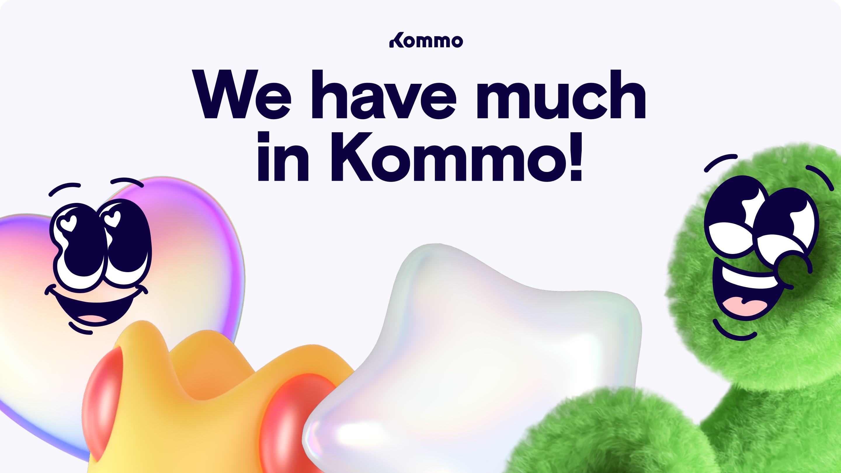
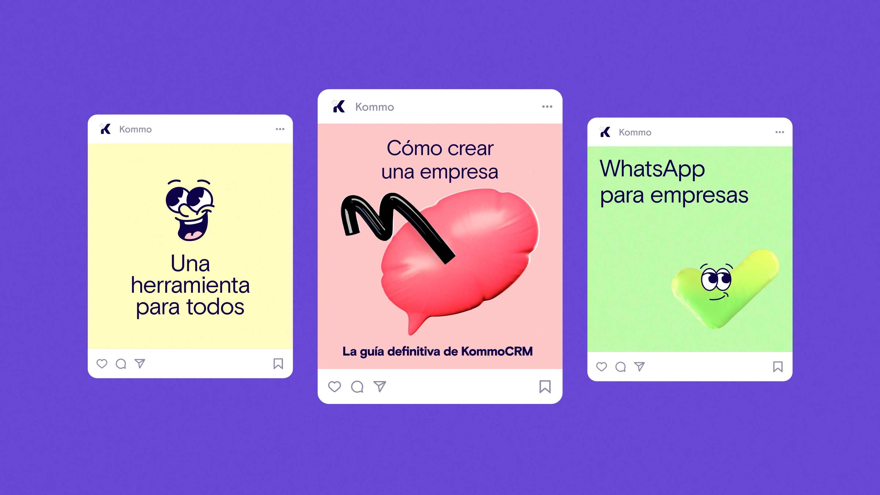
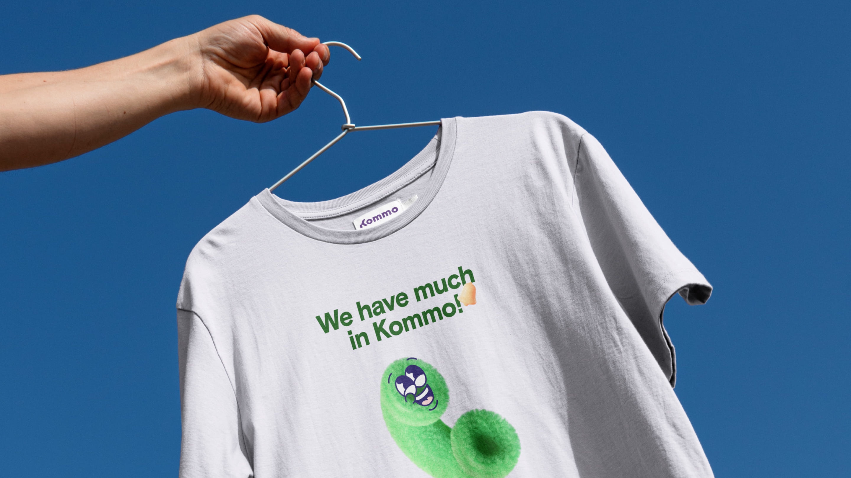
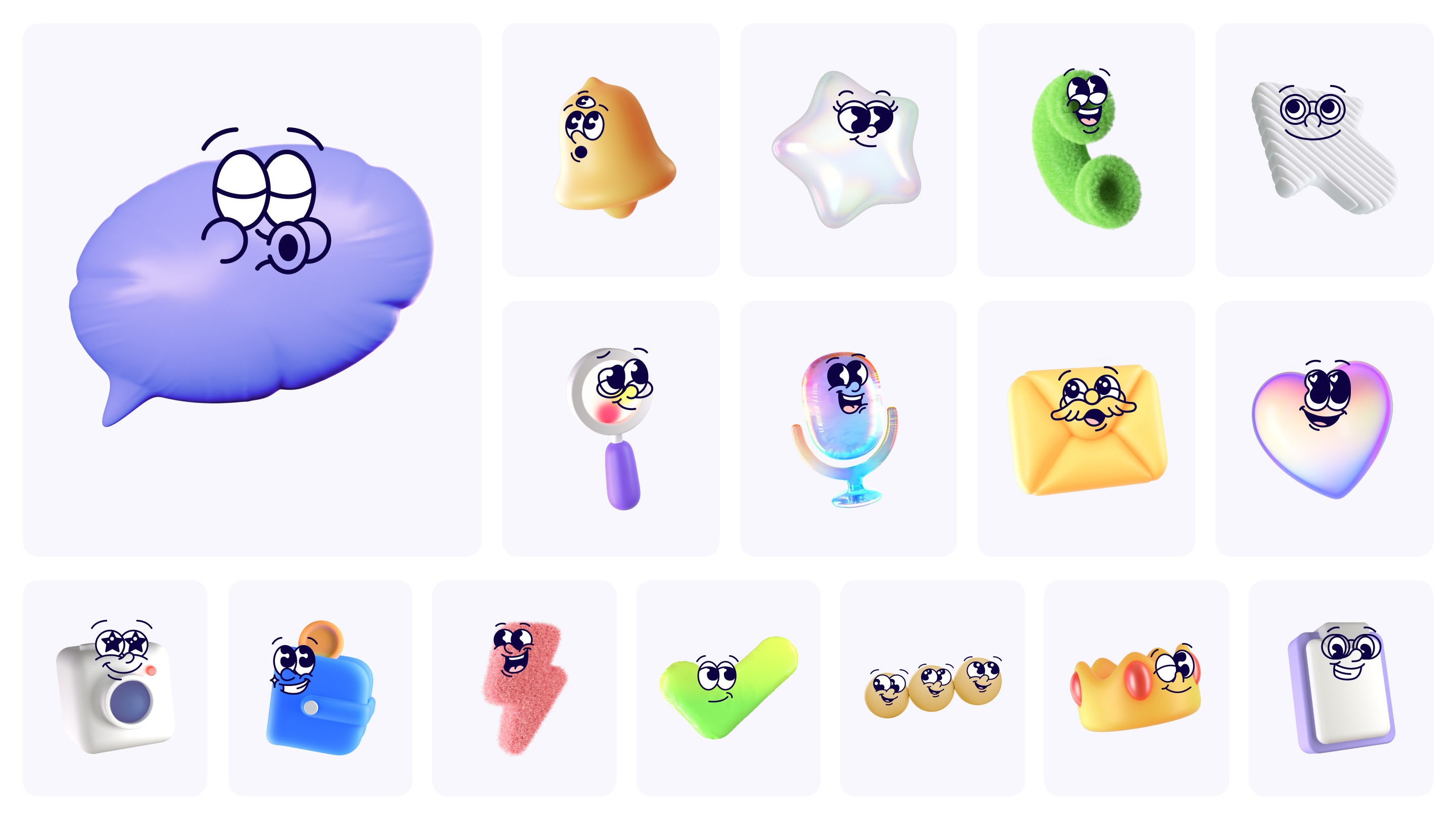
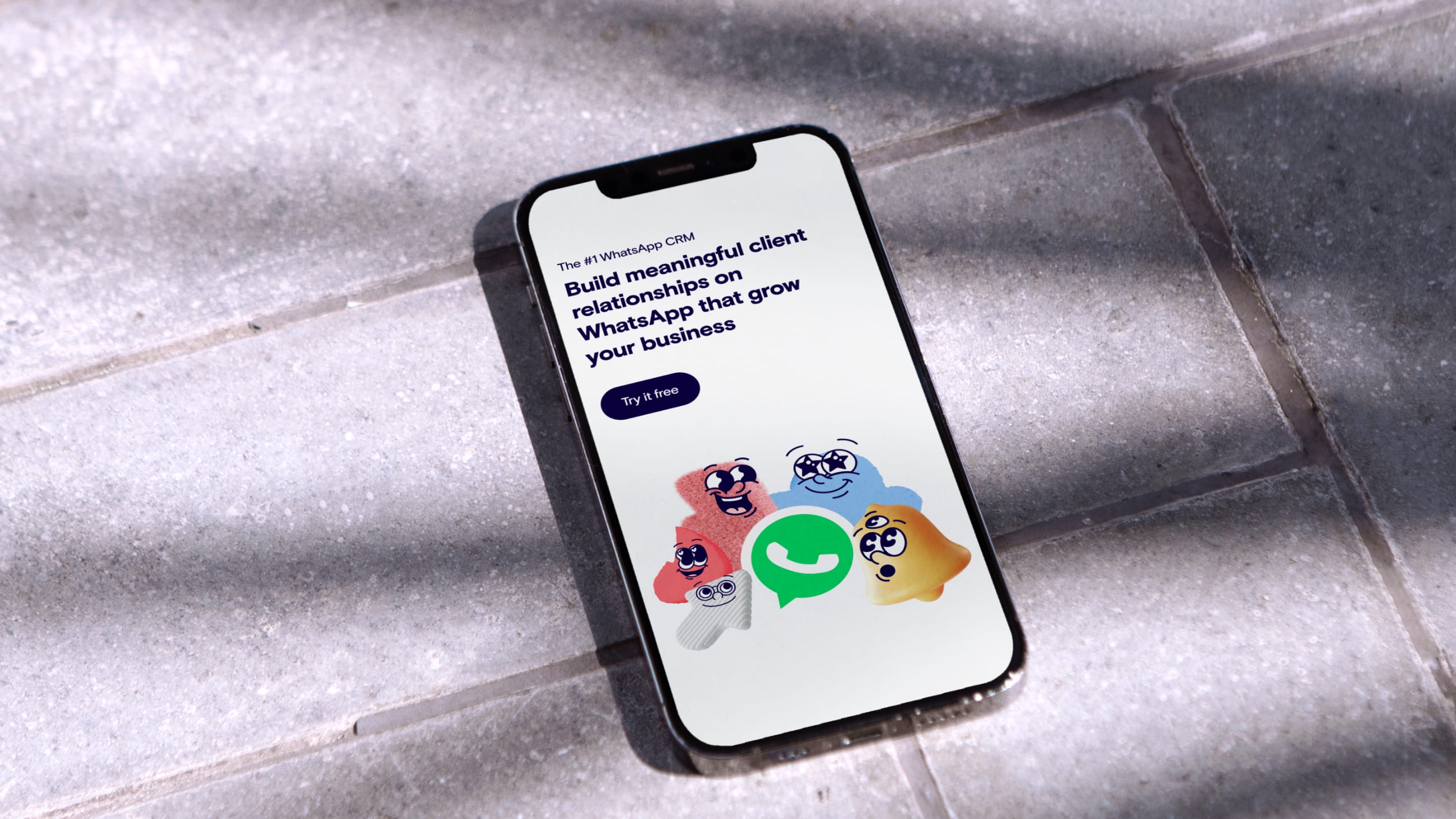
One of the most distinctive features of this brand style is the introduction of characters. These characters embody versatility, timelessness, and adaptability, becoming the familiar faces representing Kommo’s product features. They are not static; instead, they come in multiple visualizations and can be customized to suit different contexts. In essence, they serve as the bridge between the familiar yet ineffective communication tools of the past and Kommo’s modern, professional solution.
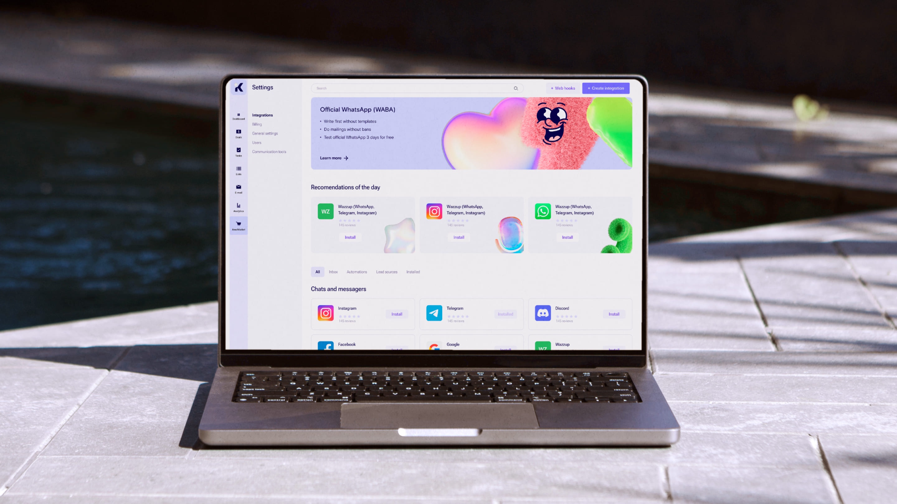
Idea: All Kommo characters are visualizations of interfaces from different platforms. In Kommo, they can coexist completely organically despite their differences.
This unique idea led to the concept of visual differentiation among the characters. By personalizing these elements, we convey a customer-centric approach that makes every interaction with Kommo enjoyable and heartwarming. This approach emphasizes the versatility and adaptability of the CRM platform. Whether it’s email, WhatsApp, or any other communication method, Kommo’s characters make every interaction feel seamless and efficient.
The redesigned brand emphasizes unity in diversity, reflecting the essence of Kommo as an inclusive and versatile communication solution. It communicates the idea that regardless of the communication channel, Kommo provides a seamless and enjoyable experience. The characters bridge the gap between traditional and modern communication tools, emphasizing that Kommo is the way forward, offering businesses a professional, efficient, and innovative solution.
The Kommo brand redesign encapsulates the commitment to empowering businesses with adaptable, efficient, and versatile communication tools, ensuring they can reach their unique goals effectively. We believe that successful communication is not one-size-fits-all, and Kommo’s brand redesign reflects their dedication to diversity and adaptability in the world of CRM and business communication.




CREDIT
- Agency/Creative: Embacy
- Article Title: Kommo Dynamic Brand Redesign for Modern CRM Excellence
- Organisation/Entity: Agency
- Project Type: Identity
- Project Status: Published
- Agency/Creative Country: Spain
- Agency/Creative City: Barcelona
- Market Region: North America
- Project Deliverables: Brand Identity
- Industry: Technology
- Keywords: WBDS Agency Design Awards 2023/24
- Keywords: Identity, Brand Redesign
-
Credits:
Design Agency: Embacy


