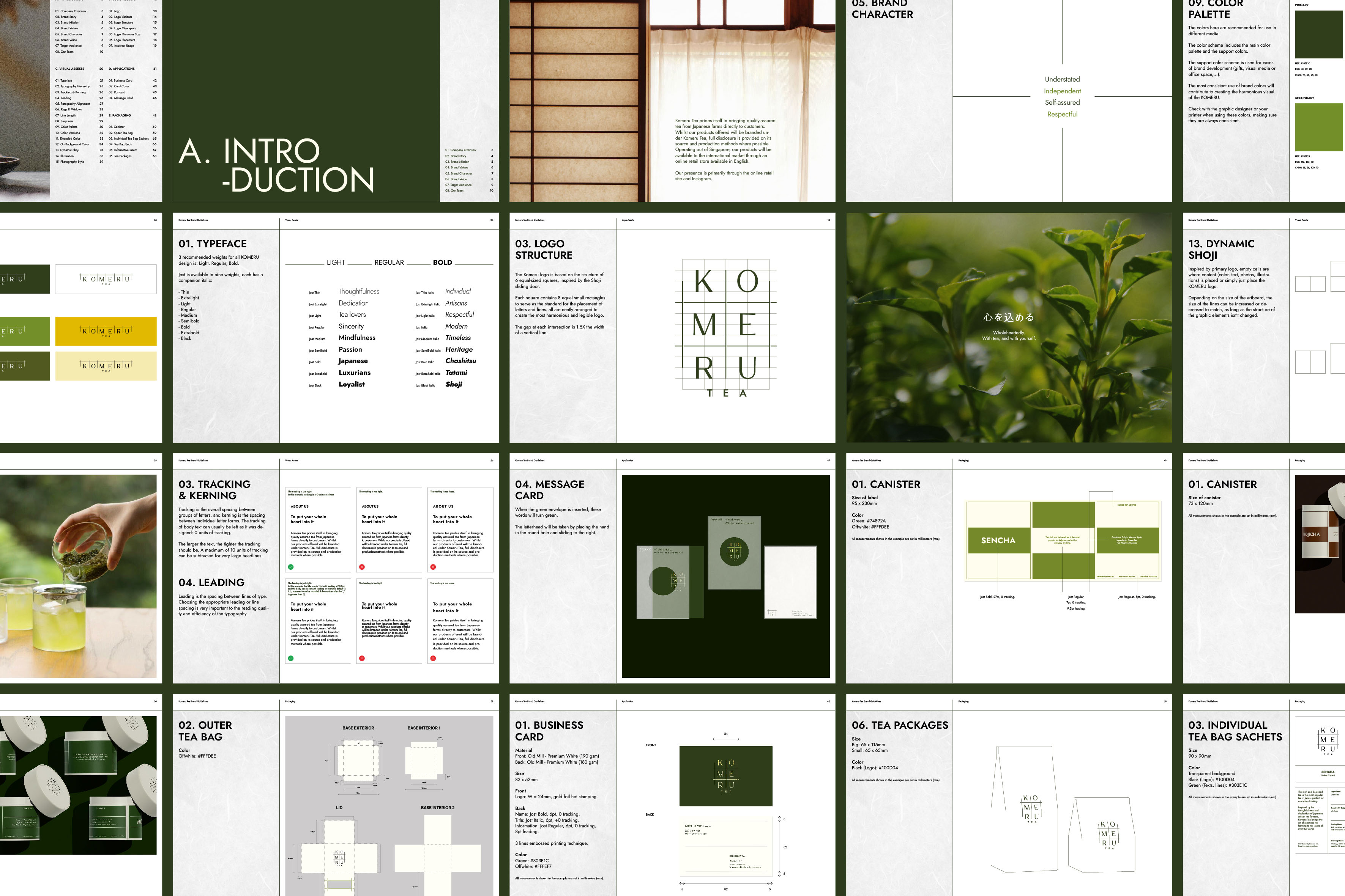
Komeru Tea prides itself in bringing quality-assured tea from Japanese farms directly to customers. Whilst our products offered will be branded under Komeru Tea, full disclosure is provided on its source and production methods where possible. Operating out of Singapore, our products will be available to the international market through an online retail store available in English. Our presence is primarily through the online retail site and Instagram.
Brand Story
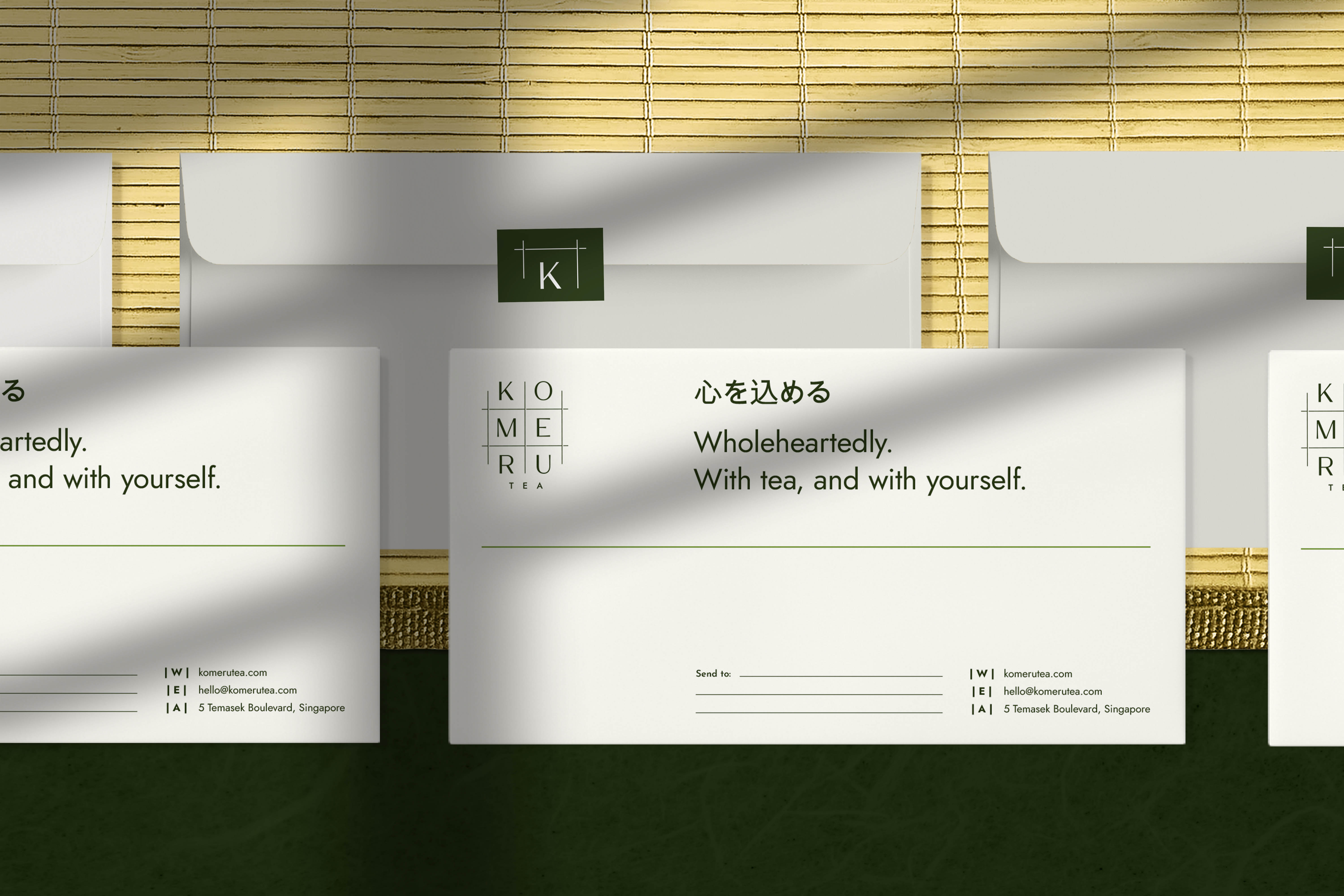
“Kokoro o Komeru” 心を込める — to put your whole heart into it. Inspired by the thoughtfulness and dedication of Japanese artisan tea farmers, Komeru Tea brings the art of Japanese tea farming to tea-lovers all over the world.
Brand Mission
With Komeru Tea, tea can be thoroughly enjoyed – from the quality of tea leaves to the touch of each teapot. Working directly with reputable Japanese tea farmers and artisans, we curate a collection of tea that embodies exceptional quality and select tea ware. Komeru Tea prides itself in delivering good tea regardless of where you are.
Brand Values
Sincerity – Mindfulness – Passion
Design
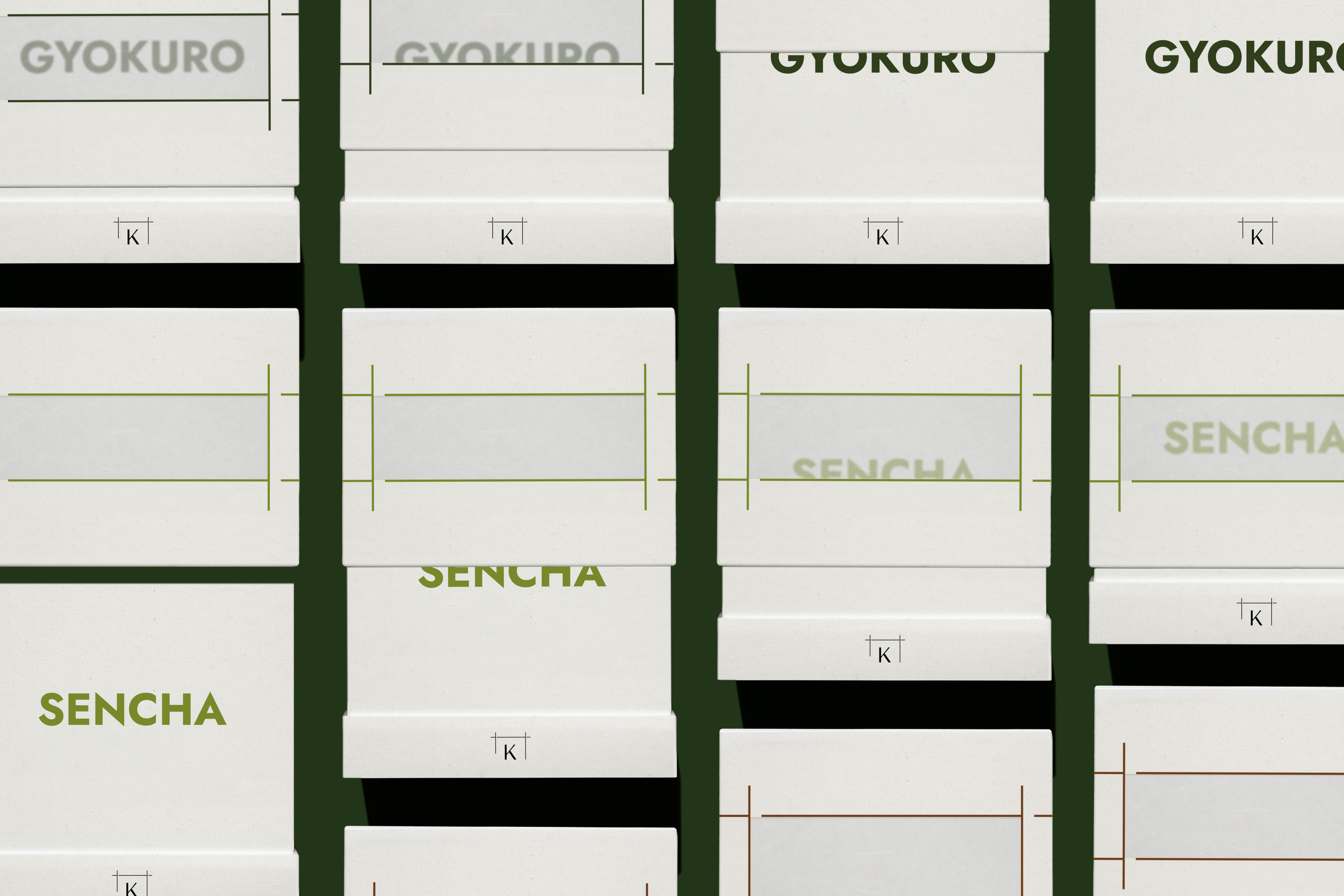
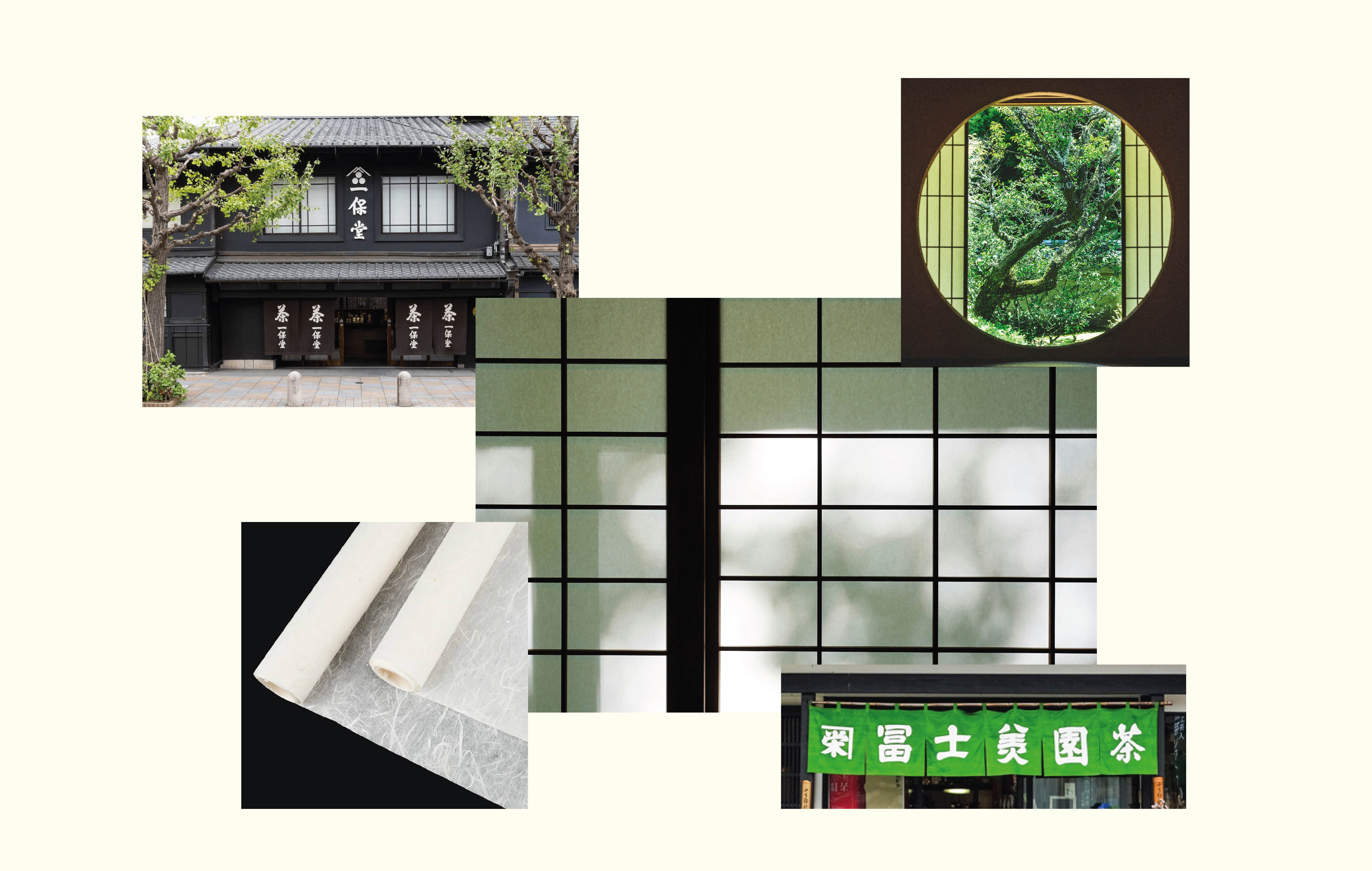
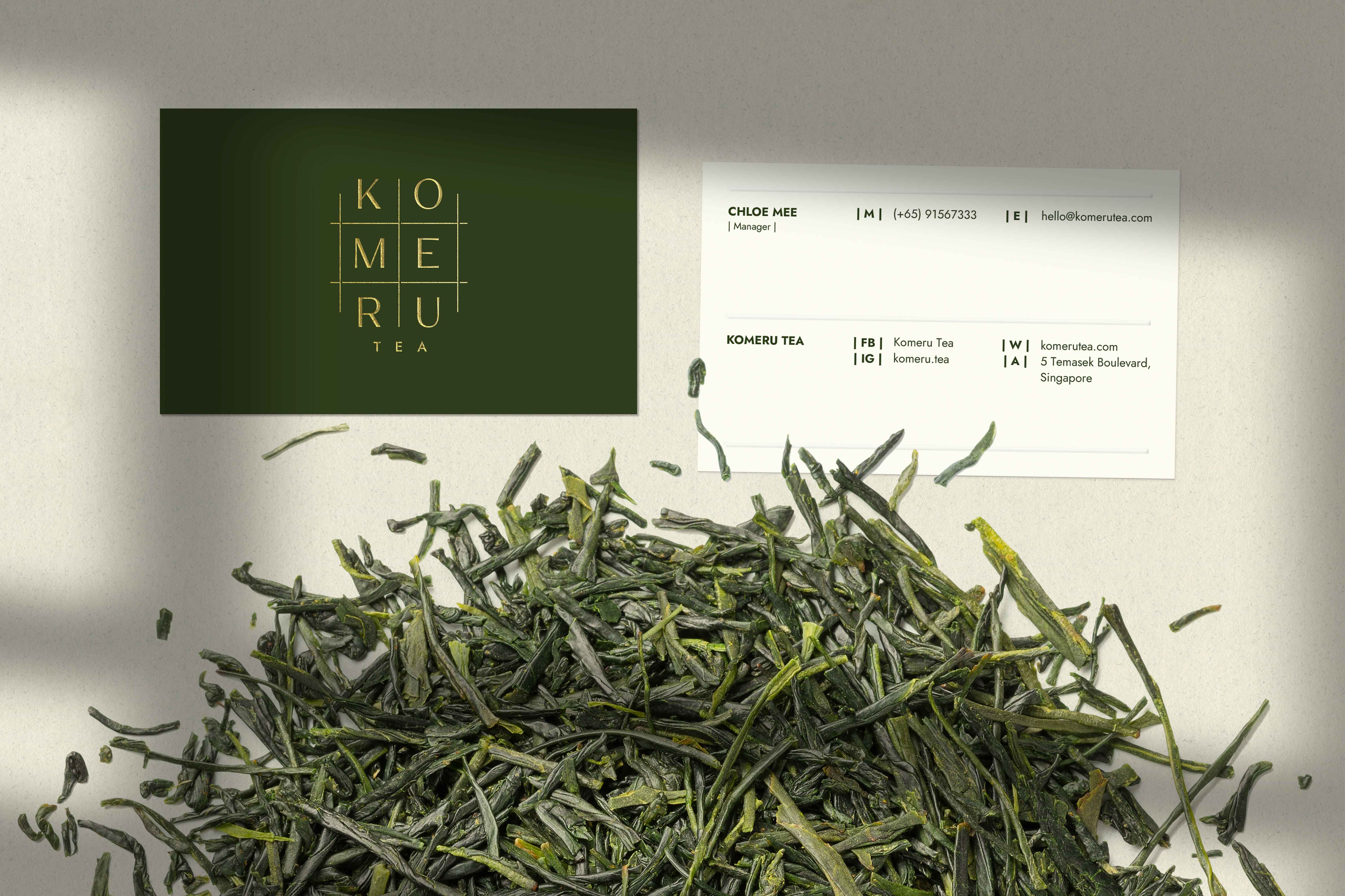
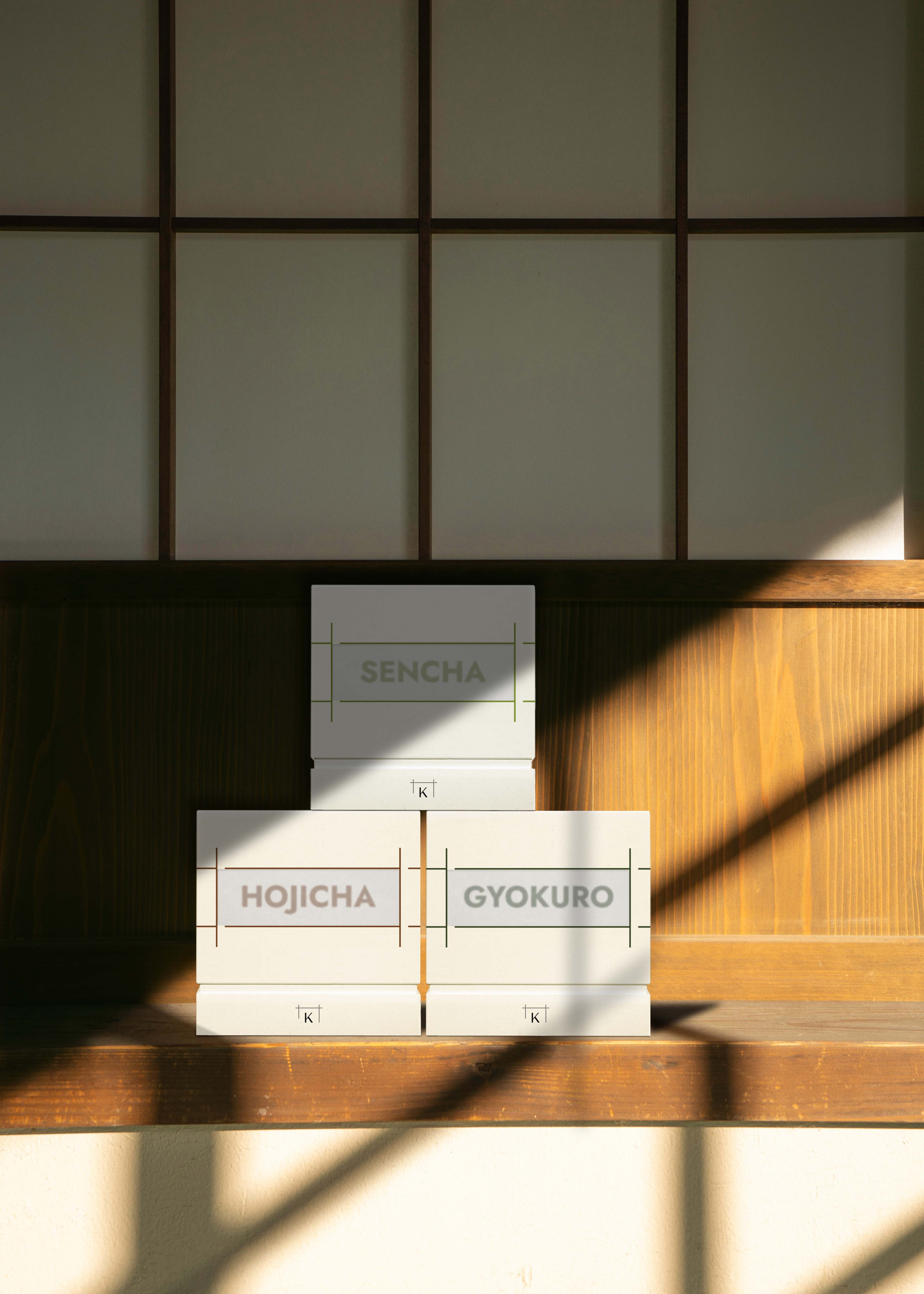
The KOMERU brand is represented by light thin lines and a subtle layout of the letters. The logo is inspired by the structure of the Shoji sliding door and the characteristic circle window in the Chashitsu tea ceremony space.
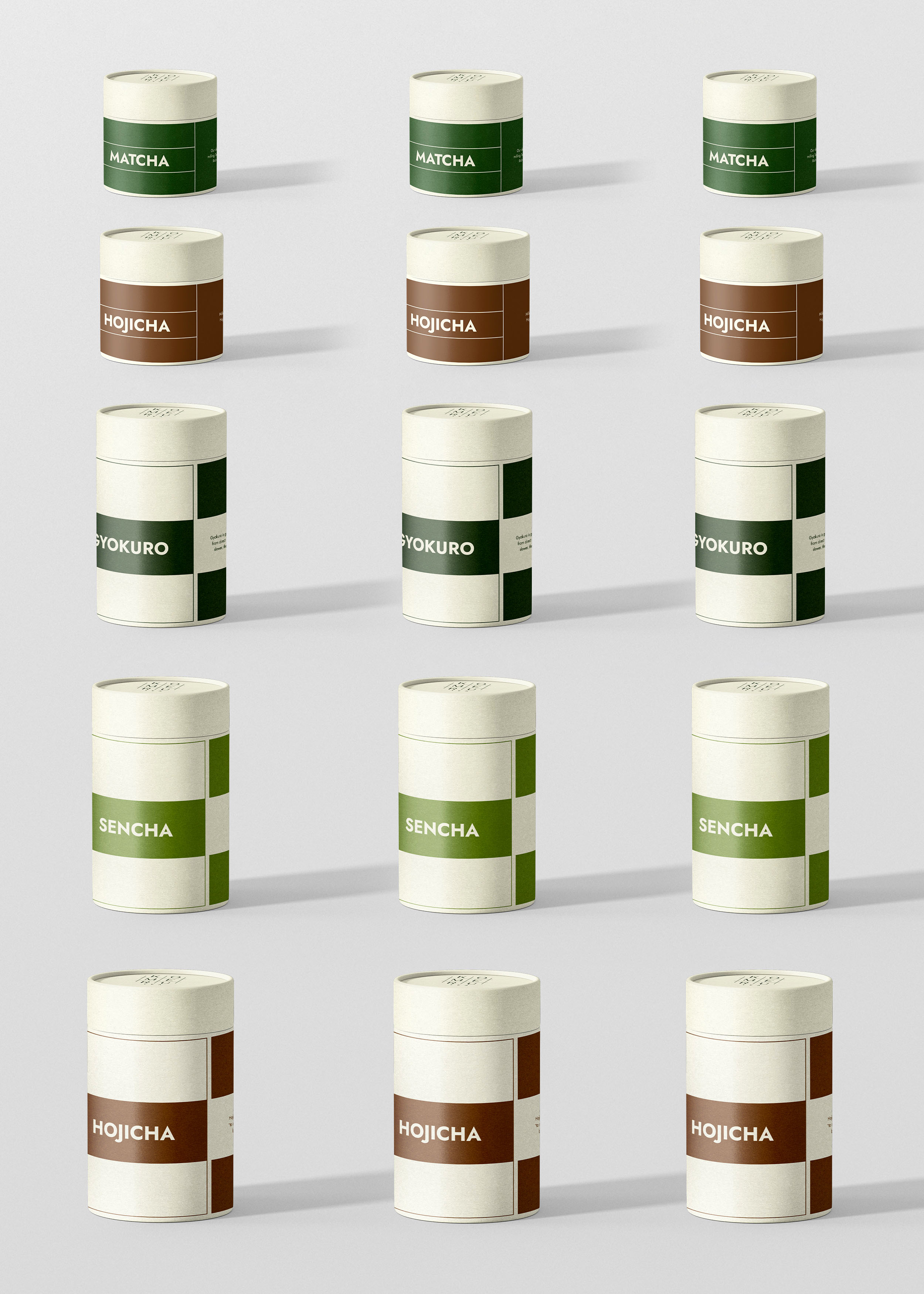
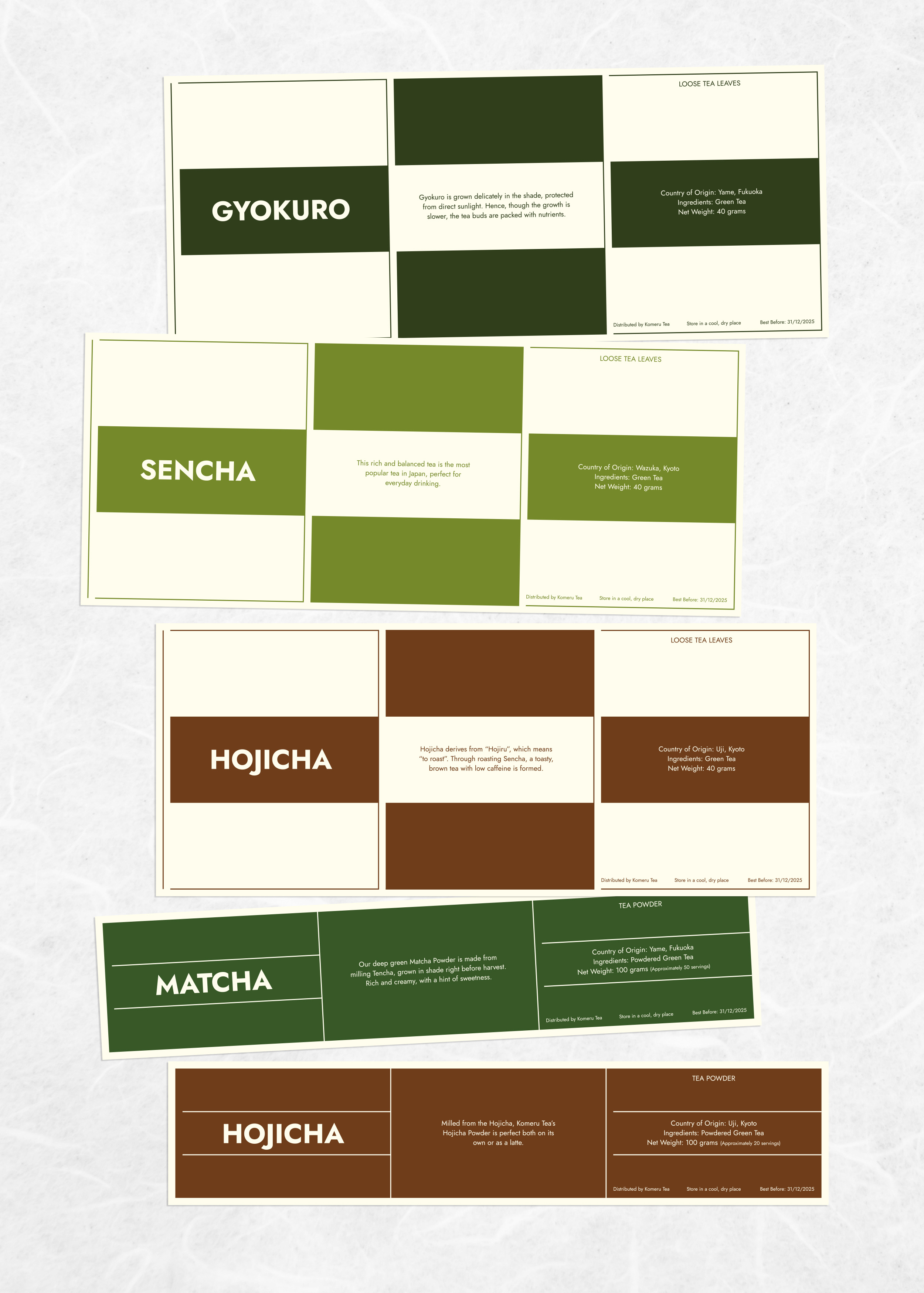
Inspired by Shoji Door, empty cells are where content (color, text, photos, illustrations) is placed or simply just place the Komeru logo. Depending on the size of the artboards, the size of the lines can be increased or decreased to match, as long as the structure of the graphic elements isn’t changed.

CREDIT
- Agency/Creative: Atelier 9AM
- Article Title: Komeru Tea Visual Identity Packaging Design Concept by Atelier 9AM
- Organisation/Entity: Agency
- Project Type: Identity
- Project Status: Non Published
- Agency/Creative Country: Vietnam
- Agency/Creative City: Ho Chi Minh
- Market Region: Asia
- Project Deliverables: Brand Design, Brand Guidelines, Brand Identity, Identity System
- Industry: Food/Beverage
- Keywords: Tea branding, Japanese style, Tea label, Shoji door, Tea packaging
-
Credits:
Creative Director: Son Nguyen
Graphic Designer: Row Nguyen


