Noble families and artists have long enjoyed mutually beneficial agreements. Artists would be commissioned and funded to create pieces of work for families that reflected their prestige, ethos and character.
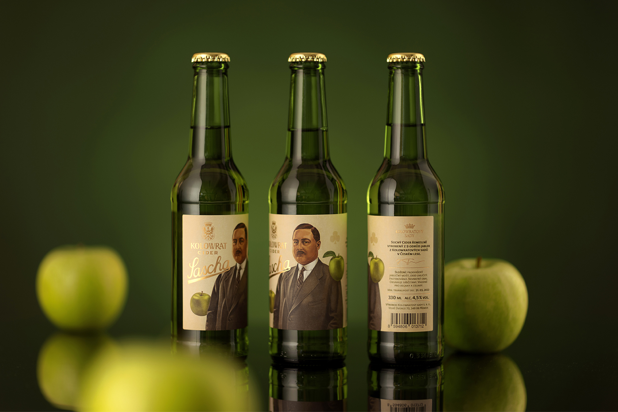
This project brought something similar. The House of Kolowrat is a Czech noble family, prominent in the history and administration of their native Kingdom of Bohemia as well as the Holy Roman Empire. The family commissioned Little Greta with a new design for their key product, cider. The design was inspired and built around Count Alexander “Sascha” Joseph von Kolowrat-Krakowsky. One of the family’s most significant descendants, our research found he was an Austrian cinema pioneer, keen racer, and great fun to be around.
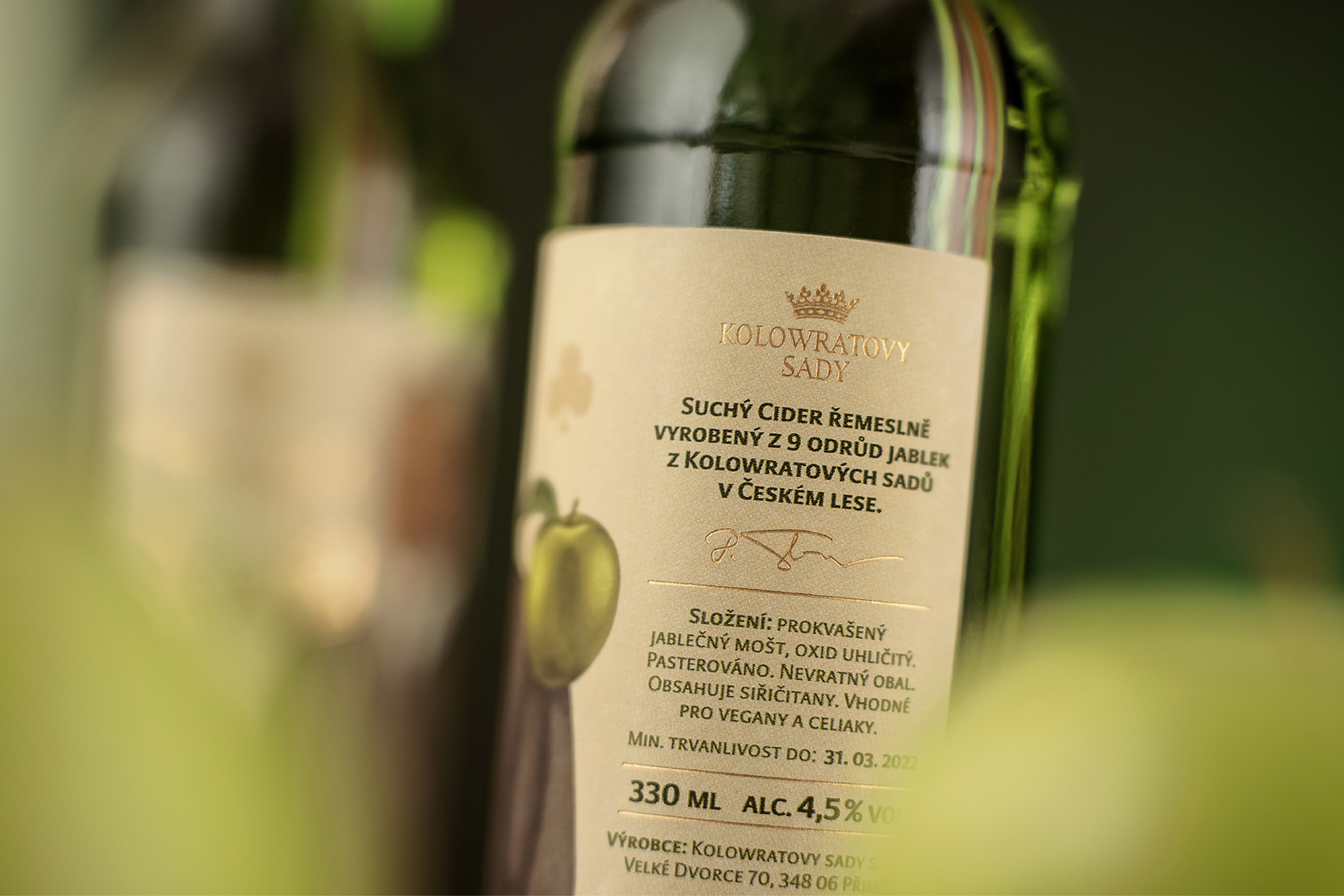
This motivated us to use his race car and shamrock (a good luck charm) as supporting visual elements. A witty touch of elegance relating to the First Czechoslovak Republic and avant-garde art, both occurring during Sascha’s life, were added to the visual mix.
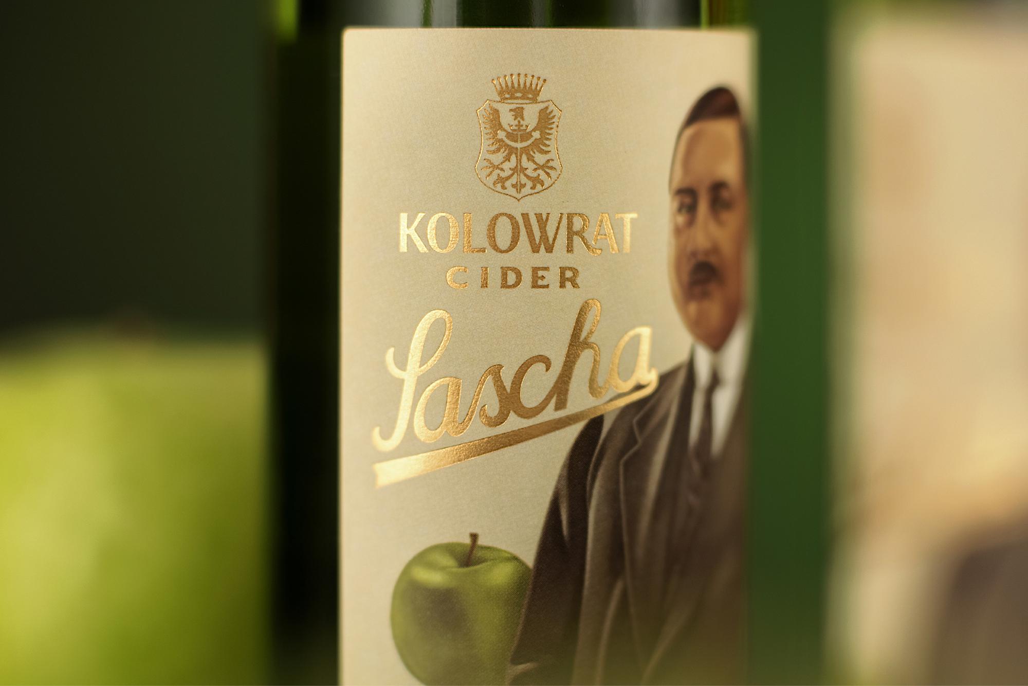
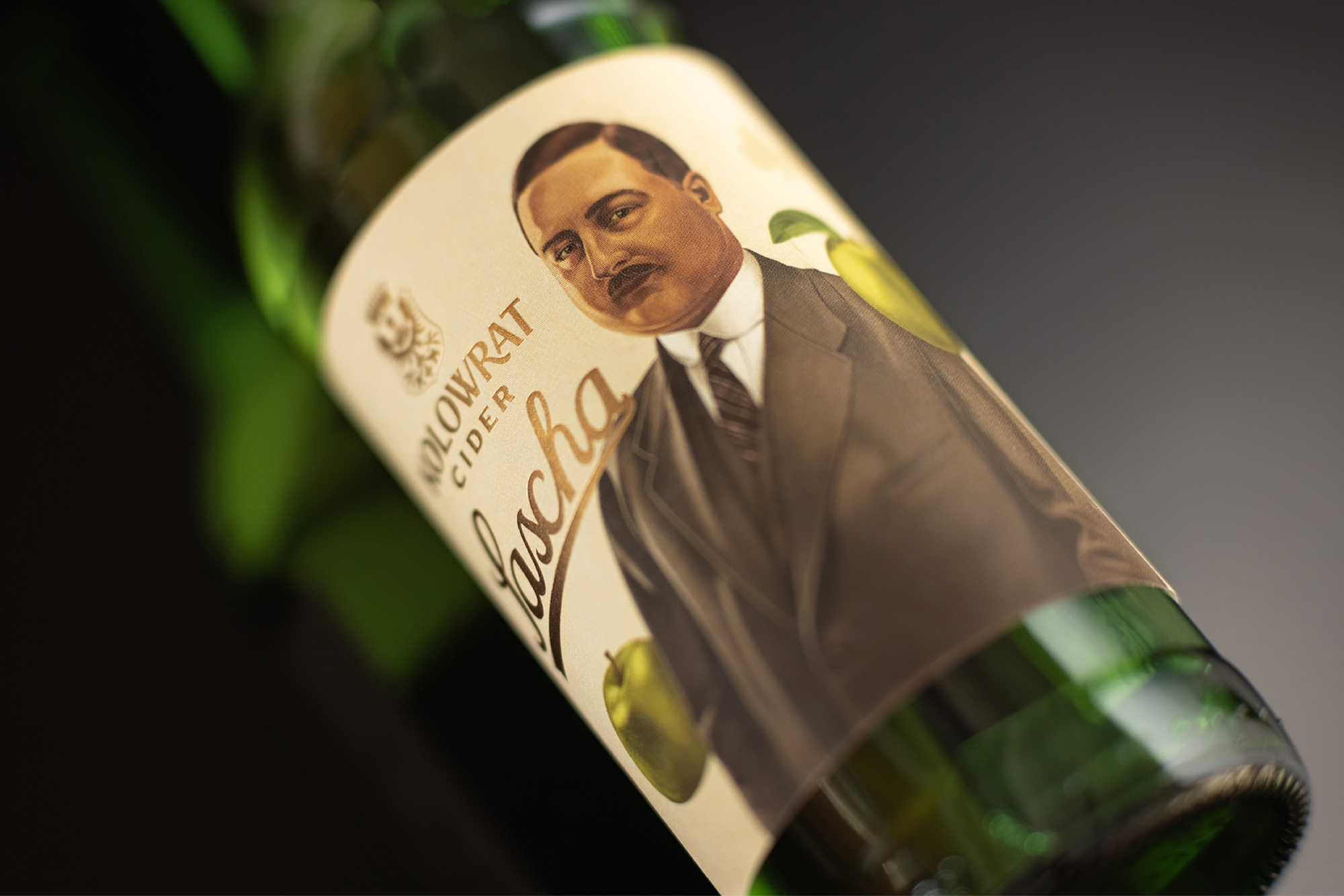
The period photographs served as a basis for the portrait of Count Sascha, which has been digitally processed in a painting style corresponding to the classical works of famous painters.
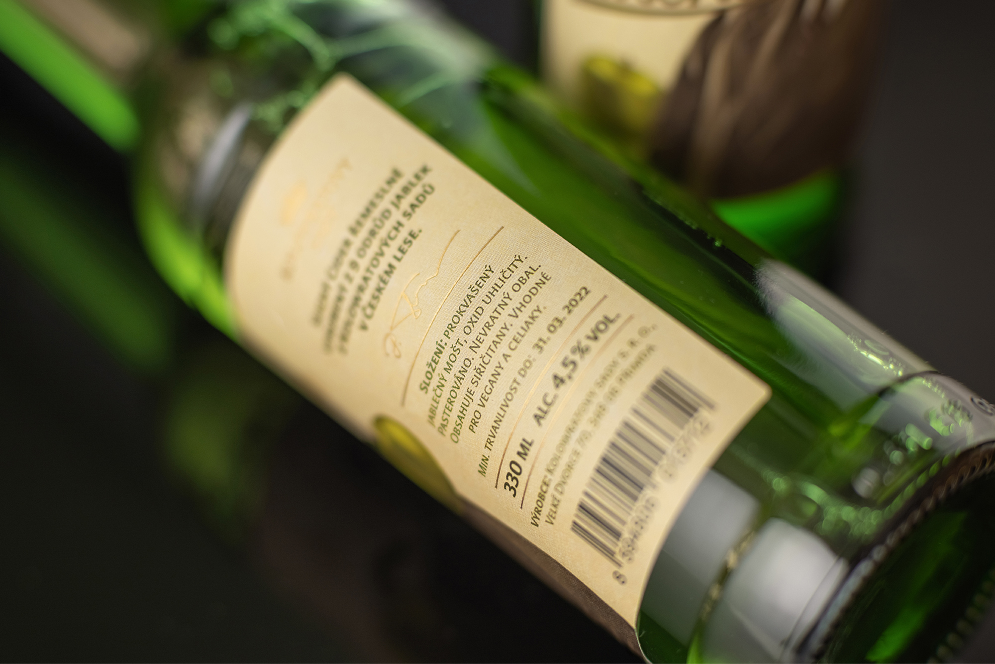
The absence of the sumptuous frame that sometimes adorns classical works is replaced by the gold embossing of the logo and product name. The bottle and the type of label recall the elegance but also the practicality of fitting in with the commonly available products.
The research included a deeper look into the life of Count Sascha Kolowrat as well as the noble family itself. The objective was a search for visual reference points across the history of the family that would define the visual identity of the family as a manufacturer.
In illustration, methodology focused on the study of painting techniques and how they can be replicated in a digital environment. In the later stages, we focused on the work of René Magritte, whose work impacted on the product as the work progressed.
The most important part of the process was the development of a sufficiently sophisticated illustrative style that would communicate the values of the product and the manufacturer with sufficient gravitas, but also with the lightness that is inherent in the product.
Technically, the design was limited by the use of one piece of label stock, a material that could withstand condensation and the cost of the finished product, yet the use of gold was something the agency insisted on.
CREDIT
- Agency/Creative: Little Greta
- Article Title: Kolowrat Cider Designed by Little Greta
- Organisation/Entity: Agency
- Project Type: Graphic
- Project Status: Published
- Agency/Creative Country: Czech Republic
- Agency/Creative City: Little Greta
- Market Region: Europe
- Project Deliverables: Graphic Design, Packaging Design
- Industry: Food/Beverage
- Keywords: packaging, graphic design, graphic, packaging design, desing, beverage, czech, kolowrat, illustration, cider, conceptualisation, little greta
-
Credits:
Art Director: Radoslav Dostal
Photographer: Julius Filip


