


43oz.com Design Studio – Koktebel
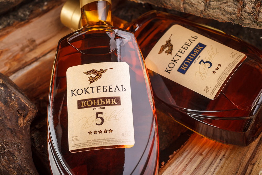
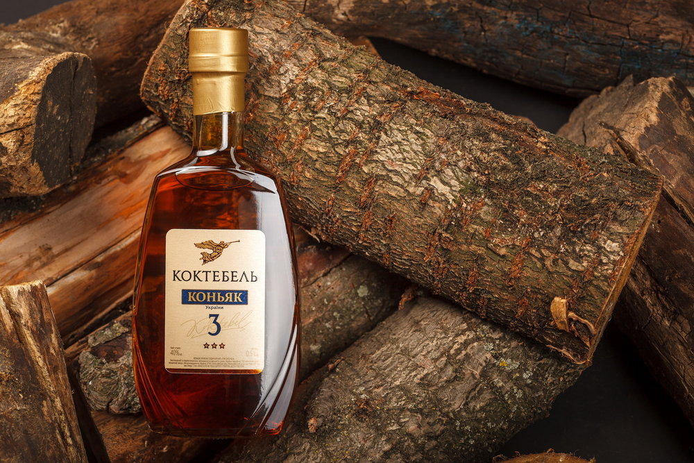
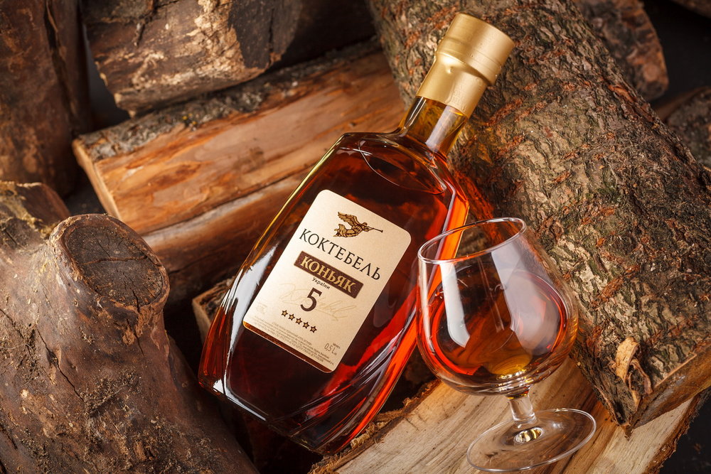
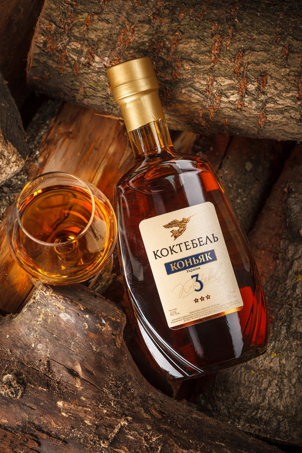
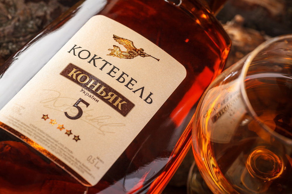
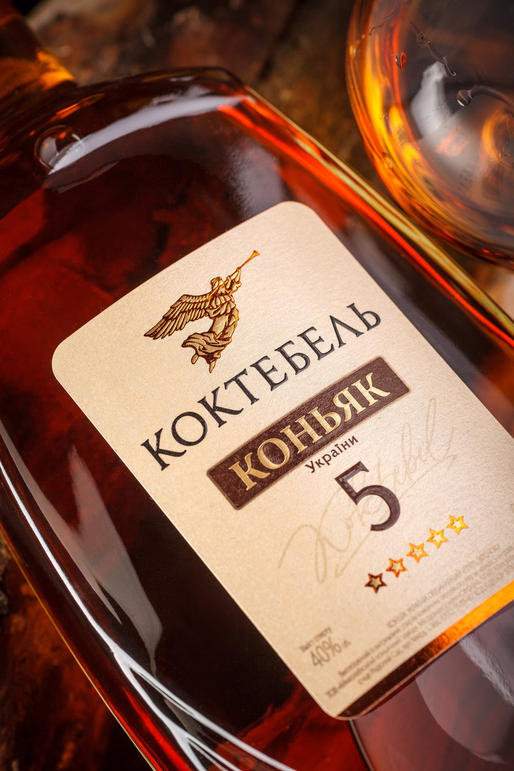
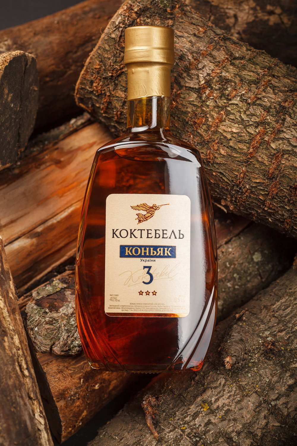
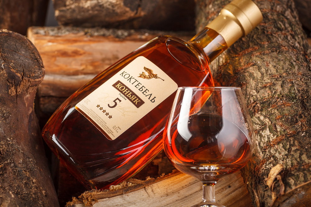
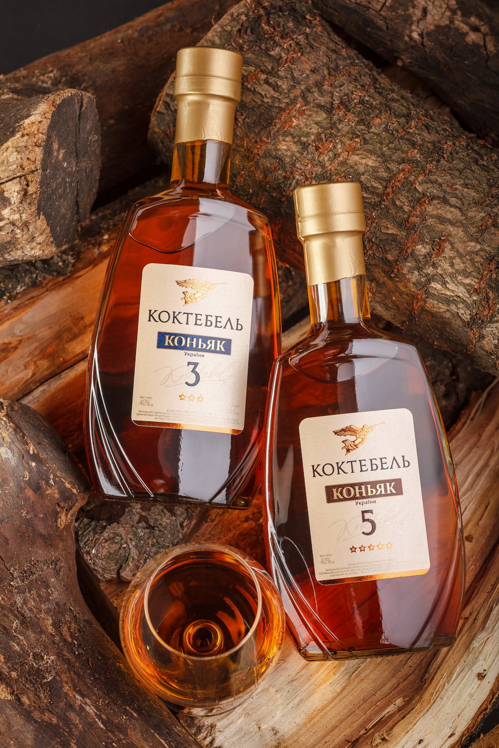
As part of the general project for renewing the design for the Ukrainian company Koktebel, our studio has redesigned the packaging for brandies produced under the same brand. The foremost task was to create a unique bottle shape, and respectively, a label design that would fit the new packaging format. Besides, we had to integrate the new design into the general style of the trademark, already set by other product lines produced by the company.
The renewed style of the Koktebel trademark involves a laconic approach and a stronger emphasis on the brand itself. That is why the Koktebel brandy label design features a rather temperate color scheme and a limited set of graphic elements used in the composition. The attention is first drawn to the logo and name of the brand, as well as the type of the product in the bottle. The handwritten element denoting the name of the brand placed underneath the aging period emphasizes the special approach of the producer towards the quality of the drink.
CREDIT
- Agency/Creative: 43oz.comDesign Studio
- Article Title: Koktebel Brandy Bottle and Label Design
- Organisation/Entity: Agency Commercial, Published
- Project Type: Packaging
- Agency/Creative Country: Moldova
- Market Region: Europe
- Format: Bottle
- Substrate: Glass, Pulp Paper


