


A Kissaten is an old-fashioned Japanese tearoom meticulously focused on crafting coffee.
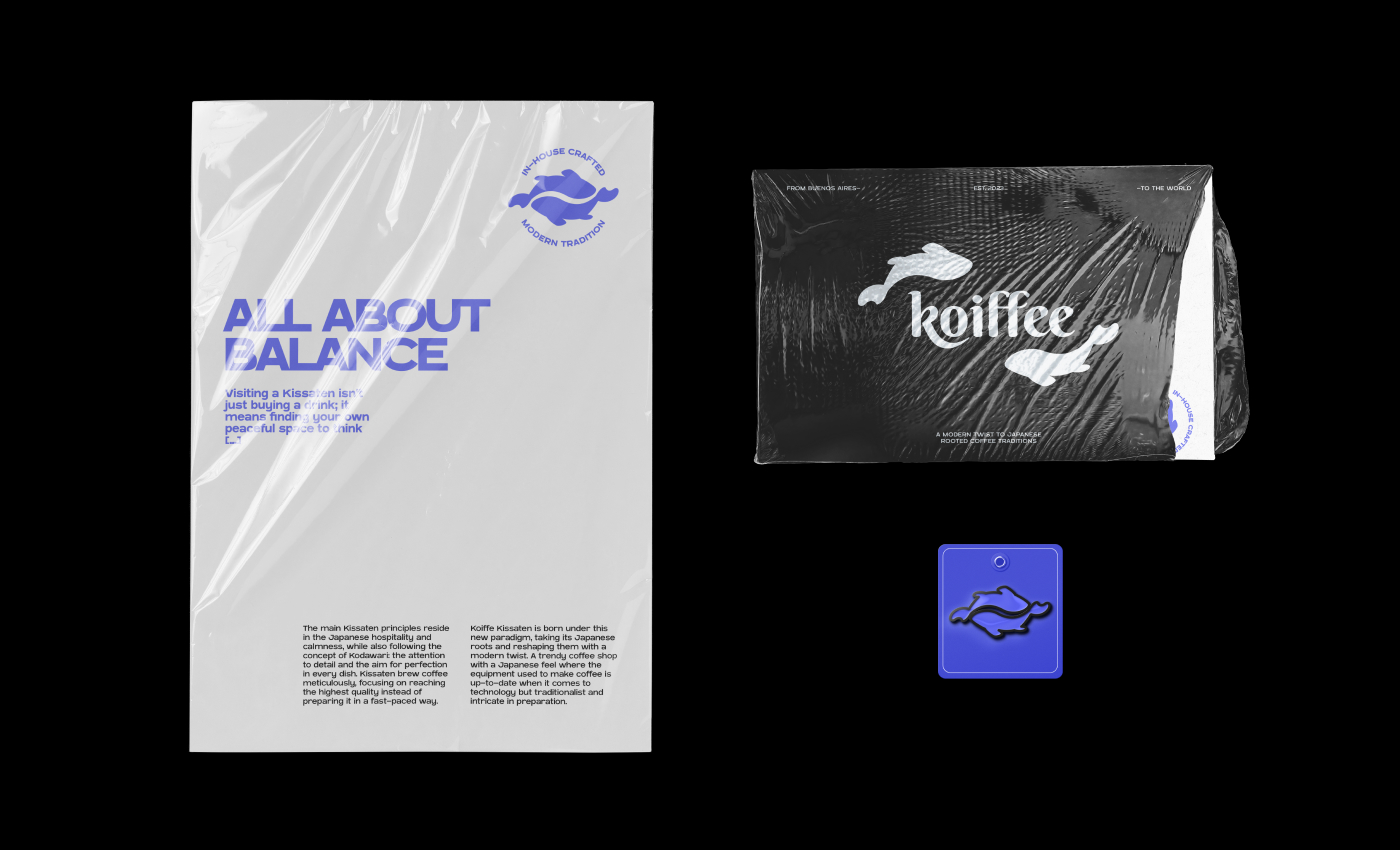
Traditionally, it was a modern and quiet place to drink coffee, as well as a gathering and more conducive place for intellectuals. Kissaten principles reside in Japanese hospitality and calmness. Visiting a Kissaten isn’t just buying a drink; it means finding your own peaceful space to think.
Kissaten also follow the Japanese concept of Kodawari, which represents the attention to detail and the aim for perfection in every dish. And when it comes to coffee, this is no exception. Kissaten brew coffee meticulously, focusing on reaching the highest quality instead of preparing it in a fast-paced way.
Japanese culture balances bringing out the latest technology while maintaining the delicate touch of their tradition.
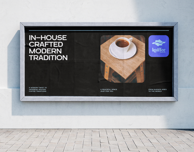
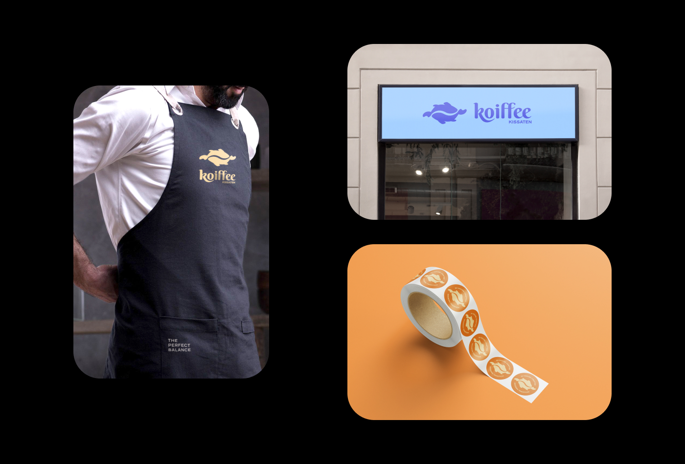
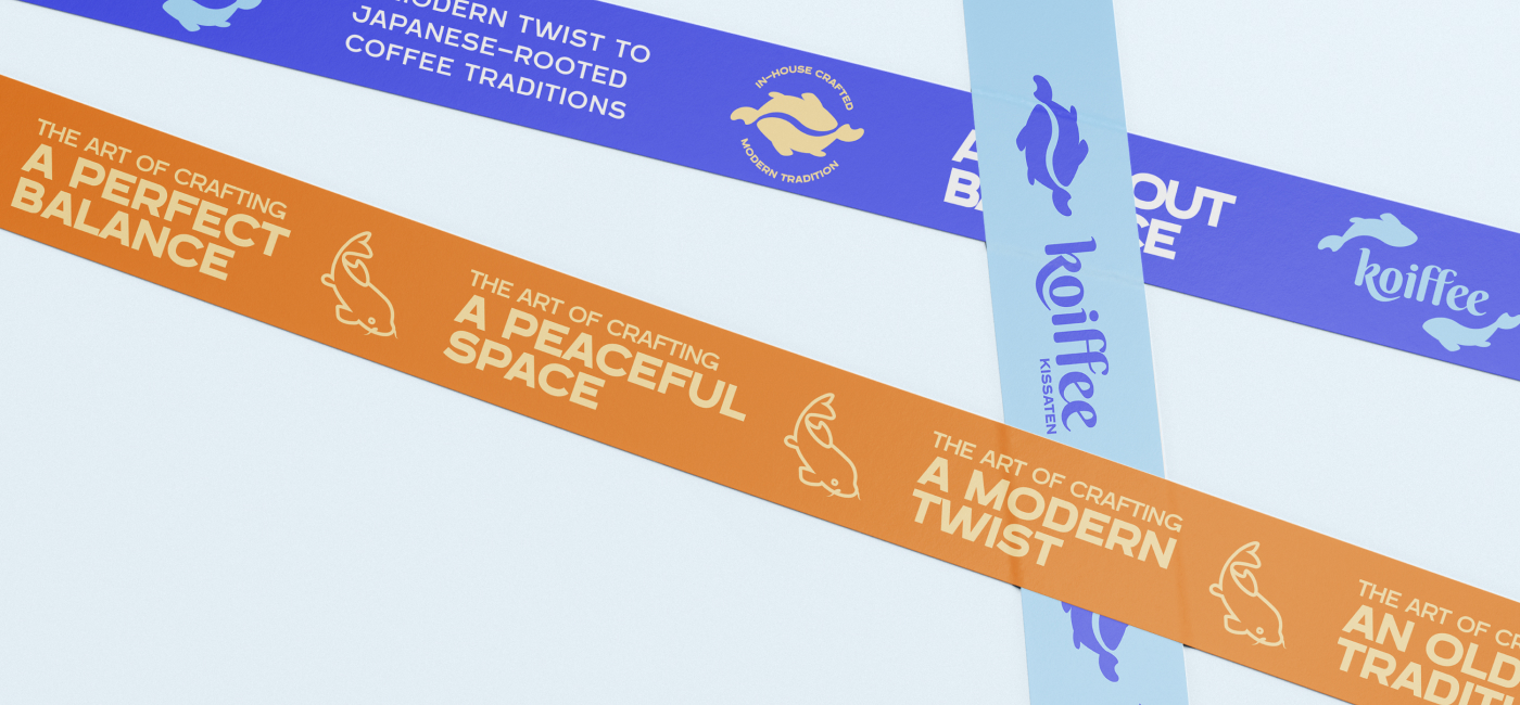
Koiffe Kissaten is born under this new paradigm, taking its Japanese roots and reshaping them with a modern twist. A trendy coffee shop with a Japanese feel where the equipment used to make coffee is up-to-date when it comes to technology but traditionalist and intricate in preparation.
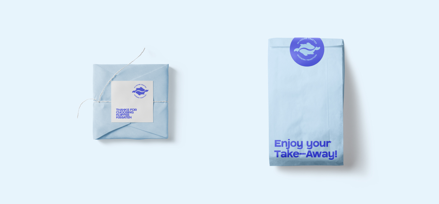
When crafting the brand identity, my goal was for the naming to reflect its essence in an engaging and easy-to-remember way. I based the wordmark on the Koi fish, a well-known symbol of balance in Japan, to reflect the duality in the modern approach given to the Japanese coffeehouses tradition.
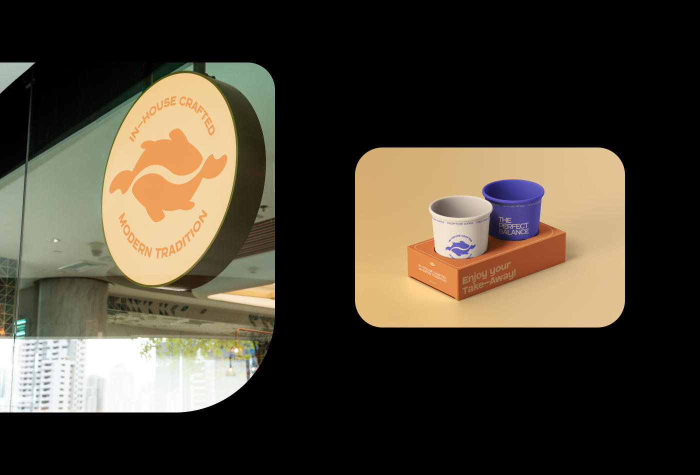
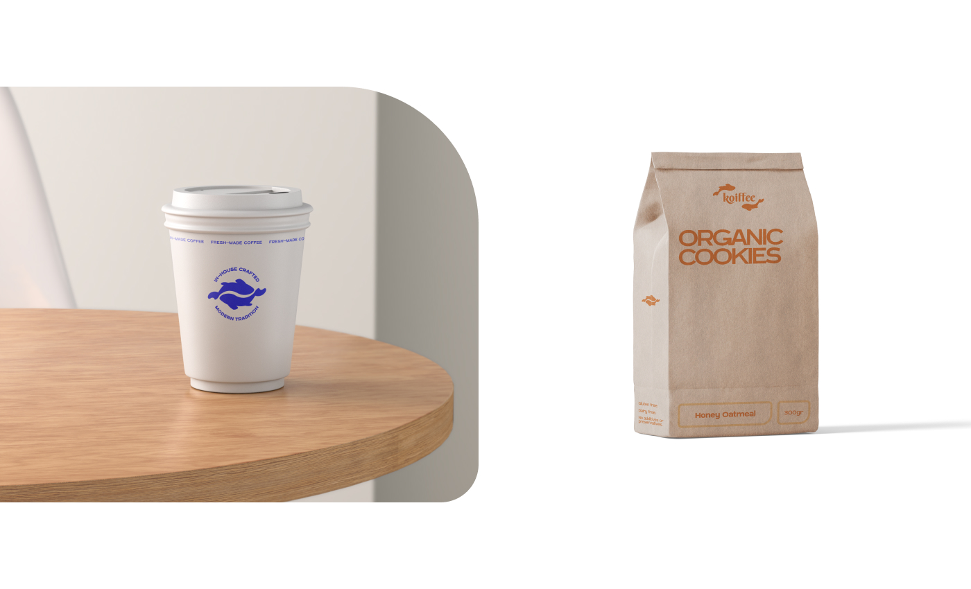
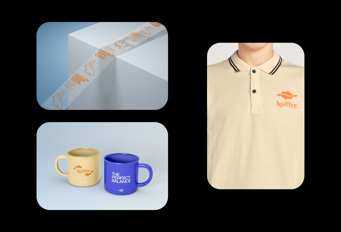
With this in mind, I designed an isotype where two perfectly aligned Koi fish create, in their duality, a coffee bean. When combining a sophisticated script font and a modern sans-serif, the logo becomes the perfect visual expression of what Koiffee Kissaten stands for.
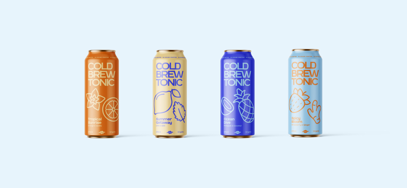
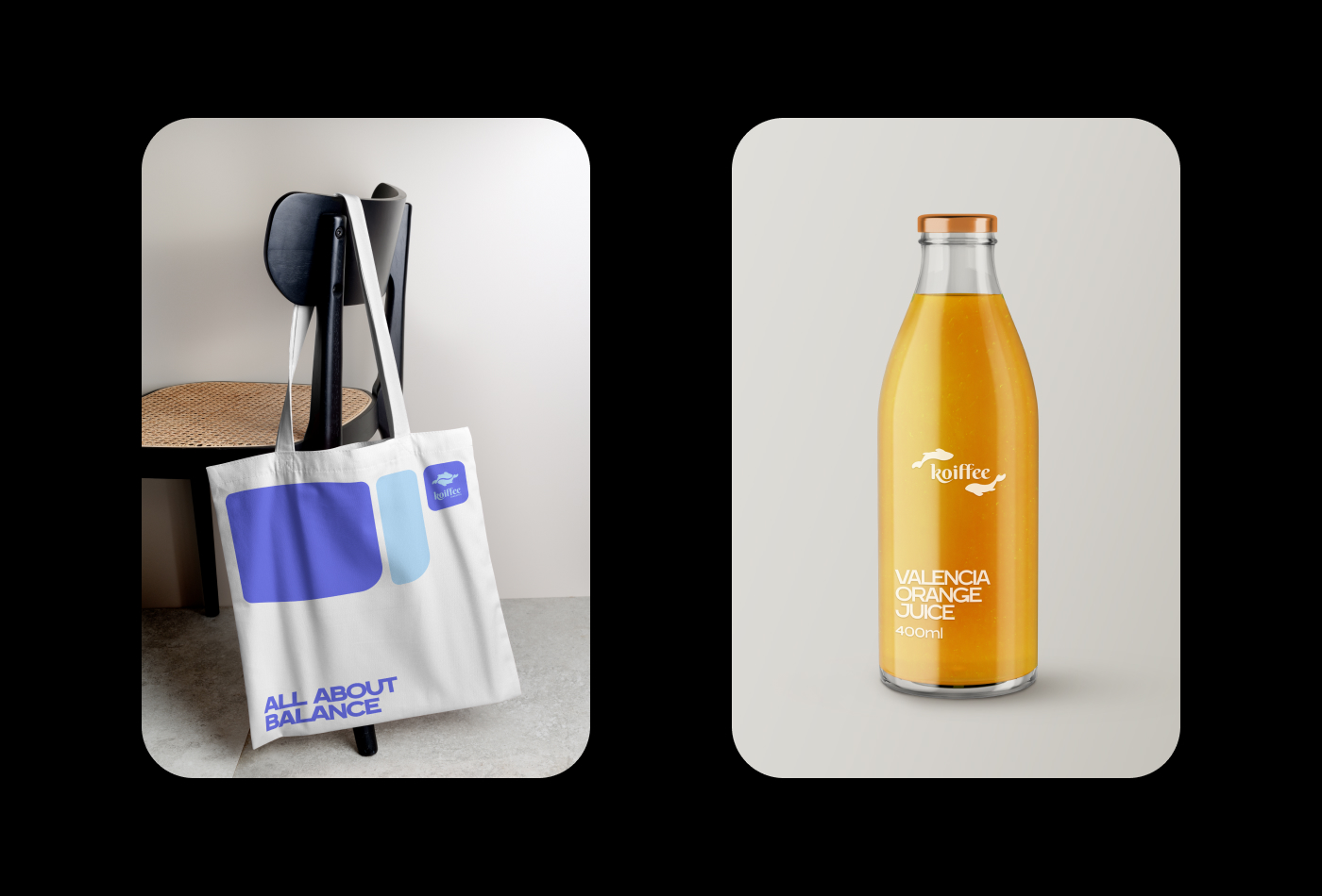
Brand colour usage is limited to a highly versatile palette of bright complementary colours, occasionally supported by pure black & white. This colour choice helps communicate Koiffee’s enthusiastic and vivid nature.
The brand has four logo variations that help the identity to be consistent and adaptable to every format and upcoming need.
CREDIT
- Agency/Creative: Nai Elipe Sakalis
- Article Title: Koiffee Kissaten Brand Identity
- Organisation/Entity: Freelance
- Project Type: Identity
- Project Status: Published
- Agency/Creative Country: Argentina
- Agency/Creative City: Buenos Aires
- Market Region: Global
- Project Deliverables: Brand Creation, Brand Design, Brand Identity, Brand Naming, Branding, Design, Graphic Design, Icon Design, Identity System, Label Design, Logo Design, Packaging Design, Poster Design, Product Design
- Industry: Food/Beverage
- Keywords: coffee, kissaten, japanese, coffee shop, cafe, modern
-
Credits:
Designer: Nai Elipe Sakalis


