Brief and Market
‘Long Drink’, a mixture of Gin and Grapefruit juice, was created in 1952 for the Helsinki Summer Olympics and has been the pride of Finland ever since. Dominated for decades by the leading brand, the category had started to decline as it had become increasingly irrelevant to new generations of adult consumers.
Sinebrychoff, Finland’s leading manufacturer of beers, ciders and soft drinks, felt that it could disrupt and develop the category by launching a new Long Drink under its KOFF beer brand; as research showed that there is significant cross consumption between Long Drink and beer, with more than 78% of beer drinkers also consuming Long Drink.
For Sinebrychoff, this was an all-in bet for a path to growth in Long Drinks. The desire was to become the second best-selling Long Drink in the market*, delivering significant, profitable volume in a category that was dominated by a strong competitor. Part of this long-term growth strategy also involved the desire to rationalise its Long Drink portfolio to focus on one clear strong brand rather than several smaller brands.
Approach
Our brief was to create a new KOFF Long Drink brand positioning, identity and packaging that would disrupt the category and shake shoppers out of their autopilot buying behaviour. In order to feel like KOFF, we needed to ensure we stayed within its key design pillars of bold, contemporary and timeless. And to appeal to a new generation of consumers we created the ‘Out of the Blue’ positioning where the Long Drink comes of age through a more modern and playful take on the category:
Brand expression
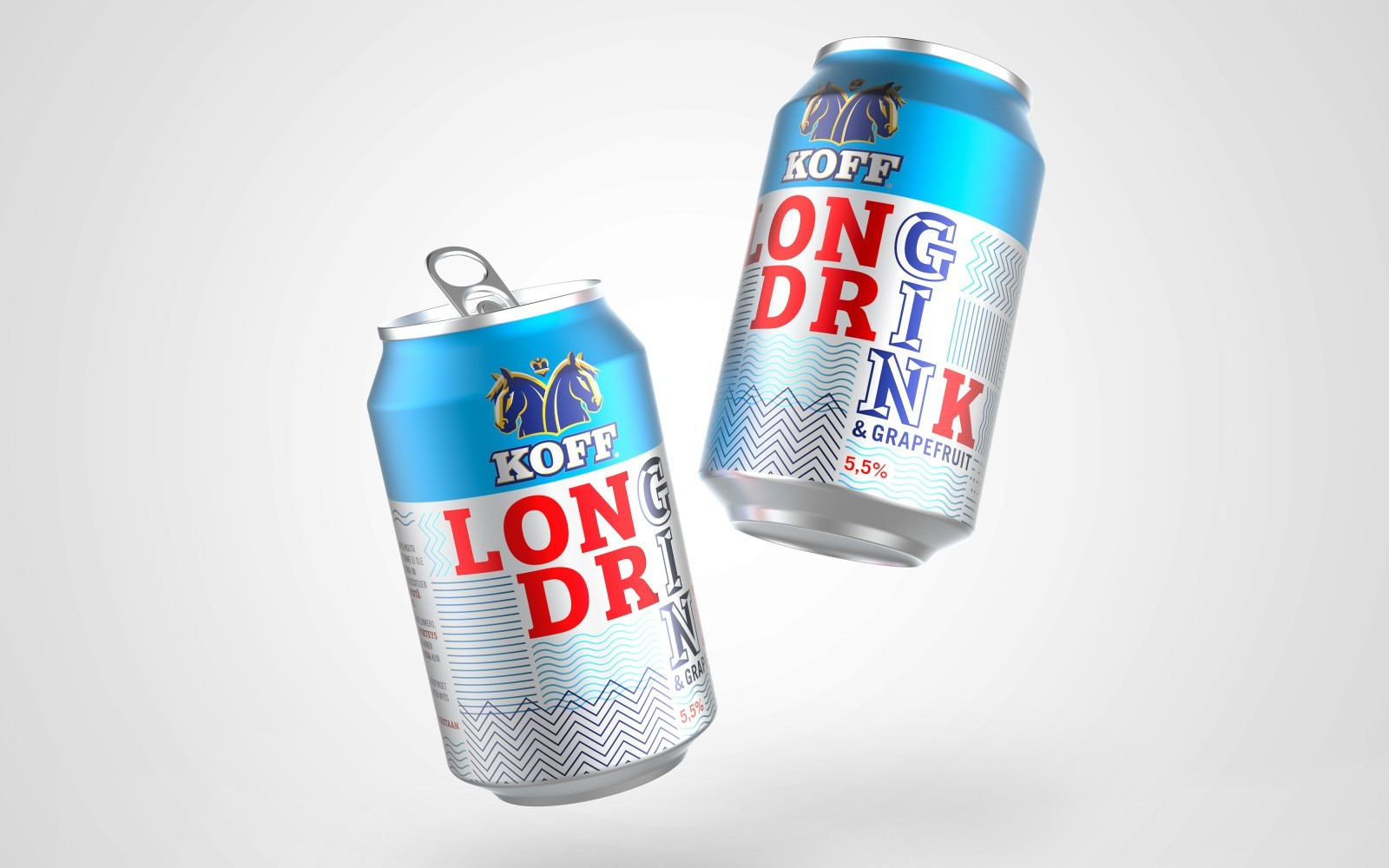
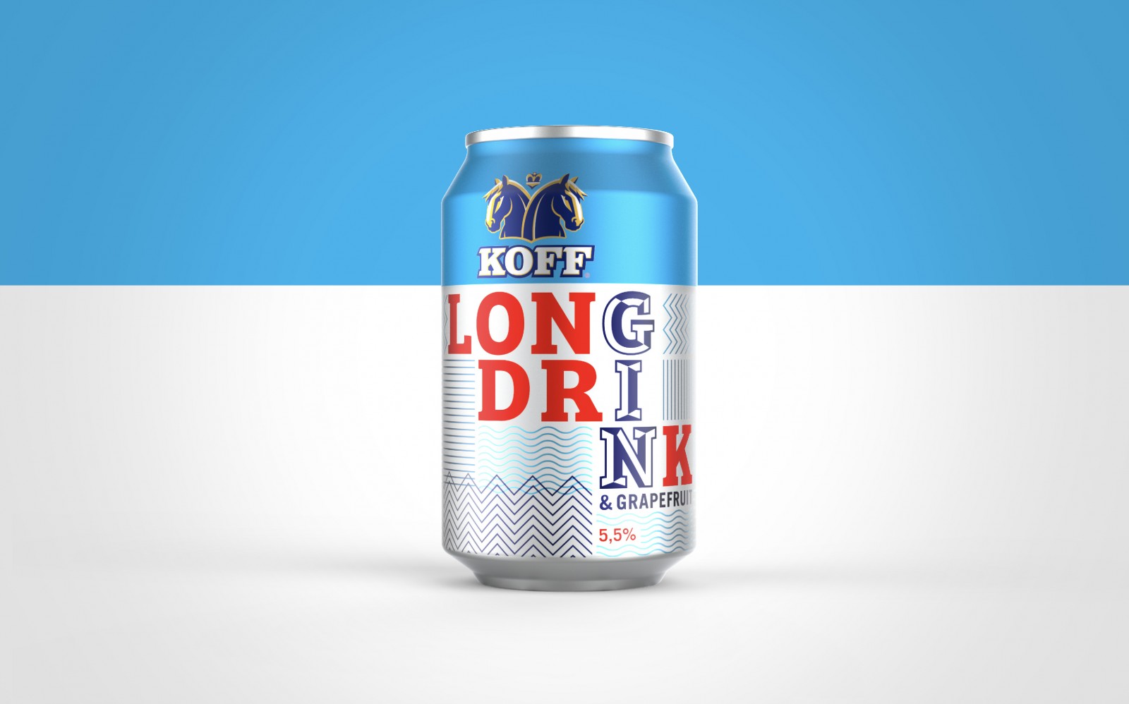
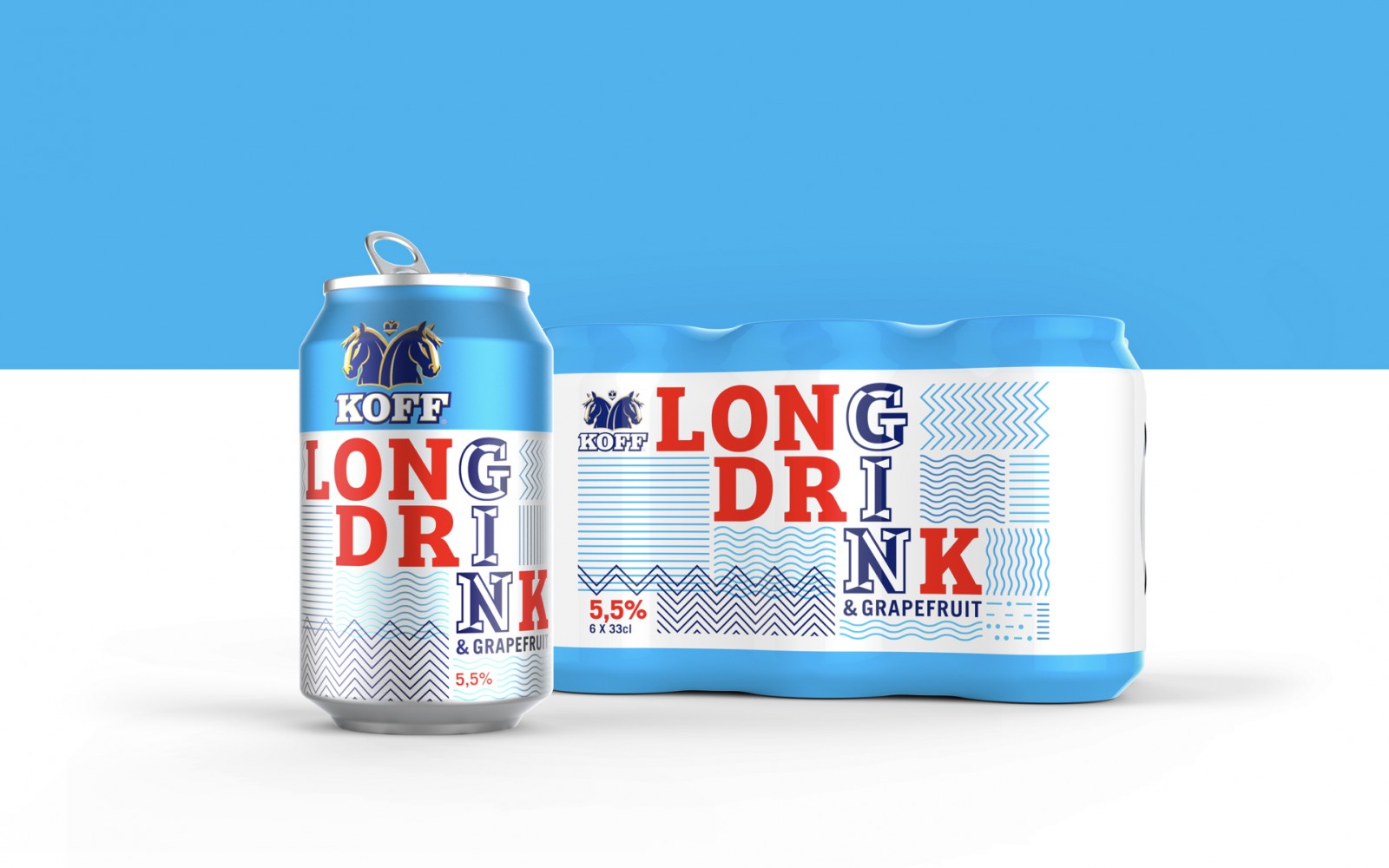
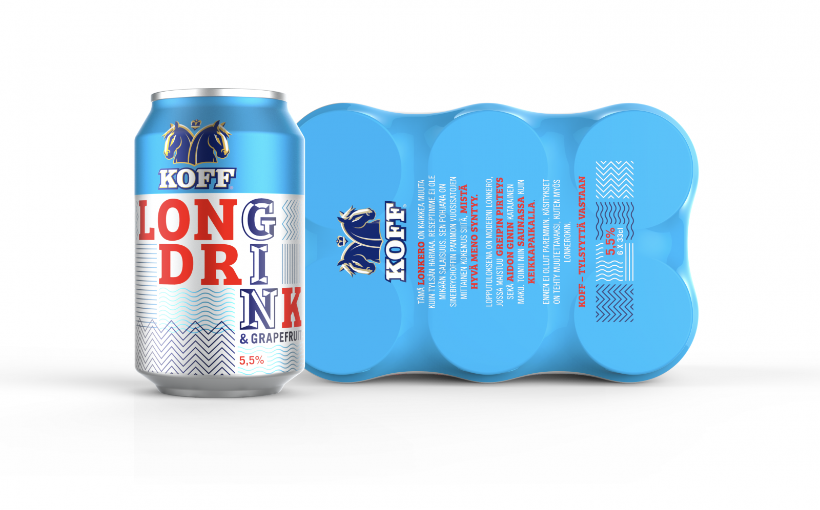
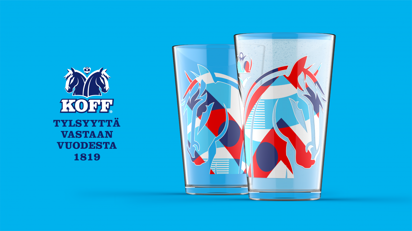
To disrupt the category and to create something ownable we needed to respect the category cues without infringing on the market leader. Unique to Finland, the category cues are strong – particularly around flavour, with the core grapefruit variant indicated by blue (cyan) and white. So, from out of a strong and contemporary blue background, the KOFF masterbrand acts as an endorser and signifies quality and credibility.
The core Long Drink wordmark clearly indicates KOFF’s presence in the category while also reinforcing the key ingredient of gin. And the use of red clearly links to KOFF (the Finnish red beer) and adds vibrancy to an otherwise fairly flat category.
The use of striped patterns is a contemporary and timeless take on the category’s mainstay of vertical stripes, adding a playful and disruptive twist.
Impact
A year after introducing KOFF Long Drink to the market, Sinebrychoff billed it as its most profitable alcoholic beverage launch in the last three years. It over-indexed on all of its key objectives for year one, gained almost double the market share it set out to achieve and was named as one of the key drivers of halting the 6-yr category decline.
With the investment in KOFF Long Drink already recouped, KOFF Long Drink is in a fantastic position to grow market share and is on track to achieve its objective of becoming the #2 Long Drink brand.
CREDIT
- Agency/Creative: Bluemarlin
- Article Title: KOFF Long Drink Brand Identity and Packaging Design by Bluemarlin
- Organisation/Entity: Published Work, Packaging Design Creation
- Project Type: Packaging
- Project Status: Published
- Format: Can
- Keywords: WBDS Agency Design Awards 2020/21


