


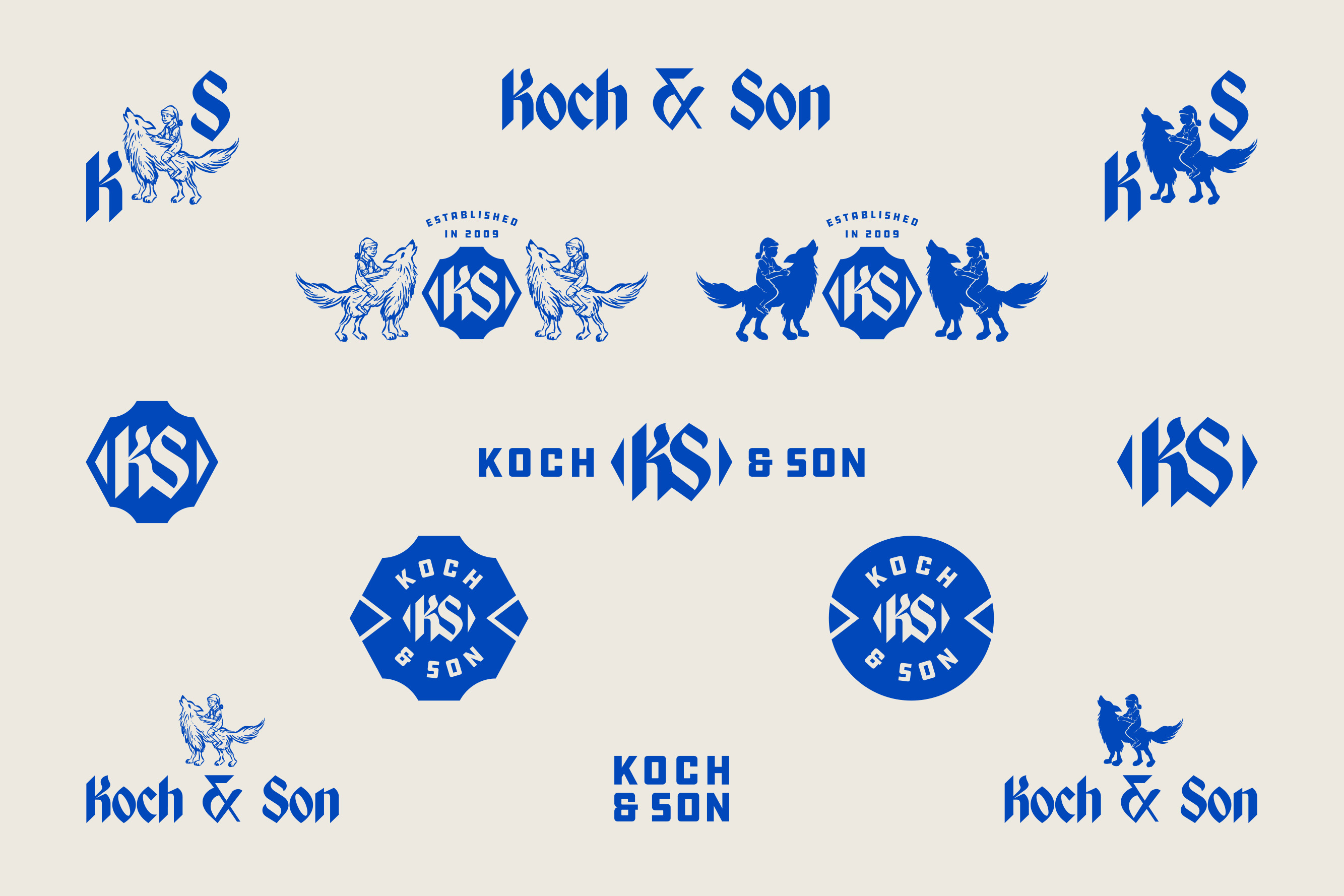
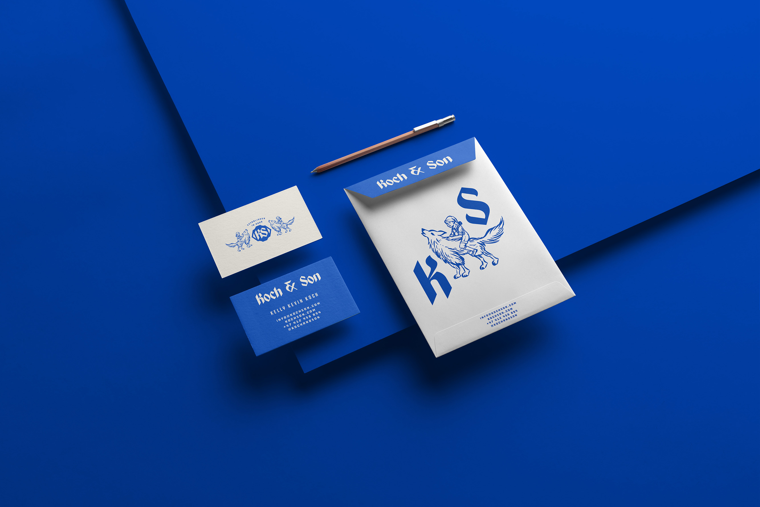
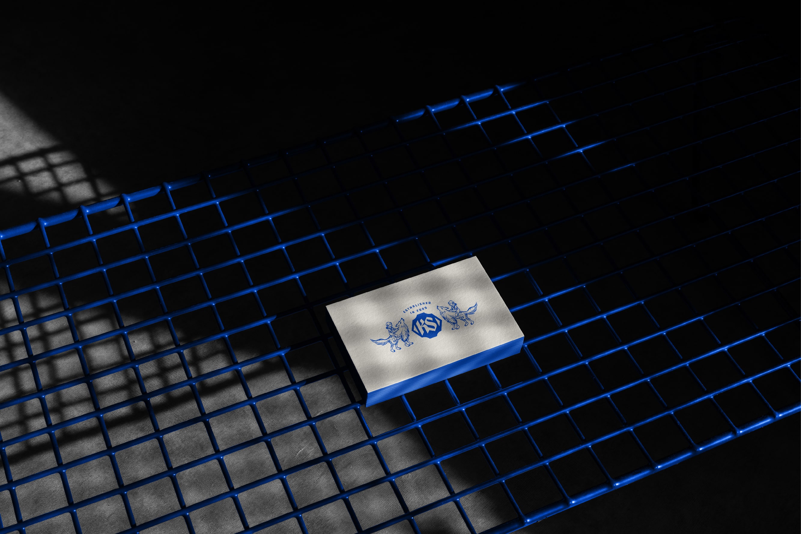
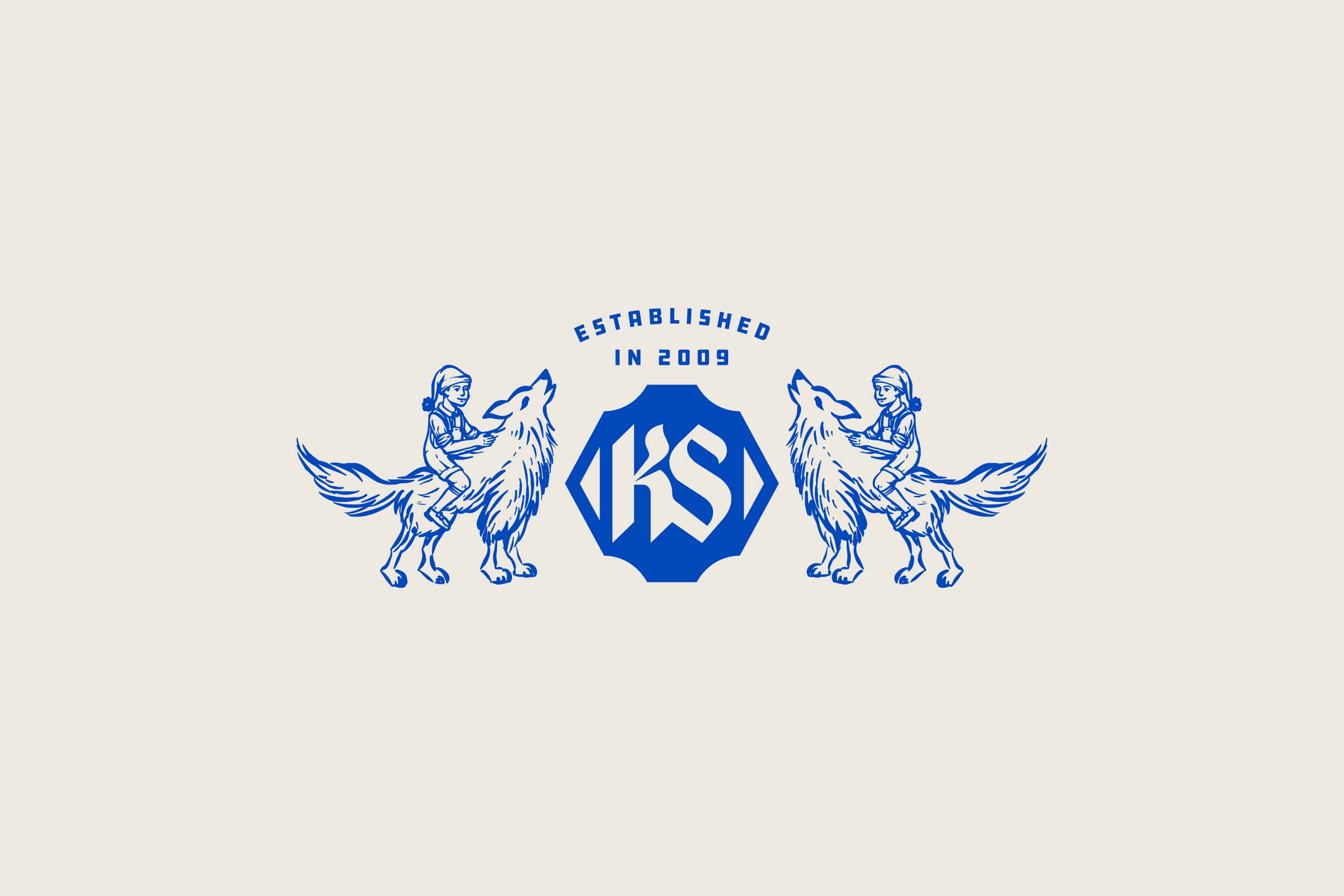
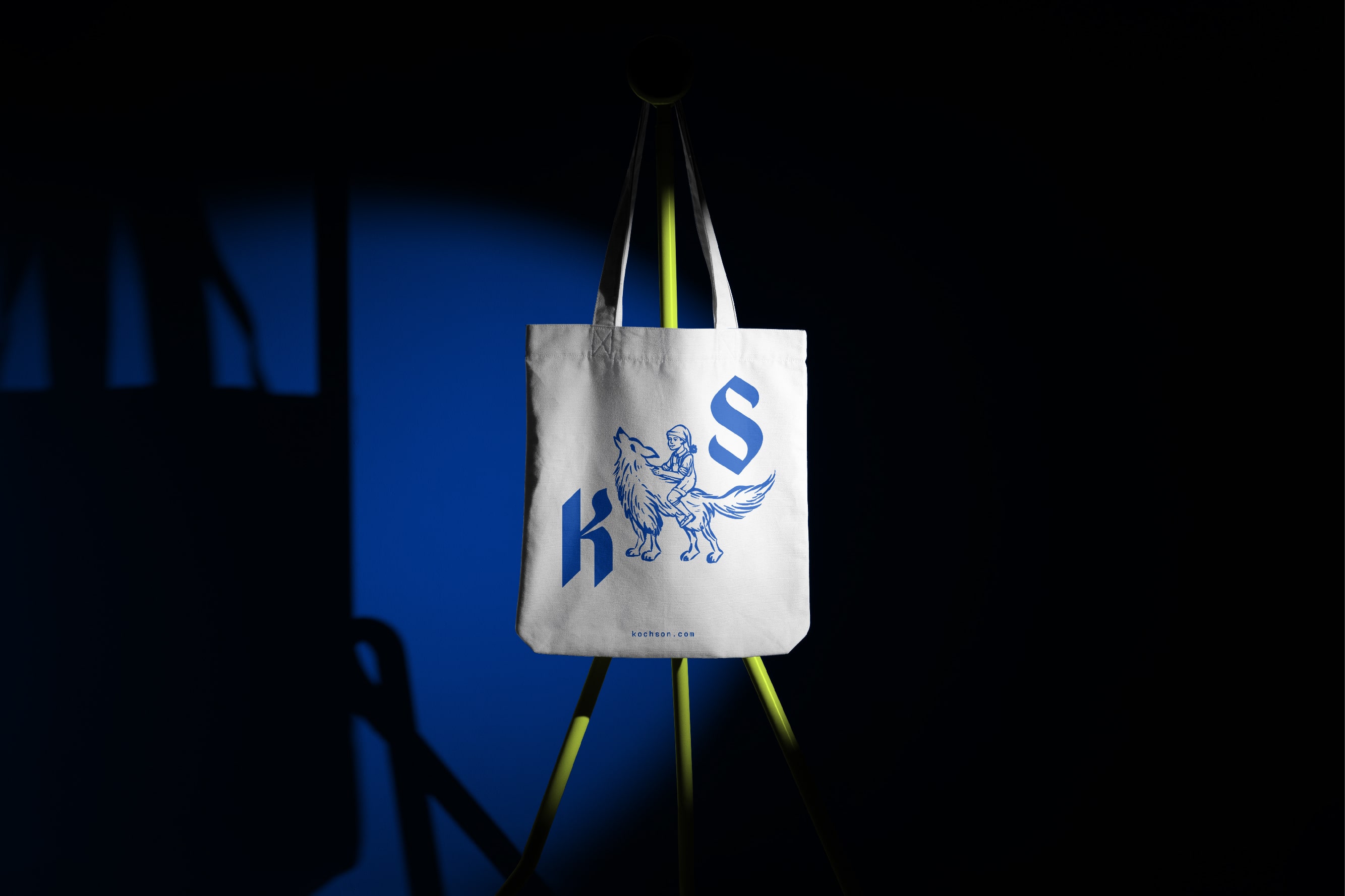
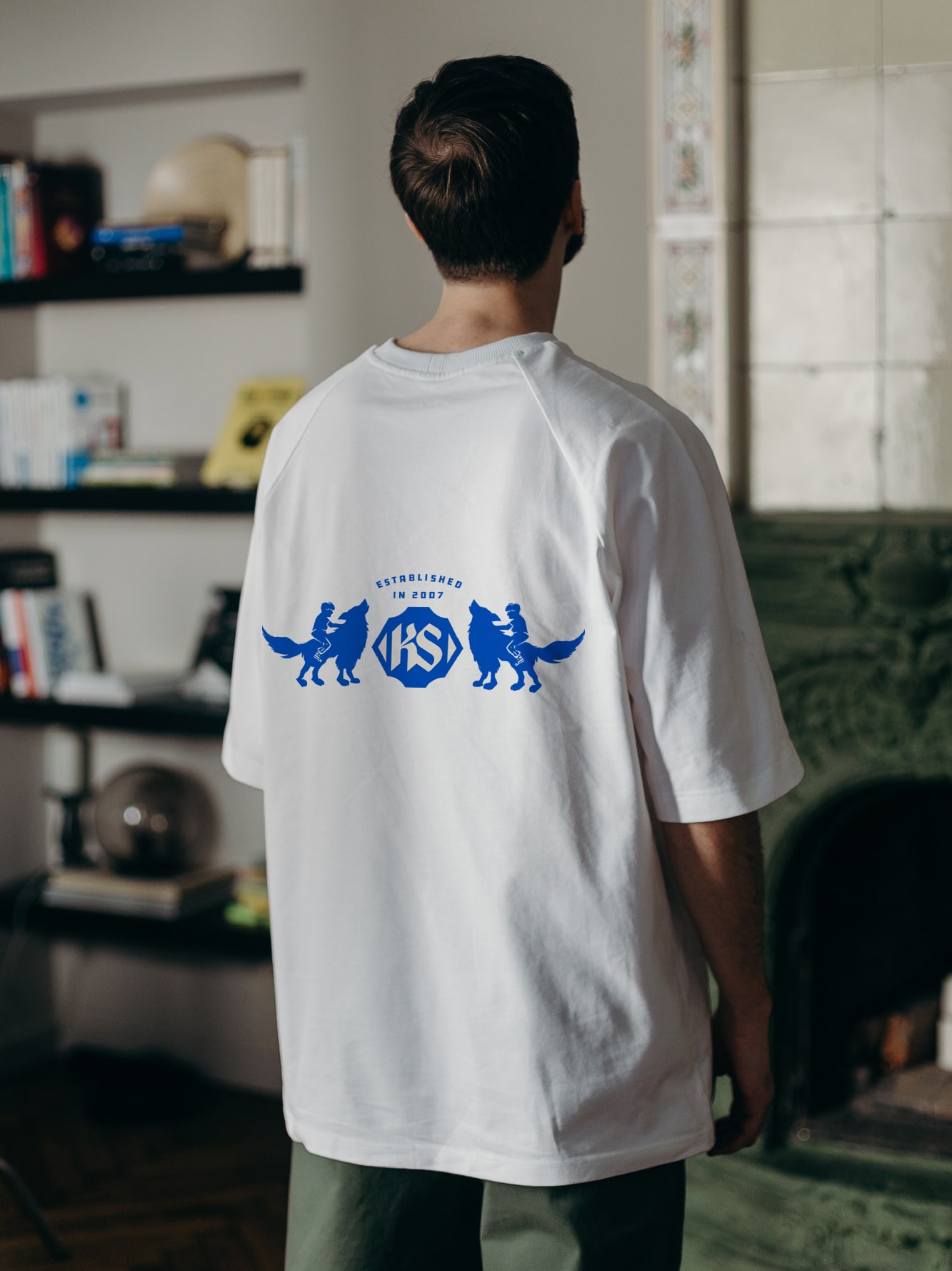
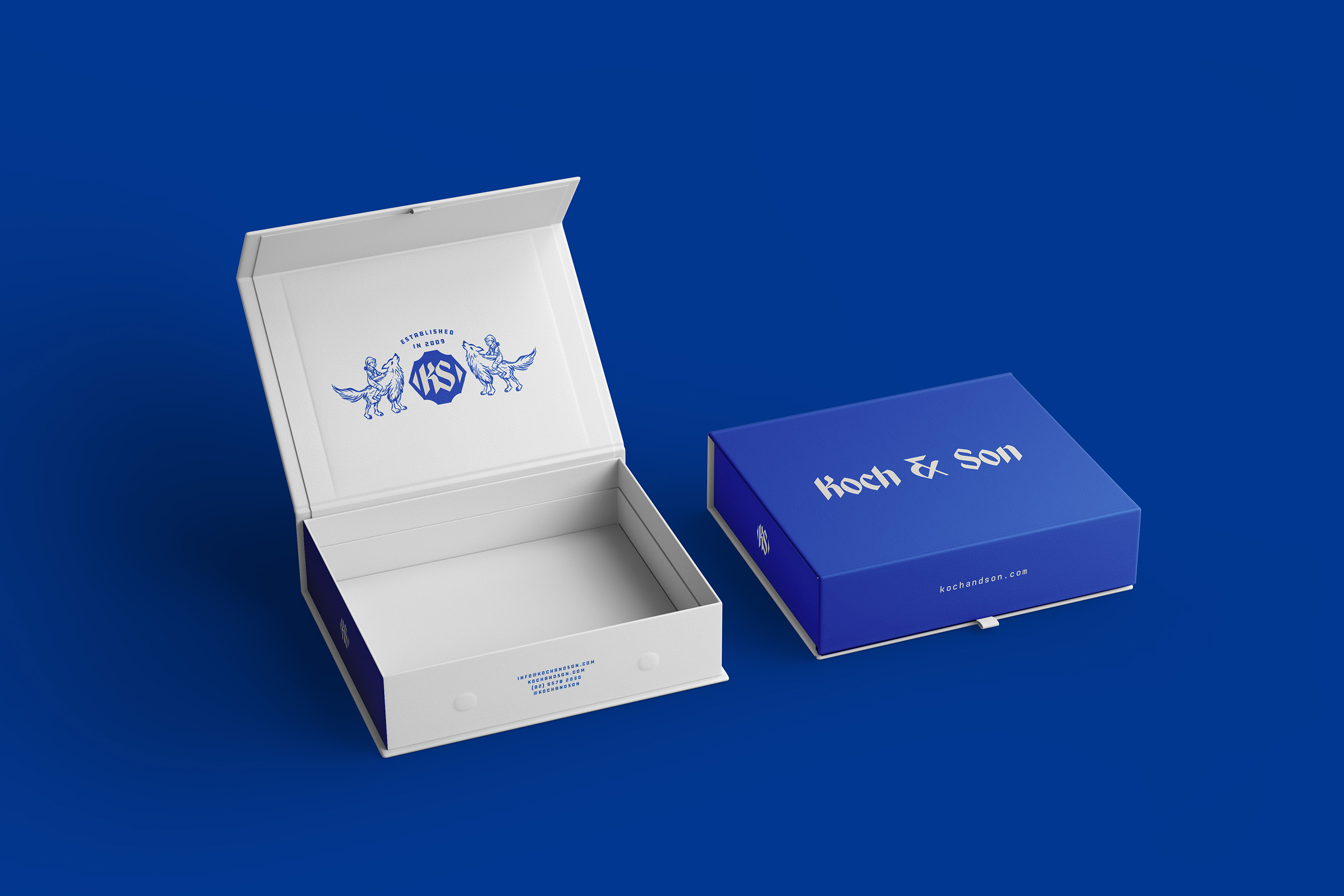
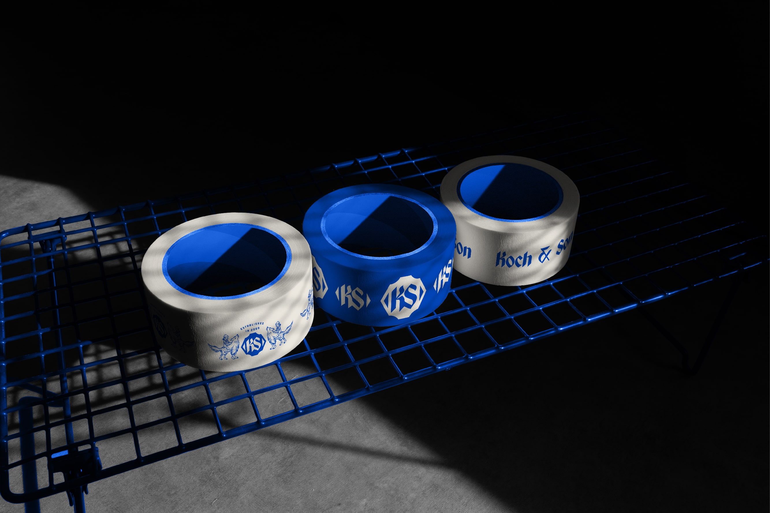
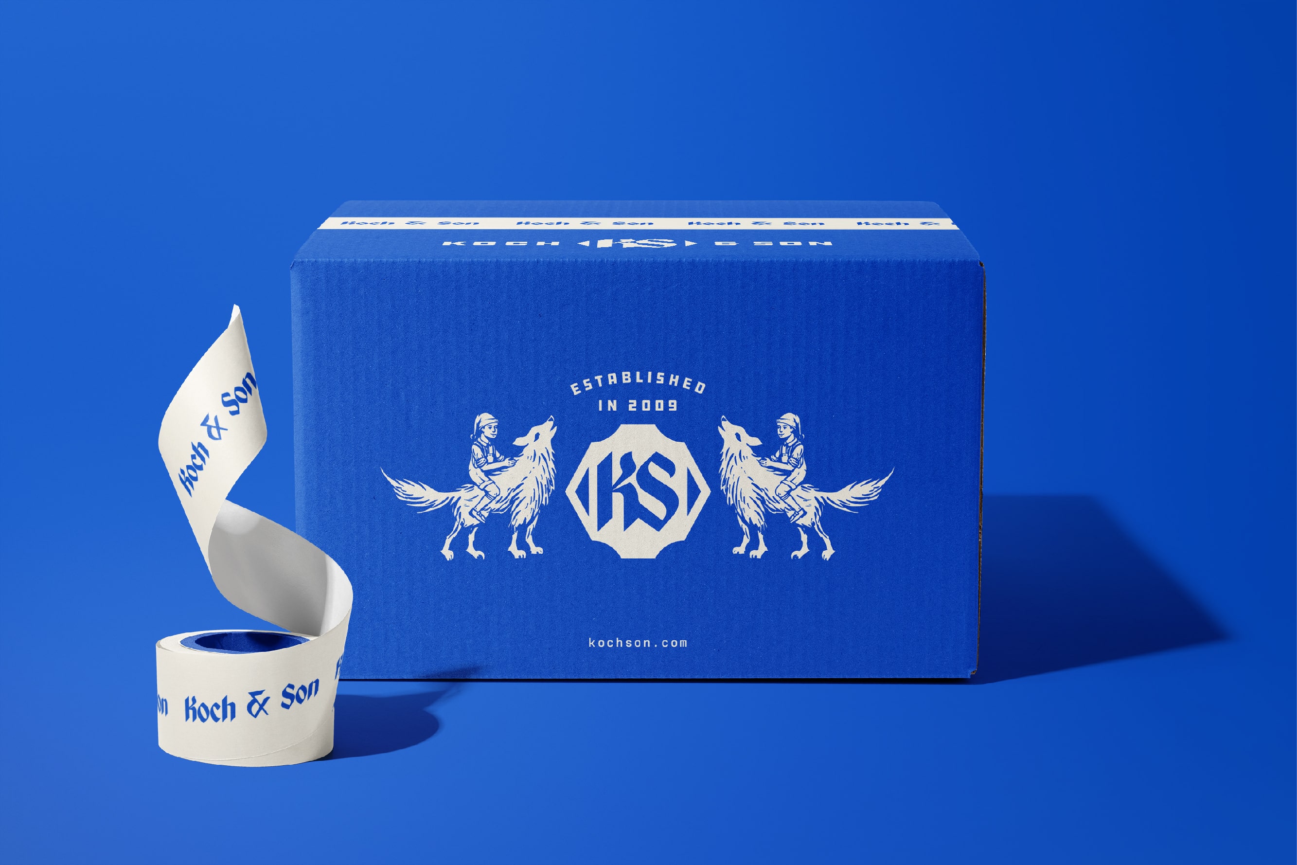
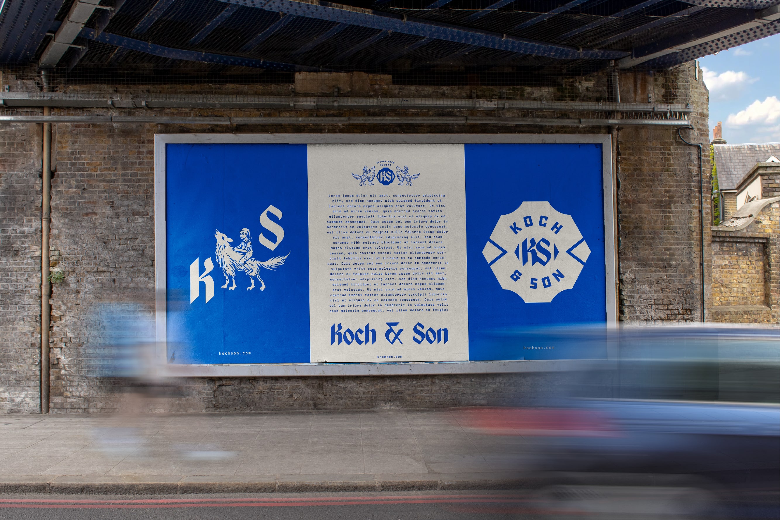
Koch & Son’s brand identity draws inspiration from the founder’s son, resulting in a unique name and logo. The logo features an illustration of a toddler riding a wolf with a stocking hat and dungarees, infused with a touch of magic. This imagery represents adventure, strength, and a sense of wonder on this personal branding.
To further enhance the brand’s identity, a KS monogram is incorporated within a distinctive badge shape, used with the toddler illustration, we’ve created a logo mark that is close to a coat of arms. To complement the logo, captivating blackletter typography is used. Blackletter, also known as Gothic script, is a classic and ornate style of typography that adds a sense of timelessness and sophistication.
In terms of color, a royal blue is chosen to make the logo truly stand out. Royal blue is associated with royalty, trust, and authority. It conveys a sense of prestige and exclusivity. The blue color contrasts beautifully against a cream background, creating a visually striking combination that grabs attention.
CREDIT
- Agency/Creative: Ceren Burcu Turkan
- Article Title: Koch & Son’s Brand Identity
- Organisation/Entity: Freelance
- Project Type: Identity
- Project Status: Published
- Agency/Creative Country: Turkey
- Agency/Creative City: istanbul
- Market Region: Europe, North America
- Project Deliverables: Brand Creation, Brand Design, Identity System, Illustration, Logo Design
- Industry: Entertainment
- Keywords: WBDS Creative Design Awards 2023/24
- Keywords: personal branding, wolf, illustration, crest, coat of arms
-
Credits:
Creative Director & Designer: Ceren Burcu Turkan


