


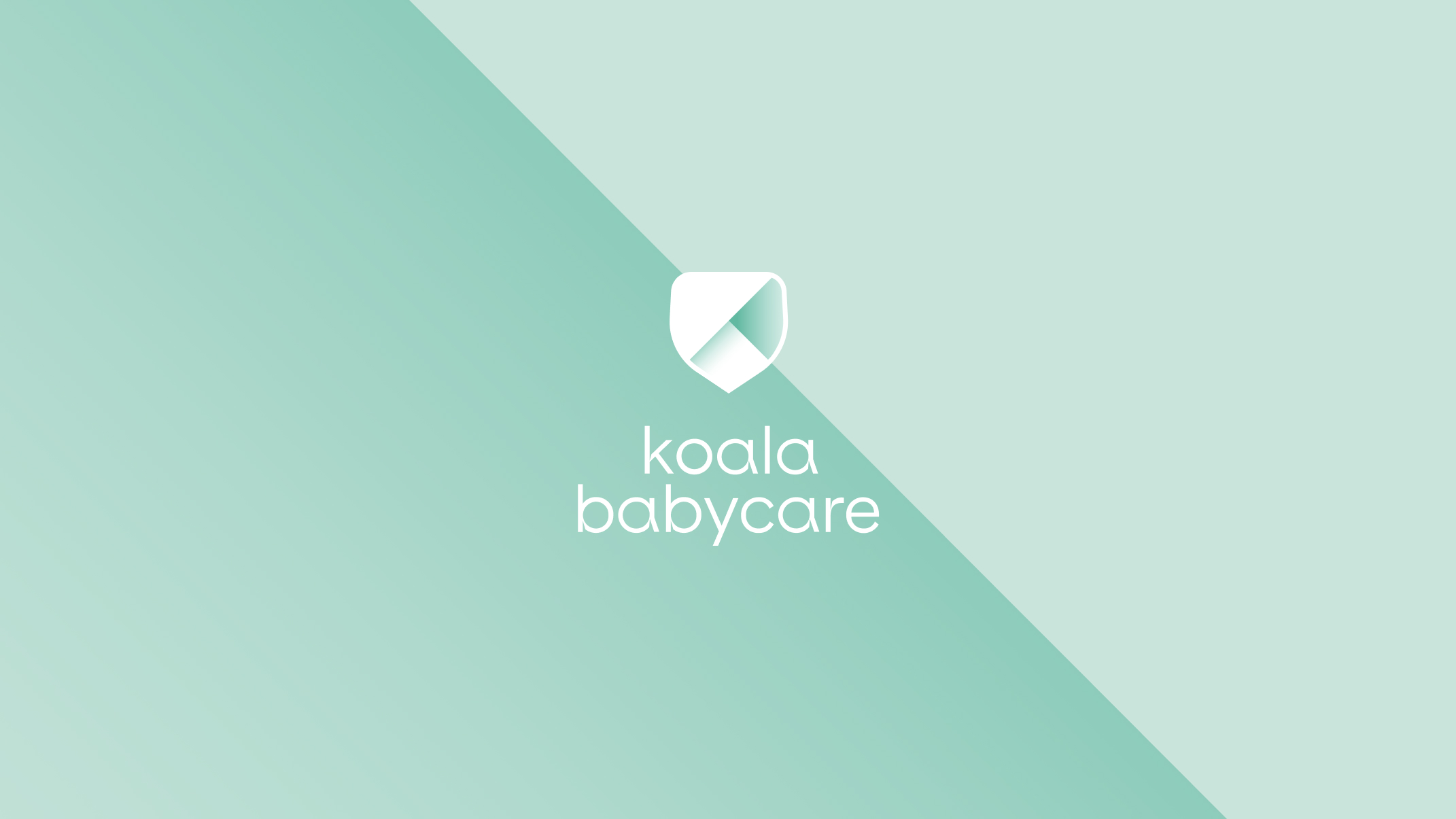
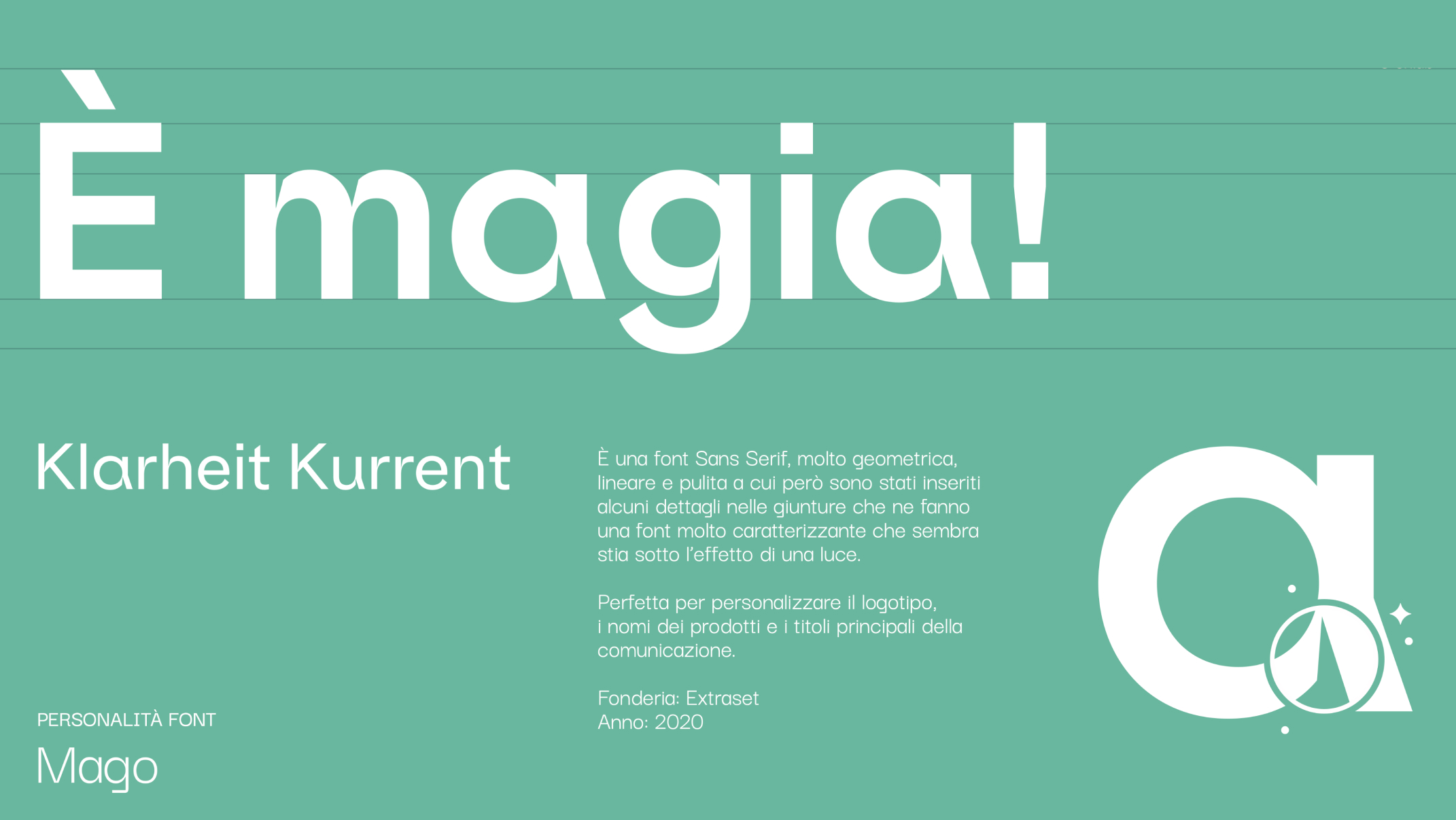
Koala Babycare supports new mothers and welcomes newborns with care and attention. The brand, represented by the stylized graphic of the letter “K,” is a symbol of protection and affection: two bands wrapped in an embrace, enclosed in a shield that evokes safety and trust. The glow that shines in the logo and throughout the entire identity system underscores the magic inherent in their mission, emanating from the evocative power of the “K.” Comparable to the symbol of a hero, the brand employs the graphic styles of superheroes, with rounded shapes reminiscent of the sinuosity of a heart, conveying a message of strength, protection, and love.
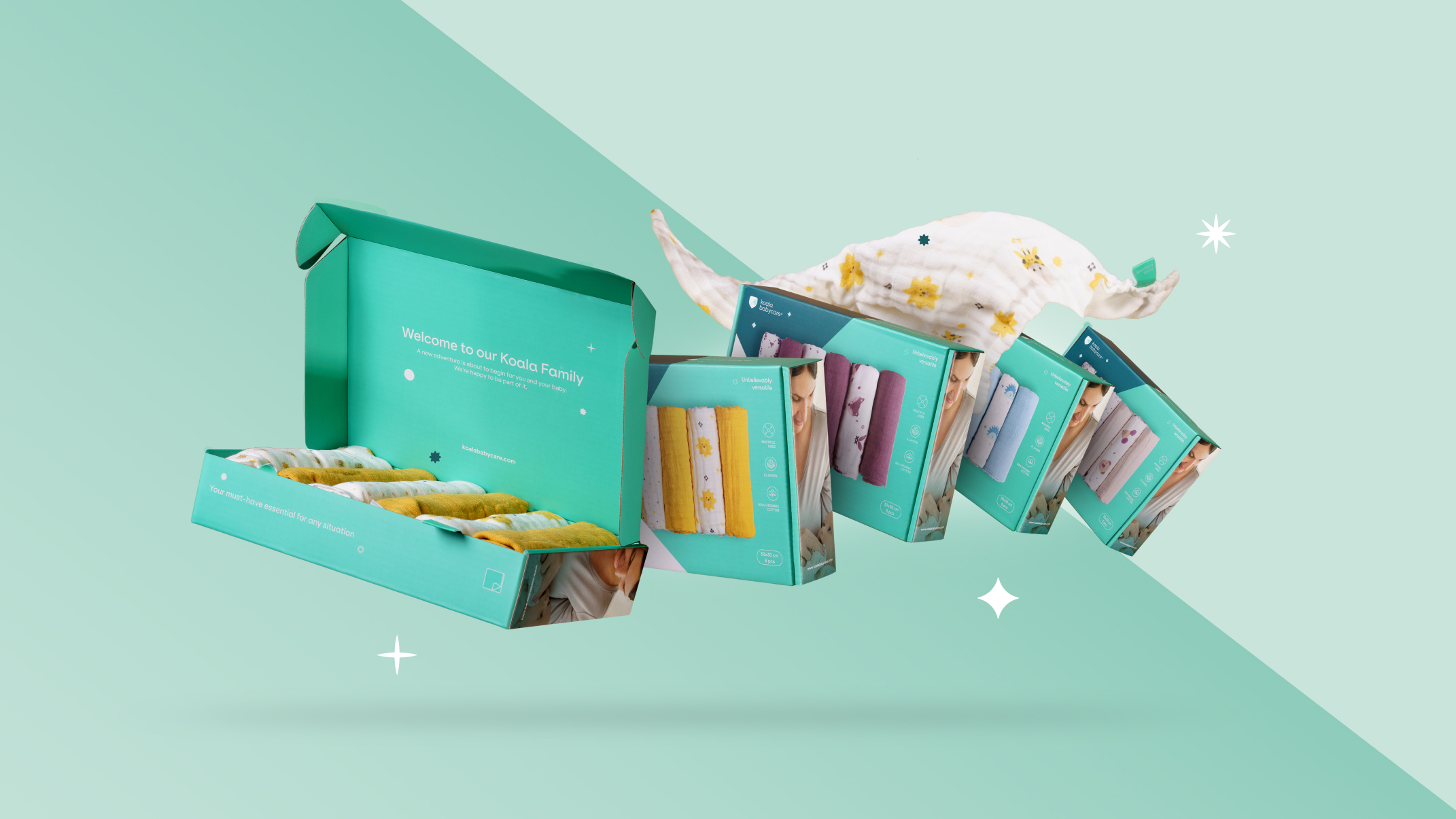
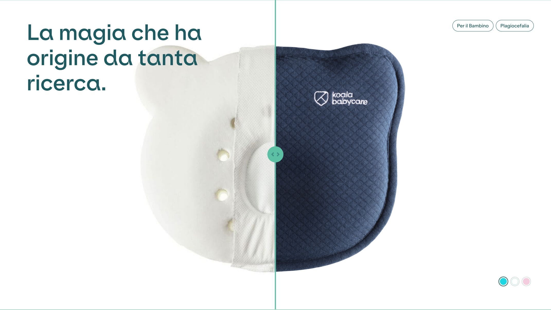
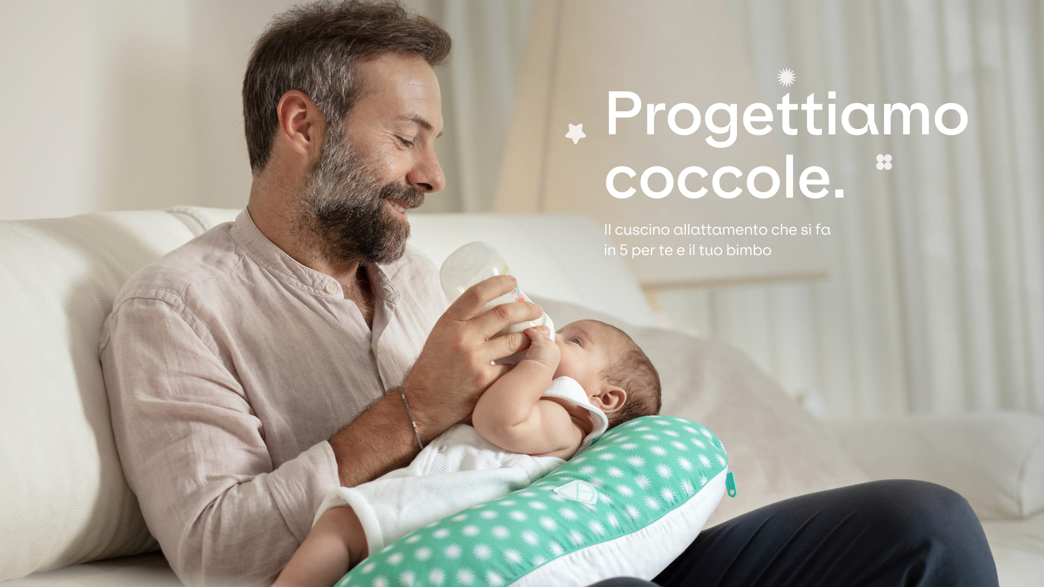
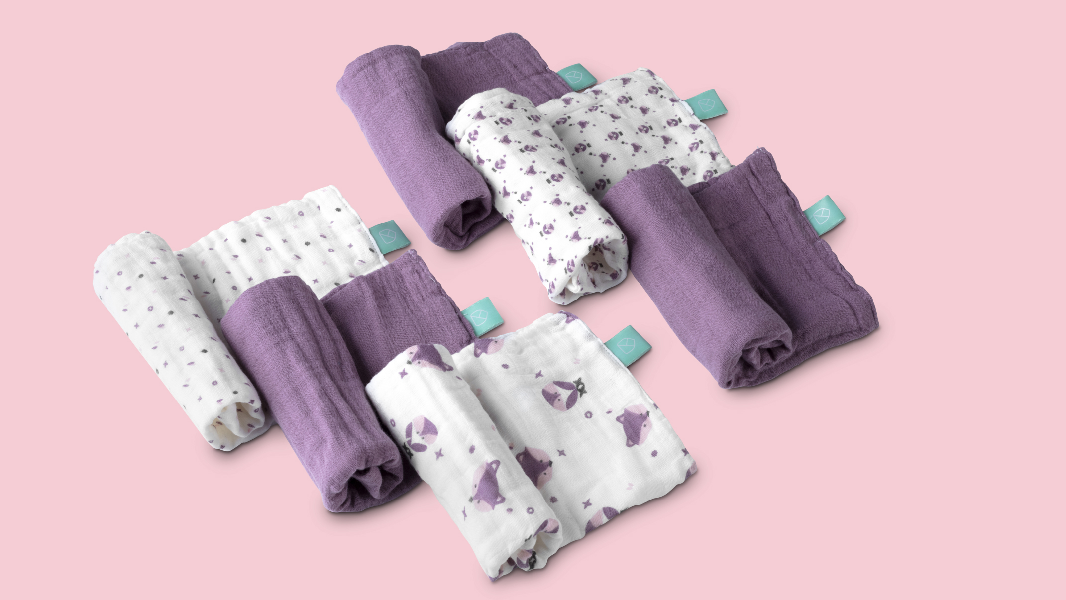
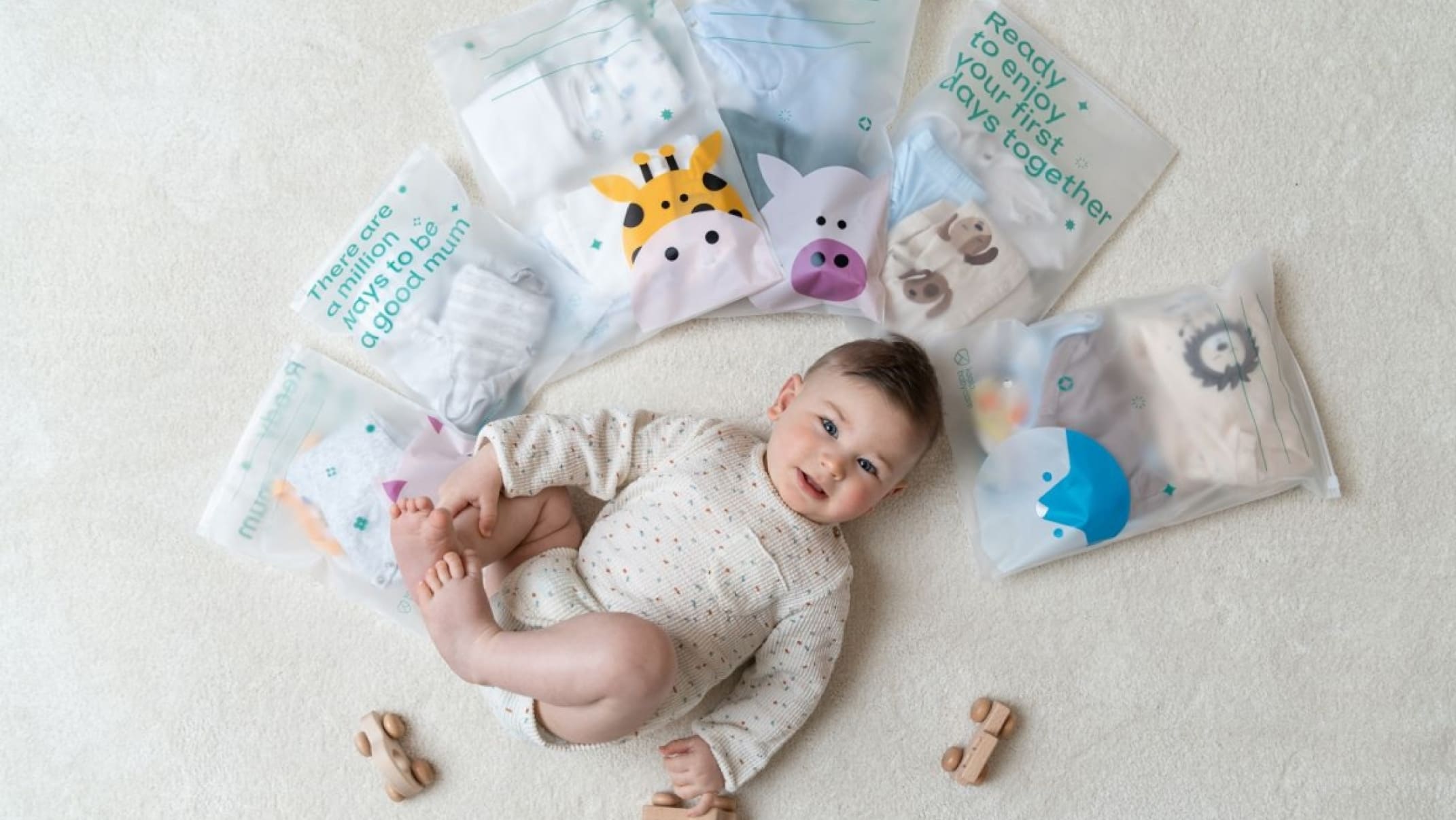
Koala Babycare, under the aegis of Byonlab, goes beyond merely offering products; it extends a comforting embrace to new mothers during one of the most critical phases of their lives. The brand’s philosophy is rooted in the belief that the early stages of motherhood are as challenging as they are beautiful, and every mother deserves both support and recognition for her unwavering dedication. Byonlab’s commitment is reflected in every aspect of Koala Babycare’s product range, meticulously designed to provide practical solutions while nurturing the emotional well-being of both mother and child.
The iconic “K” logo is more than just a visual identifier; it serves as a beacon of hope and reassurance for parents. The shield encapsulates the idea of a protective barrier, safeguarding the precious bond between mother and child. This symbolism is intentionally chosen to represent the core values of Koala Babycare—safety, trust, and affection. The luminous glow that accompanies the logo is a metaphor for the enlightening journey of parenthood, filled with moments of joy, discovery, and profound love.
CREDIT
- Agency/Creative: onlab
- Article Title: Koala Babycare Branding by onlab
- Organisation/Entity: Agency
- Project Type: Identity
- Project Status: Published
- Agency/Creative Country: Italy
- Agency/Creative City: Italy
- Market Region: Europe
- Project Deliverables: 2D Design, 3D Design, Advertising, Art Direction, Brand Design, Brand Experience, Branding, Copywriting, Creative Direction, Graphic Design, Packaging Design, Product Design, Product Photography, Rebranding, User Experience, Web Design
- Industry: Beauty/Cosmetics
- Keywords: packaging, branding, brand experience, user experience, product design
-
Credits:
Creative Director: Maurizio Cascio
Art Director: Raffaele Sabella
Visual Designer: Angela Arillo
Visual Designer: Giulia Gerini
Project Manager: Antonio Golino
3D Artist: Alessandro Faiella


