


Klern — skin care brand that highlights the combination of nature and science.
The name comes from the German word “klar”, which means “clean”.
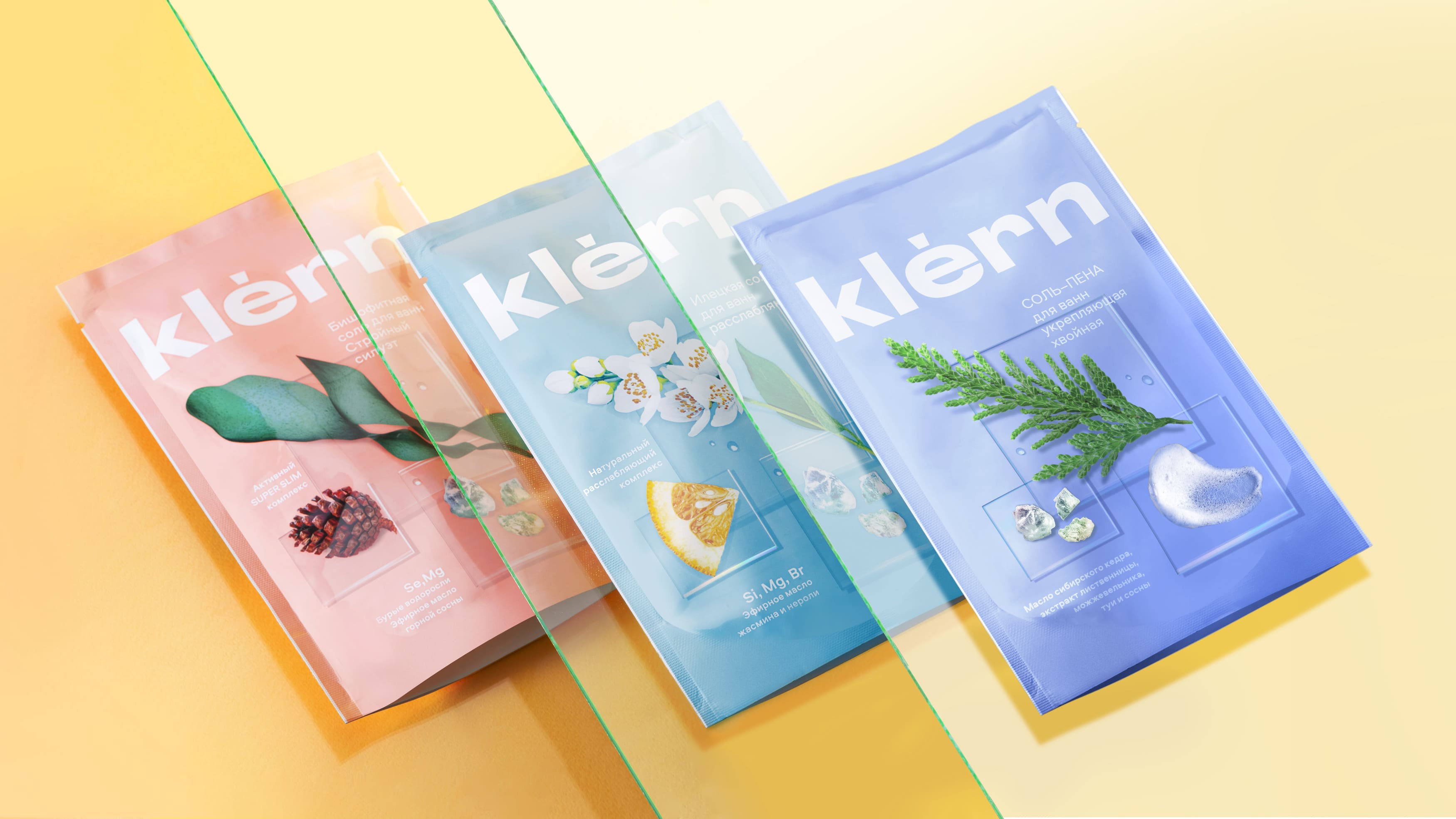
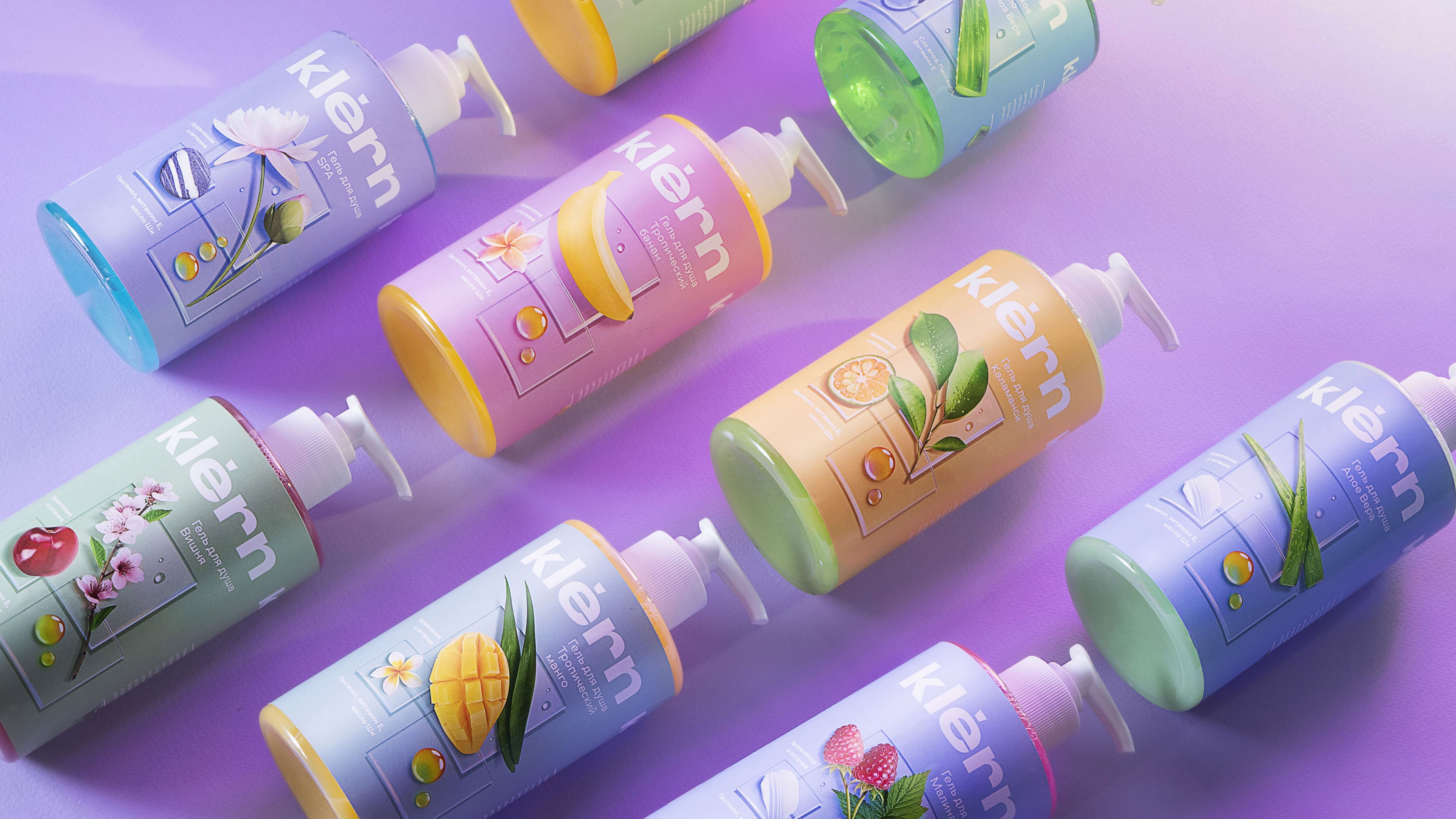
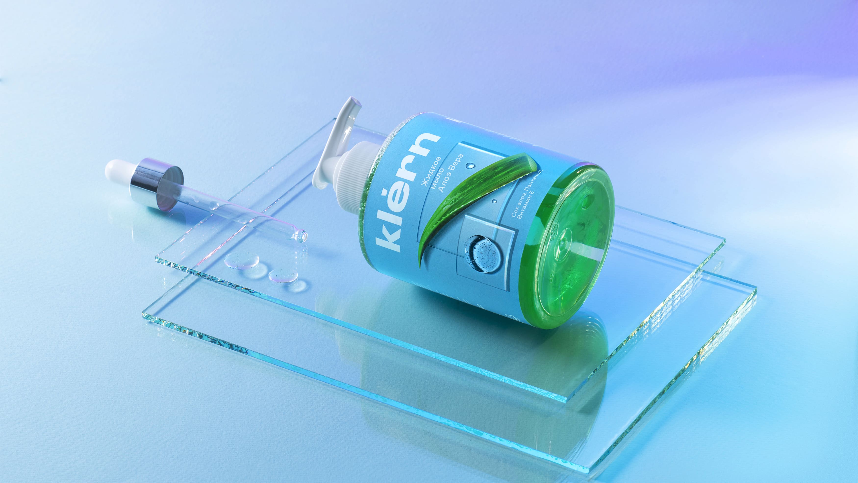
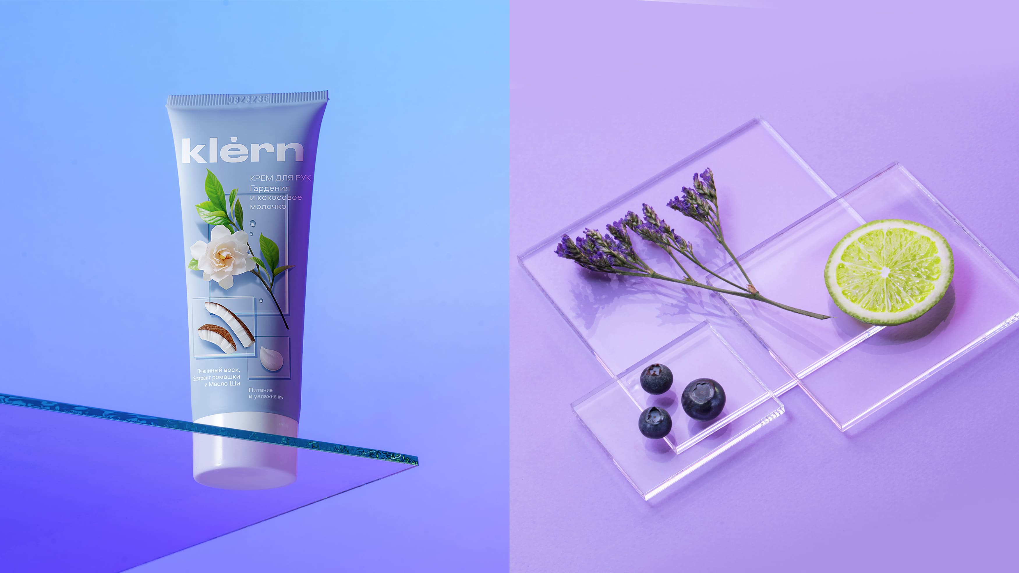
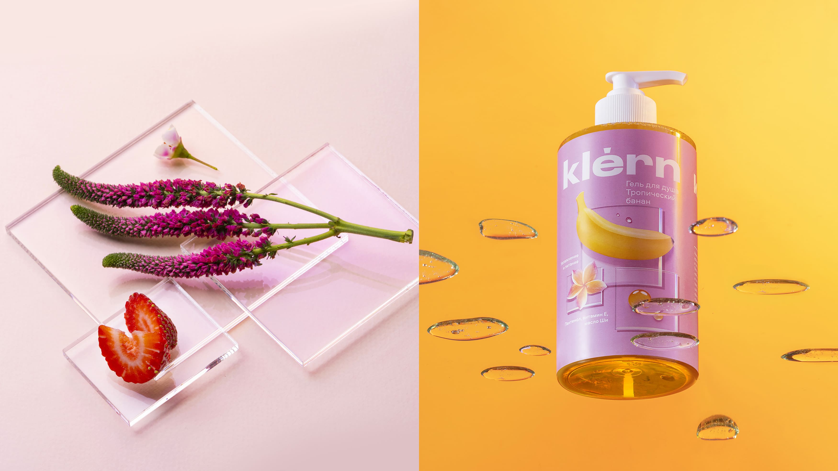
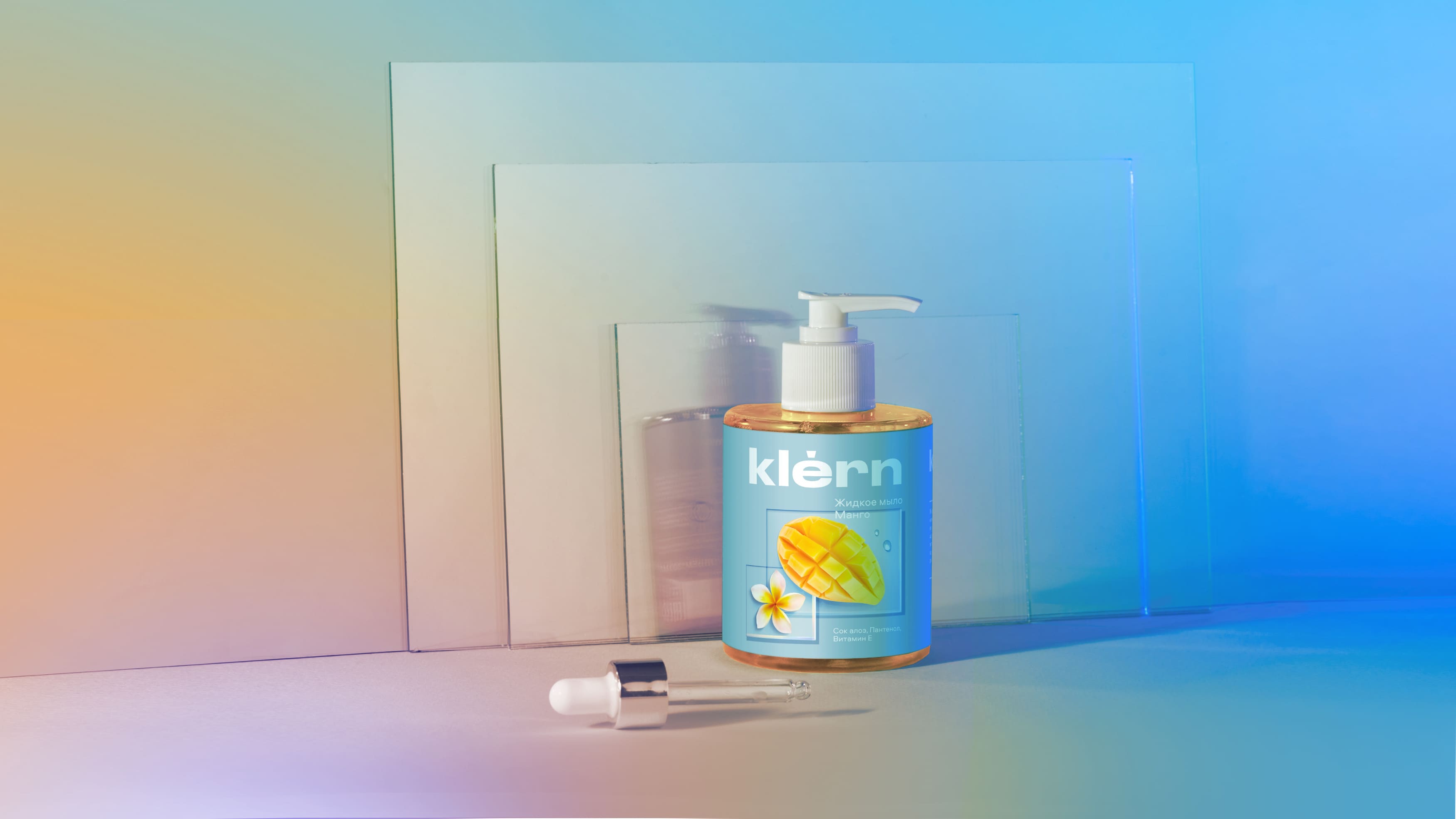
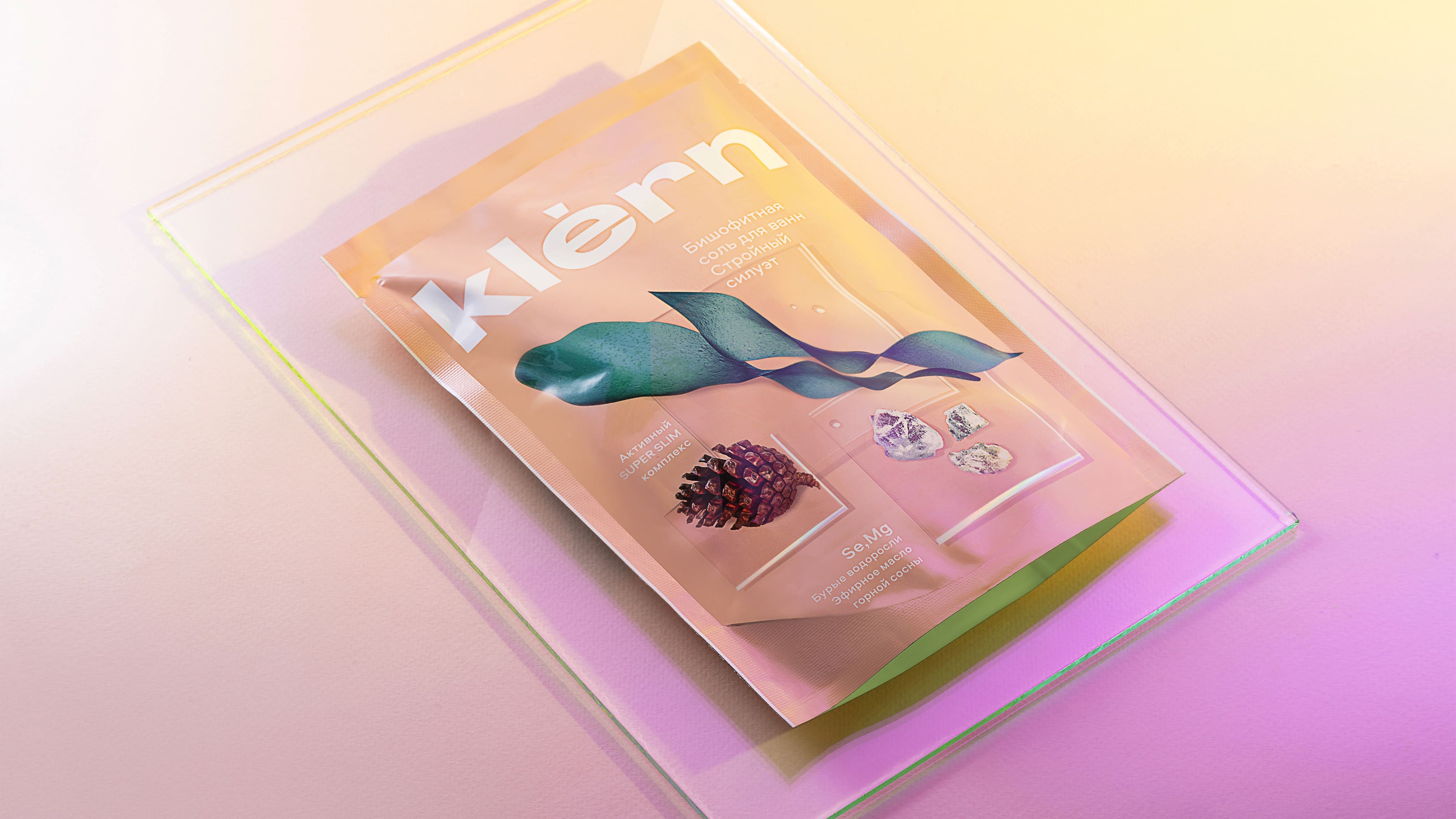
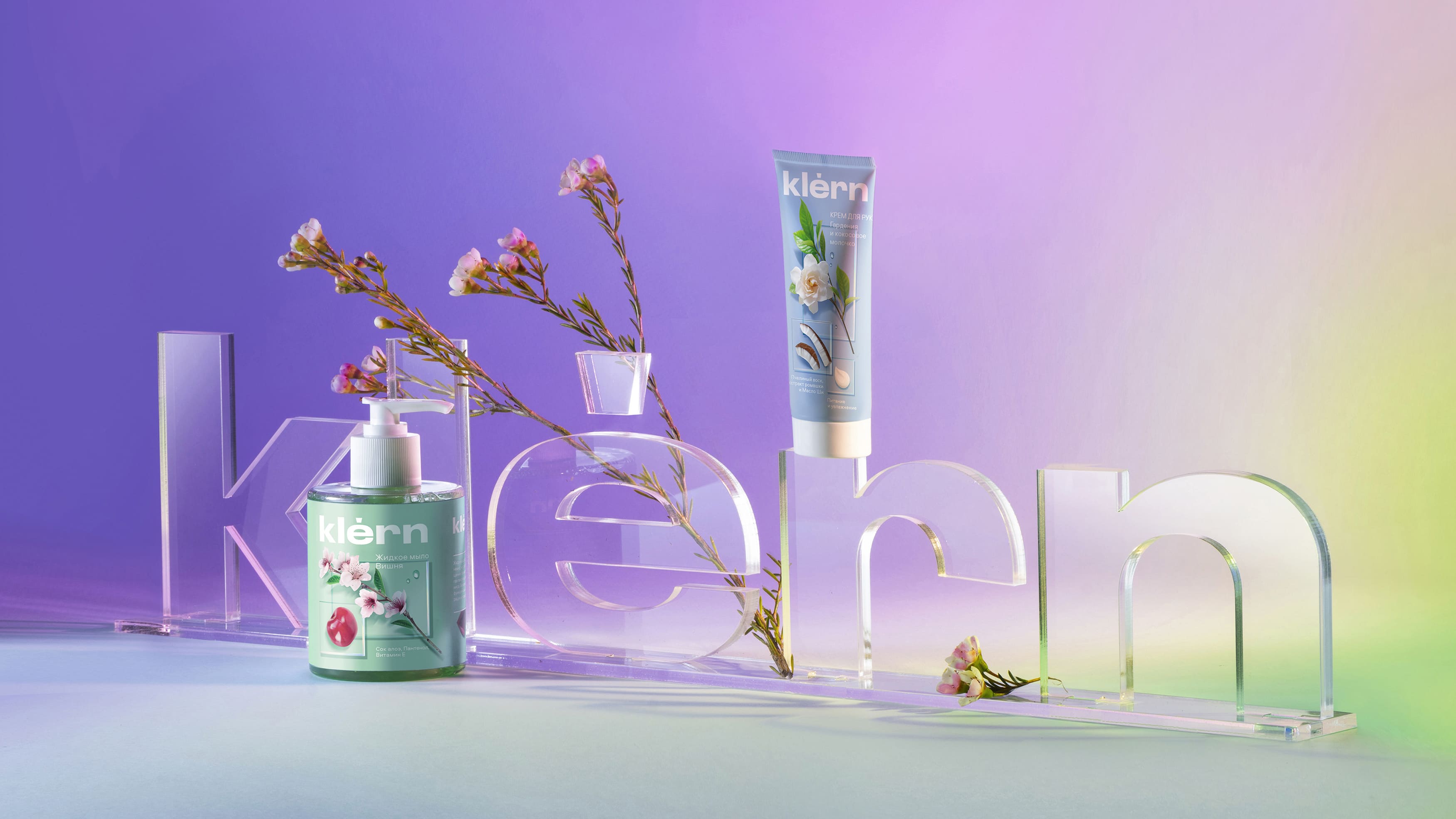
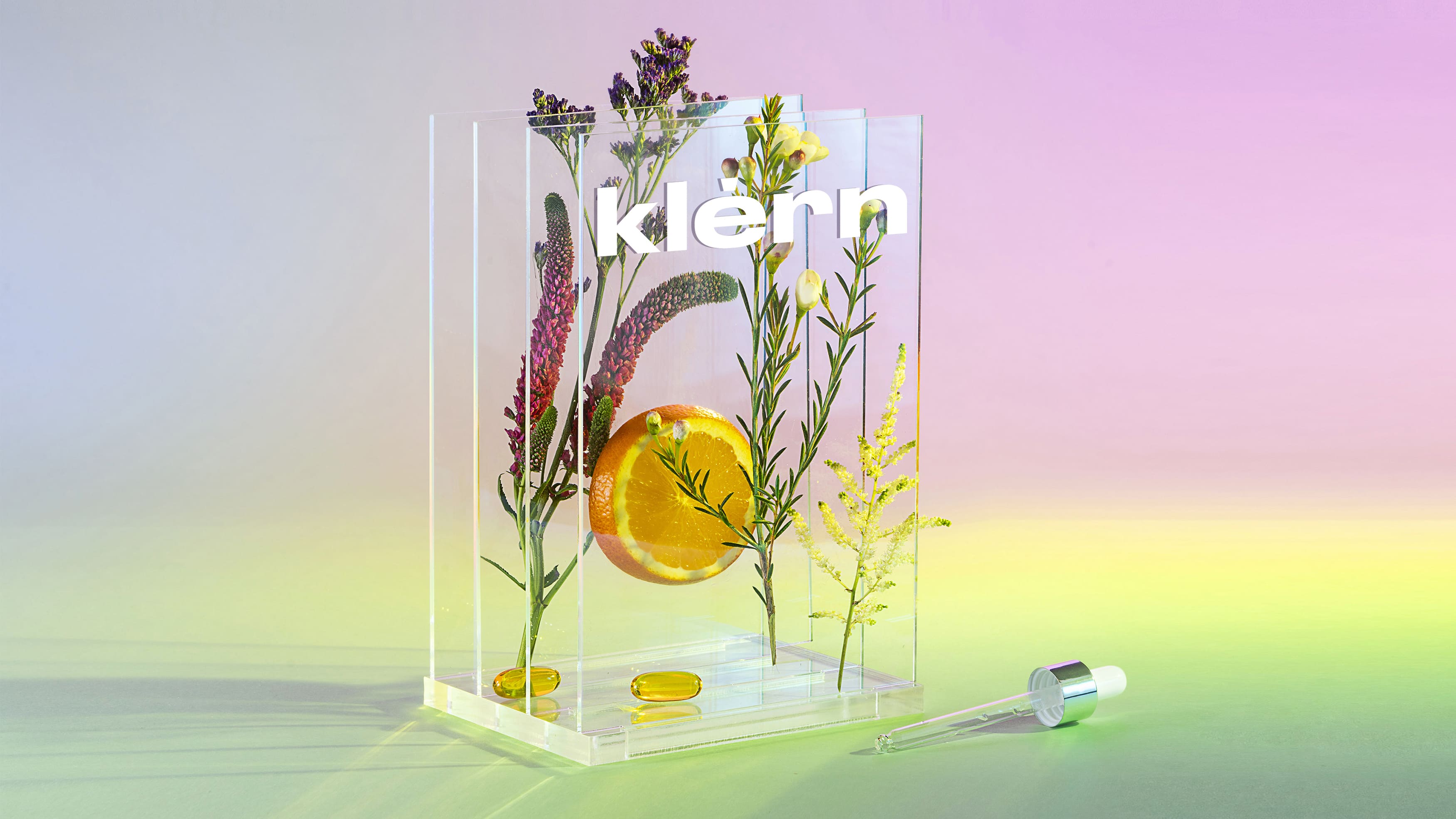
The purity and transparency is associated with the naming; naturalness, as well as the expertise that the brand translates, are reflected in the design — the label turns into a laboratory table where natural ingredients are perfectly balanced on slides.
The composition is saturated with light and air to convey the refreshing effect of skin care products.
In addition to the ingredients on the package, the texture of the product itself is shown in the form of drops — it feels like we are looking at the package through a microscope glass and can see all the details: the product, name, composition. Typography refers to a scientific approach — it is minimalistic and technological.
The color palette is gentle and restrained, it not only helps with differentiation between SKUs, but also expresses the atmosphere of a rich fragrance.
The line already includes shower gel, bath salt, bath foam, hand cream, body butter, anti-cellulite cream, body scrub, foot cream, liquid soap, gel scrub, body milk, gel for intimate hygiene.
SPAR – world’s largest supermarket chain, consisting of almost 13,700 stores serving more than 9 million customers daily. SPAR is a unique voluntary association of independent wholesalers and retailers in 35 countries around the world under one name.
Over the past 20 years, the expansion of SPAR has been particularly rapid – SPAR has appeared in Eastern Europe and on other continents – Argentina and Australia. SPAR started its work in Russia in 2000.
CREDIT
- Agency/Creative: Depot branding agency
- Article Title: Klern Skin Care Packaging Design
- Organisation/Entity: Agency
- Project Type: Graphic
- Project Status: Published
- Agency/Creative Country: Russia
- Agency/Creative City: Moscow
- Market Region: Asia, Europe
- Project Deliverables: Label Design, Packaging Design
- Industry: Health Care
- Keywords: Care, Health, packaging, design
-
Credits:
Creative Director: Vera Zvereva
Anna Burlakina: Designer


