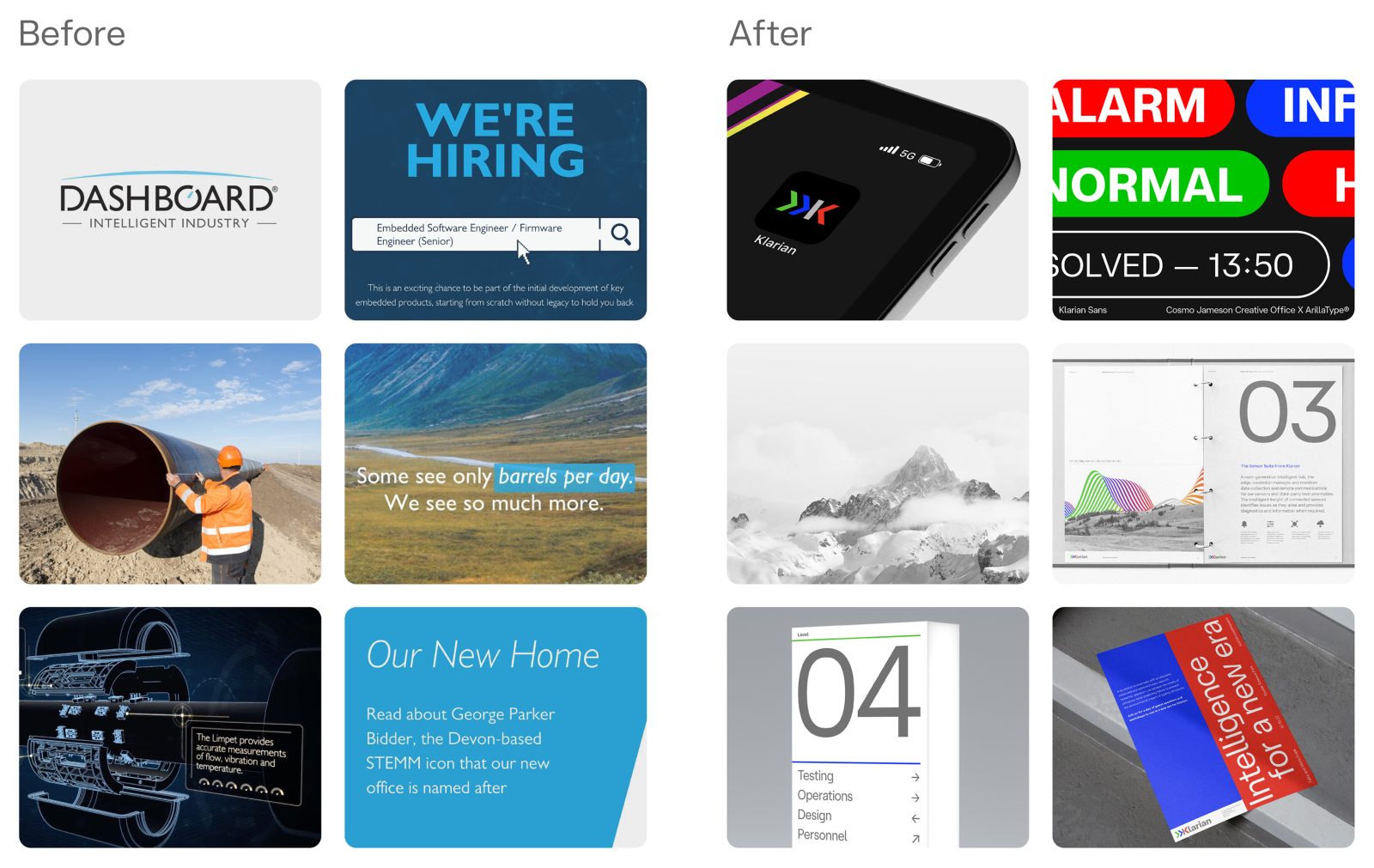
A new name, brand identity and application suite for Klarian, the British technology company innovating in the field of industry efficiency. Klarian, previously Dashboard, offers industries an end-to-end platform that delivers performance and clarity to optimise infrastructure for a more sustainable planet. Klarian’s hardware detects efficiency in infrastructure and updates users with real-time data allowing industries to progress.
Cosmo Jameson Creative Office developed the new name and identity to support Klarian’s core proposition ‘Transforming Industry Efficiency’ and to be more fitting of the company’s ambitions.
A new strategic direction for the brand outlines the idea of clarity, precision and expertise. With this, the name Klarian was coined from a rigourous naming process including key stakeholders.
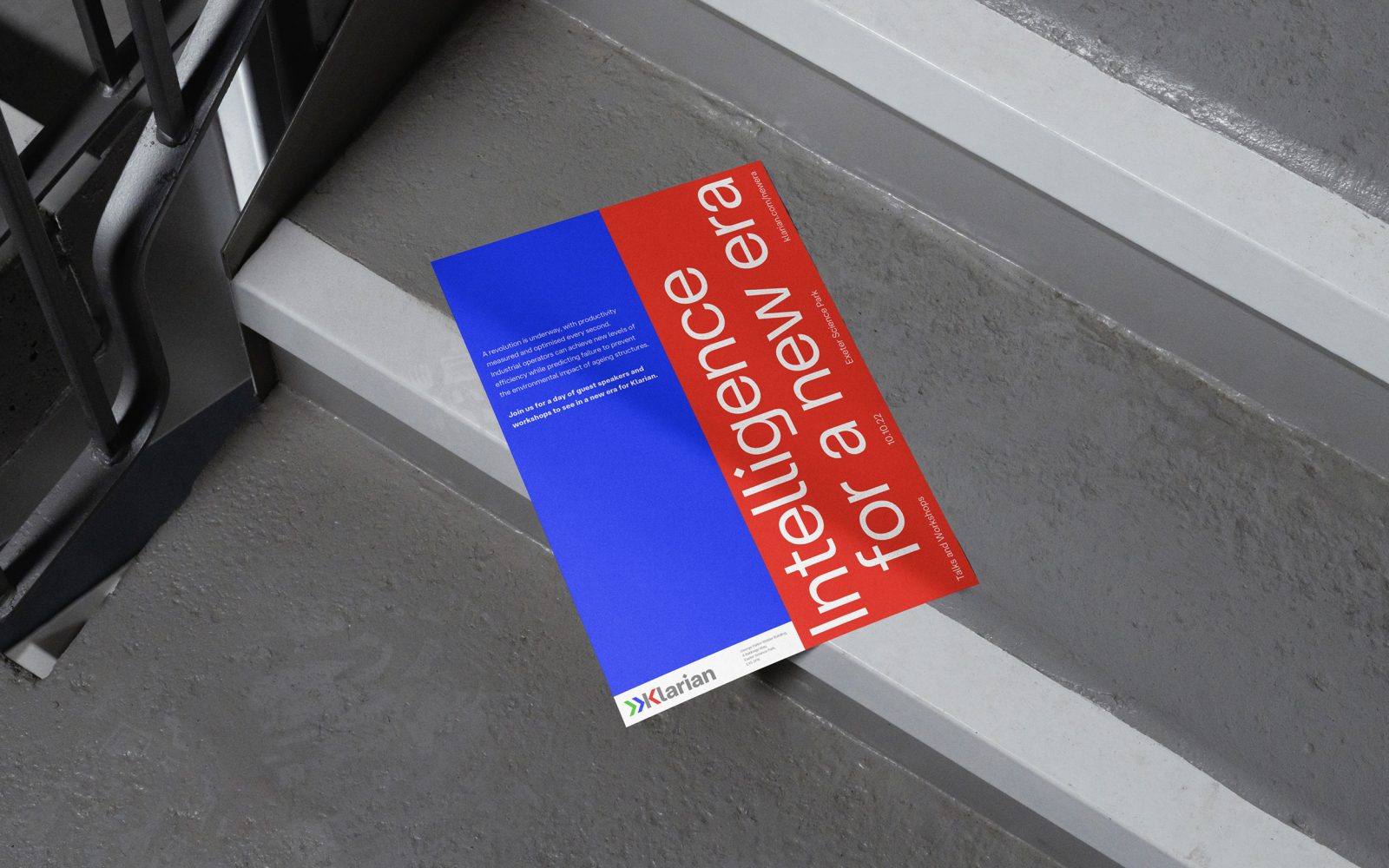
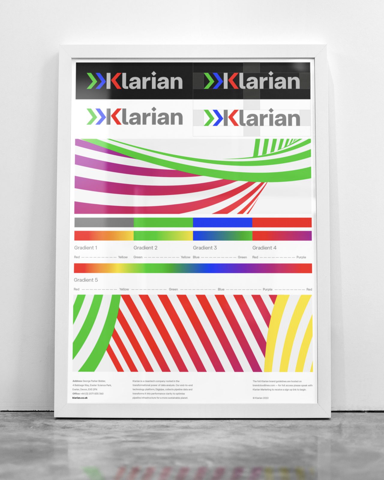
The brand’s new identity looks to buck B2B trends, doing away with the dull and safe we’re so used to in the industrial sector by delivering impact with big colour.
The idea
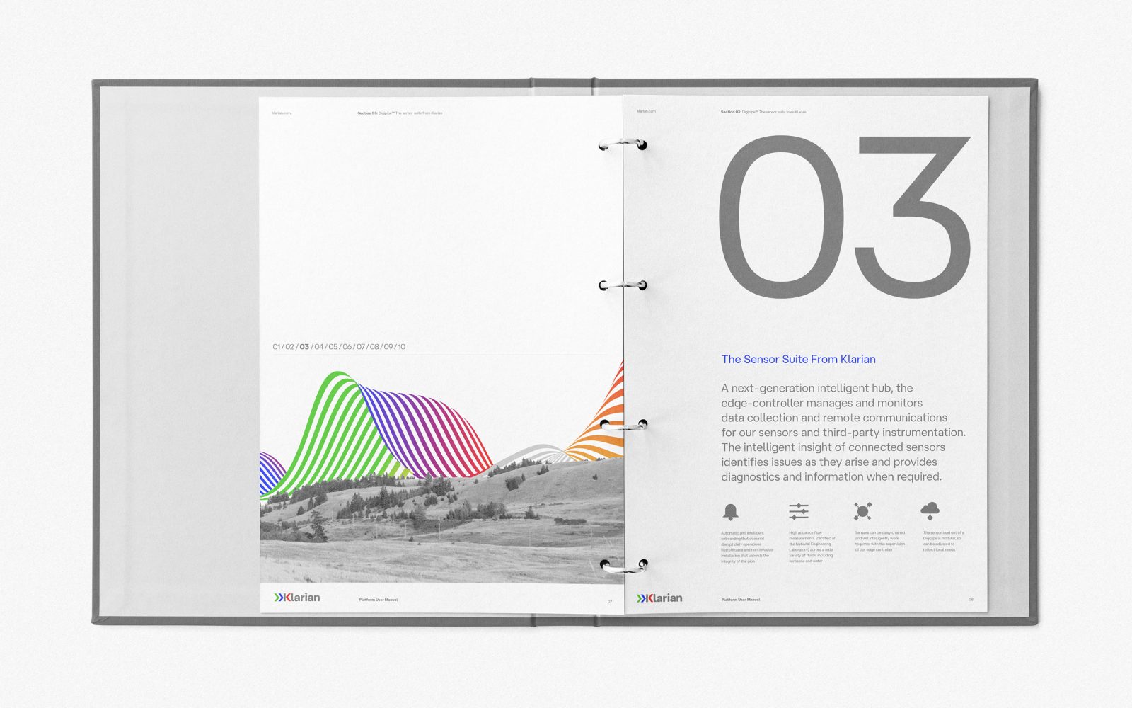
Klarian’s technology allows industry to ‘See More’. A visual metaphor for this plays out across the identity in the form of bold colour, a spectrum flow brand property and a clarity-driven application style.
Logo
Klarian’s products detects issues on infrastructure, warns users and deploys solutions to solve the issues detected. The new brand icon looks to reference this process with the use of chevrons while also forming the brand name initial ‘K’.
Bespoke type
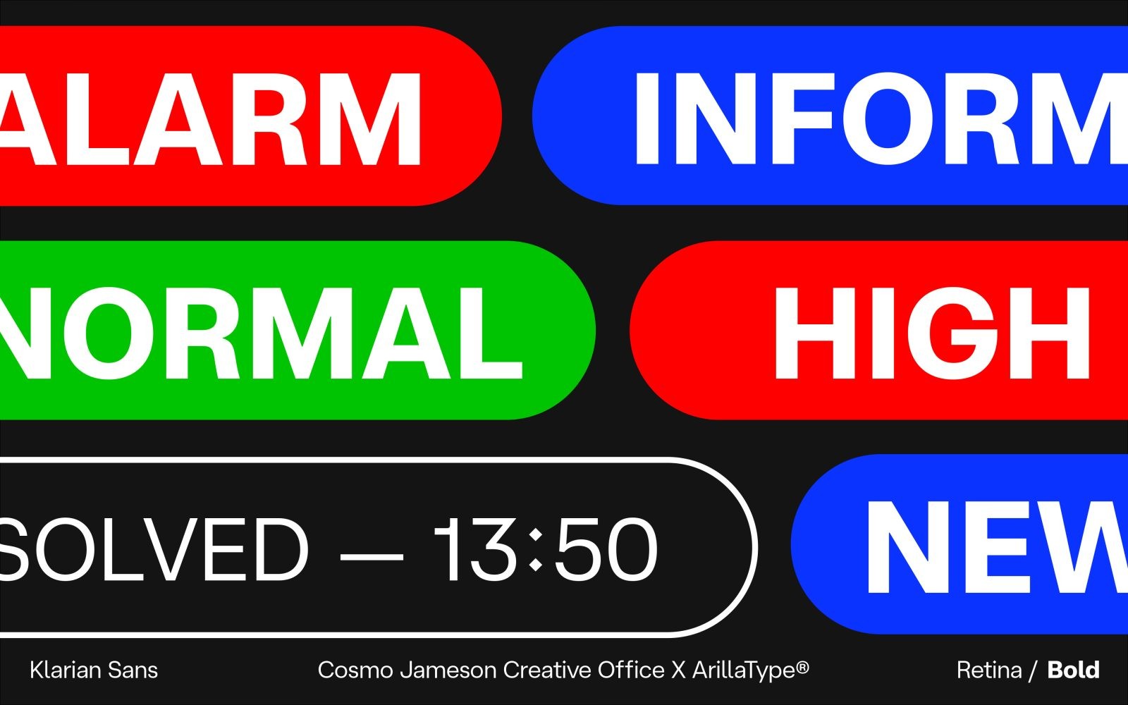
A bespoke typeface for the brand has been created in collaboration with Arilla Type. A typeface that’s both highly functional for digital use and also crafted with a distinct ‘clarity’ character (such as those diamond tittles). The bespoke typeface, based on Arilla’s ‘Hauss’, has been crafted to express character at large scale and perform functionally at small scale within product UI.
Graphic language
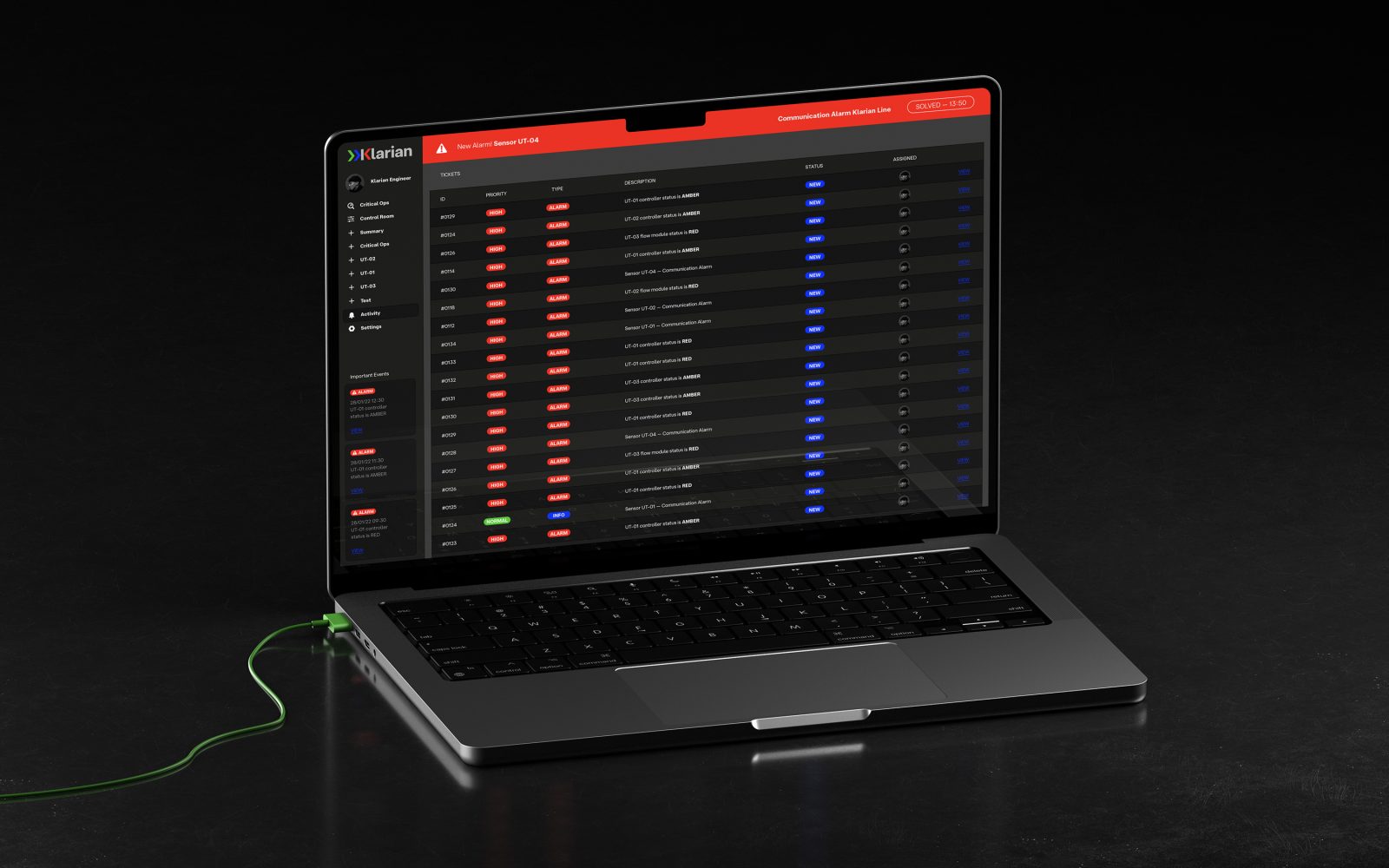
A bold and geometric graphic language inspired by the warning and notification graphics on Klarian’s product UI heroes across the identity at a funational and expressive level. A new photographic direction celebrating a cleaner world and iconography style are included in the new kit of parts.
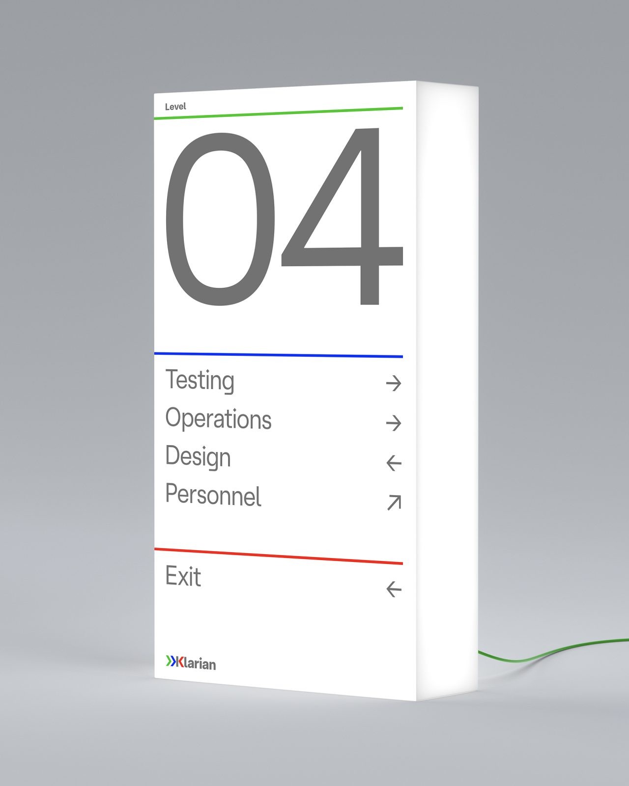
Comprehensive digital guidelines and an application suite were also created as part of the project.

CREDIT
- Agency/Creative: Cosmo Jameson
- Article Title: Klarian Technology Brand Redesign
- Organisation/Entity: Freelance
- Project Type: Identity
- Project Status: Published
- Agency/Creative Country: United Kingdom
- Agency/Creative City: London
- Market Region: Global
- Project Deliverables: Brand Identity, Brand Redesign
- Industry: Technology
- Keywords: WBDS Creative Design Awards 2023/24
- Keywords: Brand Redesign
-
Credits:
Strategy Director: Jeremy Hemmings


