


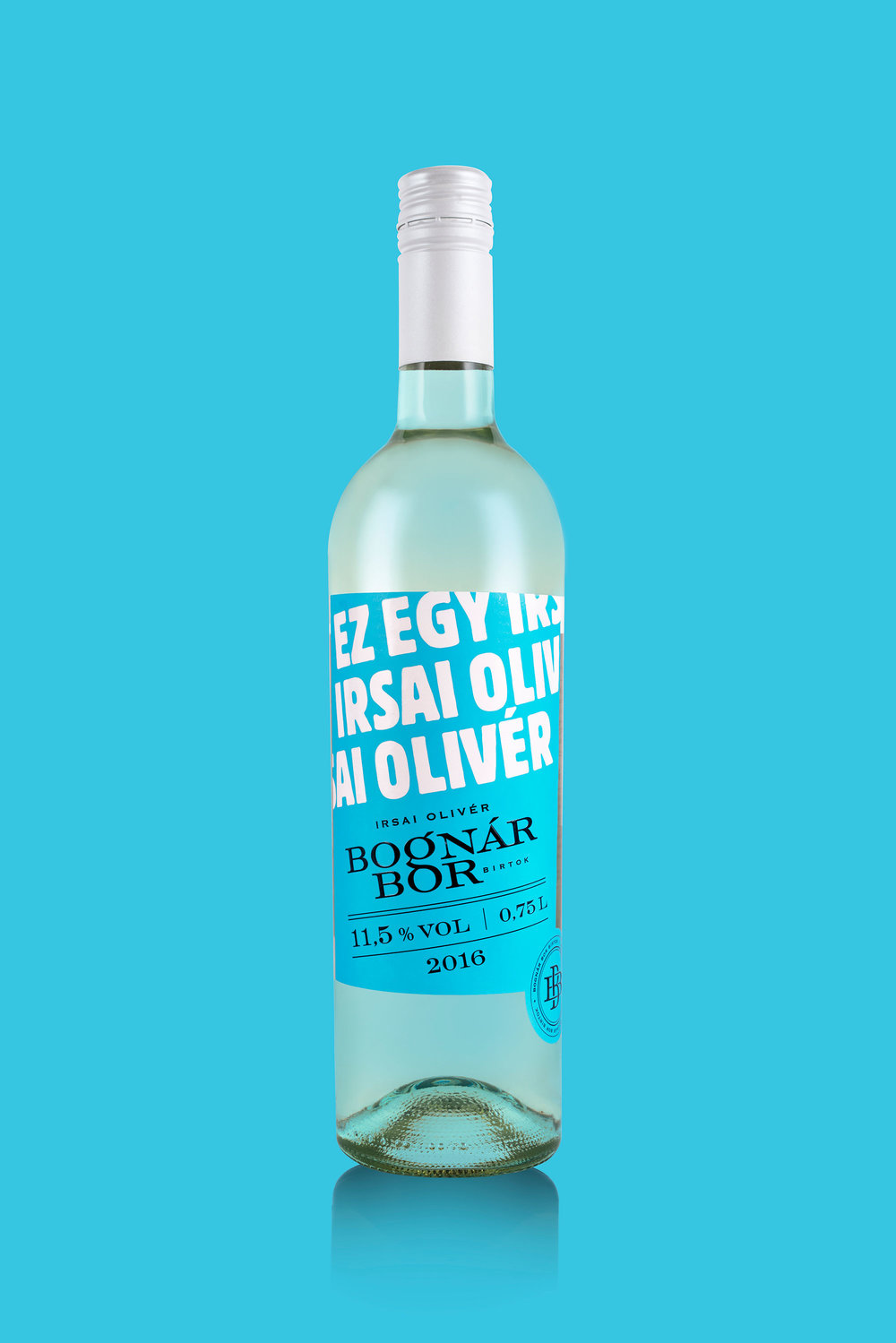
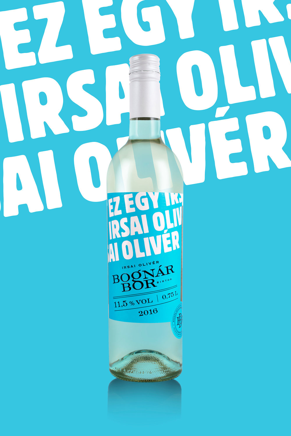
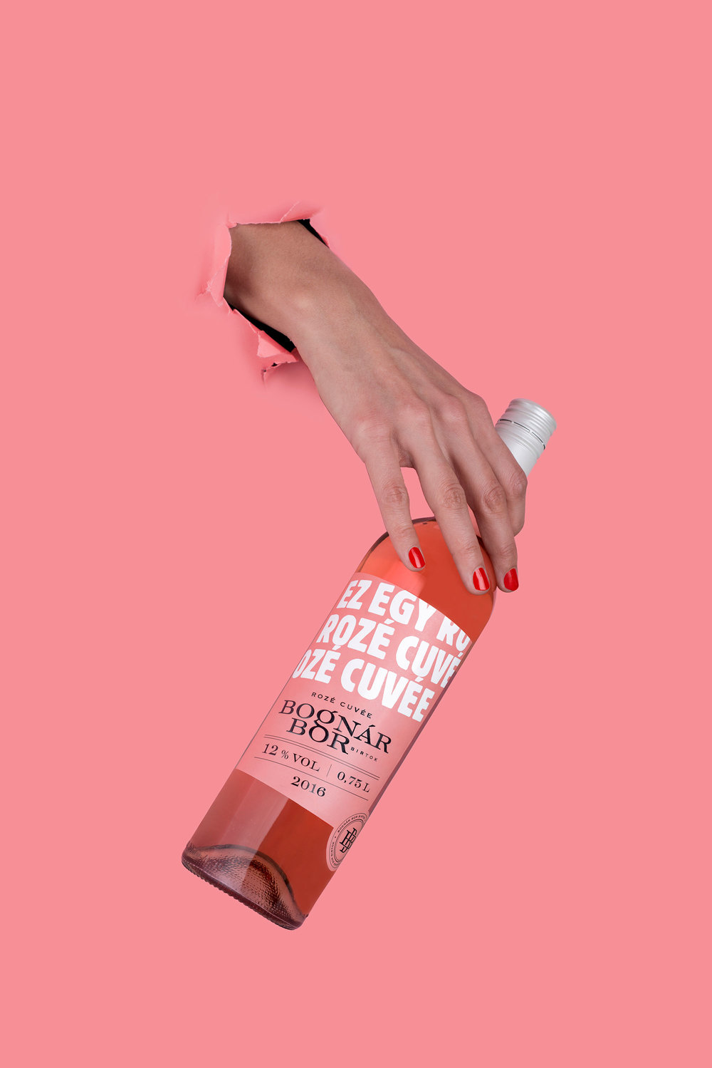
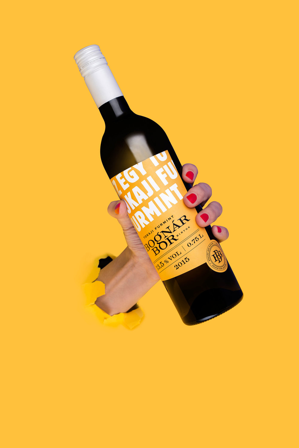
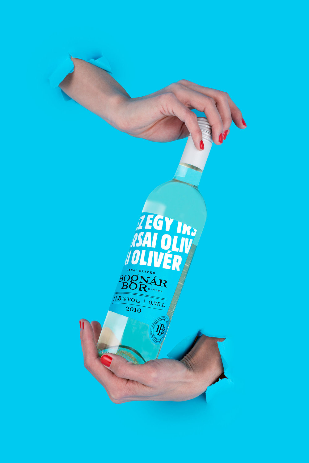
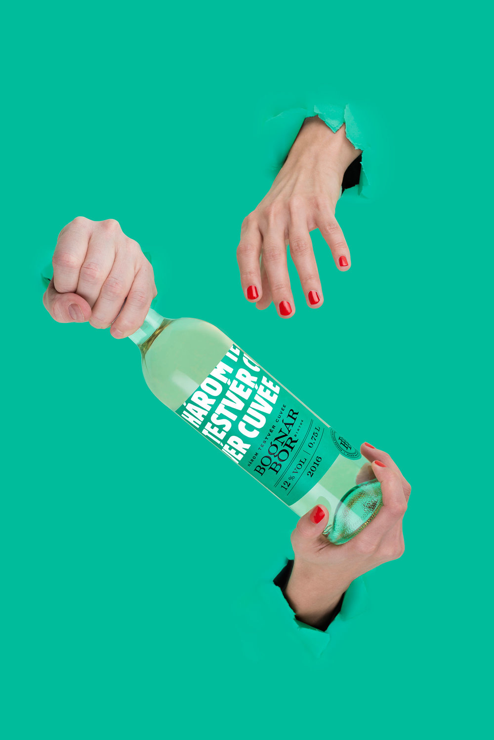
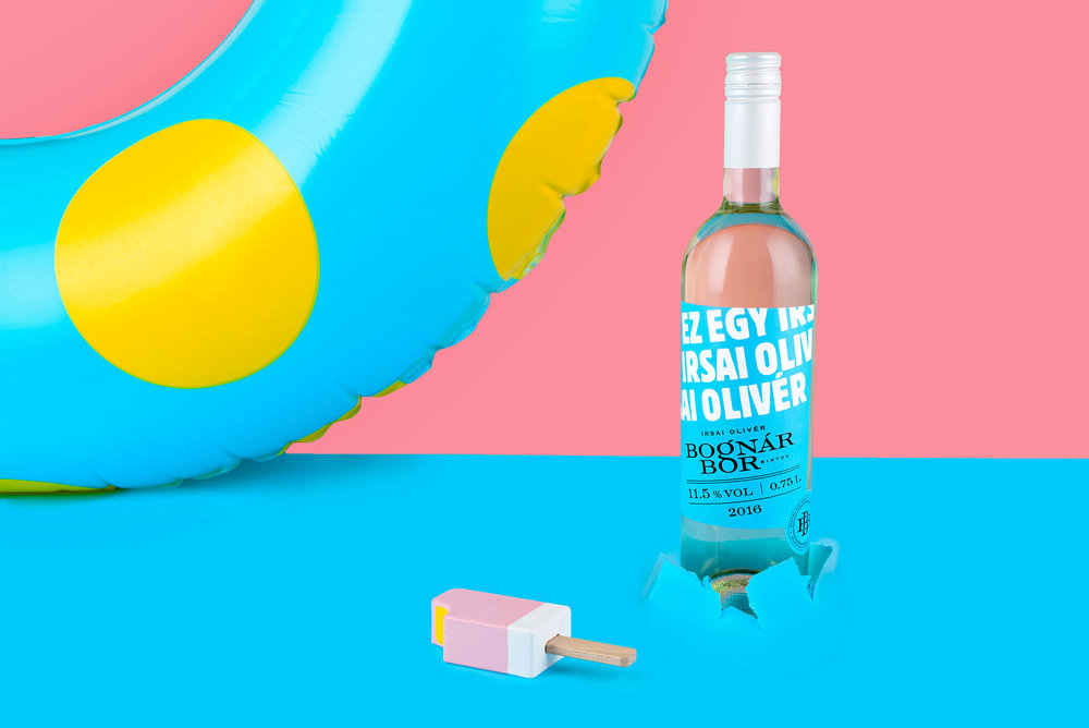
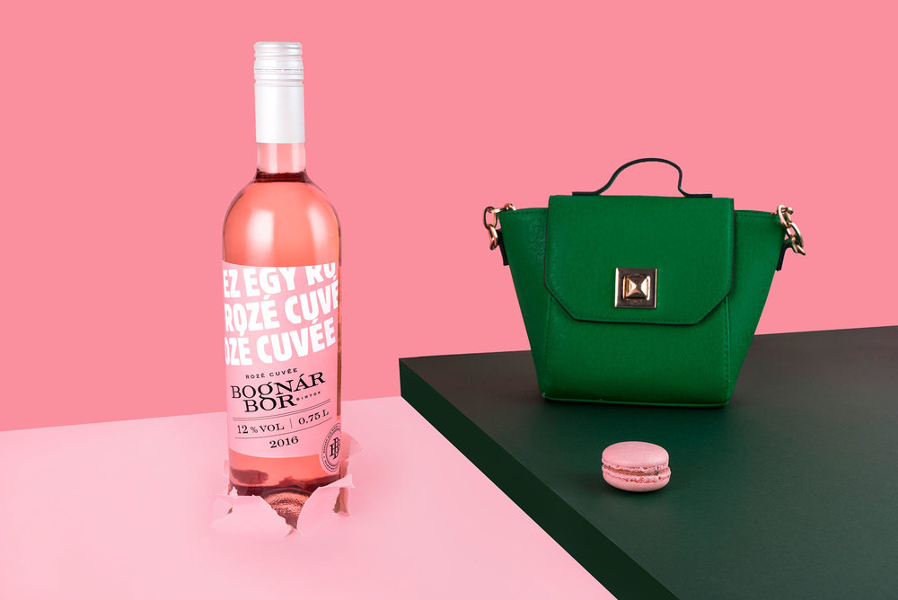
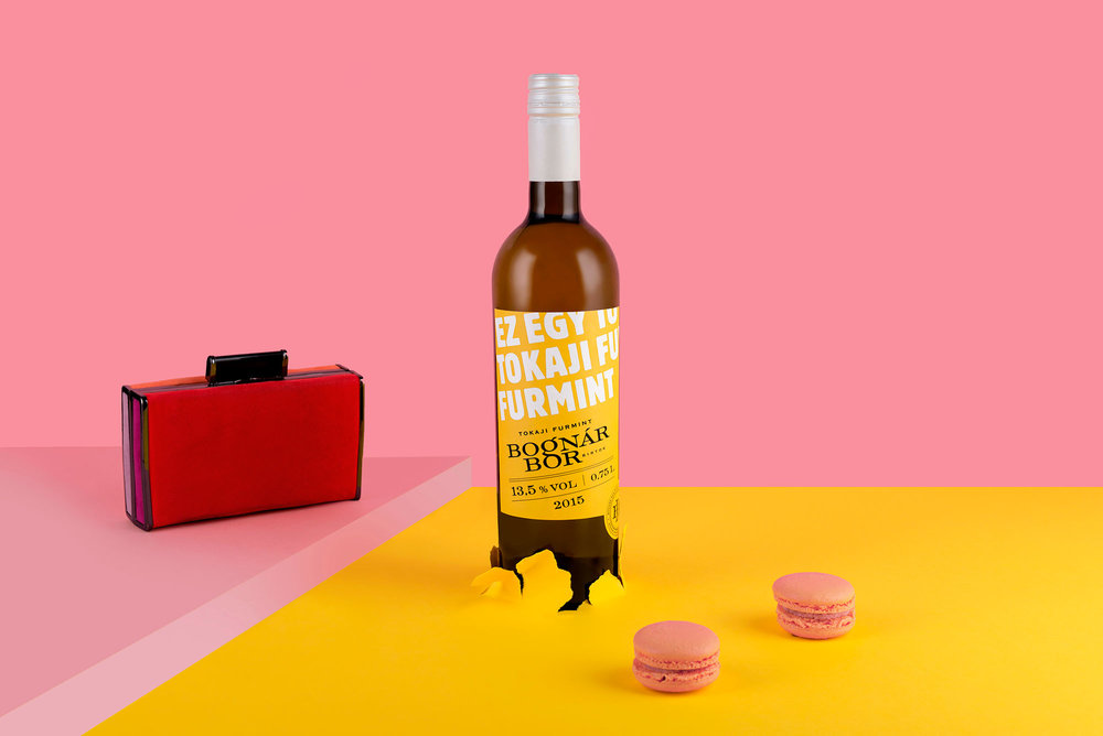
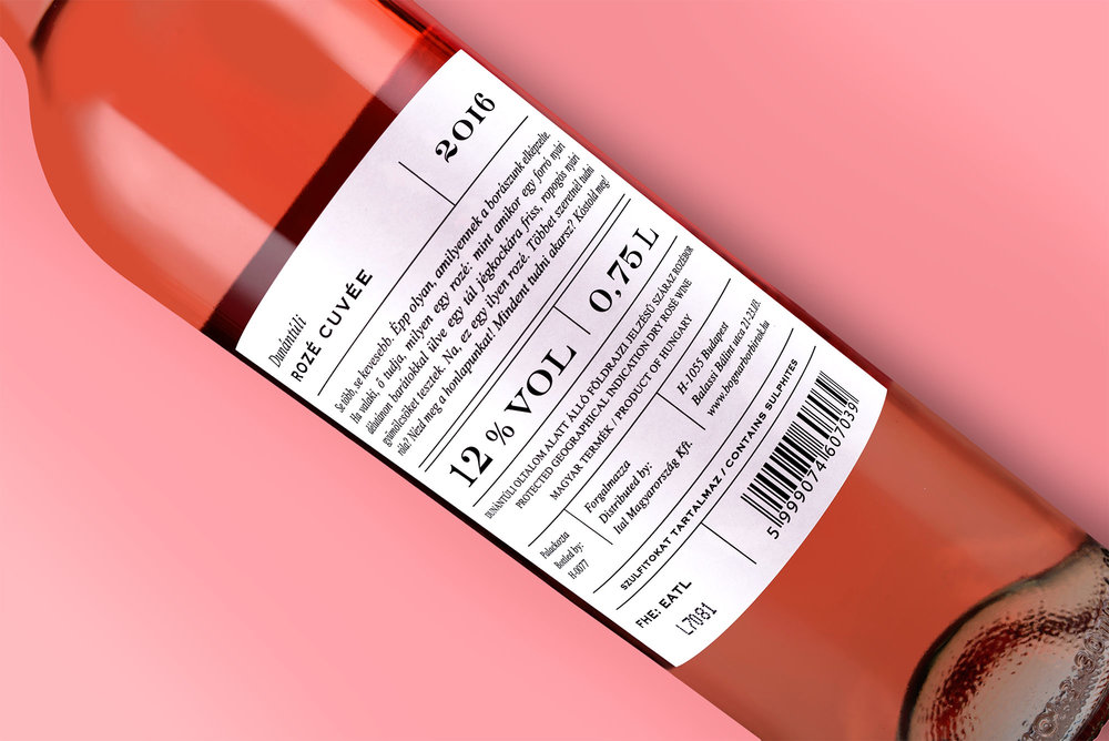
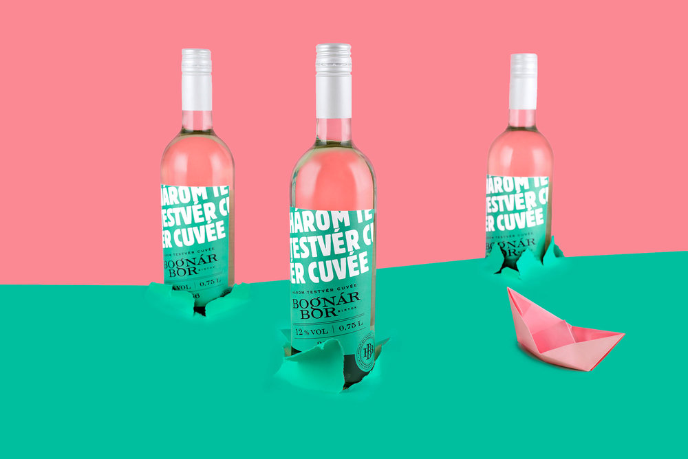
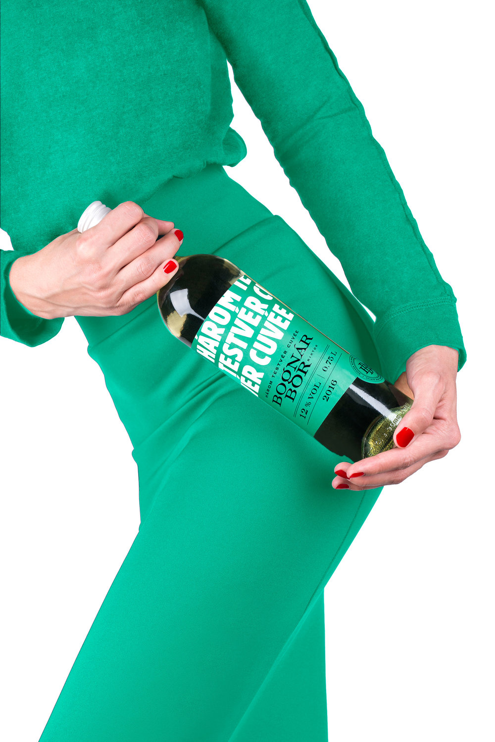
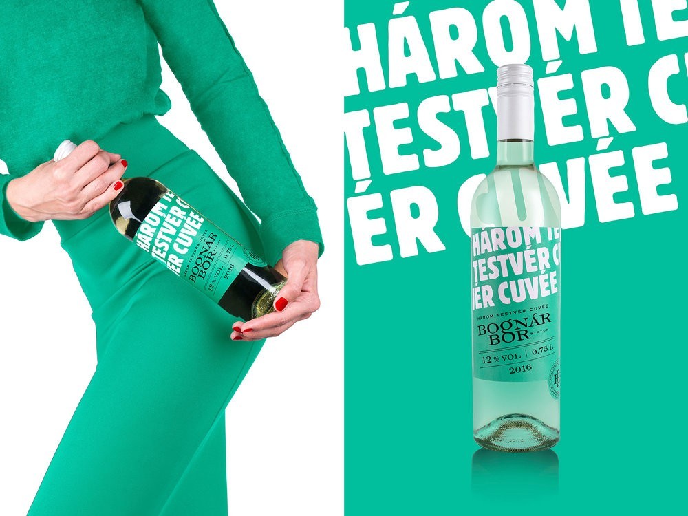
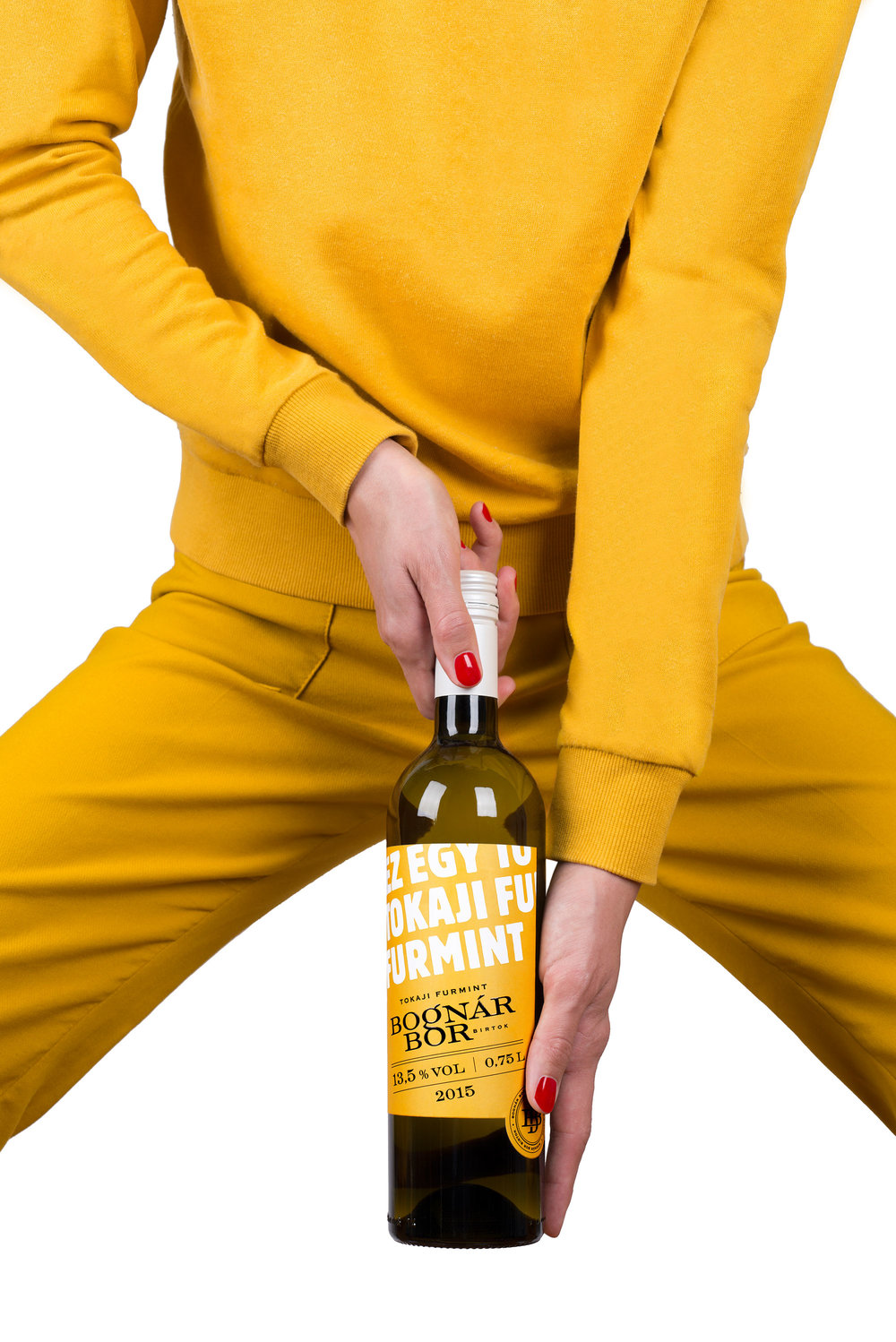
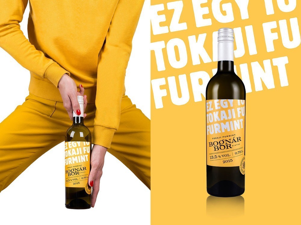
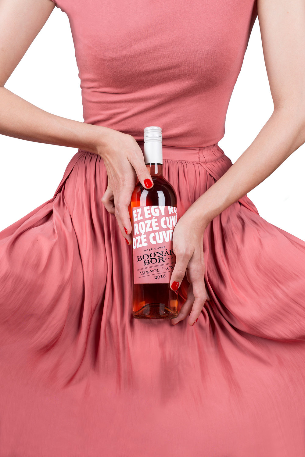
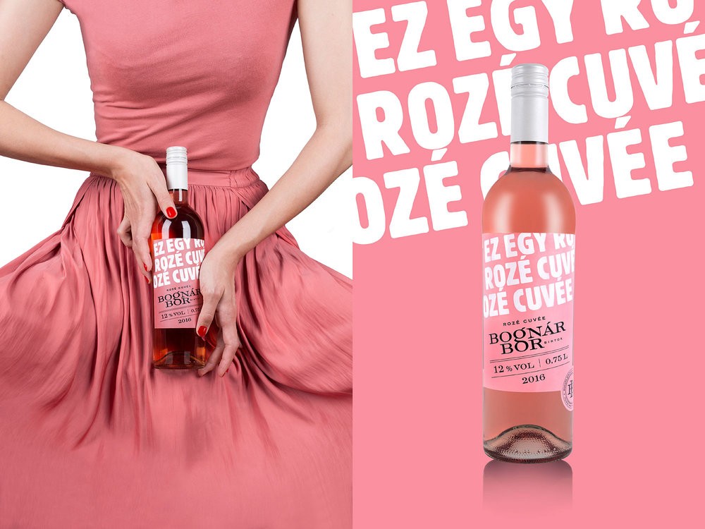
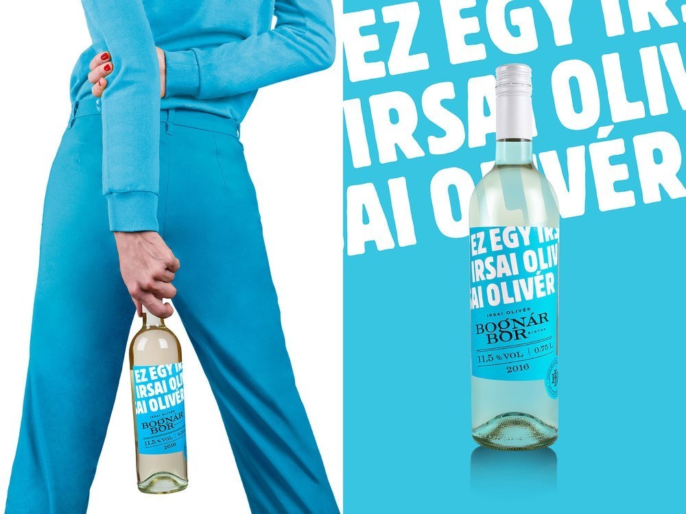
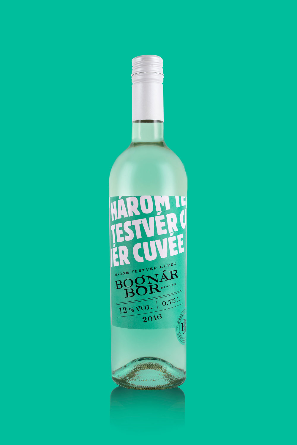
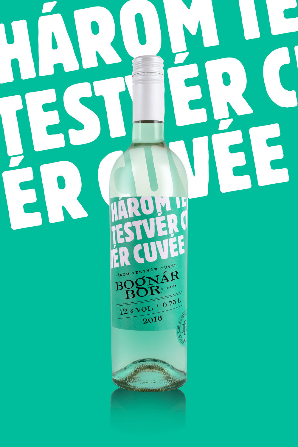
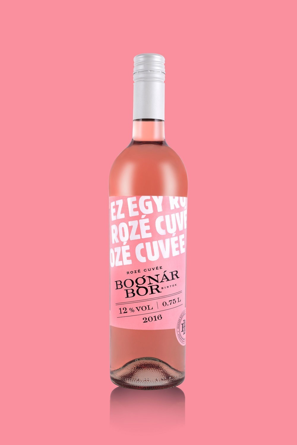
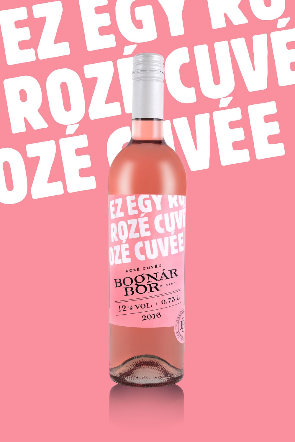
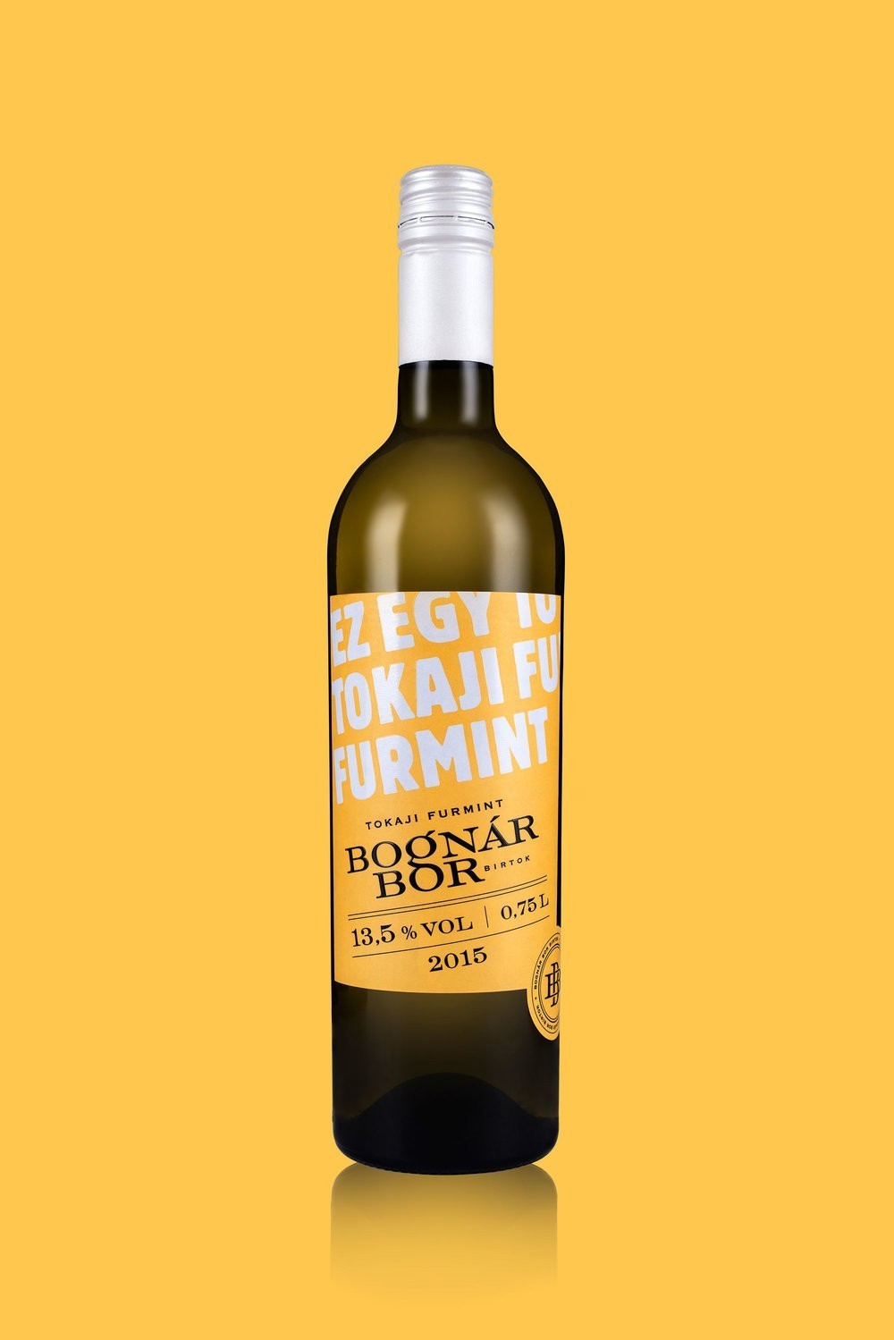
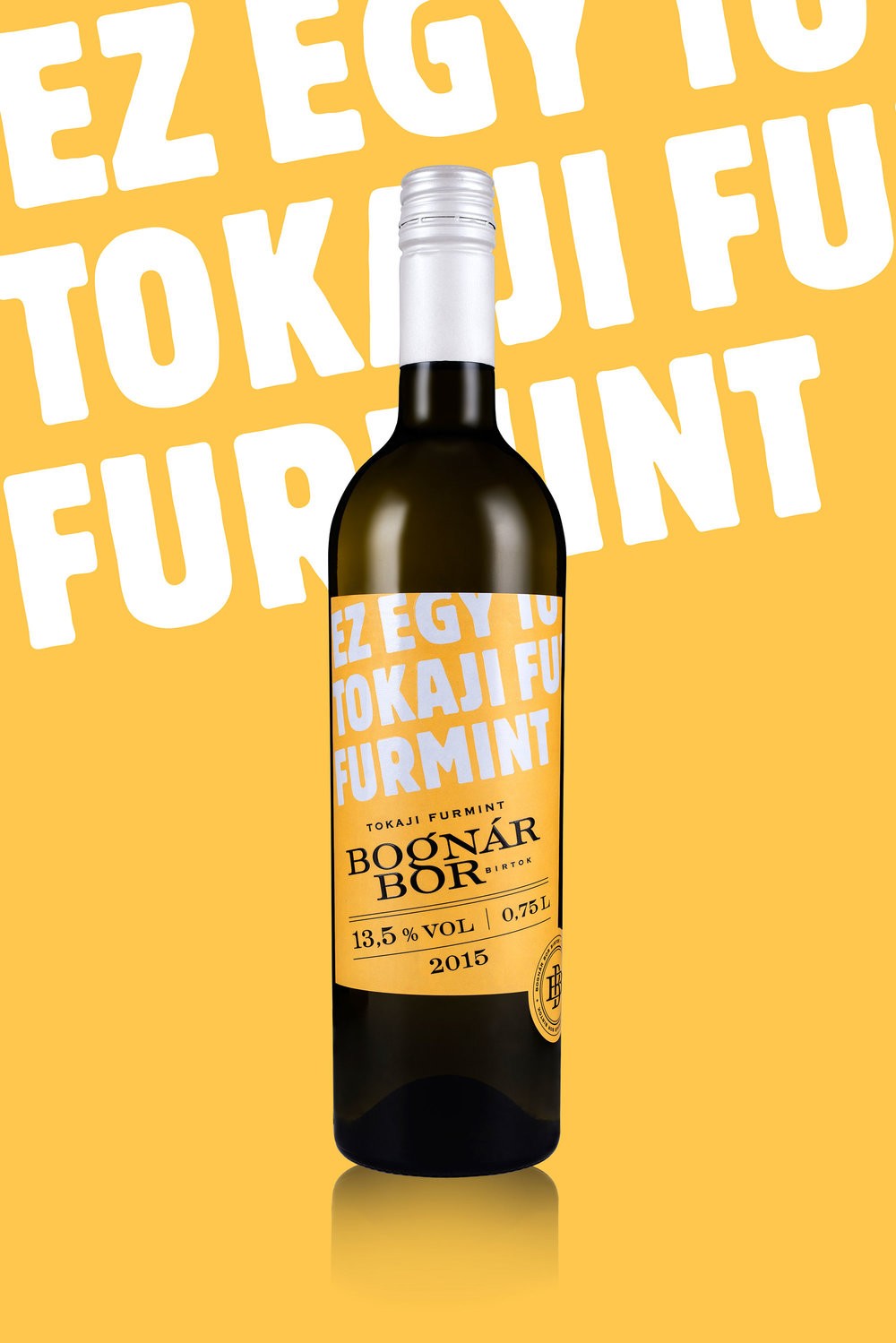
” The original name of the winery was Bognár Borbirtok (Winery Estate of the Bognars). When designing the logo I considered the word bor (wine) to be more important, so I placed greater emphasis on it, since the Bognar family (brothers) has several winery estate in different sub-regions of Hungary.The first set of the winery consisted of cheaper, looser, reductive wines in bottles with screw closure. These features required a youthful design, so I impaired the wines with strong colors.On the front labels I used big white letters to indicate that „This is a … wine.” This sentence continues in the more detailed descriptions on the back labels: „Neither more, nor less… You want to know more? Taste it.””


CREDIT
- Agency/Creative: kissmiklos
- Article Title: kissmiklos – Bognár Bor Birtok (Bognár Winery)
- Project Type: Packaging
- Format: Bottle
- Substrate: Pulp Paper
FEEDBACK
Relevance: Solution/idea in relation to brand, product or service
Implementation: Attention, detailing and finishing of final solution
Presentation: Text, visualisation and quality of the presentation


