


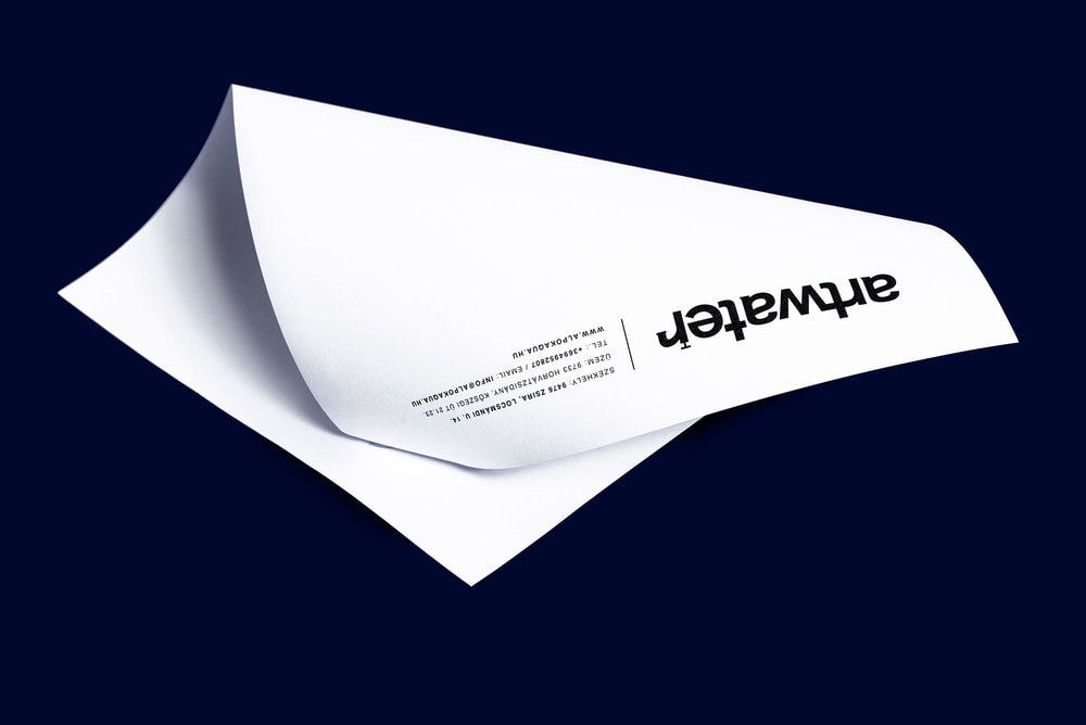
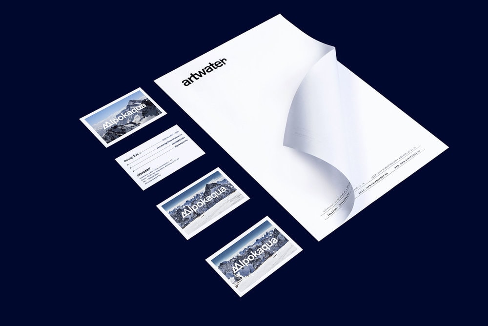
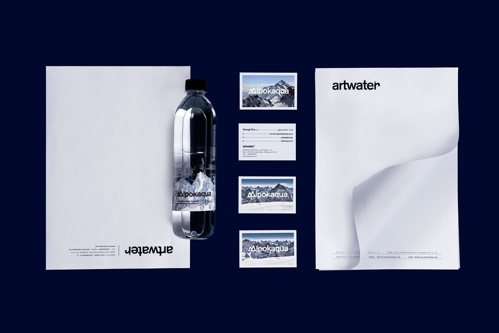
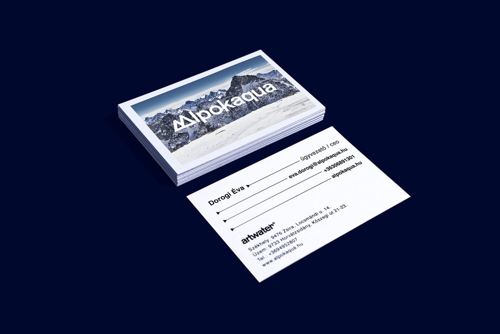
” Project 01: Identity for a bottling factory.
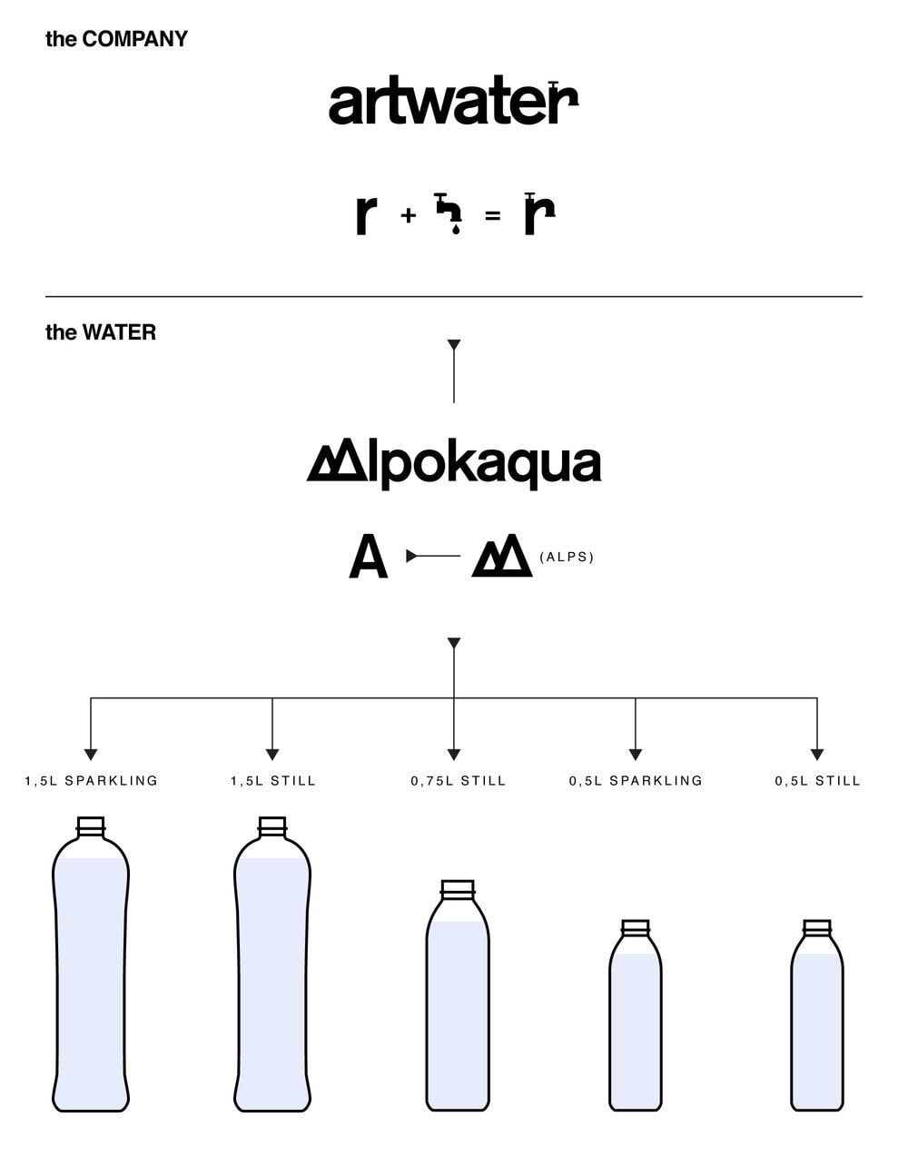
Artwater is the company that bottled the Alpokaqua mineral water. That is why I chose a
water tap as the main motive of the logo. I hid this symbol in the logo.
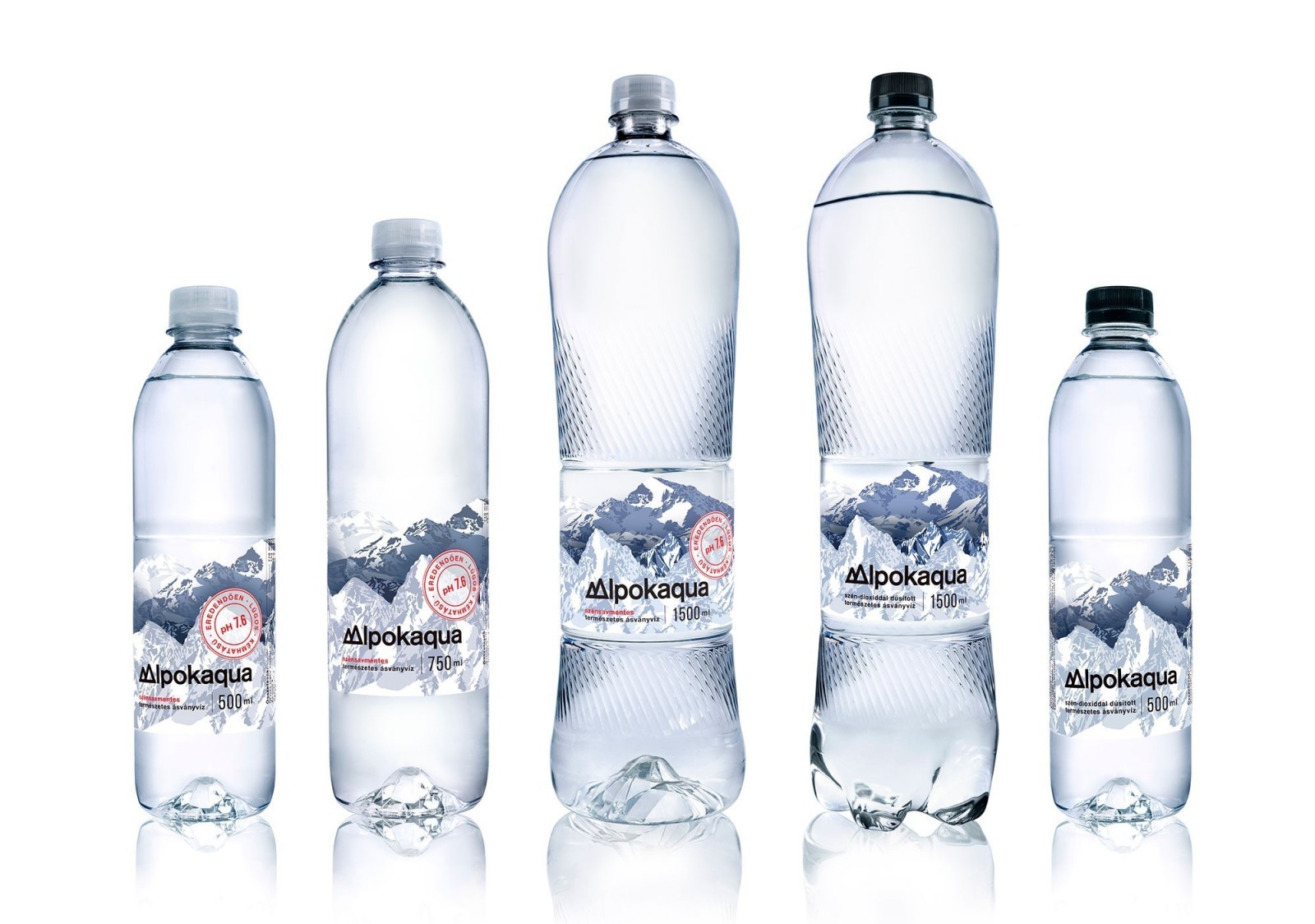
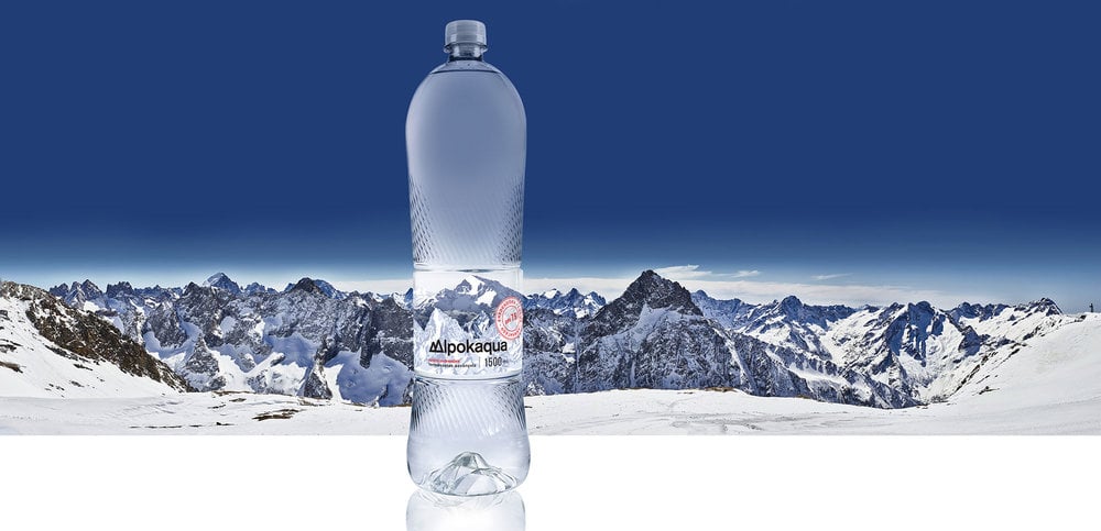
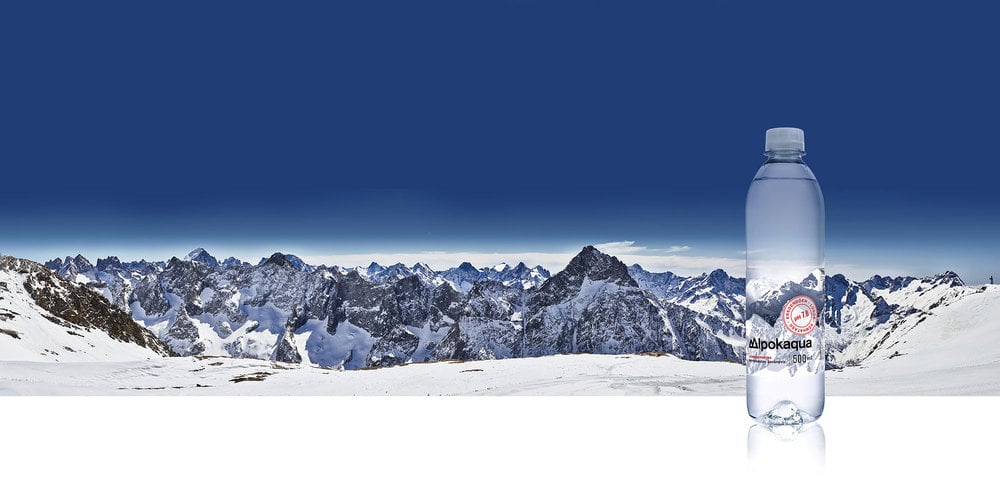
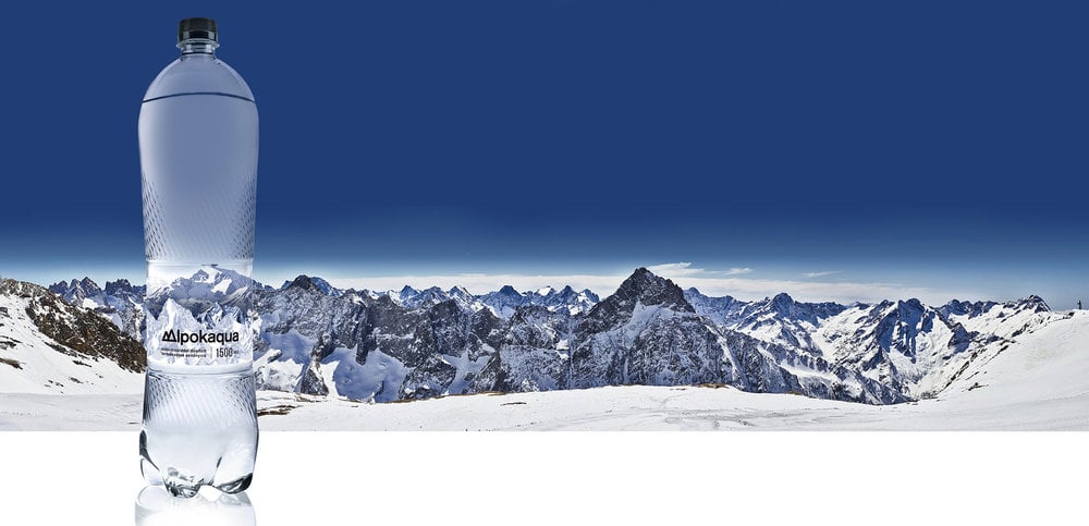
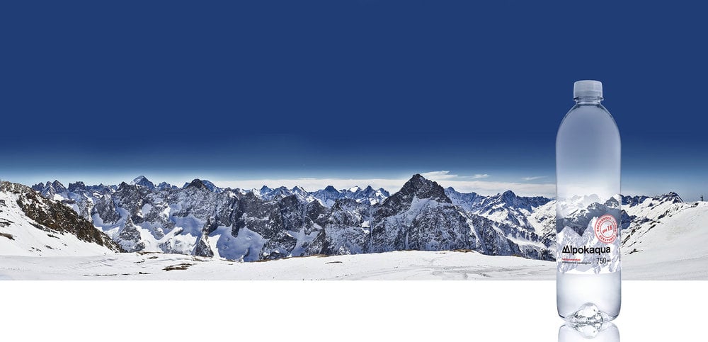
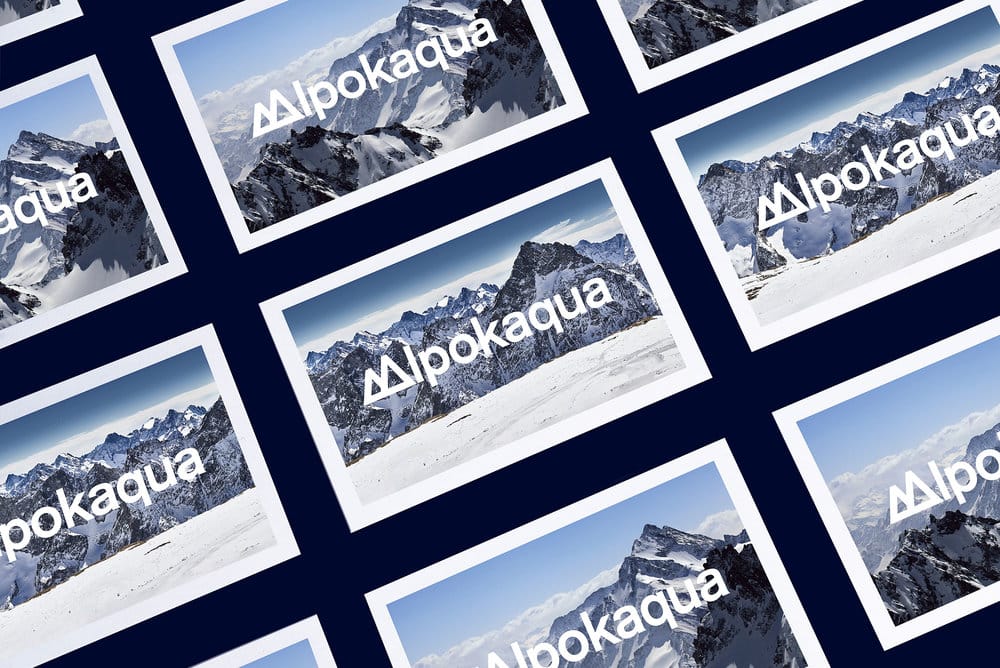
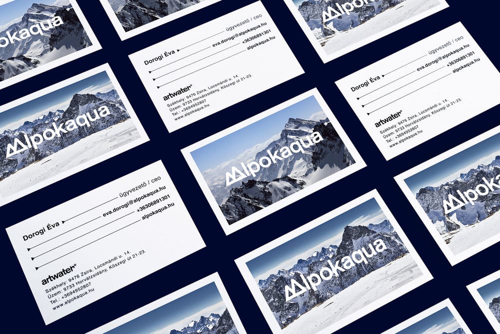
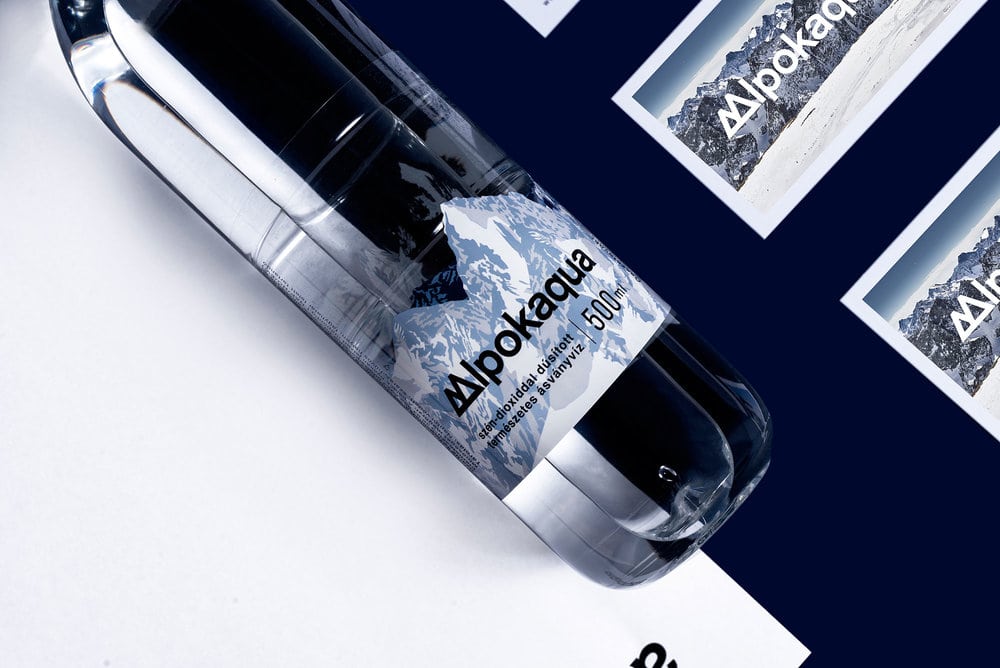
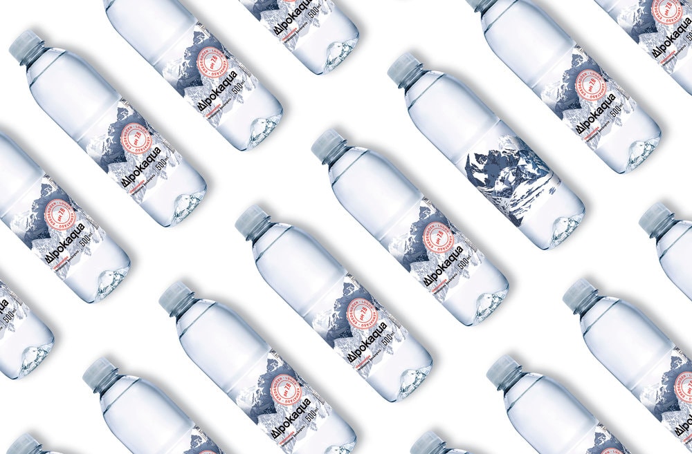
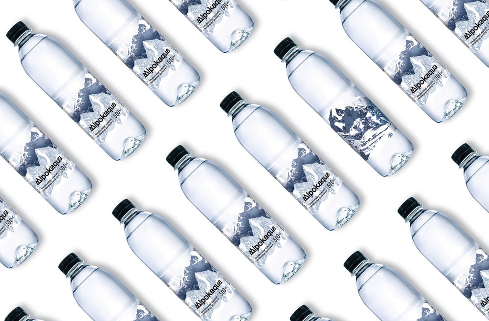
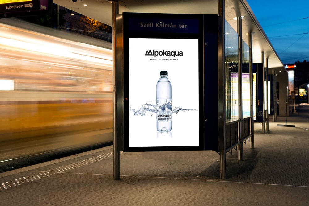
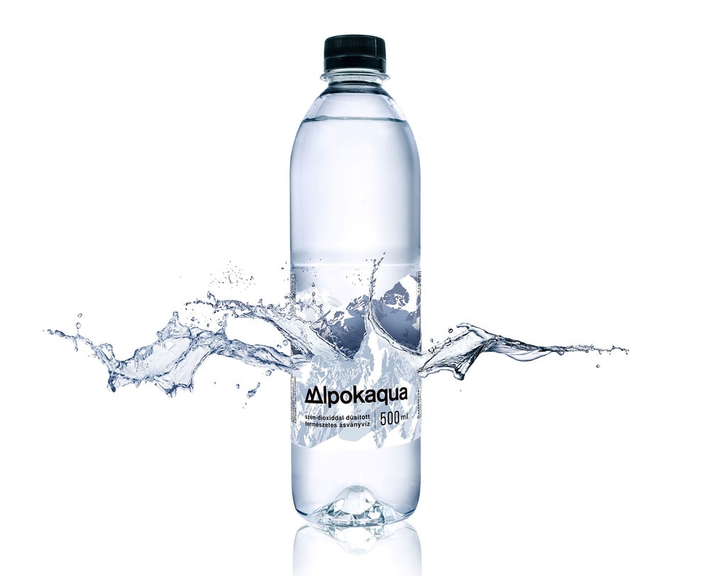
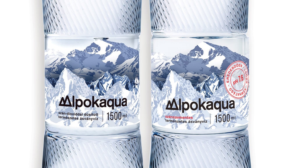
Project 02: Identity and package design for Alpokaqua mineral water.
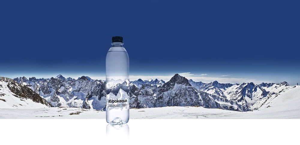
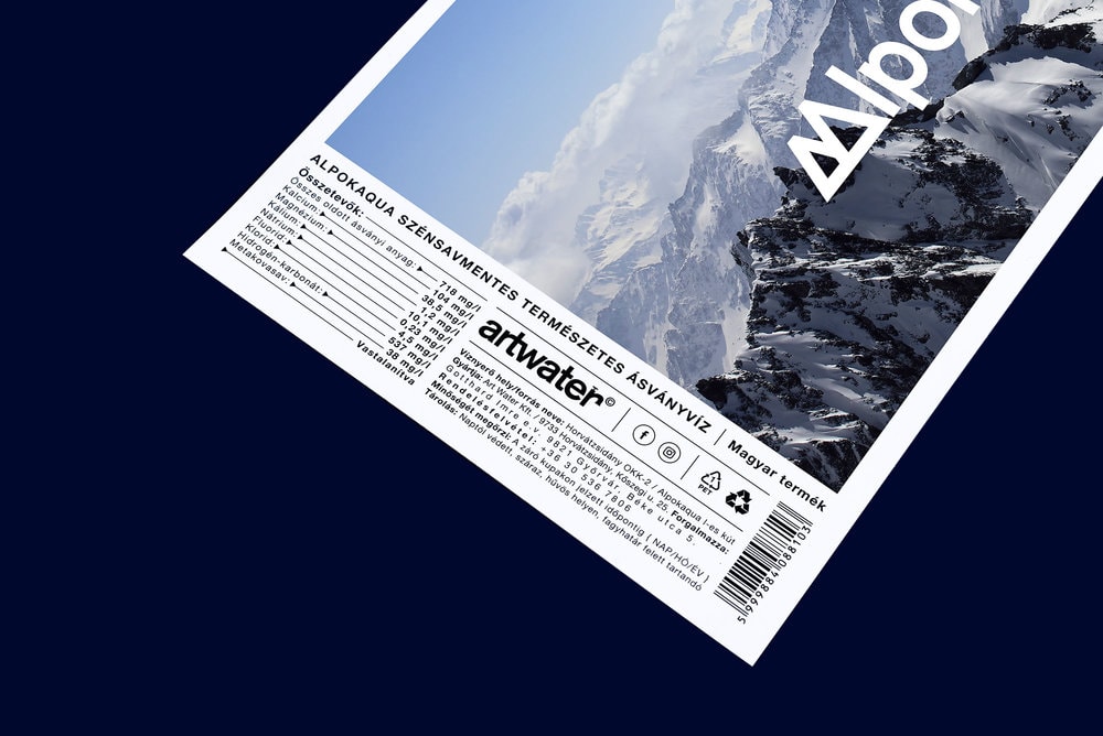
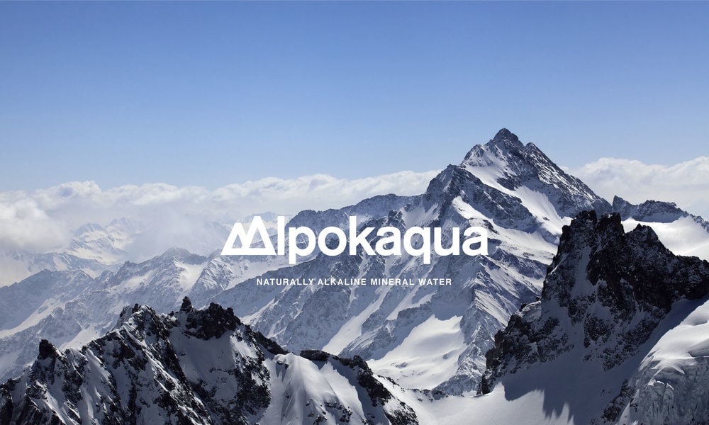
Over 15 thousand years ago the underground mineral water reservoir of Alpokaqua was
created in the one mile-high Alps, where it remained protected from environmental pollution.
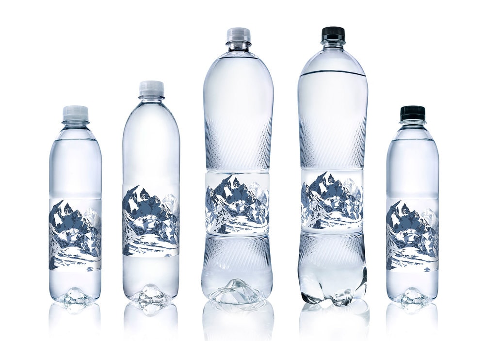
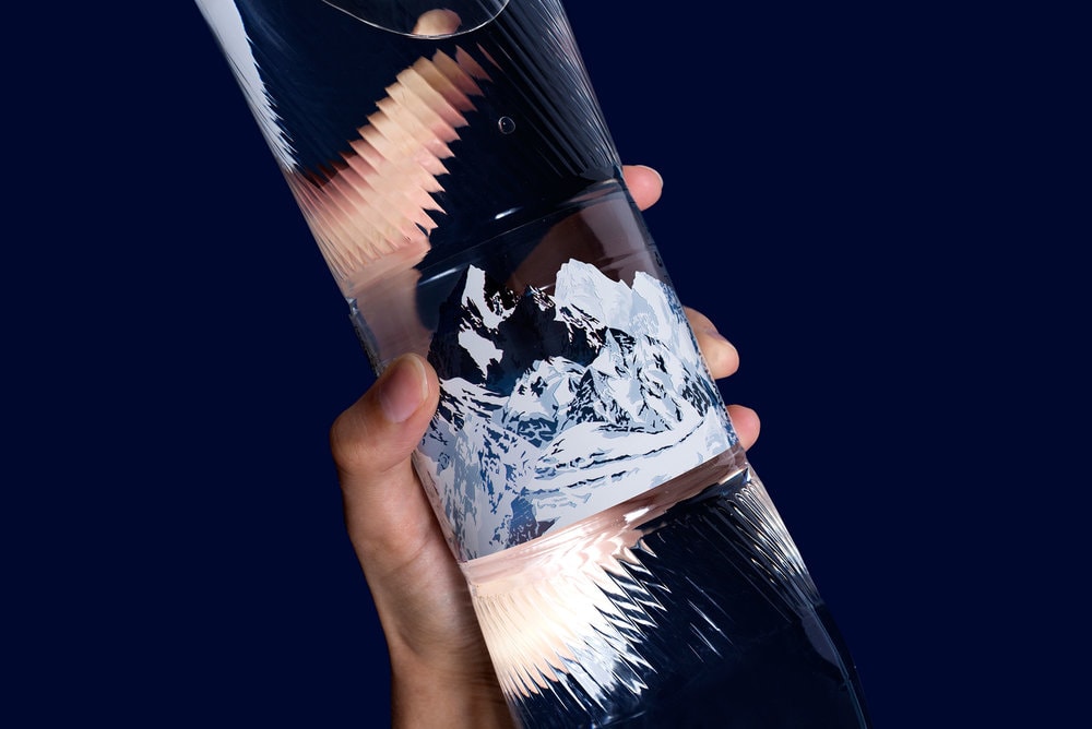
I changed the „A“ to a stylised mountain icon. The Alps motive reoccurs on the labels, too.
My intention is to design a label with an optical play. If we look through the bottle, we see the
mountains blurred on the other side of the label. Since this is an inexpensive and simple sort
of everyday water, I purposely designed an attractive, but popular look for this brand.”

CREDIT
- Article Title: kissmiklos – Alpokaqua
- Project Type: Packaging
- Format: Bottle
- Substrate: Plastic


