


The Kisliq packaging project is a bold reimagining of what breakfast can look and feel like. Designed for a product that challenges conventions — sour porridge mixed with gummy candy — this packaging doesn’t aim to fit in. It aims to stand out, to provoke, and to make you feel something unexpected before you’ve even opened the pack. Kisliq is not just food; it’s a visual and sensory experience.
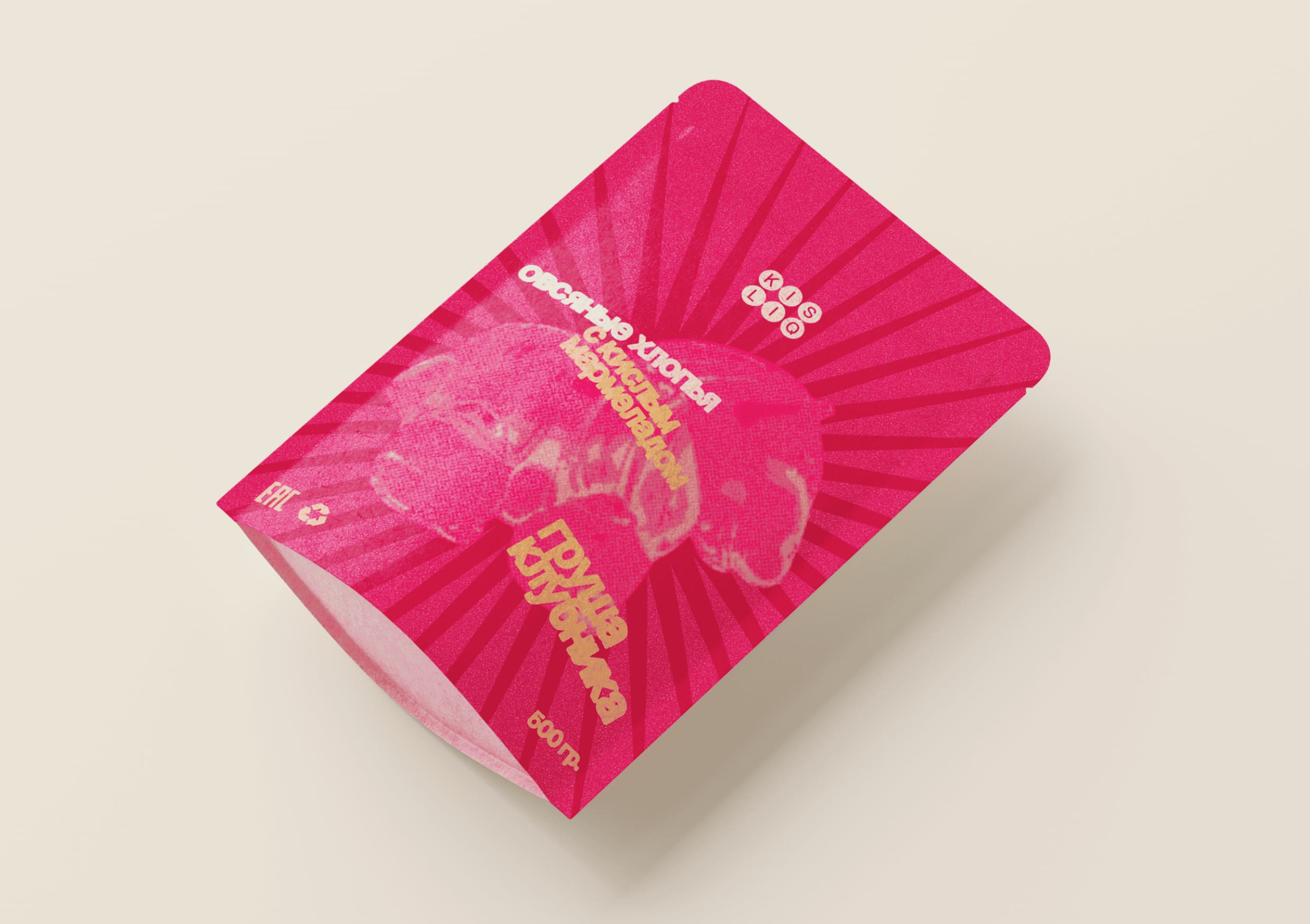
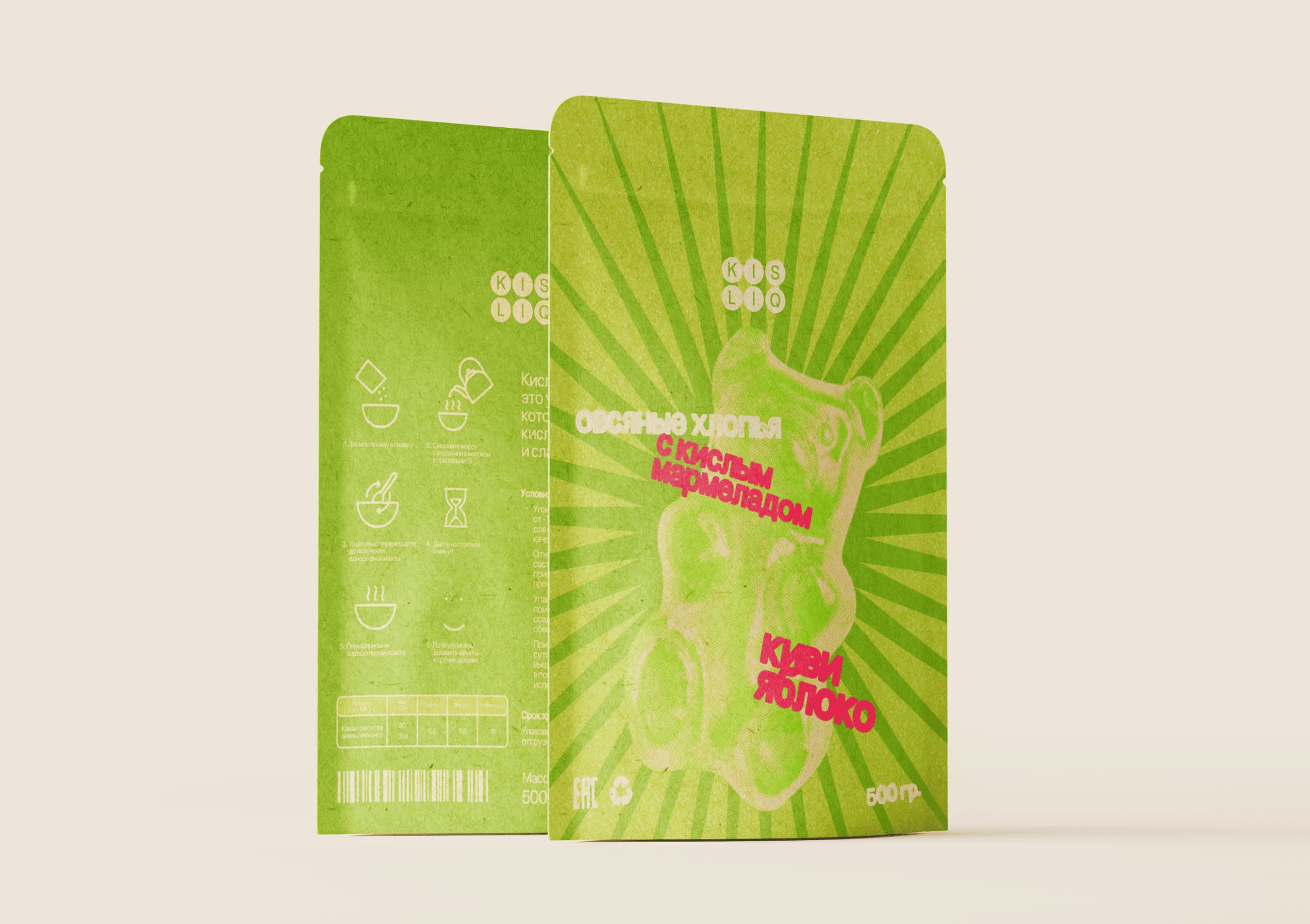
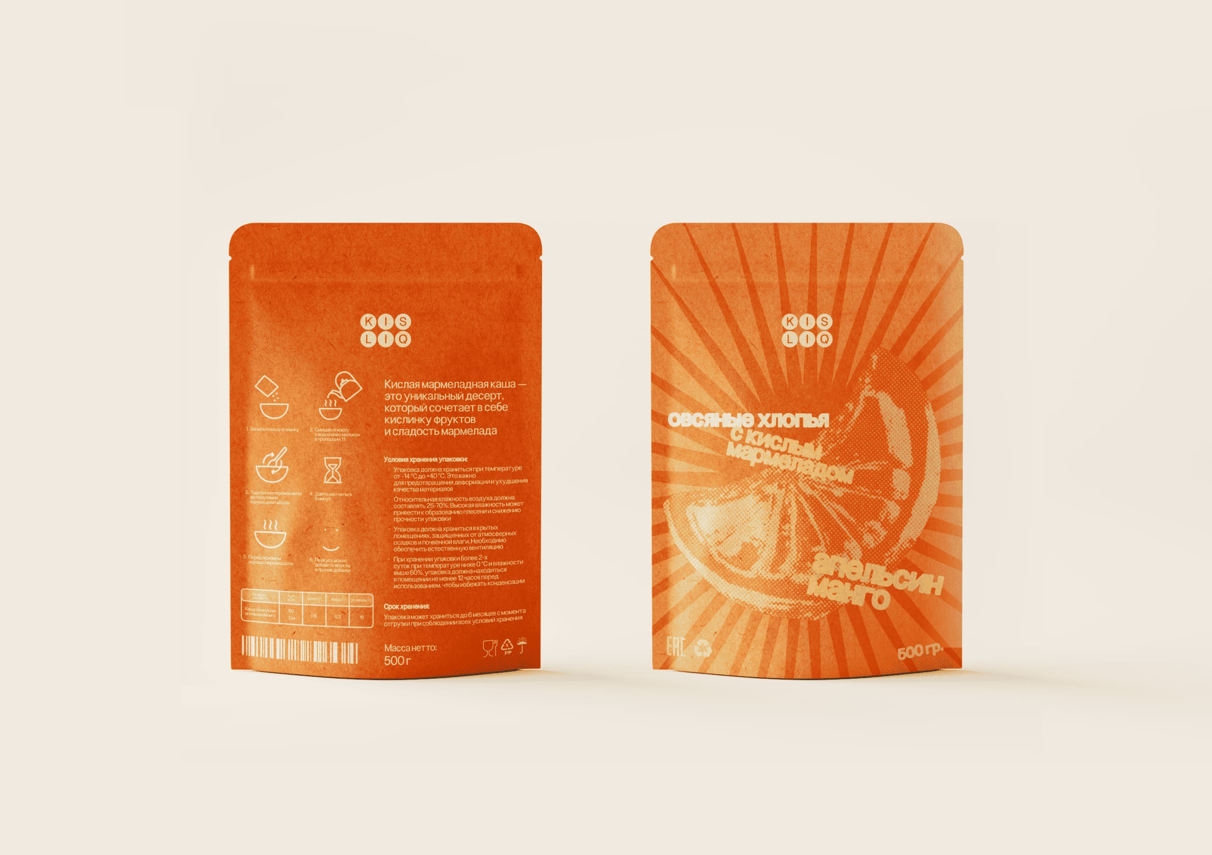
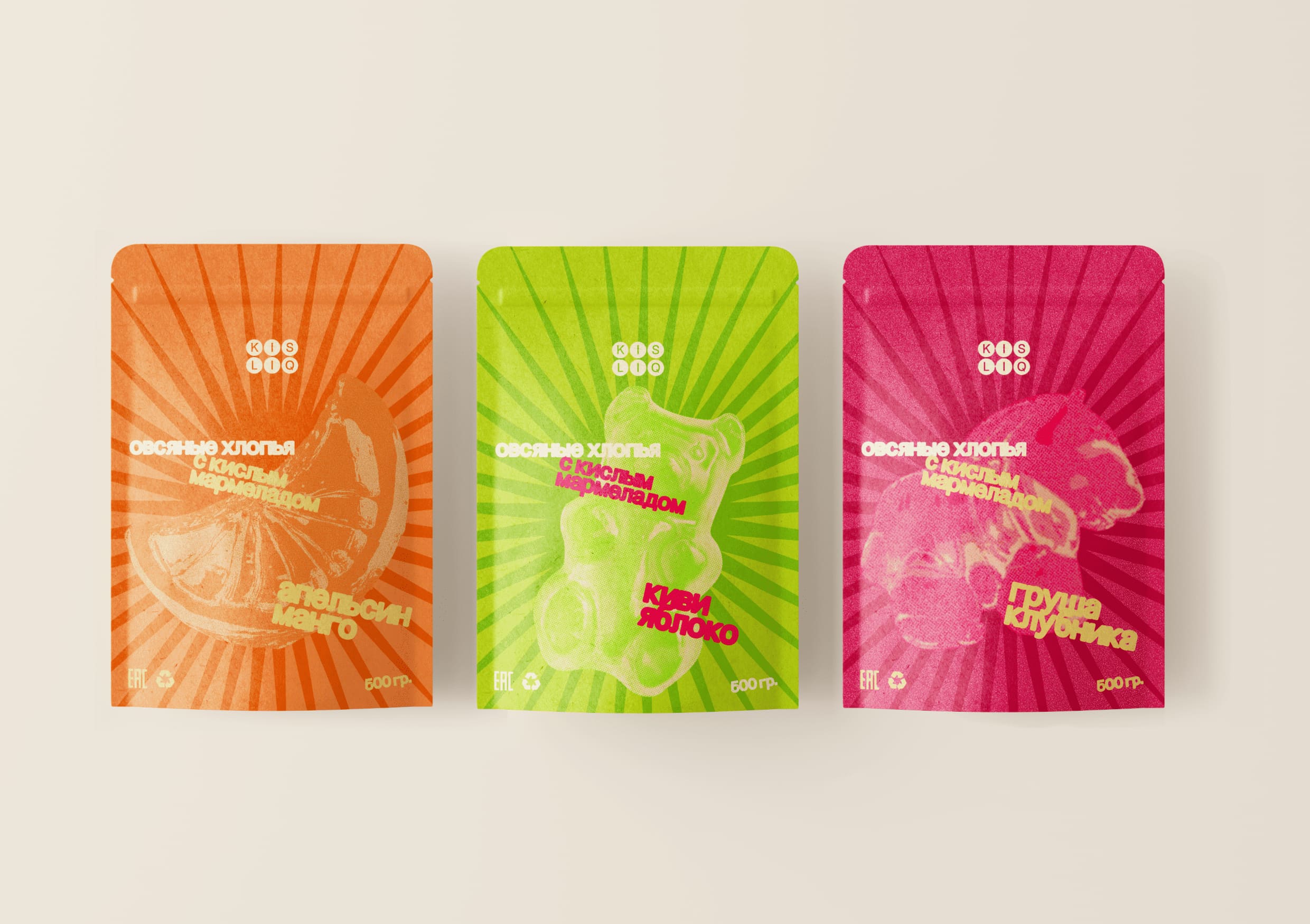
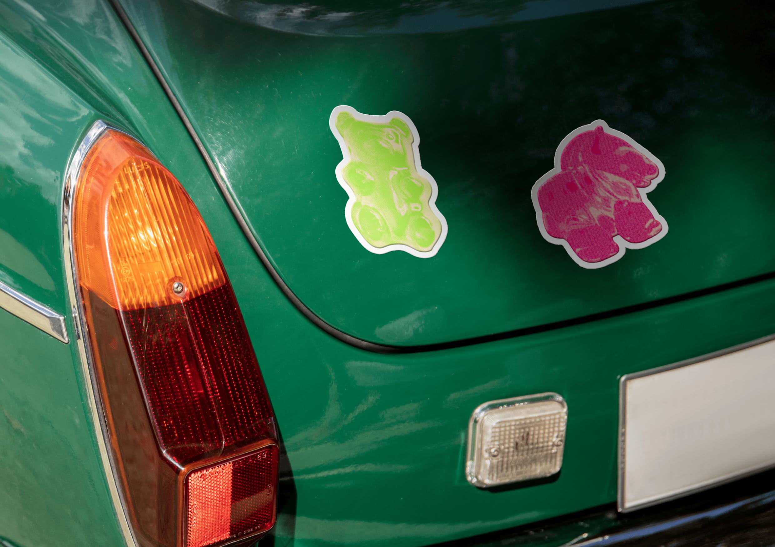
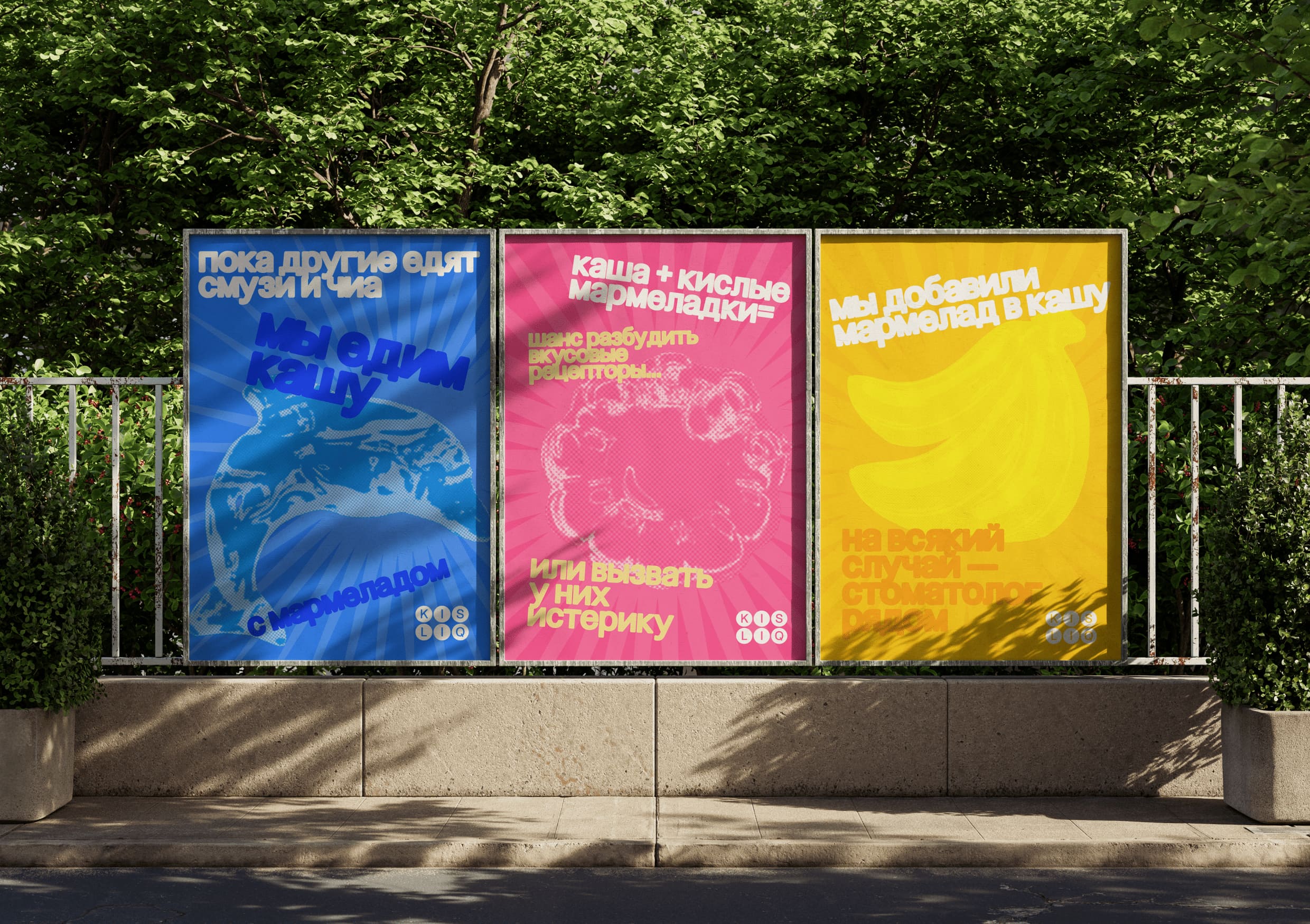
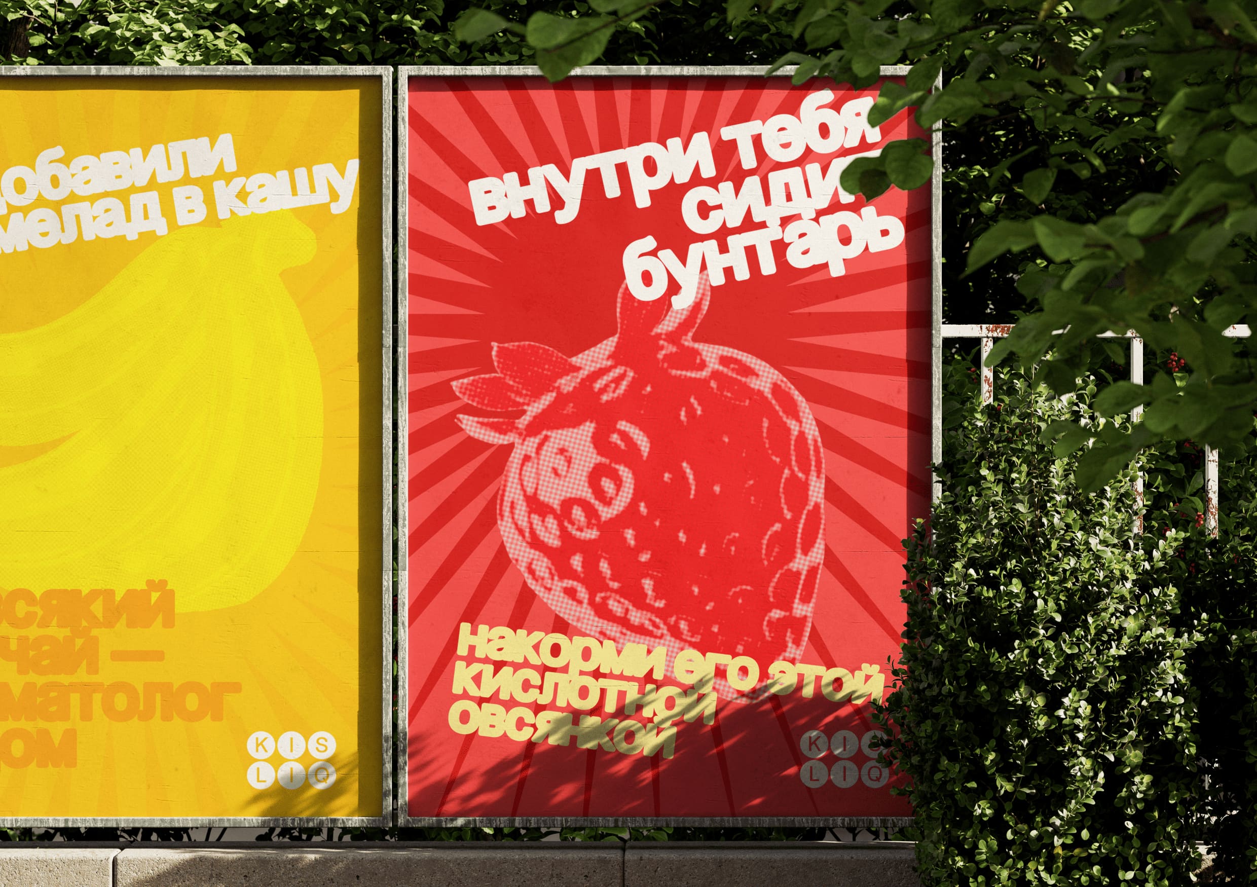
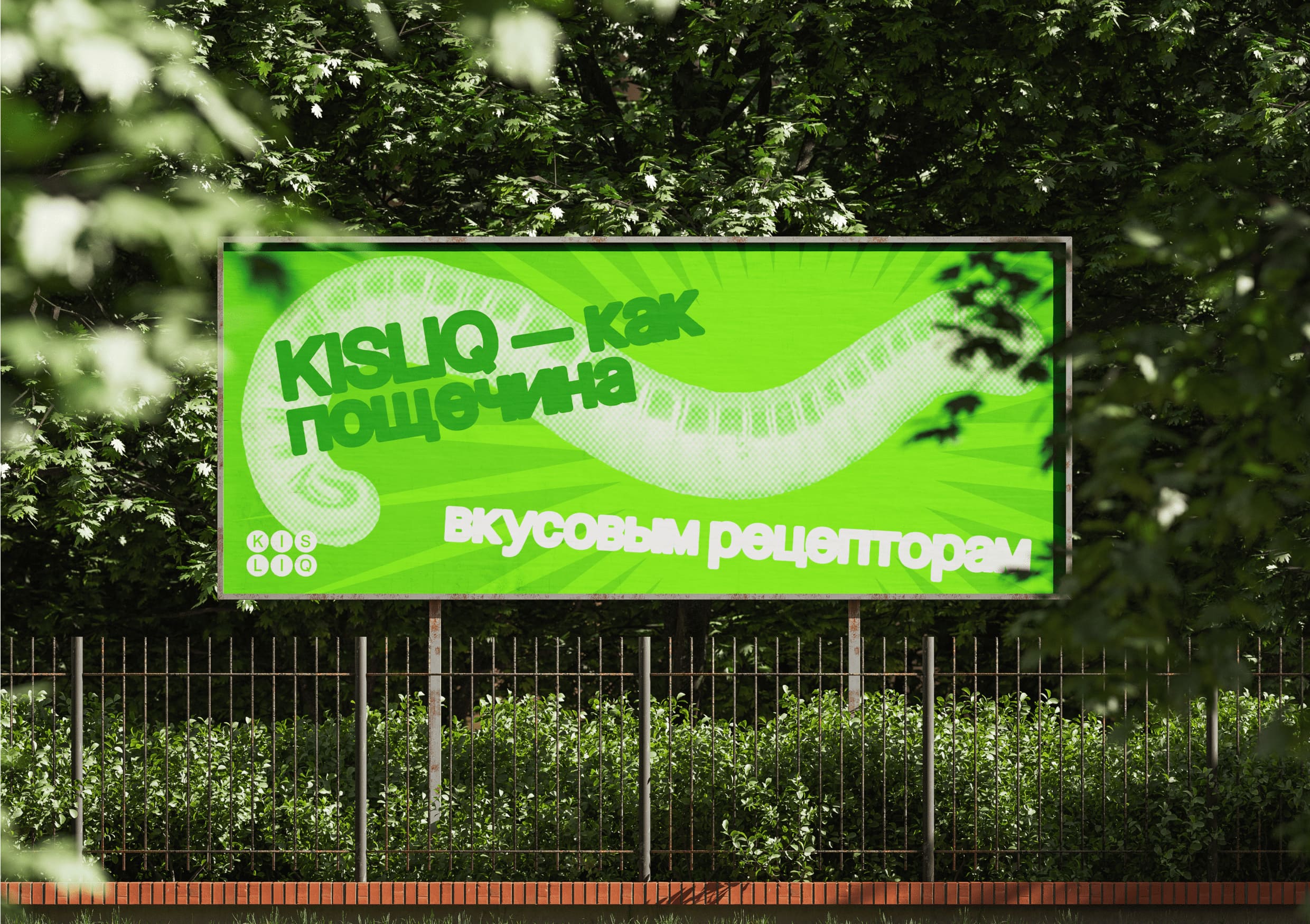
From the moment you see the packaging, it demands attention. A strange, oversized gummy character dominates the front, textured and exaggerated, radiating absurdity and charm. This figure is not here to look pretty — it’s here to break expectations. Surrounding it are vivid beams of color: electric green, neon pink, bold yellow. These aren’t just color choices — they’re emotional triggers, communicating energy, sourness, and playful defiance.
The design embraces imperfection and chaos. The background isn’t clean or minimalist; it pulses with visual noise that mirrors the product’s intensity. Typography is jagged, uneven, intentionally distorted. Each letter feels alive, reacting to the sour jolt of the porridge itself. Nothing feels static or overly refined — the entire layout seems to vibrate with energy.
Rather than promoting calm, balance, or purity, Kisliq’s branding leans into its own loudness. It’s for people who are bored with bland routines and ready for something strange and fun. This is a breakfast for rule-breakers — for those who find joy in contradictions and energy in disruption.
Kisliq is a brand that doesn’t try to fit the mold. It breaks it, colors outside the lines, and invites consumers into a world where breakfast is anything but boring. The packaging becomes a visual anthem for this attitude — rebellious, eccentric, and irresistibly bold.
CREDIT
- Agency/Creative: Polina Grivina, Irina Burakova
- Article Title: Kisliq Redefines Breakfast Energy with Disruptive Packaging by Students Polina Grivina and Irina Burakova
- Organisation/Entity: Student
- Project Type: Packaging
- Project Status: Published
- Agency/Creative Country: Russia
- Agency/Creative City: Moscow
- Market Region: Europe
- Project Deliverables: Brand Identity, Packaging Design
- Format: Pouch
- Industry: Food/Beverage
- Keywords: Breakfast, Beverage Packaging, Porridge
-
Credits:
Designer: Polina Grivina
Designer: Irina Burakova
Curator: Ekaterina Mushkina
Educational Institution: HSE Art and Design School


