


The challenge:
With 28 food allergies, Edible’s founder, Alex De Sousa, has a deeply personal understanding of the challenges faced by food-sensitive customers trying to find safe options on a menu.
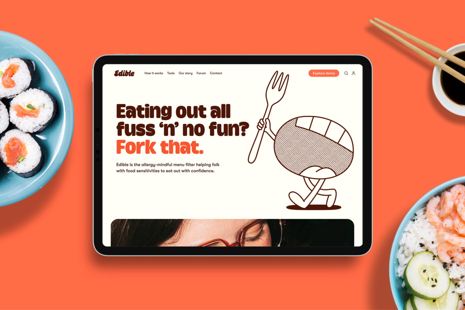
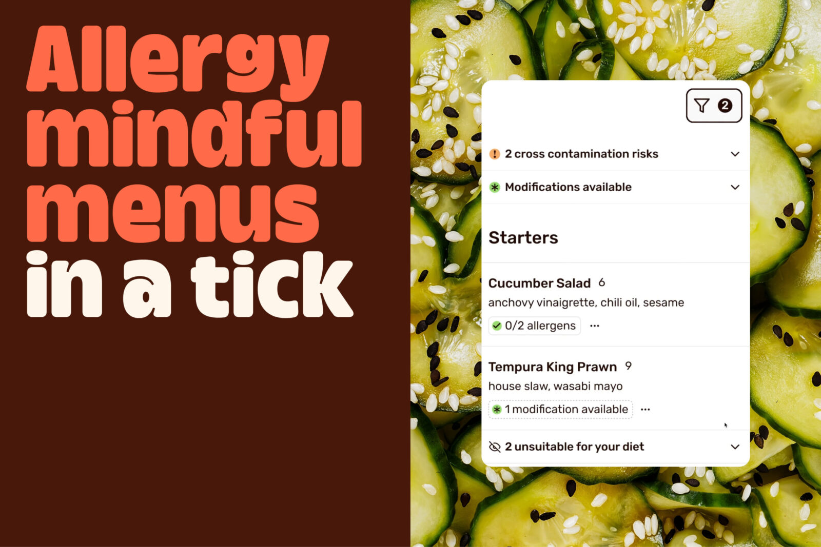
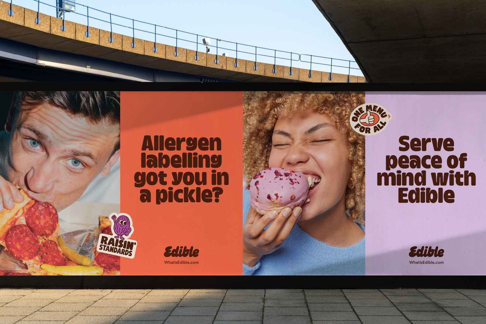
Edible is the menu app that takes the guesswork out of sharing allergy and dietary information, helping food service businesses to serve peace of mind, and empowering their customers to eat out with confidence.
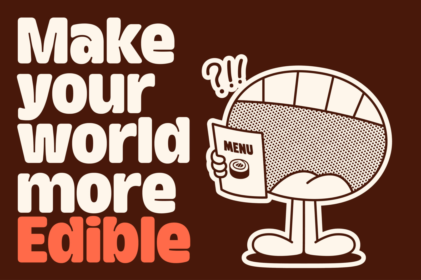
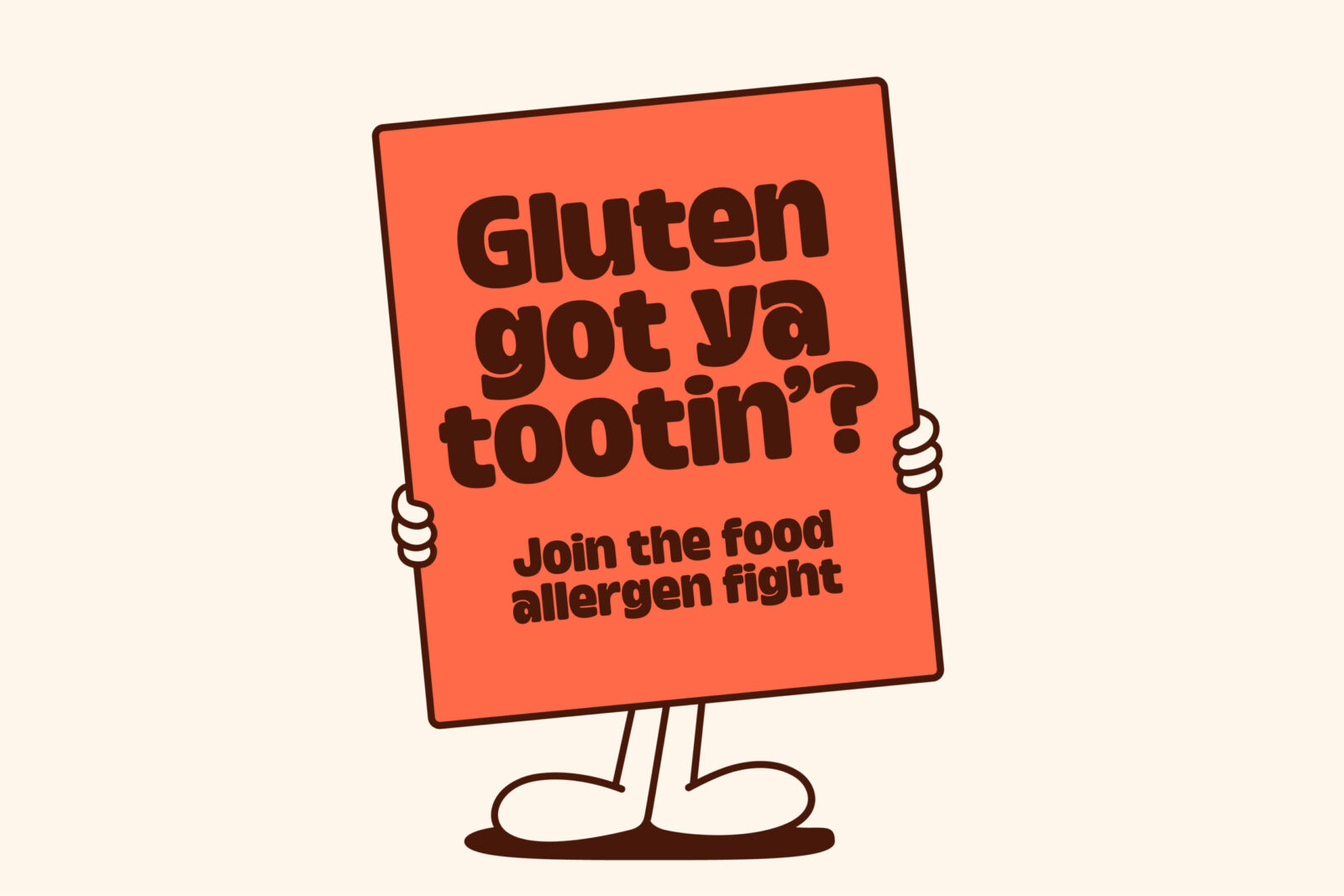
The brand’s mission — to make the world more Edible — called for a gutsy identity that rallies the community to join the food allergen fight.
The approach:
We provided a platform for people with food allergies, intolerances, and dietary needs to share their experiences and frustrations — ensuring the brand’s identity makes them feel heard and understood.
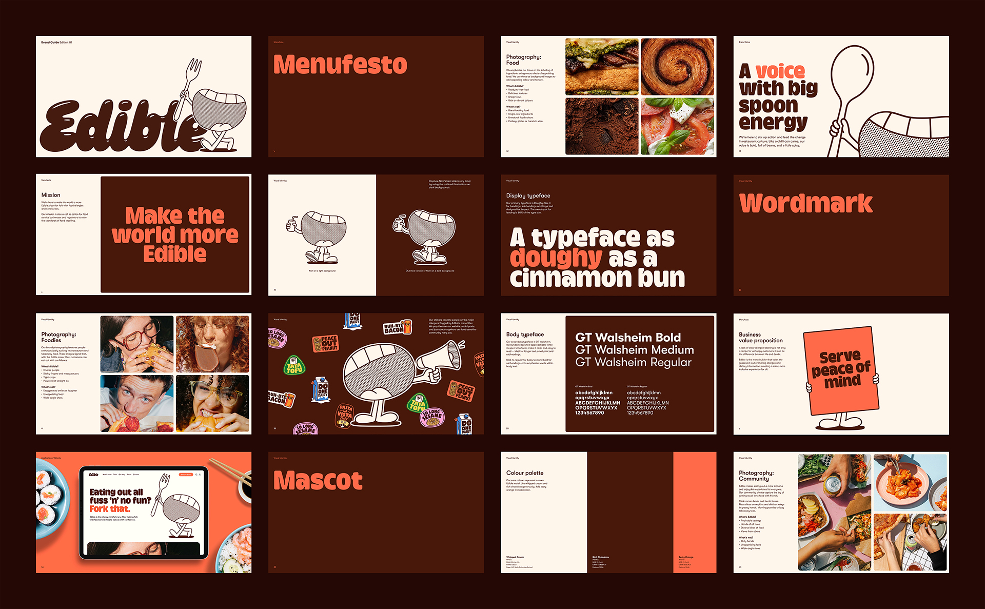
The result is a brand rooted in the values of transparency, advocacy, and community, expressed through four personas: gutsy activist, practical guide, good-humoured foodie, and empathetic supporter.
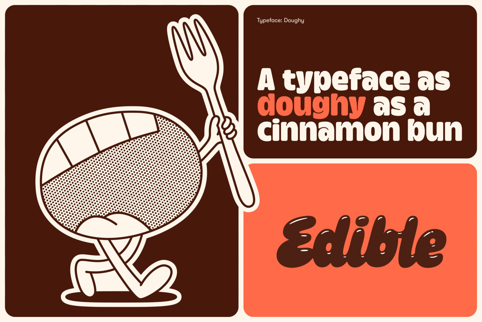
With a gooey, hand-lettered wordmark, doughy typography, and appetising colour palette, Edible’s visual identity is designed to live up to its name — all backed by a strategic ‘menufesto’.
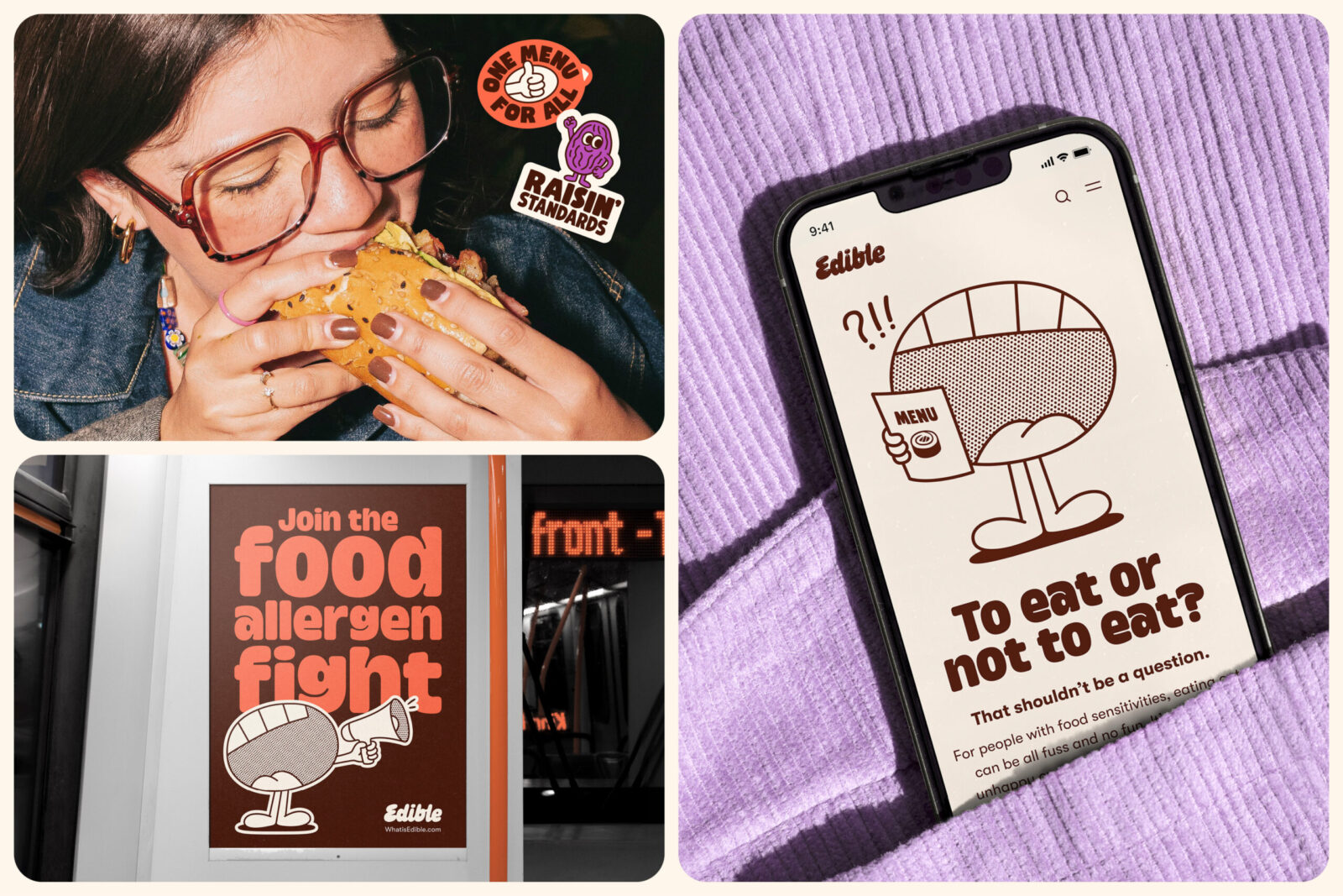
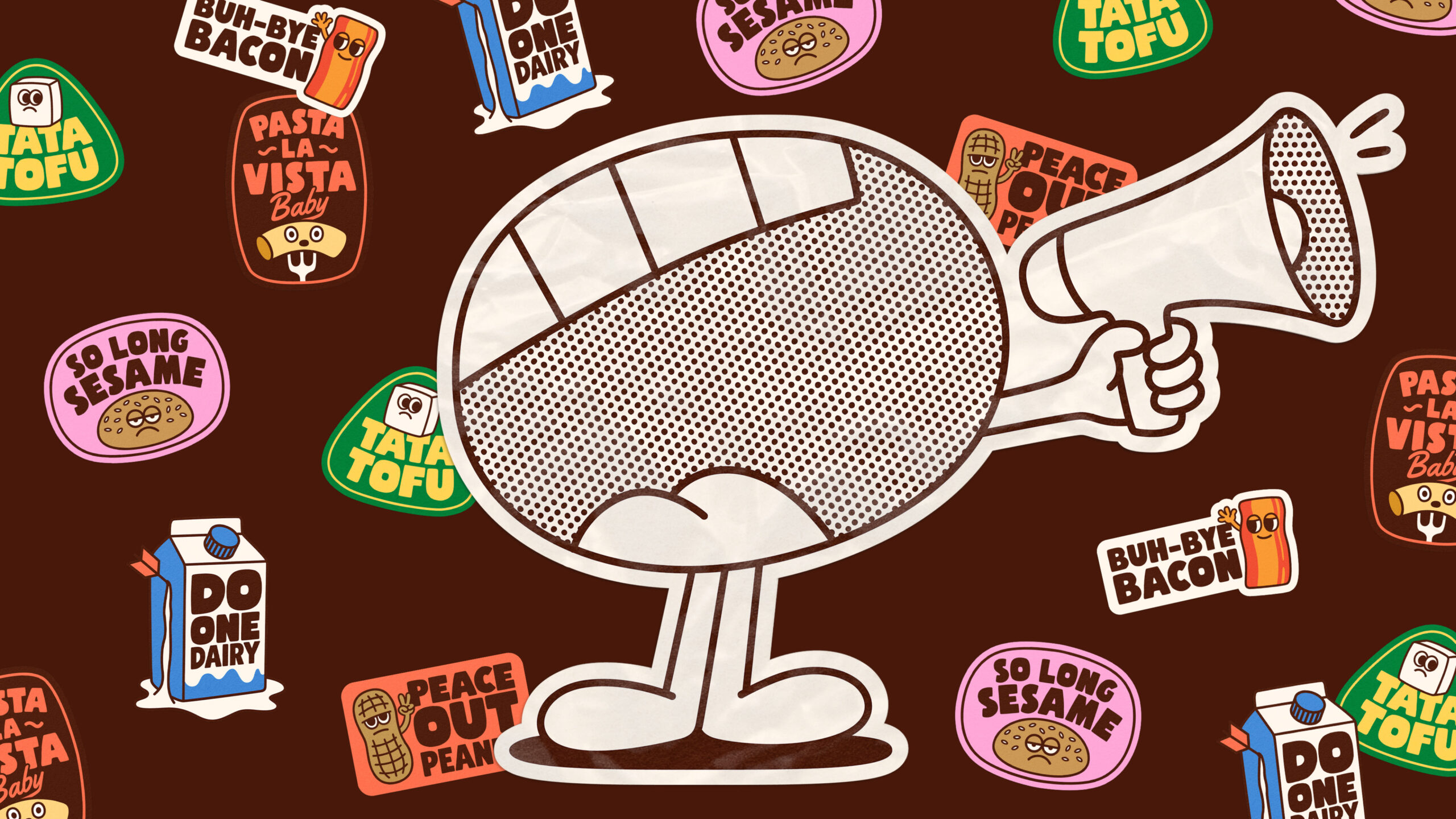
Teaming up with illustrator Ant Gardner, we created a mouthy mascot called Nom, who personifies the brand’s promise to speak up for policy change in allergen labelling. There’s a foot-tapping, soda-swigging, or fork-wielding Nom for every brand attitude.
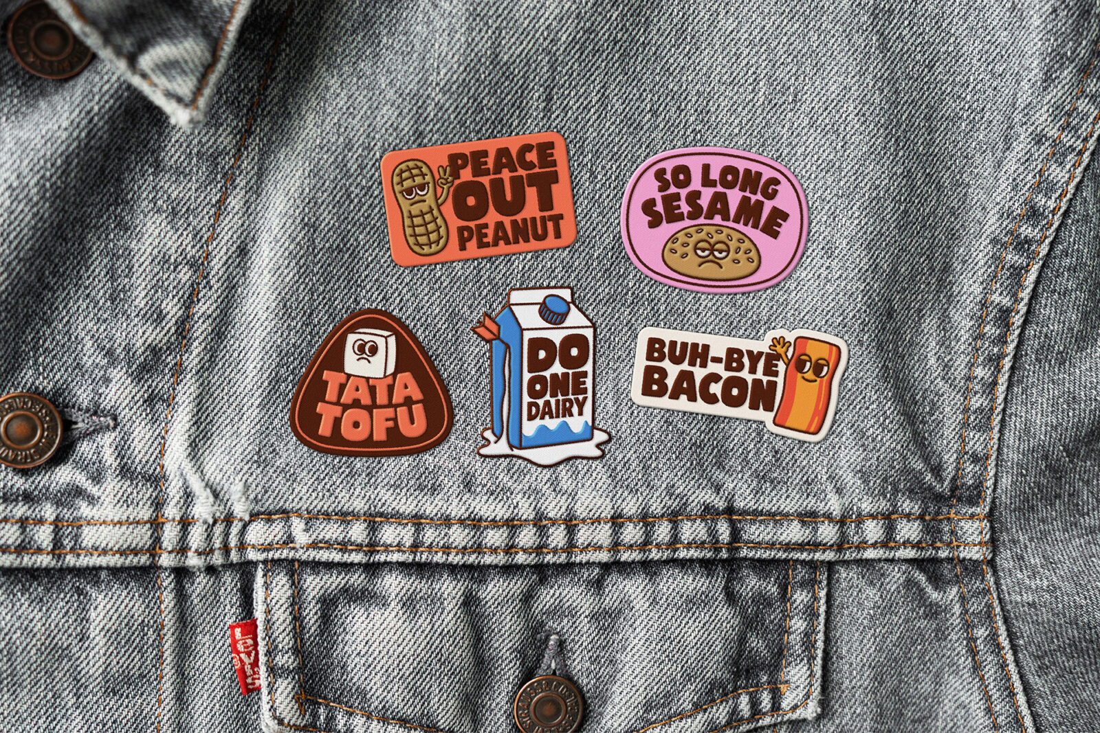
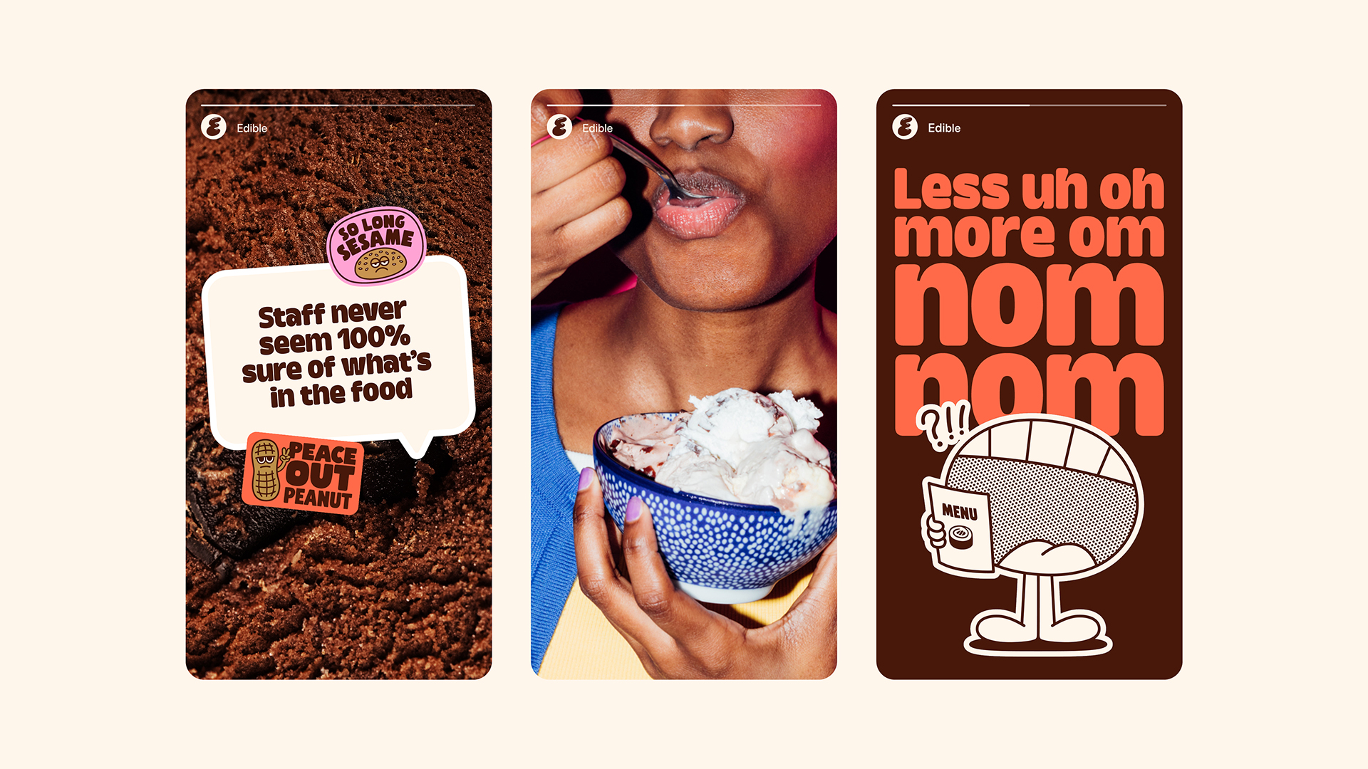
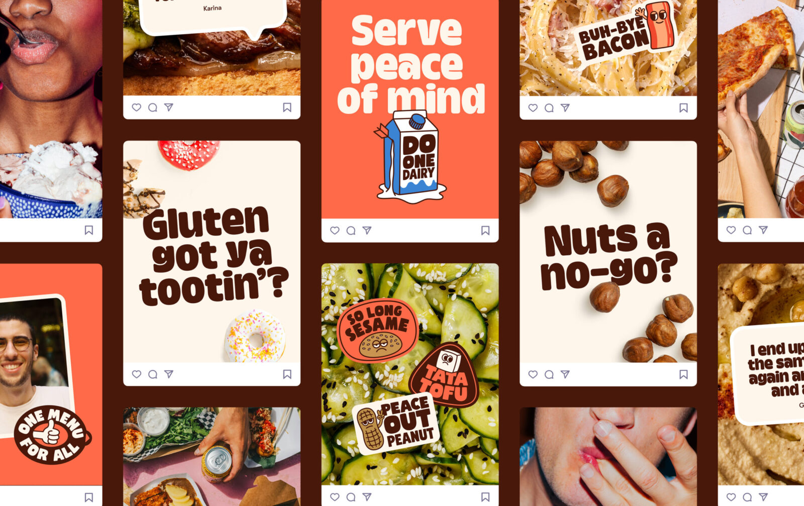
To help educate people about the allergens flagged by Edible’s menu filter, we created a series of illustrated stickers to bid these troublesome ingredients farewell — adding a touch of sassy humour to the identity.
The photography features people enthusiastically tucking into restaurant and takeaway food. A mouthful of noodles or a pizza slice in greasy hands signals that, with Edible, customers can eat out with confidence. With Edible’s focus on ingredients, macro photography was chosen to provide pops of colour and textured backgrounds.
The result:
Edible’s identity has helped propel this small, unknown start-up into the spotlight, with recent features on STV and BBC Radio Scotland. Alex credits this to the brand:
“Starting out, we had zero presence or credibility — something that’s hard to earn but essential for growth. The brand identity has given us just that. It’s why our community and food businesses are taking us seriously. We now have the language and confidence to lead the conversation on food allergen labelling”.
CREDIT
- Agency/Creative: Kirsten Murray
- Article Title: Kirsten Murray Ignites Edible’s Advocacy-Driven Identity With a Gutsy Visual World That Champions Allergy-Safe Dining
- Organisation/Entity: Creative
- Project Status: Published
- Agency/Creative Country: France
- Agency/Creative City: Lyon
- Market Region: United Kingdom and Canada
- Project Deliverables: Animation, Art Direction, Brand Design, Brand Guidelines, Brand Identity, Brand Strategy, Brand Tone of Voice, Character Design, Copywriting, Creative Direction, Graphic Design, Illustration, Logo Design, Tone of Voice
- Industry: Technology
- Keywords: WBDS Creative Design Awards 2025/26 ,Edible, menu app, brand voice, food allergies, brand design
-
Credits:
Illustrator: Ant Gardner


