


Creative thinking in education is often overlooked, leaving unrealised potential in young people, our industries and communities. But what if we changed that? The Creative Thinking Festival brings together educators, students, designers, and policymakers to rethink the role of creative thinking in shaping a more inclusive, innovative, and sustainable future.
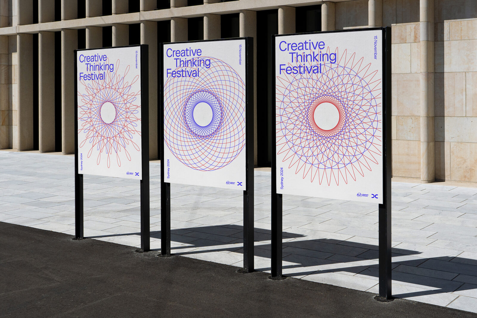
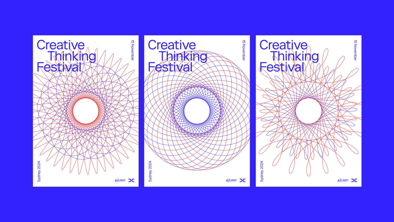
The festival’s dynamic identity is inspired by Spirograph: a favourite childhood toy that spans generations. The spirograph designs represent interconnecting perspectives and disciplines. Every combination of gear and rotation yields a beautifully unique outcome. As well as their nostalgic appeal, the spirographs serve to express the importance of diversity and collaboration in creativity.
The staggered composition for the typography conveys forward-thinking, while the subtle stylised plus and multiply symbols — derived from a spirograph cog shape — signify individuals coming together to build on and accelerate ideas.
The striking red and blue colour palette reflects the familiar Biro-pen combination traditionally used to create spirographs.
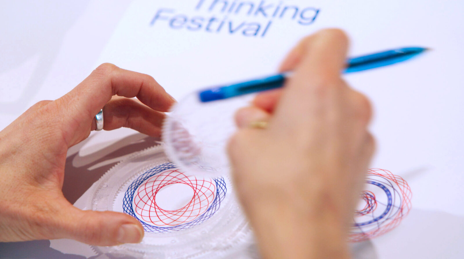
During an interactive workshop, participants were provided with blank branded posters and mini Spirograph kits to create their own designs, encouraging play and collaboration.
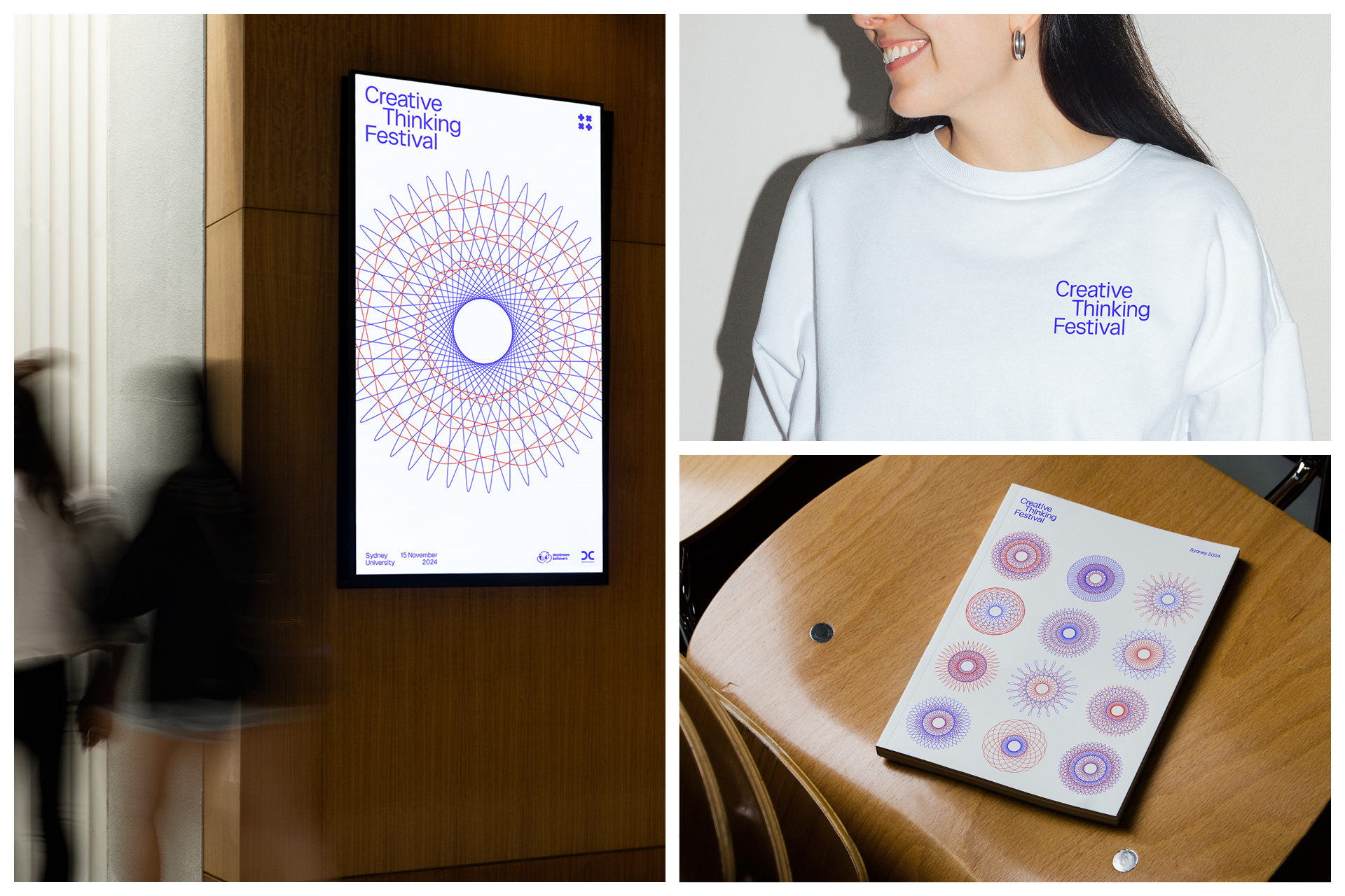
Motion design introduces another layer to the poster design, where the spirographs expand, contract, and shift in pattern. This constant evolution captures the spirit of the event: a space where ideas are never static.
The Creative Thinking Festival was successfully launched in Sydney, Australia, with the inaugural event held at the CREATE Centre at the University of Sydney. Reflecting on its strong reception, founder of the festival, Helena Good MBE, said “the brand identity is energetic, interconnected, and ever-evolving, bringing our vision for the festival to life. Attendees embraced the brand idea, seeing it as a powerful representation of the role they play in shaping the future”.
We may feel like small cogs in a wheel, but when we come together, the possibilities are infinite.
![]()
CREDIT
- Agency/Creative: Kirsten Murray , Dan Plunkett
- Article Title: Kirsten Murray Brings a Dynamic Red-and-Blue Design Language to the Creative Thinking Festival to Celebrate Collaboration and Diverse Perspectives
- Organisation/Entity: Creative
- Project Status: Published
- Agency/Creative Country: France
- Agency/Creative City: Lyon
- Market Region: Global
- Project Deliverables: Brand Design, Brand Identity, Creative Direction, Graphic Design, Logo Design, Motion Graphics, Poster Design, Web Design
- Industry: Education
- Keywords: WBDS Creative Design Awards 2025/26 Creative Thinking Festival, event, brand identity, spirograph, poster design


