


Kinnie, the original bittersweet soft drink of Malta, is expanding into new markets and strengthening its presence at home, thanks to an iconic and refreshed brand positioning, identity and packaging design developed by leading brand agency bluemarlin.
First sipped in 1952, the positioning and identity have been crafted to resonate with a new generation of global drinkers, while remaining true to the drink’s bittersweet, aromatic flavour.
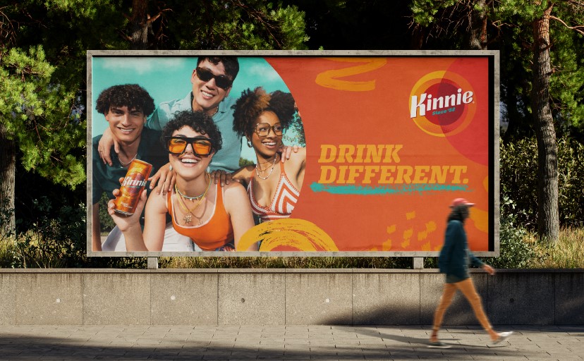
Kinnie, long cherished on home turf, isn’t looking to compete with mainstream sodas. It’s doing something braver: being itself – louder, prouder and ready to be discovered by curious palates around the world. The original alternative to colas, lemonades and orangeades, the new brand identity and campaign invite consumers to ‘Drink Different’.
“We knew Kinnie had potential to travel and broaden its fan base by engaging new audiences with its distinct flavour profile, versality and personality. But we needed to progress the brand fundamentals – built on distinctiveness, complexity and the unexpected – with more ambition and imagination,” said Andrew Eyles, Co-founder of bluemarlin. “We helped brand owners, Simonds Farsons Cisk, see that behaving like a global brand doesn’t mean becoming a generic one. It means amplifying and dramatising what makes you unique and unforgettable.”
New vibes rooted in legacy
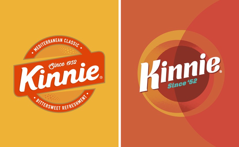
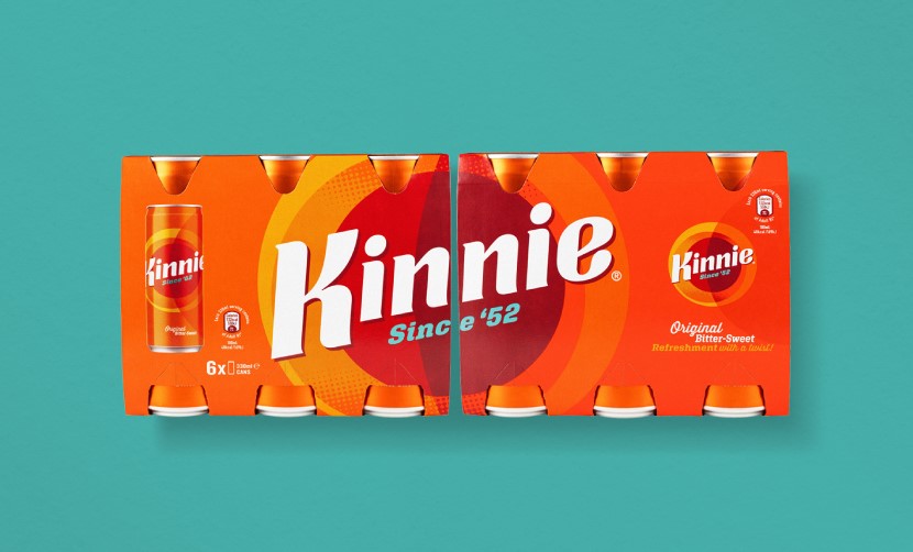
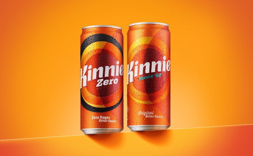
The original Kinnie logo and brand held a certain nostalgic charm and warmth, but it needed a more progressive edge for new markets. bluemarlin set out to reposition the brand, accentuate its distinctiveness and capture the unique flavour that sets Kinnie apart.
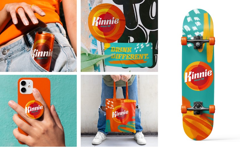
Now there’s a bold, playful and dynamic visual system designed to live across packaging, social and experiential touchpoints.
“‘Drink Different’ was an inspiring brief for the design team,” said Samantha Dumont, Executive Creative Director at bluemarlin. “Their challenge was to modernise Kinnie, clearing away the visual clutter and reimagining the brand in a way that feels bold, confident and unique, while staying true to the Kinnie that customers know and love.”
The brief became a powerful creative catalyst – a compelling invitation to reinvent an icon with purpose and flair. bluemarlin crafted a crisp, modern wordmark infused with forward momentum, drawing heavily on the original 1952 design, not just in spirit but in letterform detail, particularly in the expressive ‘K’ and the underline that gives it energy and lift.
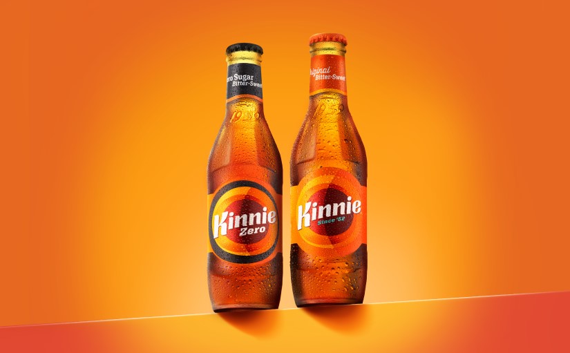
A new, larger circle casts a shadow over the logo, evoking sunny days. A deeper palette of oranges, rusts, burgundies and teals better captures the bittersweet character of the liquid. Bold slab-serif fonts are balanced with ‘Kinnie Kreativity’ graffiti elements to add a layer of disruption and energy.
Painterly textures dispersed throughout the brand world bring a dynamic, hand-crafted quality that reflects Kinnie’s free-spirited nature. Expressive brushstrokes add movement, depth and creativity to the visual language – Kinnie’s invitation to unleash your imagination.
Strategic shifts
This was never just about how Kinnie looks – it’s about what it stands for. bluemarlin has repositioned Kinnie as a free-spirited brand for explorers: drinkers aged 16+ with a taste for the alternative and a passion for creativity. In a world hungry for authenticity, Kinnie champions originality and invites people everywhere to engage with its vibrant, expressive spirit.
Kinnie (think Aperol or Campari, minus the alcohol) is refreshingly non-conformist. Whether sipped solo, with a slice of orange, or mixed with a splash of your favourite spirit, it’s a versatile drink that that makes a refreshing change.
70 going on 16
For bluemarlin, the challenge was one of scale and sensitivity: how do you take a 70-year-old cultural icon and make it future-ready without losing its soul?
With strategic precision, creative bravery and a lot of trust.
This rebrand stands as the latest example of bluemarlin’s ability to combine deep strategic thinking with bold creative expression. The project reflects the agency’s consultative approach – one that challenges clients to think bigger and act more boldly without losing sight of their identity.
“We’ve worked with the Kinnie team for nearly a decade,” said Eyles. “This rebrand was about building a flexible, globally resonant identity that still feels unmistakably Kinnie. Our focus is always on driving business growth through strategically aligned creativity.”
A Maltese Mediterranean icon. A global attitude.
“bluemarlin have been trusted brand guardians for Kinnie for a number of years now,” said Susan Weenink Camilleri, Head of Sales and Marketing at Simonds Farsons Cisk. “What we appreciate most is their ability to honour unique heritage while preparing brands for the bigger stage.
“The Kinnie rebrand isn’t about mimicking global giants – it’s about embracing who we are and expressing it with imagination, irreverence and iconic taste.”
Evviva (cheers) to Kinnie and to everyone who wants to ‘Drink Different’!
CREDIT
- Agency/Creative: bluemarlin
- Article Title: Kinnie Steps Onto the Global Stage With Bluemarlin’s Bold ‘Drink Different’ Rebrand
- Organisation/Entity: Agency
- Project Type: Packaging
- Project Status: Published
- Agency/Creative Country: United Kingdom
- Agency/Creative City: London
- Market Region: Global
- Project Deliverables: 2D Design, Brand Design, Brand Mark
- Format: Bottle, Can, Case
- Industry: Food/Beverage
- Keywords: WBDS Agency Design Awards 2025/26 , Kinnie Rebrand Global Expansion
-
Credits:
Brand designer: bluemarlin


