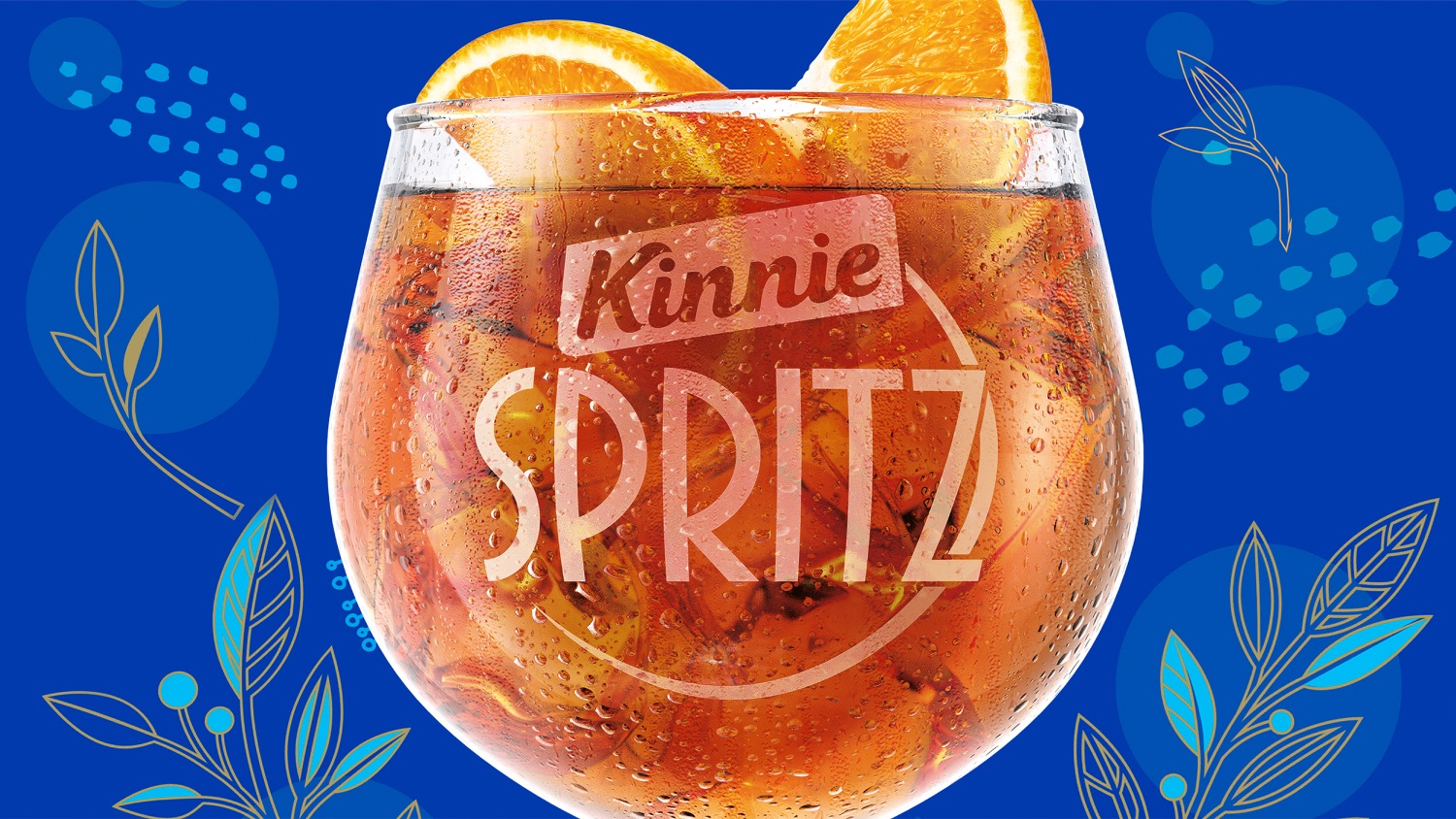
Looking to capitalise on the global Spritz phenomenon, SFC’s Kinnie Spritz brings everything that’s loved about Malta’s favourite drink but with a bit of a kick. By tapping into the brand’s sense of nostalgia, we have created a brand that is evocative of an era and is loved by consumers. So much so that SFC recorded record-breaking sales following launch.
Opportunity
Kinnie, Malta’s national soft drink, is often used as a versatile mixer in cocktails. In the midst of a growing ready-to-drink (RTD) market, the brand’s owners Simonds Farsons Cisk (SFC) saw the opportunity to launch its own viable RTD.
After having successfully repositioned and designed Kinnie, SFC asked us to define the strategic rationale and design direction for the development of this new alcoholic ‘Kinnie Spritz’ aperitif. This meant establishing the right balance between Kinnie and Spritz, given its highly established position as a soft drink, as well as to position it as a premium offering with style and glamour.
Insight
Kinnie had recently been modernised and repositioned to add a unique dimension to grown up drinking and socialising. The brand is all about capturing the ‘now’ and invites people to embrace the moment and use the power of their imagination to make their own variations of its bitter-sweet classic. So, inspired by their imagination, Kinnie created a beautiful balance of bitter, sweet and bubbles in a tipple that’s all Kinnie… but a bit more grown-up.
Kinnie Spritz is designed to evoke strong memories and take us back in time, transporting us to places we’ve never been and evoking emotion that encourages us to embrace the moment and use our imagination. It is about drinking to the past, re-imagining the future and grasping the now, while maintaining something very charming and refreshingly contemporary.
Kinnie with a Kick
The name Kinnie ‘Spritz’ brings a bitter-sweet twist to the well-loved classic cocktail (made with sparkling Italian wine and a bitter liqueur that’s often served as an aperitif) and provides Malta’s favourite drink since 1952 – but with a bit of an edge, ready to be enjoyed anywhere at any time.
Kinnie Spritz is a natural, more adventurous and grown-up, extension of the brand, therefore we took a masterbrand approach to build on brand equity but also to highlight that it’s the same great Kinnie that consumers know and love, just with an alcoholic kick.
We focused on three of Kinnie’s brand world principles to drive the creative for Kinnie Spritz. Retro, adventurous and ‘of the land’.
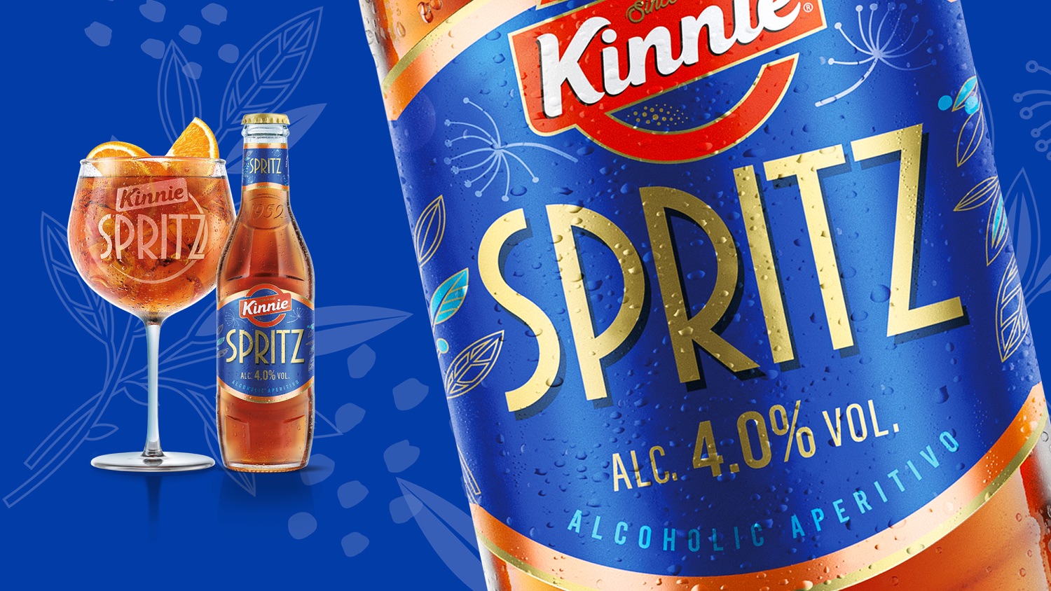
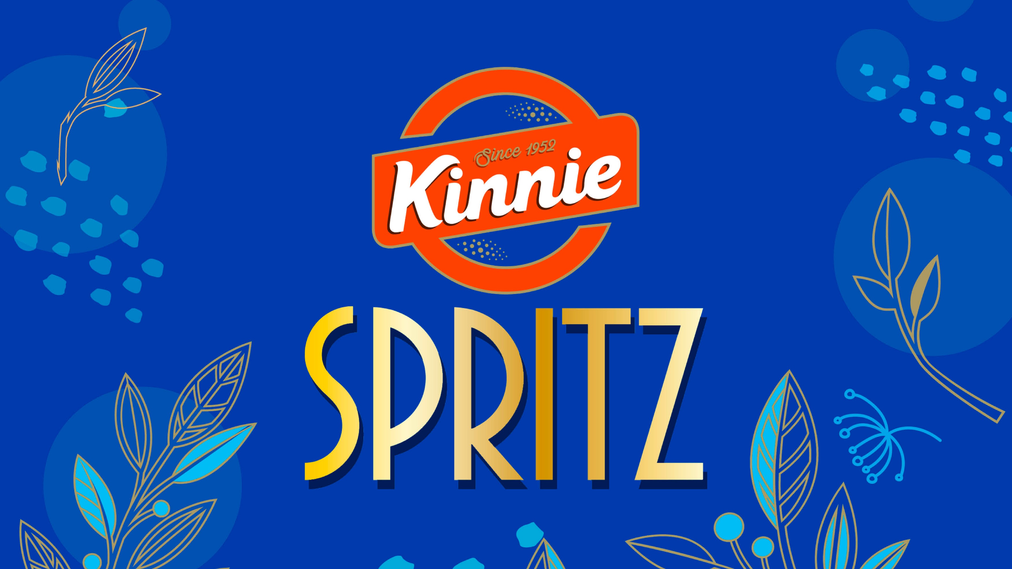
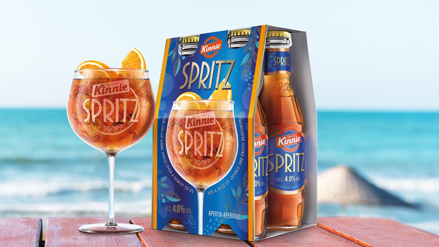
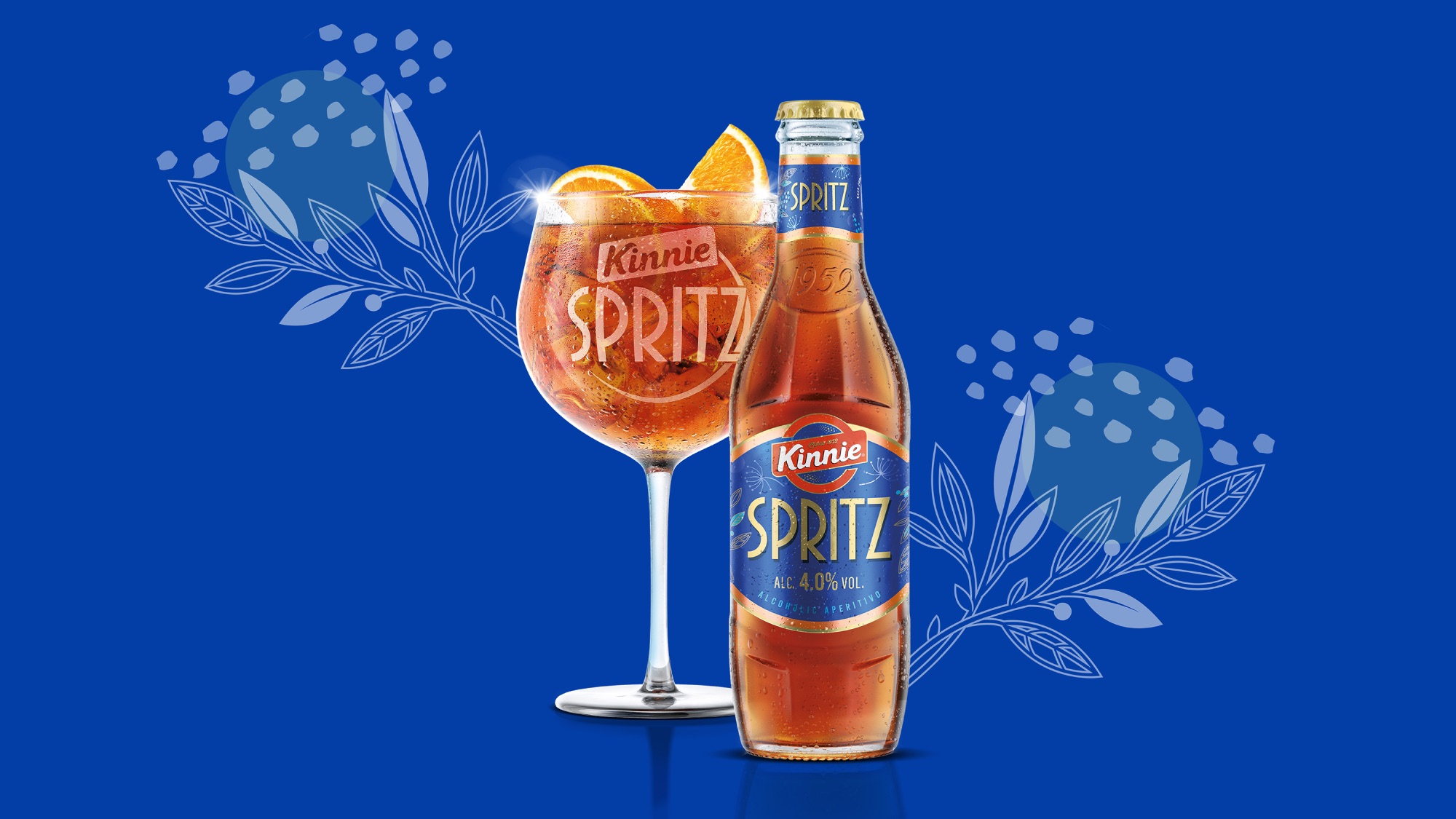
Retro and the sense of nostalgia that unites young and old drinkers alike, is reflected in the typography reminiscent of a classic cocktail lounge. The blues talk ‘of the land’ and the Mediterranean lifestyle that we romanticise. The ‘kick’ is visualised through the illustrated botanicals and the deep, rich blue to differentiate from the soft drink and add a level of sophistication and premium-ness.
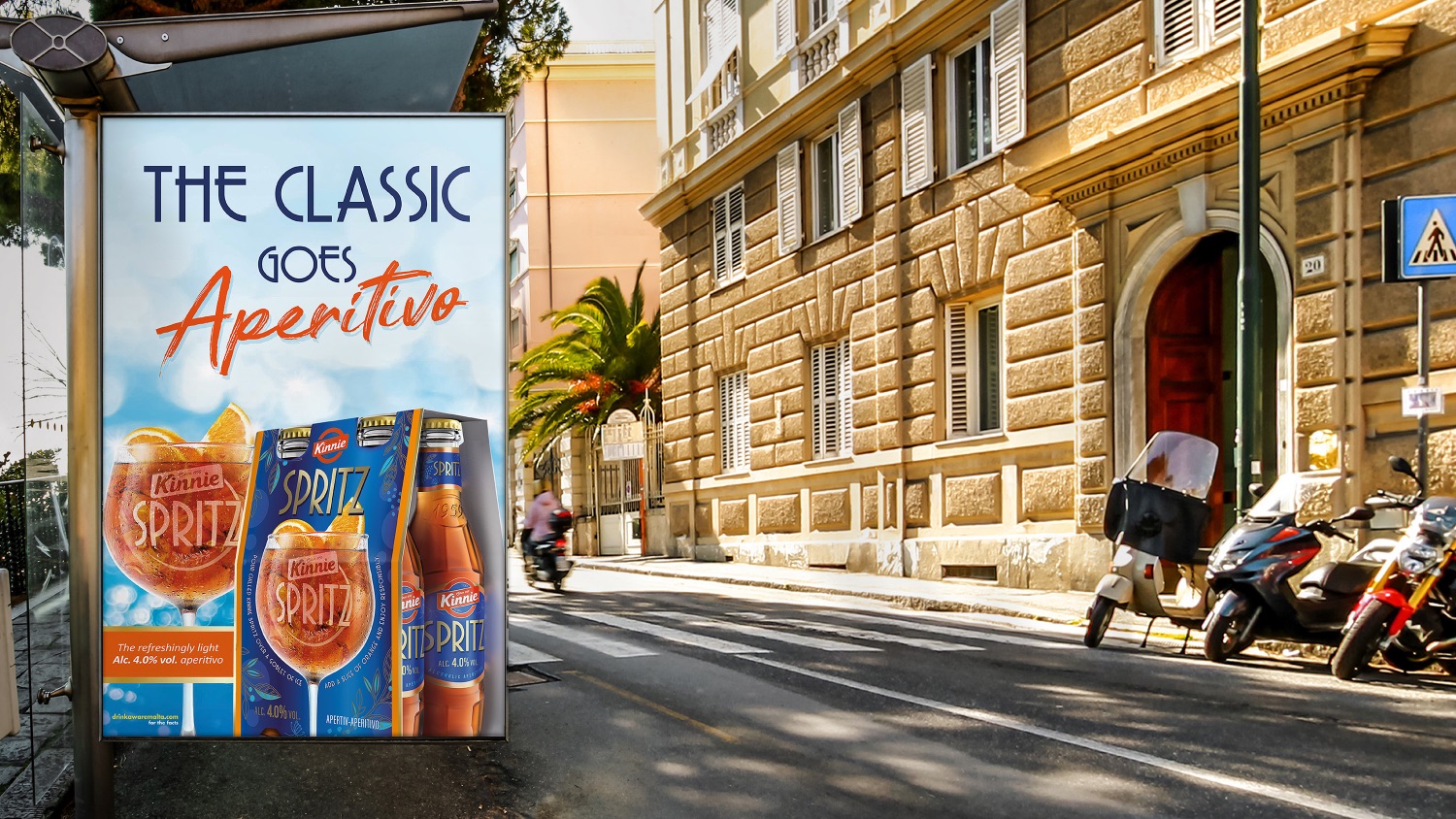
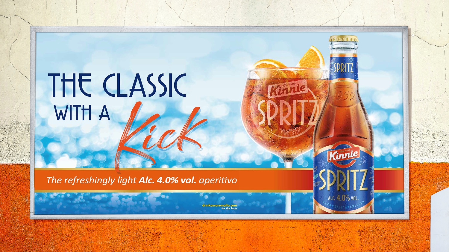
To bring the brand world to life, the launch campaign painted an image that transported consumers and captured the spirit of the ‘Kinnie Spritz moment’. The visuals in both the digital and OOH invited viewers to close their eyes, feel the heat, hear the waves, sit back, and relax.
Impact
Kinnie Spritz balances a contemporary illustrative style with a classic typographic style that is evocative of an era, with a result that’s elegant and timeless, yet full of energy.
Its launch was announced by a single social media post carried on the Kinnie Facebook Page – which immediately went ‘viral’ and garnered well over 100,000 views within the first 24-48 hours. The consumer reaction was incredible and unprecedented, with people creating a buzz around Spritz. And in just three weeks, the brand reported record-breaking sales having attracted new buyers.
CREDIT
- Agency/Creative: Bluemarlin
- Article Title: Kinnie Spritz Packaging Design Creation by Bluemarlin
- Organisation/Entity: Agency
- Project Type: Packaging
- Project Status: Published
- Agency/Creative Country: United Kingdom
- Agency/Creative City: Bath
- Market Region: Global
- Project Deliverables: Packaging Design
- Format: Bottle
- Substrate: Glass Bottle
- Industry: Food/Beverage
- Keywords: WBDS Agency Design Awards 2021/22
-
Credits:
Creative direction: David Hodgson
Design: Jo Pittard, Josh White
Visualisation: Simon Thomas
Strategy: Dan Monteith , Laura Eyles
Artwork: Steve Gordon
Account Direction: Rosie Marlow , Kim Barfoot-Brace


