Primary Objectives
When Courageous Spirits came to talk to us about their first Single Malt Whisky their biggest problem was how to position the brand. The name King’s Inch had been floated with the idea of telling the story of a lost island in the Clyde, but it that didn’t have the right character for this whisky. We focused instead on the fact that the term came from an ancient measure based on barley – a King’s inch referenced a measurement based on “3 fat barley corns laid end to end”.
They already had a very successful gin with a very urban personality. Their new whisky was intended for the same outlets, but they couldn’t really see how to relate a Single Malt Whisky to that audience; it had to be able to stand apart from the gin – but still feel like it belonged in their portfolio.
The over-arching message from the brief developed to “create Glaswegian soul”. The Scottish city of Glasgow is famous for its people and their generous hospitality and great sense of humour, the challenge was to embed these attributes into the characteristics of the packaging for King’s Inch and ooze contemporary appeal. King’s Inch needed to feel “made in Glasgow”.
Design Solution
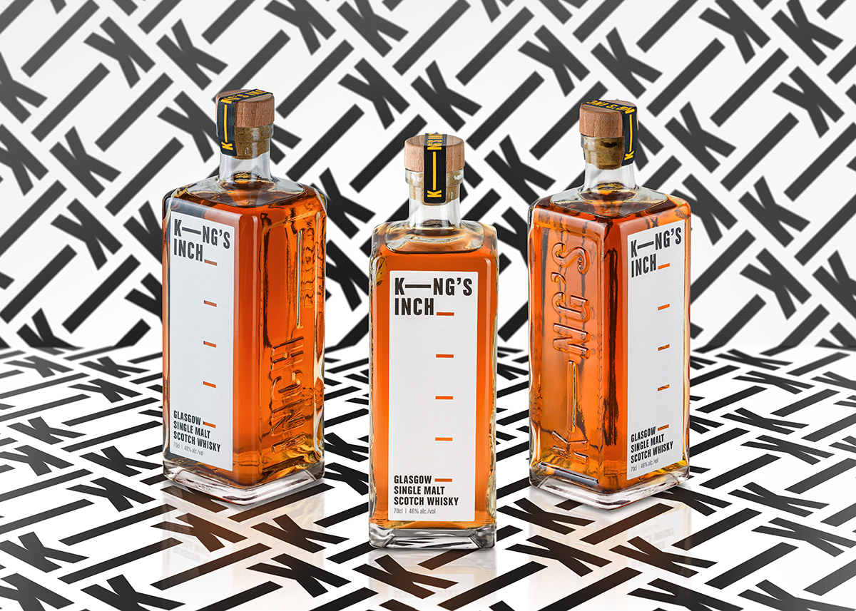
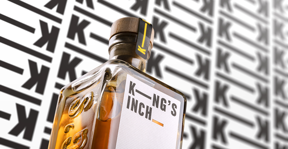
We had found a way to turn the reference to a measure into a personality. Now it would refer to ‘the measure of a good host’. This brought the name and the story up to date – celebrating Glasgow as it is now, pulling in the pace, style, language, humour and that big confident personality. With this personality, and a bit of Glasgow swagger in mind, we had direction for the pack design. We wanted the bottle itself to carry the conversation for us. We imagined the gregarious host, proudly pouring a measure of Kings Inch, their guest giving them a hard time if being a bit on the cautious side of a pour. And with a prompt to tell our story literally at his fingertips.
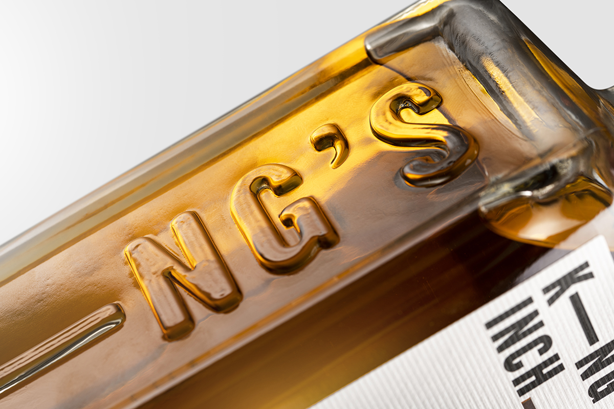
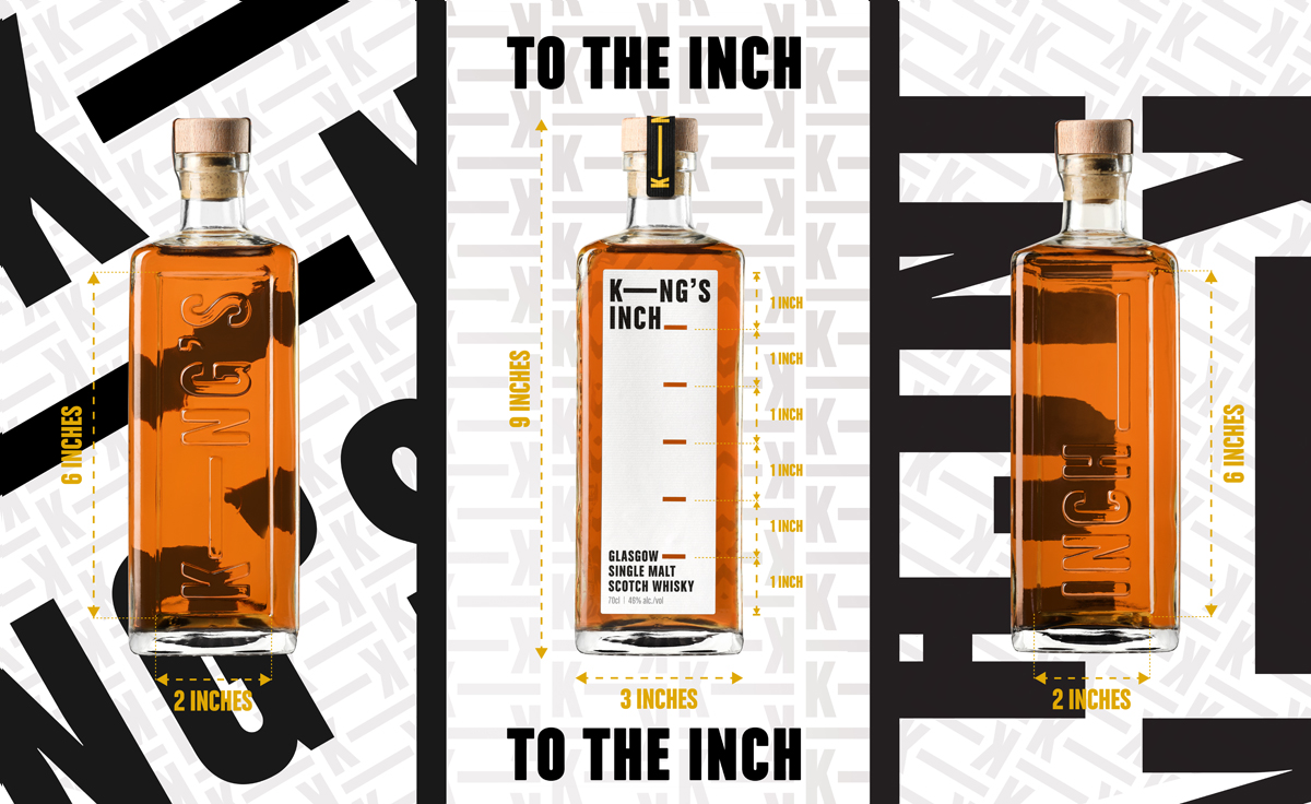
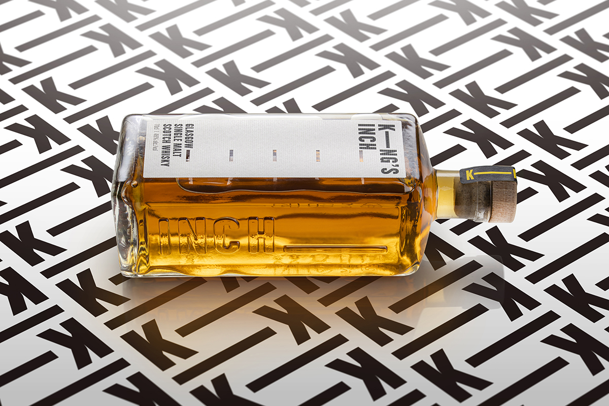
The attention to detail is all in the inch – it had to be a bespoke bottle to achieve this level of detail and attention – an exact 9″x3″x3” with the debossed sides and label in cut to 6″x2” creating a kinetic graphical footprint. And to cap it off, even the bottle stopper seal is designed to units of an inch. The bottle’s angular profile is industrial yet city-chic and the cut outs on the label are an inch apart representing a hospitably generous pouring to intentionally encourage some ‘measure’ banter.
Elements/Detail
By focusing on the detail – developing the packaging design literally inch by inch and creating a strong brand story ignited from its visual appearance – we have placed this brand firmly in its urban setting, removing it from a traditional association of Scottish whisky in picturesque rural landscapes. By using the once ‘royal’ measurement as the driver for the brand story and applying this to the bottle label immediately emphasises local camaraderie and ensures King’s Inch is nothing other than Glaswegian through and through, reflecting the craic shared over a dram.
CREDIT
- Agency/Creative: Contagious
- Article Title: King’s Inch: Capturing Glasgow’s Heart in Single Malt Whisky
- Organisation/Entity: Agency
- Project Type: Packaging
- Project Status: Published
- Agency/Creative Country: United Kingdom
- Agency/Creative City: Edinburgh
- Market Region: Europe
- Project Deliverables: Packaging Design, Product Design
- Format: Bottle
- Substrate: Glass Bottle
- Industry: Food/Beverage
- Keywords: WBDS Agency Design Awards 2023/24
- Keywords: Packaging Design , Product Creation
-
Credits:
Creative: Contagious


