Icely Done makes remarkable cocktail blends for bars across the UK; but their brand didn’t reflect either the quality of the product or the energy of the business itself or the environments they were being used in. Kingdom & Sparrow solved this by carving out a distinct brand positioning and USP and an ownable visual space with unique brand assets, bringing a sense of excitement, creativity, ownership and consistency to the brand internally and externally.
The Concept
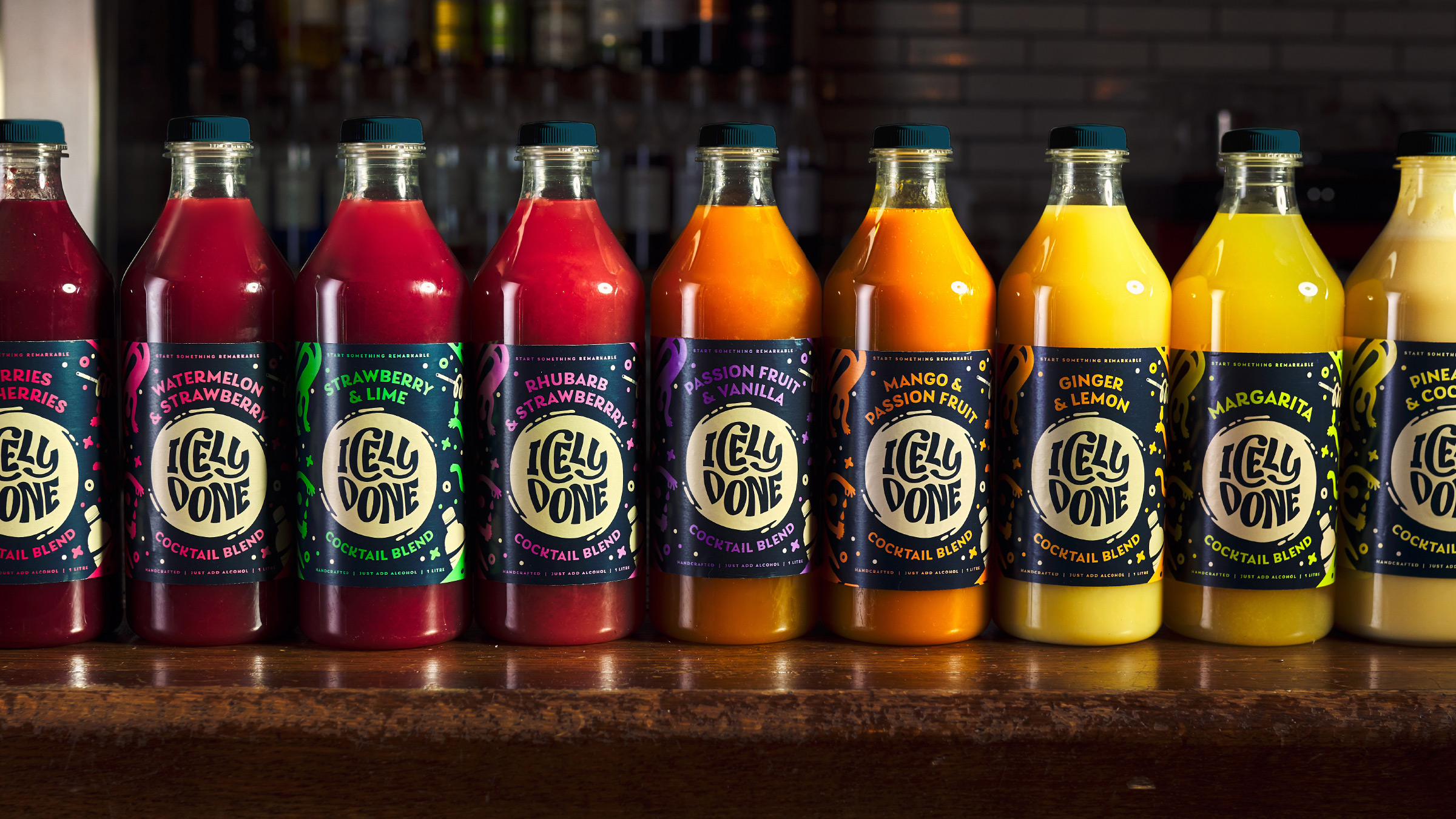
A brand to inspire internally and grab attention externally. A dynamic new identity and illustrative assets to bring energy to the brand whilst ensuring bartenders can find the right blends fast.
The Impact
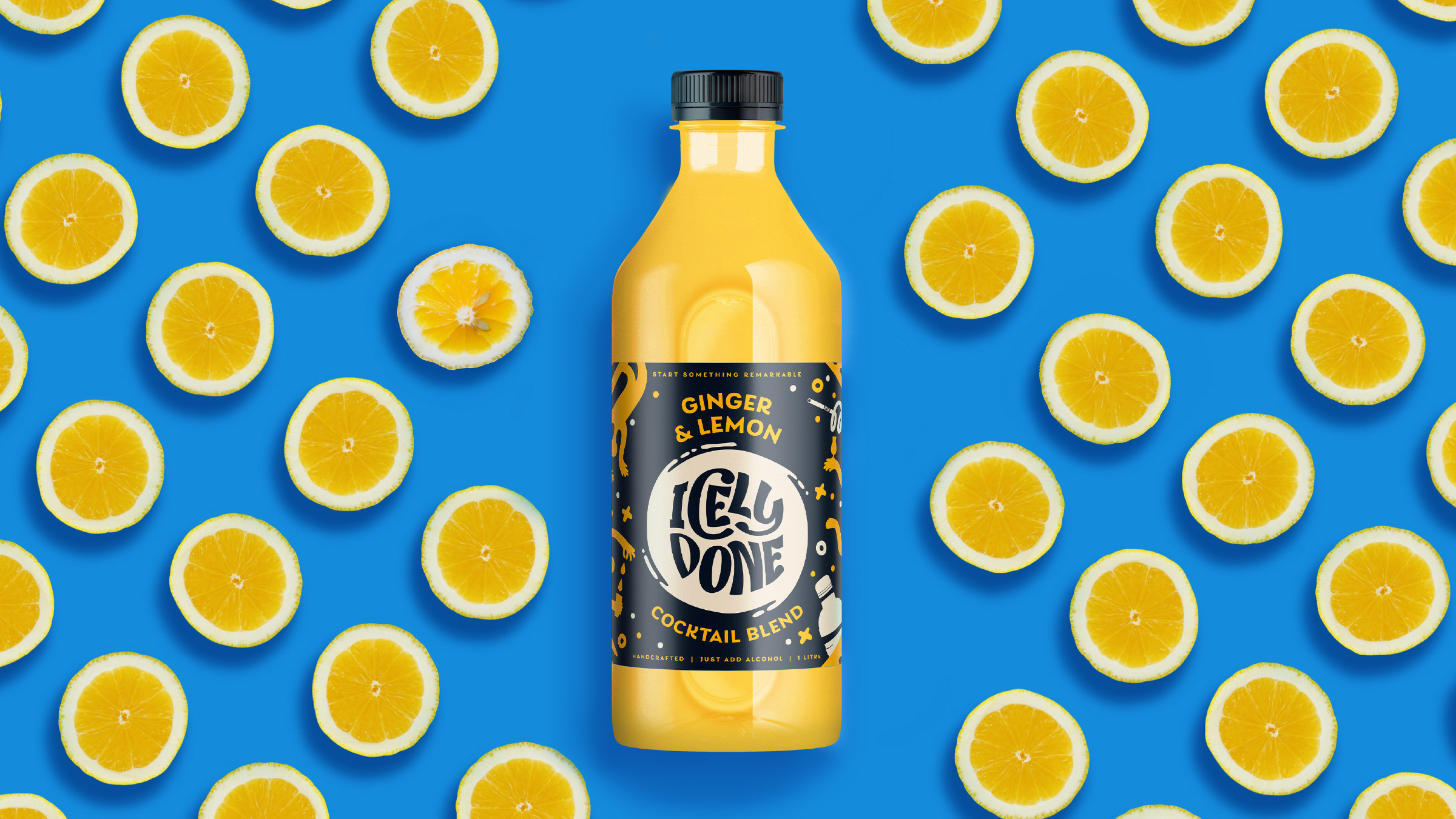
New brand rolled out across website, packaging and communications.
Positive Change
The existing identity felt too functional for the fun world of bars and cocktails. The brand story was a bit complicated for people to understand quickly.
Our strategic approach uncovered an important insight; cocktails are about fun, creativity and theatre. Pre-mixed cocktails solve problems around speed and consistency, but take away the elements consumers and bartenders love about them. Icely Done’s mixer blends had a clear role in the category – to take away the hassle, but not the joy. Icely Done, is proof that remarkable cocktails can be served at speed.
Their cocktail blends are the foundation, inspiration and catalyst for great tasting, simply served drinks.
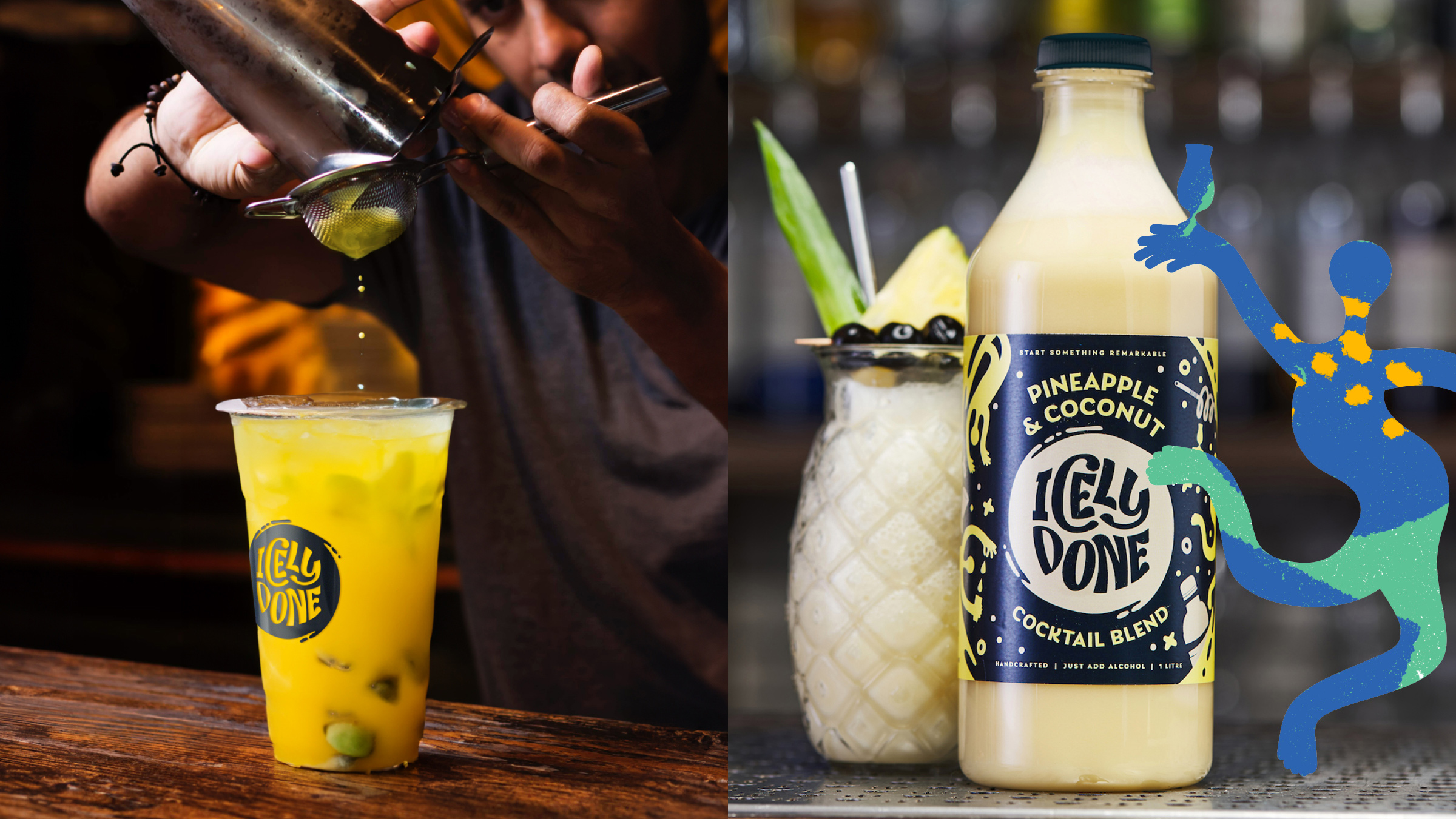
Bartenders can create fresh, delicious cocktails fast without compromising on craft or quality. They’re the start of something remarkable.
With this creative springboard, we needed to capture the energy of the start of great nights and the creativity of cocktail making.
We started by defining the brand vision, mission, values, tone of voice and personality to underpin our brand development. This would also provide a consistent culture for the brand internally.
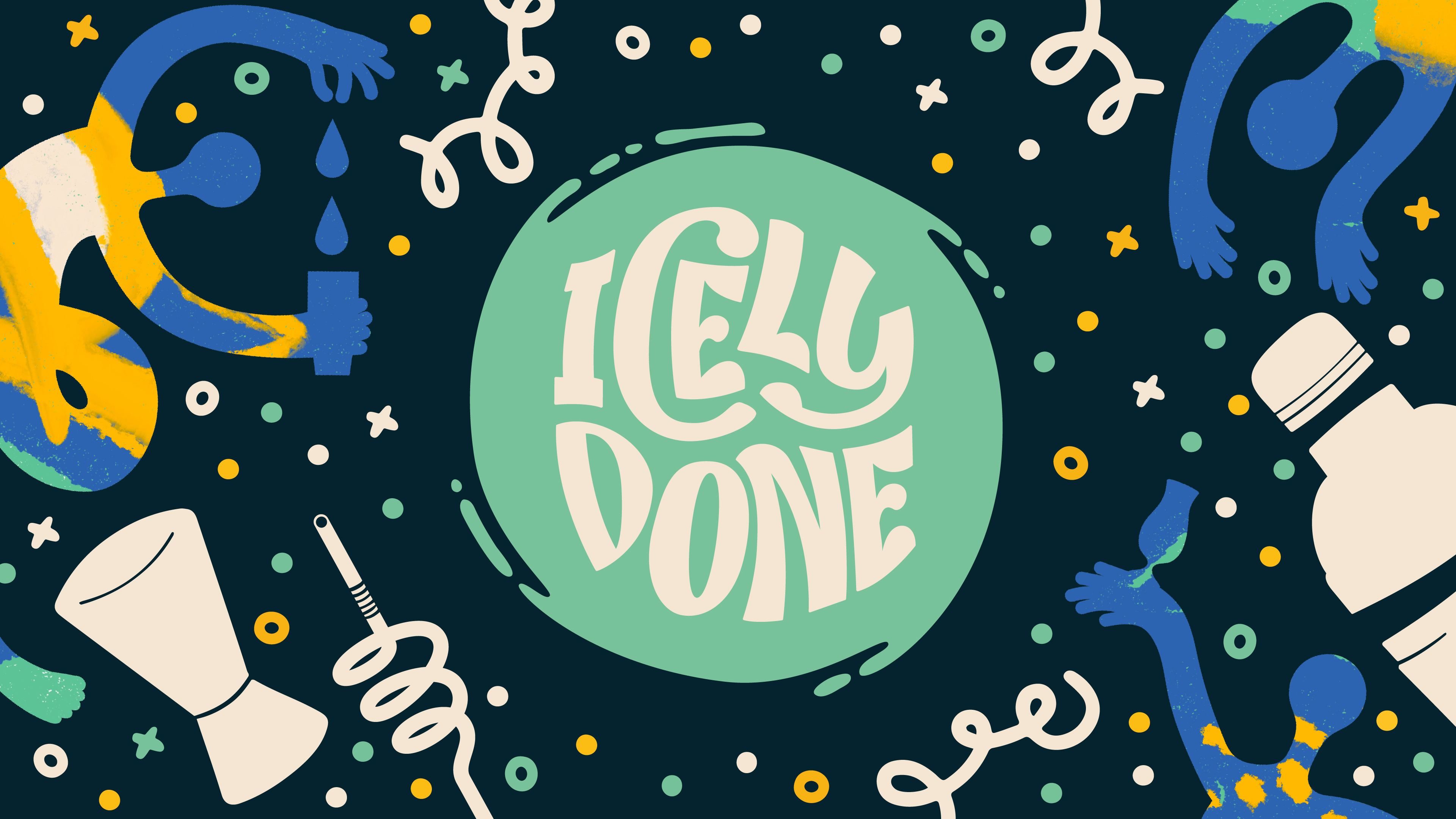
Our brand development had to feel like to lived in the world of cocktails and evening economy without losing the sense of refreshment and naturalness of the blends. The logo was inspired by a top down view of cocktail glasses, with the swirling motion providing a sense of energy and representing the mixing element of the blends themselves.
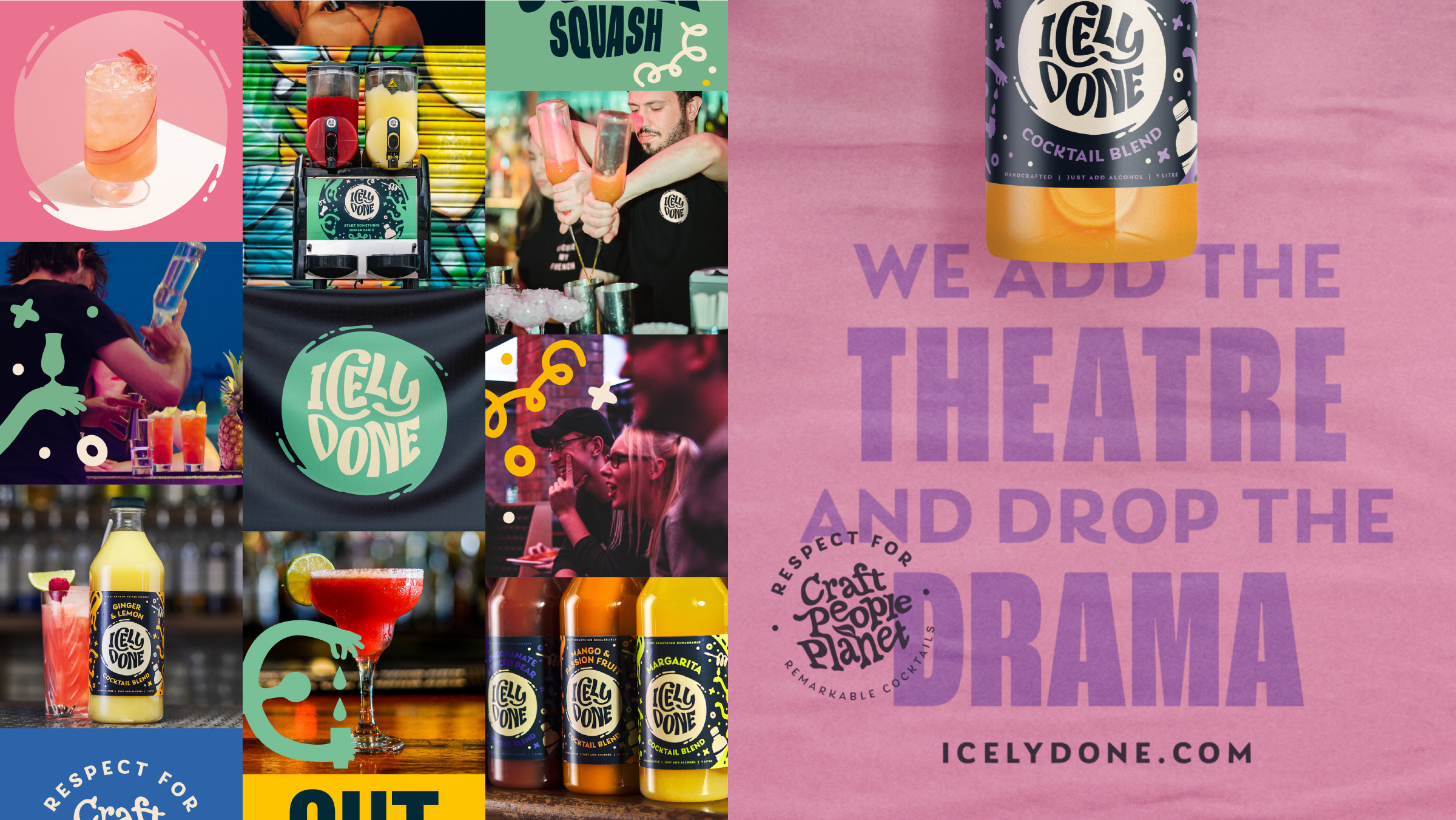
The primary colours used a darker navy to be in the cocktail world, but freshened with a lighter cream and vibrant green. The broad secondary pallet was vibrant and punchy to capture the fruity juiciness of the product and allow multiple variants to be easily identified by bartenders.
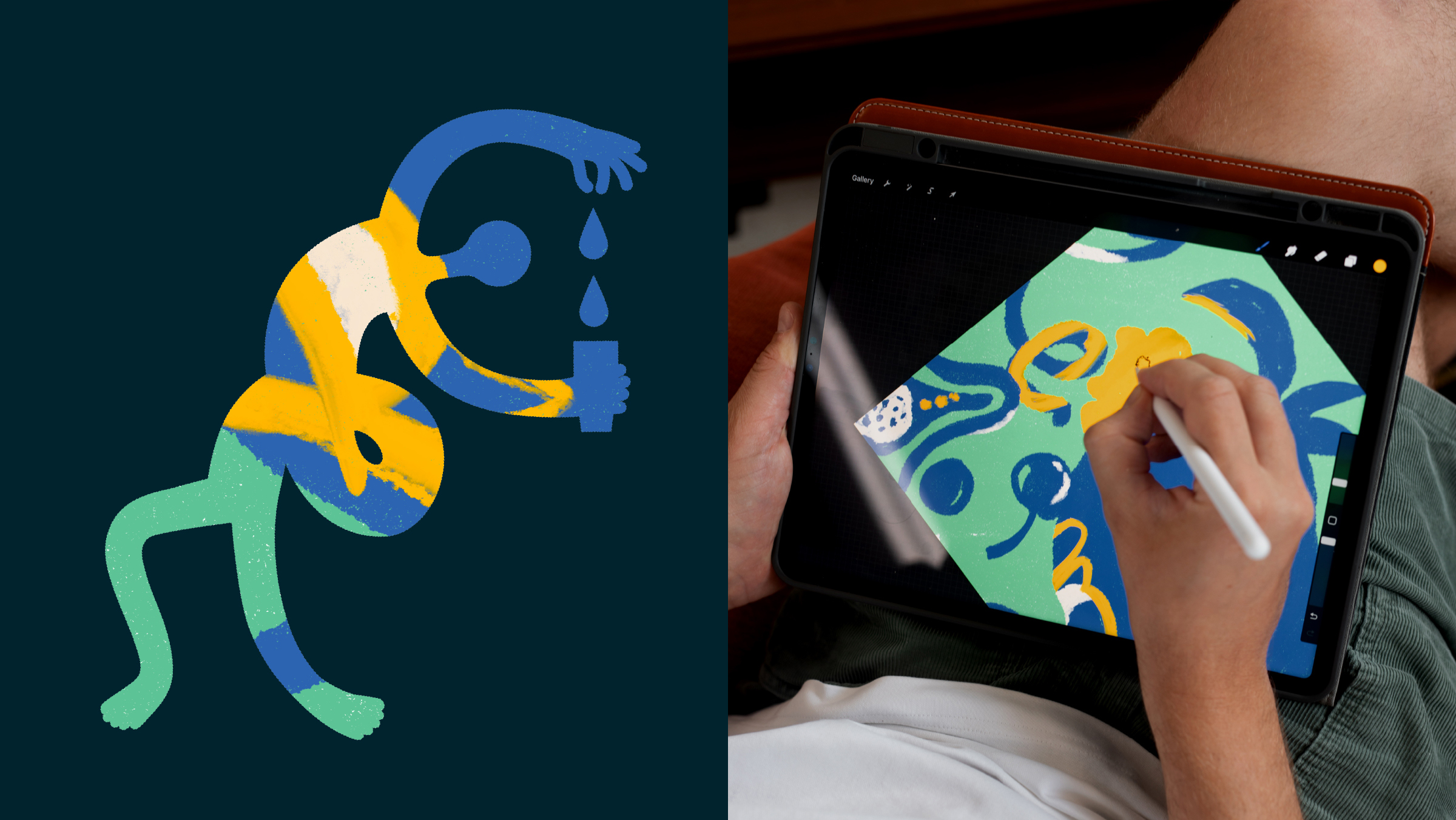
All of this was supported by a range of dynamic illustrations, including figures representing bartenders and the tools they use to make their cocktails. These could also work with photography to bring a sense of ownership and consistency to the brand at every touchpoint.
Kieron Weedon, Managing Director



CREDIT
- Agency/Creative: Kingdom & Sparrow
- Article Title: Kingdom & Sparrow Rebrand Icely Done, Helping Them Cut Through the Cocktail Clutter
- Organisation/Entity: Agency
- Project Type: Packaging
- Project Status: Published
- Agency/Creative Country: United Kingdom
- Agency/Creative City: Falmouth
- Market Region: Europe
- Project Deliverables: Brand Design, Brand Guidelines, Brand Identity, Brand Redesign, Branding, Illustration, Label Design, Packaging Design
- Format: Bottle
- Substrate: Plastic
- Industry: Food/Beverage
- Keywords: WBDS Agency Design Awards 2023/24
- Keywords: Mixer, Cocktail, label Design
-
Credits:
Creative Director: Johnny Paton


