


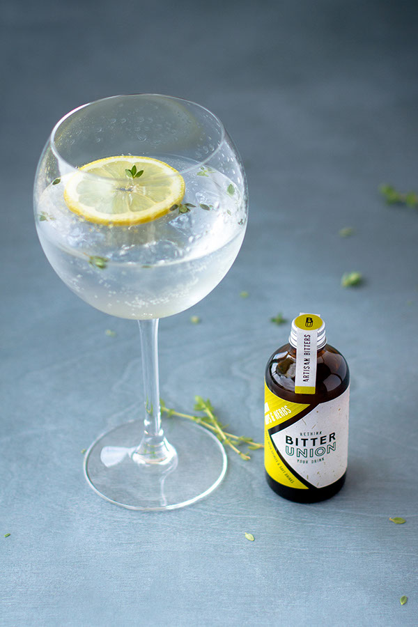
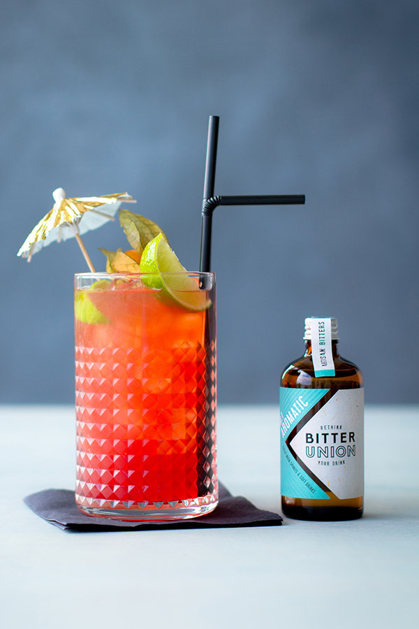
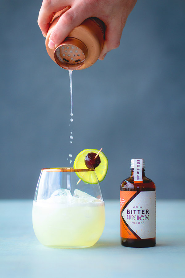
“Bitter Union is a range of delicious, natural, hand-crafted bitters that unites flavours. By adding just a couple of dashes it helps balance a gin and tonic, turn a whisky into a cocktail or even make a soft drink something special.
Their brand needed to sing about the truly artisan and micro-batch nature of their product, whilst still emphasising the fantastic quality of this premium product.
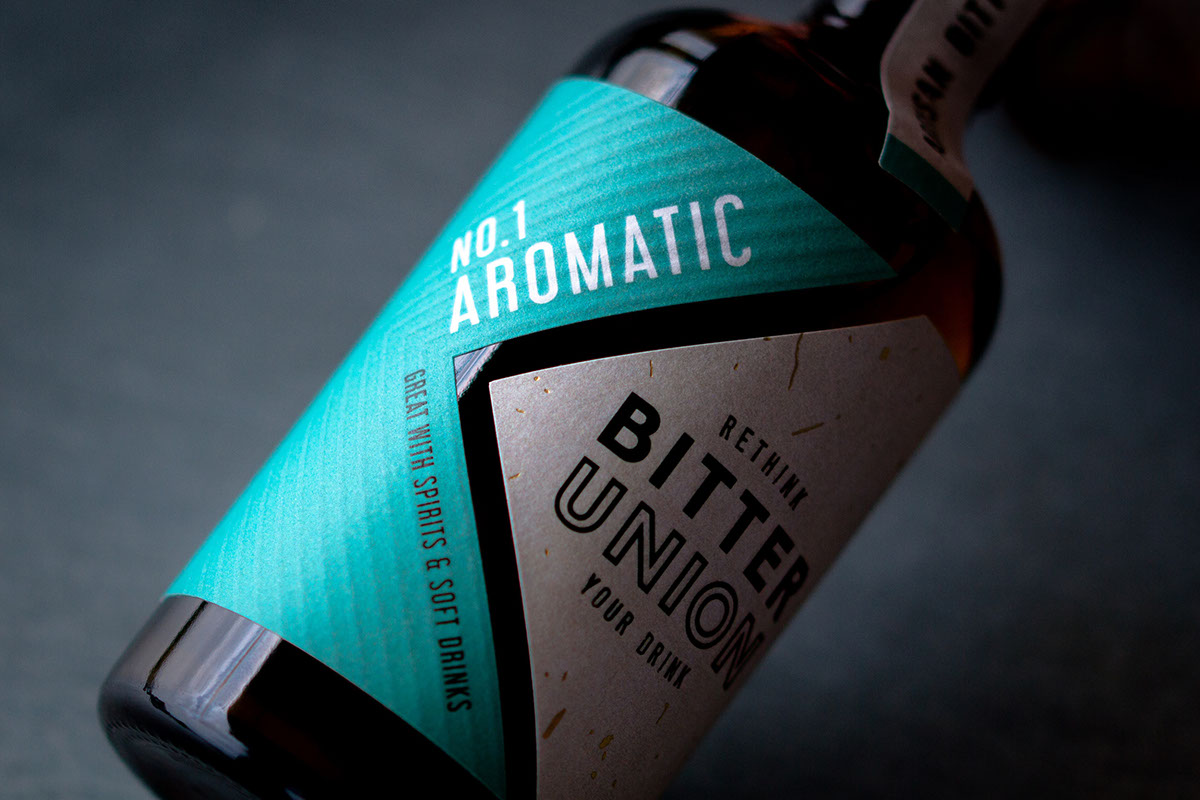
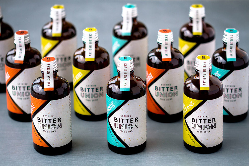
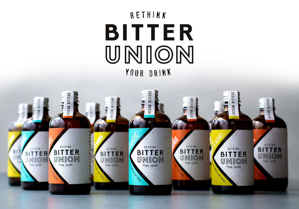
We created a logo that was balanced, clean and modern to sit on a textured background flecked with gold. The gold reflected the little dashes of bitters and adds a playful quality to the label.
As a small-batch, handmade product we were able to create a completely unique, bespoke die-cut for the label, adding bold colour and embossing to making this a striking addition to any craft spirit and mixers.”
CREDIT
- Agency/Creative: Kingdom & Sparrow
- Article Title: Kingdom & Sparrow – Bitter Union
- Project Type: Packaging
- Format: Bottle
- Substrate: Glass


