


Kindred is a compassionate e-commerce brand dedicated to delivering essential goods—such as food, hygiene products, and household items—to underserved extended families in rural South Africa. Founded with a dual purpose, Kindred aims to streamline the process of sending care packages to loved ones in remote areas while also supporting and promoting local businesses within these communities.
The brand’s mission is rooted in enhancing connectivity and fostering support for those in need. By making it easier to send essential items to distant families, Kindred helps bridge the gap between loved ones separated by distance. Simultaneously, it champions local enterprises, ensuring that these communities benefit from the economic opportunities brought about by increased visibility and support.
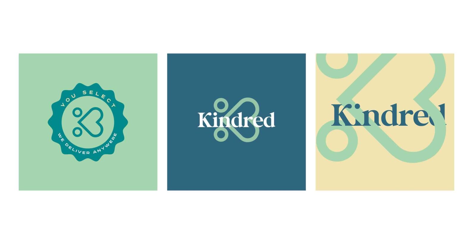
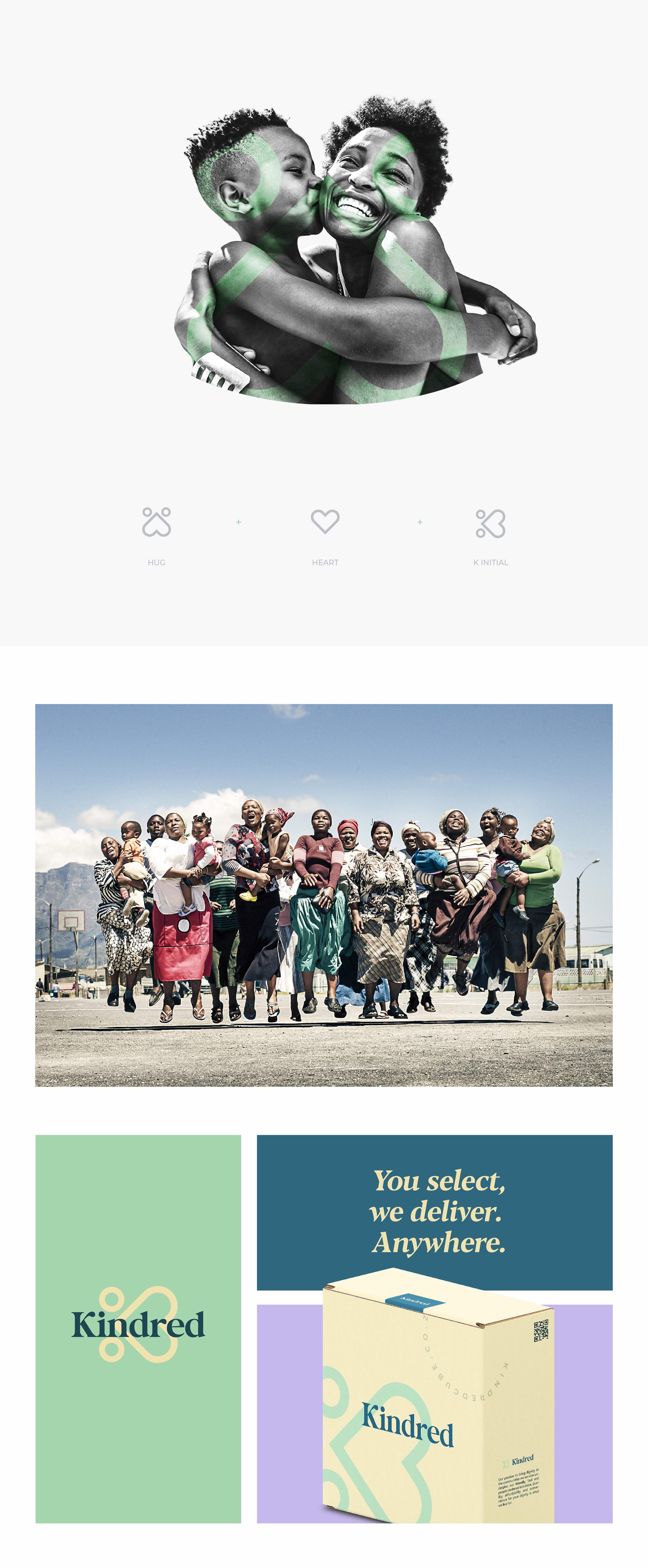
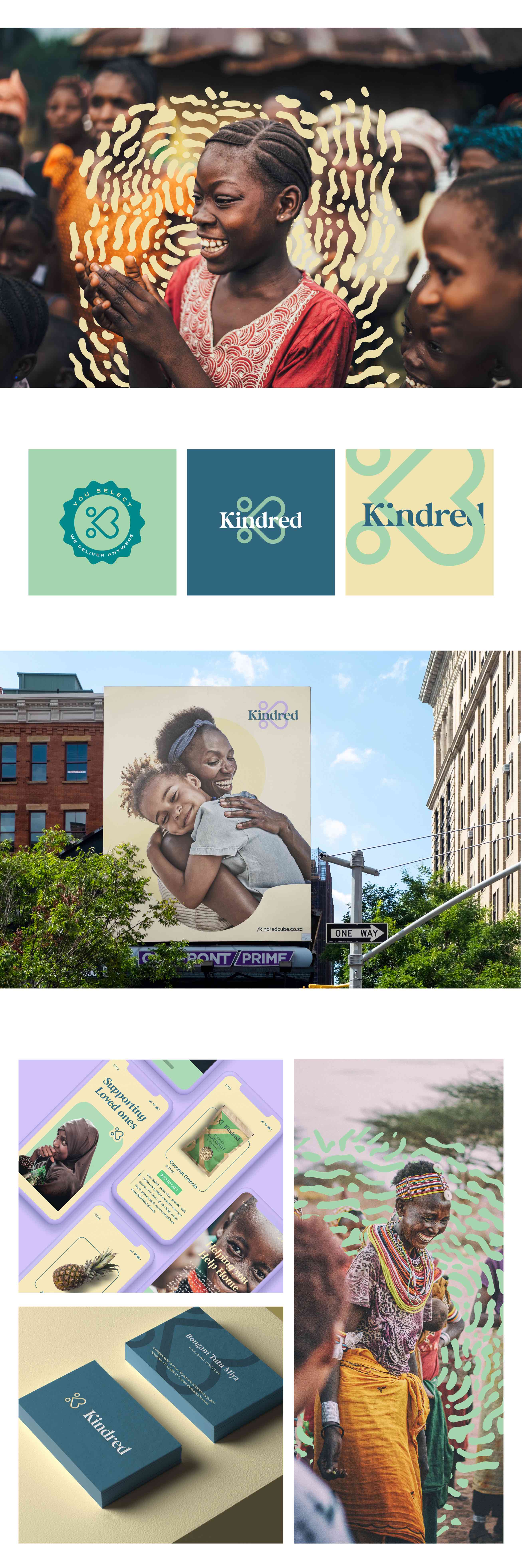
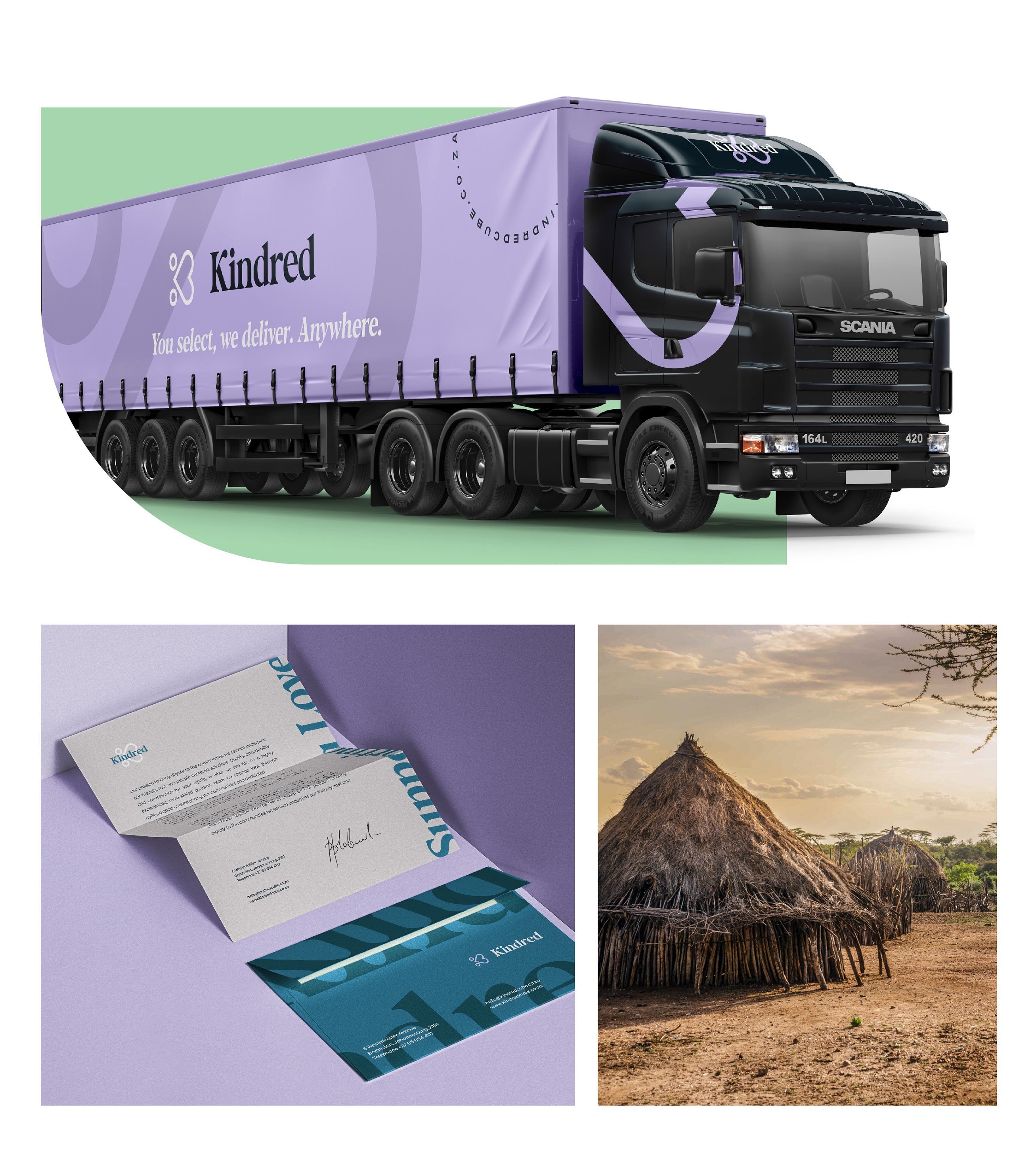
In crafting the Kindred logo, my approach as a branding and packaging designer was driven by intention and symbolism. The logo features a heart-shaped symbol, which not only represents the core value of kindness but also cleverly incorporates the initial letter of the brand’s name. This design choice embodies the essence of Kindred’s mission—emphasizing themes of family, community, and caring in a straightforward yet memorable manner.
The heart shape serves as a visual metaphor for the compassionate spirit of the brand, reflecting its commitment to fostering connections and supporting families. Its simplicity ensures that the logo remains iconic and easily recognizable, while its design conveys the warmth and generosity that Kindred stands for.
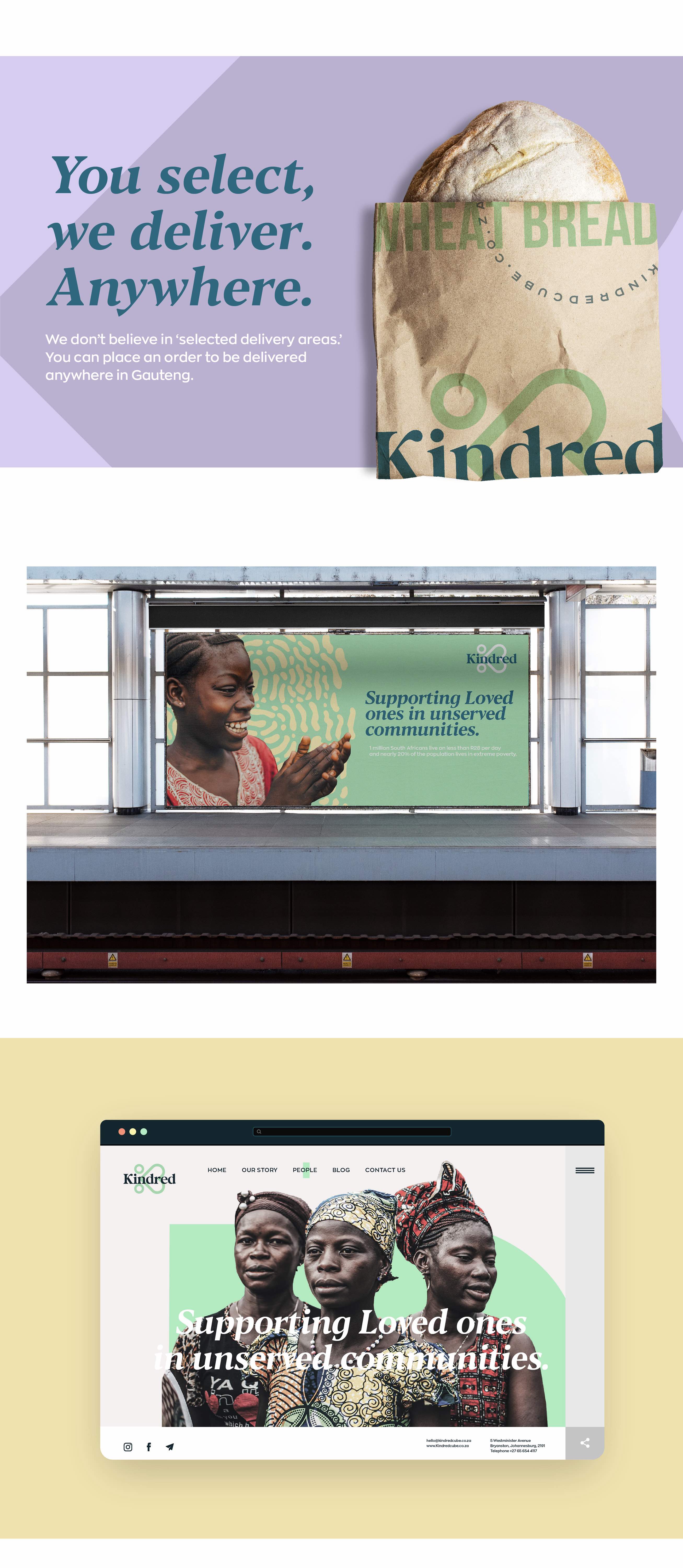
In addition to the logo, the packaging design for Kindred was thoughtfully developed to enhance the brand’s message of care and community. By incorporating elements that evoke a sense of warmth and personal touch, the packaging not only protects the products but also reinforces the brand’s commitment to delivering kindness.
Overall, the logo and packaging design are more than just visual identities; they are heartfelt representations of Kindred’s dedication to making a meaningful difference in the lives of people in rural South Africa. Each element was crafted to resonate with the brand’s mission of kindness and support, creating a powerful symbol of care and connection.
CREDIT
- Agency/Creative: Giacomo Urgeghe
- Article Title: Kindred: Heartfelt Branding and Packaging Design to Connect and Support Rural Communities
- Organisation/Entity: Freelance
- Project Type: Identity
- Project Status: Published
- Agency/Creative Country: Italy
- Agency/Creative City: olbia
- Market Region: Africa
- Project Deliverables: Art Direction, Brand Design, Brand Guidelines, Brand Identity, Logo Design, Packaging Design
- Industry: Non-Profit
- Keywords: Modern branding, minimalist design, e-commerce packaging, compassionate branding, iconic logo design, community-focused design, essential goods packaging, elegant brand identity, simple logo design, heartfelt packaging, clean design aesthetics, local business support, functional packaging solutions, visual identity design, care package design, sustainable branding, user-friendly design, sophisticated minimalism, social impact branding, purpose-driven design
-
Credits:
Art director, Brand identity designer: Giacomo Urgeghe


