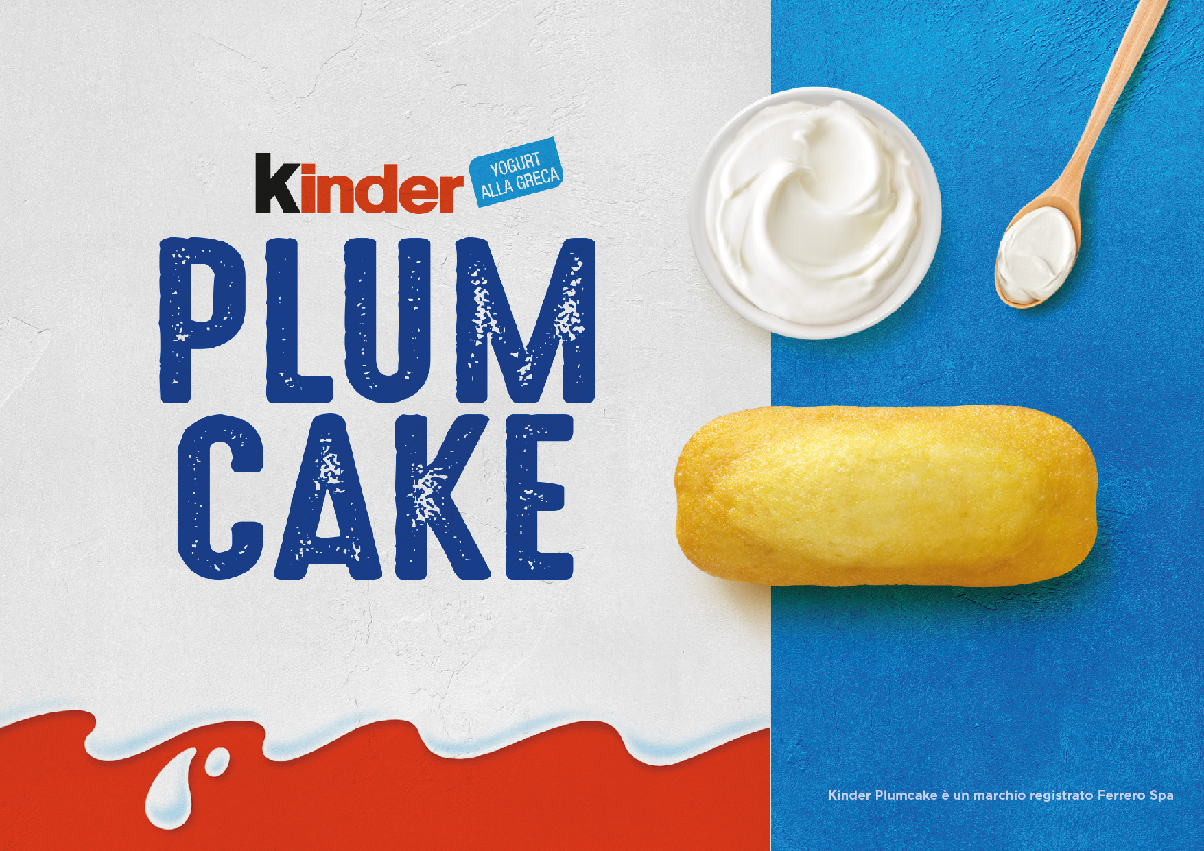
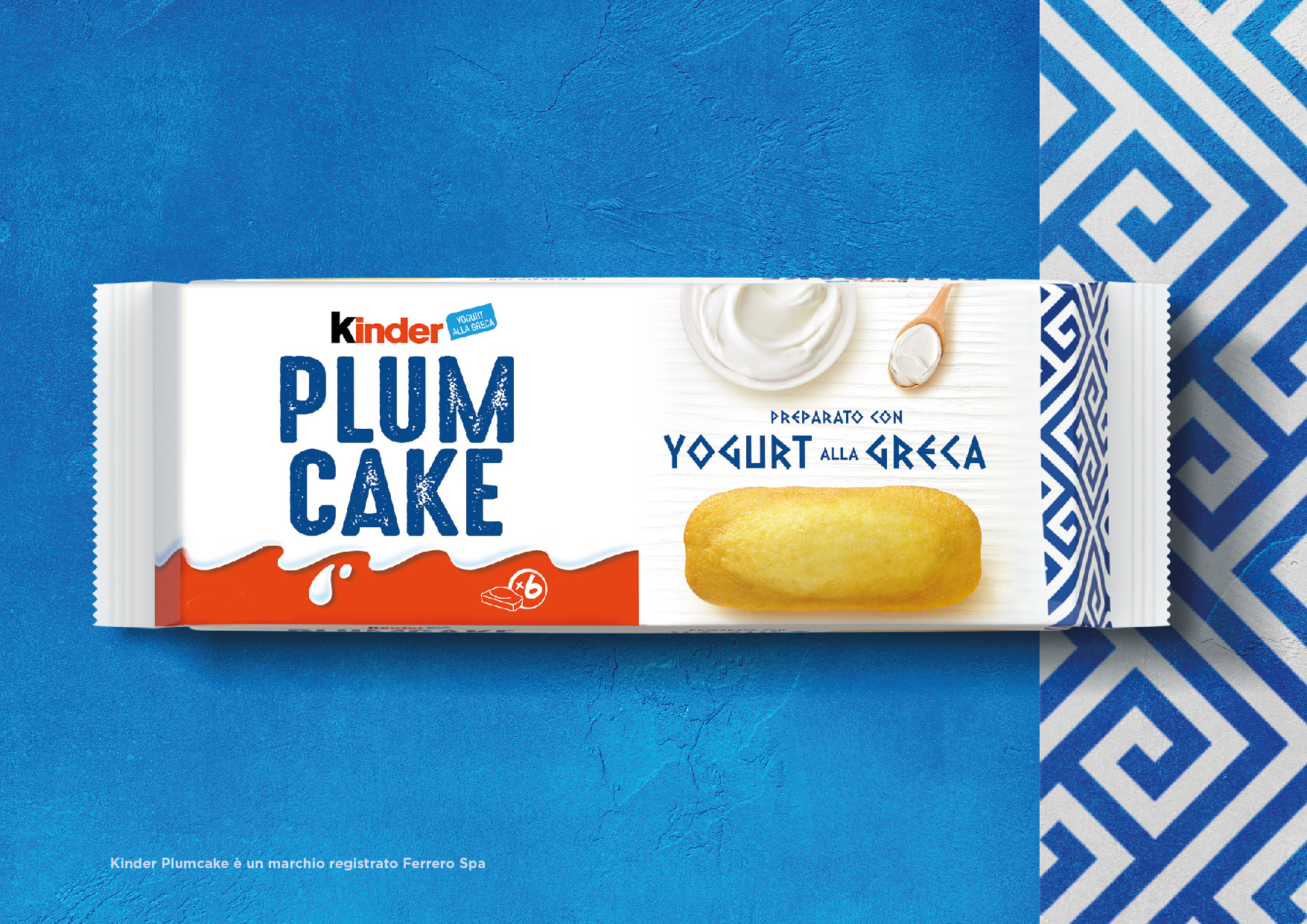
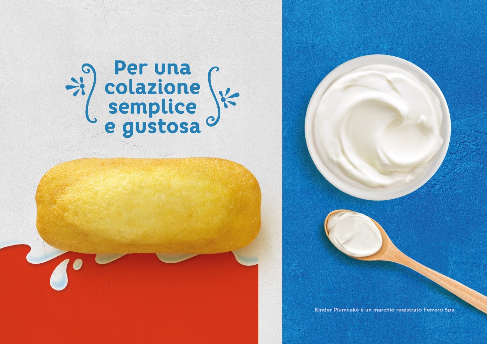
Today, with all its variations in taste and size, it has become a reference for simplicity and flavour in many European countries. Break Design, led by Giorgio and Paola Garavaglia, has reworked the concept of plum cake for Kinder Ferrero. From traditional, the communication on the pack has become modern with a top view that conveys taste and simplicity.
The addition of Greek-style yogurt is emphasized by a Greek fret, the ancient ornamental motif from the Hellenic peninsula, in order to give new life to a breakfast classic, which is now increasingly consumed all over the world.
The Kinder brand which has always inspired mothers and children with confidence – makes it clear that the product is not aimed at kids only but at the whole family. The classic Kinder white is an additional element of reassurance and attests how the company has innovated while remaining true to itself. Break design embraced this philosophy perfectly: it gave simplicity, modernity and focus to the values of the brand, while somehow changing the classic cornerstones of the key image of Kinder, bringing it into the 21st century.
CREDIT
- Agency/Creative: Break Design
- Article Title: Kinder Plum Cake Breakfast Snack Packaging Design Created by Break Design
- Organisation/Entity: Agency, Published Commercial Design
- Project Type: Packaging
- Agency/Creative Country: Italy
- Market Region: Multiple Regions
- Project Deliverables: Branding, Identity System, Illustration, Tone of Voice
- Format: Bag
- Substrate: Plastic


