Kimchi is a cutting-edge Korean American magazine that delves into the myriad facets of Korean culture, from mouthwatering cuisine and avant-garde fashion and entertainment. The magazine aims to go deep, breaking down stereotypes and misconceptions about Korean Americans. With a subversive voice that stands in stark contrast to many mass market magazines, Kimchi educates and enlightens its readers, keeping them abreast of the latest trends and movements.
Identity
There’s an edgy, sarcastic, and resourceful spirit that oozes from each page of Kimchi. Its identity is loud, confident, and unapologetically different. This begins right at its logo – a bold, blocky high-contrast font with an audacious mix of uppercase and lowercase characters. As readers open the magazine, they’re greeted with sharp, clear typography that exudes modernity and style. The magazine never shies away from color, contrast, and oversized elements.
Covers
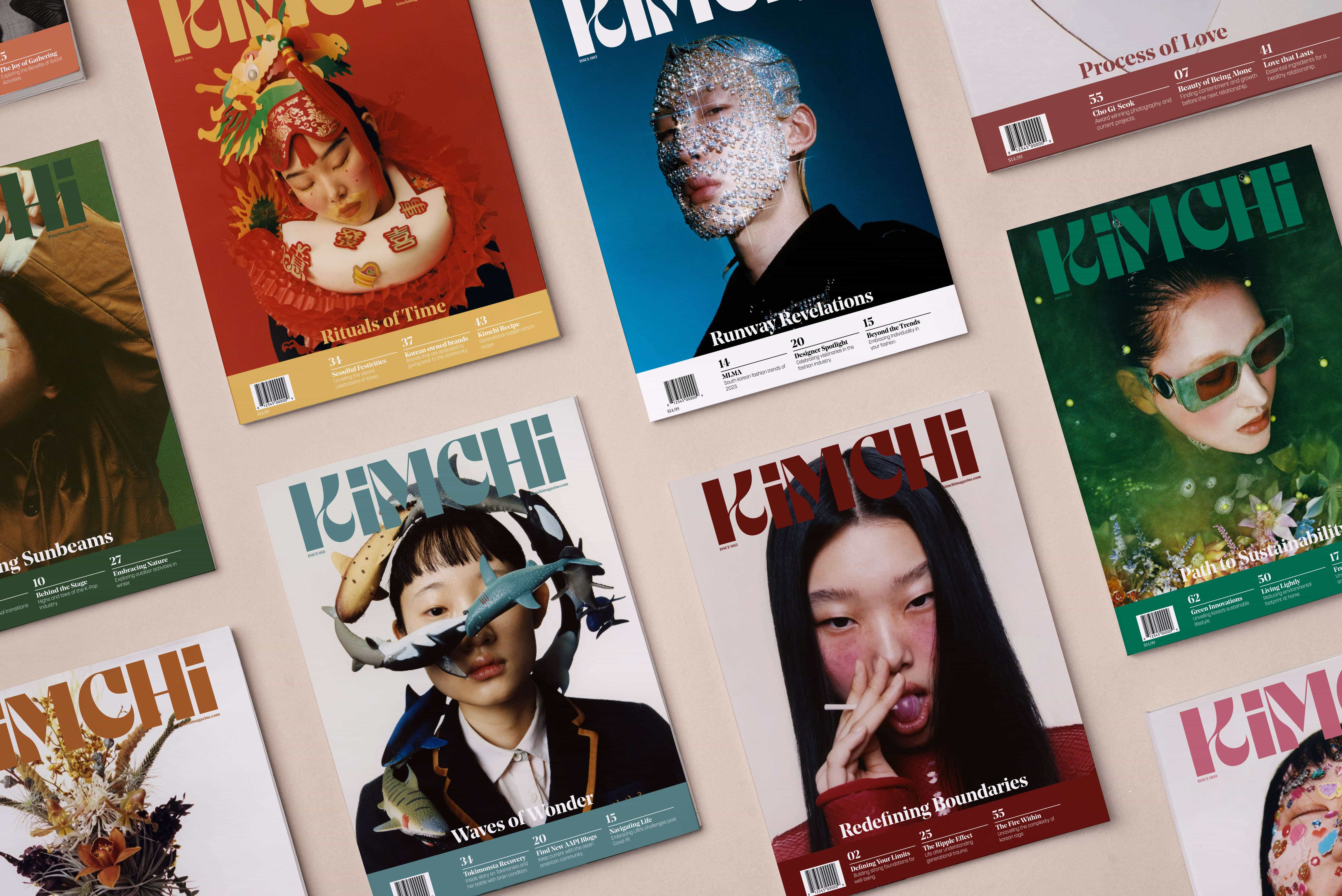
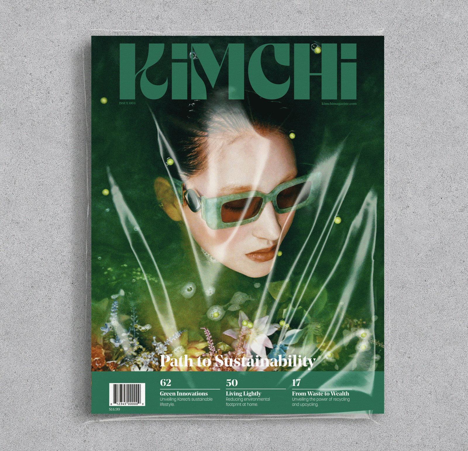
Kimchi’s magazine covers are unabashed, flaunting striking imagery that showcases the diversity and vibrancy of Korean Americans. The magazine logotype is used in a large size at the top, and is set in a custom color for each issue. This color marries the imagery to the type, and also helps differentiate each issue from the cover and spine. A clean zone at the bottom of the cover allows for information about the feature articles to remain readable and clear.
Interior
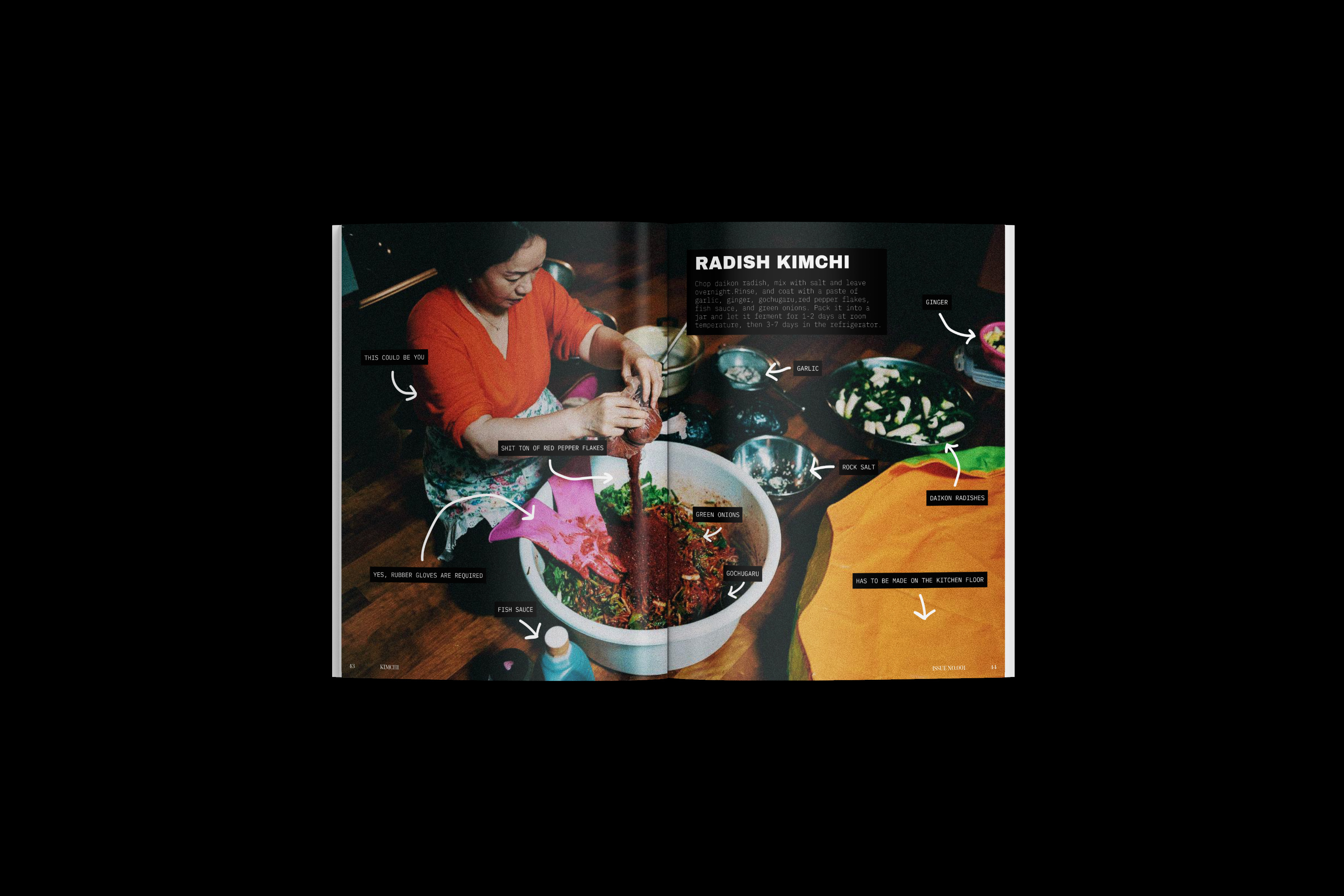
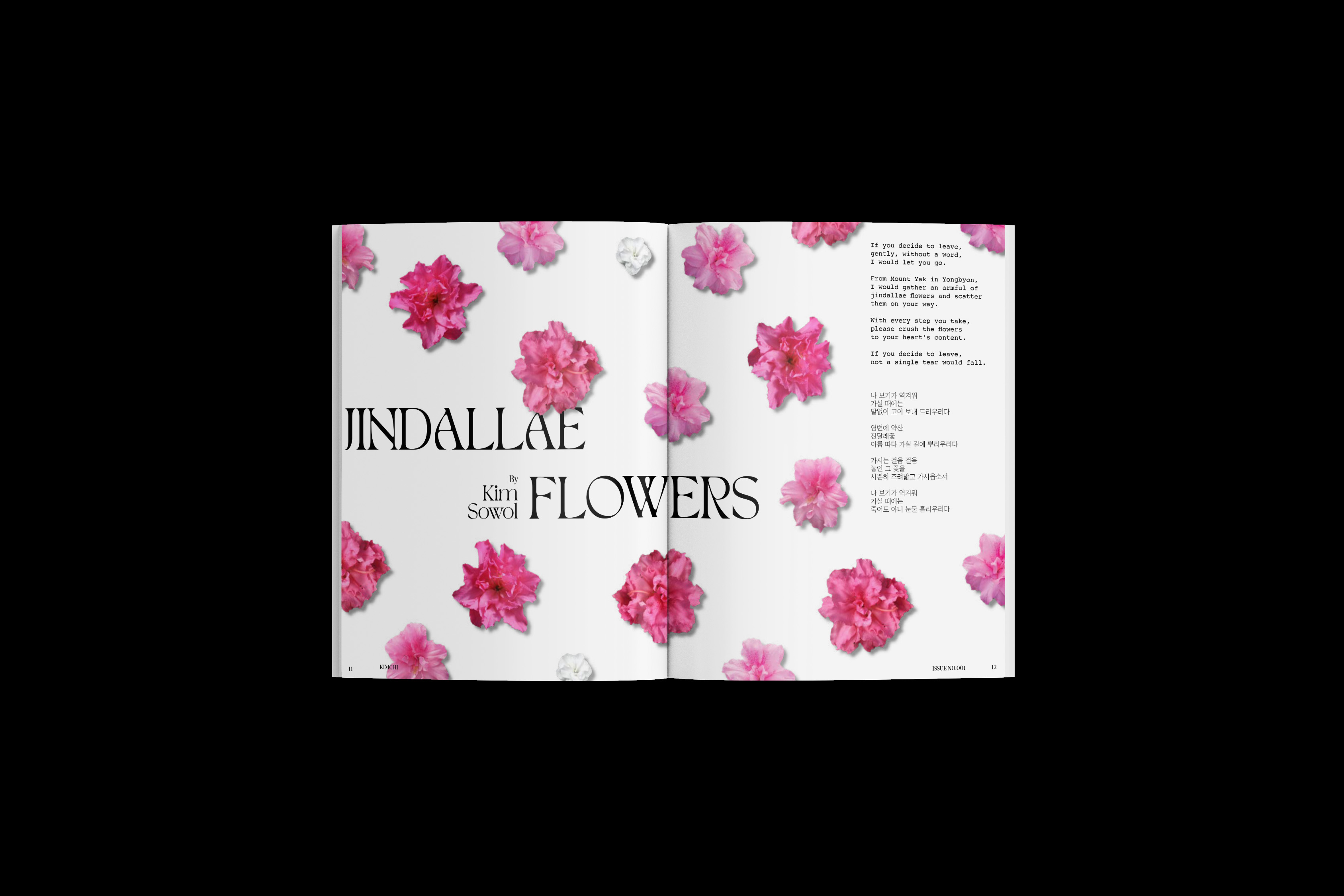
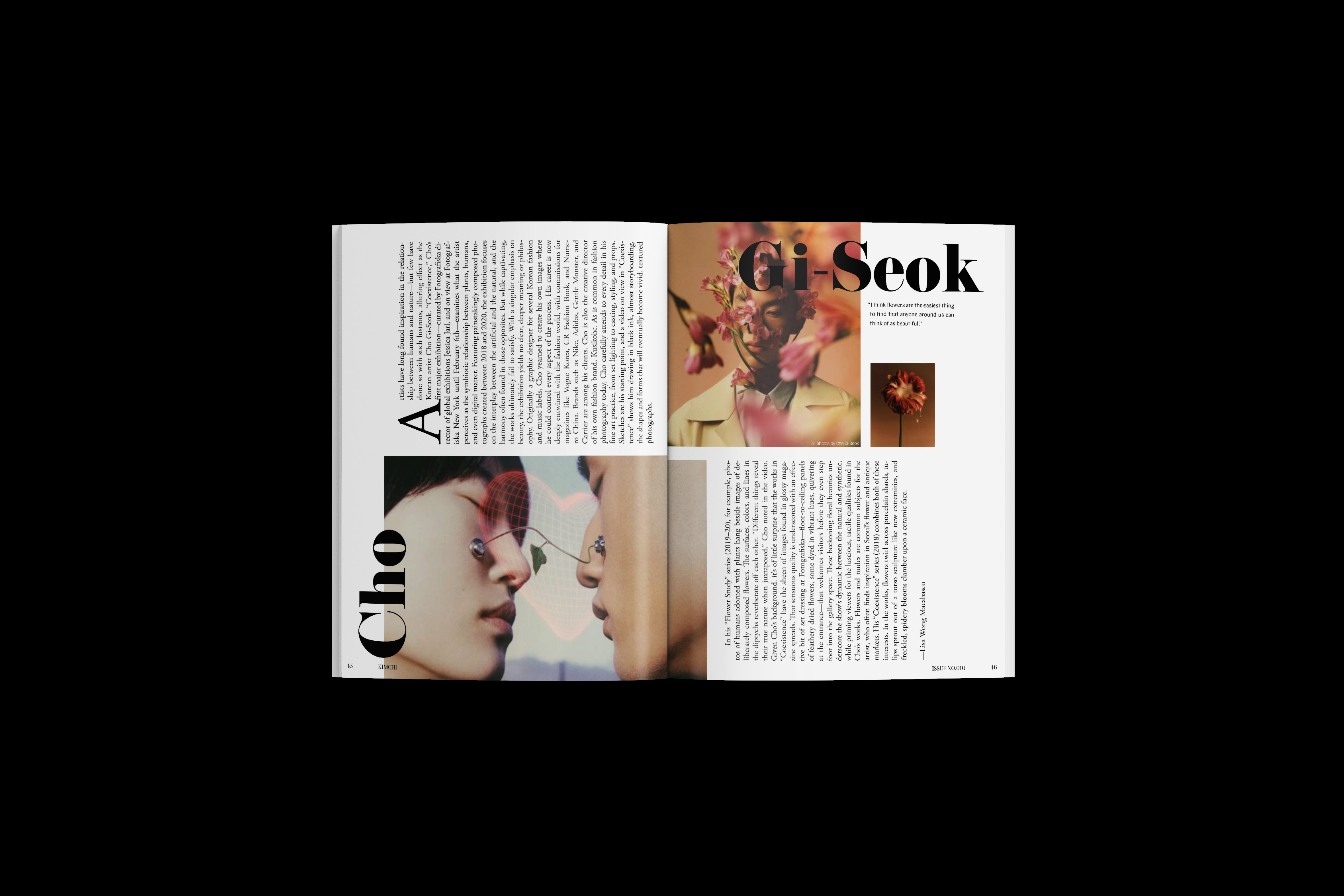
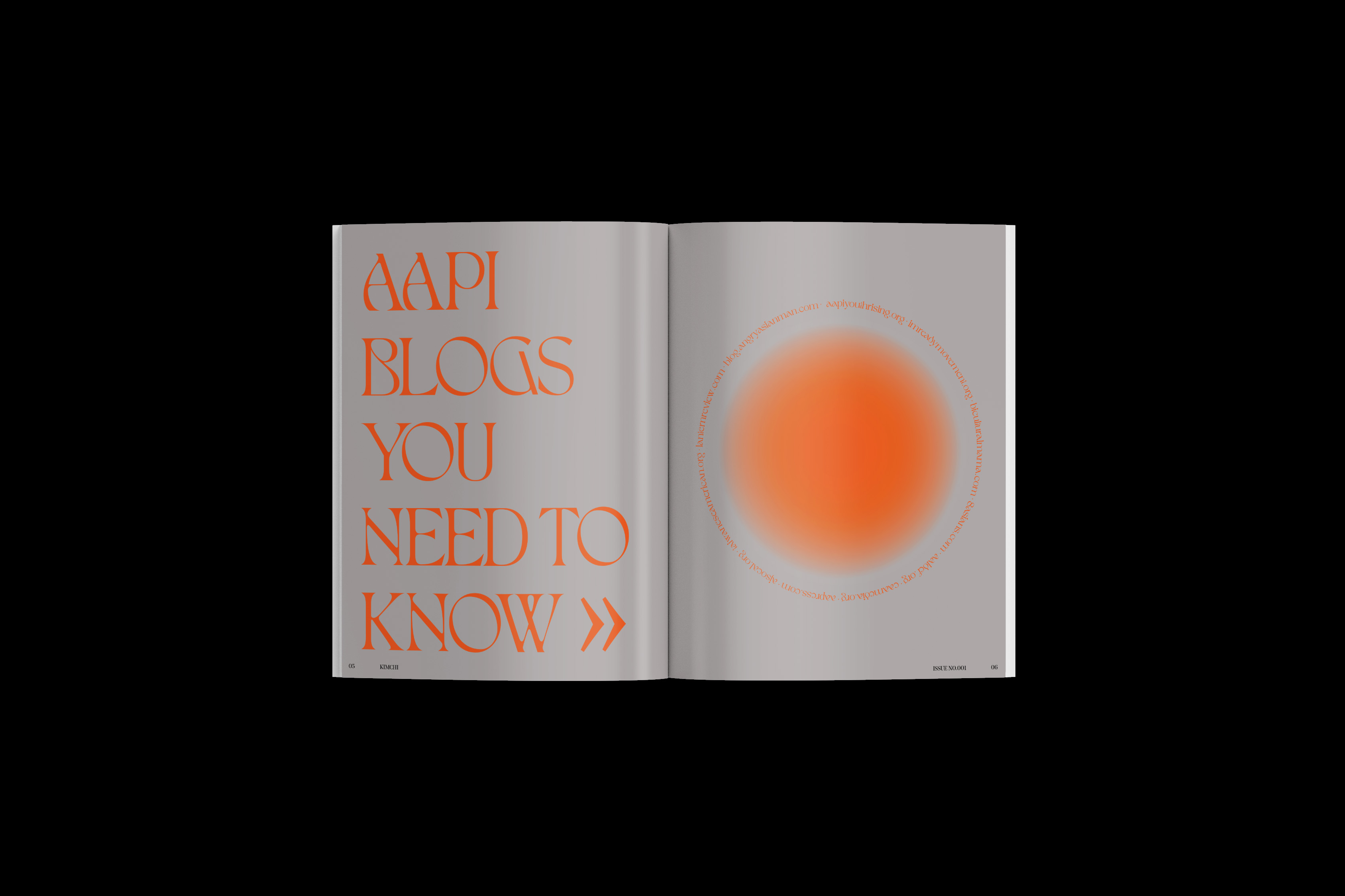
Inside, readers are treated with content where no two pages are the same. Layouts are fluid, with tons of conceptual twists that keep the eyes roaming and engaged. Type and image and frequently layered to add to the dynamic look. This creative liberty is backed by a flexible 12-column grid system, which helps keep content structured and organized. Typographic choices are daring – large, contrasting fonts dominate the pages, crafting a narrative that’s both bold and riveting.
CREDIT
- Agency/Creative: Skyler Lingo
- Article Title: Kimchi Korean American Magazine Graphic Design for Periodical Publication
- Organisation/Entity: Student
- Project Type: Graphic
- Project Status: Non Published
- Agency/Creative Country: United States
- Agency/Creative City: San Diego
- Market Region: Global
- Project Deliverables: Brand Identity, Packaging Design
- Industry: Entertainment
- Keywords: WBDS Student Design Awards 2023/24
- Keywords: Graphic Design, Periodical Publication
-
Credits:
Educational Institution tions: San Diego City College - Graphic Design
Educator's Name: Sean Bacon and Bradford Prairie


