


This multiple award-winning brand design created for Kim Ward Photography began with a simple request:
To redesign her logo with a Simplified, modern approach, and to build the brand ethos around a changing market. Instead of focusing solely on family portraits, the owner wanted to accommodate her growing commercial clientele, shooting home interiors.
The solution: We realized that a logo redesign would do little for this entrepreneur, as she sought to enter a new market. Instead of a logo, we encouraged her to focus on the bigger picture: how can she establish a reputation with new clientele?
We began by interviewing the client and identified a series of attributes that have empowered her success in the family photography market. These values were: comfort (hospitality), creativity, confidence. From here, her color palette was carefully selected to reflect these characteristics.
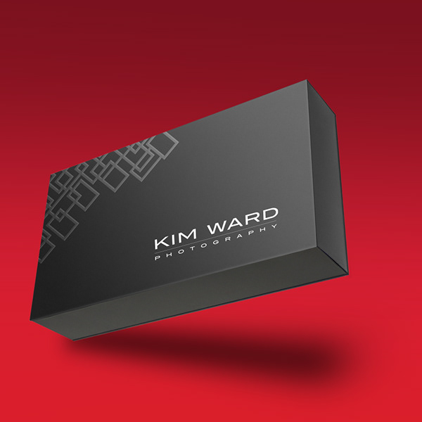
The logo would be typography focused, with an emphasis on architecture and solid construction — Something that would convert easily to a watermark, and be at home amongst other competitors in commercial photography.
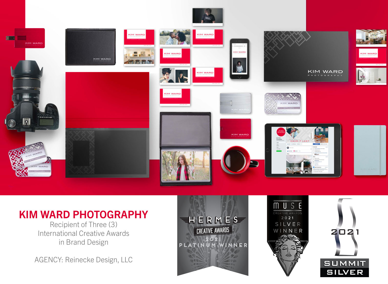
We also knew that this simplified logo could not be effective, without a brand language to propel it forward. The creative assets of the Kim Ward brand would need to be distinctive: something that is at the same time architectural and creative, and speaks to photography.
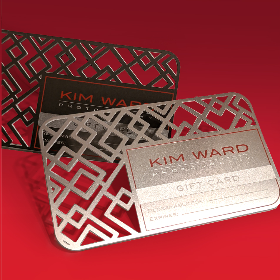
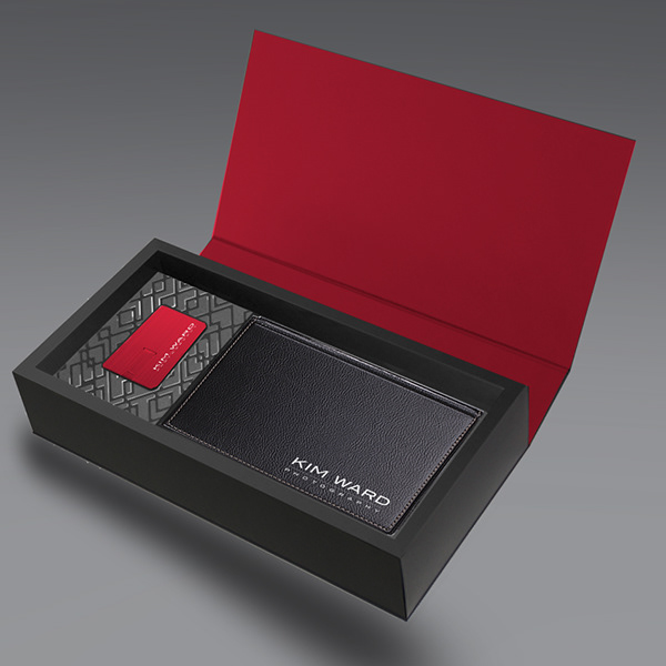
By supplementing the logo with other brand assets, we could help her stand out in the marketplace. The overlapping frame pattern was created from the concept of a viewfinder- an exercise sometimes employed by photographers by intersecting 2 frames, to get a feel tor how an image will crop.
The Reinecke Design process of designing with purpose, on purpose, meant that we labored over every decision until we were convinced it was right for our client—And it shows at every touchpoint from stationery to packaging, to gift cards and digital media.
Photography: Kim Ward
CREDIT
- Agency/Creative: Reinecke Design
- Article Title: Kim Ward Photography Redesign
- Organisation/Entity: Freelance
- Project Type: Identity
- Project Status: Published
- Agency/Creative Country: United States
- Agency/Creative City: Dallas
- Market Region: North America
- Project Deliverables: Art Direction, Brand Creation, Brand Design, Brand Guidelines, Brand Identity, Brand Strategy, Brand Tone of Voice, Copywriting, Creative Direction, Graphic Design, Identity System
- Industry: Real Estate
- Keywords: #photography #branding #identitydesign #creativity #design #artdirection #museawards #musecreativeawards #hermescreativeawards #hermesawards #summitaward #summitawards
-
Credits:
Creative Director: Christian Reinecke


