


A Daily Staple, Reimagined
Forvita has long held a place in the hearts—and kitchens—of millions of Indonesian families. Known for its affordability and fortified health benefits, Forvita needed more than just a design update. The brand came to Kiilat Creative with a clear challenge: refresh its visual identity and packaging to capture a new generation of consumers, while staying true to its existing, loyal audience.
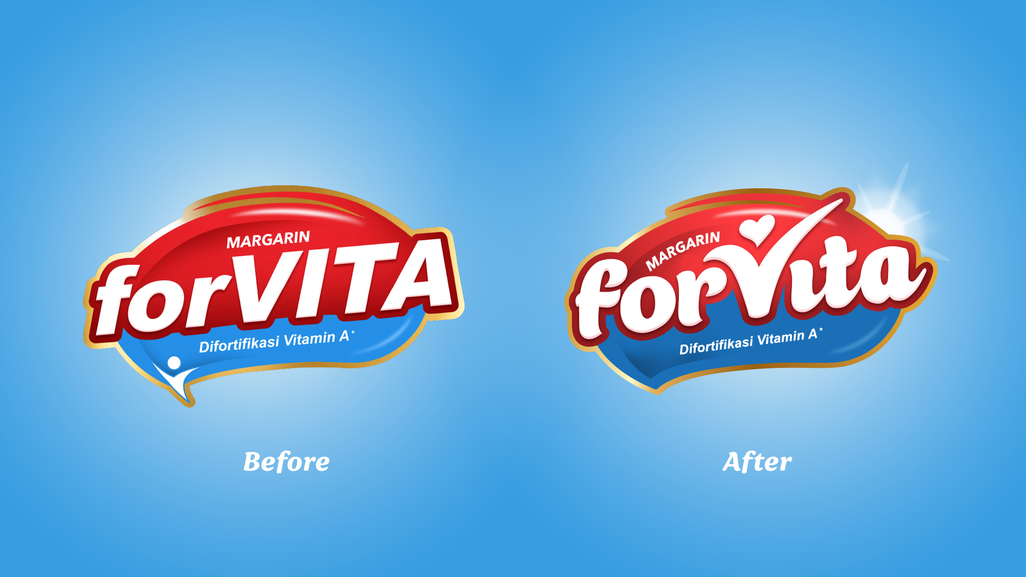
We approached this project with both strategy and sensitivity. Our goal was to reinvigorate Forvita’s presence on shelf without losing the familiarity that consumers had trusted for years. The solution? A complete brand and packaging refresh that balanced brightness, boldness, and clarity—aligned to modern retail expectations while championing Forvita’s long-standing values.
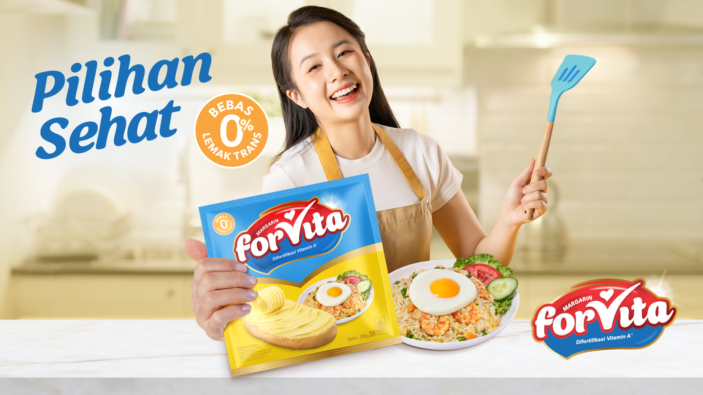
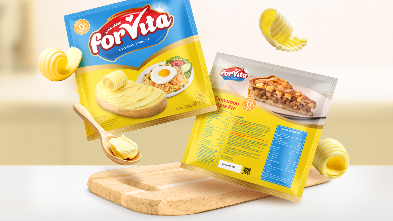
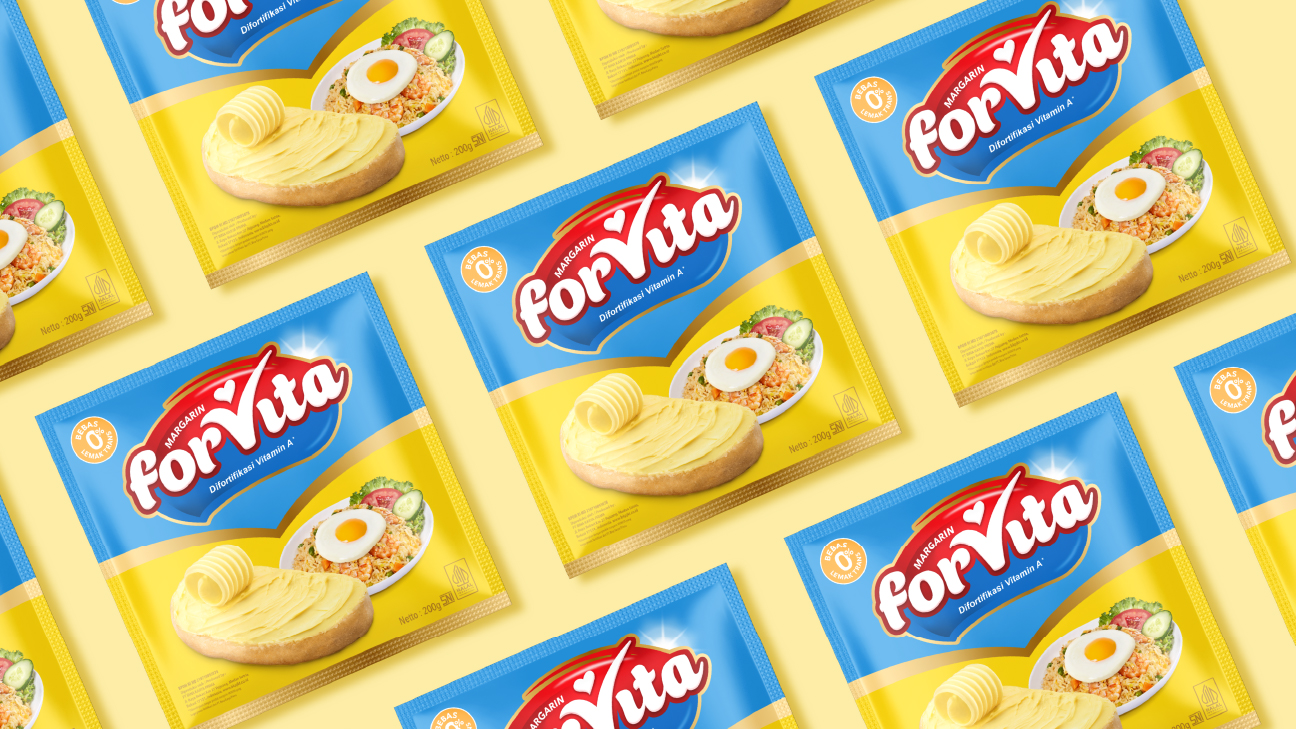
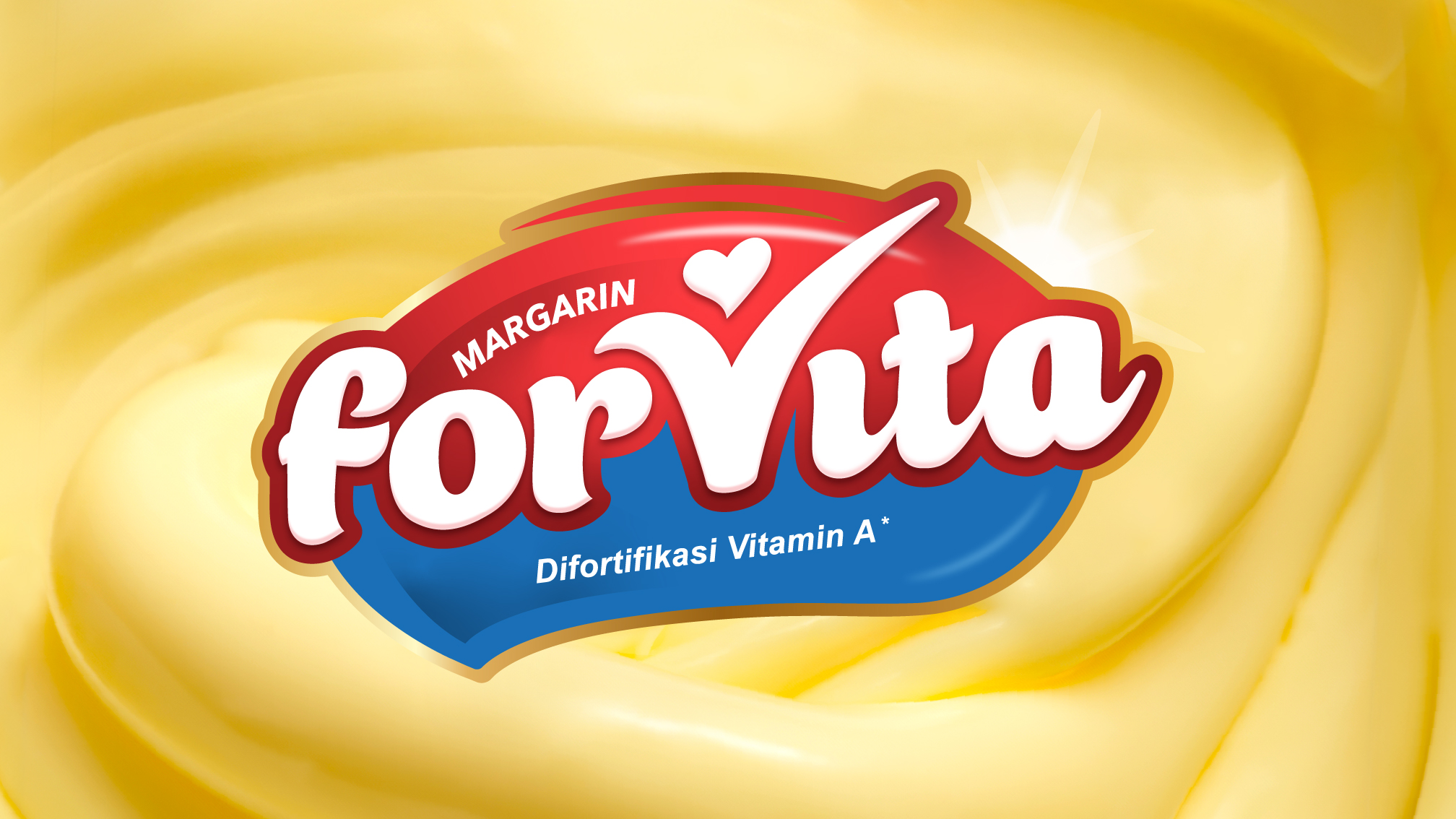
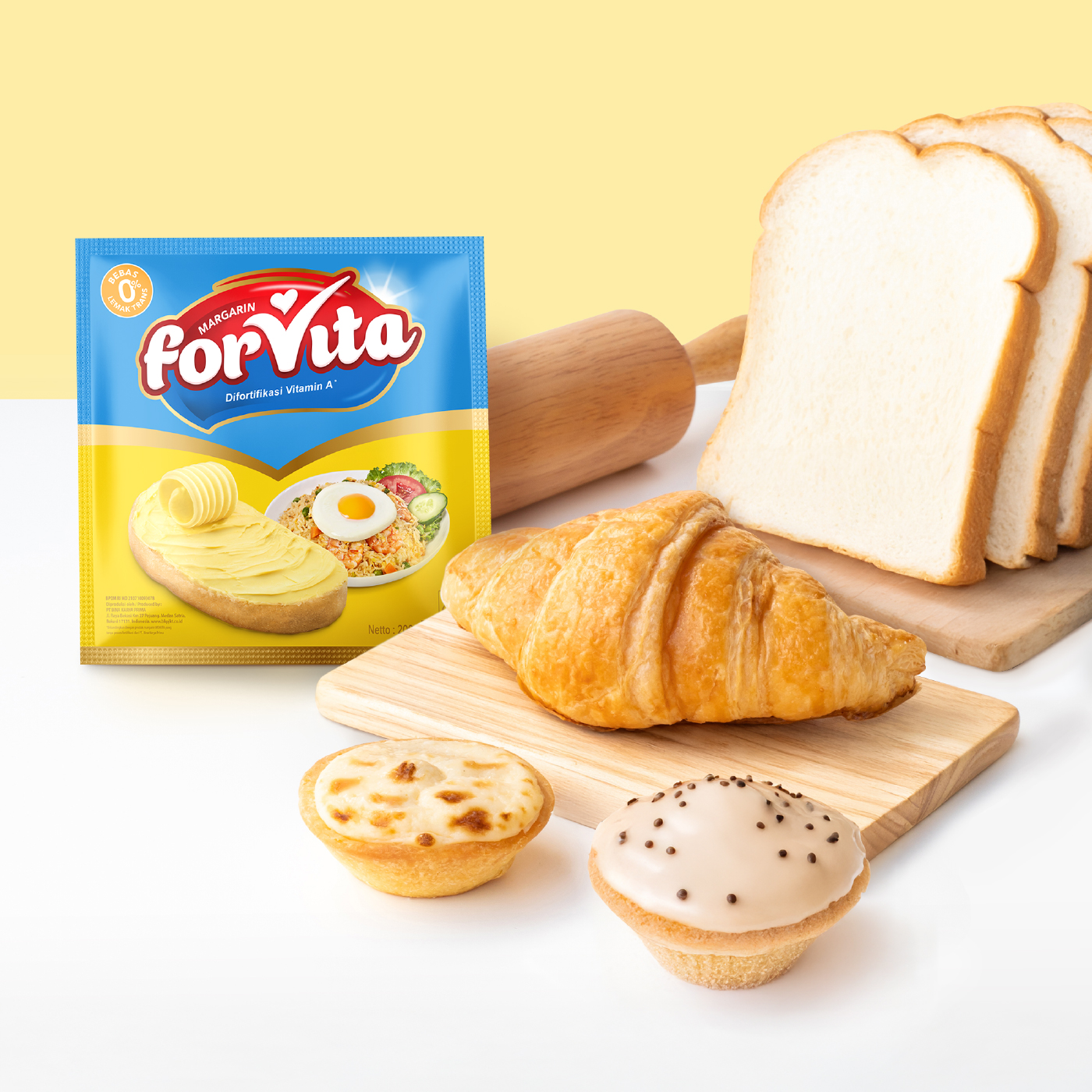
The updated identity introduces a more legible, confident wordmark, refined to work seamlessly across digital and print formats. We also introduced dynamic illustrations that hint at usage occasions and localised recipes—bringing warmth, everyday relevance, and appetite appeal to the packaging. Every visual element was carefully considered to ensure the product not only pops on shelf, but also communicates key benefits like being trans fat free (Bebas Lemak Trans) and enriched with Vitamin A.
From the curved packaging layout to the strategic hierarchy of health claims, the design captures a sense of vitality and motion—built to win attention in modern trade while still feeling at home in traditional markets. We also advised on production finishes and layout adaptability across SKUs, ensuring Forvita’s updated look could scale consistently.
This project wasn’t just about making margarine look better. It was about making a beloved staple feel relevant again—without losing the trust it had built over time. The result is a revitalised brand with shelf presence and substance, made to nourish both the consumer and the category.

CREDIT
- Agency/Creative: Kiilat Creative
- Article Title: Kiilat Creative Refreshes Forvita with a Contemporary Identity That Honors Tradition
- Organisation/Entity: Agency
- Project Type: Packaging
- Project Status: Published
- Agency/Creative Country: Singapore
- Agency/Creative City: Singapore
- Market Region: Asia
- Project Deliverables: Brand Refinement, Logo Design, Packaging Design, Packaging Guidelines, Typography, Visualisation
- Format: Sachet
- Industry: Food/Beverage
- Keywords: FMCG Branding, Packaging Design, Brand Refresh, Food Packaging, Consumer Goods, Illustration in Packaging
-
Credits:
Creative Director: Marilyn Tjitra
Director: Shaun Cunningham


