


The Opportunity
The Kids’ Food & Drink Collective is an amazing non-profit initiative – a membership association and a movement – founded by Jess Mackenzie and formed by parent-led brands determined to challenge and change Kids’ food and drink culture. Their aim is to build a global platform for change by bringing together industry, brands and consumers, united in a common goal to initiate a complete cross-sector overhaul of our children’s food environment.
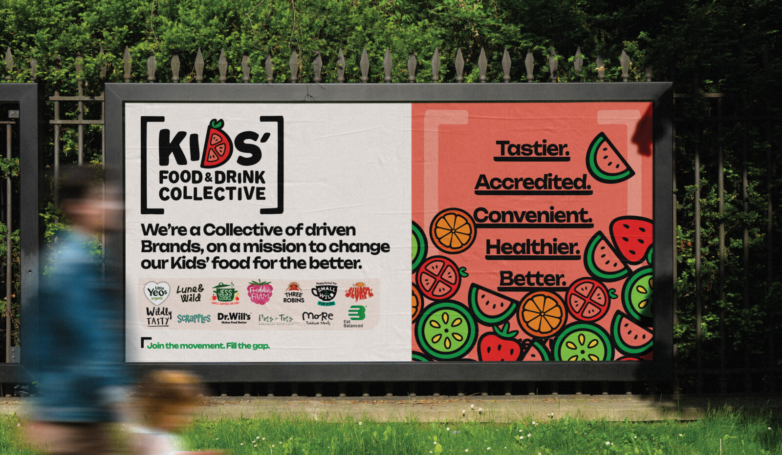
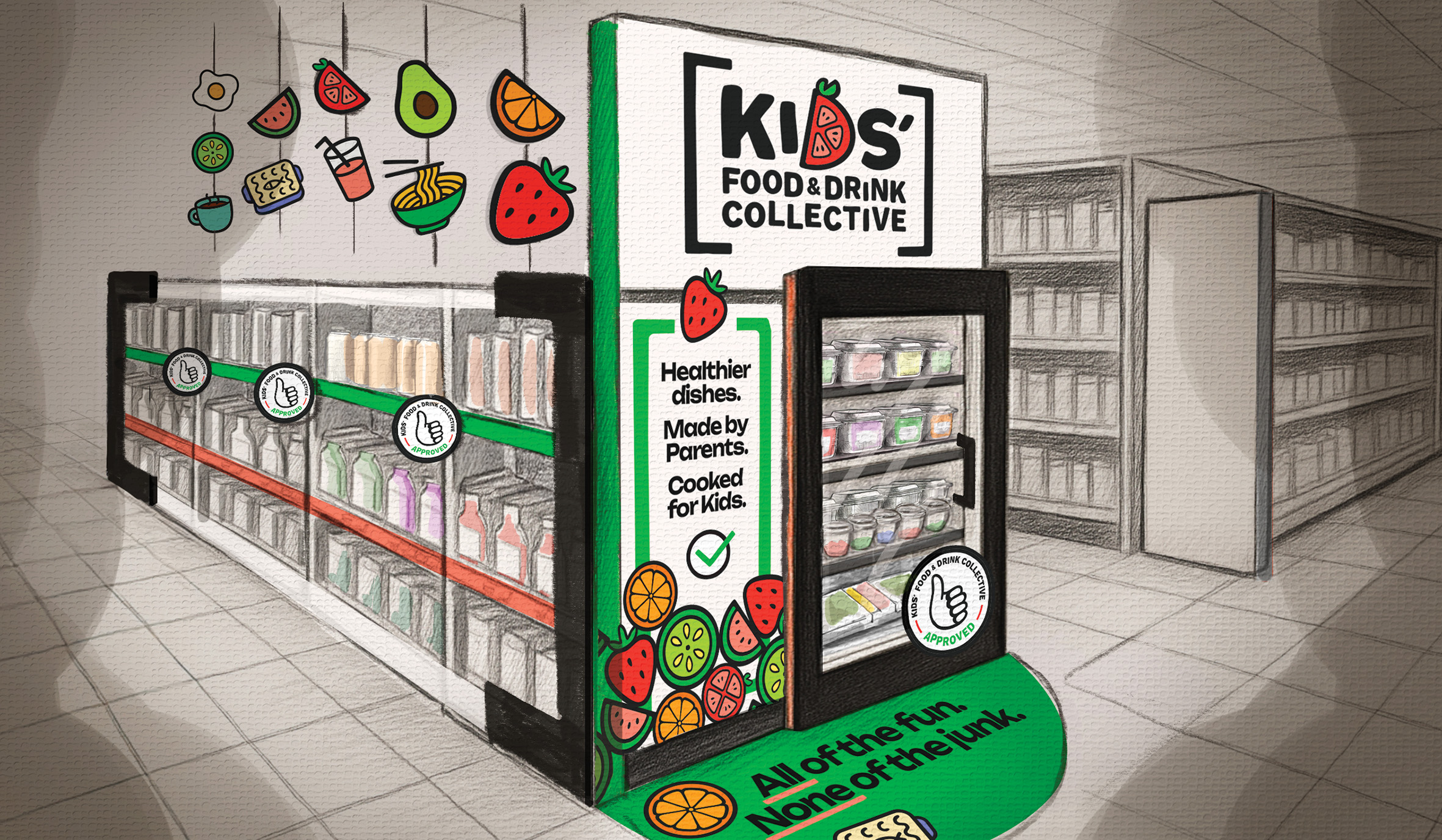
Over the last thirty years, children’s dietary health in the UK has faced significant challenges. Kids’ food in supermarkets and restaurants continues to be an afterthought, conjuring up images of soggy chicken nuggets and endless rows of crisps and confectionery – but with no signposting or guidance, parents are often left unsure what the better, convenient food choices actually are. The KFDC exists to shift these perceptions, gathering accredited, healthier Kids’ brands under one movement and making better choices easily identifiable and accessible.
Driven by the core belief that children deserve better, the Collective’s goals are to:
1. Raise the profile of their member brands, increasing their visibility and providing them with insights and opportunities and the chance to network and collaborate.
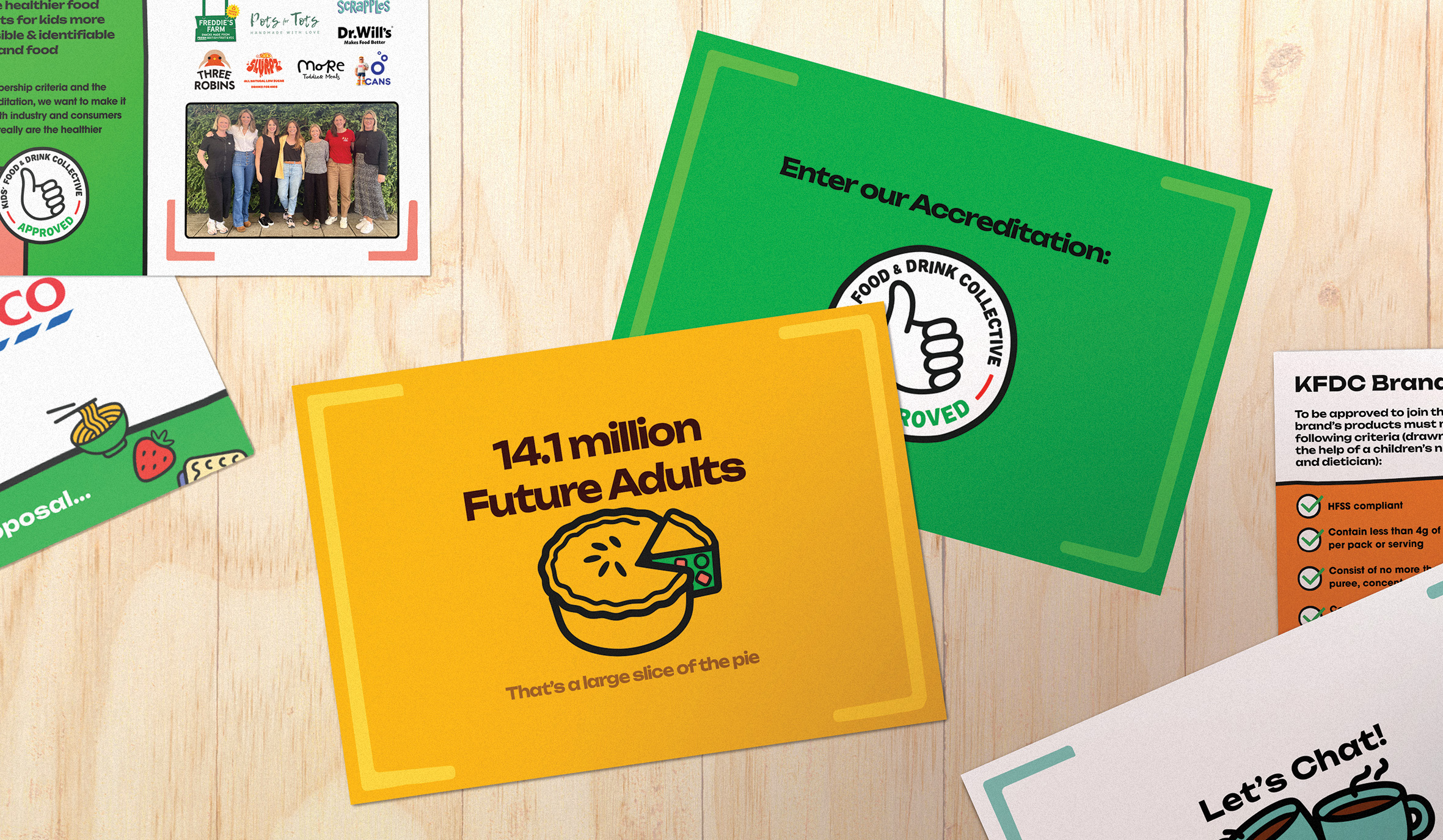
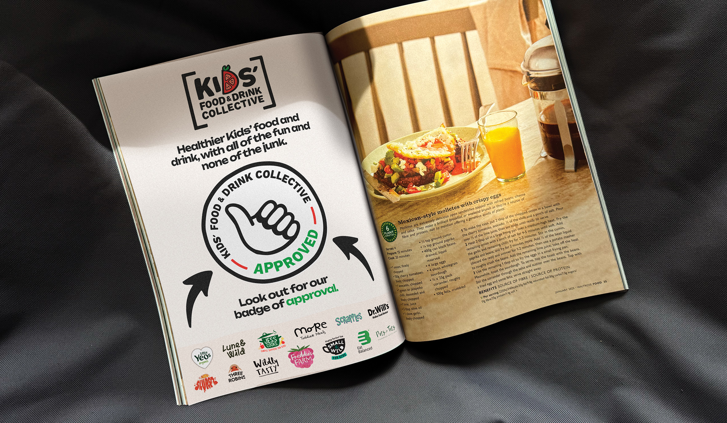
2. Establish the “KFDC approved” badge as a trusted symbol of healthier choices for both parents and industry.
3. Work with retailer and industry leaders to make healthier food and drink more visible, accessible and affordable.
4. Advocate for positive change through policy, research and public awareness.
These goals shaped the objectives of our brand redesign brief – requiring us to create a platform capable of supporting a growing range of brands, presenting as a united Collective while acting as a purposeful, passionate movement for change. After one incredibly successful year, they needed to breathe new life into the brand and communicate their messaging more powerfully to brands, parents and retailers. The ambition? To build on their momentum and help carve out a new Kids’ food and drink category, unapologetically taking up space in supermarkets, and asking a simple question: Shouldn’t our kids be eating better?!
The Design System
The core brief was to evolve the Kids’ Food & Drink Collective’s visual identity and assets into a strategic, clear, and more impactful system that could unite multiple brands, strengthen credibility, and give the movement a confident, joyful presence across print, digital and retail environments.
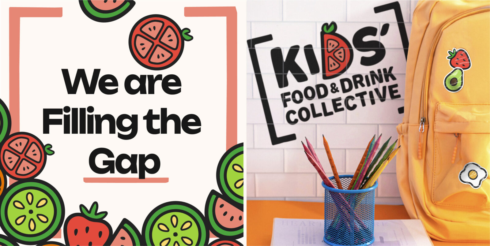
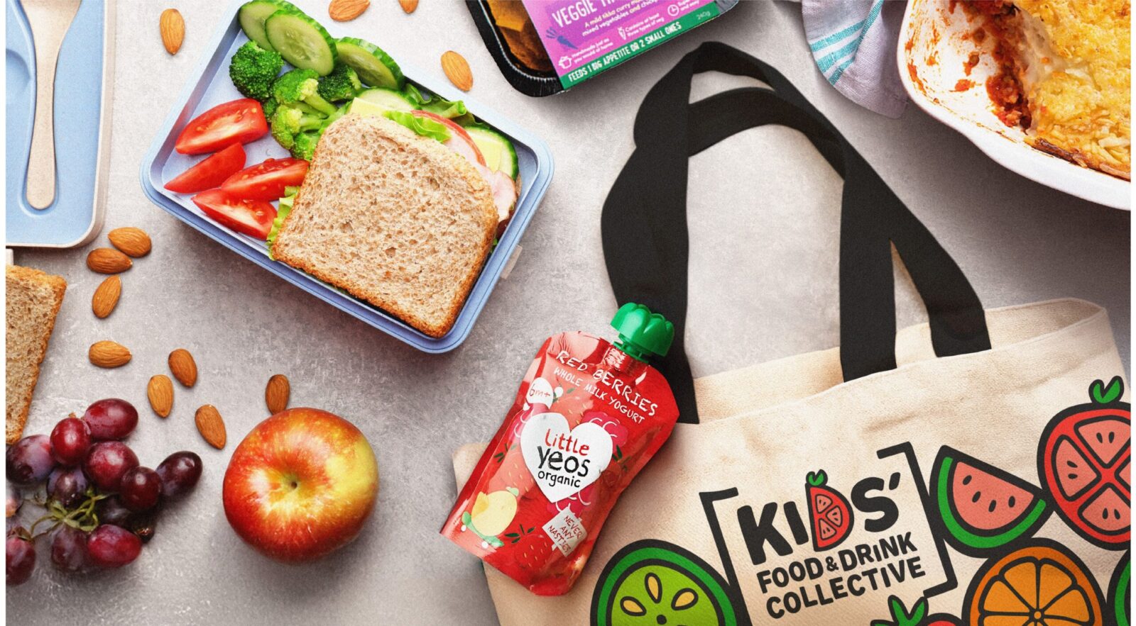
Our redesign shifted the brand into a more optimistic, feel-good space, celebrating the abundance and variety of nutritious and delicious Kids’ food and drink that the Collective’s brands bring. The refreshed identity – guided by the creative vision of “filling the gap” between what’s currently on shelves and what good Kids’ food actually is – brings strength and impact to the messaging, giving the brand presence as a collective movement with a joyful, foodie spirit at its core.
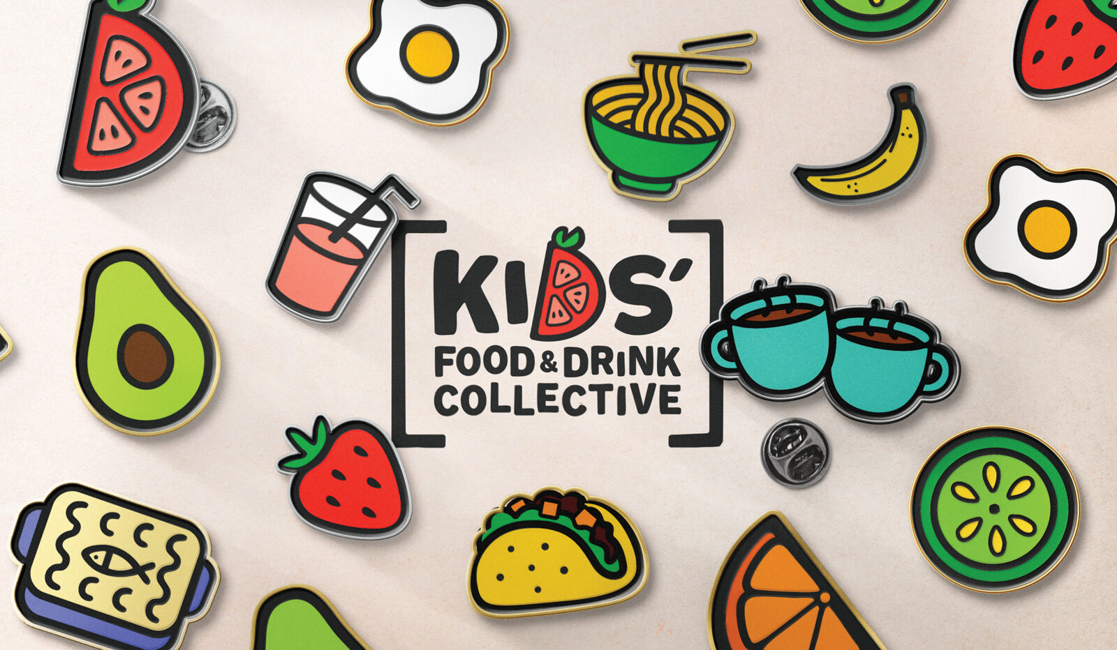
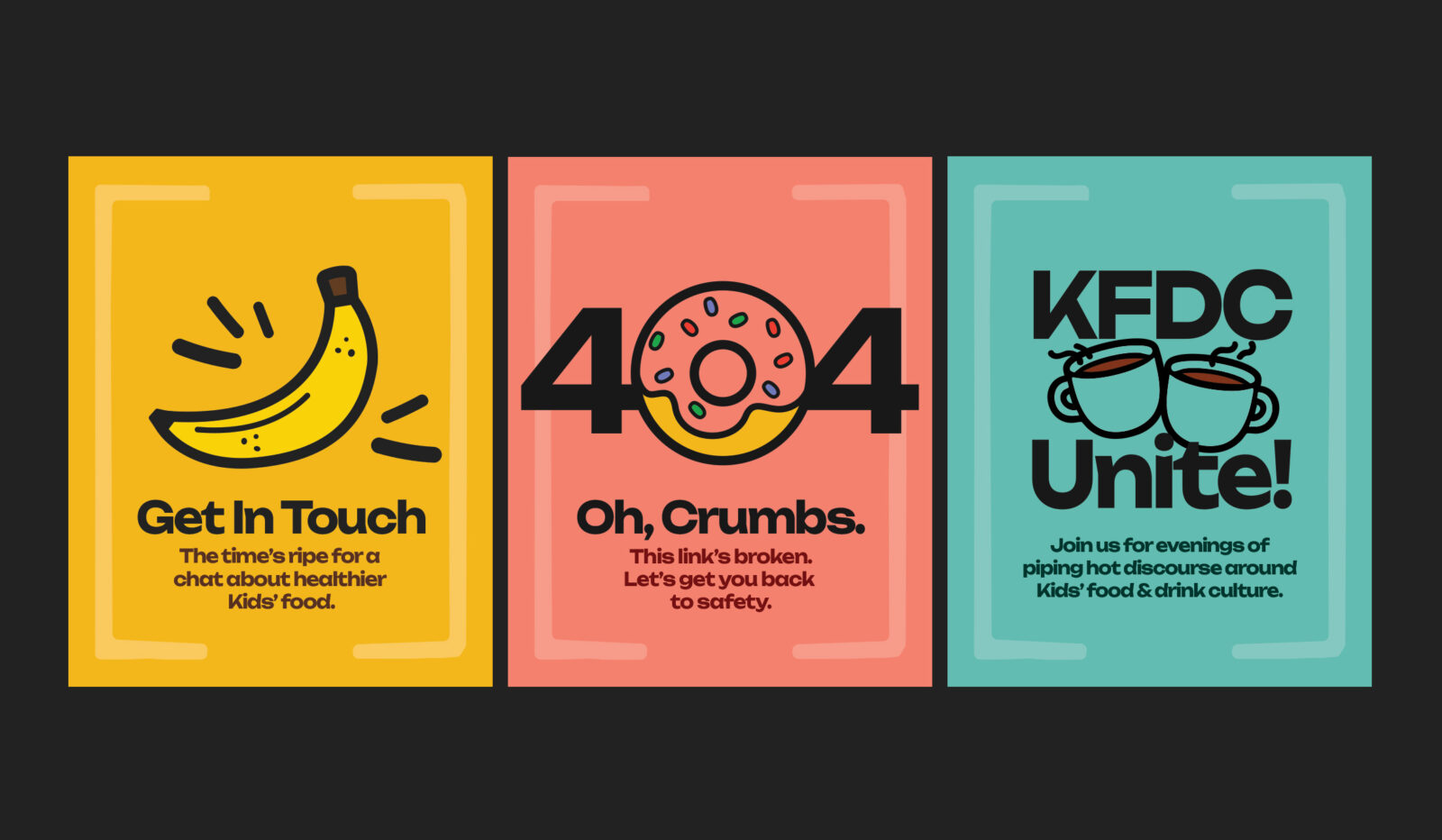
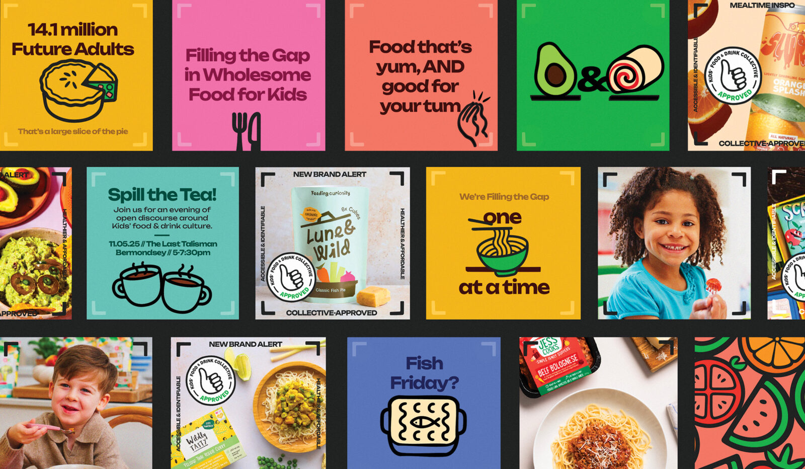
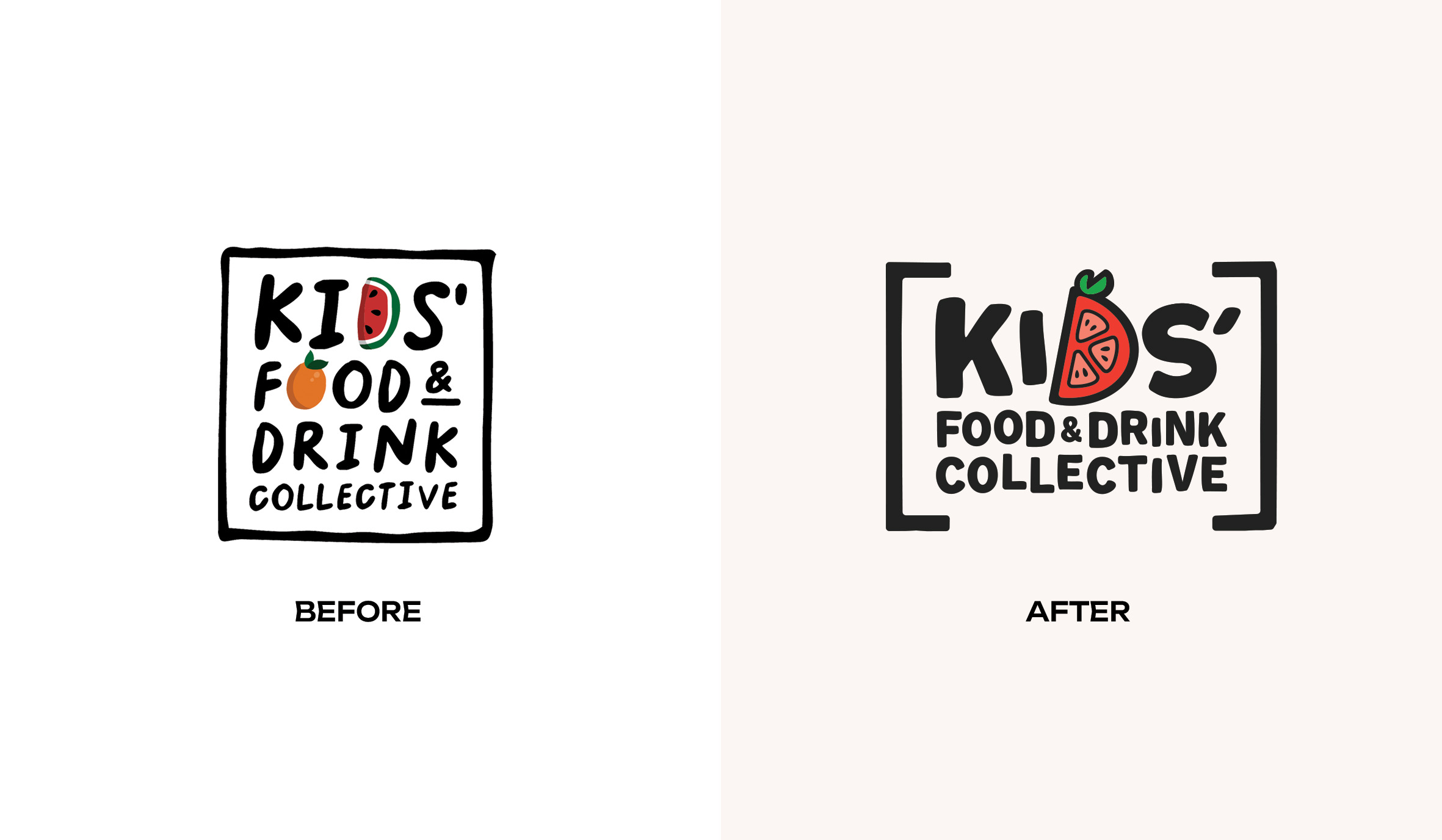
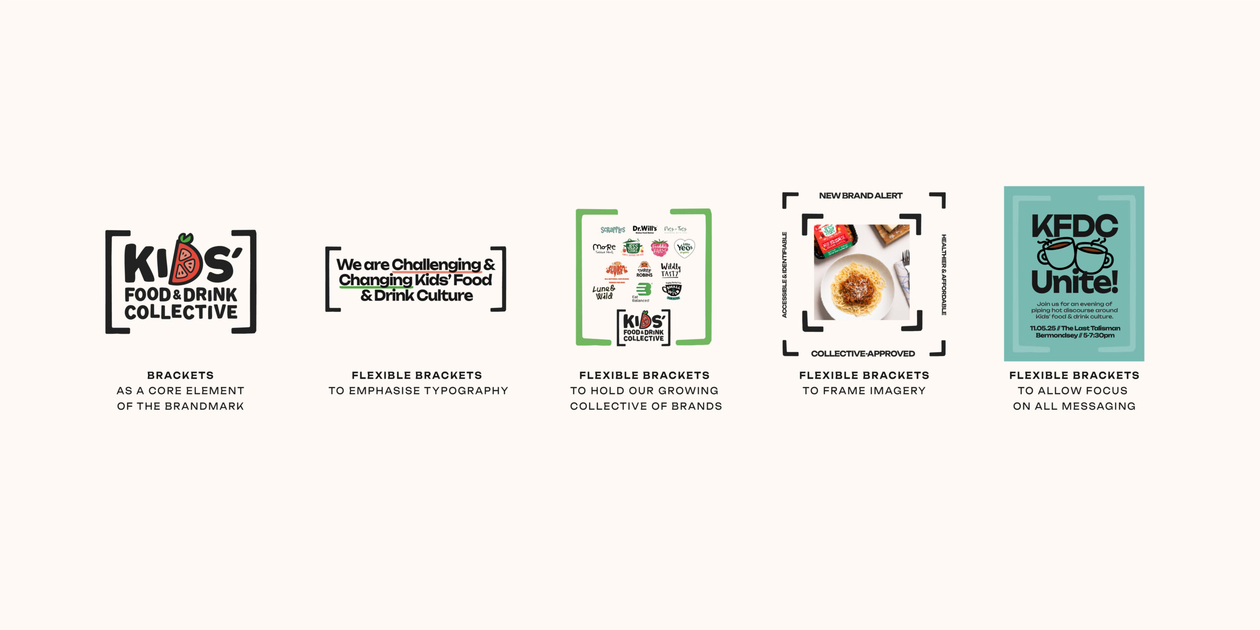
We built a comprehensive identity and toolkit to give them the flexibility to speak to a variety of stakeholders, while creating an engaging, ownable way to communicate the facts and stats around the state of Kids food, and to make them sit up and take notice of the opportunity. Introducing a set of brackets to hold the brandmark helped cement our presence as a collective and formed the foundation for a flexible bracket system – allowing for a consistent graphic language across the wide range of touchpoints we needed to consider.
The bracket system gave us an effortless way to achieve several of the Collective’s strategic objectives while maintaining ease of implementation for the client. As a non-profit without an in-house designer, one of the key tactical challenges was ensuring the design templates were genuinely usable – balancing consistency with the flexibility required to communicate in multiple ways. The bracket system achieved this through its simplicity: a clear way to “hold” the variety of brands within the Collective; a frame to spotlight the products within it; and a way to emphasise key phrases, statistics and challenges.
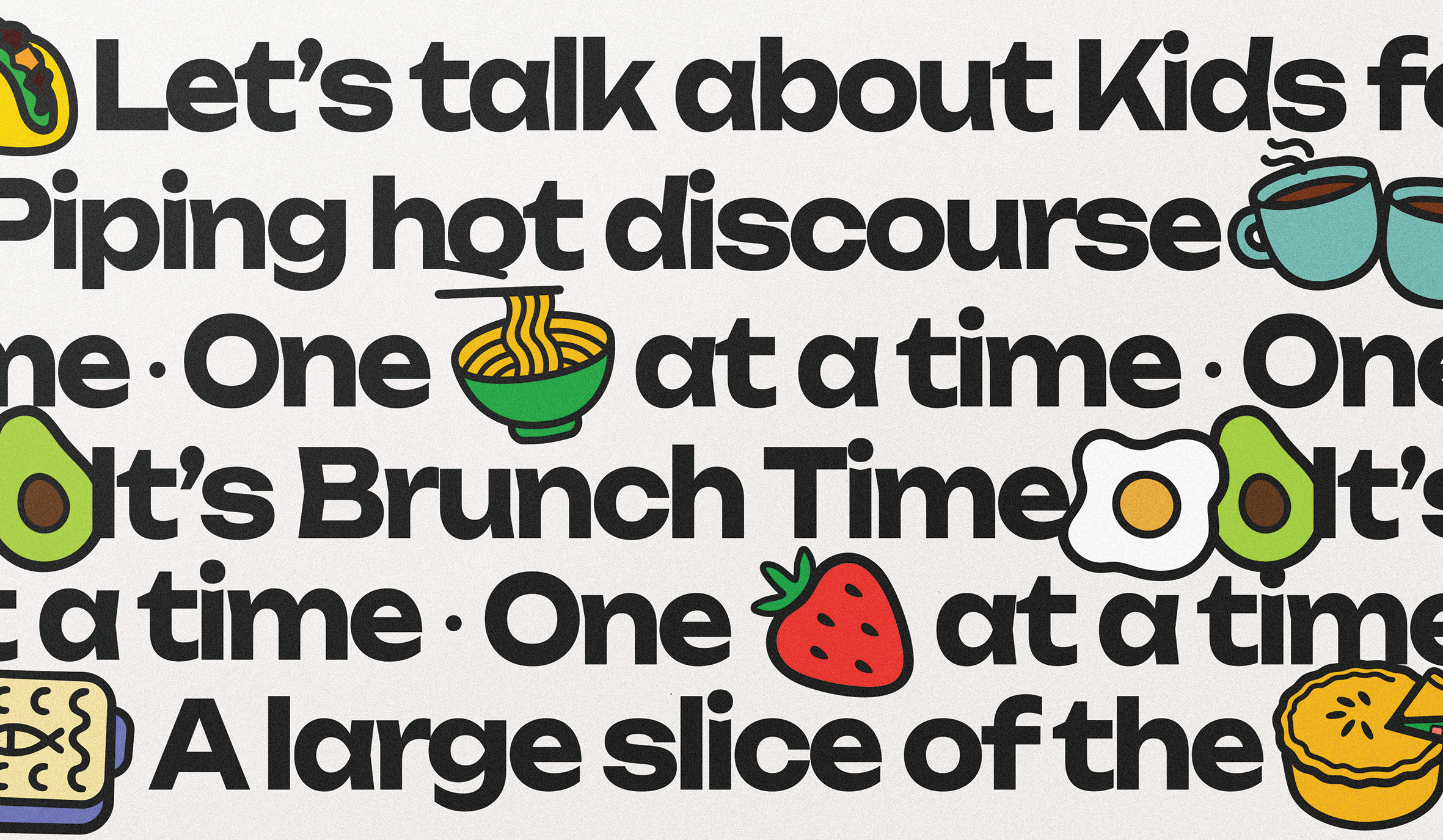
Due to this being a non-profit Collective, we were constrained on typography (needing accessible, free system fonts) and photography (sourced from individual member brands), but illustration offered the opportunity to express the joyful nature of the dishes and ingredients at the heart of the Collective’s brands. Infusing Jess’s witty, challenger attitude into the tone of voice – and supporting it through playful illustration and warm, food-inspired colours – elevated the brand’s expression in a simple, impactful way.
The Impact
As a women-owned business, The Otherly is committed to supporting and uplifting other women in business. This redesign reflects our dedication, not only to exceptional creative work, but also to championing women-led talent, and our values throughout the process. What started as a simple refresh of the assets, evolved into a comprehensive brand redesign, and the creation of a rich brand world – in real collaboration with the Jess, the Founder. Because the KFDC is so deeply rooted in Jess’ own drive, experience, and personality, we built the project around transparency and co-creation. This made the outcome not just strategically and creatively strong, but meaningful for everyone involved.
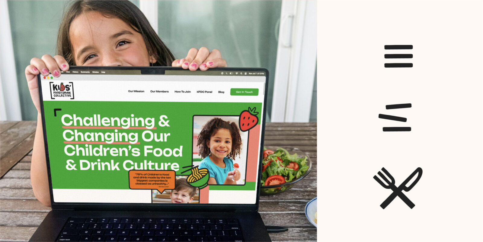
Previously, the initiative had a mission, a logo, and some basic assets. Now the brand has a strategic creative vision at its core – and a visual identity system that matches the energetic purpose and ambition of the Collective, giving them the flexibility to expand and tell their story in different ways. The identity redesign gives them credibility and allows the Collective’s joyful, disruptive presence to be felt across every required touchpoint. The impact is already visible on digital channels, where the new system has strengthened brand consistency, clarity and engagement. With a suite of dynamic assets designed to disrupt in-store environments and support future campaigning, the Collective is now equipped to grow, advocate, and influence at scale. We’re excited to see how our new work drives their next exciting chapter of growth.
Quote from Jess Mackenzie:
“The Kids’ Food & Drink Collective wouldn’t be where it is now without the support of the team at The Otherly. Their patience, commitment, dedication, and kindness have been absolutely critical to our growth and development over the past few months. Their creativity and imagination brought to life a brand identity & brand world that perfectly captures our personality and everything we stand for.”


CREDIT
- Agency/Creative: The Otherly Innovation Limited
- Article Title: Kids’ Food & Drink Collective Brand Redesign by The Otherly Innovation Limited
- Organisation/Entity: Agency
- Project Status: Published
- Agency/Creative Country: United Kingdom
- Agency/Creative City: London
- Project Deliverables: 2D Design, Animation, Brand Design, Brand Identity, Brand Mark, Brand Redesign, Brand Rejuvenation, Brand Strategy, Brand Tone of Voice, Brand World, Branding, Copywriting, Creative Direction, Design, Graphic Design, Identity System, Rebranding, Tone of Voice
- Industry: Non-Profit
- Keywords: WBDS Agency Design Awards 2025/26, Kids Food Drink Collective Non-Profit Movement Redesign Brand Identity Design System
-
Credits:
Founder – Kids' Food & Drink Collective: Jess Mackenzie
Founder/Managing Director – The Otherly: Amy Steinmetz
Creative Director – The Otherly: Chris Walsh
Creative Director – The Otherly: James Roast
Design Director – The Otherly: Lekha Nanavati
Senior Designer – The Otherly: James Bell
Client Development Director – The Otherly: Cathy Lowe
Senior Motion Designer: Andrew Whittle


