East African specialty food company The Perennial Foods Group is set to launch its first branded product; the Kib herbal tea range, with brand and packaging design by London studio & SMITH.
These are herbal teas unlike any other. Using herbs grown by Ethiopian smallholder farmers in ‘food forests’, where a range of crops are grown together using regenerative techniques that enrich the soil. They offer a new, more hopeful direction for global agriculture. The design of the range is not only a fresh take on the tired themes of ethical food and drink packaging, it is also a departure for the herbal tea category.
Rethinking tea: The Perennial Foods Group is on a mission to connect smallholder farmers in East Africa with international customers. It does this by giving them the tools, training, and opportunity to showcase their produce to the world.
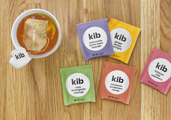
Before this launch of five herbal teas, The Perennial Foods Group had specialised in exporting fresh produce including avocados, beans and chillis. “We’re entering a crowded category,” says Andrew Weiler, Kib’s Commercial Manager. “We knew we needed a brand and pack design that would stand out on shelf. We also knew we had a story that could stand out.”
He continues: “So we needed an agency to help us tell that story on pack. Kib is Amharic for circle, and the idea of circularity is at the heart of everything we do. We use circular methods to grow the herbs we use in our teas and the packaging we use is all recyclable or compostable so that it can keep circulating instead of going to landfill. Our commitment to circularity is what delivers the naturally delicious flavours of our herbal teas. That’s the story we asked & SMITH to tell.”
A second to stand out
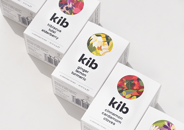
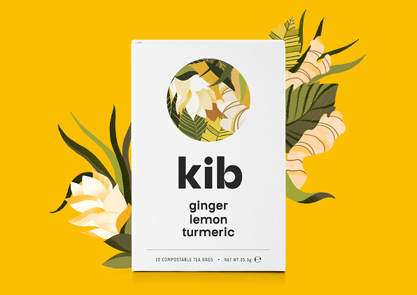
The designs launching today are unlike anything else in the tea sector. In a category laden with colour – the pure, simple black and white of the Kib colour palette will stand out on shelf. Yet there is a richness too, with lush illustrations that conjure images of the verdant food forests, and an earthy but bold palette to represent each flavour.
“If you want to stand out on shelf, you always need to understand what else is there already,” says Rachel Smith, Creative Partner at & SMITH. “So we spent a lot of time looking at the tea fixture and working out what would make the difference in that split second of purchase. There was a riot of background colour and pattern on the tea shelf, and we wanted to create something that was modern, and confident.”
They also wanted to stand out from other ethical teas and not go down the more obvious ‘kraft paper’ route, it needed to feel fresher than this. “We wanted people to purchase this tea as a modern lifestyle choice, the positive social and environmental impact messaging is there – but it doesn’t overtake everything else, like the flavour and the ingredients.”
The pack on the outside is minimally designed and then the lush, forest-like illustrations sit inside the circle and are also flooded on the inside of the pack, as if the herbs in the tea are still at home in the food forest they were grown in. The pack inner also explains in more detail how circular growing creates products of the highest quality. In the same way the circle motif is subtly present throughout, including in the ‘b’ of Kib.
The circle motif continues to be used on social and web, with modern icons and animations designed in-house to explain the concept of circular agriculture.
Design with impact: “& SMITH has helped us create an identity that lands the message of circularity while feeling fresh and exciting,” concludes Weiler. “They helped us take a step back and identify what will really stand out on the shelf – and I’m certain this design will. We trialled it at a trade fair, and people were stopping, saying it doesn’t look like anything else they’ve seen in tea.”
The food forest illustrations are by Willian Santiago and commissioned through La Baraque and the web build was by Graft Studios.


CREDIT
- Agency/Creative: & SMITH
- Article Title: Kib Launches With Brand and Packaging Designed by & SMITH
- Organisation/Entity: Agency, Published Commercial Design
- Project Type: Packaging
- Agency/Creative Country: United Kingdom
- Market Region: Europe
- Project Deliverables: Brand Strategy, Brand World, Branding, Graphic Design, Illustration, Packaging Design, Research
- Format: Bag, Box, Sachet
- Substrate: Pulp Board, Pulp Carton


