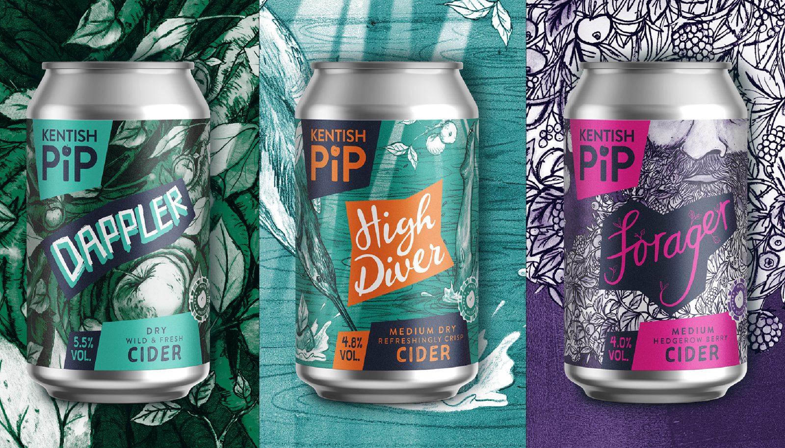
Kentish Pip is a family run, Kent-based cider producer, with ambitions to challenge mediocre cider and produce the next generation of British cider. We worked with them on the idea of bringing craft stories to the category. To help them achieve this we created a world of visual storytelling linked closely to their heritage and the stories of the cider itself.
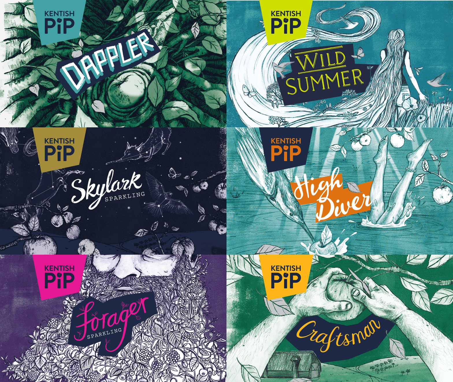
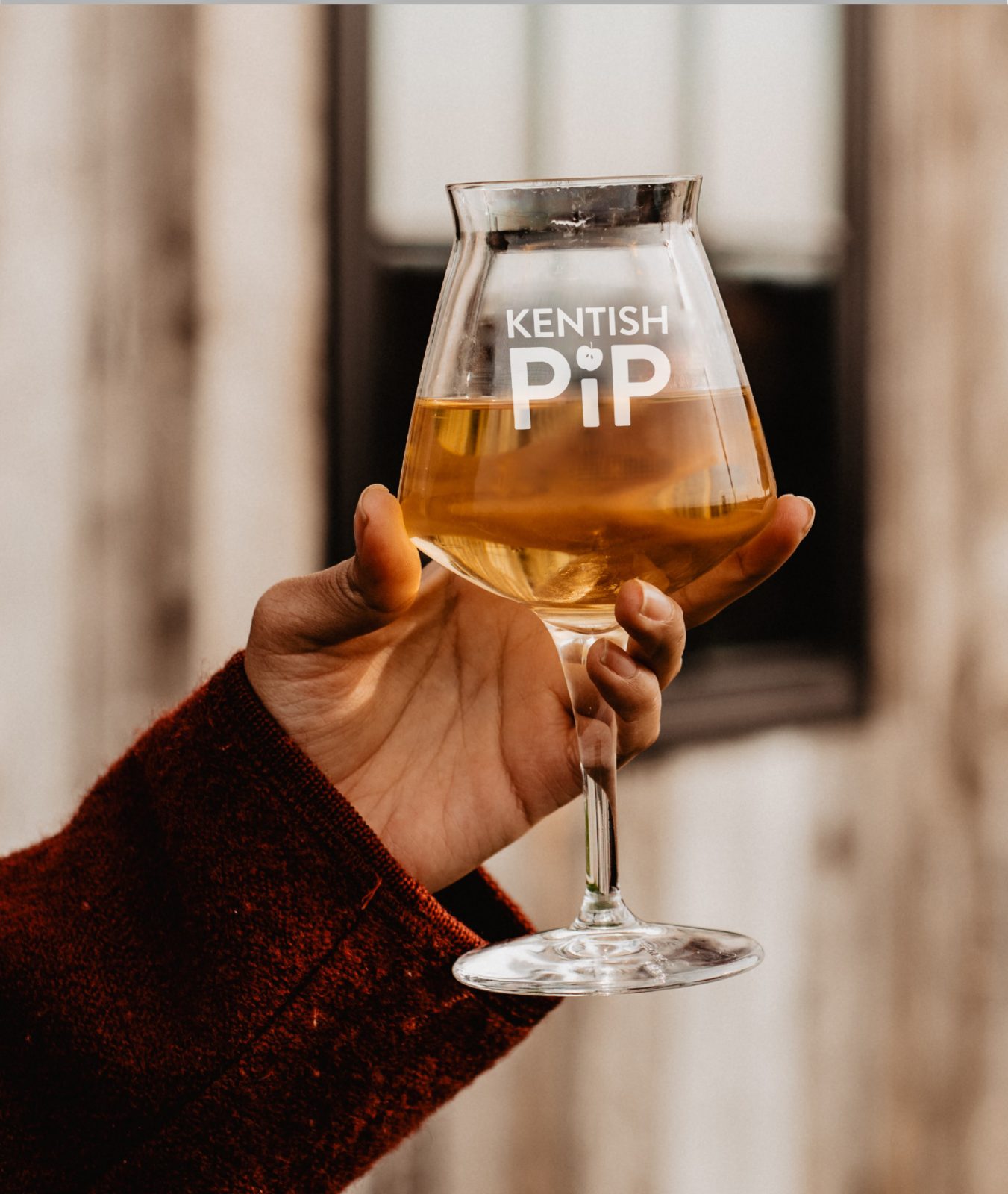
We started with a finessed logo identity that kept their established brand but helped it to feel timeless without losing personality. We also developed product names and accompanying illustrations that breathe life into the character of each product.
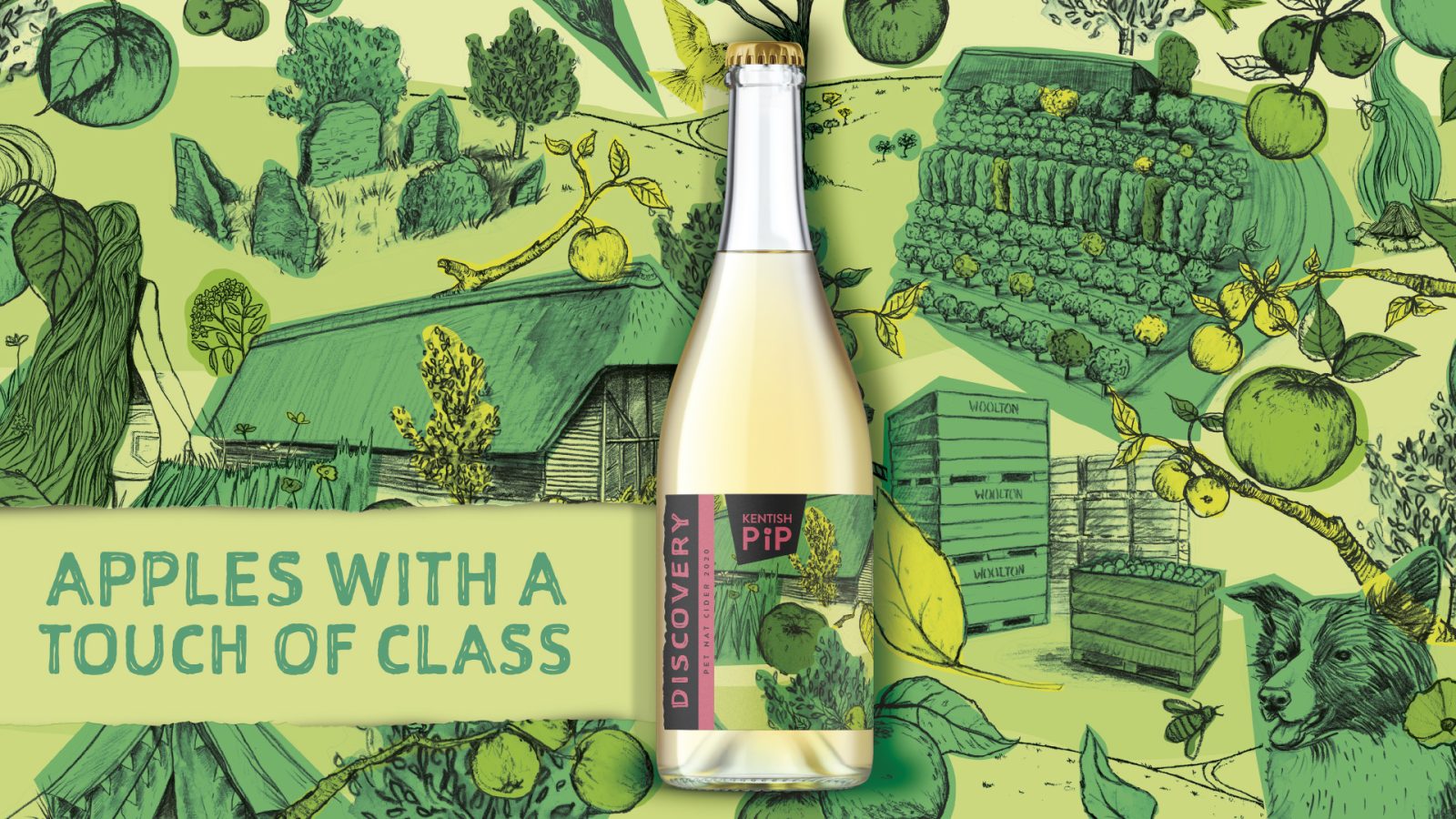
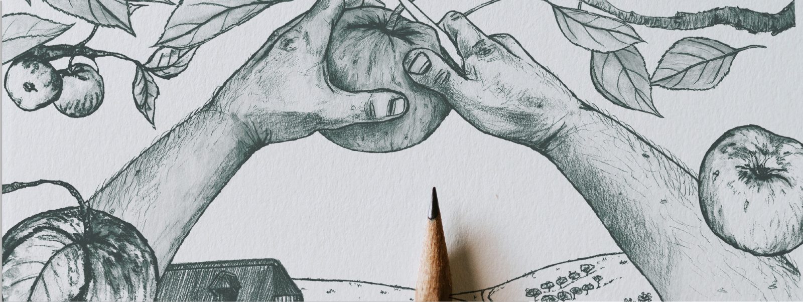
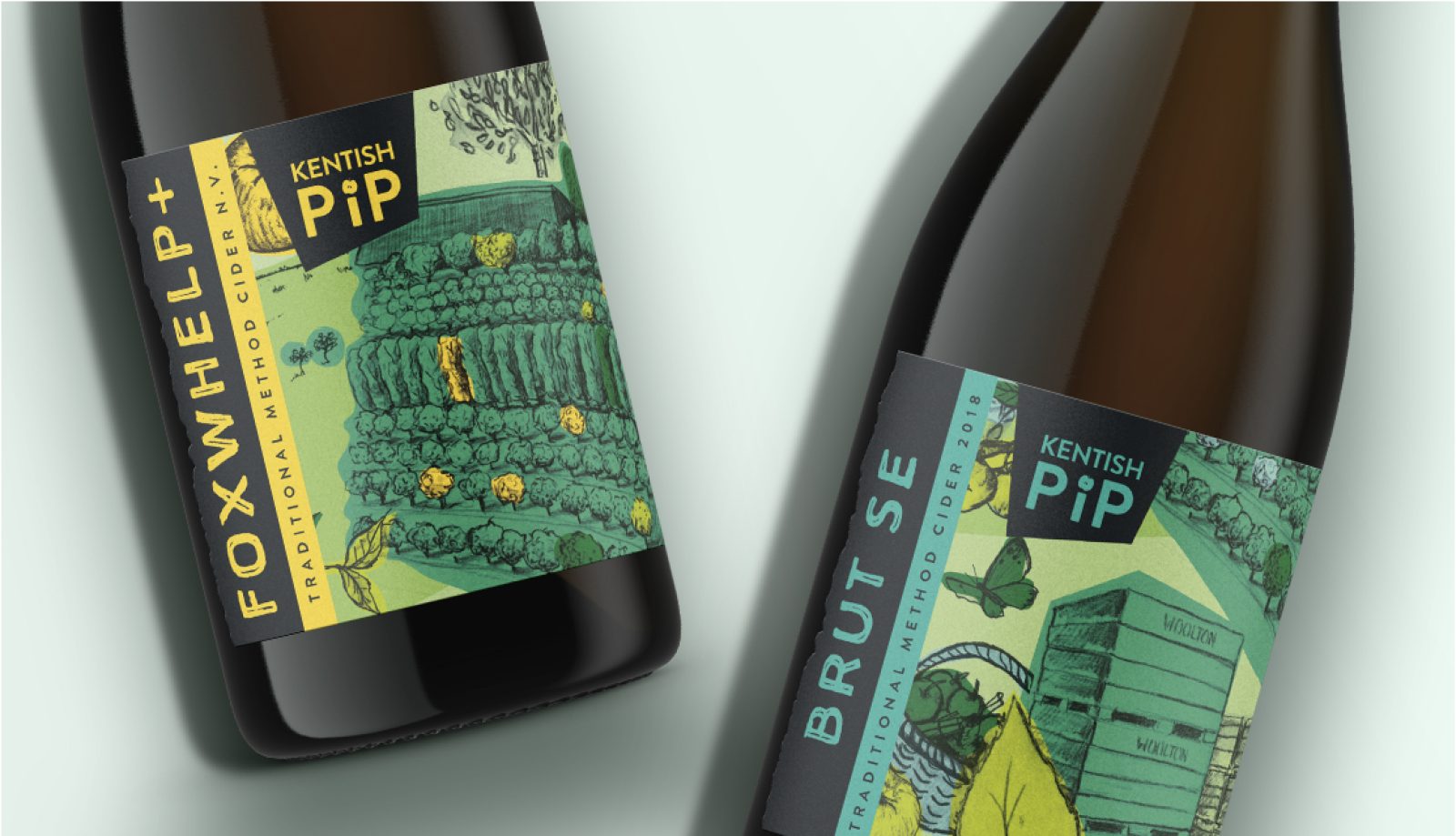
The illustrations are created by hand by our design team to bring a real sense of craftsmanship and small-batch production to the brand. They evoke modern cider landscapes that add a touch of tradition and a heap of storytelling. We wanted to tell stories that went further than provenance and process, that’s why the scenes really bring in the drinker’s experience of the cider and evoke a world beyond the everyday. Each illustration uniquely represents the ingredients and the apples used, but also considers the drinking occasion, the story behind the cider and the nature surrounding the cider.
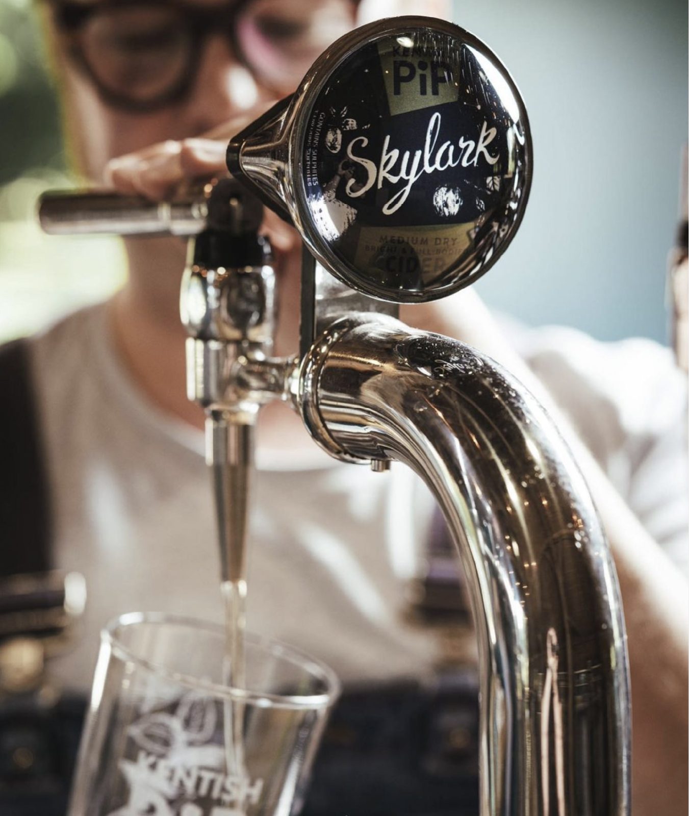
Hand-scripted typography and bold, contrasting colours help these designs stand out on a crowded shelf but with a coherent, consistent brand identity to build clear brand recognition. It keeps the brand modern and fresh, without ignoring heritage and tradition. Their unique style works across a range of casual, thirst-quenching cans and premium champagne style ciders, reaching different audience groups across channels, while still maintaining brand coherence and flexibility.
Kentish Pip sells all over the UK in independent stores, restaurants, pubs and online through craft distributors and is a strong festival favourite. They’re now an M&S approved producer and export all over the world.
CREDIT
- Agency/Creative: Kingdom & Sparrow
- Article Title: Kentish Pip Packaging Redesign
- Organisation/Entity: Agency
- Project Type: Packaging
- Project Status: Published
- Agency/Creative Country: United Kingdom
- Agency/Creative City: Falmouth
- Market Region: UK
- Project Deliverables: Packaging Design
- Industry: Food/Beverage
- Keywords: WBDS Agency Design Awards 2022/23


