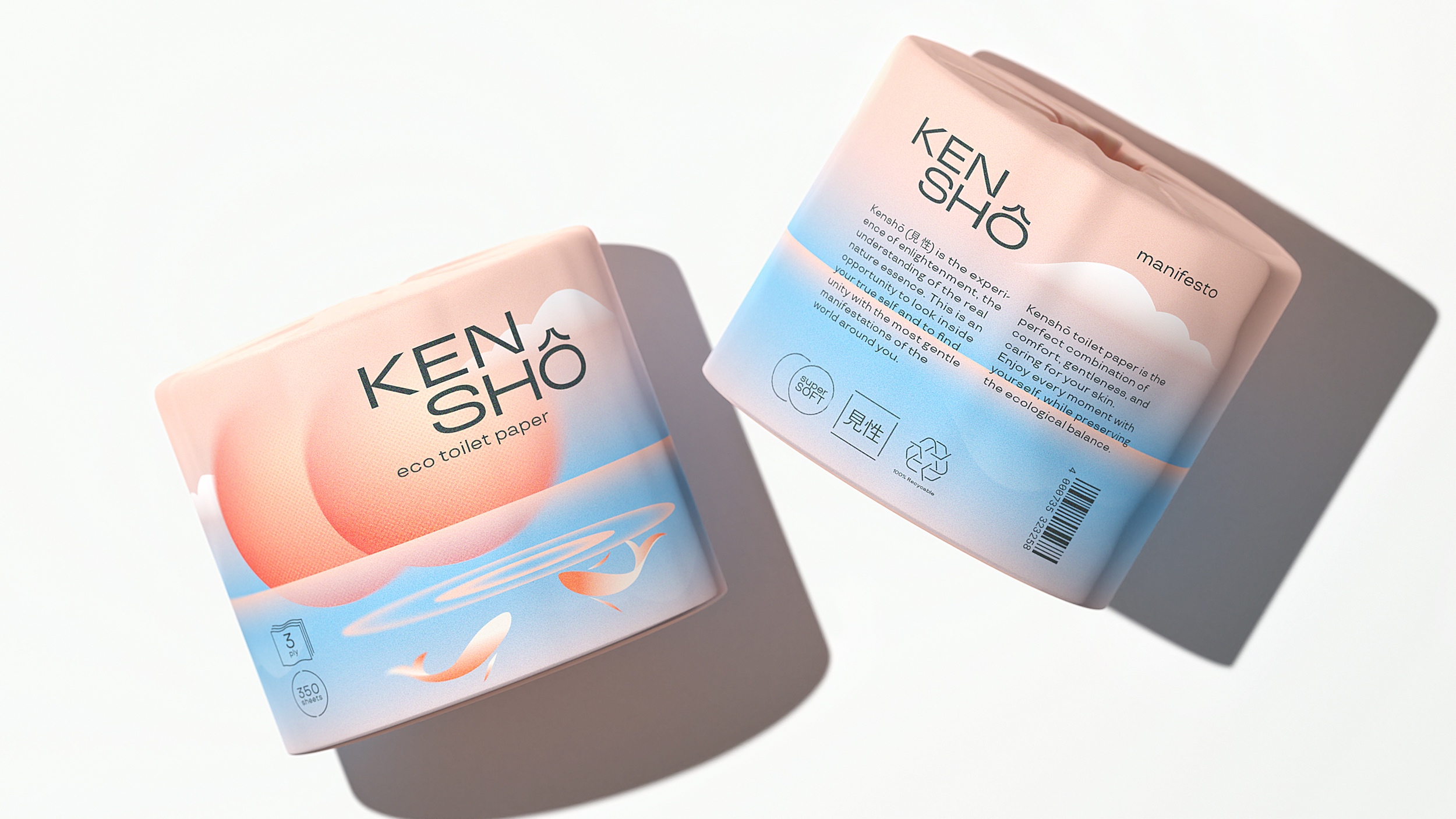
Kenshō (見 性), which translates to “seeing one’s nature”, is the experience of enlightenment, the understanding of the real nature essence. This is an opportunity to look inside your true self and to find unity with the most gentle manifestations of the world around you.
This Japanese term that symbolizes connection with the fragile yet beautiful facets of the surrounding universe has become the ideology for the brand of super soft eco-friendly bamboo toilet paper. As you embark on your daily rituals, let Kenshō guide you towards a deeper understanding of your own nature and a reverence for the world around you. Embrace the wisdom of Kenshō, and let every bathroom visit be a reminder of the interconnectedness of all things.
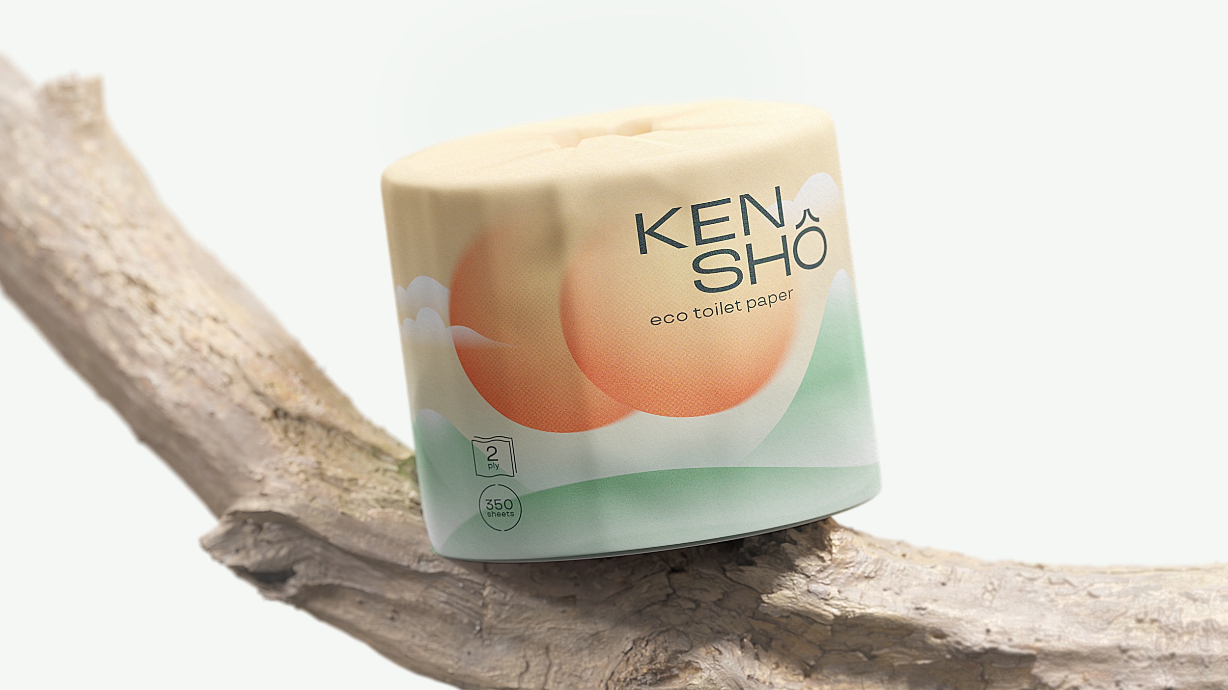
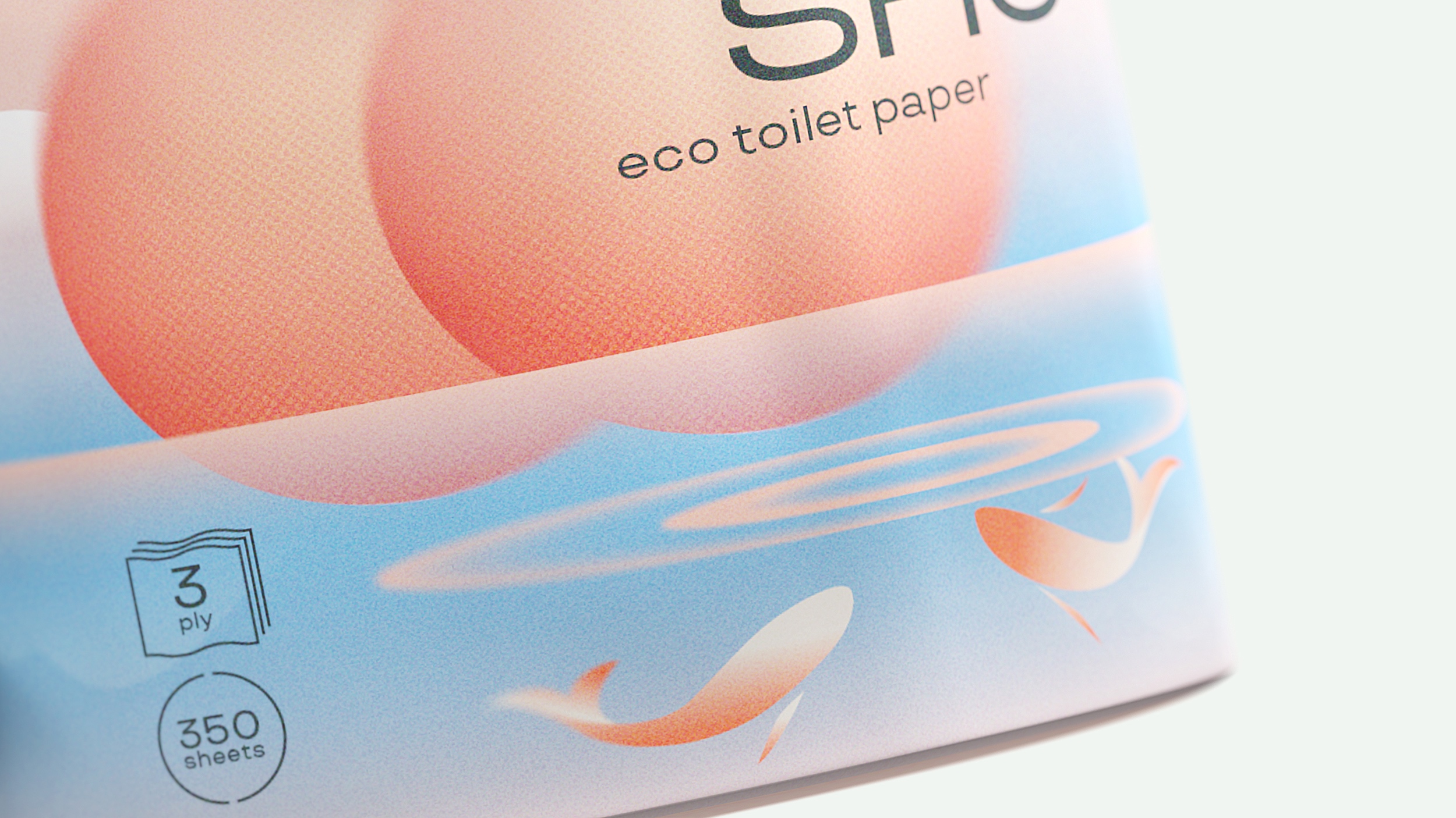
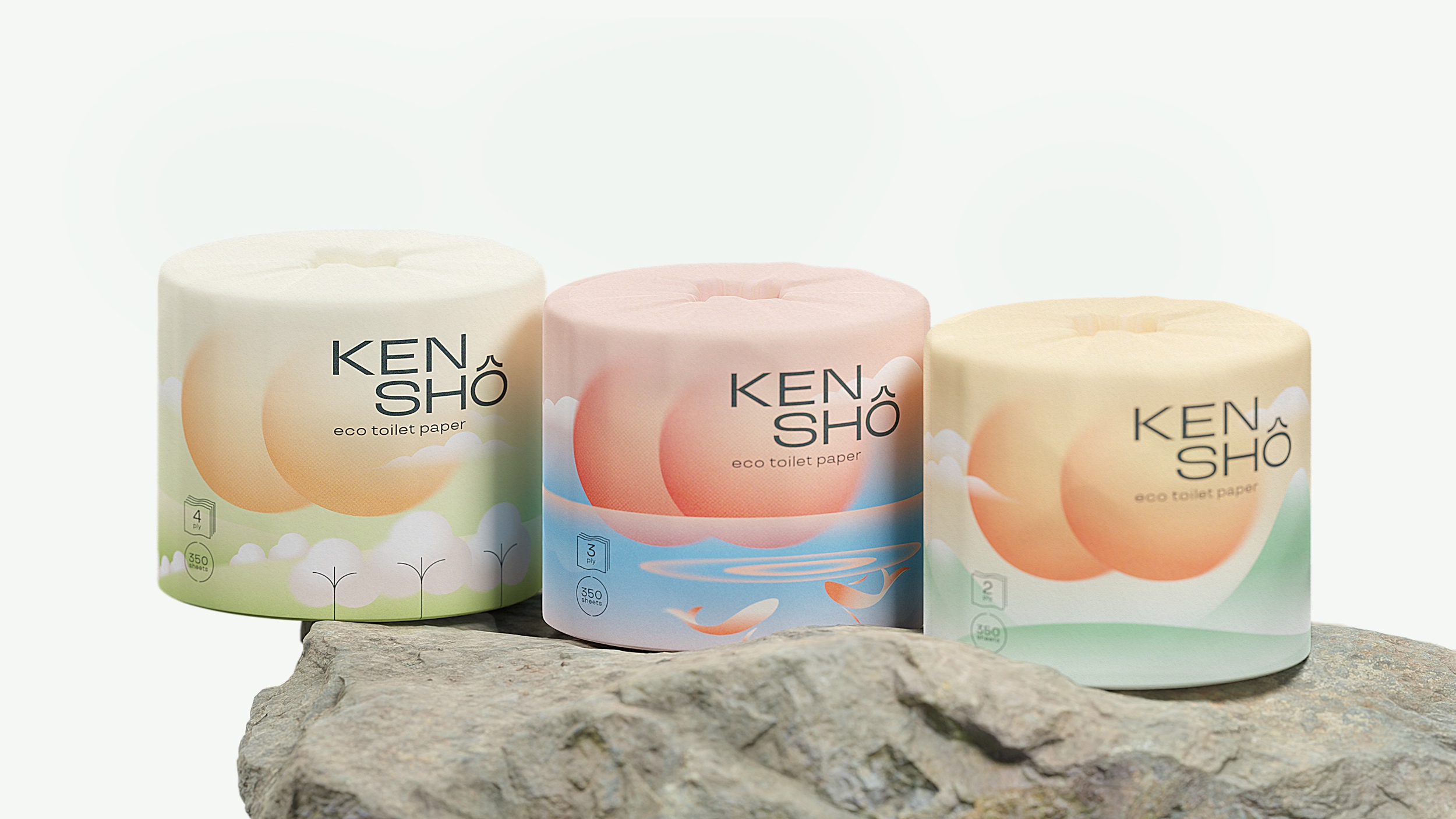
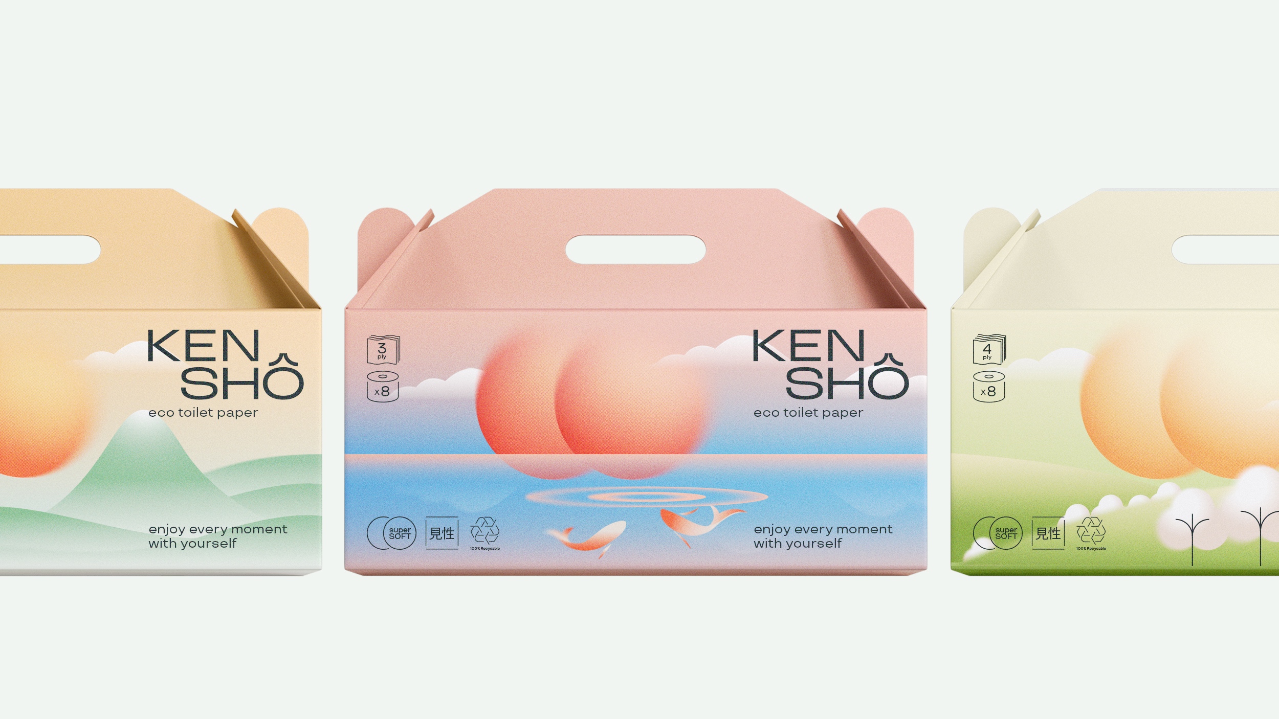
The metaphor of the concept is two suns rising over peaceful landscapes. In order to enhance the gentle nature of the brand all graphic elements are based on soft rounded shapes. The enveloping coolness of the mountain river, the gentle touch of fluffy cotton flowers, the light mountain wind are made in the style of Japanese engraving with its sense of depth, blending and gradation of colors. The color scheme consists of pastel shades that change depending on the surrounding landscape. The logo uses a modern neutral font with the accent in the letter “O”, that plays up to the intersection of two suns with its shape. Icons with fine linear graphics are neatly placed on the front of the packaging and the additional information with the manifesto is placed on the back side to bring the main landscape with two suns to the foreground.
The packaging itself is eco-friendly, using sustainable materials and minimalistic designs, symbolizing harmony, balance, and the unity of nature. This all reflect Kenshō’s commitment to the environment and creating a feeling of lightness and referring to the pristine nature in all its manifestations.
CREDIT
- Agency/Creative: politylena" target="_blank"> Elena Opanasenko , Evgeniia Nov
- Article Title: Kensho Student Packaging Design Concept
- Organisation/Entity: Student
- Project Type: Packaging
- Project Status: Non Published
- Agency/Creative Country: Russia
- Agency/Creative City: Moscow
- Market Region: Europe
- Project Deliverables: Packaging Design
- Format: Box, Wrap
- Industry: Health Care
- Keywords: WBDS Student Design Awards 2023/24
- Keywords: Packaging Design, Product Creation
-
Credits:
Educational Institution: HSE University
Educator's Name: Leonid Slavin


