


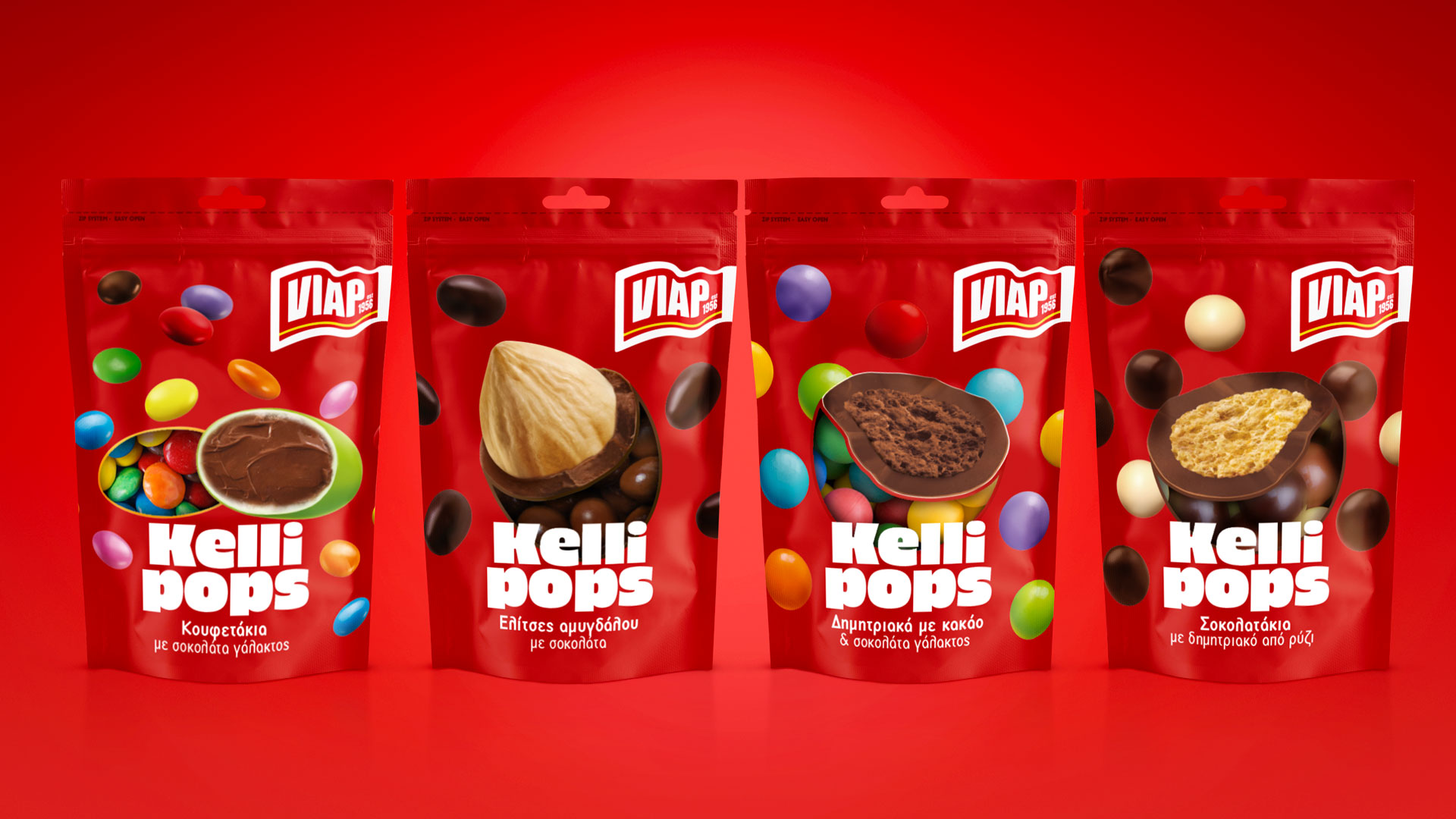
An everyday, over the counter chocolate confectionery found in Greek supermarkets and convenience stores, one that can be eaten on the spot whether in the street, office, home or carried inside a bag.
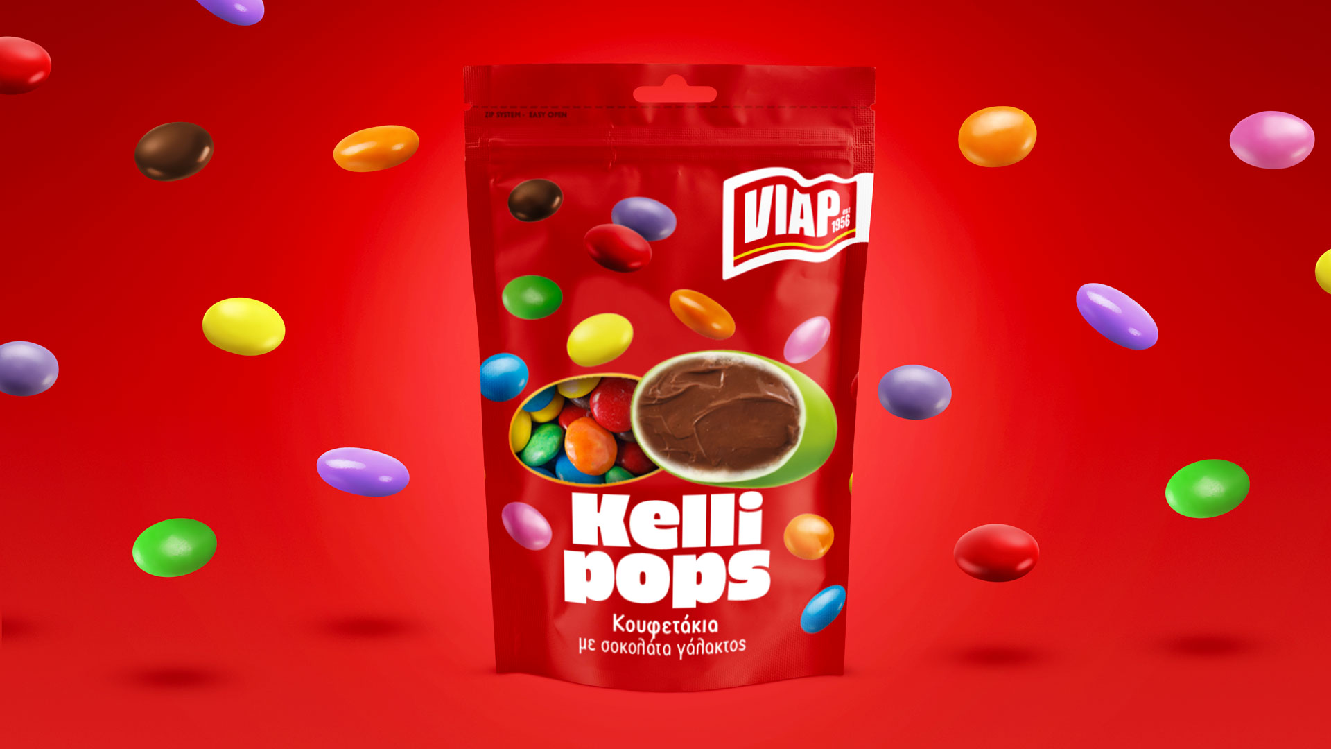
The name ‘kellipops’ derives from the greek word ‘keliphos’ meaning ‘shell’ – signifying the chocolate coating and ‘pop’ which is a fun word defining the mood, excitement, sound of crunch, that pleasant surprise on the tongue. Also a pack which pops out when you see it.
The logo uses typography inspired by the ‘60s, using a round and bold font with a playful mood. The design concept is inspired by the pop art movement using bright contrasting colours.
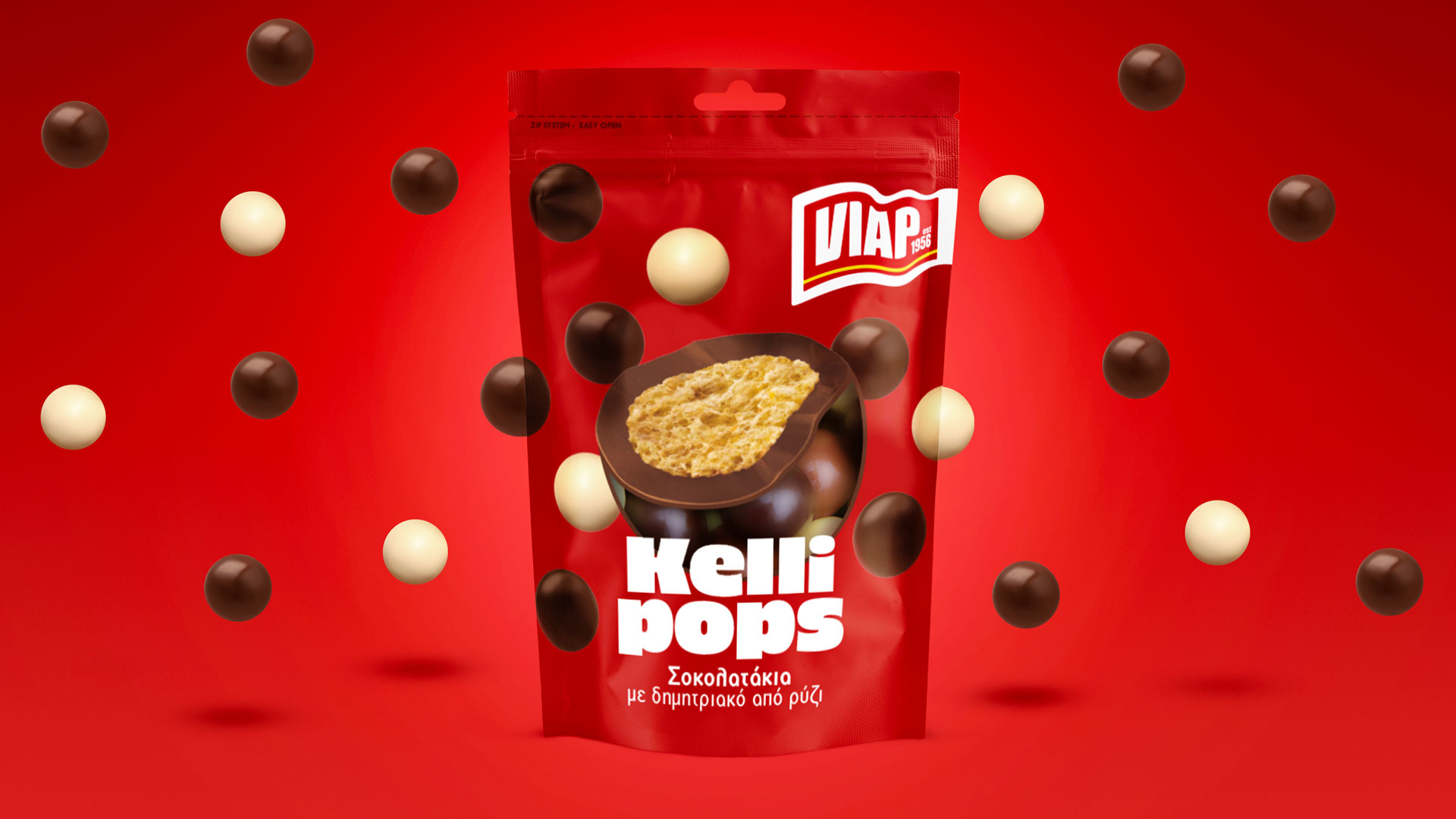
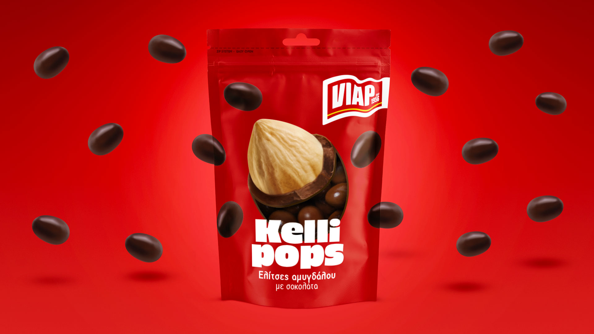
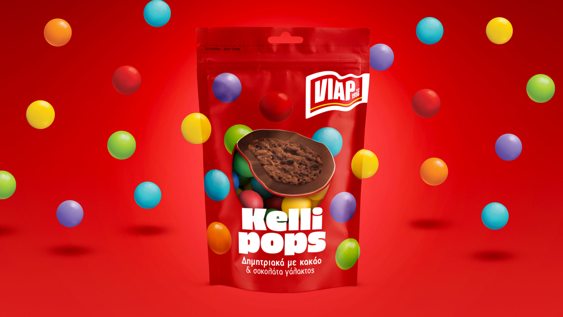
The giant product signifying the variant, is placed in the centre bearing a transparent section which allows visibility of the actual product inside the bag. On each case, the product in the centre is bisected and treated as a demo illustration taking us into the inner world of the candy-coated ball: milk chocolate, whole almond centre, cocoa cereal, rice cereal.
The background consists of each variant’s products forming a pattern related to a ‘60s polka dot array. The combination of colours, the shiny surfaces and bold letters, all become a happy composition and a wonderful mess of the joy of life. It’s a friendly world where nothing is sharp or complicated but innocent, round and nostalgic. It’s a world you would enjoy like a Ferris wheel on an amusement ride of taste.
The flag-like logo of the company is a redesign of their old logo – also a flag – which kept the old elements but brought it to a new century.
Overall, the way the product line has been designed is one that will accept more variants if they come along in this well-thought-out concept, without looking boring, dated or uninterestingly similar. The central point which is the cross-section of each product is the key point of difference among the variants while the red colour and graphics bind them together under the same brand.
CREDIT
- Agency/Creative: A.S. Strategy
- Article Title: Kellipops Packaging Design by Antonia Skaraki Strategy
- Organisation/Entity: Agency
- Project Type: Packaging
- Project Status: Published
- Agency/Creative Country: Greece
- Agency/Creative City: Athens
- Market Region: Europe
- Project Deliverables: Packaging Design
- Format: Bag
- Substrate: Plastic
- Industry: Food/Beverage
- Keywords: Brand Strategy, Brand Development, Brand Story, Brand Identity, Visual Identity, Illustration, Packaging Design, chocolate, pops, nuts, cake decoration
-
Credits:
Creative Director: Antonia Skaraki


